About the Logic Model Templates Collection
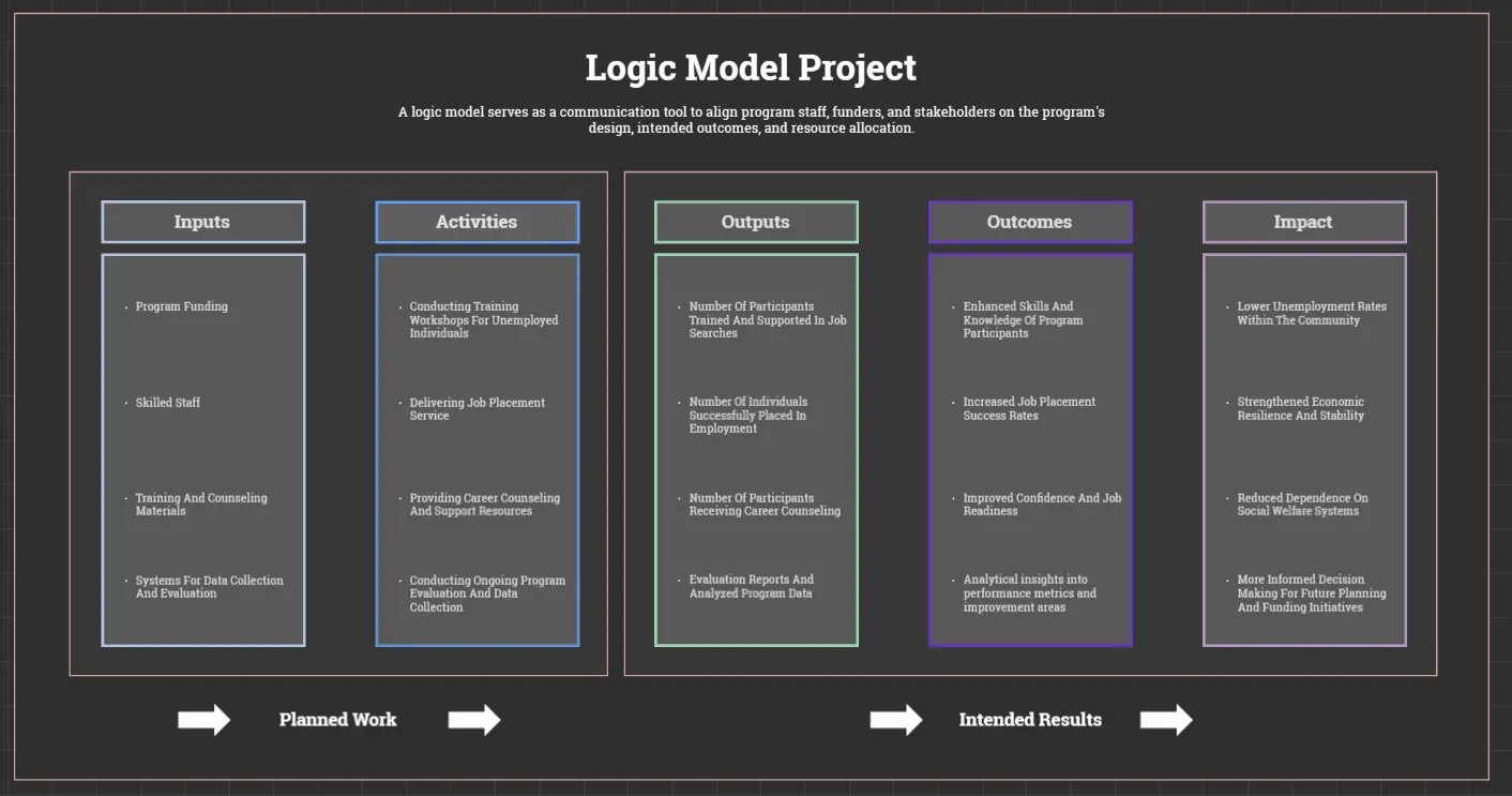
Logic model templates are essential tools for project planning and evaluation. They provide a structured way to visualize the relationships between a project's resources, activities, outputs, and outcomes. Miro's collection of logic model templates is designed to help teams of all sizes and industries streamline their project management processes. Whether you're working on a community development project, a grant proposal, or a strategic plan, our templates offer a clear and coherent framework to guide your efforts.
Why you'll love our logic model templates
Using Miro's logic model templates comes with many benefits:
Clarity and focus: These templates help you clearly articulate your project's purpose, activities, and outcomes, ensuring that all stakeholders have a shared understanding of the project's direction.
Logic and alignment: They ensure that your project's activities are logically connected to its desired outcomes, enhancing the project's coherence and efficiency.
Effective communication: The visual representation of the project's design facilitates communication with funders, partners, and stakeholders.
Improved project management: Using the logic model during project implementation allows for better tracking of progress, making it easier to identify and address any challenges that may arise.
Enhanced evaluation: The logic model provides a framework for evaluating the project's success by comparing actual results with the anticipated outcomes, enabling data-driven decision-making and future improvements.
How to use the logic model templates in Miro
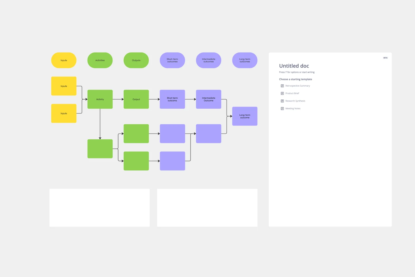
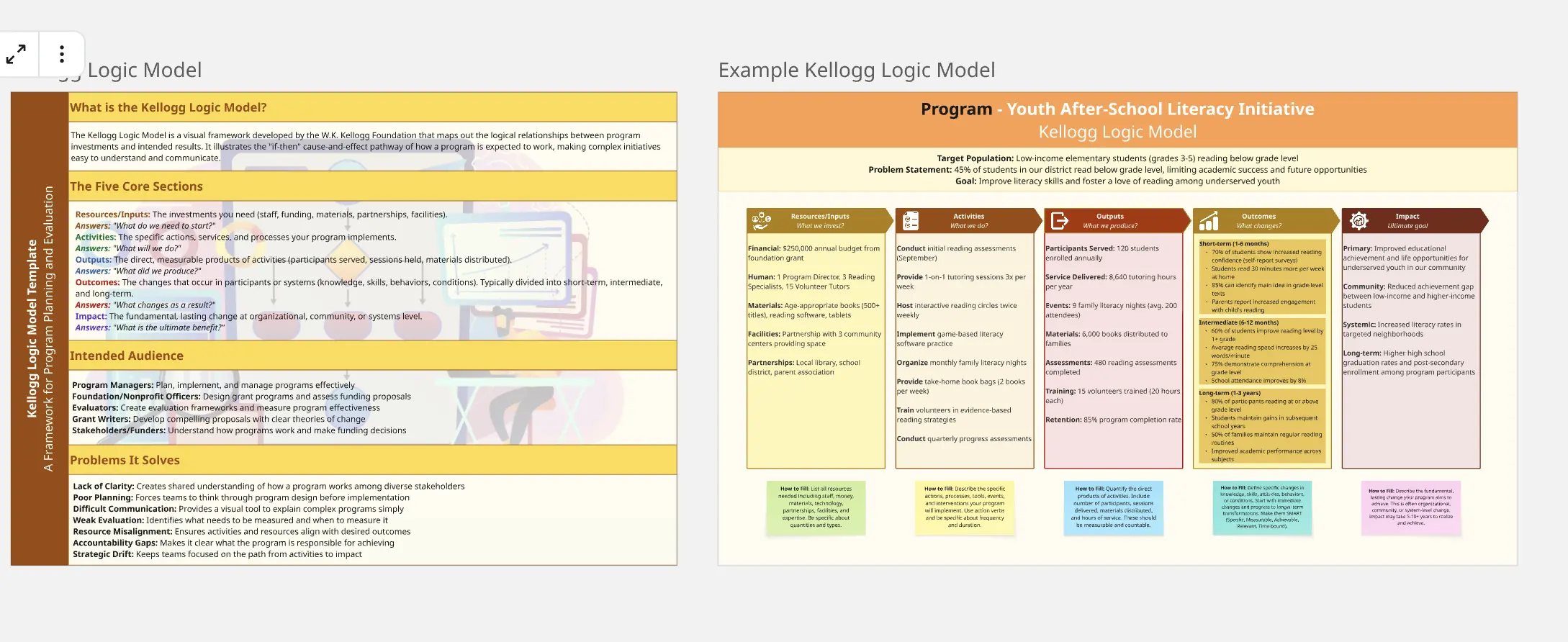
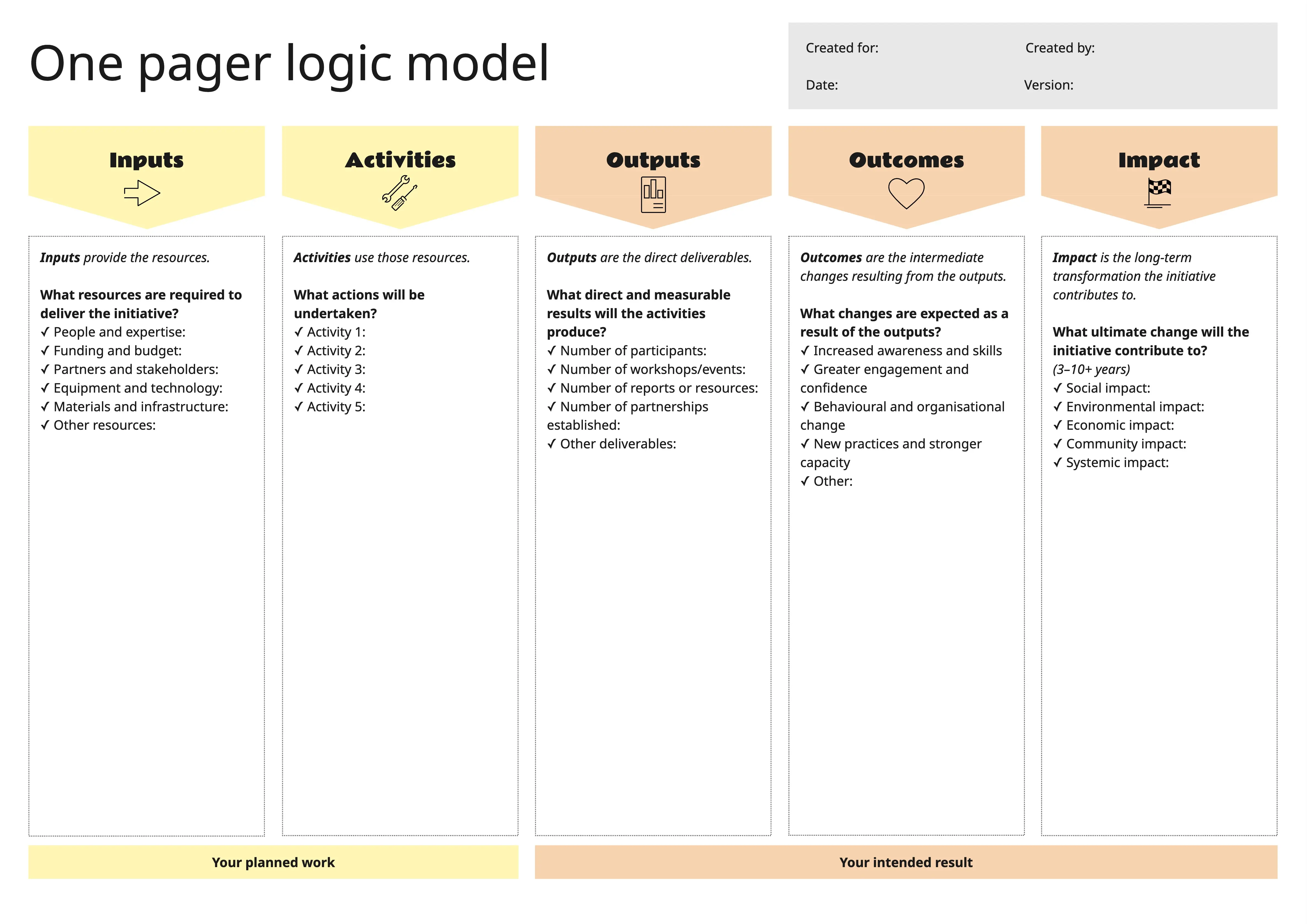
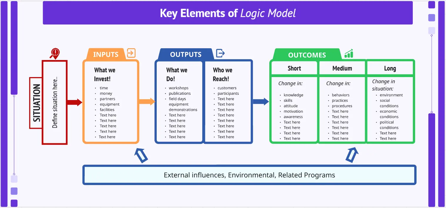
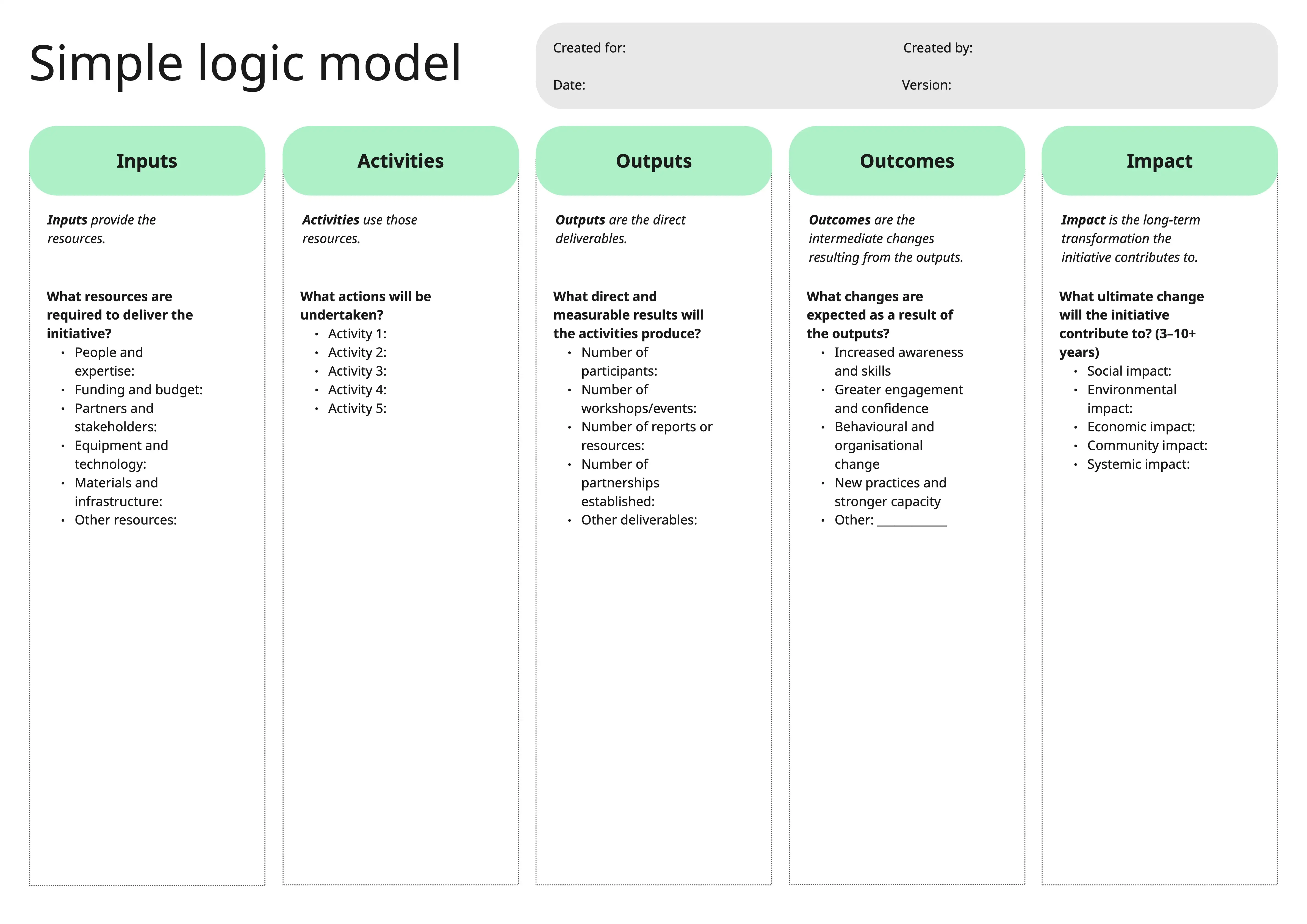
Define your project: Clearly outline your project's purpose, goals, and target population. This foundational step sets the stage for the rest of the logic model.
Identify resources: List all the resources (inputs) required for your project, such as funding, personnel, and materials.
Outline activities: Detail the specific activities that will be carried out to achieve your project's goals. These should be actionable and measurable.
Specify outputs: Identify the immediate products or services resulting from your activities. These are the tangible deliverables of your project.
Determine outcomes: Define the short-term, medium-term, and long-term outcomes you expect to achieve. These should be specific, measurable, and aligned with your project's goals.
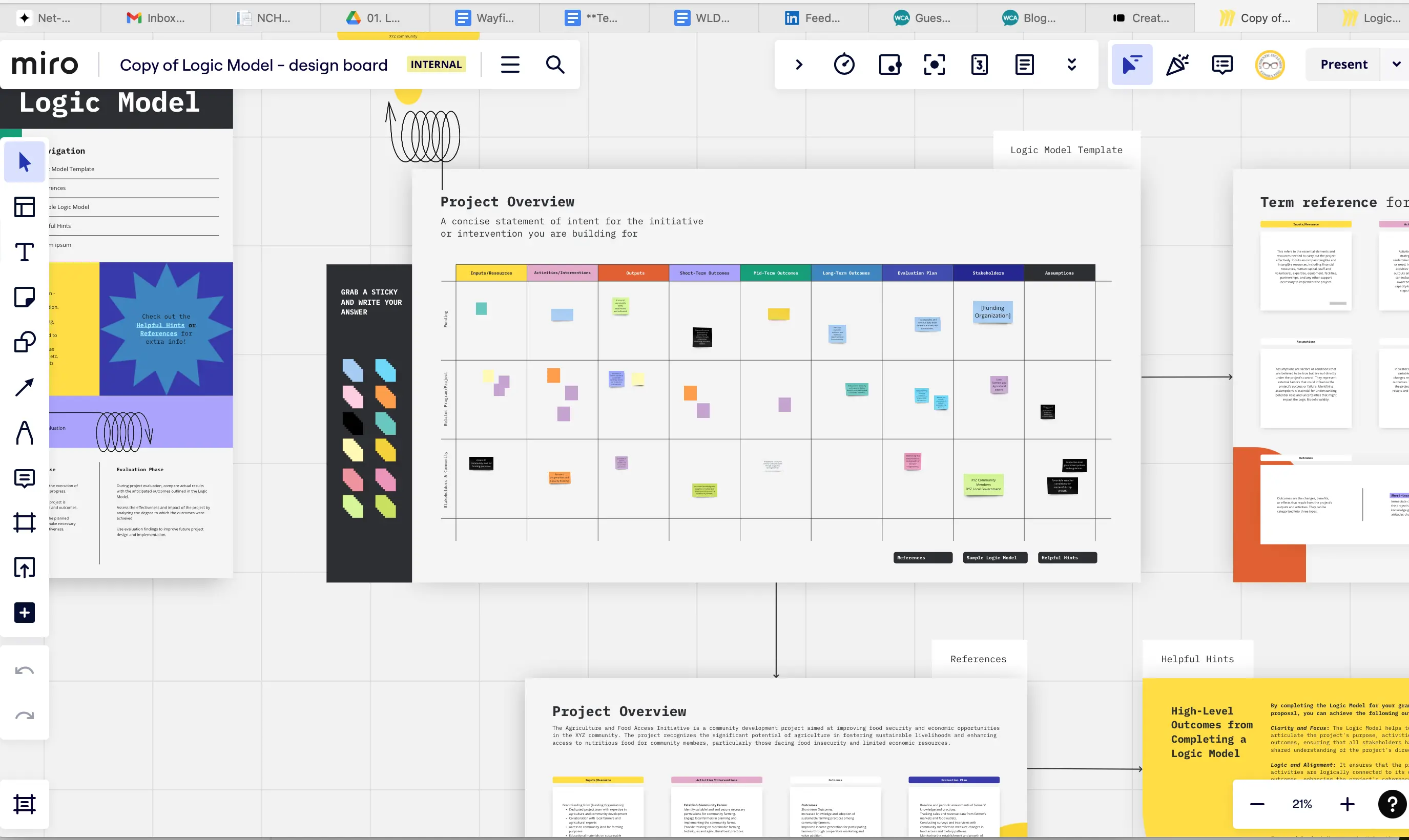
Use diagramming features: Leverage Miro's diagramming features to visually connect the different components of your logic model. This helps in creating a clear and cohesive representation of your project.
Review and adjust: Regularly review your logic model to ensure it remains relevant and accurate. Make adjustments as needed based on project progress and feedback.
By following these steps, you can effectively use Miro's free logic model templates to plan, implement, and evaluate your projects. These templates not only simplify the process but also enhance collaboration and communication within your team, helping you achieve your project goals with confidence.
Miro's logic model templates empower teams to thrive by providing a structured and visual approach to project management. With these templates, you can ensure that your projects are well-planned, efficiently executed, and successfully evaluated, leading to better outcomes and greater impact.