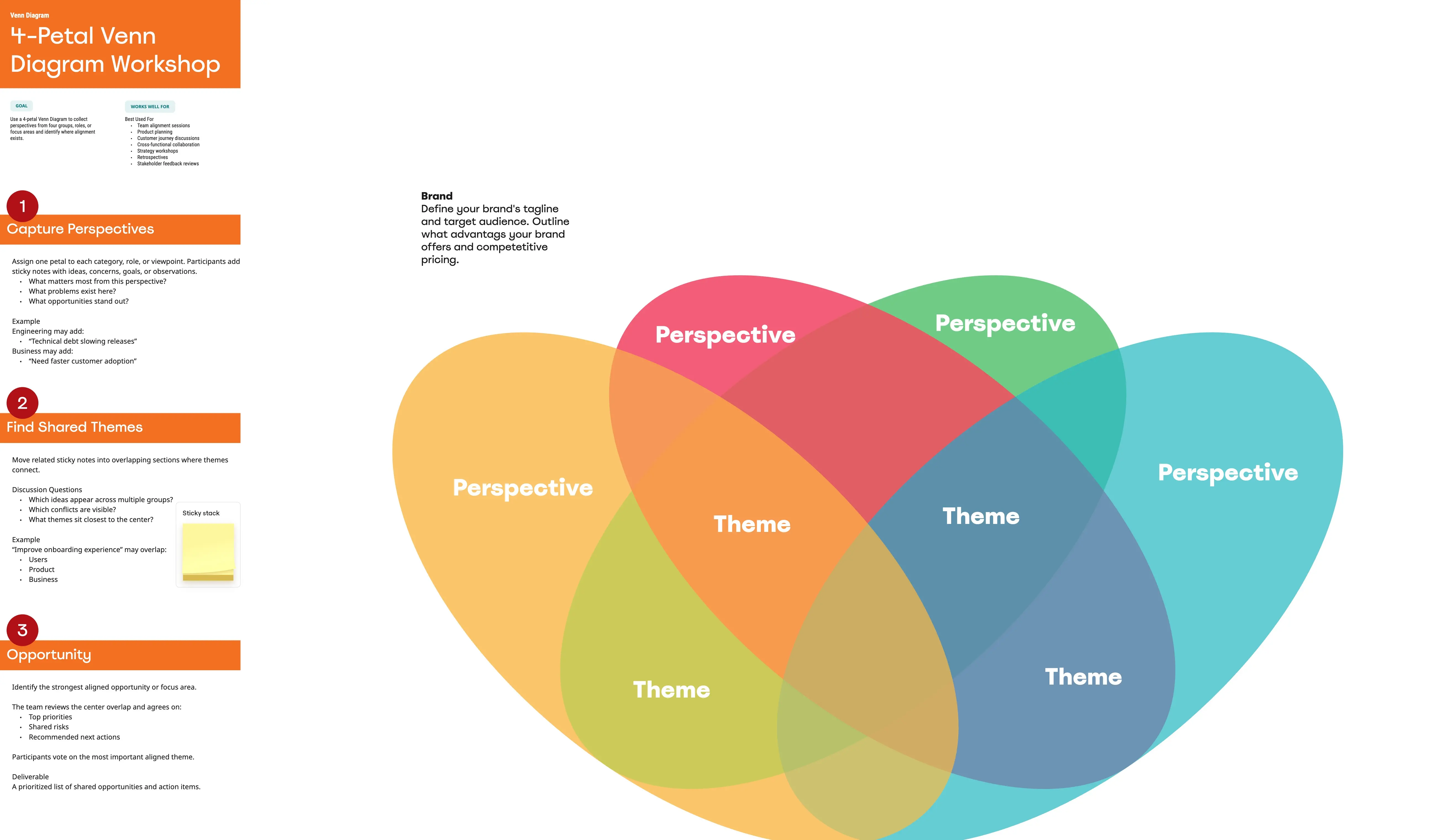
What is a Venn Diagram Template?
A Venn diagram template is a visual illustration that uses overlapping shapes (typically circles) to show the logical relationships between two or more sets of items. In business, it is the primary tool for identifying Shared Value, Competitive Advantage, and Cross-Functional Synergy. It helps stakeholders quickly grasp where different concepts overlap and, more importantly, where they are unique.
The "Intersection" Audit: 3 Ways to Find Strategic Value
A Venn diagram is only as good as the clarity of its segments. Before finalizing your diagram on Miro or PowerPoint, apply these three expert "health checks":
1. The "Sweet Spot" Audit
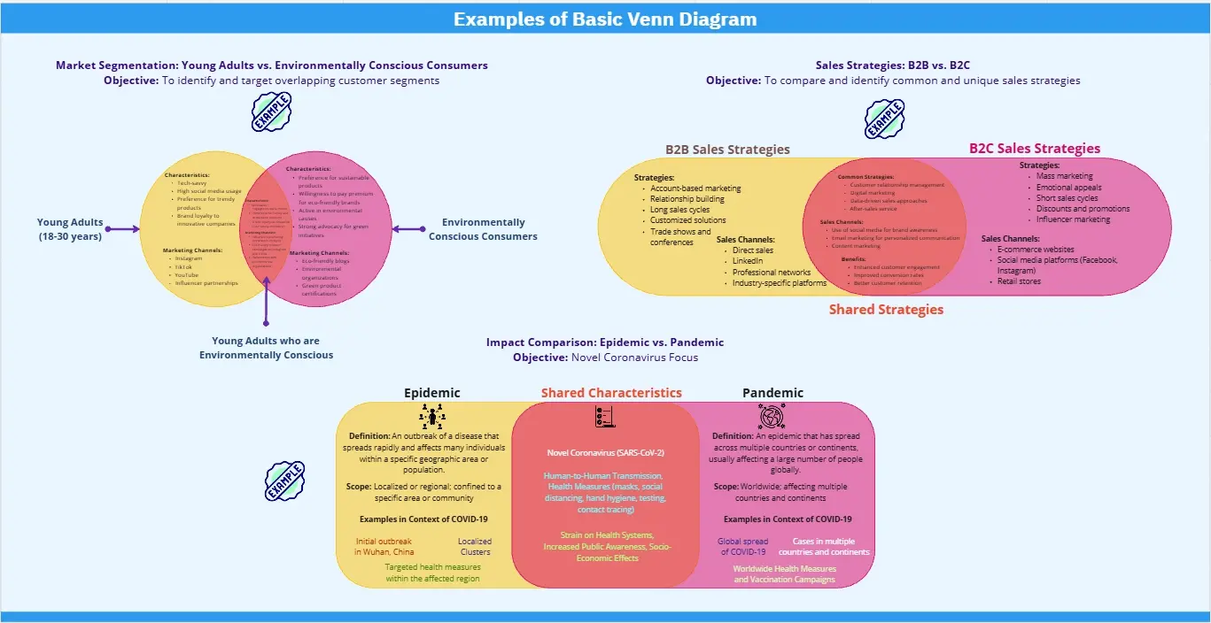
The Audit: Is your central intersection (the "core") vague or undefined? The Fix: Audit for Unique Value Proposition. The center of your Venn diagram should represent the most valuable territory—for example, the intersection of "What your customer wants,""What you do best," and "What your competitors lack." If you cannot name the center point in one sentence, your sets are not aligned.
2. The "Mutually Exclusive" Test
The Audit: Are the non-overlapping parts of your circles so similar that the diagram feels redundant? The Fix: Audit for Categorical Distinction. Each circle must represent a distinct "Set." If you are mapping "Marketing" and "Sales," the outer areas must clearly define what Marketing does exclusively (Brand Awareness) versus what Sales does exclusively (Closing Deals). This clarifies roles and responsibilities.
3. The "Relative Scale" Guardrail
The Audit: Are all your circles the same size even though one category is much larger or more important? The Fix: Audit for Proportional Weight. While traditional Venn diagrams use equal circles, a professional "Euler Diagram" (a variation) adjusts the size of the circles to represent data volume or importance. If 90% of your budget is in "Operations," that circle should physically dominate the map.
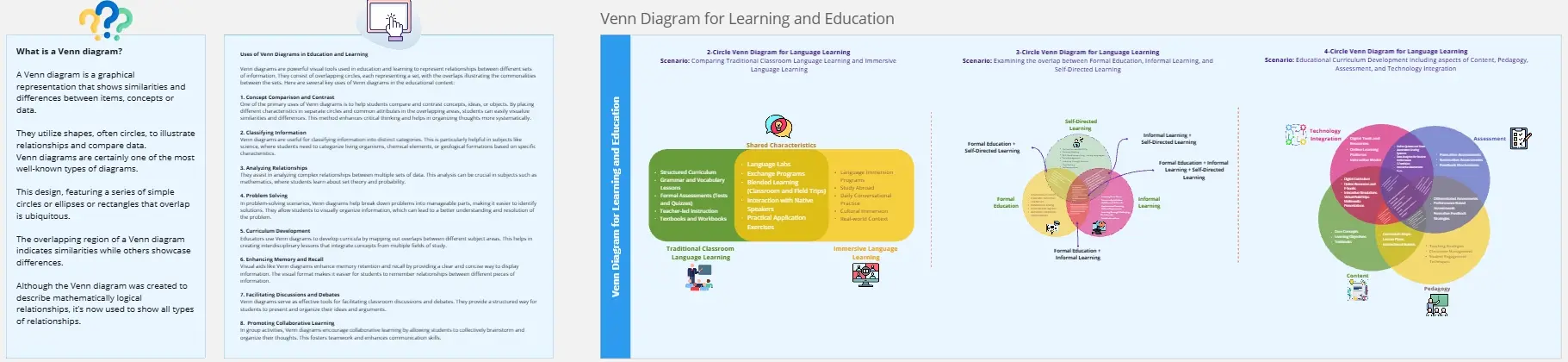
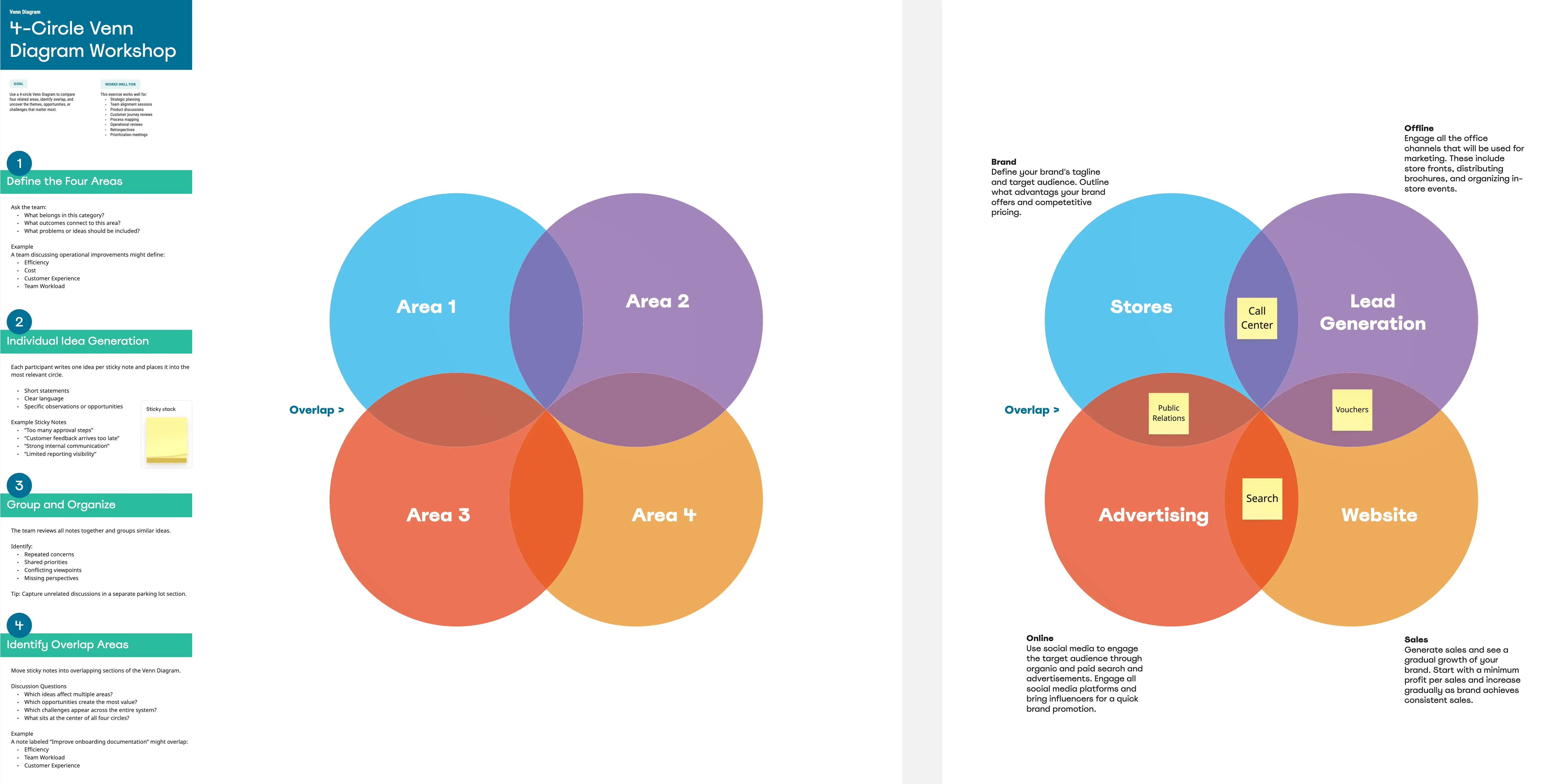
Strategic Frameworks: Which Venn Template Do You Need?
Select the framework that matches your specific business logic:
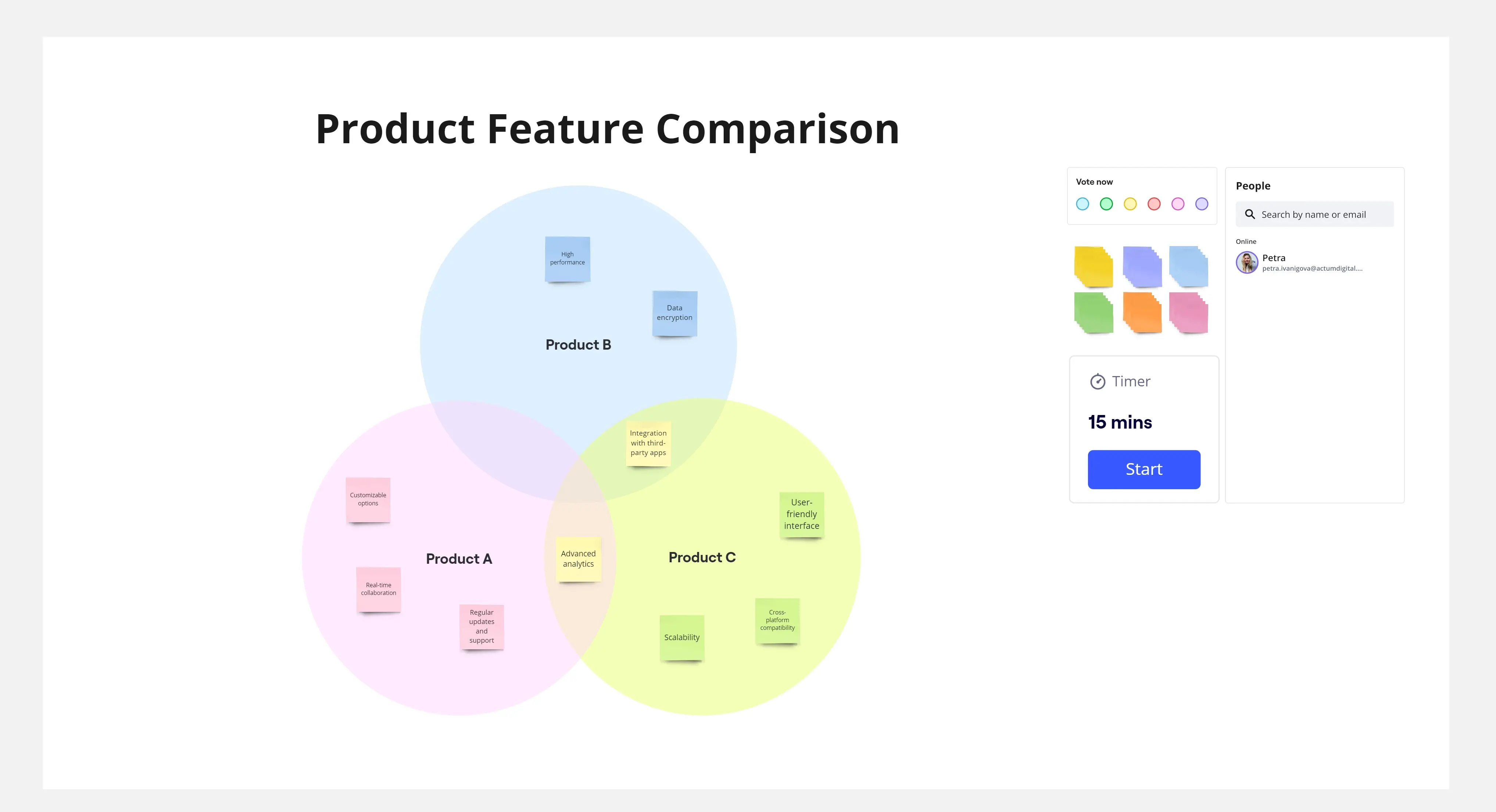
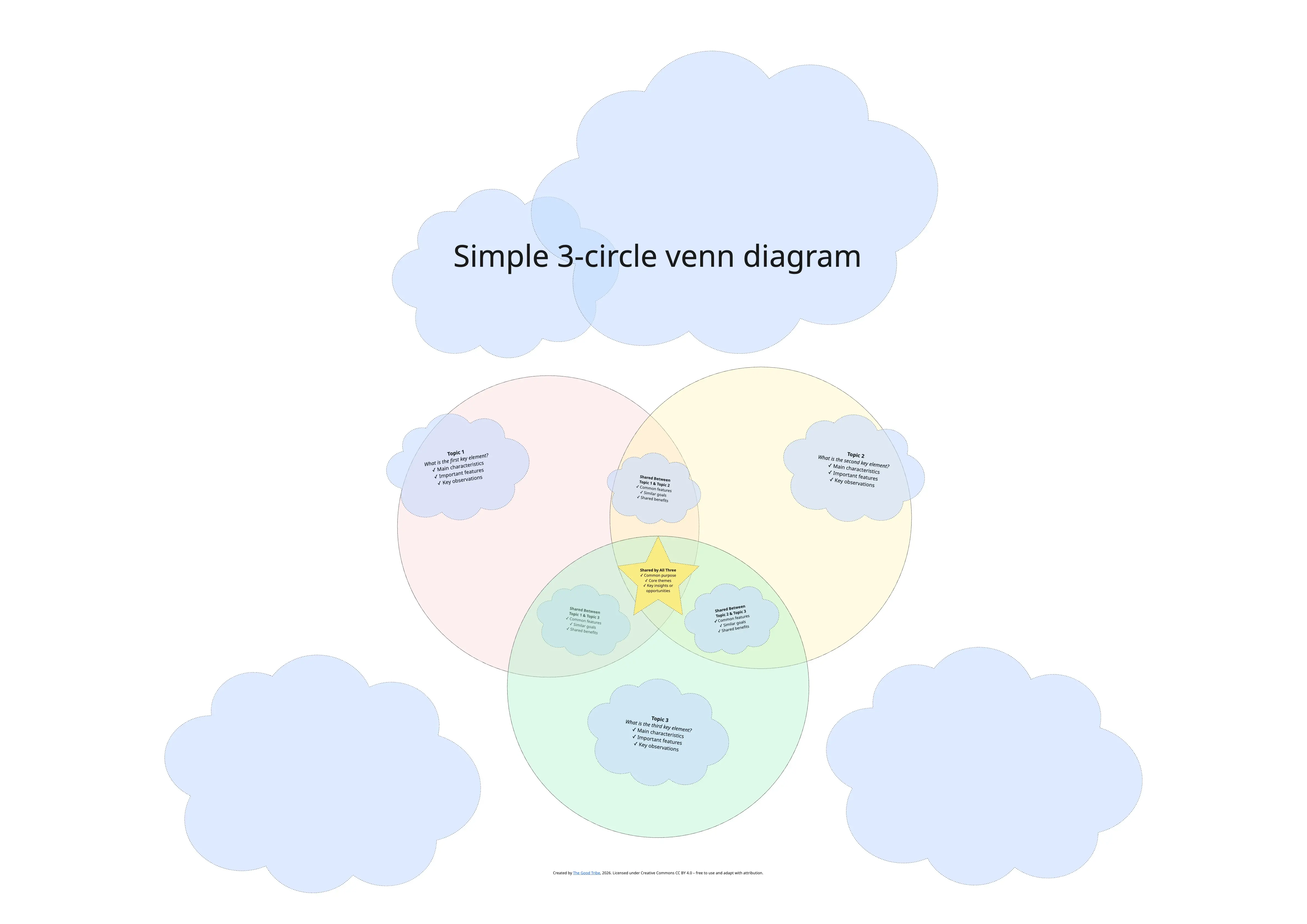
The Innovation "Sweet Spot" (3-Circle):
Best For: Product Strategy.
The Overlap:User Desirability (Do they want it?), Technical Feasibility (Can we build it?), and Business Viability (Should we do it?).
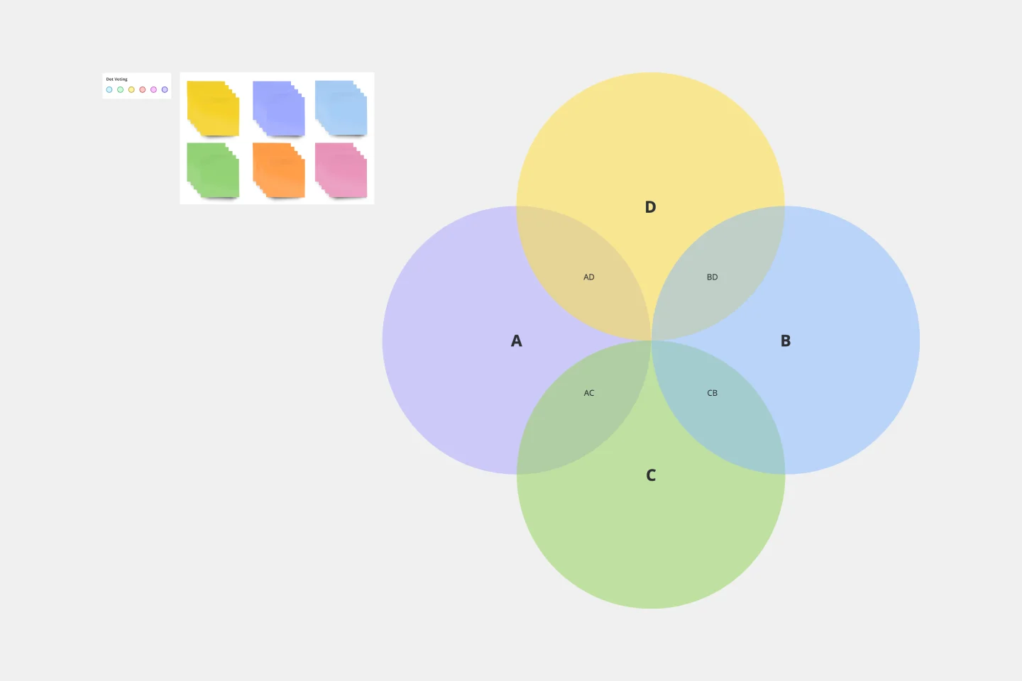
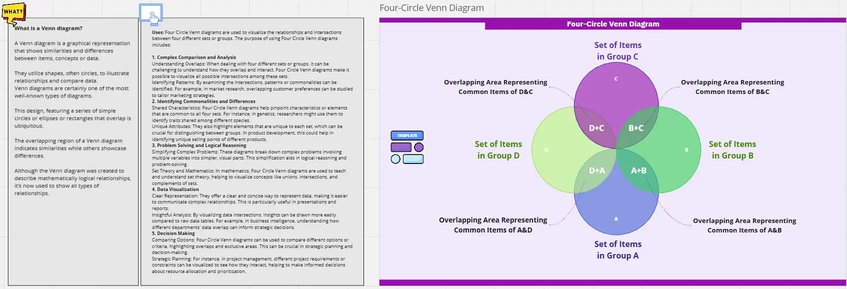
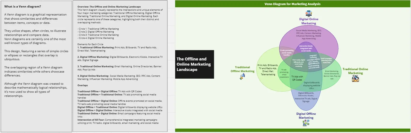
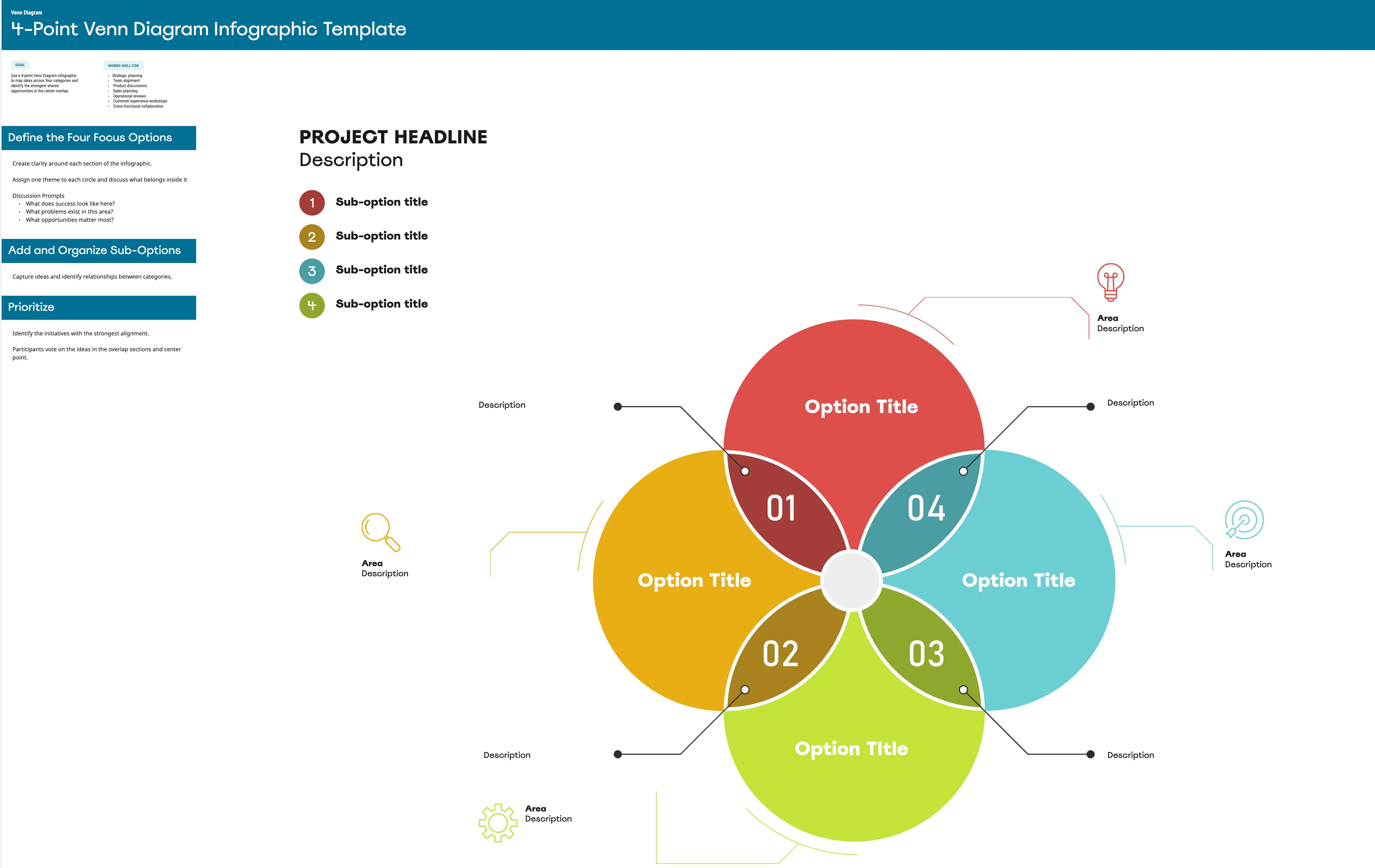
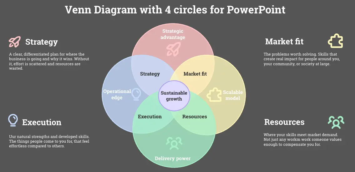
The Ikigai Template (4-Circle):
Best For: Career Coaching or Founder Vision.
The Overlap: What you love, what you are good at, what the world needs, and what you can be paid for.
The Competitive Positioning Map:
The Lean Startup Intersection:
Best For: Entrepreneurship.
The Overlap: Problem, Solution, and Market.
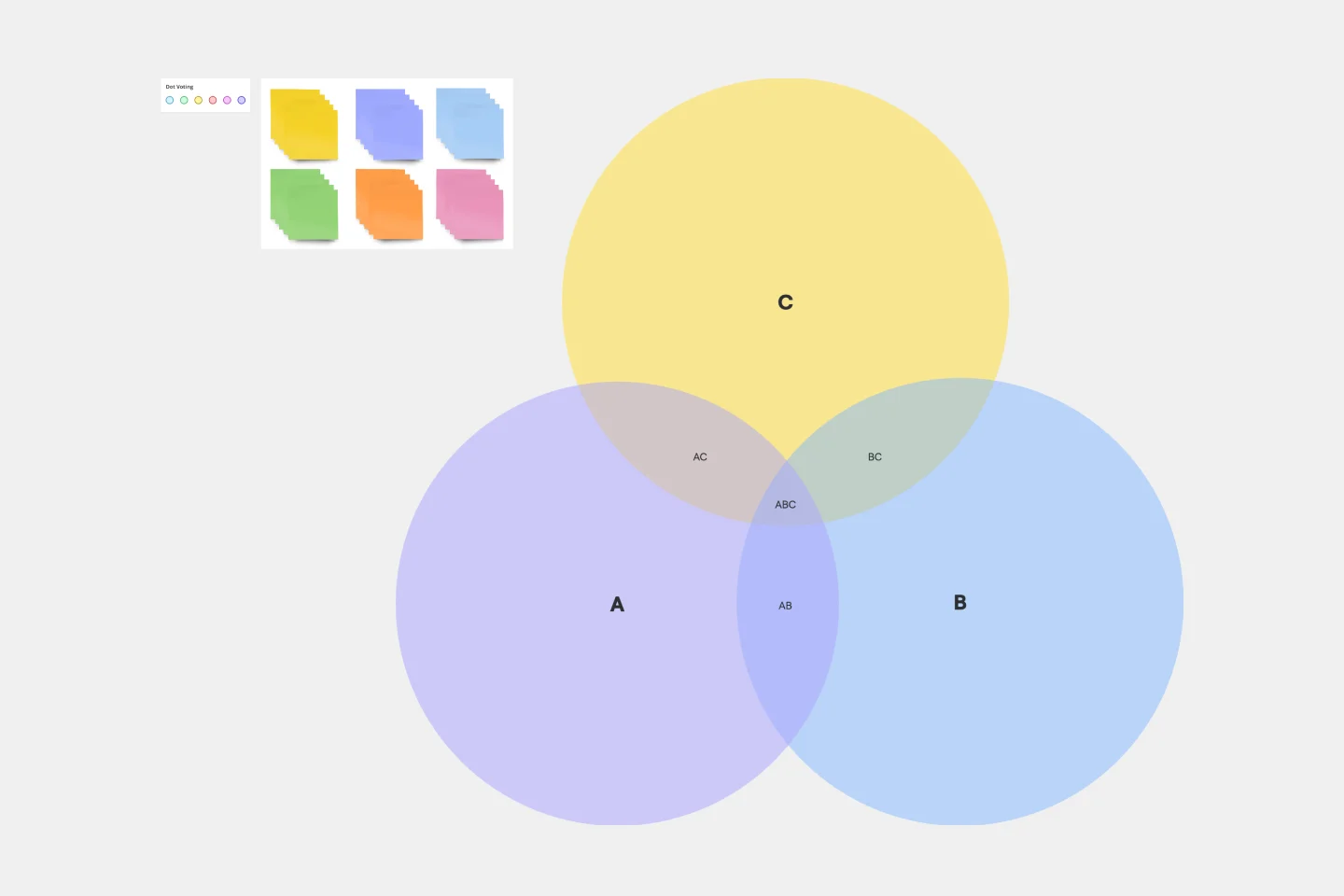
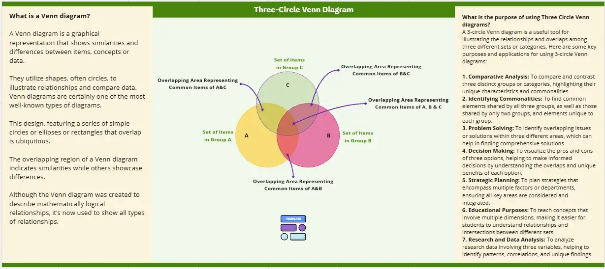
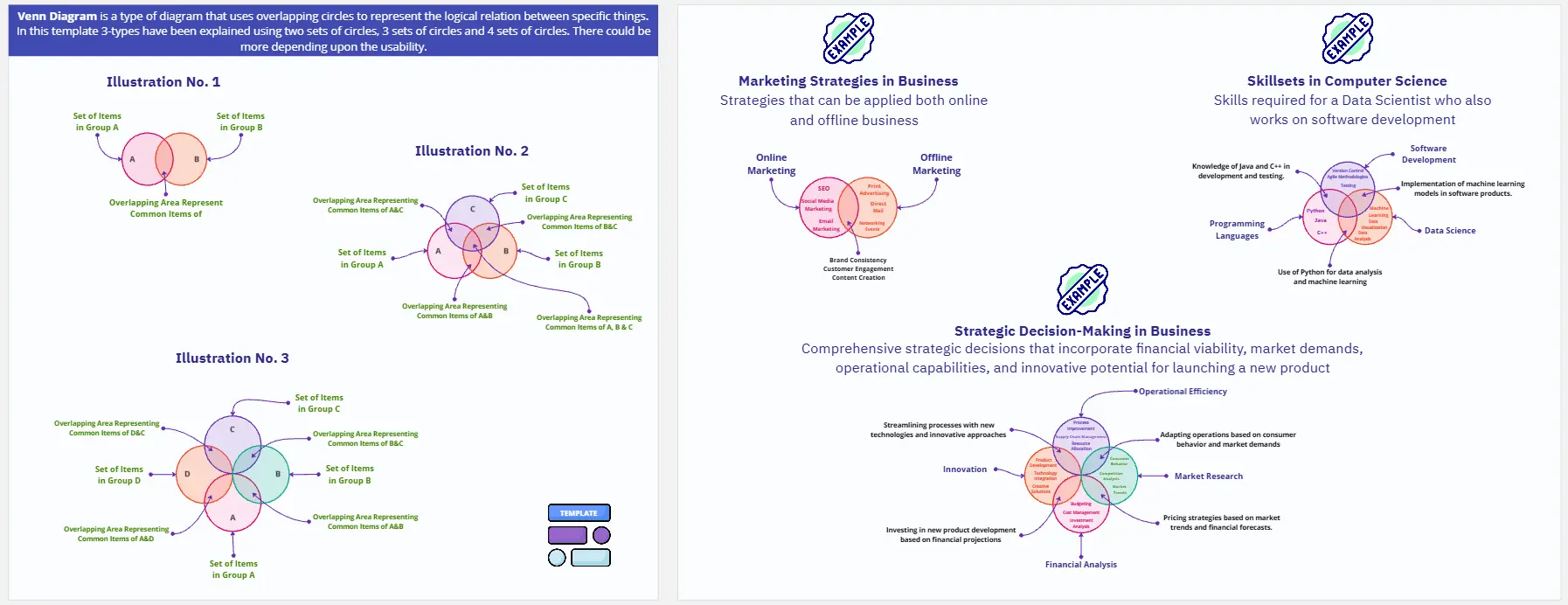
Key Components of a Venn Diagram Template
A high-performance Logic Board requires these five core elements:
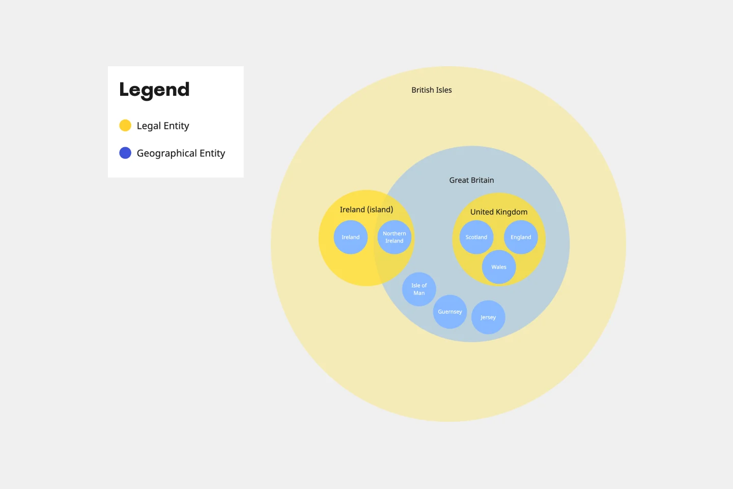
Defined Universes: The clear labels for each main circle (the "Sets").
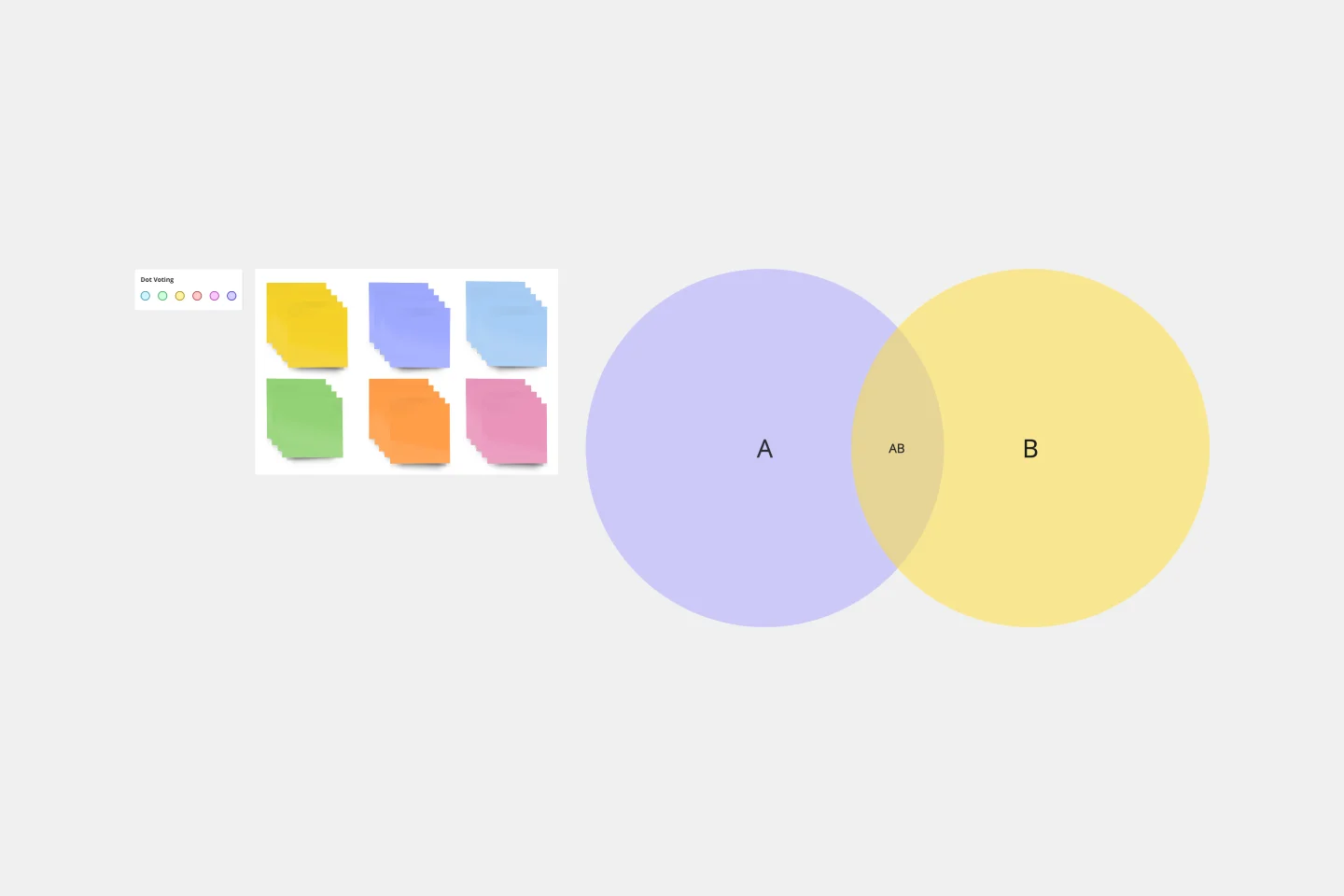
Intersections: The areas where 2 or more circles overlap (the "Shared Characteristics").
The Prime Intersection: The "Unicorn" space where all circles meet.
Excluded Zones: The outer areas of the circles (the "Differentiators").
The Legend: A brief explanation of what the overlap signifies for the business strategy.
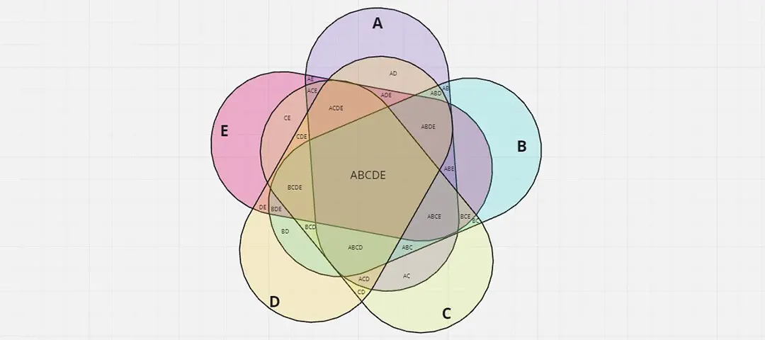
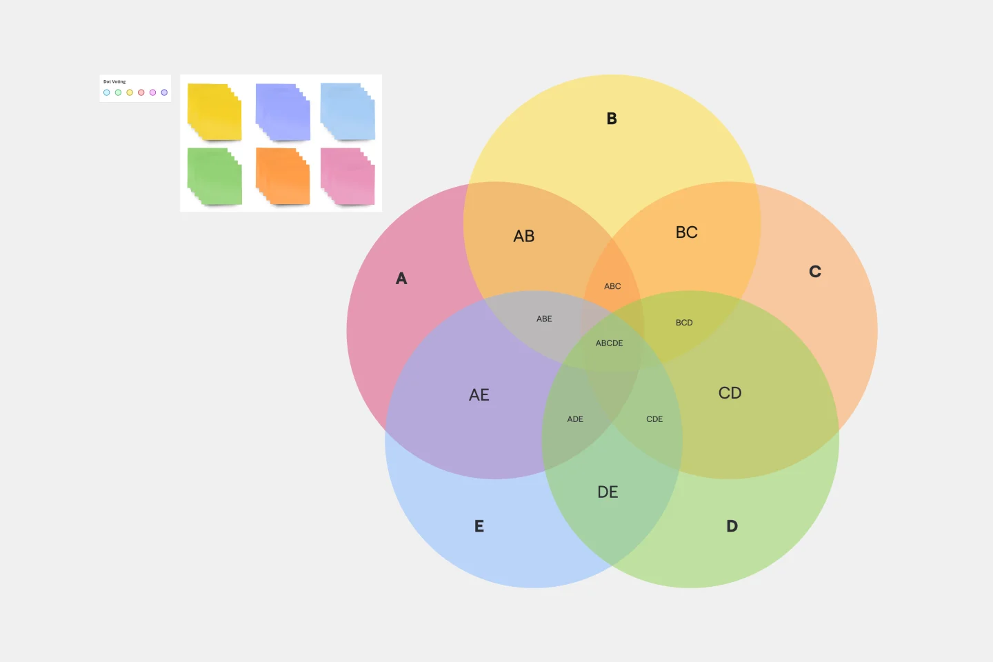
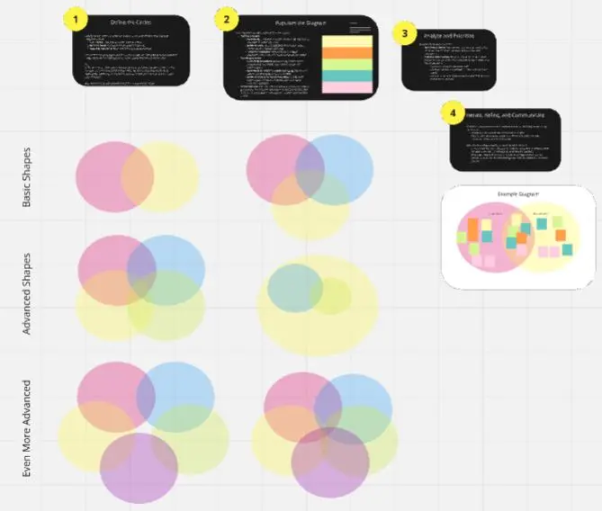
Common Pitfalls in Venn Diagrams
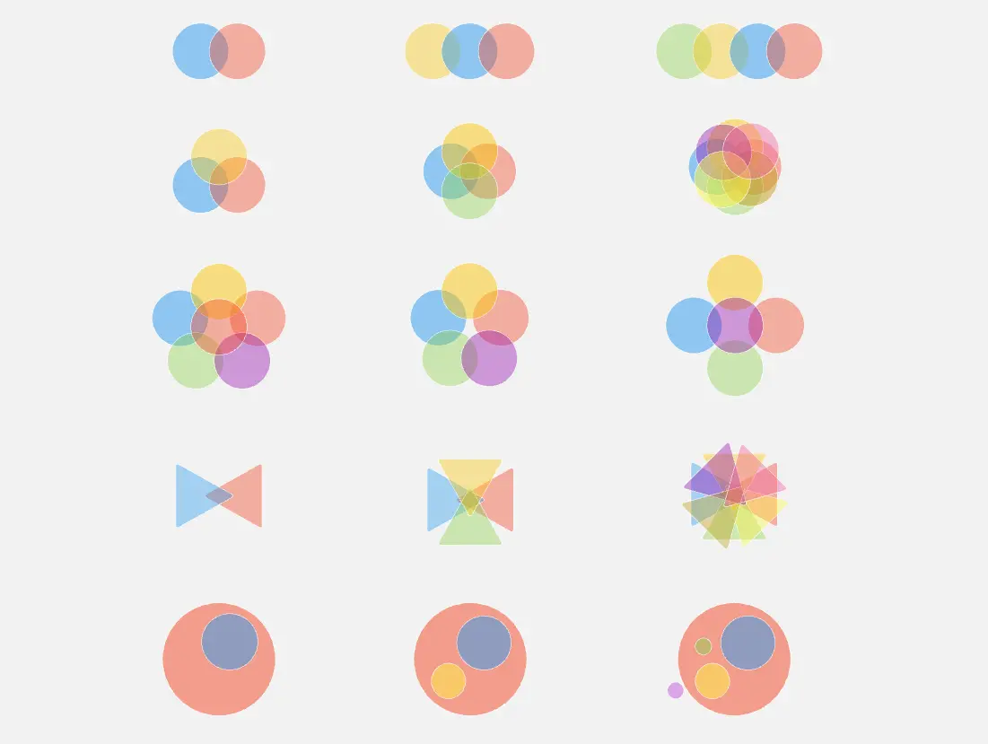
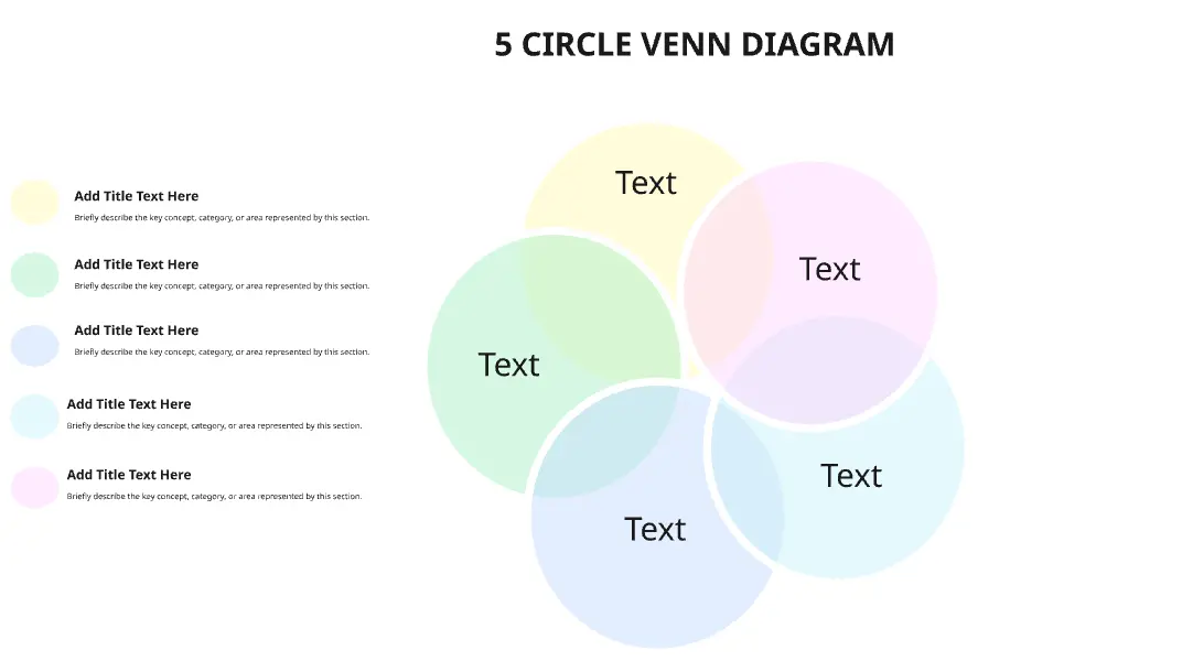
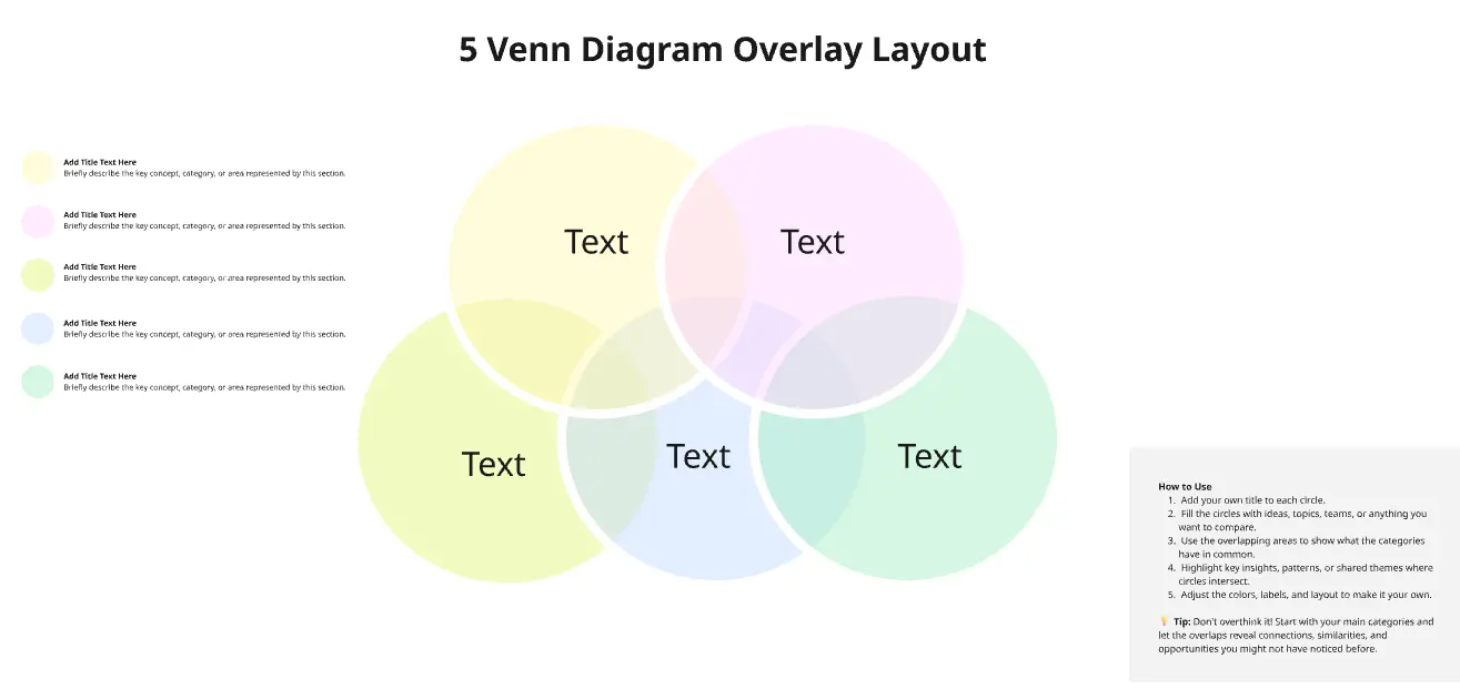
The "Spaghetti" Overlap: Trying to overlap 5 or 6 circles, making the intersections too small to read.
Static Visuals: Using the diagram as "decoration" rather than a tool for categorization.