About the T-Chart Templates Collection
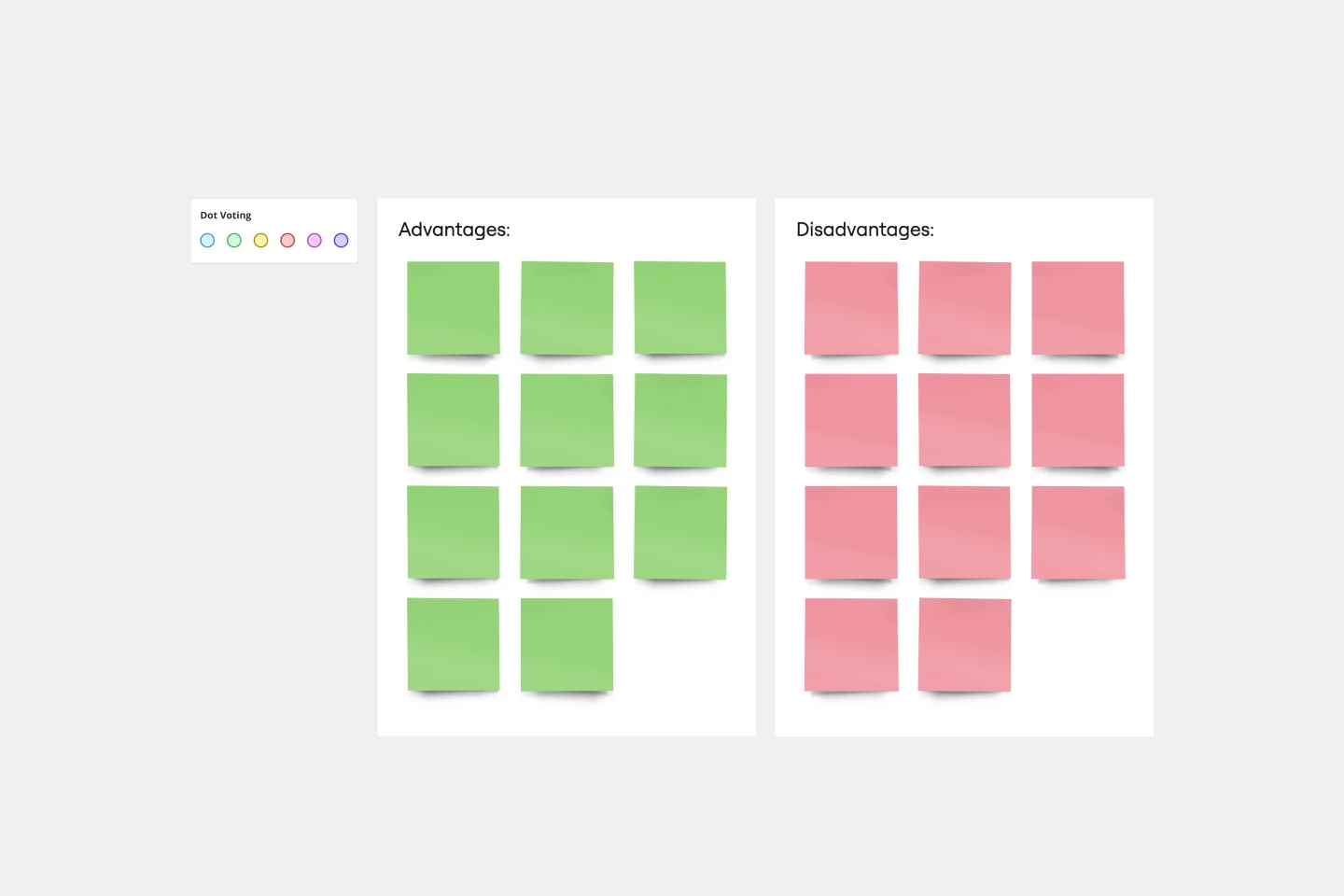
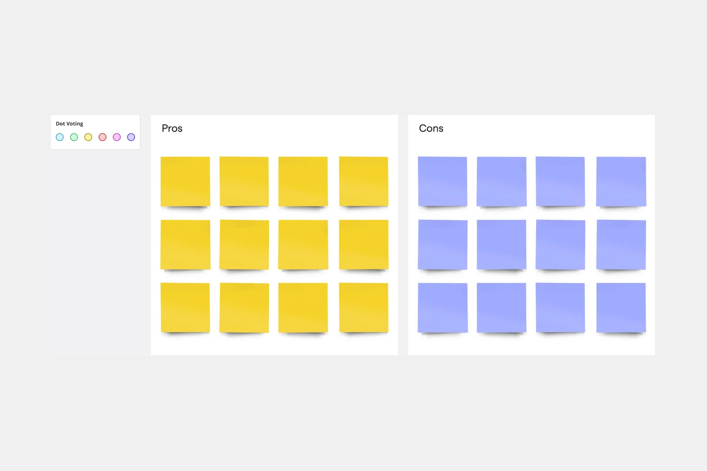
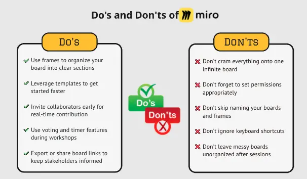
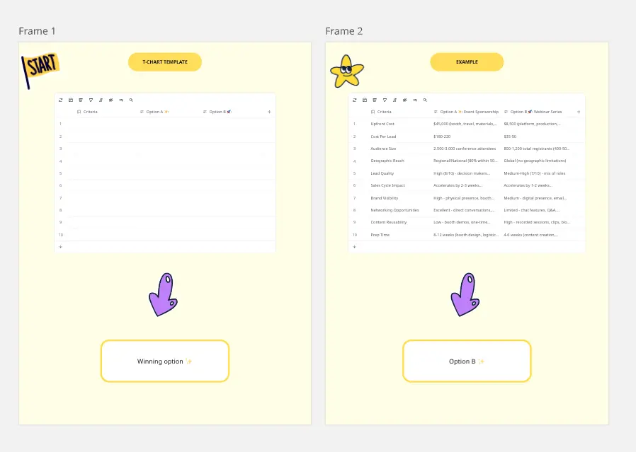
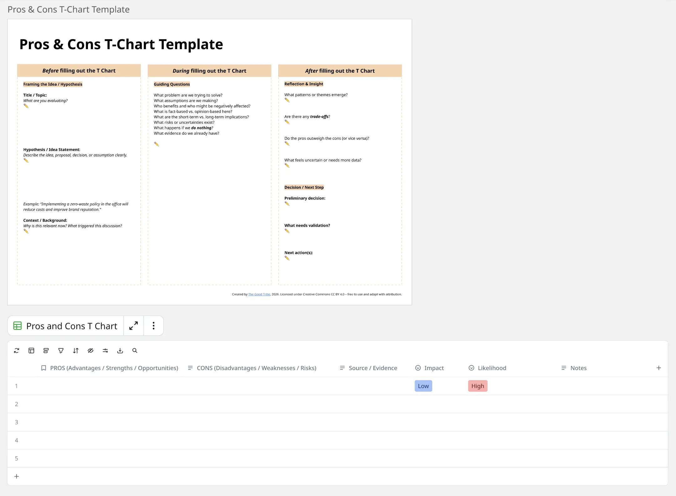
T-chart templates are versatile tools designed to help people organize and compare information effectively. They feature a simple two-column layout, typically used to list pros and cons, advantages and disadvantages, or any other comparative data. Our T-chart templates are fully customizable, allowing users to tailor them to their specific needs by adjusting colors and fonts and adding images or other visual elements. This flexibility makes them suitable for various applications, from decision-making processes to brainstorming sessions.
Why you'll love our t-chart templates
Using T-chart templates in Miro offers many benefits:
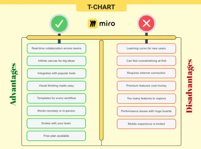
Ease of use: T-chart templates are straightforward and intuitive, making it easy for anyone to start organizing their thoughts without a steep learning curve.
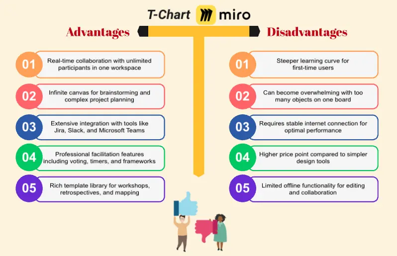
Customization: Miro's T-chart templates can be customized to fit your specific needs. You can change the labels, colors, fonts, and even add images or videos to make your T-chart more engaging and relevant to your project.
Collaboration: Miro's platform allows for real-time collaboration, enabling team members to work together on the same T-chart, regardless of their location. This fosters better communication and more efficient decision-making.
Accessibility: Miro's T-chart templates are accessible from any device, whether you're using a desktop or a mobile device. This ensures that you can work on your T-chart anytime, anywhere.
Professional appearance: The pre-designed layout of Miro's T-chart templates helps you create professional-looking charts quickly and easily, saving you time and effort.
How to use the t-chart templates in Miro
Follow these steps to make the most out of Miro's T-chart templates:
Select a template: From the main menu, select "Templates" and choose a T-chart template from Miro's extensive collection.
Add to board: Drag the T-chart template onto a blank board or incorporate it into an existing board you're working on.
Customize: Adjust the template to fit your needs. Change the column labels, colors, fonts, and add any images or videos that are relevant to your comparison.
Input data: Begin adding your data to the T-chart. Use sticky notes to input text, images, or other visual elements into the appropriate columns.
Collaborate: Share the T-chart with your team and collaborate in real-time. Miro's platform allows multiple users to edit and comment on the chart simultaneously.
Export and share: Once your T-chart is complete, you can export it as a PDF or image file, or share a link to the T-chart within Miro for easy access.
By using Miro's T-chart templates, teams can streamline their decision-making processes and enhance their collaborative efforts, ultimately helping them to thrive in their projects and initiatives.