About the Comparison Chart Template
Deciding between two seemingly equal options can take a long time unless you’re familiar with decision-making techniques like comparison charts. Comparison charts pinpoint the advantages and disadvantages of each option available to you.
With comparison charts, you make swift, intelligent choices and eliminate confusion. And they’re typically used for making purchasing and strategic decisions when it’s crucial to get both sides of a story and weigh risks.
How to use the comparison chart template in Miro
Miro’s comparison chart template empowers you to collaborate with your team in real-time to create professional-looking charts. It’s a potent tool for remote and hybrid teams looking for better ways to exchange ideas, solve problems, and brainstorm.
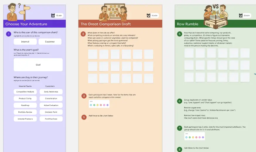
Here is how to use the template:
Edit it by clicking on the edges of the chart. Change the color scheme or add your branding elements according to your needs.
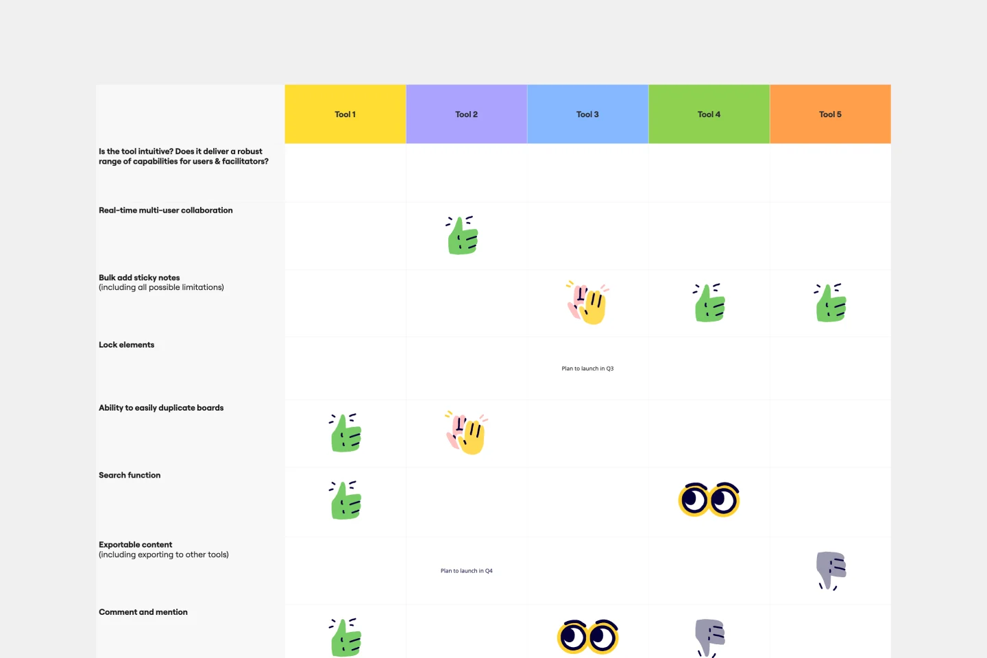
Write down the features, products, or strategies to compare.
Specify your criteria. What characteristics are crucial? What could influence your final decision?
Invite everyone to fill in the template by sharing the board link. You can set the Miro timer to speed up the brainstorming process.
Read and interpret the results. What have you learned about each option? Now that you can clearly see their advantages and disadvantages, which is preferable? Ask your team members to share their thoughts by adding comments or emojis to the chart.
Share your comparison chart with other stakeholders and departments, or include it in a presentation. You can always go back to your Miro board and make changes if needed or create graphs to complement your comparison chart.
When should you use a comparison table template?
If you’re faced with multiple options and need to pick just one, comparison chart makers are extremely useful. They help you and your team visualize your thought process, keep your conversation factual, and arrive at logical conclusions together.
Here are the most common comparison chart use cases:
Decision-making
Ideation
Planning
Strategizing
Meetings with clients
Development
Presentations
Competitor analysis
Research
A comparison chart is a valid tool that enables you to gain insights, persuade your audience, articulate your point of view, and weigh the interests of all stakeholders before settling on one specific option. As such, it can be used in virtually any work environment.
The benefits of using a comparison table template
Clear communication: Comparison charts allow you to visualize and understand the differences and similarities between items. They provide a clear, at-a-glance view of the data, which helps with decision-making.
Efficiency: Creating a comparison chart from a template saves time and effort. You don't have to start from scratch, and the structure is already laid out, making it convenient for organizing and presenting information.
Consistency: Templates ensure consistency in the format and structure of your comparison charts. This is especially important when creating multiple charts for different purposes or over time.
Customization: Easily add or remove rows and columns, change labels, and change the design to suit your needs.
Objective decision-making: A comparison matrix template promotes objective decision-making by presenting data systematically. This is useful when evaluating different options or making informed choices.
Whether you're comparing products, services, features, or any other variables, a comparison chart template simplifies the process and improves your ability to make well-informed decisions.
Comparison Chart Template FAQs
What types of information can I compare with a comparison chart template?
You can compare various data types, such as product features, specifications, prices, performance metrics, pros and cons, and any other attributes relevant to your comparison.
Can I add or remove rows and columns in the template to accommodate my needs?
Yes, the comparison matrix template is highly customizable. Add or remove rows and columns by double-clicking the table edges so you can match the number of items or criteria you want to compare.
How often should I update my comparison chart?
The frequency of updates depends on the nature of your comparison and the data being compared. You should update the chart whenever there are changes in the items or criteria being compared to ensure accuracy.