An intuitive comparison chart maker
Create a comparison chart fast
For every team and project
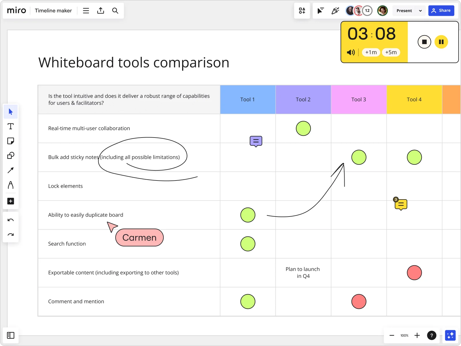
Quickly compare features
Show how your product benefits customers at a glance and design your comparison chart to move your business forward. Use Miro’s drag-and-drop feature to capture references and competitive examples and create your comparison graph fast.
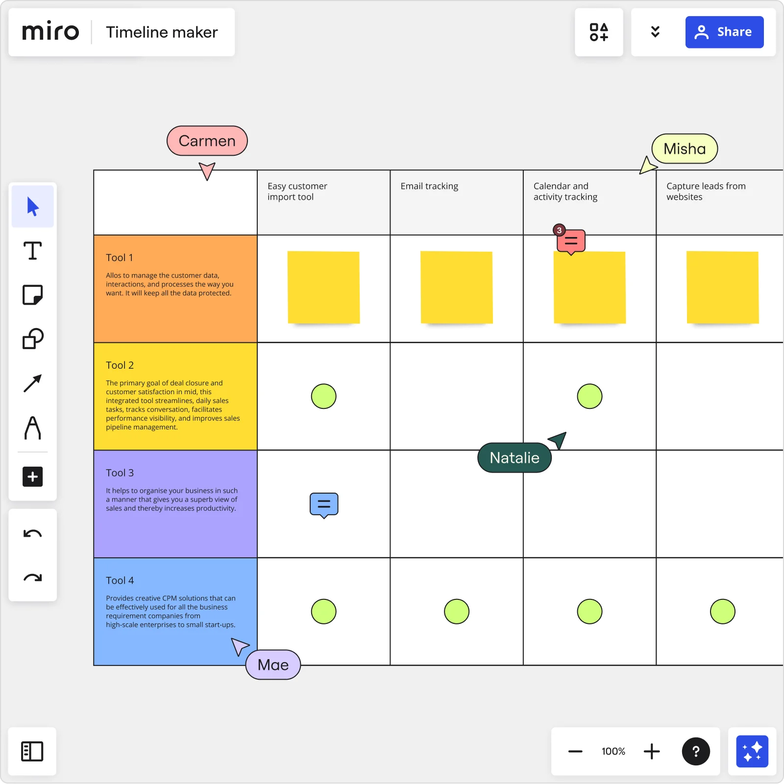
Team up to deliver value
Brainstorm ideas and make your comparison chart stand out. Miro’s collaborative features, such as live cursors and sticky notes, allow teams to come together and develop the best communication strategy in real time or asynchronously.
Customize your comparison graphs
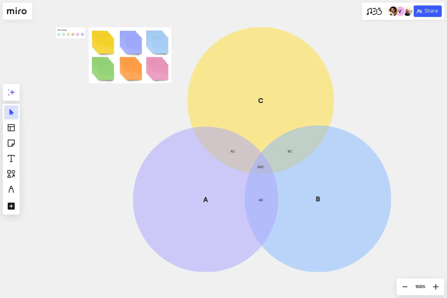
You don’t need to be a designer to create a comparison graph with Miro. Use one of our ready-made templates or create a comparison chart on your own with just a few clicks, selecting our tables feature.
Include everyone
Make sure every voice is heard when you create your comparison chart. Ask for instant feedback directly on the board, and use the voting feature to know which iterations should be prioritized. Come together as a team and improve your comparison chart.
Presentations that stick
Impress stakeholders internally or externally, and showcase your product to clients and potential customers with eye-catching comparison charts added to your presentations. Miro’s extensive tool kit allows you to bring in design elements, brand assets, and other artifacts to help you get your point across the best way.
Share it with others
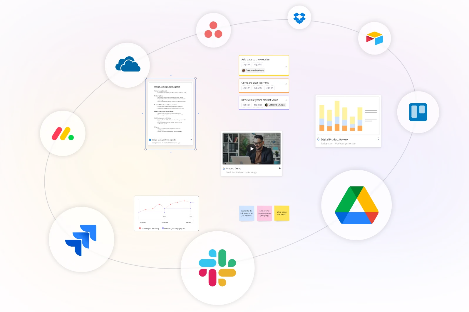
Miro’s comparison charts can be embedded in other team collaboration tools or downloaded as a PDF or image. Explore our many integrations with Confluence and Jira, or simply keep your Miro board as a living document that others can comment on, give feedback, and share.
Integrated with your favorite tools
Related templates


What is a comparison chart?
How to create a comparison chart in Miro
Discover Miro's capabilities

The world's most innovative companies are collaborating in Miro, everyday
“With Miro, we went from project brief to in-market launch in 10 months. That usually takes 3 years at PepsiCo.”
Caroline de Diego
Senior Manager, Global Design & Marketing Innovation at PepsiCo

“Bringing everyone together to plan in Miro means the most impactful initiatives will happen at the right time.”
Lucy Starling
Product Operations Lead at Asos

“The team onboarded in 10 minutes to use Miro for workshops. Getting our organization to adopt this product was a no-brainer.”
Konrad Grzegory
Agile Transformation Lead at CD PROJEKT RED

“Miro templates helped us go from scratch to a full-fledged plan where we mapped activities, ideas, and dependencies.”
Marc Zukerman
Senior Director of Project Management at Hearst

“Miro allows all our teams to align themselves with certain tools and models: they work independently and create products that really meet our customers' needs.”
Luke Pittar
Sustainability Innovation & Design Coach at The Warehouse Group

“To be truly innovative, everyone needs to have a voice, and everyone needs to be able to iterate on each other’s ideas. Miro has made that possible for us.”
Brian Chiccotelli
Learning Experience Designer at HP

Users love Miro for end-to-end innovation. We're the G2 leader in visual collaboration platforms and are rated in the top 50 enterprise tools. Miro helps large companies get meaningful work done.
Top 50 Products for Enterprise
G2 reviews

Comparison chart FAQs
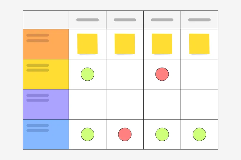
Can I adjust the number of rows in the comparison chart template?
Yes. Edit your comparison table by hovering over the edges and clicking on the plus icon to add more rows.
Can I share or download my comparison table?
Yes. Download your comparison graph by clicking on the top left corner icon to export your board. You can save your comparison table as an image or pdf.
What is the difference between a comparison chart and a competitive analysis matrix?
A comparison chart visualizes how two or more options differ across a set of shared attributes. It can be qualitative or quantitative and is designed for quick, visual comprehension. A competitive analysis matrix is a specific type of comparison chart used in business strategy to evaluate competitors across dimensions like pricing, features, target market, and positioning. The matrix format is typically more exhaustive and text-heavy, while a comparison chart prioritizes visual clarity and immediate pattern recognition.