About the Cluster Diagram Template
Unlock the potential of organized ideas with the cluster diagram template - a tool that brings structure to thoughts and processes. Essentially, this template is a method for visually grouping and comprehending complex ideas, information, or data sets. With its intuitive layout and adaptable features, it encourages collaborative analysis and categorization, revolutionizing the way concepts are connected and perceived.
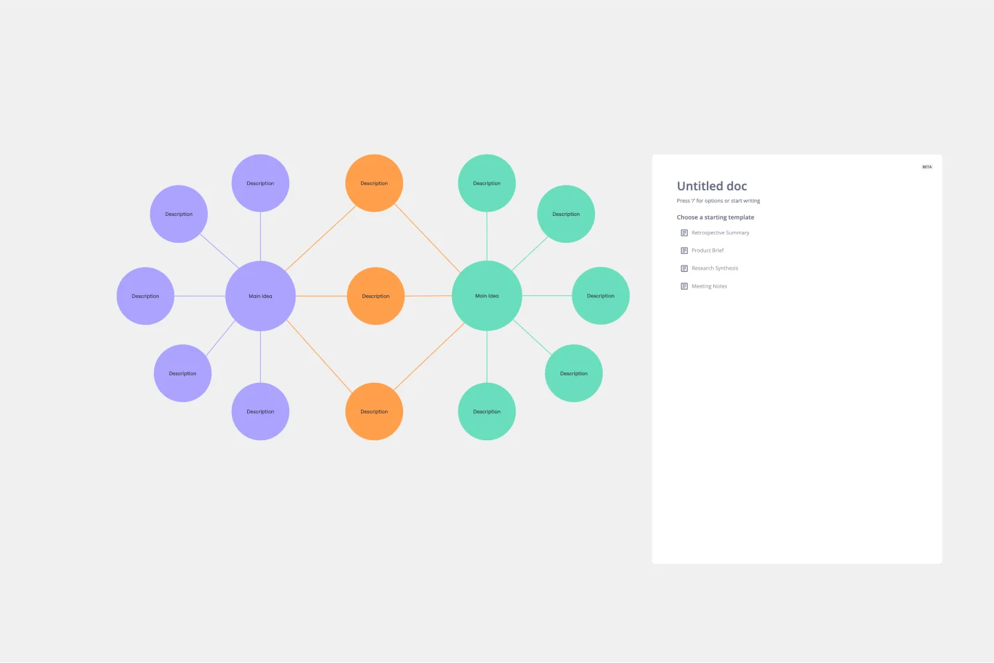
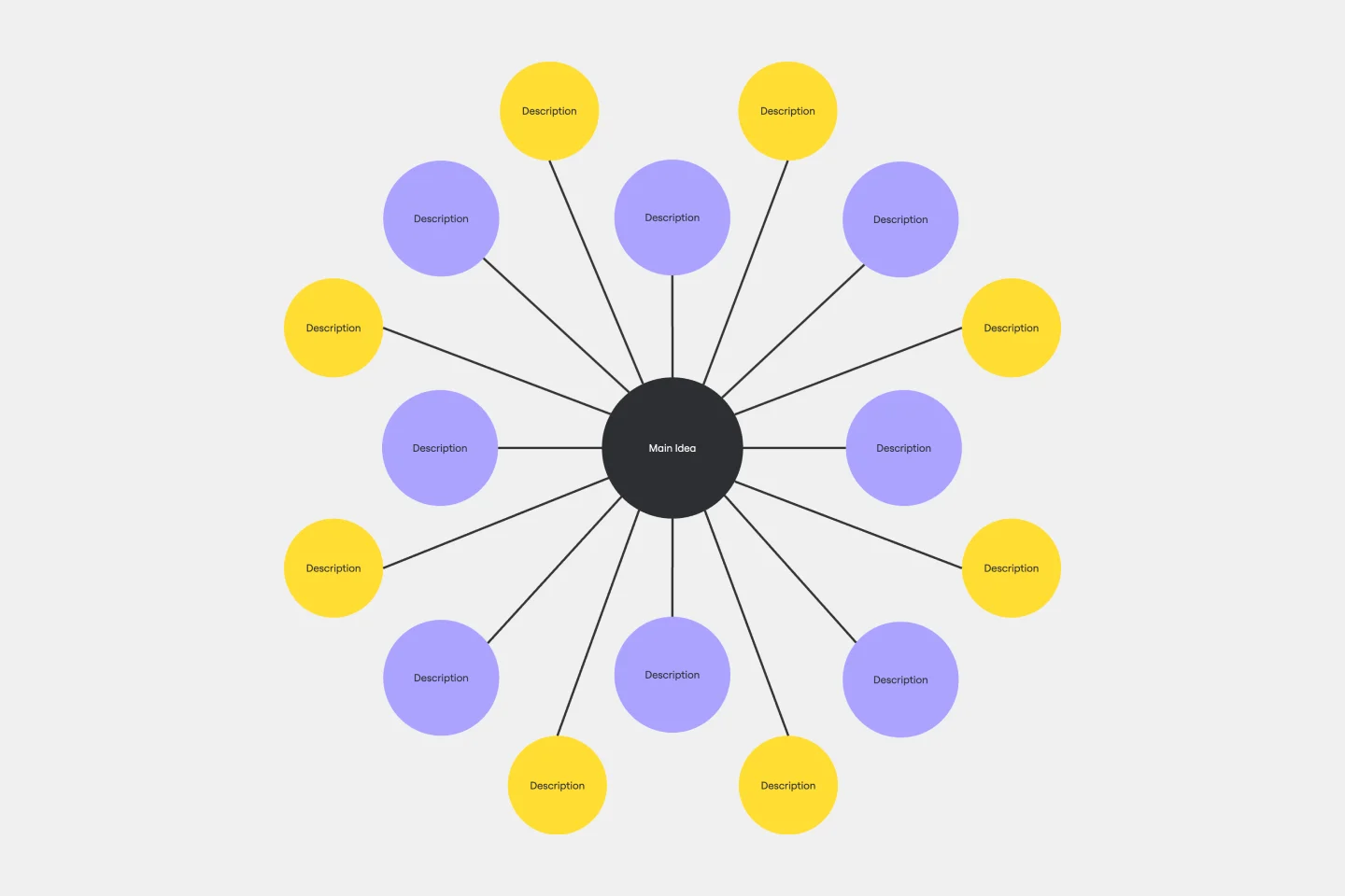
The cluster diagram consists of several key areas that work together to create a visual information ecosystem. It has central nodes representing main ideas, surrounding clusters categorizing related concepts, and connector lines that map their relationships. This template helps to understand the relationships and hierarchies within a subject by placing core ideas at the center and branching them out into detailed subtopics. By using this template, you can create a map that is as informative as it is visually engaging.
How to use the cluster diagram template in Miro
Creating a detailed and dynamic cluster diagram is a seamless experience:
Start with the central node: Identify the main concept or idea and place it at the center of your board.
Add clusters: Branch out from the central node with clusters representing subtopics or related ideas.
Connect with lines: Draw connector lines between the central node and clusters and among clusters to illustrate the relationships.
Customize effortlessly: Edit the template with just a few clicks, changing colors, texts, and more to suit the specific needs.
Expand with ease: Use the automated diagramming features to add more branches and connector lines, growing the diagram organically.
Enrich the context: Drag and drop any artifact – images, documents, links – onto the board, integrating them into the diagram for enhanced depth and clarity.
This highly editable template invites users to iterate rapidly, expanding the clusters and refining ideas without sacrificing clarity or visual appeal.
Why should you use a cluster diagram template?
Using a cluster diagram template offers several compelling advantages:
Enhanced organization: It categorizes information into clear, visually distinct groups.
Improved understanding: The template simplifies complex systems, making them easier to grasp and communicate.
Increased engagement: Visual clustering captures attention and encourages interactive participation.
Flexible adaptation: It's adaptable enough to suit various contexts, from business strategies to education.
Facilitates idea generation: It provides a structured framework that can spark creativity and innovation.
Cluster Diagram Template FAQs
Is it possible to work on the cluster diagram template collaboratively?
Yes, the template is perfect for collaboration, allowing multiple users to contribute simultaneously, share insights, and build upon each other's ideas in real time.
How does the cluster diagram template integrate with other analytical methods?
It's highly complementary and can be used alongside other analytical tools and methods to enhance data interpretation and idea generation.
Can the cluster diagram template be exported for presentations?
It can be effortlessly exported to various formats, making it an excellent tool for sharing insights and presenting organized information to stakeholders or team members.