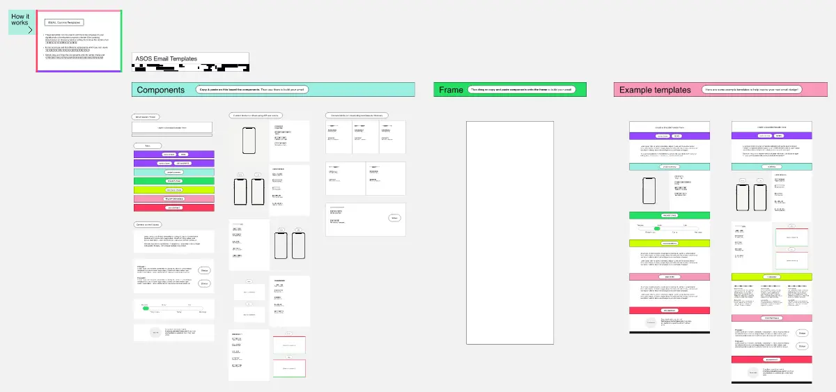
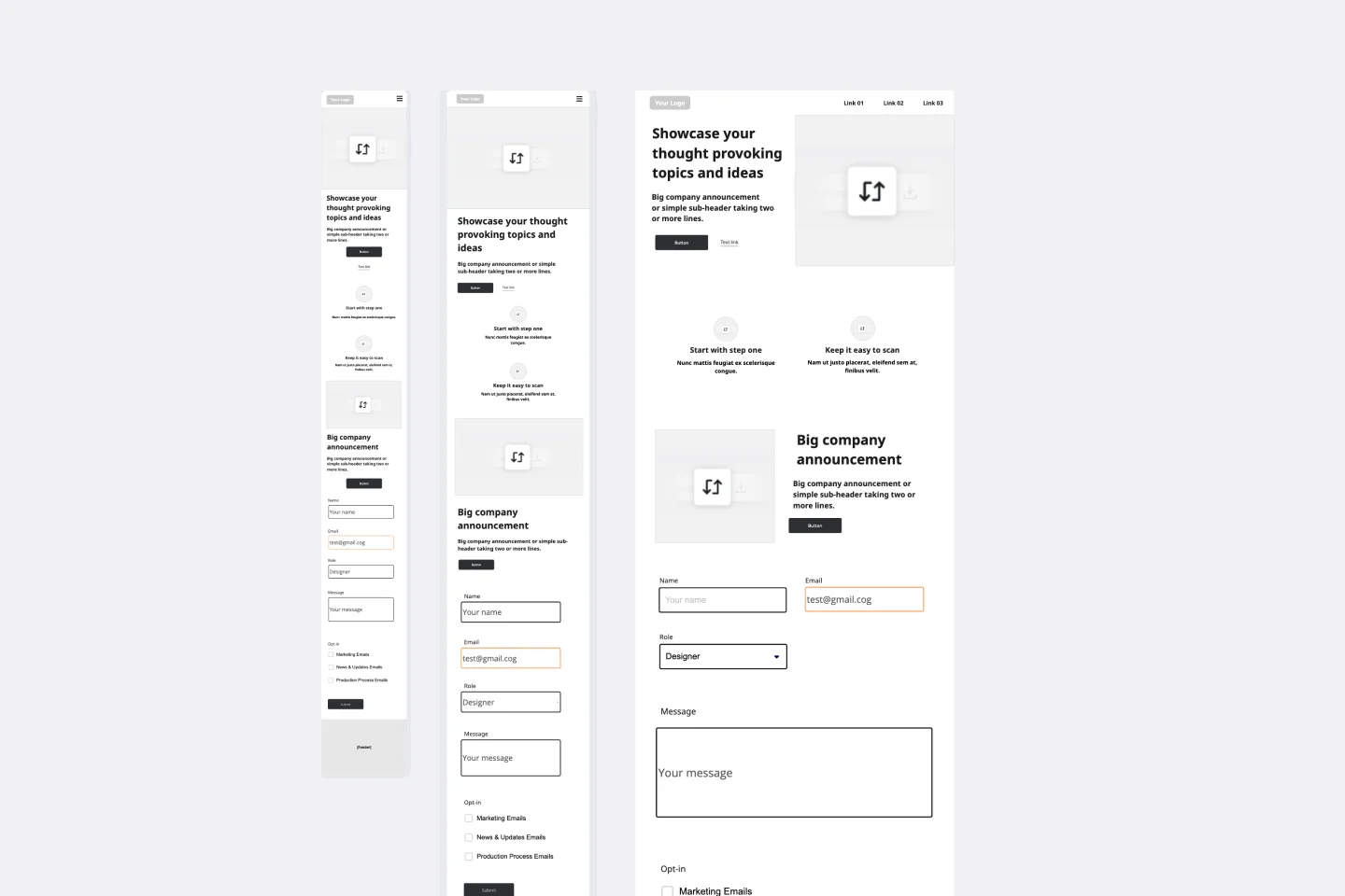
Marketing Email Wireframe
This template provides a proven structure for promotional marketing emails designed to drive conversions through clear hierarchy and strategic placement of key elements.
Email Header
Position your company branding at the top with sender information. Include the subject line as a bold statement that immediately communicates your offer value. Add a pre-header section with a browser view fallback link for email clients that don't display properly.
Hero Section
Open with your company identifier followed by a compelling headline that captures attention. Display the discount or offer percentage prominently in large, bold typography to create immediate visual impact and establish the value proposition.
Visual Content Area
Include a featured image placeholder that showcases your product, service, or seasonal theme. This visual break helps segment the email content while reinforcing your brand identity and offer context.
Offer Details
Present the discount code clearly with a label so subscribers can easily identify and copy it. Position your primary call-to-action button directly below with high-contrast styling and action-oriented copy that drives urgency.
Supporting Information
Provide concise instructions explaining how to redeem the offer and which products or services qualify. Include a prominent expiration date to create urgency and encourage immediate action.
Legal Disclaimer
Add fine print covering exclusions, terms, and limitations. Keep this section visible but secondary to maintain transparency while not distracting from the main offer.
Footer
Structure your footer with horizontal rows containing social media links, customer support access, copyright information, and required legal links. Center the unsubscribe option at the bottom to meet compliance requirements.
Design Principles
Maintain center alignment throughout to create a clean, focused reading path. Use whitespace strategically to separate sections and prevent visual overwhelm. Ensure the call-to-action button stands out through color contrast and adequate spacing from surrounding elements.
Responsive Considerations
Design with mobile-first thinking, ensuring all text is readable at small sizes and buttons are easily tappable. Keep the email width narrow enough to display properly across devices.
Cheers!
Khawaja Rizwan