Table of contents
Table of contents
What is a Swimlane Diagram?
Summary
In this guide, you will learn:
- What a swimlane diagram is
- Key components of swimlane diagrams
- How swimlane diagrams illustrate work flow
- When and why to use swimlane diagrams
- Differences between horizontal and vertical swimlanes
- Step-by-step instructions on how to create a swimlane diagram
Collaborative AI Workflows
Join thousands of teams using Miro to build the right thing, faster.
Unpacking Swimlane Diagrams
Suppose you’re building a new website for a company. The designer creates a wireframe that everyone approves. The developer starts programming the backend. The content team starts the editorial calendar. All seems well. But two months into the project, you realize that both the designer and the content team are writing user interface text. You need a swimlane diagram to show who does what and when in your project.
In this article, you’ll learn what a swimlane diagram is, tips for using one, and a swimlane diagram template to help get you started.

What is a swimlane diagram?
A swimlane diagram is a graphical representation of who does what and when in a process. A swimlane diagram uses the metaphor of lanes in a pool that extend horizontally or vertically to indicate ownership of workflow tasks. Swimlane diagrams can uncover duplicated efforts, redundancies, inefficiencies, and bottlenecks.
Lanes in a swimlane diagram can represent people, but they can also represent work groups, departments, or even tools and other processes. These parties can be internal or external.
A swimlane diagram illustrates who is responsible for each step in a process. It also describes how these steps relate to different actions and actors. As in a flowchart or workflow diagram, shapes represent steps and handoffs between team members or other actors in a process. Arrows between process steps show how information flows and transfers from one stage to another.
Although people commonly use the term swimlane diagram, these diagrams have different names, including cross-functional flowcharts, Rummler-Brache diagrams, or swimlane process maps.
What are the differences between swimlane diagrams and flowcharts?
A swimlane diagram is a type of flowchart. Both flowcharts and swimlane diagrams describe activities in a process, the inputs and outputs, and decision paths (or communication loops.) However, while a flowchart shows only activities, a swimlane diagram adds what person, role, entity, or process performs the actions.
What are swimming pools?
Swimlane diagrams can take up a lot of space and become messy if there are many participants. One way to bring order to a swimlane diagram chaos is through pools. Swimming pools contain more than one lane. When diagramming an entire process in an organization, a pool may represent a process, and the lanes represent the departments or roles performing activities.
Swimlanes and pools feature prominently in business process modeling notation (BPMN) and its software variant, unified modeling language (UML). In BPMN, cross-functional flow diagrams map processes that include multiple departments. In UML, these diagrams showcase activities managed in different areas.
What are the benefits of a swimlane diagram?
Here are the main benefits of mapping processes with swimlane diagrams:
Visualize responsibilities
By dividing the diagram into lanes, swimlane diagrams clearly indicate which roles or departments are responsible for specific tasks or activities. This visual representation helps to clarify roles and responsibilities, reducing confusion and improving accountability.
Improve clarity and understanding
By providing a clear and concise representation of the process flow, swimlane diagrams make it easier for stakeholders to understand how different roles, departments, or individuals contribute to the overall process. It helps to identify dependencies, handoffs, and potential bottlenecks.
Streamline processes
Analyzing swimlane diagrams can reveal inefficiencies, redundancies, or gaps in the process flow. Identifying such areas for improvement becomes easier as the diagram clearly shows where delays or issues might occur. It serves as a basis for process optimization and streamlining efforts.
Documentation and training
Swimlane diagrams serve as valuable documentation of processes within an organization. They can be used for onboarding new employees, training purposes, or as a reference point for process-related discussions and documentation updates.
When to use swimlane diagrams vs. other tools
Not every process needs a swimlane diagram. Sometimes a simple flowchart does the job. Other times, you need a Gantt chart or Kanban board instead. Here's how to decide when swimlanes are your best option.
Decision framework: When swimlanes work best
Swimlane diagrams shine when you need to answer questions like:
- Who's responsible for each step in this process?
- Where do handoffs happen between teams or departments?
- Why does this process keep getting stuck between marketing and sales?
- How do we coordinate multiple teams working on the same project?
If your main concern is accountability and cross-functional collaboration, swimlanes are probably your answer. They make it crystal clear who owns what, where work passes between teams, and where communication gaps exist.
Quick comparison: Swimlane vs. other process tools
Quick comparison: Swimlane vs. other process tools
Tool | Best for | Shows responsibility? | Shows sequence? | Shows timing? |
Swimlane diagram | Cross-functional processes, handoffs, accountability | ✅ Yes - by lane | ✅ Yes | ❌ Not typically |
Flowchart | Decision logic, single-owner processes | ❌ No | ✅ Yes | ❌ No |
Gantt chart | Project timelines, resource scheduling | ⚠️ Sometimes | ⚠️ Sometimes | ✅ Yes |
Kanban board | Work-in-progress tracking, task status | ⚠️ Sometimes | ❌ No | ❌ No |
Process map | High-level workflow overview | ❌ No | ✅ Yes | ❌ No |
Miro supports all of these visualization types, so you can easily switch between formats or use multiple views depending on your audience. Your sales team might prefer a Kanban board for daily work, while your operations team needs a swimlane diagram to document the full customer onboarding process.
Use swimlane diagrams when...
You should reach for a swimlane diagram when:
- Multiple teams or departments collaborate on a single process. Customer onboarding that involves sales, operations, and support? Perfect swimlane territory.
- Handoffs are causing problems. If work keeps getting dropped between teams, swimlanes expose exactly where those handoffs happen and who's supposed to catch the ball.
- You're documenting standard operating procedures that span different roles. Swimlanes make training materials clearer because new hires can immediately see what their lane handles.
- You need to identify process bottlenecks by department. When you can see that everything backs up in the "Legal Review" lane, you know where to focus improvement efforts.
- Compliance requires clear accountability. Industries like healthcare, finance, and manufacturing often need documented proof of who performed which steps. Swimlanes provide that clarity.
- Process optimization is the goal. Before you can improve a process, you need to understand it. Swimlanes reveal redundancies, unnecessary steps, and gaps in current workflows.
Don't use swimlane diagrams when...
Swimlanes are probably overkill if:
- Only one person or team handles the entire process. A standard flowchart is simpler and faster to create when there's no need to show cross-functional responsibility.
- You're focused on project timelines and deadlines. Swimlanes don't show time duration well. Use a Gantt chart or timeline instead when dates matter more than handoffs.
- The process is extremely complex with 10+ departments. Too many lanes create visual clutter. Consider breaking the process into smaller sub-processes, each with its own swimlane diagram.
- You need real-time task tracking. Swimlanes document the process, but they don't track individual task status. Use a Kanban board or project management tool for daily work management.
- The audience just needs high-level understanding. Executive presentations often benefit from simpler process maps. Save the detailed swimlane diagram for the teams actually doing the work.
- The process changes constantly. If your workflow shifts weekly, maintaining a detailed swimlane diagram becomes more burden than benefit. Document stable processes first.
In Miro, you can start with a swimlane diagram for process documentation, then create linked Kanban boards for daily execution, and even build Gantt charts for project planning—all referencing the same underlying process. This flexibility means you don't have to choose just one tool; you can use the right visualization for each audience and purpose.
How to identify bottlenecks with swimlane diagrams
One of the most powerful uses of swimlane diagrams is spotting where work gets stuck. Once you can see the full process laid out with clear ownership, bottlenecks become obvious. Here's how to find them and what to do about them.
5 signs of bottlenecks in your swimlane diagram
1. One lane is overloaded with activities
If the "Legal Review" lane has 8 steps while every other lane has 2-3, you've found your bottleneck. Work backs up because one team handles a disproportionate share of the process.
What to do: Can some of Legal's steps be delegated? Can you hire additional legal support? Can you create pre-approved templates to reduce review volume? The swimlane makes the imbalance visible, which is the first step to fixing it.
2. Long wait times between steps
Your diagram shows an arrow from "Submit for approval" to "Begin work"—but in reality, requests sit for days waiting for that approval. The diagram doesn't show the time dimension, but your team knows where delays happen.
What to do: Add notes to your Miro board indicating average wait times. If "Manager Approval" typically takes 3 days, note that. These annotations turn your swimlane into a diagnostic tool that highlights where time gets lost.
3. Excessive handoffs between lanes
The process ping-pongs back and forth between Customer Service and Operations five times. Each handoff is an opportunity for miscommunication, dropped tasks, or delays.
What to do: Look for opportunities to consolidate ownership. Can one team handle steps 2 and 4 instead of handing off twice? Can you empower Customer Service to make decisions that currently require Operations approval? Fewer handoffs usually mean faster processes.
4. Unclear accountability for a step
If you can't decide which lane owns "Verify customer information," that ambiguity is creating a bottleneck in real life. When no one clearly owns a step, it often gets delayed or done incorrectly.
What to do: Force the decision. Assign the step to the team best positioned to do it, document it in the swimlane, and communicate the new ownership clearly. Ambiguity is expensive.
5. A decision point with no defined criteria
Your diagram shows a diamond for "Approve or reject?" but there's no documented criteria for that decision. In practice, this means inconsistent decisions, rework, and frustrated team members who don't understand why their work was rejected.
What to do: Document decision criteria directly in your Miro board. Link the decision diamond to a separate note or checklist that details exactly what "approved" looks like. This clarity eliminates a major source of delays and rework.
Simple analysis techniques
Color-code by cycle time: In Miro, use different colors to show which activities take minutes, hours, days, or weeks. Red for steps that take more than a week, yellow for days, green for same-day completion. The red zones show you where to focus improvement efforts.
Track handoff frequency: Count how many times work crosses between lanes. The more handoffs, the higher the risk of delays and errors. Calculate a "handoff ratio" for different process variations—the version with fewer handoffs is usually faster and more reliable.
Map current state vs. ideal state: Create two swimlane diagrams in Miro—one showing how things work today, another showing your streamlined vision. The gaps between them become your improvement roadmap.
Measure touch time vs. wait time: Annotate your diagram with how long each activity takes (touch time) versus how long work waits before someone picks it up (wait time). In most processes, wait time dwarfs touch time. Reducing wait time has huge impact.
Before and after example: Customer onboarding
Before optimization:
- 7 lanes (Sales, Operations, IT, Finance, Legal, Customer Success, Support)
- 23 steps total
- 12 handoffs between lanes
- Average time to onboard: 6 weeks
- Major bottleneck: Legal review taking 2 weeks, with contracts bouncing back to Sales 40% of the time for corrections
After analysis and improvement:
- 5 lanes (Sales, Operations combined with IT, Finance, Legal, Customer Success)
- 16 steps (eliminated redundant checks)
- 6 handoffs (reduced by creating pre-approved contract templates and empowering Sales to handle tier-1 IT setup)
- Average time to onboard: 3 weeks
- Legal review: 3 days (using templates for standard deals, reserving full review for custom contracts)
How the swimlane revealed the fix: The diagram showed that 60% of Legal's time went to fixing basic contract errors that Sales could have avoided with better training. It also revealed that IT and Operations were doing duplicate system checks. The visual made these inefficiencies obvious—once you can see them, solutions become clearer.
How Miro helps spot inefficiencies
Comments and feedback loops: Team members can add comments directly to problem areas. "This step always takes 3 days longer than it should" becomes a visible flag for improvement.
Version comparison: Miro's version history lets you compare your process over time. As you make improvements, you can literally see the diagram simplify—fewer steps, fewer handoffs, clearer flows.
Data overlays: Link your swimlane to actual data. In Miro, you can add frames with charts showing volume by lane, cycle time by step, or error rates at decision points. These data overlays turn your swimlane into an analytical dashboard.
Collaborative problem-solving: Share your bottleneck-annotated diagram in a Miro board and invite the team to a brainstorming session. Use sticky notes to capture improvement ideas right next to the problem areas. The visual context keeps everyone focused on the same issues.
The key insight: Swimlane diagrams don't just document processes—they diagnose problems. When you can see who does what and where handoffs happen, bottlenecks become obvious. And once you can see the problem clearly, you're halfway to solving it.
Advanced swimlane techniques
Once you're comfortable with basic swimlane diagrams, these advanced techniques help you handle more complex scenarios and create diagrams that meet professional standards.
Pools vs. lanes: Understanding the hierarchy
In formal process modeling (especially BPMN), there's a distinction between pools and lanes:
Pools represent completely separate organizations or major entities that don't share the same process infrastructure. Think: your company vs. a vendor, or Company A vs. Company B in a partnership.
Lanes represent teams, roles, or departments within a single organization. Marketing, Sales, Operations—these are lanes within your company's pool.
Why it matters: Pools have harder boundaries. Communication between pools happens through well-defined interfaces (APIs, formal requests, contracts). Communication between lanes can be more fluid (Slack messages, quick meetings, shared systems).
When to use pools: If you're mapping a process that spans your company and an external vendor, create two separate pools—one for your company (with lanes for your internal teams) and one for the vendor (with their lanes). The diagram shows where formal handoffs cross organizational boundaries.
Miro tip: Create pools by using distinct background colors or borders to separate major entities. Within each pool, use standard horizontal lanes for internal teams. This visual hierarchy makes it immediately clear when work crosses organizational boundaries—which is often where the biggest delays and miscommunications happen.
Horizontal vs. vertical orientation: When to use each
Most swimlane diagrams are horizontal (lanes run from left to right), but vertical orientation (lanes run top to bottom) works better in some situations.
Horizontal swimlanes (most common):
- Natural reading flow for English speakers (left to right = time progression)
- Works well for processes with many steps but fewer lanes (3-6 lanes)
- Better for presentation slides and documents (landscape format)
- Easier to show time progression when you add timeline markers
Vertical swimlanes (less common but useful):
- Works better when you have many lanes but fewer steps
- More natural for organizational hierarchy views (executives at top, individual contributors at bottom)
- Fits portrait-oriented documents and mobile screens better
- Some teams find top-to-bottom flow intuitive for approval processes (request starts at bottom, moves up through management layers)
Miro tip: Miro's infinite canvas means orientation is flexible. Start horizontal, and if your diagram becomes too wide to follow, rotate to vertical. You can even create both orientations for different audiences—horizontal for workshops, vertical for mobile-friendly quick reference.
BPMN compliance basics
Business Process Model and Notation (BPMN) is the international standard for process modeling. If your organization needs formal process documentation—especially in regulated industries—you'll want basic BPMN compliance.
Key BPMN elements for swimlanes:
- Start event (circle): Where the process begins
- End event (circle with thick border): Where the process concludes
- Task (rounded rectangle): An activity someone performs
- Gateway (diamond): Decision points or parallel splits
- Sequence flow (solid arrow): The order of activities
- Message flow (dashed arrow): Communication between pools
- Data object (document icon): Information used or created in the process
Why bother with BPMN? It's a universal language. A properly BPMN-formatted swimlane can be imported into process automation software, understood by consultants worldwide, and meets compliance requirements for many industries.
When you don't need BPMN: If you're just documenting internal processes for your team's use, standard flowchart symbols are fine. BPMN adds precision but also complexity. Use it when you need it, not because it exists.
Miro tip: Miro offers BPMN shape libraries that include all standard notation. If you're new to BPMN, start with Miro's pre-built BPMN swimlane templates—they use correct notation, and you can modify them for your specific process. As you get comfortable, you'll naturally learn which symbols mean what.
Color coding strategies
Strategic use of color makes swimlane diagrams significantly easier to scan and understand—but random colors just create noise.
Effective color coding approaches:
1. Code by lane (most common): Each lane gets a distinct color. Marketing is blue, Sales is green, Operations is orange. This helps readers quickly track which team is active at any point in the process.
2. Code by activity type: All decision points are yellow, all automated steps are purple, all customer-facing activities are green. This highlights the nature of work regardless of who does it.
3. Code by cycle time: Red for slow steps (>1 week), yellow for medium (1-7 days), green for fast (<1 day). This immediately shows where bottlenecks exist.
4. Code by exception frequency: Gray for routine steps that rarely have issues, orange for steps with occasional problems, red for chronic problem areas. This becomes a risk heat map.
5. Code by status (for process improvement): Green for optimized steps, yellow for "needs work," red for "major problems," white for "not yet reviewed." This turns your diagram into a project roadmap.
Rules for effective color coding:
- Consistency matters: Use the same color scheme across all your organization's diagrams. Don't make Marketing blue in one diagram and green in another.
- Limit your palette: 5-7 colors maximum. More than that becomes visually overwhelming.
- Consider colorblind users: Use patterns or labels in addition to color, or choose colorblind-friendly palettes.
- Make it meaningful: Every color should have a purpose. Random prettification actually makes diagrams harder to understand.
Miro tip: Create a color legend directly on your Miro board. Use a small frame in the corner that shows what each color means. This legend ensures everyone interprets your diagram the same way. You can also save color schemes as part of your Miro template so every new diagram starts with consistent, meaningful colors.
Showing subprocesses and expanded views
Sometimes a single activity in your swimlane actually represents a complex subprocess with multiple steps. You have two options:
Option 1: Collapse to a single shape with an indicator Show "Process customer refund" as one rectangle, but add a small "+" symbol or indicator that there's more detail available. This keeps the high-level diagram clean.
Option 2: Create linked detailed views In Miro, you can link a shape in your main swimlane to a separate board that shows the expanded subprocess. Readers who need detail can click through; readers who just need the overview stay at the high level.
When to use subprocesses: If an activity involves 5+ steps or multiple decision points, it's probably worth breaking into a subprocess. The main diagram stays readable while preserving the ability to drill into details.
Miro tip: Use Miro's frames and board links to create a hierarchical set of diagrams. Your Level 1 board shows the entire process at 30,000 feet. Clicking on any major activity jumps to a Level 2 board showing that subprocess in detail. This approach scales to very complex processes while keeping each individual diagram manageable.
Swimlane diagram example
The key purpose of swimlane diagrams is to understand who is responsible for completing activities in processes. Other visual process flow diagrams such as timelines, Gantt charts, roadmaps, and Kanban boards can all include swimlanes to show task and process owners.
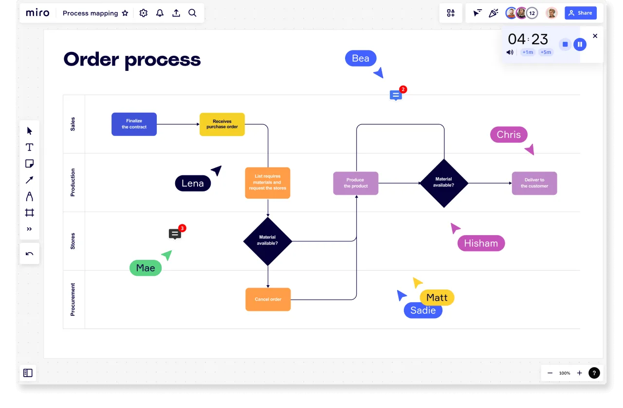
Let’s look at our example of a team mapping the process of fulfilling an order. In the diagram, each swimlane corresponds to a department involved in the fulfillment in some critical way.
- Sales: First, the sales team finalizes the contract and submits the purchase order.
- Production: Next, the production team lists the materials required to fulfill the order.
- Store: The store or warehouse then assesses if the required materials are available. If they are not, the Procurement team is informed and may have to cancel the order. If the materials are available, the Production team gets started making the product according to the customer's specifications.
With each department's role mapped out, the sequence of activities and the responsibilities within each role is clearly understood. This allows for better collaboration and communication between the different departments.
Characteristics of swimlane diagrams
Although swimlane diagrams vary from person to person, some conventions do exist which add clarity to drawings and simplify the creation process. Formal diagrams often use standard flowchart symbols.
The swimlane shapes you use also depend on whether your diagram must conform to any rules or standards, such as when you must use BPMN for diagrams. The following are the standard symbols used to represent process events.
Labels
Clearly label each element so there’s no confusion about what is being represented.
Start and end points
Indicate the start and end of the process. Formal maps use a round-cornered rectangle.
Decision point
This represents a question to be answered or a choice to be made. A diamond shape indicates a decision point.
Action or task
A rectangle depicts actions, activities, or tasks.
Input or output
Includes anything that enters or results from the process and can be information, data, or the result of another process. A parallelogram represents inputs and outputs.
Connector
Represented by a small circle, connectors show a link to another diagram and, thus, another process.
Document
A rectangle with an undulating bottom border indicates a document required by the process.
Straight arrow
Indicates a physical handoff of documents or items.
Jagged arrow
Indicates an electronic handoff of a deliverable.
Object on a boundary link
Activities or tasks shared by actors sit on swimlane boundary lines.
How to create a swimlane diagram
A helpful swimlane diagram benefits from reflection before you ever draw the first line. Consider what your goal is for the map and what problem you are trying to solve. Then, research your process and start to create your swimlane diagram.
Research
Before you sit down to diagram a process, it helps to consider what you need to map and why. What activities are essential to achieve your project or task? How do actors transfer assignments and communicate between steps? Who are the process and task owners?
For new processes, break activities into steps and define which roles, teams, and departments will own them. For existing processes, document what people do in the current process, not what they should do or what’s in the current documentation. Then, sketch out possible improvements. Finally, ask stakeholders how they view the steps you’ve added to the cross-functional flowchart.
Drawing
Although processes can be complex, a swimlane diagram should minimize the complexity as much as possible. To help make your diagram as intuitive as possible, follow these guidelines as you map your process:
- Focus on who, what, and when to reduce visual noise.
- Use shapes and colors consistently. Consider differentiating the swimlane shapes in each swimlane in a different color.
- Create a hierarchy of important elements by using different shape sizes. In other words, make important items larger.
- Add labels to show essential details for your audience.
You can also explore different options for the layout of a diagram. For example, consider the flow direction of your swimlane map. If you list actors in a column on the left, your top row can mark phases in the process or timeline. People often use a two-column top-to-bottom flow with vertical lines to assess value-added activities in value stream map templates.
Some people also think swimlane diagrams work best with linear processes and less well when describing processes that extend in many branches from a central activity.
If you map complex activities or overviews for a large organization, consider drawing separate diagrams for each activity or creating pools to contain subprocesses and actors.
Here are a few steps to make the process run smoothly:
- Choose a free ready-made swimlane template. For a prototype, use different colored sticky notes to sketch your process.
- Create two columns of rows. In the left-hand column, write your actors, the people, jobs, or tools who will perform activities. Create swimlanes. Add as many as you need to depict your process.
- Enter the starting point in a rounded rectangle circle in the upper left lane and label it.
- Add and label additional steps in each lane as appropriate, connecting each step to the previous step or steps with a line as you would in a flowchart. Conventionally, you work down and to the right as you chart progress. Add arrows to indicate the process flow. Lines can cross swimlanes as the output of one step moves to the next step.
- Label elements with short descriptions. Keep the diagram clean.
- Share the prototype with team members and other stakeholders for verification, and keep your diagram updated as things change.
Common mistakes to avoid
Even experienced teams make predictable mistakes when creating swimlane diagrams. Here are the pitfalls to watch for—and how to avoid them.
1. Overcomplicating with too much detail
The mistake: Trying to document every tiny substep and decision point. Your swimlane diagram becomes a wall of shapes and arrows that nobody wants to read.
The fix: Focus on the steps that matter for understanding roles and handoffs. If you're mapping "Process customer order," you don't need to show "Open email application, click compose, type customer name..." Just show "Send confirmation email" with Customer Service in the responsible lane.
Miro tip: Use Miro's zoom features to create high-level and detailed views. Keep your main diagram at the 30,000-foot level, then link to separate detailed boards for teams that need step-by-step procedures.
2. Poor lane alignment and inconsistent spacing
The mistake: Lanes of different widths, activities that don't line up horizontally, or cramped spacing that makes the diagram hard to follow.
The fix: Keep all lanes the same width unless there's a specific reason to vary them. Align activities that happen simultaneously at the same horizontal level. Leave consistent white space between shapes.
Miro tip: Use Miro's smart guides and alignment tools to snap shapes into place. The grid view helps maintain consistent spacing, and you can create a template with pre-sized lanes to ensure every diagram follows the same layout standards.
3. Missing or unclear decision points
The mistake: Showing a linear process when reality involves decisions, approvals, or branches. Teams following your diagram hit unexpected decision points and don't know what to do.
The fix: Use diamond shapes for any decision point where the process can go different directions. Label each path clearly: "Approved / Rejected" or "Priority Order / Standard Order." If a step requires approval, show it explicitly.
Miro tip: Miro's flowchart shape library includes diamond decision symbols. Color-code approval steps differently so they stand out visually—your team will immediately recognize where they need to wait for a decision.
4. Unclear handoffs between lanes
The mistake: An arrow crosses from Marketing to Sales, but nobody knows what actually gets transferred or what triggers the handoff.
The fix: Label every cross-lane arrow with what's being handed off and what triggers the transfer. Instead of just an arrow, add text: "Qualified lead meeting criteria" or "Approved contract + PO." This clarity prevents work from getting dropped.
Miro tip: Use Miro's connector labels or add small text boxes along connecting lines. For complex handoffs, link to a separate checklist or document that details exactly what "ready to hand off" means.
5. Inconsistent symbols and notation
The mistake: Using different shapes for the same type of activity, or inventing your own symbols that others don't understand.
The fix: Stick to standard flowchart symbols. Rectangles for activities/tasks, diamonds for decisions, circles for start/end points. Create a legend if you need to use any specialized symbols, but try to keep it simple and standardized.
Miro tip: Start from Miro's swimlane diagram templates, which use standard symbols. If your organization has notation standards (like BPMN), use Miro's shape libraries that include those specific symbols.
6. Outdated diagrams that don't reflect reality
The mistake: Creating a beautiful diagram, using it once, then never updating it as the process evolves. Six months later, it's worse than useless—it's misleading.
The fix: Treat your swimlane diagram as a living document. Assign someone to own it. Review it quarterly, or whenever the process changes significantly. Better yet, make diagram updates part of your process improvement workflow.
Miro tip: Share your Miro board with the teams who execute the process. When someone notices the diagram doesn't match reality, they can add a comment directly on the board. Version history in Miro lets you track what changed and when, which helps with compliance and continuous improvement.
7. Skipping stakeholder validation
The mistake: Creating the diagram in isolation, then presenting it as the definitive process—only to discover that half the lanes say "that's not how we actually do it."
The fix: Build the diagram collaboratively. Interview people from each lane. Share drafts and ask "is this right?" Walk through scenarios with the team to verify the process actually flows this way.
Miro tip: Use Miro's real-time collaboration features to workshop the diagram together. Schedule a 60-minute session where representatives from each lane join the board simultaneously. As you build the process, everyone can flag inaccuracies immediately, and you'll end up with a diagram that actually reflects reality.
8. Forgetting to show parallel activities
The mistake: Drawing everything sequentially when some steps actually happen at the same time. This misrepresents the process and hides opportunities to speed things up.
The fix: When activities happen simultaneously in different lanes, show them at the same horizontal level. Use parallel arrows if needed. This accuracy matters—if Design and Content actually work at the same time, showing them sequentially suggests the process takes longer than it does.
Miro tip: Miro's infinite canvas makes it easy to show parallel paths. Arrange simultaneous activities side-by-side at the same vertical position, then use connector lines to show where they converge. Color-coding parallel activities helps readers understand they happen concurrently.
How to supercharge swimlane creation with Miro AI
Building comprehensive swimlane diagrams can feel overwhelming when you're staring at a blank canvas. You know your process inside and out, but translating that mental map into a clear visual representation? That's where things get tricky.
Miro's AI-powered visual canvas transforms this challenge into an opportunity. Instead of starting from scratch, you can leverage intelligent assistance to accelerate your diagram creation while ensuring you capture every critical detail.
- Generate process content: Describe your workflow and let Miro AI create sticky notes with key process steps that you can organize into your swimlane diagram.
- Organize scattered ideas: Transform messy brainstorming sessions into structured content by having AI group related activities and suggest which swimlane each belongs in.
- Create supporting documentation: Ask Miro AI to generate process descriptions, identify handoff points, and highlight improvement opportunities based on your swimlane diagram.
- Get content suggestions: Receive AI-powered recommendations for missing process steps, decision points, and workflow optimizations to enhance your swimlane diagram.
Ready to experience AI-powered process mapping? Try a new way of building your swimlane diagram on Miro's innovation workspace and see how AI can transform your approach to visual collaboration.
Frequently asked questions about swimlane diagrams
What's the difference between a swimlane diagram and a regular flowchart?
A regular flowchart shows the sequence of steps in a process but doesn't indicate who is responsible for each step. A swimlane diagram adds lanes (horizontal or vertical sections) that assign each activity to a specific role, department, or system. The key difference: swimlanes make accountability explicit.
Use a flowchart when you're documenting a process that one person or team handles end-to-end. Use a swimlane when multiple teams or roles share responsibility and you need to show handoffs clearly.
How many lanes should I include in my swimlane diagram?
Practical limit: 3-7 lanes for most diagrams. Fewer than 3 lanes and a swimlane diagram is probably overkill—just use a standard flowchart. More than 7 lanes and the diagram becomes visually cluttered and hard to follow.
If your process genuinely involves 10+ departments, consider breaking it into multiple smaller diagrams. For example, create separate swimlanes for "Customer acquisition process" and "Post-sale onboarding process" rather than one giant diagram covering everything from first contact to renewal.
Exception: Vertical swimlanes can sometimes handle more lanes because vertical space is less constrained on a scrollable document or screen.
Do I need special software to create swimlane diagrams?
No, you can technically draw swimlane diagrams with paper and pencil, or in generic tools like PowerPoint and Google Slides. However, dedicated diagramming tools make the process much easier and the results more professional.
Miro is particularly well-suited for swimlane diagrams because:
- Pre-built templates get you started instantly
- Smart connectors automatically redraw arrows when you move shapes
- Real-time collaboration lets teams build diagrams together
- Integration with other tools means your diagram connects to your broader workflow
- Infinite canvas accommodates processes of any complexity
Free tools exist, but they usually lack collaboration features, which defeats much of the purpose—swimlane diagrams are most valuable when built and maintained by teams, not individuals.
How often should I update my swimlane diagrams?
Review quarterly as a baseline, but update immediately when the process changes significantly. Signs your diagram needs updating:
- Team members say "we don't do it that way anymore"
- A reorganization changes who owns which steps
- New software or automation changes the workflow
- Compliance requirements introduce new approval steps
- Process improvement initiatives redesign part of the workflow
Best practice: Assign ownership of each diagram to someone who knows the process intimately. Make "update the swimlane" a standard part of any process change project. In Miro, use version history to track what changed and when—this audit trail matters for compliance and helps teams understand how processes evolved.
Can swimlane diagrams show time duration or deadlines?
Standard swimlane diagrams don't inherently show time—they focus on sequence and responsibility. However, you can annotate your diagram to include timing information:
- Add text labels showing expected duration for each step ("2 hours," "3 business days")
- Use color coding to indicate fast vs. slow activities
- Include SLA (service level agreement) targets for specific steps
- Add a timeline ruler along the top or side of your diagram
When time matters more than responsibility, use a different tool. Gantt charts and timeline visualizations are better for project scheduling. Swimlane diagrams excel at showing who does what and in what order—time is secondary.
Miro tip: Create layered views. Your base swimlane shows the process structure. Add a semi-transparent frame overlay with timeline markers to show typical cycle time without cluttering the diagram. Readers can toggle this layer on or off depending on whether they need timing information.
What's the best way to handle decision points in swimlane diagrams?
Use diamond shapes for any point where the process branches based on a decision or condition. Label each outgoing path clearly so readers know what determines which path is followed.
Best practices for decision points:
- Make criteria explicit: Instead of just "Approved?" write "Approved (meets budget & technical requirements)?"
- Limit options: If a decision has more than 3-4 possible outcomes, consider whether you're actually showing multiple decision points that should be separate diamonds
- Show what happens for each outcome: Don't draw a diamond with paths that just disappear—show where each decision path leads, even if it's to an end point or a return loop
- Assign the decision to a lane: The diamond should sit in the lane of whoever makes the decision, making accountability clear
Miro tip: Use Miro's comments feature to document detailed decision criteria. The diamond on the diagram shows there's a decision; clicking through to the attached note gives the full decision logic. This keeps your diagram clean while preserving important detail.
How do I show repeating loops or iterations in a swimlane diagram?
Use a backwards arrow that returns to an earlier step in the process. Label this arrow to show what triggers the loop: "Revisions required," "Quality check failed," or "Additional approval needed."
Common scenarios:
- Rework loops: Design submits a prototype, Stakeholder reviews, feedback triggers return to Design for revisions. This can loop multiple times before approval.
- Escalation loops: Support handles a customer issue, but complex cases loop back through Management for escalation before returning to Support for resolution.
- Iterative development: In agile workflows, Development → Testing → Development loops for multiple sprints before Release.
Be careful not to create infinite loops visually. Make sure there's a clear exit condition—a path that breaks the loop and moves the process forward. Otherwise readers will wonder "when does this ever end?"
Miro tip: Use a different color or style (like dashed lines) for backwards/loop arrows so they're visually distinct from forward progress arrows. This helps readers understand the primary flow vs. exception paths.
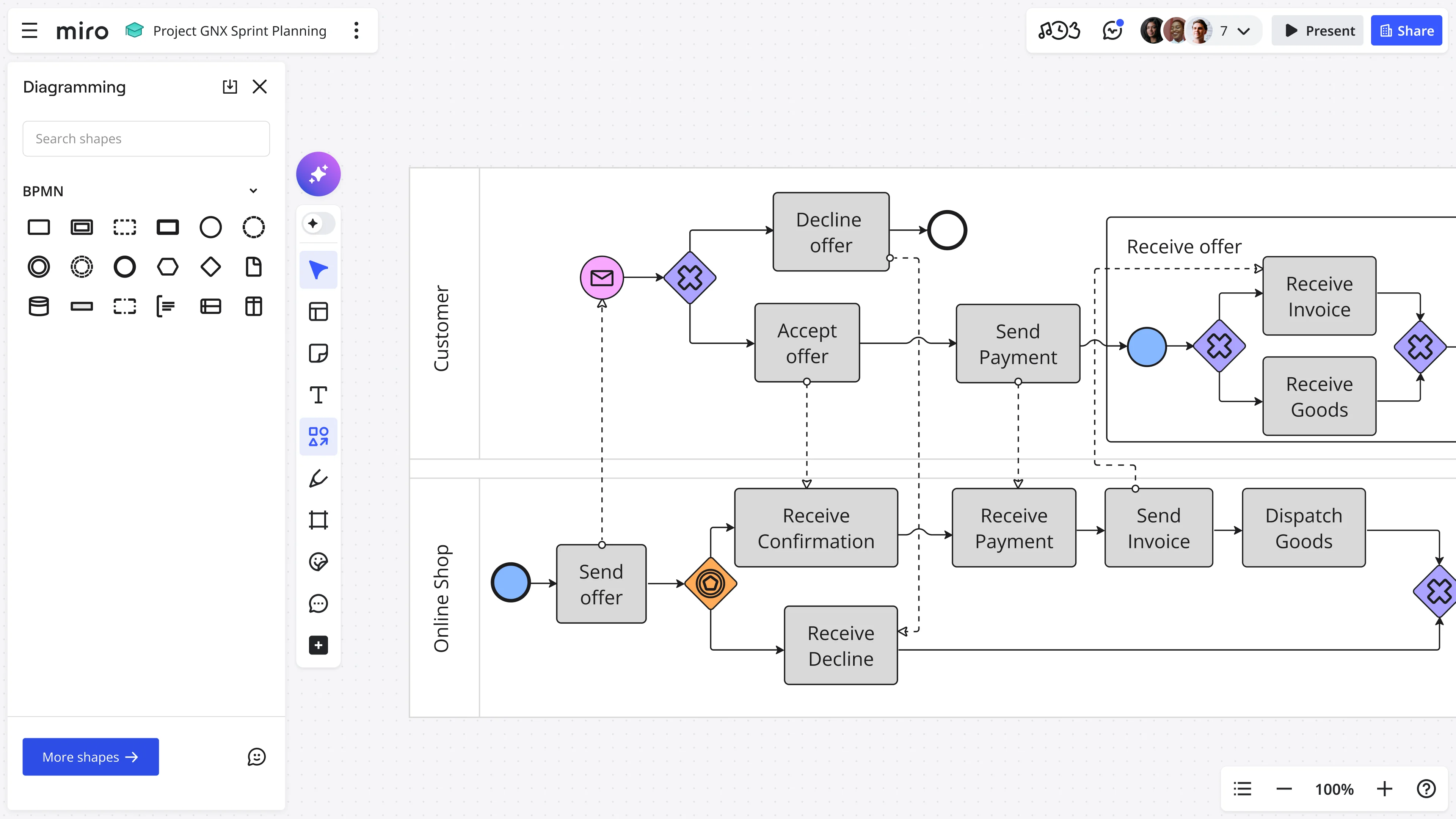
Can I use swimlane diagrams for cross-organizational processes (with external vendors or partners)?
Yes—this is where pools become important. Create separate pools for each organization, then use lanes within each pool for internal roles or departments.
Communication between pools is shown with special message flow arrows (often dashed lines in BPMN) to indicate formal information exchange between organizations. These cross-pool connections usually represent:
- API calls or data integrations
- Contract deliverables
- Formal requests or approvals
- Information sharing (invoices, reports, specifications)
Example: Your company's "New Product Launch" process might have one pool with lanes for Product, Marketing, and Sales. A second pool represents your Manufacturing Partner with their lanes for Production, Quality Control, and Shipping. Arrows between pools show where you send specifications and they return finished goods.
Miro tip: Use clear visual separation for pools—different background colors, bold borders, or frames. This makes it immediately obvious when work crosses organizational boundaries, which is where delays and miscommunications most often occur.
Author: Miro Team Last update: December 15, 2025