
Table of contents
Table of contents
User flow examples to help you build your next big thing
Summary
In this guide, you will learn:
- What a user flow is (and what it isn’t)
- Why user flows matter in UX design
- How to create a user flow in 5 steps
- Best practices for clear, usable user flow diagrams
- When to use user flows across the product lifecycle
- User flow examples and templates you can use in Miro
- How Miro supports user flow analysis and iteration with your team
Collaborative AI Workflows
Join thousands of teams using Miro to build the right thing, faster.
You’ve just launched a new feature. The team’s proud of it, but users aren’t quite getting it. They miss key actions, drop off early, or take paths you never expected. That disconnect is exactly where user flows help.
It’s not just a design problem - it’s a collaboration one. In Miro’s 2025 Momentum at Work report, knowledge workers said they spend three hours on meetings, admin, and email for every hour of focused, creative work — and 6 in 10 said silos stall momentum. When teams lack a shared view of how users move through a product, progress slows even further.
User flows bring clarity back into the process. They help teams spot friction early, align faster, and design journeys that feel intuitive instead of confusing.
Whether you're designing a new app, shaping a new feature, refining an existing journey, or aligning stakeholders around a complex flow, user flow diagrams give you a clear starting point. So where do you begin? And how do you make sure your flow truly reflects your users' real needs and actions? That’s exactly what we’ll walk through next.
What is a user flow?
A user flow is a visual map of the steps a user takes to complete a specific goal inside your product or service.
It shows how users move from an entry point - such as a homepage, onboarding screen, or feature trigger - through a series of actions and decisions until they reach a final outcome. This might be signing up for a newsletter, making a purchase, or completing a task.
By laying out this path clearly, teams can clearly see how the interface supports (or interrupts) progress toward that goal. Rather than guessing how users might move through an interface, user flows gives teams a shared, practical way to design around real behaviour and spot roadblocks early.
Why is user flow important in UX design?
You can have great ideas, strong designs, and solid research, yet still end up with a confusing experience if users don’t know what to do next. That’s where user flows make the difference.
They don’t just tick off a design box but instead become a blueprint for creating a product that works. Industry research shows that teams who deeply integrate UX research into product strategy achieve up to 3.6× more active users and significantly stronger product–market fit than those who don’t. When research insights feed directly into user flow analysis, design teams can identify friction earlier and improve experiences before problems scale.
User flows are beneficial to the design process because they help teams:
- Create smoother user experiences
User flows surface friction, confusion, and dead ends early. Before they become costly UX problems. Instead of discovering issues in usability testing or after launch, teams can fix them while ideas are still flexible.
- Align teams and stakeholders
A user flow gives everyone a shared visual reference. Designers, product managers, engineers, and stakeholders can quickly understand how a feature is supposed to work without relying on long explanations or assumptions.
- Work more efficiently
By mapping the path to a goal, user flows reduce guesswork and rework. Teams spend less time debating “what should happen next” and more time designing solutions that support clear user progress.
- Prioritize what matters most
User flows highlight critical steps, decisions, and moments of drop-off. This makes it easier to focus effort on the interactions that have the biggest impact on user success.
How to create your user flow with Miro
Building a user flow sounds technical, but with Miro, it doesn’t have to be complicated. In our innovation workspace, teams can move from rough ideas to structured flows quickly - using templates, AI assistance, and real-time collaboration.
User flows work best when they’re grounded in real people, real goals, and real behaviour. Here’s a simple five-step process you can use for any product, feature, or journey.
1. Define the user and goal
Before you start creating anything, get specific about who you’re designing for. Start with one clear user and one clear objective.
Ask yourself:
- Who is this flow for? Imagine the person behind the screen. Are they new or experienced? Confident or cautious?
Then clarify:
- What are they trying to achieve? Not in general, but in this exact interaction.
Knowing this keeps the flow focused and helps you design with intention instead of assumption.
For example, a goal might be “create an account,” “complete a purchase,” or “submit a support request.”
2. Identify the entry point
Next, define where the user starts. Every flow starts with a trigger. It might be a search result, a homepage button, an email link, or an in-app notification. Wherever it begins, mark that moment clearly.
Entry points shape expectations, so starting here ensures your flow reflects how users really arrive. Not just how you wish they would.
3. Map key steps
Now sketch the main path forward and map out user actions. Think of every click, swipe, or input a user makes between the starting point and final goal:
- What does the user do first?
- What happens next?
- Which screens or actions move them closer to their goal?
Focus on meaningful steps, not micro-interactions. Forms, selections, confirmations, and transitions are usually more important than every single tap or click.
In Miro, this is where simple shapes and connectors help you see the journey at a glance.
4. Add decision points
Real journeys aren’t linear. Users hesitate, change their minds, run into errors, or choose different options. Add these decision moments to your flow so your design reflects reality. Not just ideal behavior.
These are often points where confusion, drop-off, or frustration appear. That’s what makes them some of the most valuable parts of your user flow chart to design carefully. Clear prompts, helpful feedback, and well-designed alternatives here can make the difference between progress and abandonment.
5. Define endpoint
Finally, decide what “done” looks like. Is it a confirmation screen? A dashboard? A success message? A return to the previous screen?
A clear endpoint helps you judge whether the journey actually delivers on the user’s goal, and whether the experience ends with clarity instead of uncertainty.
User flow best practices
Once you’ve mapped your first flow, these best practices help keep it clear, usable, and easy for teams to work with.
- Start with user goals. Anchor every flow in what the user is trying to achieve. A clear goal keeps the journey focused and prevents unnecessary steps.
- Keep it simple. Avoid overloading your diagram with too many branches or edge cases. Simple flows are easier to understand, and allow gaps, friction, and opportunities easier to spot.
- Use consistent symbols and labels. Stick to the same shapes, arrows, and naming conventions. Visual consistency helps everyone understand the flow quickly and reduces misinterpretation.
- One goal per flow. Each user flow chart should map to a single task or outcome. This makes it easier to validate, iterate, and communicate.
- Share early and iterate collaboratively. User flows work best when they’re reviewed, challenged, and refined with your team. Early feedback helps surface gaps before design and development begin.
When to use a user flow
User flows are useful across the entire product lifecycle. Here are the moments when they deliver the most value:
- Early ideation. Use a user flow to clarify the big picture before jumping into screens, layouts, or wireframes. It helps teams align on structure, sequence, and intent first - before design details take over.
- Adding or redesigning features. Map how users will discover, access, and complete a new or updated feature. This makes gaps, dead ends, and unnecessary steps easier to spot early.
- Preparing usability tests and scenarios. User flows help define realistic test paths, so you’re evaluating the steps that actually matter in a task or journey.
- Cross-functional alignment. A user flow provides a shared visual reference across product, design, and engineering teams that makes complex journeys easier to discuss, review, and build together.
User flows work best when they’re treated as living planning tools, not just diagrams, helping teams design with clarity from idea to delivery.
User flows vs other UX diagrams
User flows are often confused with other UX and product diagrams. While they’re closely related, each serves a different purpose in the design process. Understanding the difference can help teams choose the right tool at the right time.
User Flows — Comparison Table
User Flows vs. | Relationship | User Flows | The Other |
User Flows vs. | Relationship | User Flows | The Other |
Flowcharts | Subset — all user flows are flowcharts | A specific type of flowchart focused on how users move through a product to complete a task. Captures the 'what' and 'why' of a user's experience. | General-purpose diagrams used to map any process or system — not limited to user experiences. |
Task Flows | Broader — task flows are components of user flows | More detailed — capture multiple path journeys, decisions, and outcomes. Focus on the overall 'what' and 'why' of the full experience. | Map a single, linear, ideal path to complete one task. No alternative routes or system responses. Focus on the 'how' of one specific action. |
Wireframes | Complementary — user flows come first | Show how users move between screens — mapping the path and decisions made to achieve a goal. Define structure and sequence. | Show what screens look like — detailing the layout of individual screens and where elements are placed. |
Customer Journey Maps | Subset — user flows are one part of a journey map | Zoom into one specific task inside a product. Focus purely on interactions and steps within a product. | Show the holistic user experience over time — across touchpoints, emotions, and channels. |
Sitemaps | Complementary — structural vs. behavioral | Show how users actually move through pages to achieve a goal. Behavioral — focused on paths and decisions. | Show how all pages are organized in a high-level, hierarchical overview. Structural — focused on architecture. |
UI Flows | Higher-level — UI flows are a detailed type of user flow | Stay at a higher level — focusing on decisions, paths, and logic rather than screen design. | More detailed and screen-focused. Include visual layouts alongside navigation, bridging UX concepts and developer implementation. |
Get inspired with some of our user flow examples
Not every user flow looks the same - and it shouldn’t. The best format depends on what you’re trying to understand: a mobile journey, a checkout process, a multi-role system, or a complex website structure. Let's explore a few user flow examples that'll level up your next design sprint. Each one offers a unique way to map user journeys, depending on the product and your design needs.
1. Screen flow
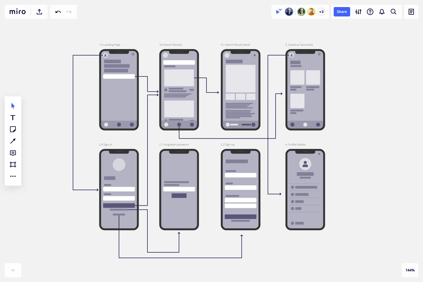
Screen flows help teams simplify navigation and ensure every screen moves users closer to their goal. If you're focusing on mobile apps or websites, the screen flow template is your best friend. It visually represents each screen a user interacts with and shows how they move between them. This helps you spot unnecessary steps and confusing transitions.
For example, imagine a designer mapping how a new user signs up for a fitness app. The flow starts at the welcome screen, moves through the account creation, preference selection, and ends on the home dashboard. By laying out each screen, the team can quickly identify friction and refine the experience before development begins.
Think of it like zooming out to get a bird's-eye view of how each screen connects to the next, making it easier to simplify complex processes.
Best for: Mobile apps, onboarding flows, checkout journeys, and screen-driven experiences.
2. User flow example template
This is your flexible, all-purpose starting point. The user flow example template adapts easily to different products, from SaaS apps to e-commerce platforms. It helps you visualize how users move through different stages — from awareness to action.
How Upwork aligned global teams with user flows in Miro
Upwork, a global freelance marketplace, connects millions of freelancers and clients through a complex, multi-sided platform. With remote teams spread across the world, aligning around user needs and priorities was a growing challenge.
To support their goal of building a more human, flexible future of work, Upwork’s teams used Miro’s User Flow Template to map how freelancers and clients move through key journeys on the platform. These user flows helped teams build empathy for real user needs, surface friction points, and align around shared goals — even when working asynchronously.
By pairing user flow maps with tools like Miro’s Bull’s Eye Diagram Template, teams could prioritise what mattered most. Then use the visual workspace to brainstorm, test, and refine ideas together. Instead of disconnected conversations across tools, user flows became a shared reference point for collaboration, decision-making, and innovation.
Best for: Early exploration of how users move from entry point to goal across a product or feature.
3. UI flowchart

For those working on web apps or software interfaces, the UI flowchart template gives you a more technical view. It maps the relationships between UI elements and interactions, ensuring every click and scroll is accounted for.
For instance, a SaaS team might map how users create and edit a report. The flow shows dropdowns, modal windows, confirmation states, and error messages. This helps designers and developers align on exactly what happens when users interact with each element.
Best for: Web apps, dashboards, and complex interfaces with multiple interaction states.
4. Website flowchart
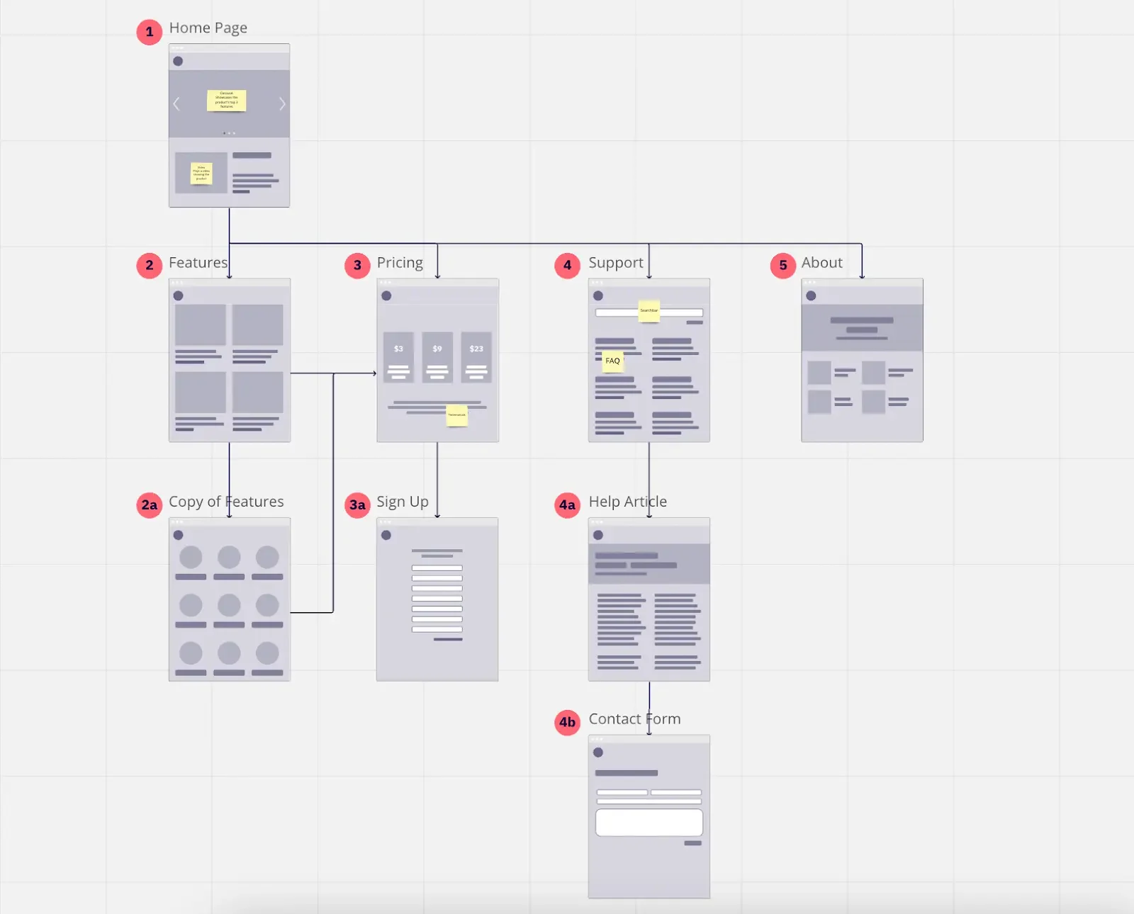
This one is for web designers and developers. The website flowchart template provides a structured view of how pages connect across your site and how users navigate between them. They’re especially useful for designing websites with multiple pages, forms, or checkout processes.
A marketing team, for example, might map how visitors move from a landing page to a pricing page. Then to a contact form or trial signup.
By visualizing this path with a website flowchart, they can easily spot dead ends, unnecessary detours, or missing calls to action where users might drop off — and fix them before launch.
Best for: Marketing websites, content-heavy platforms, or multi-step funnels.
5. Swimlane diagram

Designing a flow that involves multiple roles? The swimlane diagram template is a great way to visualize how different departments or user roles interact with each other and the system. It separates tasks into "lanes," showing who is responsible for each action in the process.
In a CRM flow, one lane might show a sales rep creating a lead, another shows a manager approving it, and a third shows the system triggering follow-ups. Each role gets its own lane, making responsibilities, dependencies, and handoffs easy to understand at a glance.
Best for: Multi-user systems, internal tools, or processes involving handoffs.
6. Flowchart template
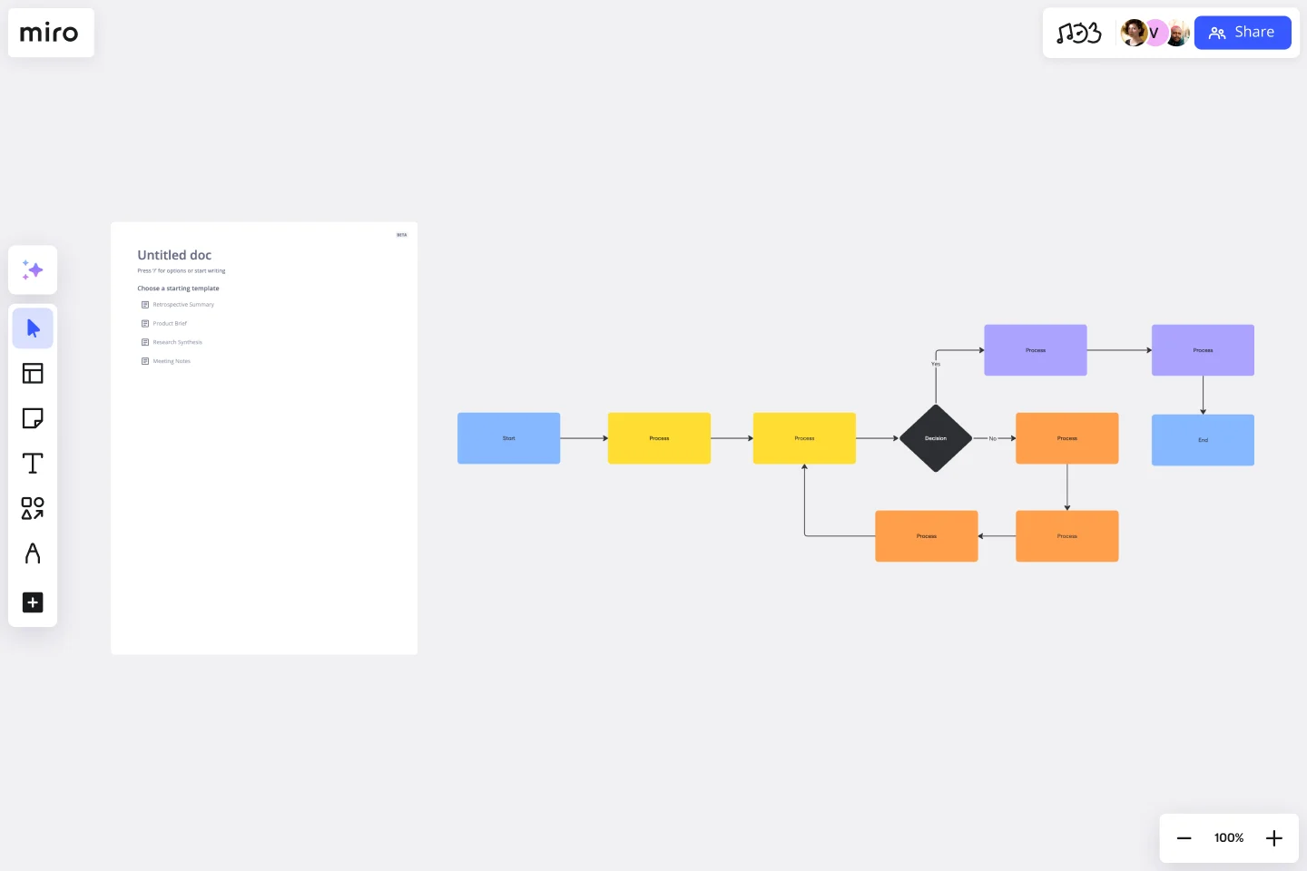
Sometimes, simple is best. A flowchart template is a tried-and-true classic way to outline processes and user journeys. It's versatile and easy to customize for any project, helping you track the logic of decision points and actions.
A support team, for instance, might map how users resolve an issue: self-service help, chatbot, human support, or escalation. Decision diamonds show where users branch based on their answers.
If you’re starting from scratch, Miro’s AI flowchart generator can help you build that first structure in seconds. By turning a short prompt into a draft flowchart, it removes the blank-page barrier and gives teams a clear foundation they can refine together.
It’s a great starting point if you're working on a general project and want to organize your thoughts before diving into the details.
Best for: High-level logic, decision trees, and early exploration.
Take your product to the next level with Miro
Creating an exceptional user experience doesn't happen by accident. It’s shaped by teams who take time to understand how users move, decide, and succeed as they navigate your product. User flows give you that clarity and help you design journeys that feel intuitive, intentional, and simple to follow.
With Miro, user flows become more than diagrams; they become shared thinking spaces. Product managers, designers, and engineers can explore ideas together, test assumptions, and refine journeys before a single line of code is written.
That shared, visual approach makes it easier to turn feedback into progress. As Ryan, Learning Experience Director at Llamasoft, explains:
“Miro lets us get feedback from other parts of the organization and flow it right into the product, cutting out a number of iterations. With a complete digital trail of our progress right in Miro, we remain accountable but stay efficient.”
As a flexible UX flow tool, Miro’s supports everything from simple onboarding paths to complex multi-role systems. Teams collaborate in real time or asynchronously and move from rough ideas to clear direction — faster and with less friction.
Start your next user flow in Miro today. Choose a template that fits your use case and bring your team into the process early.
User flow FAQs
What makes a good user flow?
A good user flow is clear, focused, and grounded in real user goals. It uses a simple user flow map to show how people move from entry point to outcome, including key decisions and alternative paths.
It should support user flow analysis by making it easy to spot friction, confusion, or drop-off points before designs move into development.
What tools create user flows?
User flows can be created using diagramming or UX design tools that support flowcharts, wireframes, and collaboration. Miro is a popular user flow tool because it lets teams build, share, and iterate on flows in real time or asynchronously using templates, comments, and visual mapping features.
What are common user flow mistakes?
Some of the most common mistakes include:
- Skipping over user flow analysis and relying on assumptions
- Trying to cover too many goals in one user flow chart
- Making diagrams too detailed or cluttered
- Ignoring alternative paths and error states
- Creating flows in isolation without team feedback
Avoiding these helps keep your user flow practical and usable.
What is an example of a user flow in UX?
A simple user flow example in UX could be an e-commerce checkout journey:
- Landing on a product page
- Adding item to cart
- Reviewing cart
- Entering shipping details
- Completing payment
- Seeing a confirmation screen
Each step shows how users move through the interface to complete a specific goal.
What’s the difference between a user journey and a user flow?
A user journey shows the full experience across time, touchpoints, and emotions. A user flow focuses on the steps a user takes to complete a specific task inside a product.
Journeys show the story. User flows show the path.
Who creates user flows?
User flows are typically created by UX designers, product designers, and UX researchers, often alongside product managers and engineers. Because user flow analysis benefits from multiple perspectives, the best flows are built collaboratively using shared UX flow tools rather than in isolation.
Author: Miro Team
Last update: February 20, 2026