About the User Flow Template
A user flow diagram template (also known as an interaction or task flow diagram) is a step-by-step visual mapping process, outlining what a user does to finish a task or complete a goal through your product or experience. Instead of guessing at journeys, you can see every decision point, pathway, and outcome laid out clearly.
Diagramming the user flow can help interpret the quality or experience of the path a user chooses. The flow can also reveal how many steps they chose to complete a task and what pathways they decide to take when interacting with your product or service to solve a pain point.
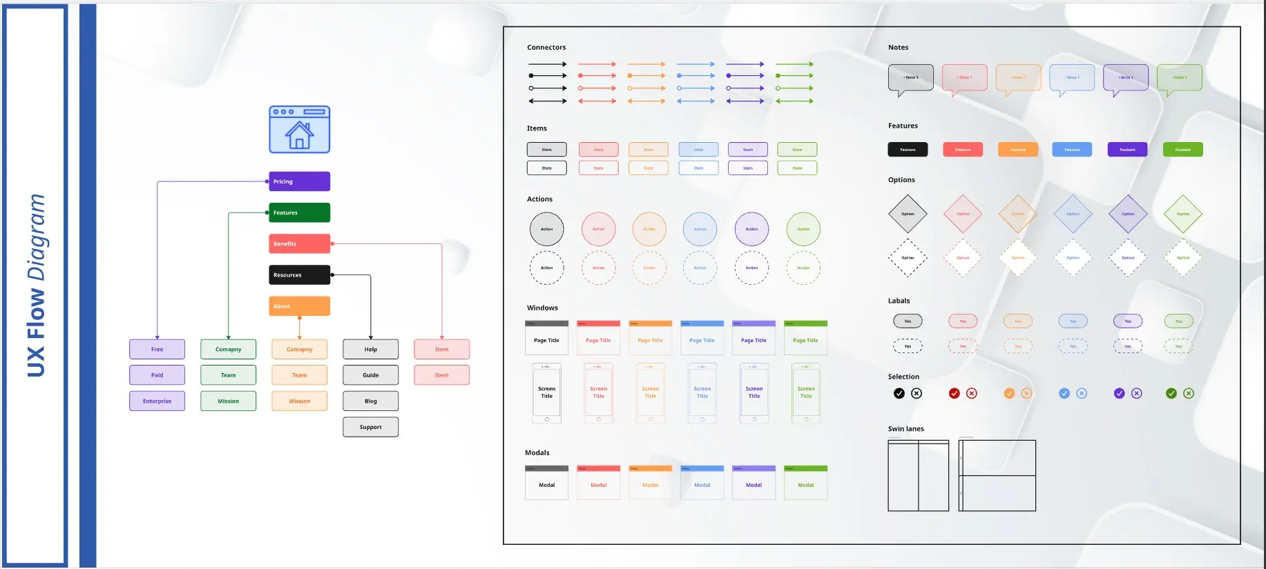
While user flow diagrams focus on how a user moves through a particular product, a Screen Flow Template presents a wireframe-style page layout in the form of a flowchart.
Miro provides a flexible user flow diagram tool that makes it simple to collaborate on flows, whether you’re mapping a website user flow diagram or a mobile app journey.
What is a user flow diagram?
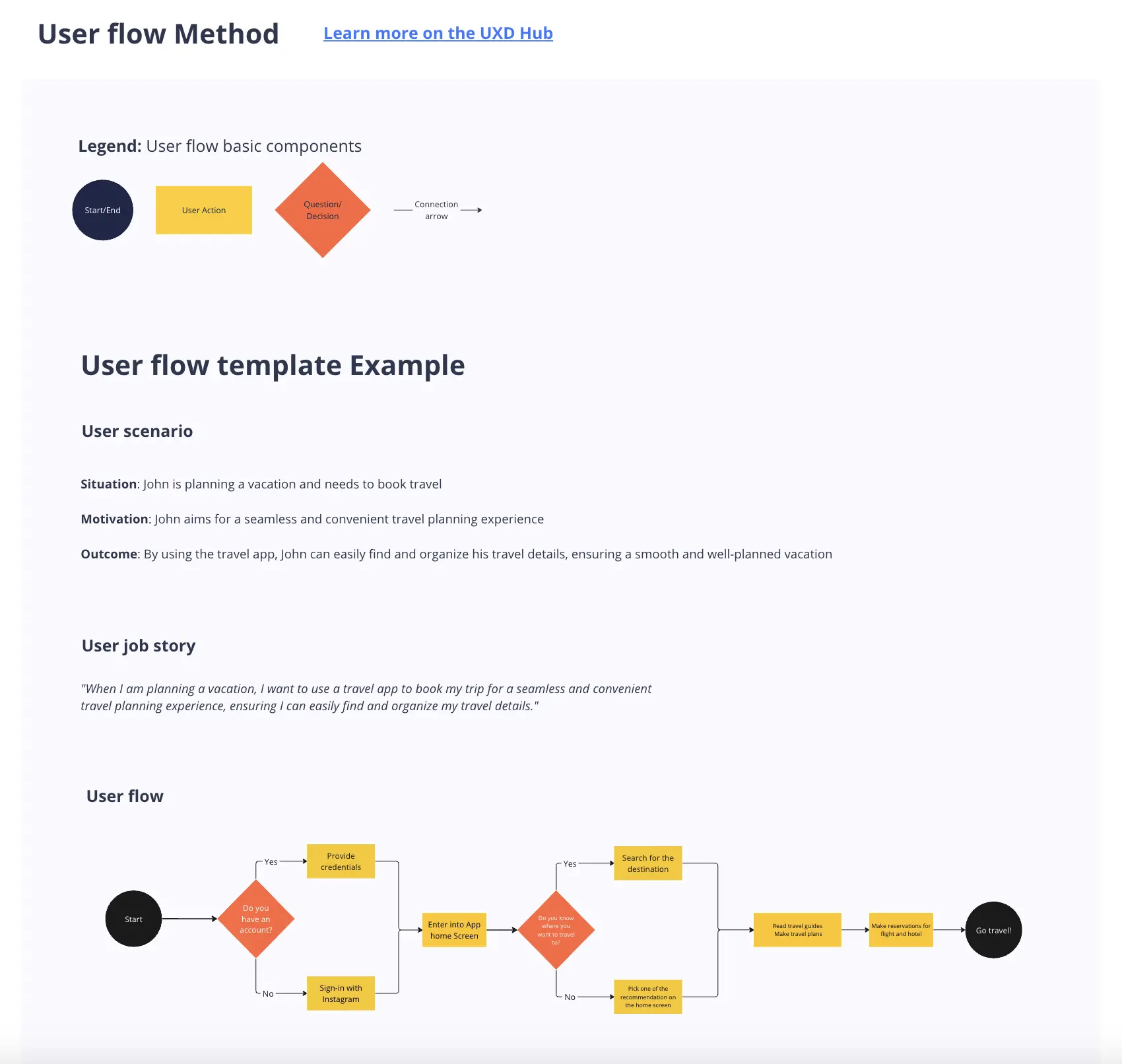
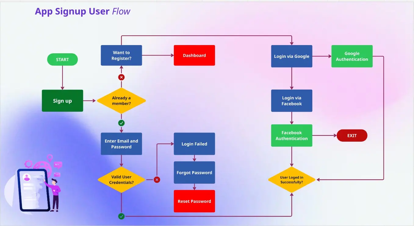
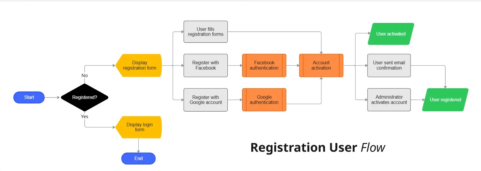
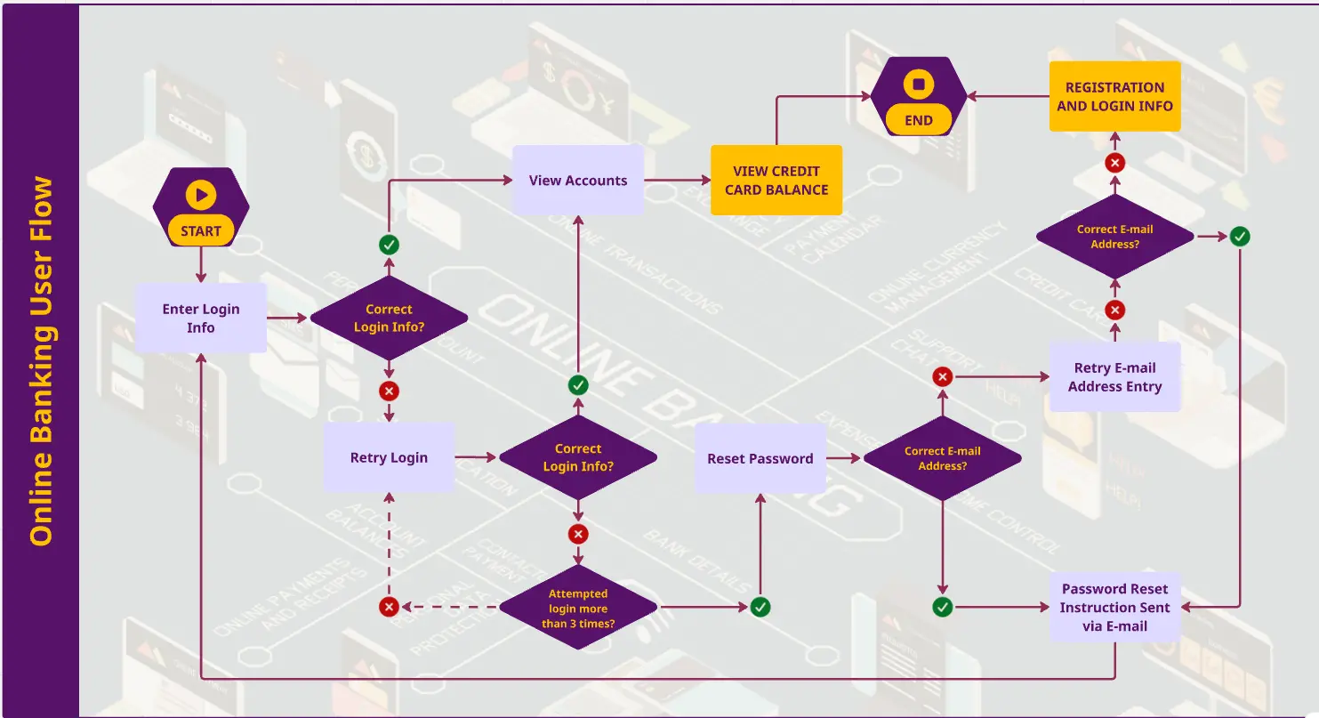
User flows diagram help UX and product teams map out the logical path a user should take when interacting with a system. As a visual tool, the user flow diagram shows the relationship between a website or app’s functionality, potential actions a user could take, and the outcome of what the user decides to do.
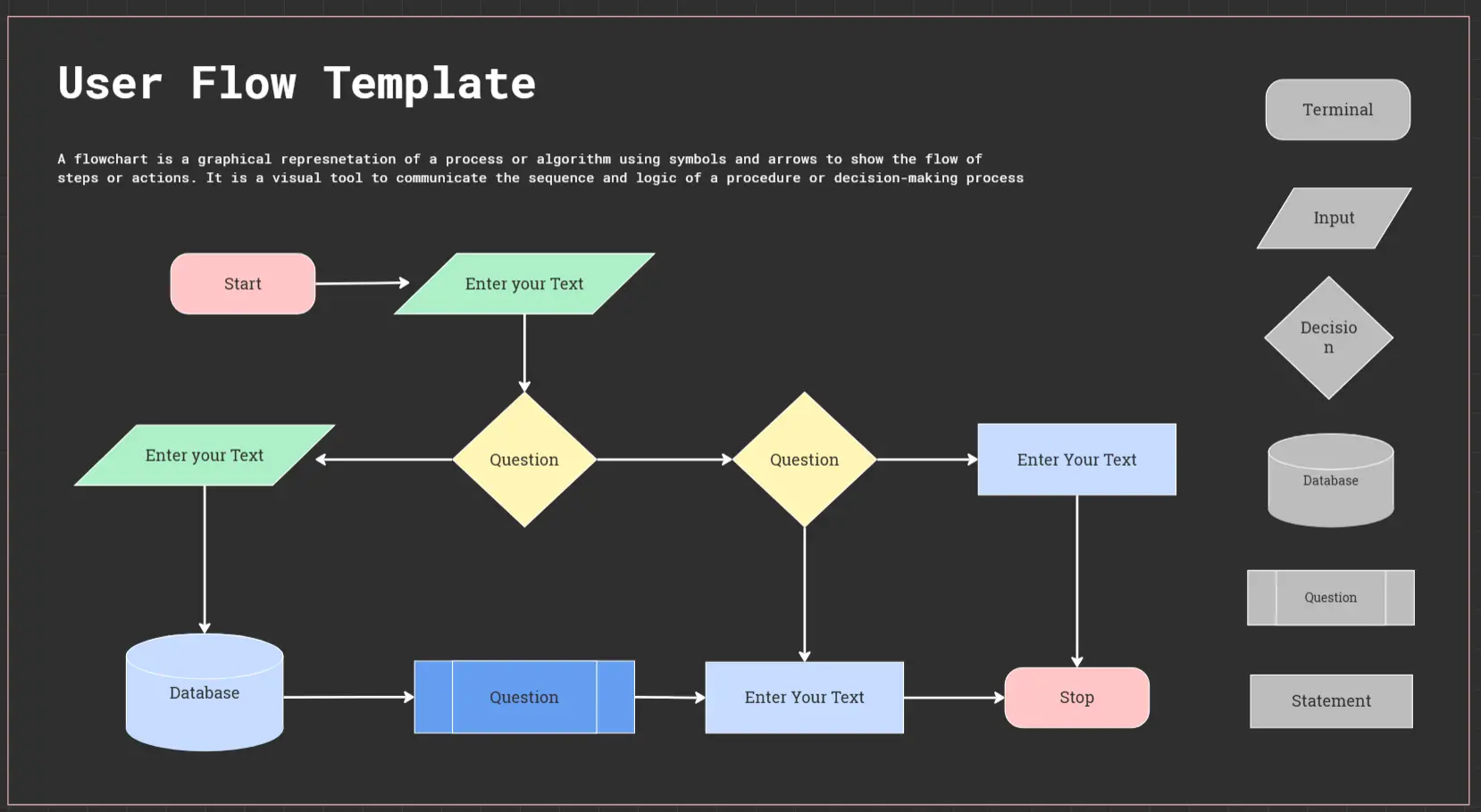
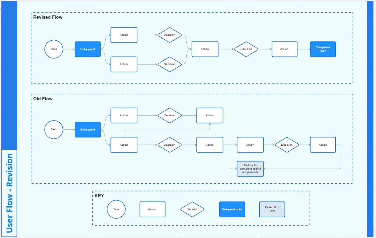
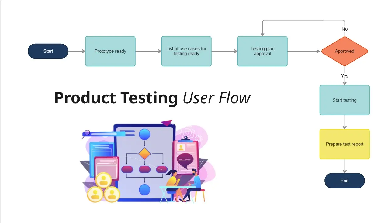
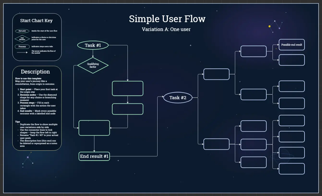
The main elements of a user flow are:
A start or endpoint: this makes clear where the flow begins or finishes
Process or action: shows what steps the user takes, such as “login” or “purchase”
Decision points: shows when a user has to make a choice
Arrows: they show where the user is headed based on decisions made
Try a user journey flow template if your design or product team is trying to gauge or improve how the existing user experience can lead to better customer conversion rates.
The process can help you keep your user in mind and pinpoint the business objective, such as a purchase, newsletter sign-up, or opting for a free trial.
When to use a user flow template
User flow diagrams can help you:
Build intuitive interfaces: does your flow feel easy to move through, efficient to use, and intuitive to the user?
Decide if your existing interface is fit-for-purpose: what’s working, not working, or needs improvement? Does the flow feel seamless and make sense?
Present your product flow to internal teams or clients: can your design team see what your customer says or does during the purchase, sign-up, or log-in process? Can clients get a step-by-step overview to align with your vision?
When creating – or recreating – a user flow, ask yourself and your team:
What’s the user trying to do?
What’s important to the user and will give them the confidence to keep going?
What extra information will the user need to be successful?
What are the user’s hesitations or barriers to accomplishing the task?
A user flow map can help designers (and their teams or clients) stay user-centered, even when mapping out complex processes.
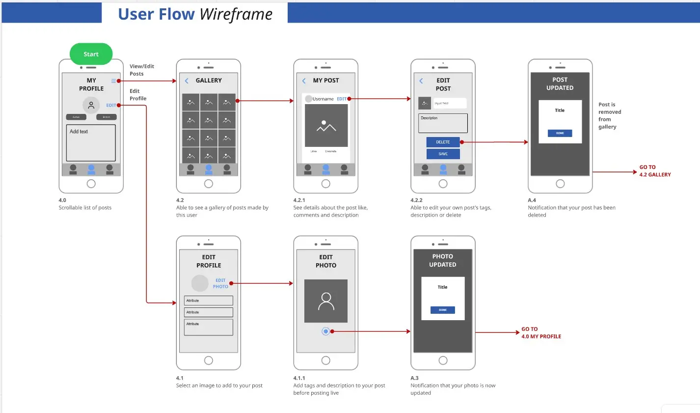
As a designer, you can use user flow diagrams to decide how you’ll design pages, screens, or surfaces on your website or app and rearrange what content and navigational tasks to include.
Create your own user flow diagram
Mapping your own user flow is easy. Miro’s visual workspace is the perfect canvas to create and share your diagram. Start by selecting the user flow template, then take the following steps to make one of your own:
Decide on your business objectives and your users’ objectives
Figure out where you’d like your users to end up. If you don’t have one already (or need to update it), use a customer journey map to create a shared vision of your customer experience. Every team member can benefit from a shared understanding of your customers’ feelings at every potential touchpoint with your product or service. Building user empathy will inform every step of your user flow process.
Discover how visitors find your website
Are they finding your product or service through direct traffic, organic search, paid advertising, social media, referral links, or emails? Identifying points will be the start of your user flow diagram, depending on what you find out.
Find out what information your users need and when they need it
Users convert when they’re served the right information at the right time. Map key information needs, consider what your customer wants from your digital touchpoint, what will keep them engaged, and how they may be feeling. Engagement – for example, a chatbot interaction – is still a potential success metric – it’s not all about leading to a final purchase.
Map out your user flow
You can edit the existing shapes and arrows from our user flow template to accommodate the user research you’ve uncovered in the previous steps. After your customer discovers your first touchpoint, what do they do next? How many steps until they complete a task? Use the basic user flow on the template to start drawing your own. Change touchpoints and drop-offs and connector lines arrows directions to fit your user flow diagram better.
Get feedback from your team
Invite your team, clients, or cross-functional stakeholders to view your Miro Board. You can choose to leave feedback asynchronously with sticky notes or @mentions for peer review. You can also hop on a video call in your Miro Board and assign someone on your team to play a note-taker role. Once you have enough team input, make adjustments accordingly.
Share with other stakeholders or clients and keep reiterating as needed
Your user flow will change over time as your customers’ attitudes and motivations evolve. Adapt accordingly, stay user-centered.
Not sure where to start? Browse user flow diagram examples in the Miroverse, or create your own user flow diagram template from scratch.
Clarity in user journeys means fewer blind spots, smoother experiences, and stronger results. With Miro’s free User Flow Template, you can turn complex processes into simple, shareable diagrams that keep your whole team aligned.
Start building user flows in Miro today and give your users the seamless experiences they deserve.
User flow template FAQs
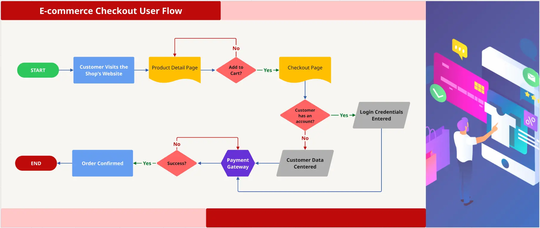
What is a user flow example?
Imagine you are developing a site for an event. If you want to improve your user experience, you must map out all the necessary steps to the event’s registration and purchase of tickets. You can start by tracking your customer flow and where they begin their journey to buy your event’s tickets. The user flow diagram helps you visualize at a glance how the customer will complete their purchase (your website’s ultimate goal), from registration to payment page.
Can I use the user flow template online with others who don’t have a Miro account?
Yes, you can share the board or diagram via a link with external stakeholders. Even if they don’t have a Miro account, they can view or comment (depending on your sharing settings). This helps ensure feedback loops include all necessary voices and reduces delays.
Is there a blank user flow template I can start with (without example content)?
Absolutely. The template comes with a blank mode (or you can clear example content) so you can build a flow from scratch. This is ideal when you want to map your own unique user paths without preconceptions.
How many steps or screens should a typical user flow have?
It depends on the complexity of the task, but often simpler is better. For many flows, 5-10 steps (or fewer) are sufficient to map start, decision points, and end. With Miro, you can easily expand or collapse flows as needed, so if the flow gets too bulky, you can split it into sections or phases.
What if users take multiple paths or drop-offs? How do I represent that?
That’s exactly what decision nodes are for. Use decision points in the template to show different branches, and drop-off points where users may leave the flow. Miro’s tools let you visually differentiate paths (arrows, color, labels) so you can highlight critical divergences or friction points.
What tools does Miro offer to help with collaboration and feedback during flow design?
Miro supports both real-time and asynchronous collaboration. Team members can comment, leave sticky-notes, tag others via @mentions, or review flows on video/conferencing while the diagram is shared. These features help reduce miscommunication and accelerate iteration.
Can I use the user flow template example to inspire my flow or do I have to adapt it heavily?
Use the example as a starting point. The examples are there to spark ideas and give structure, but every product’s user journey is unique. With Miro you can adapt example flows, change paths, add decision points, add or remove screens to match your specific UX reality. For repeatable processes, you can save custom templates for your team to reuse.
How often should I revisit and update my user flow diagrams?
You should revisit user flows whenever you gather new user data, when a key flow performs poorly (high drop-off or user confusion), or when product changes are made (new features, redesigned screens). Miro’s real-time collaboration makes it easy to revise flows with input from multiple team members.
Are there resources or user flow templates available from other teams?
Yes. The Miroverse is our community-driven library with thousands of templates created by Miro users and industry experts. You’ll find ready-made user flow template examples, customer journey maps, and UX workflows to jump-start your projects.
Plus, you can connect with peers in the Forum, join live events, and learn new tips and best practices from the community.
What’s the learning curve for building user flows in Miro?
Very minimal. The User Flow Template provides a simple starting point with shapes, arrows, and connectors ready to use. Because it’s drag-and-drop and highly visual, most teams can map their first flow in minutes. For more advanced needs, Miro AI can help generate outlines or summarize feedback directly on the board.
How do I know my team’s user flows and data are secure in Miro?
Miro provides enterprise-grade security, including SOC 2 compliance, encryption at rest and in transit, and granular access controls. You decide who can view, edit, or comment on your flows, so you can collaborate with confidence knowing sensitive work is protected.
How does the User Flow Template connect with other tools?
Miro integrates with 160+ tools including Jira, Figma, and Slack. You can embed live Jira tickets into your flow, attach design files, or share updates automatically in Slack — ensuring your flows are not just diagrams, but part of your broader workflow from planning to delivery.
Can Miro handle large or complex user flows?
Yes. Miro’s infinite canvas makes it easy to scale your flows, whether you’re mapping a simple signup journey or a complex multi-platform experience. You can zoom into specific details, link flows together, and keep related research or wireframes side by side, so everything stays connected as your project grows.