Designing an E-Commerce Product Page helps product and design teams wireframe a focused product page that reduces hesitation, supports quick selection, and moves shoppers to “Add to Cart” across desktop and mobile.
What is this?
A 75–90 minute workshop to define buyer actions, prioritize content, and draft a responsive layout
A shared process to align conversion goals, variant logic, and interaction patterns
A blueprint for a product page that balances fast purchase paths with deeper evaluation
What problem does it solve?
Shoppers hesitate from missing trust signals or unclear policies
Variant selection creates friction (size/color errors, hidden stock status)
Mobile layouts bury the CTA or overwhelm users with long content
How to use
Define the required buyer actions (images, variant selection, price/policy clarity, add to cart)
Inventory content into Primary vs Secondary (what must show before scroll)
Wireframe desktop layout (gallery left, buy box right) and mobile layout (stacked + sticky CTA)
Design selection behavior and error states (unselected size, out-of-stock variants, low stock)
Add feedback loops: cart confirmation, shipping ETA, return summary, trust badges
Common pitfalls
Too many competing CTAs (buy, wishlist, subscribe) with no hierarchy
Hidden costs or policies discovered late in the flow
Variant UI that fails on edge cases (sold-out sizes, backorder, limited colors)
Ways to avoid mistakes
Make the “buy box” complete: price, variant selectors, availability, delivery/returns, CTA
Surface key trust details near the CTA (shipping, returns, guarantees, reviews summary)
Use sticky mobile CTA and progressive disclosure for long sections (details, FAQs, reviews)
FAQ
Q: Who can benefit from this template? A: E-commerce PMs, UI/UX designers, CRO teams, and brand designers building product pages that convert on mobile and desktop.
Q: What should be above the fold? A: Gallery, title, price, variants, availability, primary CTA, and a short shipping/returns promise.
Q: What should we measure after launch? A: Variant-selection rate, add-to-cart rate, scroll depth, error frequency, and drop-off by device.
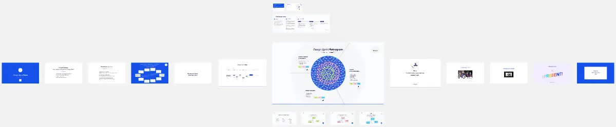
Miro Features Used
Frames for each workshop step, Sticky notes for action and content inventory, Voting to rank primary elements, Sections for Primary vs Secondary content, and Shapes/Cards to build the desktop/mobile wireframe with states.

