Designing a Blog Page That Supports Growth helps marketing teams redesign the blog as a discovery and conversion path, using clear content pillars, strong navigation, and embedded CTAs to raise organic traffic, time on site, and lead capture.
What is the Designing a Blog Page That Supports Growth for Marketing teams?
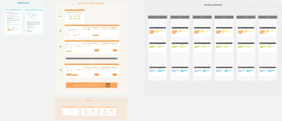
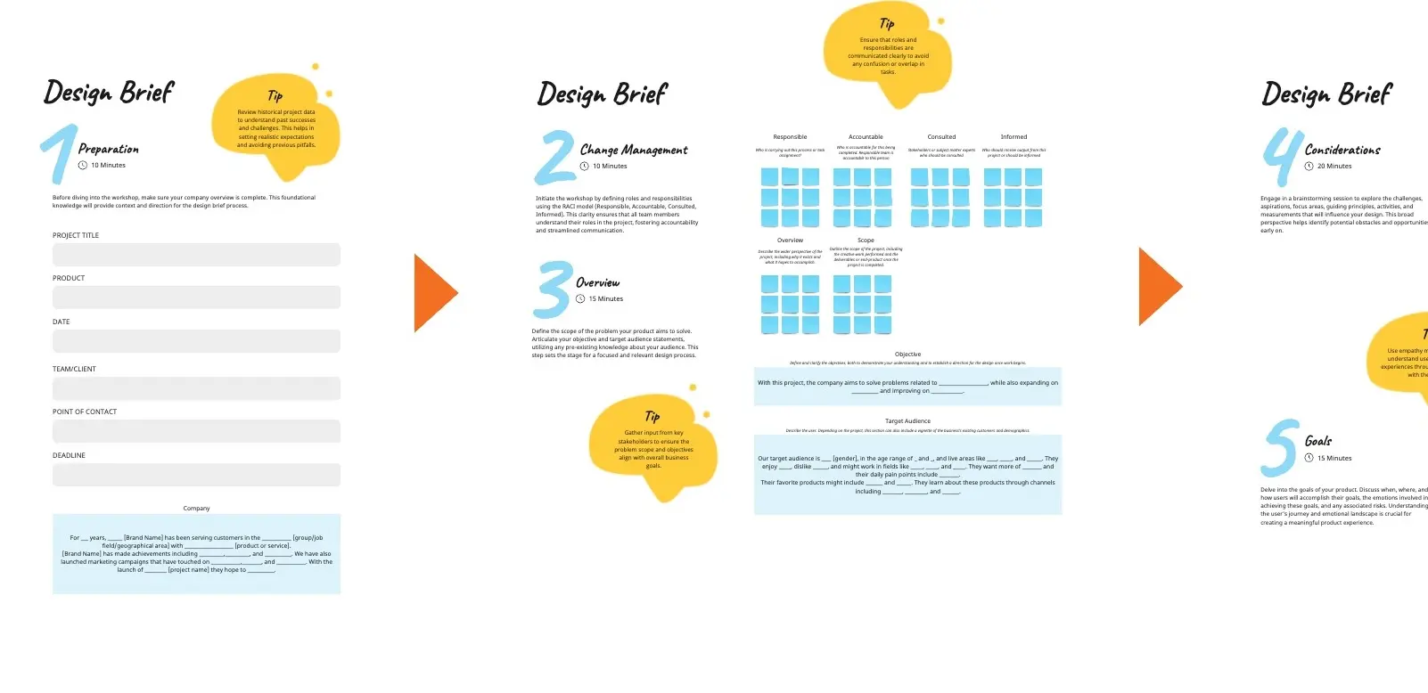
A 90-minute workshop to plan the blog’s role in the funnel and reshape the page UX
A framework to connect SEO goals, content strategy, and on-page conversion paths
A shared way to align marketing, content, design, and demand gen
What problem does the Designing a Blog Page That Supports Growth solve?
Blogs that feel like archives, not guided journeys
Readers can’t find relevant posts fast, so they bounce
Content ranks but doesn’t move users toward subscribe, demo, or product value
How to use the Designing a Blog Page That Supports Growth for Marketing teams
Define the blog’s job (traffic, authority, leads, product education) and next-step CTA
Review competitor layouts: tags, hubs, intent filters, featured series, lead magnets
Wireframe the page: featured post/collection, filters + search, post cards, CTA blocks
Set featured rules: what gets pinned, which pillars lead, sorting logic by stage or relevance
Add measurement plan: engagement, conversions, scroll depth, click paths
Common pitfalls
Too many tags with no clear pillars
Featured content chosen by taste, not strategy
CTAs that interrupt reading or feel unrelated
Ways to avoid mistakes
Limit to 3–5 pillars; map each post to one primary pillar
Feature content tied to current goals (lead magnet, demo, activation guide)
Place CTAs in “natural exits” (end of post cards, mid-feed block, footer)
FAQ
Q: Who can benefit from this template? A: Content leads, SEO strategists, growth marketers, designers, and demand gen teams responsible for site conversion.
Q: What should the blog page highlight first? A: One featured collection tied to a pillar, then a filtered feed with clear reader paths by topic or intent.
Q: What should we track after launch? A: Bounce rate, time on page, filter/search usage, newsletter signups, and clicks to demo/pricing from blog sessions.
Miro Features Used
Frames for each workshop step, Sticky notes for goals and pillar mapping, Image uploads for competitor screenshots, Voting to pick top UX patterns and pillars, and Sections to organize the wireframe blocks and featured content rules.