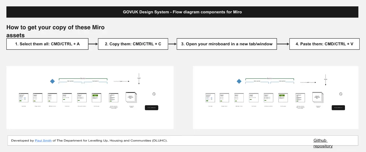
UX Flow Diagram Template
This template helps teams map end-to-end user journeys with consistent, reusable components. It includes a working example and a comprehensive library to build, annotate, and standardize flows quickly.
What It Is
A visual system for designing and communicating UX flows. Use it to show screens, actions, decisions, and outcomes across roles or phases, with clear color coding for categorization.
What’s Included
Working example flow: A left-side journey starting from a Home window and branching through Vision, Roadmap, Baseline, Promotion, with actions and decision points leading to outcomes like Free, Company, Commerce, Help, Sales, Enterprise, Project, Backlog, Bug, Support.
Component library (right side), organized into:
Connectors: Directional arrows in black, red, orange, blue, purple, green; solid and outline.
Items: Rounded rectangles in six colors; solid and outline.
Actions: Circles in six colors; solid and dashed.
Windows: Screen/page frames with title bars and mobile frames labeled “Screen Title” in all six colors.
Modals: Overlay window components in six colors.
Features: Dark rectangular labels (black through green) for callouts.
Options: Decision diamonds in six colors; solid and dashed.
Notes: Speech bubbles in six colors for annotations.
Labels: Pill-shaped tags in six colors; solid and dashed.
Selection: Check and close icons in multiple states.
Swim lanes: Grid layouts for roles, systems, or phases.
How to Use
Review the working example to align on conventions (shapes, connectors, decisions, outcomes).
Set a legend for color coding (see below) and stick to it.
Lay out swim lanes for roles or phases to structure the flow.
Drag Windows and Modals to represent screens; use Items for containers and Features for key callouts.
Add Actions for user/system steps and Options for decision points with clear yes/no exits.
Connect steps with directional arrows; use solid for primary paths and outline/dashed for alternates.
Tag steps with Labels; add Notes for rationale and edge cases.
Use Selection icons to mark states (success, blocked, out of scope).
Validate paths against outcomes; remove dead ends or annotate them.
Export or share and version the board for reviews.
Color Coding
Use black, red, orange, blue, purple, green to categorize by user type, priority, system layer, or project phase. Define one meaning per color and document it in the legend.
Best For
Designing new user journeys or feature flows.
Communicating scope and dependencies across teams.
Usability reviews, handoff to engineering, and stakeholder alignment.