28likes
181uses
Design consistent user experiences across desktop, tablet, and mobile in just 40 minutes.
Does your product's most important content remain accessible when users switch between desktop, tablet, and mobile devices?
The Responsive Layout Prototyping Workshop helps product teams explore how interfaces adapt across different screen sizes. Using Miro's editable wireframing components, participants create three versions of the same screen, evaluate content priorities, and identify opportunities to improve responsive usability.
I designed this workshop for UI/UX designers, frontend developers, product managers, and startup teams who want to validate responsive layouts before investing in detailed design or development.
Duration: 40 minutes Format: Individual or collaborative, virtual or in person Best For: Responsive design, UI/UX design, wireframing, product development, and cross-device usability
Choose one product screen, such as a pricing page, product listing, or account dashboard. Use the provided Miro frames, editable device wireframes, and sticky notes to create responsive layouts.
Miro Tools: Sticky Notes and Text
Identify the primary task users need to complete.
Write the task on a yellow sticky note and identify the information and actions that must remain accessible across all screen sizes using green sticky notes.
Miro Tools: Wireframing Library, Desktop Screen, UI Components, and Shapes
Build a simple desktop wireframe containing the primary content and interactions.
Focus on information hierarchy, content grouping, and the main user action.
Miro Tools: Wireframing Library, Tablet and Mobile Screens, Shapes, and Text
Create tablet and mobile versions of the same interface.
Rearrange content to fit the available space. Experiment with stacked elements, simplified navigation, adjusted spacing, and reorganized content.
Keep the primary user task accessible on every device.
Miro Tools: Comments, Sticky Notes, and Checklist Shapes
Compare all three layouts and evaluate whether users can complete the same task.
Review content visibility, readability, navigation, touch interactions, and layout consistency.
Record usability concerns and refine the wireframes.
AI Tip: Ask AI to review your desktop, tablet, and mobile layouts for missing information, poor content hierarchy, and potential usability problems. Use its recommendations to guide improvements.
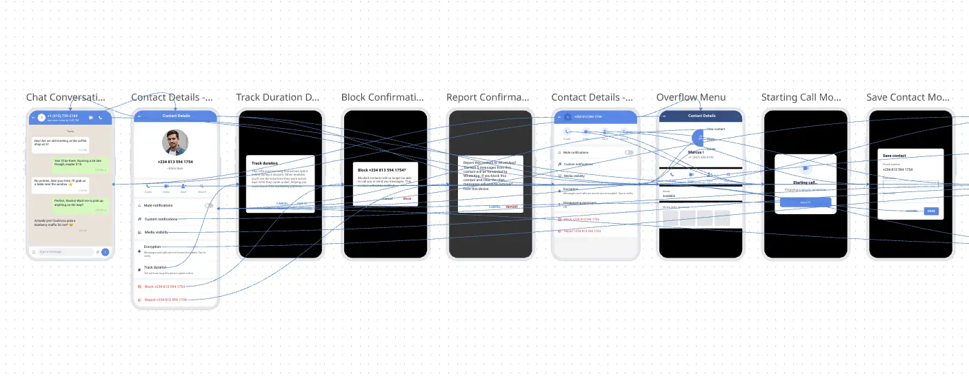
Three editable low-fidelity wireframes demonstrating how one product experience adapts across desktop, tablet, and mobile.
Use these prototypes to communicate responsive requirements, align stakeholders, prepare usability testing, and guide detailed design or development.
1. What is responsive prototyping?
Responsive prototyping explores how an interface changes across different screen sizes without losing important content or functionality.
2. How is responsive design different from creating separate device designs?
Responsive design adapts the same experience to different screen widths. Separate device designs may introduce different experiences or functionality for each device.
3. Do I need UI/UX design experience?
No. Miro's wireframing components provide a simple way to create basic layouts and compare them across devices.
4. Why create three different layouts?
Desktop, tablet, and mobile layouts help teams evaluate how content and navigation behave across a range of screen sizes.
5. Does every element need to appear on all three layouts?
Not necessarily. Secondary content can be reorganized or placed behind navigation controls, but users should still have access to information required to complete their tasks.
6. Can Miro automatically resize my wireframes?
Basic Miro wireframes are edited manually. The workshop focuses on making deliberate layout decisions rather than automatically resizing designs.
7. Can I use this workshop for an existing product?
Yes. Recreate an existing screen in Miro and explore how its layout could be improved for different devices.
8. What should I do with navigation on smaller screens?
Explore simplified menus, reorganized navigation, or alternative placements that keep important destinations accessible.
9. Can AI help create responsive layouts?
Yes. AI can recommend layout changes, content priorities, and responsive patterns. Review its suggestions against user needs and accessibility requirements.
10. Can I complete this workshop individually?
Yes. Create all three layouts independently and invite colleagues to review the results afterward.
11. Do the prototypes need to be interactive?
No. Editable static wireframes are sufficient for comparing layouts and documenting responsive behavior.
12. What should I do after completing the workshop?
Use the three wireframes to validate responsive requirements, test layouts at actual device sizes, and prepare more detailed UI designs or development specifications.
Responsive design is about preserving the user experience, not making every screen look identical. Focus on content priorities, readable layouts, and accessible actions across devices.

Deanne Watt
Product Strategy @ MiNDPOPGroup.com
My approach to product is to get to the heart of what drives a company. I am passionate about the entire end-to-end process and making it more efficient, collaborative as well as aligning teams and improving communication. We have built about 200 Miro boards so far that cover ideation, strategy, design, engineering, and even marketing promotion.