Table of contents
Table of contents
UX/UI moodboards: From subjective opinions to strategic design decisions
Summary
Professional UX/UI moodboards eliminate subjective feedback loops by shifting design conversations from personal taste to strategic decisions grounded in user needs and proven patterns.
What you'll learn:
- How to create three strategic design directions (Safe, Modern, Edgy) that give stakeholders meaningful choice without overwhelming them
- The Goldilocks method for organizing UI patterns, typography, color usage, and interaction models that answer specific product questions
- How to use Miro's Web Clipper to capture 50+ competitive references in a single research session without disrupting your workflow
- Why testing accessibility (contrast ratios, keyboard navigation, focus states) during moodboarding saves weeks of expensive rework
- Facilitation techniques using dot voting, emoji reactions, and threaded comments that convert "I don't like this" into data-driven consensus
Key outcomes:
- Shorter, more decisive design reviews that produce clear direction in a single meeting
- Reduced revision cycles because decisions are documented with strategic rationale, not subjective preferences
- Faster development velocity when engineering teams have accessible references showing exactly which patterns to implement
- Living documentation that keeps teams aligned from kickoff through launch and onboards new members with full context
Time investment: 90 minutes of focused research with Web Clipper populates a strategic moodboard. One 60-minute structured review session replaces weeks of back-and-forth revisions.
UI moodboard explained
Imagine spending three days perfecting an interface. The typography is clean, the color palette is well-chosen, and you’ve used patterns your users already know. You head into the design review feeling confident.
Then someone says: “I don’t like this blue.”
There’s no explanation or link to user needs or business goals—just personal taste presented as feedback. Suddenly, you’re arguing about shades of blue while the launch date gets pushed back.
Professional UX/UI moodboards solve this problem. They don’t force everyone to agree on style. Instead, they help shift the conversation from “Do I like it?” to “Does this solve our users’ problems?”
This guide will show you how to create strategic UI moodboards that align teams and help ship products. If you’re a UI designer tired of subjective feedback or an art director working to build alignment across teams, this will help you start your next project faster.
What makes a UX/UI moodboard different
Beyond Pinterest: The professional standard
Traditional moodboards often look like mood ring packaging—artfully arranged photos of coffee cups, succulents, and abstract watercolors that are supposed to represent “trust” and “innovation.” They might be beautiful, but they aren’t helpful for building products.
Professional UX/UI moodboards are strategic tools. Every element has a clear purpose, such as showing your team which navigation pattern to use, which button styles meet accessibility needs, and which typography hierarchies make information easy to scan.
What actually belongs in a UX moodboard
Here’s what earns a spot on your board:
UI patterns from real products. Navigation systems your users already understand. Card layouts that prioritize the right information. Data visualizations that make complex information clear. These aren’t theoretical—they’re screenshots from apps your users interact with daily.
Typography in action. Not just “We should use Inter”—but examples showing heading hierarchies, body text treatments, and UI copy working together. Show it, don’t just name it.
Button styles and interaction states. Primary buttons. Secondary buttons. Disabled states. Hover states. Destructive actions. Your engineering team needs to see all of them to build a consistent system.
Color applications in context. Forget the lonely color swatch. Show backgrounds. Show CTAs. Show alert messages. Your team needs to understand how colors work in real interfaces.
Interaction models your users will recognize. How do modals enter and exit? What happens when content loads? Reference products your users already trust.
The strategic purpose
A UX/UI moodboard saves you weeks of churn:
First, it aligns stakeholders before you commit to high-fidelity design. Much easier to course-correct when you’re comparing screenshots than when you’re three weeks into building a design system.
Second, it creates shared vocabulary. When everyone can point to the same reference and say “navigation like Notion,” you eliminate misunderstanding before it turns into wasted work.
Third, it reduces revision cycles. “I don’t like this blue” becomes “This color doesn’t meet WCAG AA contrast standards for our text size.”
Fourth, it builds stakeholder confidence. When you show three strategic directions backed by real-world examples and clear reasoning, you’re facilitating smart decision-making.
The Goldilocks method: Creating three distinct directions
Why three directions work
Give stakeholders one option, and you’re asking for a yes/no vote on your personal taste. Give them five options, and the meeting turns into design by committee.
Three directions hit the sweet spot: enough choice to give stakeholders agency, focused enough to drive a decision in a single meeting. Instead of “Do you like this?” you’re asking “Which direction best serves our users and business goals?”
Here’s the framework: Safe, Modern, and Edgy.
Direction 1: Safe/familiar
This direction uses patterns users already know from established products. Lower learning curve. Higher confidence in usability.
When to recommend: Risk-averse stakeholders, regulated industries, or modernizing legacy systems where users need natural evolution.
What this looks like: Enterprise SaaS patterns. Conventional navigation. Proven typography. Conservative button styles. Generous spacing.
Example references: Salesforce navigation, Atlassian card-based views, Stripe data tables, Notion sidebar organization.
Direction 2: Modern/balanced
This direction balances contemporary design trends with proven usability. It feels current without alienating users.
When to recommend: Competitive markets, growth-stage companies refreshing brands, or products that need to signal active maintenance.
What this looks like: Card-based layouts with subtle shadows. Generous whitespace. Accessible color systems. Contemporary typography. Microinteractions that provide feedback without distraction.
Example references: Linear’s command palette, Figma’s toolbar organization, Airtable’s grid-to-kanban views, Framer’s onboarding flows.
Direction 3: Edgy/differentiated
This direction uses bold patterns that make your product instantly recognizable. Higher risk, higher reward.
When to recommend: Startups competing against established players, consumer products where personality matters, or users who value design as a feature.
What this looks like: Unconventional navigation. Distinctive typography. Experimental interactions. Bold color usage.
Example references: Stripe’s landing page layouts, Arc browser’s sidebar approach, Linear’s dark-first aesthetic, Pitch’s presentation builder.
Setting up the Goldilocks boards in Miro
Open a new Miro board. Create three large frames, side by side. Label them clearly: Safe, Modern, Edgy.
Within each frame, add sections for categories like Navigation Patterns, Color Usage, Typography, Component Patterns, Iconography, and Motion & Interaction. Keep the structure the same across all three directions so stakeholders can make direct comparisons.
Use Miro’s frames feature to set clear visual boundaries. Add a text box at the top of each direction to explain when you would recommend that approach. This helps stakeholders focus on strategy instead of just looks.
Strategic categorization: Organizing for decision-making
Why organization matters
A pile of beautiful screenshots teaches your team nothing. A strategically organized moodboard answers specific questions: How should navigation work? What typography hierarchy makes information scannable? Which button styles meet accessibility requirements?
A random collage is just pretty wallpaper. Strategic categorization turns your moodboard into a decision-making tool.
Essential category buckets
Navigation patterns answer: How do users move through our product? Include primary navigation structures, desktop to mobile transformations, and how search integrates.
Color usage answers: How do colors create hierarchy and guide action? Show colors doing actual work—backgrounds, CTAs, alerts, text hierarchies.
Typography answers: How does text hierarchy guide users? Show heading hierarchies in action, body text at different sizes, UI copy, and responsive examples.
Component patterns answer: How are repeated UI elements structured? Cards, forms, inputs, tables, modals—the building blocks your design system will standardize.
Iconography answers: What visual language creates consistency? Show icon styles, different sizes, and complete sets—not individual icons.
Motion and interaction answers: How does the interface respond? Use short video clips or GIFs showing transitions, loading indicators, microanimations, scroll behaviors.
Implementation in Miro
Use sticky notes or text boxes as category headers. Make them stand out visually so they serve as clear signposts. Color-code categories if it helps, but keep it simple to maintain clarity.
Group related elements together using Miro’s grouping feature. Create visual hierarchy through sizing and spacing.
Miro advantage: Unlike static slide decks, your canvas grows as you need it. The infinite canvas adapts to your thinking process.
Sourcing and capturing the right references
Where to find strategic UX patterns
Start by looking at direct competitors, since your users already know these patterns. Study products in related areas. Reference platform-specific design systems like iOS HIG, Material Design, and Fluent. Review established company design systems such as Shopify Polaris, Atlassian Design, and IBM Carbon. Use specialized pattern libraries like Mobbin, UI Sources, and Screenlane.
The Miro Web Clipper: Seamless collection
Here’s the problem with traditional research: Screenshot. Download. Upload. Place. Add context. Repeat 47 times while losing your mind.
Miro’s Web Clipper Chrome extension eliminates that friction entirely.
You’re browsing a competitor’s product. You see a navigation pattern worth referencing. Click the Web Clipper extension. It captures the screenshot. Select your Miro board. Done. The screenshot appears instantly with the source URL automatically preserved.
Real workflow example: Spend 90 minutes doing competitive analysis. Visit 15 products. Capture 50+ references directly to your Miro board while you browse. By the time you close your session, your moodboard is already half-populated.
Without Web Clipper? That same research would take three hours and involve another hour of organizing. The tool doesn’t just save time—it prevents the “I’ll organize these later” procrastination that kills momentum.
What to capture (and what to skip)
Capture: Patterns that solve similar problems. Variations of the same pattern (grab five different card layouts). Full context screenshots. Both successful examples and cautionary tales.
Skip: Generic stock photography. Unrelated aesthetics. Incomplete UI with placeholder content.
Annotation strategies
Every reference should include context. Use Miro’s comment feature directly on images: “This navigation collapses gracefully on mobile—notice how they prioritize the top 4 items.”
Add sticky notes explaining strategic rationale: “Captured this because our users are also managing hierarchical information—worth discussing whether nested folders or tags work better.”
Miro advantage: Comments stay attached to specific images, so six weeks later when someone asks “Why did we choose this pattern?” the reasoning is right there.
Accessibility check: Building inclusive design from the start
Why accessibility can’t wait
Here’s the expensive way to handle accessibility: Build your design system. Launch. Get sued. Retrofit everything.
Here’s the smart way: Test accessibility at the moodboard stage. Fixing accessibility issues during moodboarding takes minutes. Fixing them in production takes weeks and thousands of dollars.
Color contrast validation
WCAG sets specific contrast ratio requirements. Level AA requires 4.5:1 contrast for normal text, 3:1 for large text. Most products aim for WCAG AA as the baseline.
Test your moodboard colors right now. Pull up WebAIM’s contrast checker. Test your proposed text colors against backgrounds. Test button colors.
Common mistakes you’ll catch early: Light gray text on white backgrounds. Colorful CTAs that fail contrast requirements. Disabled states that are too subtle.
When you find a color combination that fails, fix it on the moodboard. Darken the text. Lighten the background. This is why you’re testing now—so you can adjust before commitment.
Pattern accessibility
Flag patterns that create accessibility problems during moodboarding:
Keyboard navigation: Can users tab through every interactive element in a logical order?
Focus states: Are they visible? Users navigating with keyboards need clear feedback.
Touch target sizes: Mobile interfaces need minimum 44x44 pixel touch targets.
Form field labels: Choose patterns with persistent labels, not just placeholder text that disappears.
Documenting accessibility decisions
Create a dedicated section on your moodboard for accessibility notes. For each color combination, note the contrast ratio and WCAG level achieved.
Use colored sticky notes to flag accessibility status. Green = passes WCAG AA. Yellow = needs adjustment. Red = fails and requires alternative.
When you present the three directions, mention accessibility outcomes upfront: “All three directions meet WCAG AA standards. The Modern direction achieves AAA for most text.”
Facilitating moodboard reviews: From opinions to decisions
The problem with traditional design reviews
You’ve seen this meeting. The designer presents. Stakeholders go quiet. Then the highest-paid person says “I’m not feeling the green” and everyone nods like that’s actionable feedback.
This is HiPPO syndrome (Highest Paid Person’s Opinion). It leads to endless revision cycles because “I’m not feeling it” never produces clear next steps.
Structuring the review session
Before the meeting: Share the Miro board 24-48 hours in advance. Give stakeholders time to review asynchronously. Add context: project goals, user problems, specific questions this moodboard answers.
Set clear evaluation criteria:
- Which direction best matches user expectations?
- Which aligns with our brand positioning?
- Which is technically feasible within our timeline?
- Which meets our accessibility requirements?
During the meeting: Time-box discussion per direction (15 minutes each). Frame questions strategically: “Based on our user research showing 80% of our users also use Competitor, does the Safe direction’s familiar patterns reduce friction or feel too generic?”
Using Miro’s collaboration features
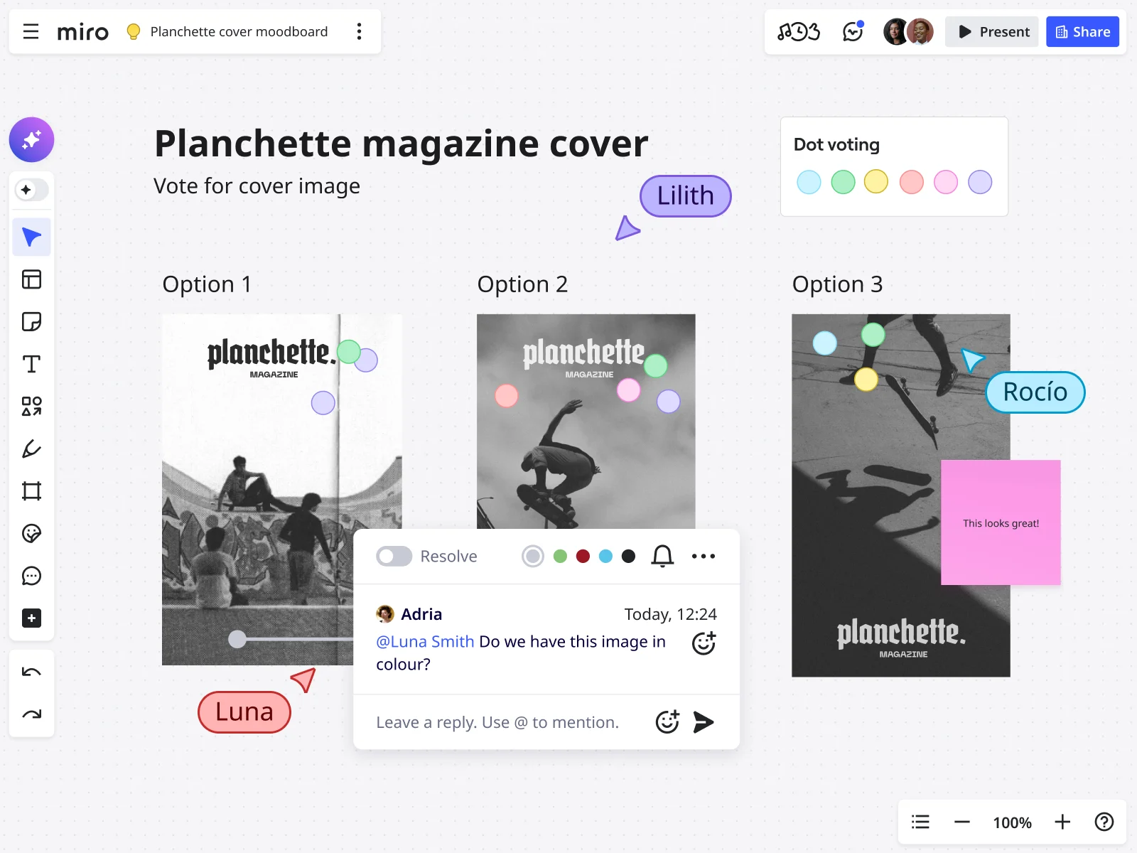
Dot voting for democratic decisions
Each stakeholder gets three votes to distribute across directions. Click the voting feature in Miro. Set the vote count. Start the vote. Watch results appear in real-time.
This reveals consensus fast. If Direction 2 gets 12 votes and the others get 3 each, your path forward is clear.
Why this matters: Voting transforms endless debate into data-driven decisions. Vote before you discuss to capture gut reactions without groupthink.
Emoji reactions for gut responses
Quick temperature checks without typing. ❤️ = love this. 🤔 = I have questions. 😬 = I’m concerned.
When to use: Gathering quick feedback on specific patterns within a direction to focus discussion.
Comments for structured feedback
Click any element and add a comment. Tag team members to bring them into the conversation. Threading keeps discussions contextual—no more “Which version are you talking about?” confusion.
Comments create an audit trail. Six weeks later when someone asks “Why did we choose this?” you can point to the conversation.
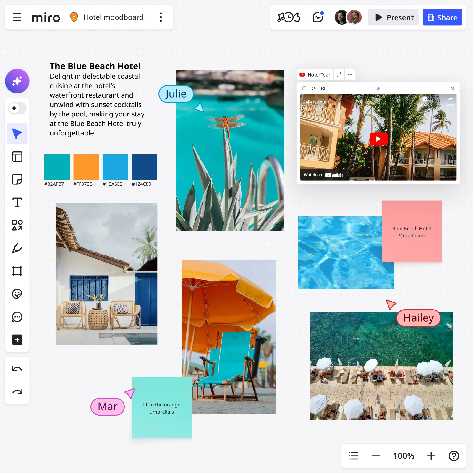
Sticky notes for collaborative annotation
During async review, invite stakeholders to add their thoughts via sticky notes. Color-code by department: Design = yellow, Engineering = blue, Product = green, Leadership = pink.
These annotations enrich the conversation before your live meeting.
Decision-making framework
Voting reveals preferences, but preferences aren’t decisions. Use a scoring framework.
List your criteria: Usability, Brand alignment, Technical feasibility, Accessibility, Business impact. Score each direction against each criterion using 1-3 scale.
Devil’s advocate round: Before finalizing, ask “What could go wrong with this direction?” Surface concerns worth monitoring during implementation.
Documenting the “why” behind decisions
Add a “Decision Rationale” section to your board:
- Which direction was selected
- The voting/scoring breakdown
- Key reasons this direction serves users and business goals
- Elements from other directions worth incorporating
- Concerns to monitor during implementation
Capturing next steps
Before your review ends, capture action items:
- Which direction moves to high-fidelity design?
- What specific elements from rejected directions should be incorporated?
- Who owns each next step?
- What’s the timeline?
Miro advantage: Next steps live on the same board as design decisions. Context and action items in one place.
Why Miro is purpose-built for UX/UI moodboarding
The collaborative canvas advantage
Static slide decks trap moodboards in linear presentations. Miro’s infinite canvas mirrors how designers actually think. You spread out. You organize spatially. You create sections that grow as you discover patterns.
Real-time multiplayer editing means distributed teams work simultaneously. Your PM in New York adds comments while your designer in Berlin captures color examples while your engineer in Tokyo flags technical concerns.
Seamless research-to-moodboard workflow with Web Clipper
Traditional process: Research → Screenshot 47 times → Download → Upload → Organize → Add context → Realize you’re exhausted.
Miro Web Clipper process: Research → Click extension as you find examples → Continue researching → Finish with 47 organized references already on your board.
The tool doesn’t just save time—it maintains momentum. When capture is frictionless, you capture more examples. More examples = richer strategic foundation.
Built-in collaboration tools
Comments on images transform Miro moodboards from personal reference to team decision-making tool. Threading keeps discussions organized. @mentions bring the right people into conversations.
Dot voting converts subjective opinions into quantifiable preferences. Real-time visualization shows where consensus exists.
Emoji reactions provide instant gut responses. The visual pattern tells you everything—ten heart reactions and zero concerned faces means that pattern resonates.
Sticky notes let you add context anywhere. Color-code by purpose or department. Collaborative annotation during async review captures surface reactions before live meetings.
Organization at scale
Frames and sections create visual boundaries and hierarchical structure. Title frames clearly. Sections let you collapse/expand detail.
Tags and search help you find patterns as your board grows. Tag elements as you add them: “accessibility-approved,” “needs-discussion,” “mobile-first.”
Templates for repeatability save your refined structure. Start from Miro’s moodboard templates and customize.
Async + real-time flexibility
Distributed teams span time zones. Miro supports both working modes seamlessly: Share for async review on individual schedules, or schedule focused real-time sessions where everyone annotates together.
Recording captures everything—comments, votes, discussions. Share with stakeholders who couldn’t attend.
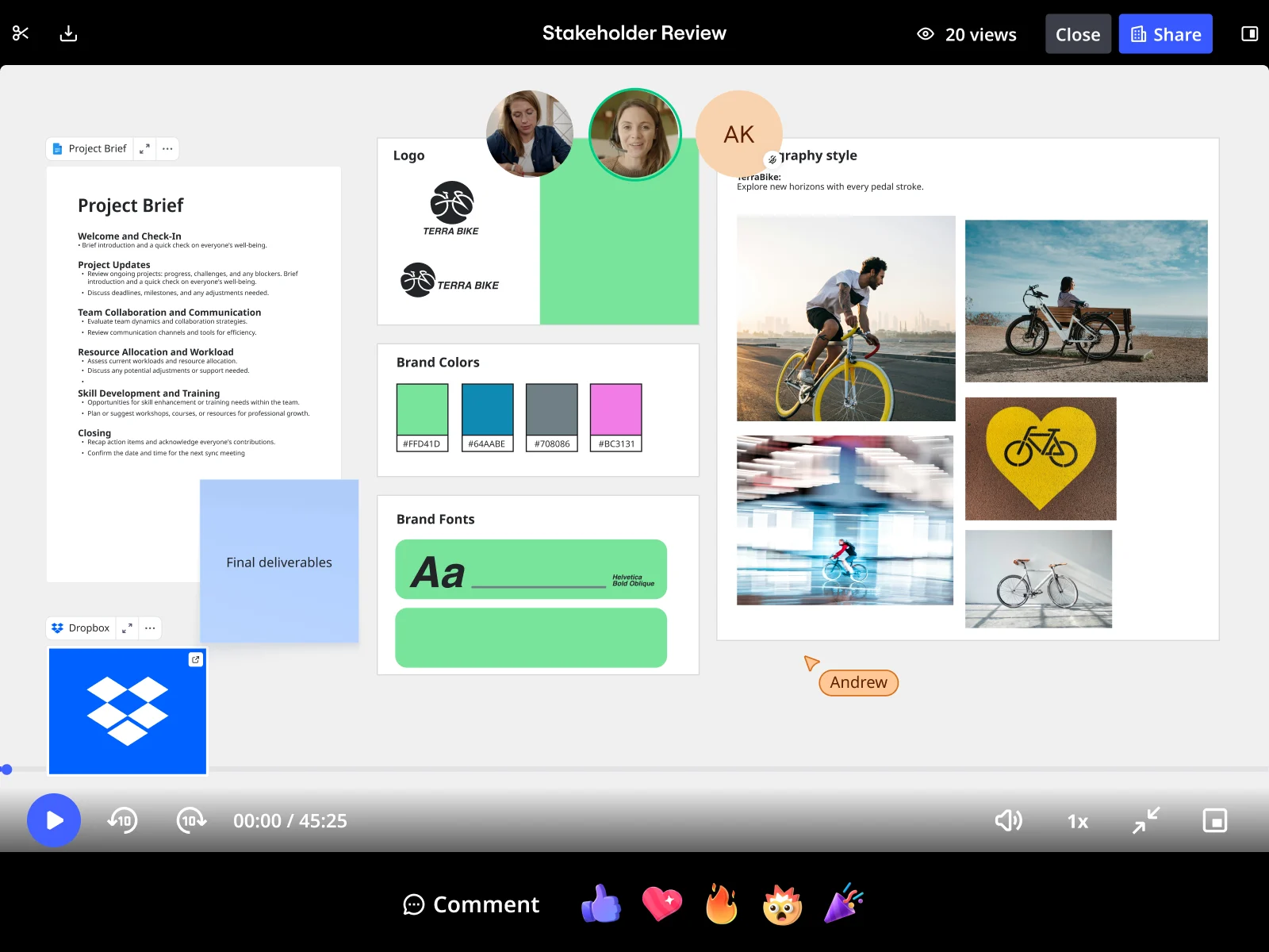
Real-world case studies
Lufthansa Miles & More: Rapid prototype validation
Lufthansa’s Miles & More program needed to validate product vision with management under tight timelines. Product Owner Björn Ehrlinspiel used Miro to create a strategic moodboard, then rapidly translated patterns into prototypes.
Result: Created, validated, and aligned on solution in less than one day. “I’m way more confident that the things we are implementing are the right things.”
Moladin: Design system foundation
Moladin, Indonesia’s leading mobility marketplace, needed consistent UI patterns across growing product teams. The design team created a comprehensive moodboard that became the source of truth for design decisions.
Result: Doubled story points—teams completed twice the work. Chief Product Officer Praz Perkasa: “Miro has become the backbone of our product development.”
Conclusion
Remember that design review where someone said “I don’t like this blue” and derailed three weeks of work?
That doesn’t happen when your UI moodboard shifts the conversation from personal taste to strategic decisions. When every pattern is backed by real-world examples. When accessibility is tested upfront. When stakeholders vote using clear criteria.
Professional UX/UI moodboards transform how teams make design decisions. From “I think we should…” conversations that go nowhere to “This pattern serves our users better because…” discussions that move products forward.
What makes Miro purpose-built for this work: Your research, organization, collaboration, and documentation all happen on one shared canvas that keeps everyone aligned from research through delivery.
Your next steps:
Start with Miro’s mood board template. Install the Web Clipper for your next project. Apply the Goldilocks method. Facilitate your first structured review with dot voting. Document your chosen direction and keep it accessible throughout development.
When you ground design conversations in strategic patterns, accessibility standards, and user needs—rather than subjective taste—you ship better products faster. Time to build your next moodboard.
UI Moodboard FAQs
How is a UX/UI moodboard different from a traditional moodboard?
Traditional moodboards focus on aesthetic inspiration—curated photography, texture samples, lifestyle imagery that captures a "feeling" or "mood." UX/UI moodboards are strategic tools featuring functional design patterns from real products: navigation systems, button styles, typography hierarchies, and color applications in context.
The difference: Traditional moodboards inspire emotion. Professional UX/UI moodboards solve user problems. If your stakeholder can't point to a pattern and say "This navigation approach supports our information architecture better than alternatives," you've built the wrong kind of moodboard.
Can I share my Miro moodboard with external stakeholders and clients securely?
Yes. Miro provides enterprise-grade security controls for sharing moodboards with external collaborators. You can invite external stakeholders with specific permission levels: view-only access for clients who need to review without editing, comment-only access for feedback, or full edit access for close collaborators. For sensitive projects, use board-level passwords or expiring share links that automatically revoke access after a set timeframe.
Miro's enterprise plans include SSO, SAML authentication, and advanced admin controls that let you enforce security policies across your organization. All data is encrypted in transit and at rest, and Miro is SOC 2 Type II, ISO 27001, and GDPR compliant—critical when your moodboards contain unreleased product designs or competitive research.
How does Miro integrate with our existing design and project management tools?
Miro integrates seamlessly with the tools your team already uses. Embed Figma files directly on your board to show reference patterns alongside your implementation. Connect to Jira, Asana, Monday.com, or Trello to create linked tasks—trace from strategic moodboard decision through design system component to shipped feature. Slack and Microsoft Teams notifications keep everyone informed when comments are added or voting completes.
The Web Clipper Chrome extension works alongside these integrations, letting you capture references from any tool directly to your Miro moodboard. Also integrates with Sketch, Adobe Creative Cloud, GitHub, GitLab, Confluence, and Notion for complete workflow coverage.
Can our entire design community access and contribute to moodboards?
Miro supports both project-specific moodboards (private to designated team members) and team-wide moodboard libraries where your entire design community contributes to shared pattern collections. Create a central "UI Pattern Library" board where designers across all projects add interesting patterns they discover, building institutional knowledge that new designers can learn from.
Admins can set team-wide policies and permissions—maybe all designers can view the shared pattern library, but only design leads can edit it. Product managers, engineers, and other functions can be invited to view moodboard libraries without editing access, building shared understanding across disciplines.
How many references should a professional moodboard include?
Fifteen to thirty references per direction is the sweet spot if you're using the Goldilocks method (three directions = 45-90 total references). Fewer than 15 lacks substance for decision-making; more than 30 becomes overwhelming. Quality over quantity—each reference should demonstrate a specific pattern or approach.
Keep moodboards organized using Miro's frames and sections for visual boundaries, tags for filtering ("accessibility-approved," "needs-discussion," "mobile-first"), and search functionality to find patterns instantly across 100+ references. Create visual hierarchy with distinct category headers, size reference images appropriately, and version your moodboard as decisions evolve rather than deleting old patterns.
Read more
Join our 100M+ users today