Table of contents
Table of contents
Mood board vs. brand board vs. style guide: The complete lifecycle guide
Summary
In this guide, you'll learn:
• The lifecycle of visual identity: How mood boards, brand boards, and style guides represent three distinct phases—Discover (exploration), Define (decision), and Deliver (standardization)—in the evolution from chaos to order
• Decision framework: Diagnostic scenarios showing exactly which deliverable you need based on your current project phase—whether you're starting from scratch, developing a campaign, fixing inconsistent application, or scaling
• The Miro advantage: How leading brand teams build connected systems on one infinite canvas—preserving the complete journey from mood boards through style guides with all decision history visible
• Implementation guide: 4-week framework for setting up your collaborative brand workspace, from initial canvas structure through ongoing maintenance
Read time: 12 minutes
Best for: Brand managers, design leaders, and anyone tired of brand project misalignment
Mood board vs. brand board vs. style guide
The email subject line reads: “Need style guide by EOD Friday.”
Your design team stops in their tracks. A style guide? The rebrand just started last week. Right now, you’re collecting inspiration, testing color options, and figuring out the brand’s overall feel. Creating a full style guide now would be like writing instructions before the product even exists.
You reply carefully: “Just to clarify, do you mean a mood board to explore visual directions, or do you actually need the full style guide with usage rules?”
The response comes back: “Aren’t those the same thing?”
And just like that, you’re facing the kind of costly misunderstanding that can derail brand projects everywhere.
The real problem isn’t miscommunication. It’s not understanding the process
When stakeholders use “mood board,” “brand board,” and “style guide” interchangeably, everyone loses. Designers deliver exploratory mood boards when clients expect strict standards. Brand managers request “brand boards” and receive 60-page style guides that overwhelm rather than enable. Teams waste weeks building the wrong deliverable at the wrong time.
But here’s the key: these three documents aren’t competing tools. They’re like siblings, each representing a different stage as a visual identity moves from chaos to order.
Think of it as the natural lifecycle:
- Mood Board = Exploration and discovery (divergent thinking)
- Brand Board = Decision and definition (beginning convergence)
- Style Guide = Documentation and standardization (complete convergence)
Understanding which phase you’re in eliminates the frustration that kills brand projects before they launch.
This guide will help you:
- Navigate the visual identity lifecycle and know exactly which deliverable fits your current phase
- Stop wasting time and budget on misaligned requests
- Preserve the history of design decisions instead of losing context between phases
- Build connected brand systems where exploration flows naturally into standardization
Let’s start with the lifecycle itself. Once you see it, everything will make sense.
The lifecycle of visual identity: From chaos to order
Every visual identity moves through three distinct phases. The mistake most teams make? Skipping phases or requesting the wrong deliverable for where they actually are.
Here’s the complete journey:
Phase 1: DISCOVER – The mood board phase
Mental Model: Divergent thinking Goal: Explore possibilities and align on emotional direction Output: Mood Board
What actually happens here
The Discover phase is intentionally messy. You’re casting a wide net, testing aesthetic directions, learning what resonates with stakeholders—all before committing to specific design decisions.
This is divergent thinking in action. You’re not narrowing to one answer yet. You’re expanding possibilities. You’re creating space for unexpected creative directions that might be exactly what the brand needs.
What you’re doing:
- Gathering visual inspiration from different sources such as competitor brands, other industries, art, architecture, and photography that sets the right mood
- Testing several aesthetic directions at once, like modern versus classic, bold versus minimal, or warm versus cool
- Identifying patterns in what stakeholders respond to and why
- Translating brand strategy into visual language
- Building alignment before anyone touches design software
What a mood board contains:
- Photography and imagery establishing mood and tone
- Color palette exploration (inspiration colors, not final selections)
- Typography samples showing font personalities
- Textures, patterns, visual treatments
- References to brands or design work capturing the desired feel
- Descriptive words that anchor the look and feel, such as “sophisticated,” “approachable,” or “innovative”
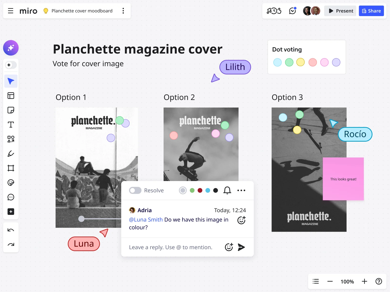
Real-world example: A fintech startup exploring brand identity creates three mood boards. Direction A emphasizes “trust and stability”—navy blues, serif fonts, imagery of established institutions. Direction B goes full “innovation and disruption”—vibrant gradients, geometric patterns, modern sans-serifs. Direction C balances both with contemporary design and grounded colors.
The goal isn’t to pick one board and follow it exactly. It’s to learn which visual elements connect with people and why.
When you actually need a mood board
Request a mood board when:
- Starting a brand identity from scratch
- Beginning a rebrand before committing to direction
- Exploring creative direction for a major campaign
- Stakeholders haven’t aligned on the aesthetic feel yet
- You’re testing multiple visual directions before investing in detailed design
- The current brand feels “off” but you can’t articulate why
Red flag: If you skip the mood board phase and go straight to logo design, expect endless revisions as stakeholders realize they never agreed on the basic look and feel. You’ll end up backtracking, but only after wasting time and money.
Phase 2: DEFINE – The brand board phase
Mental Model: Beginning convergence Goal: Make and document specific design decisions Output: Brand Board
What’s different in this phase
The Define phase is where exploration crystallizes into decisions. Based on learnings from mood boards and stakeholder feedback, the design team makes specific choices: which logo concept works, which colors to use, which typography pairing feels right.
This is beginning convergence. You’re narrowing from many possibilities to specific selections. But you’re not yet defining comprehensive rules for every scenario—that comes in Phase 3.
What you’re doing:
- Designing logo concepts and selecting the primary logo
- Finalizing the color palette with exact color codes
- Selecting typography pairings that work together
- Creating logo variations for different contexts
- Developing core visual elements—icons, patterns, graphic devices
- Testing how these elements work together in real applications
What a brand board contains:
- Primary logo and logo variations (stacked, horizontal, icon-only)
- Complete color palette with technical specifications (HEX: #1A1A1A, RGB: 26, 26, 26, CMYK: 0, 0, 0, 100)
- Typography pairings with font names, weights, and recommended sizes
- Visual examples showing how elements work together
- Core visual elements like icon styles or patterns
- All essential brand elements on one scannable page
Real-world example: That same fintech startup has chosen a direction that blends trust with innovation. Their brand board shows a modern wordmark logo with a geometric symbol, both horizontal and stacked versions, five brand colors with technical codes, a font pairing (sans-serif for headings, serif for body text), and icon style examples. It’s everything a designer needs to create consistent brand materials, all on one page for quick reference.
When you need a brand board
Request a brand board when:
- Design decisions are finalized and you need reference documentation
- Multiple team members need to apply the brand consistently
- You’re briefing external agencies or freelancers on the brand
- The team needs quick access to brand assets without hunting through folders
- You’re onboarding new members who need to understand brand standards fast
- You’re moving from exploration to actual application
Red flag: If you create a brand board before finalizing your design decisions, you’ll have to keep updating it as things change. This defeats the purpose of having a stable reference.
Phase 3: DELIVER – The style guide phase
Mental Model: Complete convergence and standardization Goal: Document comprehensive rules for brand application at scale Output: Style Guide (Brand Guidelines)
What happens when you need governance
The Deliver phase is when the brand becomes standardized. You’re no longer exploring or defining. Now, you’re documenting exactly how the brand should be used in every situation, channel, and use case.
This is complete convergence and strict standardization. You’re creating rules, specifications, and guardrails ensuring anyone who touches the brand applies it consistently, whether they’re a new designer in Singapore or an agency partner in São Paulo.
What you’re doing:
- Documenting logo usage rules—clearspace, minimum sizes, approved backgrounds, what NOT to do
- Defining color usage hierarchy and accessibility requirements
- Specifying typography hierarchy across all applications
- Creating templates for common deliverables
- Establishing photography and imagery guidelines with art direction
- Documenting tone of voice and messaging frameworks
- Providing code snippets for developers implementing the brand digitally
What a style guide contains:
- Comprehensive logo specifications with measurements and clearspace requirements
- Detailed color usage rules—primary vs. secondary, approved combinations, accessibility compliance
- Complete typography system with hierarchy, sizing, line height, letter spacing
- Photography art direction with example images showing what works
- Icon libraries and illustration style guidelines
- Template libraries for presentations, social media, email signatures
- Tone of voice guidelines with example copy
- Do’s and don’ts for every brand element
- Technical specifications—CSS code, font files, asset formats
Real-world example: The fintech startup’s style guide is now 40 pages. Logo clearspace requirements show the logo needs space equal to the height of the symbol on all sides. Approved color combinations ensure accessibility. Complete typography scale runs from H1 (36pt) through captions (12pt). Photography guidelines show examples—diverse people in natural settings, no overly staged corporate photos. Templates exist for sales presentations and social media. Even email signature specifications are documented.
When you need a style guide
Request a style guide when:
- The brand needs to scale across multiple teams or geographies
- You’re onboarding many new team members or external partners
- Brand consistency becomes challenging as the organization grows
- You’re launching in new channels or markets
- Developers need technical specifications for digital implementation
- You’re seeing “brand drift” with inconsistent applications appearing everywhere
- The brand has matured beyond initial launch and needs governance
Red flag: If you create a comprehensive style guide too early, before the brand has been tested in the market, you’ll end up with rigid rules that don’t reflect how teams actually use the brand.
Why the sequence actually matters
Each phase builds on the one before it. If you skip a phase, you’ll have to backtrack later. It’s almost certain.
Skip Discover (Mood Boards) → Endless design revisions because stakeholders haven’t aligned on aesthetic direction. You’ll loop through logo concepts forever because you never established what the brand should feel like.
Skip Define (Brand Boards) → Inconsistent brand application because teams lack clear reference for core elements. Everyone interprets “the brand” differently, and you become the bottleneck answering the same questions repeatedly.
Skip Deliver (Style Guides) → Brand erosion at scale because there’s no governance as the organization grows. What started as a cohesive brand fragments into variations across regions, teams, and channels.
The most successful brand teams recognize exactly where they are in the lifecycle and request the appropriate deliverable for that phase. Not what sounds impressive. Not what other companies have. What actually serves the work that needs to happen right now.
Side-by-side: The three siblings at a glance
Let’s get concrete about what makes each deliverable different:
Mood Board vs. Brand Board vs. Style Guide: Side-by-Side Comparison
Dimension | Mood Board (Discover) | Brand Board (Define) | Style Guide (Deliver) |
Phase | Exploration | Decision | Standardization |
Thinking Mode | Divergent (expanding) | Beginning Convergence | Complete Convergence |
Primary Goal | Align on aesthetic feel | Document specific choices | Govern comprehensive application |
Format | Collage/inspiration board | Single-page reference | Multi-page document (20-100+ pages) |
Content Type | Inspirational imagery, color ideas, font samples | Finalized logos, exact colors with codes, specific fonts | Detailed rules, usage examples, templates, code |
Specificity | Abstract, exploratory | Specific but concise | Comprehensive, prescriptive |
Flexibility | Highly fluid, evolves through feedback | Fixed reference point | Governed with formal update processes |
Typical Timeline | 1-3 weeks | 2-4 weeks (post-design) | 4-8 weeks (post-launch) |
Primary Users | Design team, stakeholders, executives | Designers, marketers, content creators | Entire organization, agencies, partners |
Key Question Answered | What should this brand FEEL like? | What ARE the brand elements? | HOW do I apply the brand correctly? |
Update Frequency | Archived after direction selected | Quarterly updates | Annual reviews + ongoing additions |
Success Metric | Stakeholder alignment achieved | Team can apply brand consistently | Zero brand usage questions |
What actually goes into each
Mood Board Includes:
- 10-20 inspirational images establishing mood
- 3-5 color palette explorations (not final choices)
- 5-8 typography samples showing font personalities
- Textures and patterns suggesting visual treatment
- 3-5 descriptive adjectives anchoring the direction
- References to other brands capturing desired aesthetic
Brand Board Includes:
- Primary logo (full color, main version)
- 2-4 logo variations (horizontal, stacked, icon, one-color)
- 5-8 brand colors with full technical codes (HEX, RGB, CMYK, Pantone)
- 2-3 typography pairings (heading + body fonts with names and weights)
- Core visual elements (3-5 icon examples or pattern samples)
- 1-2 application examples showing elements working together
Style Guide Includes:
- Logo section (10-15 pages): specifications, clearspace, sizes, backgrounds, do’s/don’ts
- Color section (8-12 pages): hierarchy, usage rules, accessibility, approved combinations
- Typography section (10-15 pages): complete scale, hierarchy, spacing, line height
- Imagery section (8-10 pages): photography guidelines, art direction, editing style
- Application section (20-30 pages): templates, examples, channel-specific guidelines
- Technical section (5-10 pages): developer specifications, code snippets, file formats
- Messaging section (10-15 pages): tone of voice, brand story, example copy
The visual differences are clear: a mood board is an inspiration collage, a brand board is an organized reference, and a style guide is a detailed instruction manual.
Decision framework: When to request which
The most common mistake? Requesting the wrong deliverable for your current project phase. Here’s how to diagnose exactly what you need.
For brand managers: Knowing where you actually are
Scenario 1: Brand identity from scratch
Situation: Launching a new brand, sub-brand, or undergoing complete rebrand.
What you need (in sequence):
Week 1-3: Mood Boards
→ Align stakeholders on aesthetic direction before investing in design
Week 4-8: Brand Design + Brand Board
→ Design the identity and create reference documentation
Month 3-4: Style Guide
→ Document comprehensive standards after testing brand in initial applications
How to request it:
- Phase 1: “We need 2-3 mood board directions exploring how this brand could look and feel. The goal is stakeholder alignment on aesthetic before we commit to detailed design work.”
- Phase 2: “Based on the approved mood board direction, we need logo design and a brand board documenting our core brand elements for the design and marketing teams to reference.”
- Phase 3: “Now that the brand has launched and we’re seeing real-world applications, we need a comprehensive style guide to govern brand application as we scale.”
Scenario 2: Campaign or initiative creative
Situation: Developing creative direction for a campaign, product launch, or major initiative within an existing brand.
What you need:
- If extending the existing brand: Brand Board as reference + Campaign Creative Brief
- If exploring new creative territory: Mood Board → Campaign Brand Board (campaign-specific visual elements)
How to request it: “This campaign needs its own visual identity that extends our main brand. Let’s start with a mood board exploring creative directions, then create a campaign brand board documenting the campaign-specific visual elements teams can use alongside our main brand standards.”
Scenario 3: Inconsistent brand application
Situation: Your brand exists but teams are applying it inconsistently. You’re seeing “brand drift.”
What you need:
- If you have clear brand elements but no documentation: Brand Board immediately
- If brand application has become complex across channels: Style Guide
How to request it: “We have a brand identity, but teams are interpreting it differently across regions and channels. We need [a brand board for quick reference / a comprehensive style guide for detailed governance] to align everyone on proper brand application.”
Scenario 4: Scaling the organization
Situation: The company is growing rapidly—new hires, new teams, new markets, new agency partners.
What you need: Style Guide + Templates + Onboarding Process
How to request it: “As we scale, we need comprehensive brand documentation that enables new team members and external partners to apply our brand correctly without constant guidance. We need a style guide with templates, clear usage rules, and onboarding materials.”
For design leaders: Setting the right expectations
Design leaders must educate stakeholders on the lifecycle to prevent misalignment. Here’s the conversation framework:
When a client requests a “style guide” but you’re in discovery
“I want to make sure we’re aligned on what you need right now. A style guide is comprehensive documentation for an established brand—it’s the final phase of the lifecycle. But it sounds like we’re still in exploration. What would serve you better at this stage is a mood board to align stakeholders on aesthetic direction. Then we’ll design the identity, document it in a brand board, and create the comprehensive style guide once we’ve tested the brand in market. This sequence prevents us from building rigid rules before we know what actually works.”
When a client requests a “mood board” but they need immediate standards
“It sounds like you already have a brand identity but need documentation for your team to apply it consistently. A mood board is for exploration when you’re still deciding what the brand should look like. What you actually need is a brand board—a reference document showing your finalized brand elements so your team can use them correctly. We can create that in 2-3 weeks versus spending time exploring directions you’ve already chosen.”
The educational moment every time
“Think of it like building a house. Mood boards are architectural inspiration—we’re exploring what style of house resonates before we draw blueprints. The brand board is the blueprint showing specific decisions. The style guide is the construction manual with detailed instructions for anyone who needs to build or renovate. Each serves a purpose at a different phase. Skip a phase, and you’ll backtrack later.”
Quick reference: “What should I request?”
Request a Mood Board if:
- You’re starting from scratch or exploring new territory
- Stakeholders haven’t aligned on aesthetic direction
- You want to test multiple creative directions before committing
- You can’t articulate what the brand should look or feel like yet
Request a Brand Board if:
- Design decisions are finalized and you need documentation
- Multiple team members need consistent access to brand elements
- You’re briefing external partners on the brand
- You’re moving from exploration to application
Request a Style Guide if:
- Your organization is scaling and needs governance
- Brand consistency is becoming challenging
- You’re launching in new channels or markets
- You have complex brand architecture
- Developers need technical specifications
The golden rule: When in doubt, start by identifying where you are in the lifecycle—Discover, Define, or Deliver—and request the deliverable that matches. Don’t focus on what sounds impressive. Choose what actually helps your current work.
The collaboration challenge: Why context gets lost
Even when brand teams understand the lifecycle and request the right deliverable at the right time, most face a critical problem: each phase happens in isolation, and context disappears between phases.
Here’s how it typically breaks down:
Phase 1 (Discover): Mood boards created in PowerPoint or scattered across Pinterest boards. Stakeholder feedback happens in email threads, Slack channels, and meeting notes that get buried. The chosen direction gets verbally communicated to designers who weren’t in the room.
Phase 2 (Define): Designers work in Figma or Adobe Illustrator creating the brand identity. The brand board gets exported as a PDF and stored in Google Drive. Or shared via email. Or both, creating two versions no one’s sure which is current.
Phase 3 (Deliver): Style guide created in InDesign, exported as another PDF, stored in a different folder or built as a website requiring developer resources every time something needs updating.
What actually gets lost
1. Design decision context
Why did the team choose direction A over direction B? What was the reasoning behind this specific color palette? Why this typography pairing instead of the other options?
When each phase lives in a different tool, this context evaporates. Six months later, when someone questions a brand decision, no one remembers the rationale. You’re left defending choices you can’t explain.
2. Stakeholder feedback history
What did the CMO love about the original mood board? What concerns did the product team raise? What compromise was reached between competing stakeholder preferences?
When feedback scatters across email threads, Slack conversations, and meeting notes, this history becomes archaeology. You know there was a reason. You just can’t reconstruct it.
3. Design evolution
How did the final brand evolve from initial exploration? What iterations happened along the way? What was tried and rejected, and why?
When deliverables are disconnected, the brand appears to spring into existence fully formed. New team members see the final output but have no idea about the journey that led there.
4. Cross-functional alignment
Marketing sees the mood board presentation deck. Design sees the Figma files. Product references the PDF brand board. Executives see only the final style guide at launch.
Different stakeholders see different pieces at different times, experiencing fragments instead of the complete journey from exploration to standardization. No one has the full picture.
The impact: More than just inefficiency
This disconnection creates tangible problems:
- Repeated questions drain time: “Why did we choose these colors again?” requires research to answer every single time
- Decision reversals waste budget: Stakeholders who weren’t part of mood board conversations question final decisions and want to revisit settled choices
- Onboarding takes forever: New team members can’t understand how the brand evolved, so they make mistakes that veteran team members catch
- Context recreation kills momentum: Every new project requires reconstructing rationale instead of referencing shared history
- Governance becomes impossible: Without visible decision history, brand guidelines feel arbitrary, and teams ignore them
The best brand teams solve this by building connected brand systems where the whole lifecycle lives in one collaborative workspace. This approach preserves context, supports ongoing collaboration, and keeps everyone aligned from exploration to standardization.
The Miro advantage: One workspace, complete journey
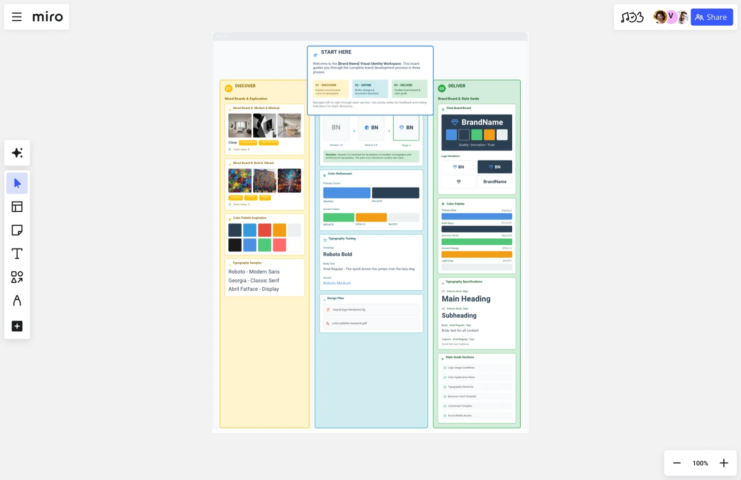
What if mood boards, brand boards, and style guides didn’t live in disconnected tools? What if the entire visual identity journey—from messy exploration to polished standardization—existed on one infinite canvas where context is preserved and stakeholders see the complete evolution?
This is what makes Miro fundamentally different.
Visualizing the history of design decisions
Picture opening your brand workspace and seeing the complete story:
Left side of the canvas: The original mood boards—three exploratory directions with stakeholder comments and voting results still visible. You can see exactly which visual elements resonated, read the specific feedback that guided decisions, and understand why direction B was chosen over A and C. The context isn’t buried in email—it’s right there.
Center of the canvas: The refinement zone where mood board inspiration evolved into specific brand elements. Logo concepts are arranged showing the progression from initial sketches to final design. Color palette refinement displays how inspiration colors from the mood board became the finalized brand palette. Typography exploration shows fonts that were tested before the final pairing was selected. Connector lines link final choices back to mood board inspiration.
Right side of the canvas: The finalized brand board with all core elements documented, visually connected to the exploration that informed each choice. Stakeholder approval notes are visible. Links to master files in Figma, Adobe Creative Cloud, or your asset library sit right on the board—no hunting through folders.
Bottom section: The expanding style guide with comprehensive usage documentation, templates, and application examples—all connecting back to the core brand board above it. As teams identify new use cases, new sections get added. The style guide grows with the brand.
What this actually enables
1. Preserved context that doesn’t require archaeology
Six months after launch, when someone asks “why these colors?”, you don’t search email archives hoping someone remembers. You scroll left on the Miro board and see the original mood board, the stakeholder feedback captured in comments, and the rationale documented right there in sticky notes. The answer takes 30 seconds to find.
2. Continuous collaboration without scheduling nightmares
Mood boards don’t require finishing a presentation and scheduling a meeting with 12 people across 4 time zones. Stakeholders visit the Miro board asynchronously, leave comments directly on visual elements, vote on preferred directions using Miro’s built-in voting features, and provide specific feedback—all without leaving their workflow.
The design team works in Figma but uses Miro’s Figma integration to embed frames directly into the board, creating live connections. When the logo design updates in Figma, the Miro brand board reflects the change automatically. No more exporting, re-uploading, and wondering which version is current.
Marketing teams reference the brand board without switching contexts. They can see not just what the brand elements are, but scroll left to understand where they came from and why these choices were made.
3. Cross-functional visibility that breaks down silos
Product managers contribute to mood boards alongside designers using Miro’s infinite canvas that accommodates everyone’s input without space constraints. Engineers access technical specifications from the style guide section using smart grids and frames that keep information organized. Sales teams reference brand messaging using search to find exactly what they need. Executives see the complete journey—not just final deliverables.
Everyone works on the same canvas with appropriate permission levels: edit access for the core brand team, comment access for extended teams, view access for the broader organization.
4. Living documentation that evolves with your brand
As the brand evolves, the Miro board evolves with it. New mood boards for campaigns appear in adjacent frames. Brand board updates reflect real-time changes that propagate through connected assets. Style guide sections expand based on new use cases teams encounter.
The history remains visible—you can see version evolution using Miro’s version history—but teams always access the current, updated standards. No confusion about which PDF is latest. No outdated documentation floating around.
5. Onboarding that actually makes sense
When new team members join, they don’t just receive a PDF brand board and good luck. They access the Miro workspace and see the entire brand journey visualized on one canvas. They understand not just what the brand is, but why it is—because the exploration, decision-making, and standardization all live in one visual narrative.
Using Miro’s Presentation Mode, brand managers can walk new hires through the journey from mood boards through final standards, with all context preserved and questions answered through visible documentation.
Real teams, real results
GitHub’s design team used Miro to transform how they collaborate on brand work, increasing AI tool usage by 140% to over 1 million events monthly. The key? Replacing hesitation with curiosity by giving teams a collaborative workspace where they could explore, iterate, and align without friction.
As Alexandra Yanes, Senior Product Manager at GitHub, explained: “One of the most powerful things is leadership modeling. Executives didn’t just talk about the use of AI and new collaboration approaches; they were actually using it. It helped replace that hesitation internally with curiosity—that permission to explore, fail, and learn.”
When brand teams move from disconnected documents to connected systems on Miro’s infinite canvas, similar transformation happens. Exploration doesn’t get lost when you move to definition. Definition stays connected to documentation. And everyone—from designers to executives—sees the complete picture.
From disconnected documents to connected system
Traditional approach: Mood board PowerPoint → Figma designs → PDF brand board emailed around → InDesign style guide → Everything scattered across folders → Context lost
Miro approach: One continuous canvas where exploration flows into definition flows into standardization, with all context preserved, all stakeholders connected, and the complete history of design decisions visible
This is the difference between disconnected documents that fragment understanding and a connected brand system that builds alignment.
Implementation: Building your connected brand system
Ready to move from disconnected documents to a connected brand workspace? Here’s your 4-week framework.
Week 1: Set up the canvas structure
Action items:
- Create a new Miro board titled “[Brand Name] Visual Identity Workspace”
- Use Miro’s frames and sections to establish structure:
- Left section: “01 - DISCOVER: Mood Boards & Exploration”
- Center section: “02 - DEFINE: Brand Development & Refinement”
- Right section: “03 - DELIVER: Brand Board & Style Guide”
- Create a “START HERE” frame explaining the board structure and how to navigate
- Set up team permissions: brand team gets edit access, stakeholders get comment access, broader organization gets view access
- Add your brand strategy documentation—positioning, values, target audience—as foundation
Miro features to use:
- Frames to organize sections and create clear visual hierarchy
- Smart grid to keep sections aligned and professional-looking
- Custom colors (once defined) to make the board itself feel on-brand
- Links to relevant documents in Google Drive, Dropbox, or other tools via integrations
Time investment: 2-3 hours to set up properly
Week 2: Populate discovery section (Mood Boards)
Action items:
- Create 2-3 mood board frames exploring different aesthetic directions
- Use Miro’s image upload, web clipper or AI image generator to gather inspiration—drag images directly onto the canvas, paste URLs to generate rich previews
- Add color palette inspiration using color pickers
- Include typography samples with text boxes showing different font treatments
- Label each direction with descriptive adjectives using sticky notes
- Invite stakeholders to review asynchronously via link sharing
- Enable voting to identify preferred direction
- Use @mentions in comments to gather specific feedback on visual elements
Miro features to use:
- Drag-and-drop image uploads for quick inspiration gathering
- Web clipper to pull inspiration directly from websites
- Color pickers to capture exact palette ideas
- Voting features for structured stakeholder input
- Comments and @mentions for specific, contextual feedback
- Sticky notes for documenting rationale and capturing insights
- Timer feature during live workshops to keep feedback sessions focused
Collaboration tip: Set a clear deadline (“Please review and vote by Friday EOD”) to maintain momentum without requiring synchronous meetings. Async collaboration works when expectations are clear.
Time investment: 1 week for creation + feedback gathering
Week 3: Build definition section (Brand Development)
Action items:
- Based on approved mood board direction, begin designing brand identity in your preferred tool
- Use Figma integration or Adobe Creative Cloud connections to embed design files directly into Miro
- Create a “Design Evolution” section showing logo iterations, color refinement, typography testing
- Use connector lines to visually link final choices back to mood board inspiration
- Document decision rationale using text boxes or sticky notes—capture the “why” while it’s fresh
- Get stakeholder approval on final selections using comments and sign-off processes
- Begin organizing approved assets for easy reference
Miro features to use:
- Figma integration to embed live design files (updates automatically when Figma files change)
- Adobe Creative Cloud connections for Illustrator, Photoshop files
- Connector lines to show design evolution and relationships between elements
- Text boxes and sticky notes for documenting rationale
- Version history to track iterations and decisions over time
- Presentation mode for walking stakeholders through design progression
Pro tip: Don’t hide the messy middle. Showing design iterations and rejected options helps stakeholders understand the rigor behind final decisions. It builds confidence that you explored thoroughly before landing on the solution.
Time investment: 2-3 weeks depending on design complexity
Week 4: Create delivery section (Brand Board + Initial Style Guide)
Action items:
- Create finalized brand board in the right section using smart grids for clean layout
- Include: all logo variations, complete color palette with codes, typography specifications, core visual elements
- Link brand board elements back to master design files using integrations with Google Drive, Dropbox, or asset management tools
- Begin style guide with priority sections—logo usage, color guidelines, typography hierarchy
- Set up templates for common deliverables using Miro’s template feature
- Plan ongoing expansion based on team needs—don’t try to build everything at once
Miro features to use:
- Smart grids for professional brand board layout
- Integration with Google Drive, Dropbox, Box for asset library links
- Frames for organizing different style guide sections
- Template creation for reusable brand elements
- Tags and search functionality so teams can find what they need fast
- Export options to share sections externally when needed
Time investment: 1 week for initial brand board + style guide foundation
Ongoing: Maintaining your living brand system
The work doesn’t stop at launch. The most effective brand workspaces evolve continuously:
Monthly:
- Review comments and questions to identify style guide gaps
- Add FAQ sections addressing recurring questions
- Update examples showing new use cases
- Archive outdated sections while keeping them accessible via version history
Quarterly:
- Conduct brand audits reviewing consistency across channels
- Gather team feedback on documentation usefulness via surveys or collaborative sessions
- Add new sections for emerging needs
- Update templates based on how teams actually work
Annually:
- Comprehensive review: does the brand still serve business goals?
- Update style guide for new channels, products, or markets
- Refresh mood board inspiration to test whether the brand still feels current
- Document evolution and decision rationale for major updates
The key is treating your Miro brand workspace as a living system rather than a static document—continuously evolving while preserving the history of how decisions were made.
From confusion to clarity
The frustration you’ve experienced—delivering the “wrong” deliverable, facing stakeholder confusion, losing context between project phases, watching brand consistency erode—stems from a fundamental misunderstanding.
Mood boards, brand boards, and style guides aren’t competing options you choose between based on what sounds more impressive or what other companies have. They’re siblings representing the natural evolution of visual identity from exploration to standardization.
When you understand the lifecycle—Discover, Define, Deliver—you know exactly which deliverable serves your current phase:
- Mood boards for exploration when stakeholders need to align on aesthetic direction
- Brand boards for documentation when design decisions are finalized and teams need consistent reference
- Style guides for governance when the brand needs to scale with comprehensive standards
But just knowing the lifecycle isn’t enough. The old way of using separate tools for each deliverable loses the context that makes brand decisions meaningful and easy to explain.
The most effective brand teams build connected brand systems where the entire journey lives in one collaborative workspace:
- Mood boards preserve stakeholder feedback and decision rationale instead of burying it in email
- Brand boards connect back to the exploration that informed them instead of appearing arbitrary
- Style guides link to living brand boards that update in real-time instead of becoming outdated PDFs
- Cross-functional teams contribute throughout the journey instead of seeing only final deliverables
- New team members see the complete evolution instead of just the current state
This is what transforms brand development from frustrating miscommunication into aligned, efficient collaboration that actually accelerates innovation.
Taking action
Start by diagnosing where you are in the lifecycle. Not where you wish you were. Not where the project plan says you should be. Where you actually are right now.
Then request—and create—the appropriate deliverable for your current phase.
Even more importantly, consider moving from disconnected documents to a connected brand workspace where exploration flows naturally into definition flows into standardization—preserving context, enabling collaboration, and keeping everyone aligned.
When the entire team sees the complete journey from chaos to order on one canvas, everyone understands not just what the brand is, but why. And that changes everything.
Ready to build your connected brand system? Start with Miro’s visual workspace designed for exactly this journey—from mood boards through brand boards to comprehensive style guides, all on one infinite canvas where context is preserved and collaboration happens naturally.
FAQs
What is the main difference between a mood board, brand board, and style guide?
These three tools represent different phases in the visual identity lifecycle. A mood board is used during the Discover phase for exploring aesthetic directions through divergent thinking. A brand board is used during the Define phase for documenting finalized brand elements as you begin converging on decisions. A style guide is used during the Deliver phase for comprehensive brand governance representing complete convergence. They’re not competing choices—they’re sequential siblings in the design process, each building on the previous phase.
When should I request a mood board vs. a style guide?
Request a mood board when you’re in the exploration phase and stakeholders haven’t aligned on aesthetic direction—typically at the start of a brand project, rebrand, or major campaign. Request a style guide when you’re in the standardization phase and need comprehensive documentation to govern brand application at scale—typically after the brand has launched and the organization is growing. If you’re between these phases with finalized design decisions needing documentation, request a brand board instead.
Can I skip mood boards and go straight to brand design?
You can, but skipping the mood board phase typically results in endless design revisions because stakeholders haven’t aligned on fundamental aesthetic direction. Mood boards create alignment before investing in detailed design work, saving significant time and budget over the project lifecycle. The exploration phase prevents expensive backtracking when stakeholders realize they haven’t agreed on what the brand should feel like.
What should be included in a brand board?
A brand board should include your finalized brand elements on one scannable page: primary logo and 2-4 logo variations (horizontal, stacked, icon-only, one-color), complete color palette with technical codes (HEX, RGB, CMYK, Pantone), 2-3 typography pairings with font names and weights, core visual elements like icon styles or patterns, and 1-2 examples showing how elements work together. The goal is quick reference for consistent brand application without overwhelming detail.
How is a brand board different from a style guide?
A brand board is a concise one-page reference showing what your finalized brand elements are. A style guide is comprehensive documentation (typically 20-100+ pages) showing detailed rules for how to apply those elements correctly in every scenario. Think of the brand board as answering “what are the brand elements?” and the style guide as answering “how do I use them properly across all contexts?” Brand boards serve immediate application needs. Style guides serve scaling and governance needs.
Do I need all three documents for my brand?
It depends on your brand maturity and organizational size. At minimum, every brand needs a brand board for consistent reference. Add mood boards when exploring new brand directions, undergoing rebrands, or developing major campaigns where stakeholder alignment on aesthetic is critical. Implement comprehensive style guides when scaling across teams, geographies, or channels where governance becomes necessary to prevent brand drift.
What tools do professional brand teams use to create these deliverables?
Professional teams traditionally use different tools for each phase: PowerPoint or Pinterest for mood boards, Figma or Illustrator for brand design and brand boards, InDesign for style guides. However, leading teams increasingly use collaborative visual platforms like Miro that support the entire lifecycle on one canvas—preserving context, enabling continuous collaboration from exploration through standardization, and keeping all stakeholders aligned throughout the journey.
How do I prevent losing context between brand project phases?
Context loss happens when each phase lives in disconnected tools—mood boards in PowerPoint, designs in Figma, style guides as PDFs scattered across folders. Solve this by creating connected brand systems where the entire journey lives in one collaborative workspace. Use platforms that let you preserve mood boards, show design evolution, document brand boards, and expand into style guides all on one canvas where stakeholders see the complete history of design decisions and understand not just what the brand is, but why these choices were made.
Read more
Join our 100M+ users today