Instantly visualize data with Miro’s bar graph maker
Make a bar graph that stands out
Why use Miro’s bar graph maker?
No context switching
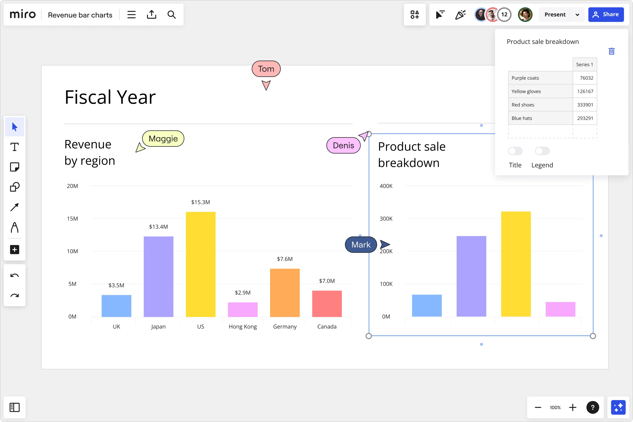
With Miro’s built-in Charts feature, you don’t need to juggle between multiple apps or spreadsheets. Create a bar graph with just a few clicks directly on the canvas. Select it on our left toolbar, pick the bar graph, and add it to your board. Whether you want a single series or a double bar graph maker, Miro makes it fast and intuitive.
Customizable features
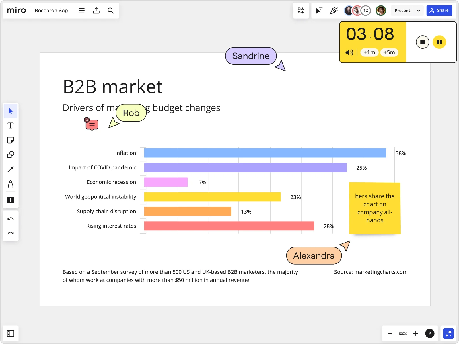
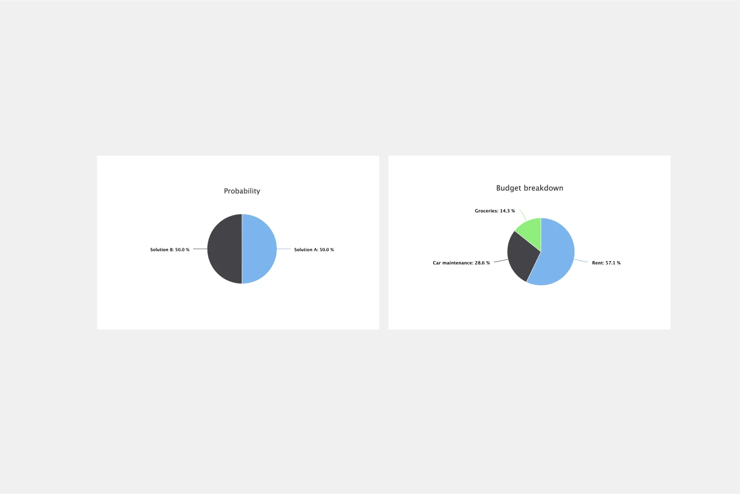
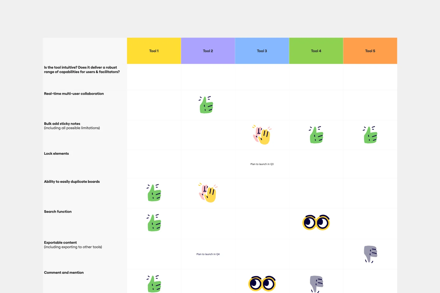
Your charts should tell your story - not the other way around. With our bar graph creator, you can quickly edit titles, descriptions, and legends to clarify your data. Add multiple variables to your bar graph for richer insights, apply contrasting colors, and freely resize your bar graph to fit your presentation. Unlike a blank bar graph maker that forces you into rigid layouts, Miro’s customization features give you the flexibility to create everything from simple bar graphs to complex visualizations.
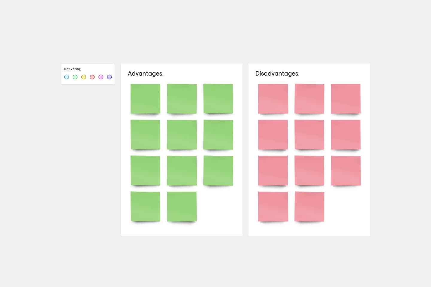
Collaboration that works
With Miro’s online bar graph maker, your team can collaborate seamlessly on the same board, whether in real time or asynchronously. Use sticky notes to add insights, tag teammates for feedback, or record a Talktrack to walk others through your bar chart example. With instant feedback loops and built-in iteration capabilities, you can refine your data story faster than ever.
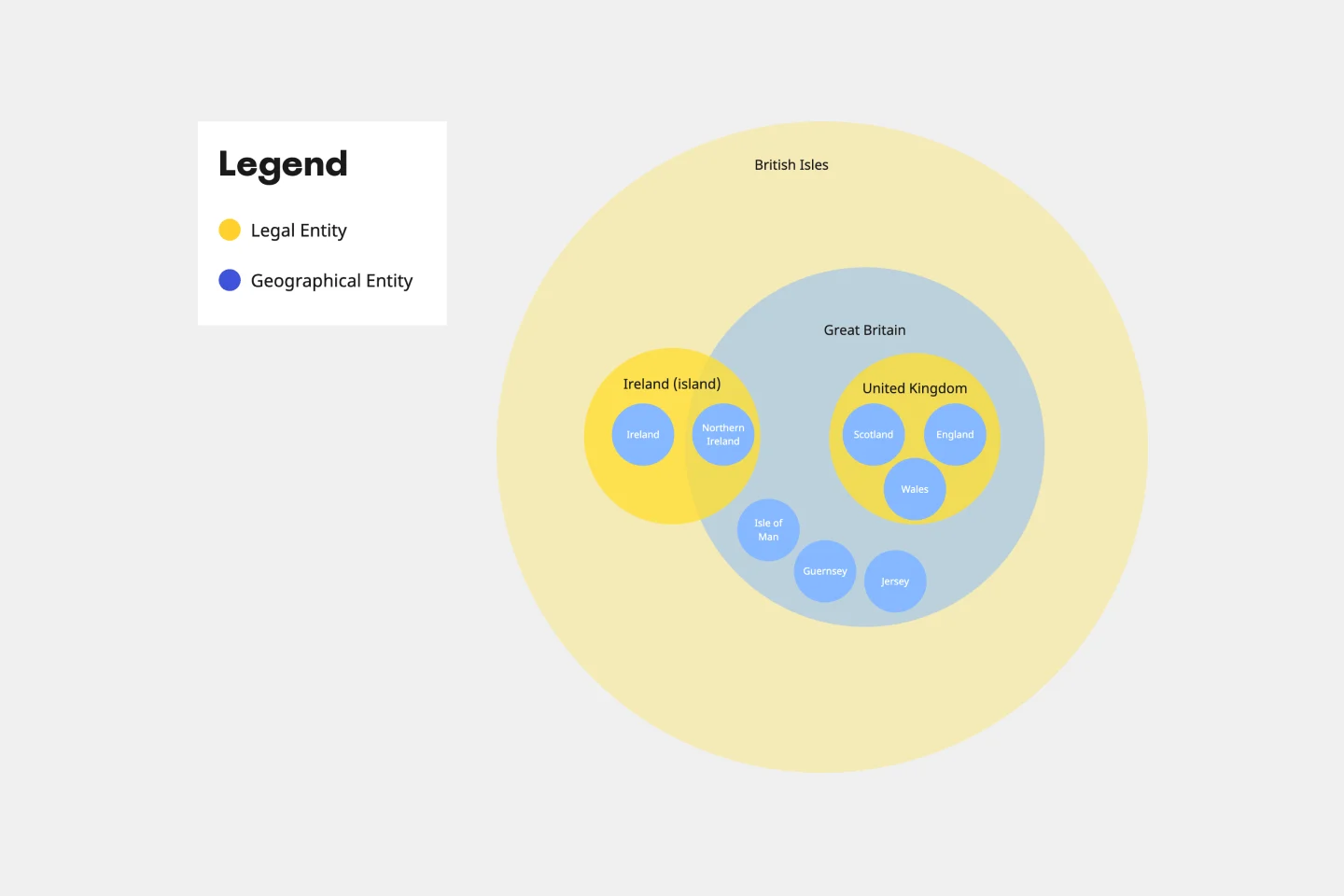
Infinite canvas
Your chart doesn’t need to exist in isolation. Miro’s infinite canvas lets you add any related content to the same board, from diagrams to sticky notes, or multiple other graphs. Create a bar graph free from clutter by keeping references, context, and visuals in one shared workspace. Don’t waste time looking for references elsewhere; make a bar chart quicker with Miro’s bar chart generator.
Presentation mode
Turn your chart into a polished story in minutes. Add your bar graph to frames, switch on presentation mode, and walk your audience through the data with confidence.With Miro’s bar chart generator, you can deliver professional, engaging presentations where visuals and context live side by side - no more fumbling with static slides.
Smarter insights with Miro AI
Miro AI helps you go from raw ideas to structured bar charts in less time. You can quickly generate chart-ready data from sticky notes, cluster themes into categories, or summarize findings into a clear takeaway.
This means your charts will be more than visuals - they become insights your team can act on, together.
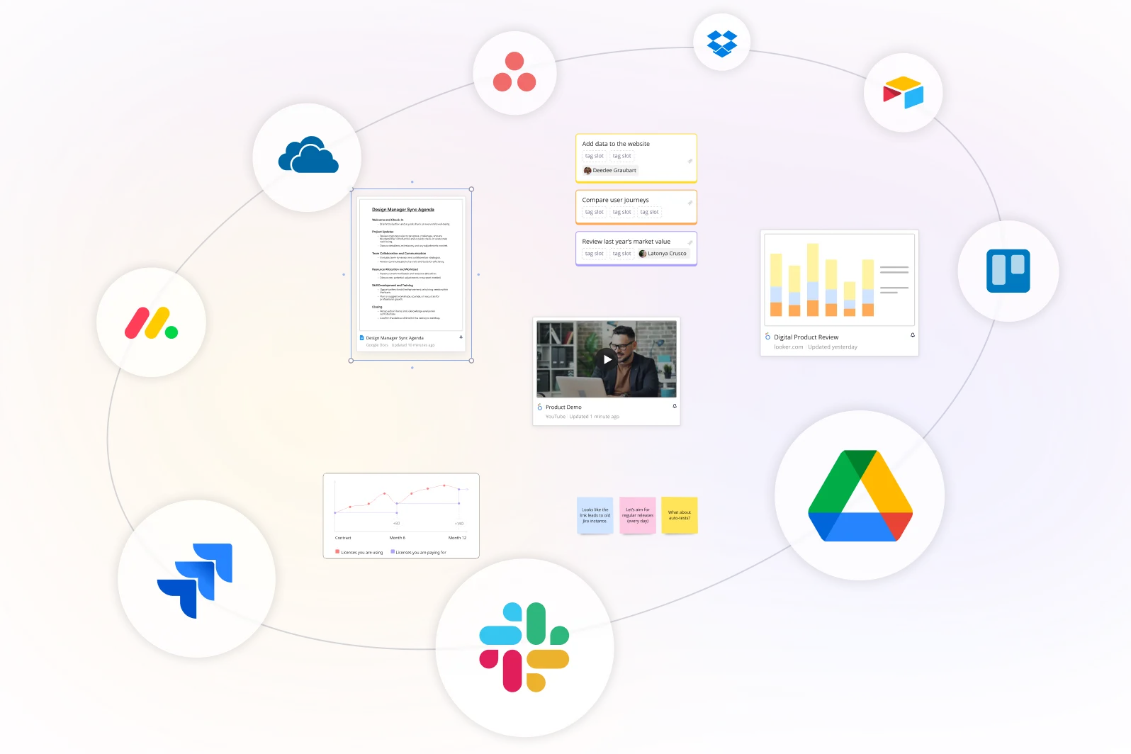
Integrated with your favorite tools
Related templates
How to create a bar graph
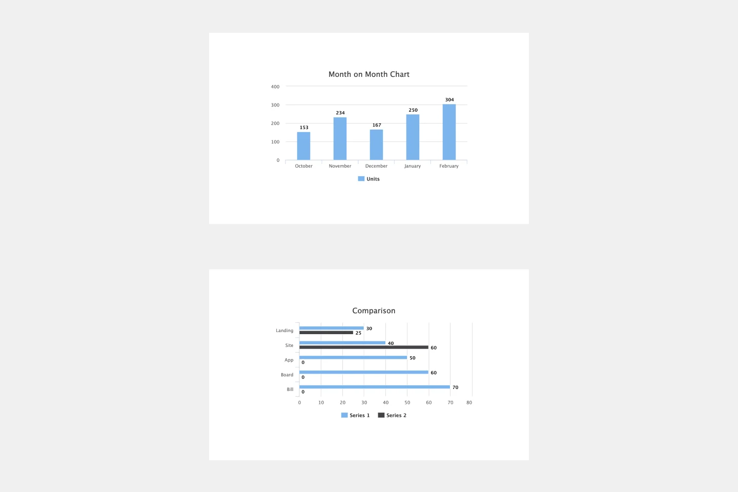
On your Miro board, open the Charts app from the toolbar and select the bar graph option. You can choose between horizontal and vertical layouts depending on how you want to display comparisons.
If your data requires more depth, add multiple series to show side-by-side results - perfect for creating double bar graph examples.
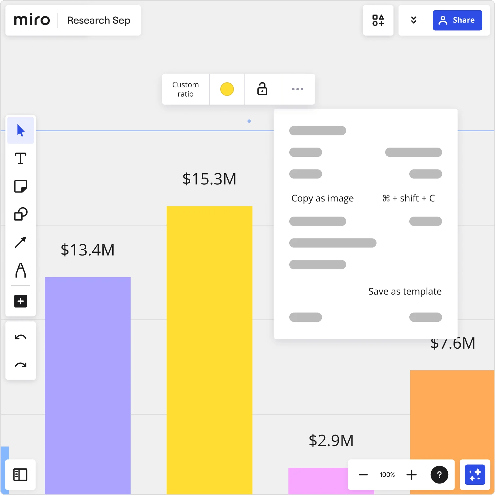
Click on your new chart to open the data editor. Here, you can manually enter values, paste data directly, or import a CSV file to save time. As you add numbers, your bar chart generator automatically updates the visualization in real time. Fine-tune the details by editing axis labels, adding legends, or changing titles for clarity. Go further with Miro AI and let it clean up your layouts, suggest the most effective chart type based on your data, or summarize key insights.
After editing and customizing your bar graph, you can share it with your team effortlessly. Export it as an image or PDF for report insertion or drop it into frames and use presentation mode to walk your audience through the insights. For collaboration, invite your teammates onto the board and choose whether they can view, comment, or edit in real time or asynchronously.

The world's most innovative companies are collaborating in Miro, everyday
“With Miro, we went from project brief to in-market launch in 10 months. That usually takes 3 years at PepsiCo.”
Caroline de Diego
Senior Manager, Global Design & Marketing Innovation at PepsiCo

“Bringing everyone together to plan in Miro means the most impactful initiatives will happen at the right time.”
Lucy Starling
Product Operations Lead at Asos

“The team onboarded in 10 minutes to use Miro for workshops. Getting our organization to adopt this product was a no-brainer.”
Konrad Grzegory
Agile Transformation Lead at CD PROJEKT RED

“Miro templates helped us go from scratch to a full-fledged plan where we mapped activities, ideas, and dependencies.”
Marc Zukerman
Senior Director of Project Management at Hearst

“Miro allows all our teams to align themselves with certain tools and models: they work independently and create products that really meet our customers' needs.”
Luke Pittar
Sustainability Innovation & Design Coach at The Warehouse Group

“To be truly innovative, everyone needs to have a voice, and everyone needs to be able to iterate on each other’s ideas. Miro has made that possible for us.”
Brian Chiccotelli
Learning Experience Designer at HP

Users love Miro for end-to-end innovation. We're the G2 leader in visual collaboration platforms and are rated in the top 50 enterprise tools. Miro helps large companies get meaningful work done.
Top 50 Products for Enterprise
G2 reviews

Bar graph maker FAQs
How do a bar graph and histogram differ?
A bar graph displays data related to categories, while a histogram shows how numerical data are distributed. A bar graph can be used to show how many speakers each language has worldwide, comparing data through categorial grouping. A histogram can be used to show how many people received a particular grade on an English test, highlighting how this variable data is distributed. It’s important to note that a bar graph is not a histogram; they serve different purposes and show data differently.
How do you make a bar graph with multiple variables?
If you are using Miro’s graph maker, when editing your bar graph inside the Charts tool, click enter to add extra columns to represent more variables. You can add as many variables as you’d like, and if you need more information on how to create a bar graph, please check our Help Center article.
How does Miro help my team collaborate on bar graphs?
Miro makes chart creation collaborative by design. With our online bar graph maker, teammates can co-create visuals on the same canvas, leave comments directly on data points, and use Talktracks to record walkthroughs for async feedback.
Are there templates or examples for bar graphs in Miro?
Yes! Miro provides a wide range of templates, including ready-to-use bar graph examples that save time and spark ideas. You can also browse Mirovers, our community-driven library where thousands of teams share their own chart templates from simple bar graph makers to complex multi-series comparisons.
Is Miro’s bar graph maker easy to use?
Miro is designed to be an easy bar graph maker, requiring no design experience. Simply select the chart tool, input or import your data, and customize the look with labels, legends, and colors. Move even faster with Miro AI; tidy layouts, suggest visuals, and summarize insights.
Is Miro’s bar graph maker free?
Yes, Miro offers a free bar chart maker option for individuals and small teams who want to create a bar graph online without the cost. For advanced features like unlimited boards, extra integrations, and expanded AI credits, you can upgrade to a paid plan.
Can I use Miro AI for bar graphs?
Yes, Miro AI can help you create bar graphs. Use it to automatically tidy your chart layout, suggest the best type of graph for your dataset, or summarize insights so your team is aligned, quickly.
Can Miro handle complex or large-scale bar graphs?
Absolutely! Miro scales effortlessly, making it more than a simple bar graph maker. You can create everything from quick bar chart examples to complex graphs using our double bar graph maker option. With our infinite canvas, you can display multiple charts side-by-side, combine them with diagrams, and keep references nearby.
How does Miro connect with the tools we already use?
Miro integrates with over 160 apps, including Google Sheets, Jira, Confluence, Asana, and Tableau. This means you can pull data directly into your online bar graph maker, keep information synced, and connect your visuals to the tools you use every day.
How secure is my data when creating bar graphs in Miro?
Enterprise-grade security is what holds Miro together, protecting your charts and data so you can collaborate safely and securely. You can control who accesses your graphs with robust permissions and domain restrictions, ensuring only people you choose can view or edit your visualizations.