
How do you measure the value of a product that’s redefining teamwork? The first step is understanding how users are naturally leveraging the platform to get their work done. At Miro, our product is a visual platform for innovation that allows users to interact with each other on an infinite canvas, doing everything from brainstorming new ideas to tracking projects to completion.
We set out to examine our users’ behavior on our platform and develop a deeper understanding on how they work with each other. Getting a grasp on how collaboration looks is important for two reasons: it helps us hone our analytics so we can provide more value to our users, and it also helps admins (especially at larger companies) understand the value that Miro brings to their teams.
The challenge: how do you measure collaboration?
Patterns of collaboration are always changing, which makes it challenging to visualize and understand. We already know that teams in Miro expand as their companies grow, and as more people at the company adopt the product. So, we asked ourselves: what if we can view these interactions as a social network? All users are connected to each other through the boards where they collaborate, so maybe we could simply take various events — such as when a board loads, or a widget is created — and construct a graph. We can monitor how the graph changes over time, as more teams use Miro to collaborate with each other, to see how the patterns of collaboration also evolve.
In addition to graph visualization, we also used page rank and clustering coefficients to discover other insights about teamwork.
A technical dive into graph visualization
Graph visualization is a really interesting and complicated problem. Initially, we have information only about edges of the graph (who is connected with whom), but we need to somehow translate this structure into 2D/3D space.
We did this using force-directed graph drawing. With this concept, we consider a force between any two nodes. The edges are represented by springs between the rigid metal rings as nodes. The attractive force is analogous to the spring force, and the repulsive force is analogous to the electrical force. The basic idea is to minimize the energy of the system by moving the nodes and changing the forces between them, until the system reaches its equilibrium state.
Graph visualization: measuring collaborative connections
To begin, let’s take a look at a software company with more than 1,000 employees and 10 offices around the world.
8 months and 150 users: Dispersed, small-team collaboration
In this first graph, the company has been using Miro for eight months. Each node represents an individual active user. If the nodes are connected, it means there is at least one common board in which both users are active. The color of the nodes tells us how many collaborative sessions the user had. Red is the most active.
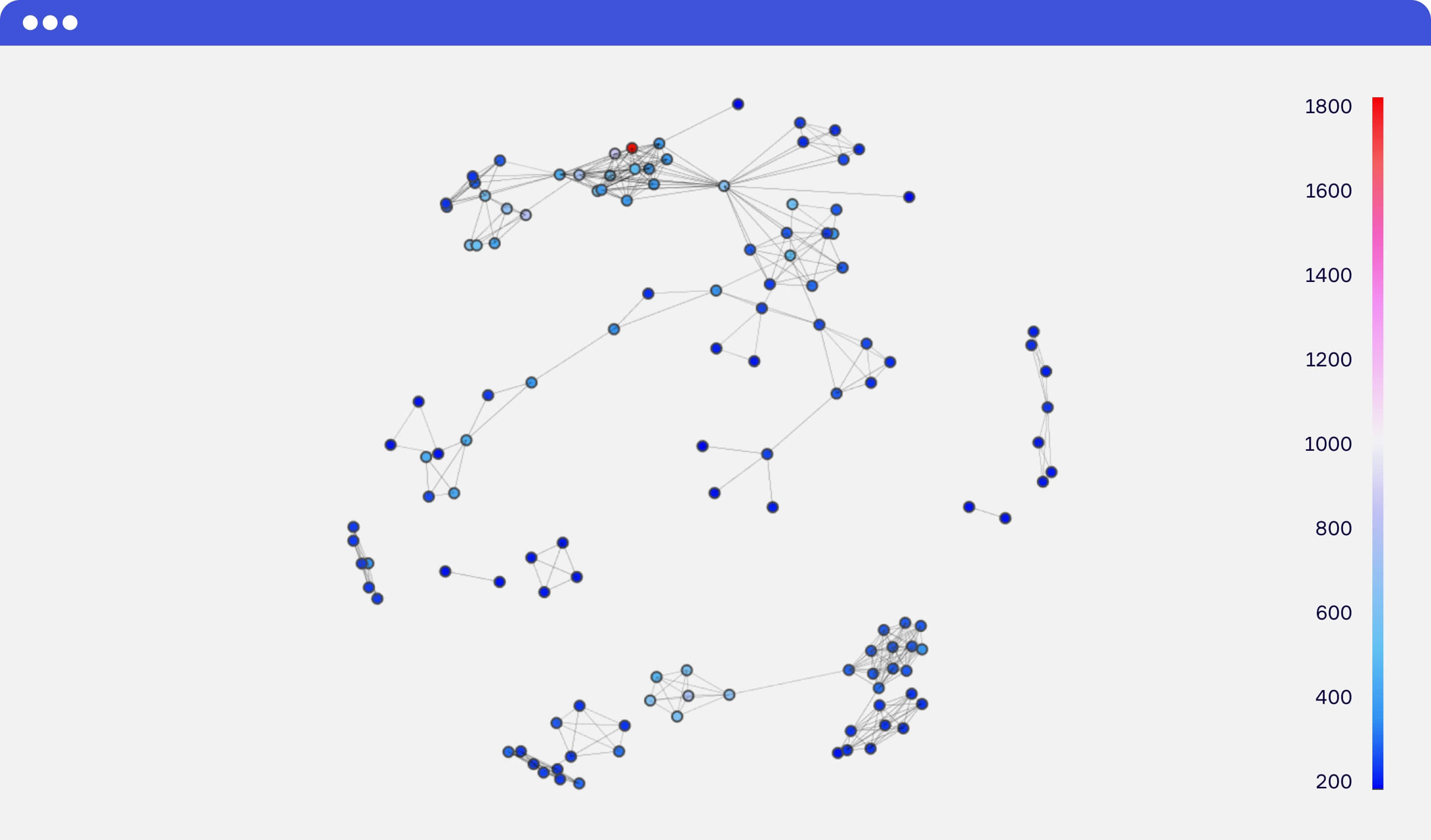
At this point, we see clusters of collaborating small teams without much cross-collaboration between them. So these clusters tend to be dispersed across the space and the graph doesn’t have a pronounced “core.”
12 months and 300 users: Centralized collaboration, with a common core
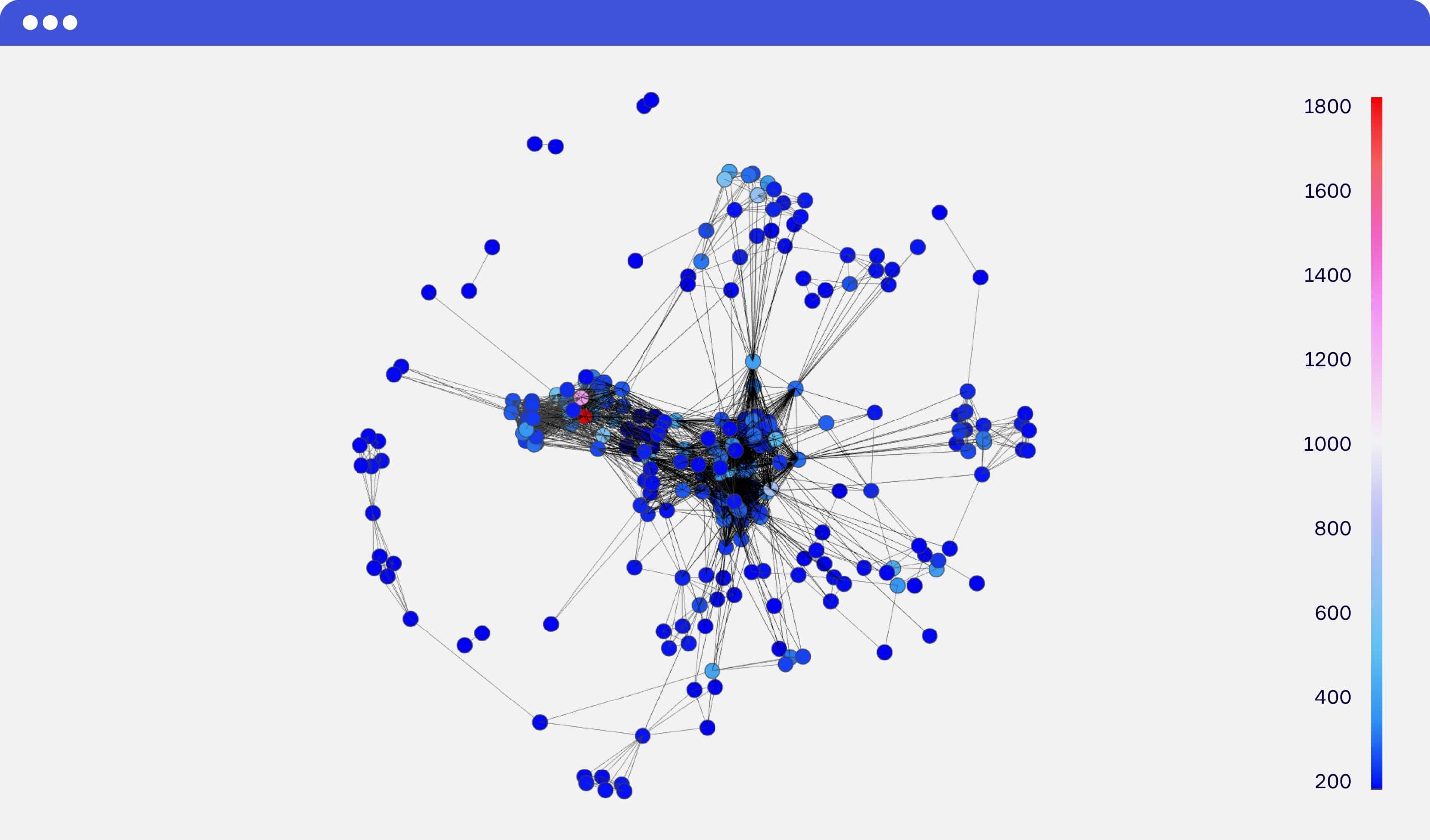
Collaboration graph #2 — approximately 2 months later (you can see the interactive plot here).
Now the company has had a chance to unite under one main account, with multiple teams. In the graph, you can see big clusters in the center, which can tell us that more and more people in the company are using Miro together. But how are they using it? Who are the super users? The connectors? We can start to characterize the clusters by looking at job titles.
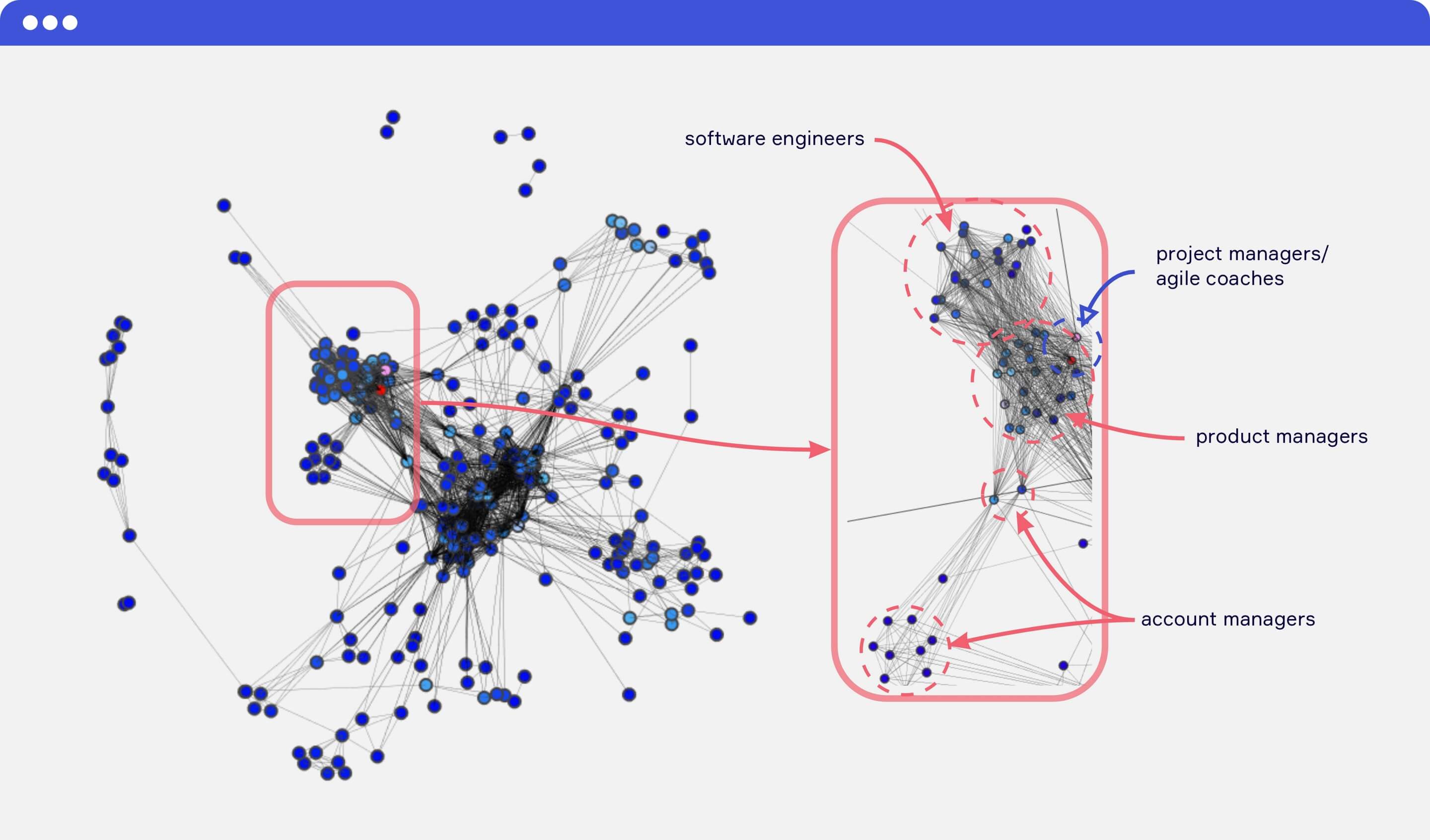
Let’s start with the super-users. Zeroing in on the two red dots that highlight the most active users, we can see that they are agile coaches. This makes sense; distributed agile teams use Miro to stay aligned, and maintain a feedback loop. Agile coaches play a particularly cross-functional role as mentors and facilitators that consult with multiple teams to create and establish a sustainable process.
But what about the rest of the product development loop? Looking at the cluster around the agile coaches, we see an intense connections between product managers and software engineers, who are continually working together in iterative sprints. In Miro, their boards are often centered around frameworks like user story mapping, sprint planning, and retrospectives that involve inputs from multiple members of the development team.
We also see some less intense but equally important connections between product managers and account managers. Whether it’s feature requests from customers or staying in the loop on the product roadmap, account managers sit at the bi-directional apex between the development team and the customers they’re developing for.
Page rank: measuring who is the most connected
In the graphs above, we determined collaborative connections by looking at the number of actions taken by specific pairs, based on their user roles. But there is another way to get insights about collaboration by using only the graph structure: we can use page rank and clustering coefficients to see which users are the most connected.
In the context of collaborative work, a high page rank will have users who connected with a large number of other users either directly or indirectly.
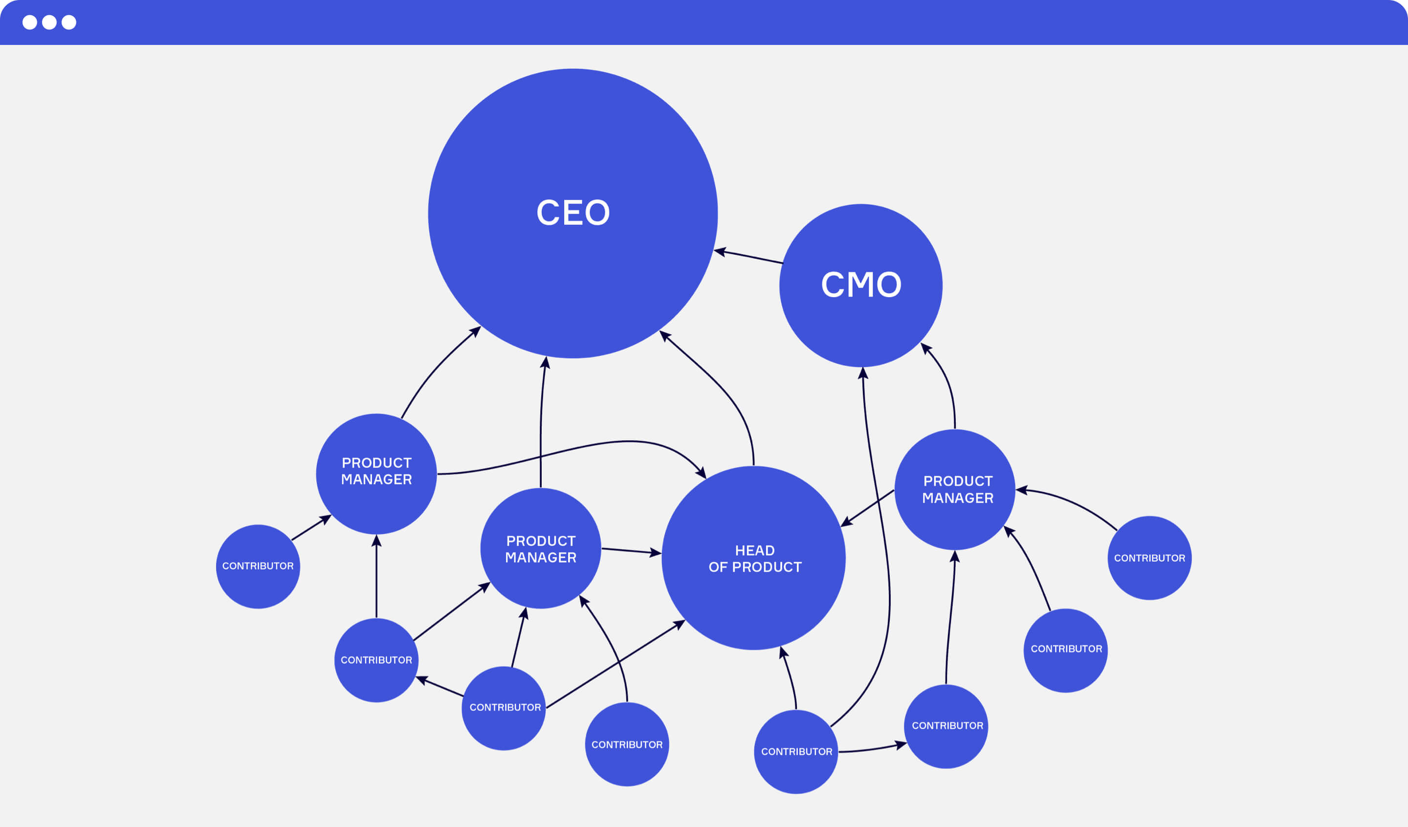
Example of company’s structure, where the circle radius is proportional to the estimated “page rank”.
Interestingly, our experiments showed that users with the highest scores often turn out to occupy higher positions in their companies.
So knowing the page rank of each user, along with the number of sessions, boards and etc., we can better understand who could be a decision-maker or internal champion for Miro in the represented team at that particular moment. This is important for our internal teams, so we can better serve our customers.
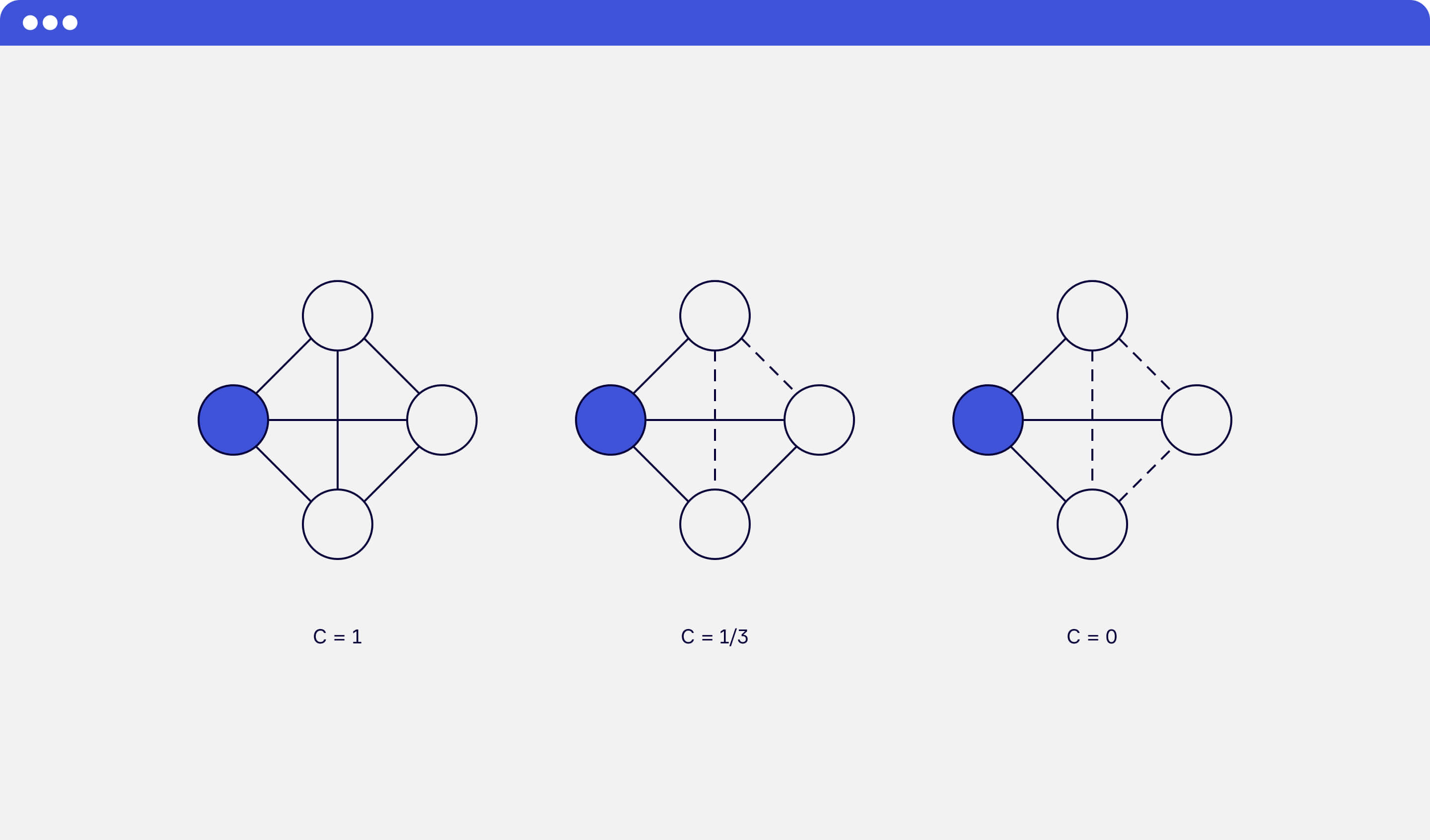
Clustering coefficient: measuring a team’s health
With a clustering coefficient, the local clustering of each node is the fraction of triangles that exist over all possible triangles in its neighborhood at a given time. The average value of these clustering scores is the clustering score of the whole graph — which represents the team.
Furthermore, we can measure the dynamics of the team’s collaboration score. But the result depends on the time frame when the graph has been built. Looking at how different teams use Miro, we saw how teams often hold weekly planning meetings or monthly retrospectives, and collaborate asynchronously.
So, it takes a while to form the collaboration structure of the team and prevent the score from dropping when the team has taken a brief break from collaborating. With those patterns in mind, we decided to use a timeframe of four weeks and build new graph for every team after each week.
Here is the visualization of collaboration scores of two “real” teams, changing over approximately one year:
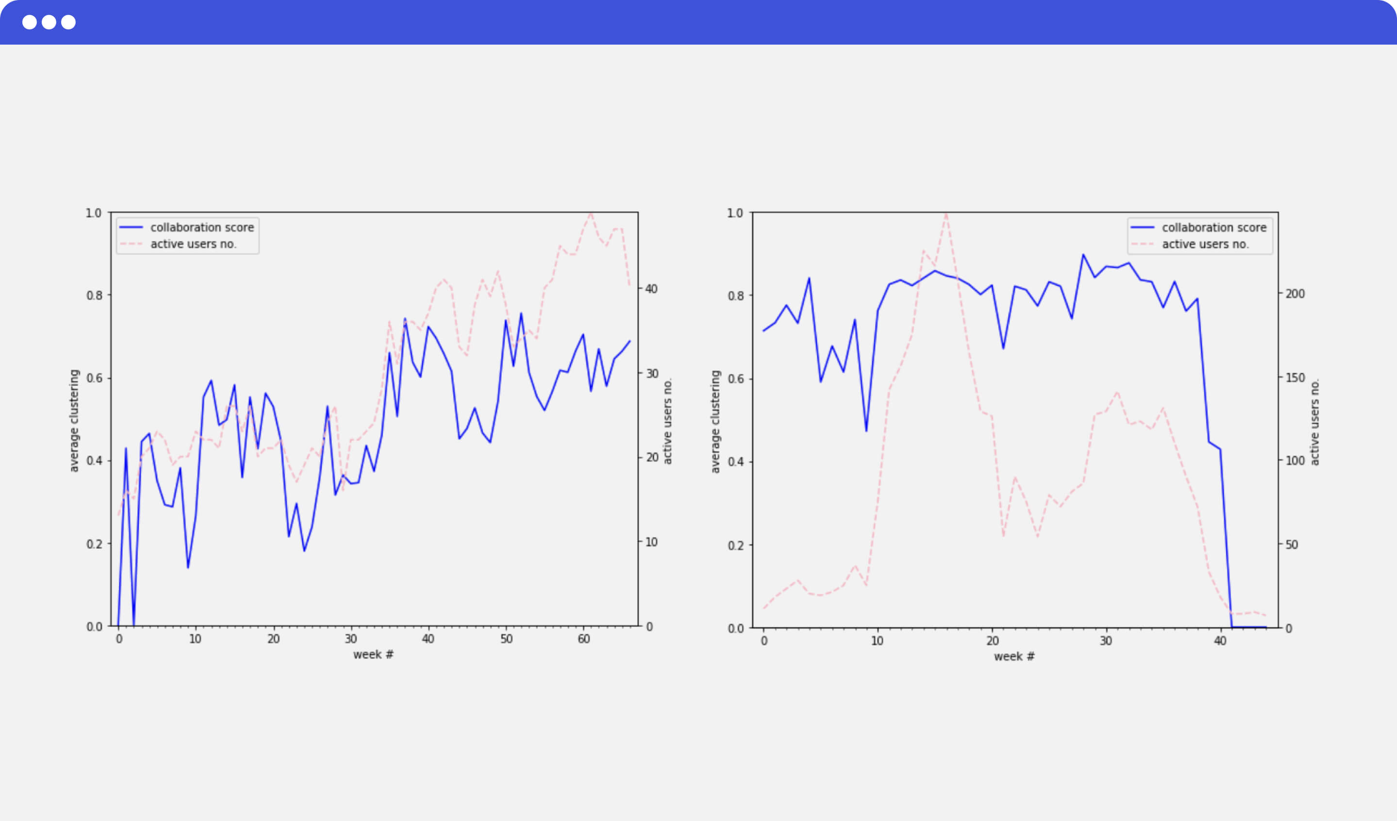
Examples of clustering score changing over time.
On the left, you can see that the team is growing both in terms of active users and collaboration intensity. Although the growth is slow, the long-term overall trend is good.
On the right, you see a team with a consistently high collaboration score from the start. And you can also clearly see that the score didn’t drop even when the number of active users dropped significantly on the ~20th week. So, we landed on this metric as something that could be used as one of the principal dimensions of account’s health.
Over time, a collaboration graph can serve as a really good representation of a company’s working processes. It’s informative, easy-to-build, and can be one of the main sources of insights for all collaboration-centered products.