Table of contents
Table of contents
Low-fi vs. high-fi wireframes: When to use which
Summary
In this article:
- The real cost of getting fidelity wrong – Why polishing too early triggers aesthetic feedback instead of strategic validation, and the actual time economics of fidelity choices (low-fi: 15-30 min per screen vs. high-fi: 4-8 hours per screen)
- Understanding the fidelity spectrum – What low-fidelity and high-fidelity actually mean, plus the resource trade-off framework (low-fi buys speed; high-fi buys clarity)
- The decision matrix—when to use which – Specific criteria and a simple decision tree for choosing the right fidelity based on your uncertainty level, project phase, and stakeholder needs
- The hybrid approach—moving fast without compromise – How to strategically mix fidelity levels and use progressive refinement to validate fast while maintaining stakeholder confidence
- How Miro accelerates the entire process – Why visual workspaces enable 20x faster iteration, how AI-powered wireframing accelerates concept-to-validation, and how unified collaboration eliminates context loss between teams
Low fidelity and high fidelity wireframes
You know the feeling. Your team spends three weeks building a high-fidelity prototype with polished interactions, real copy, and pixel-perfect components. But when you show it to users, you realize the whole flow is backwards. The task order is confusing, and users leave by step two.
Now you’re facing a tough reality: all those hours spent on colors, micro-interactions, and button styles are wasted. You have to start over, the launch date is the same, and your team is already burned out before the real work even starts.
Here’s the thing, design leaders don’t talk about enough: most wireframing failures aren’t design failures. They’re resource allocation failures. Teams choose the wrong fidelity at the wrong time, then pay for it in delayed launches, scope creep, and endless revision cycles.
This isn’t a creativity problem. It’s an economics problem.
The level of wireframing fidelity affects how fast you learn, how quickly you can make changes, and whether your design budget goes toward finding user needs or just making guesses look good. Choosing the right fidelity moves your project forward. The wrong choice leads to more rework.
This guide explains when to use low-fidelity or high-fidelity wireframes, depending on your project phase, what your stakeholders need, and your team’s goals. You’ll get a clear framework that matches fidelity to your level of uncertainty, so you can focus on what matters and avoid unnecessary polish.
The real cost of getting fidelity wrong
The “pretty trap”
Your designer presents a gorgeous prototype. The navigation flows smoothly. The animations are buttery. The color palette perfectly captures your brand. Your stakeholders lean in, impressed.
Then they start talking about button placement. Whether the logo should be slightly larger. If that particular shade of blue feels “trustworthy enough.” Nobody mentions the user flow. Nobody questions whether this solves the actual problem.
This is the pretty trap, and it can cost you weeks.
When teams use high-fidelity too soon, stakeholders focus on what they see, not what’s important. Polished designs get comments on looks, while simple gray boxes get feedback on strategy. You wanted feedback on your checkout flow, but instead you get opinions about font weights.
The problem gets worse. Your designer spent six hours perfecting the checkout screen. It looks great and feels done. But user testing shows no one understands step three. Fixing it means redoing the whole flow. Now, the designer sees those six hours about to be erased, and every new suggestion feels personal.
This is sunk cost fallacy in action. Polish creates emotional attachment. Emotional attachment creates resistance to change. Resistance to change kills the iteration cycles that produce great products.
Real numbers: teams that polish too early experience 2-3x longer iteration cycles. Not because the work is harder. Because changes feel expensive, so teams avoid them.
The sketch confusion
The opposite problem can hurt projects just as much.
Your design team presents rough wireframes to your executive steering committee. Gray boxes. Lorem ipsum. Placeholder images labeled “hero shot goes here.” You explain the user flow enthusiastically, gesturing at rectangles.
Your CFO squints at the screen. “So… what does it actually look like?”
You explain it’s early stage. You’re validating logic before investing in visual design. This is best practice. This is smart resource allocation.
Your CFO looks unconvinced. “Can you mock up what it might look like? Just so we can visualize it?”
What they really mean is, “I can’t approve a budget for something I can’t picture.” This creates a bottleneck, extends the timeline, and kills momentum.
This happens because different stakeholders need different levels of detail to make decisions. Engineers can use low-fidelity wireframes since they focus on logic, not looks. Executives who approve budgets need to see the value, and rough sketches don’t inspire confidence for big investments.
The economic reality
Here’s what fidelity actually costs:
A low-fidelity wireframe screen takes 15-30 minutes. You’re working fast, sketching layouts, testing hierarchy, validating flow logic. You can create 10 variations in an afternoon.
A high-fidelity wireframe screen takes 4-8 hours. You’re selecting real images, writing actual copy, applying brand guidelines, defining component states, ensuring pixel-perfect consistency. You can create 1-2 screens in an afternoon.
The numbers are clear. If you use high-fidelity for early exploration, you’ll test only one idea instead of ten. You might spend eight hours perfecting a concept that user testing could reject in just eight minutes.
That’s why choosing fidelity is about managing resources, not just style. You have limited design hours, budget, and time. Every hour spent polishing an untested idea is an hour you could have used to find out what users really need.
The real question isn’t which fidelity is better. It’s which resource matters more right now: speed or clarity?
If you’re unsure about the solution, focus on speed. If you’re confident in the solution, focus on clarity.
Understanding the fidelity spectrum
What low-fidelity actually means
Low-fidelity wireframes are the design equivalent of thinking out loud.
Visually, they’re simple: boxes representing content areas, basic shapes for UI elements, grayscale or minimal color, placeholder text, rough icons or simple symbols. They look unfinished because they are unfinished. That’s the point.
What you’re actually communicating with low-fidelity wireframes isn’t “here’s what it will look like.” It’s “here’s how information flows, here’s the content hierarchy, here’s how users move through the experience.”
You’re testing logic, not aesthetics. The speed advantage is significant. You can sketch 10 different navigation approaches in the time it takes to perfect one. You can test three onboarding flows with users before lunch. You can throw away ideas that aren’t working without feeling like you’re deleting valuable work.
Best use cases: rapid iteration when you’re still figuring out the solution, testing core assumptions before investing in polish, collaborative brainstorming where non-designers need to contribute, any scenario where your uncertainty level is high.
What high-fidelity actually means
High-fidelity wireframes are the design equivalent of making a commitment.
Visually, they’re detailed: actual copy instead of Lorem ipsum, real images or carefully selected stock photos, brand colors and typography applied correctly, specific spacing and alignment, interactive elements with defined states, realistic data and content.
They look finished because they’re meant to represent the final product. That’s the point.
What you’re communicating with high-fidelity wireframes is “here’s exactly what users will see, here’s precisely how this interaction works, here’s the spec developers need to build this.”
You’re providing clarity, not exploring options. This clarity is important. Stakeholders see exactly what they’re approving, and developers get precise requirements without having to guess about spacing or interactions.
Best use cases: developer handoff when you’re ready to build, testing specific UI interactions and micro-animations, executive presentations where vision needs to be crystal clear, final validation before launch, any scenario where your uncertainty level is low.
Quick reference: Low-fi vs. high-fi at a glance
Here's everything you need to know about low-fidelity versus high-fidelity wireframes in one place. Use this when you're mid-project and need a quick sanity check on whether your fidelity choice matches your current needs.
Low-fidelity vs. high-fidelity wireframes: Quick reference guide
Dimension | Low-Fidelity (Speed) | High-Fidelity (Clarity) |
Factor | Low-Fidelity Wireframes | High-Fidelity Wireframes |
Time per Screen | 15-30 minutes | 4-8 hours |
Primary Purpose | Testing logic and user flow | Providing specifications and clarity |
Visual Elements | Gray boxes, placeholder text, basic shapes | Real copy, brand colors, actual images, detailed interactions |
Best For | Discovery, exploration, rapid iteration | Development handoff, executive presentations, final validation |
Uncertainty Level | High - still figuring out what to build | Low - validated approach, ready to execute |
Change Cost | Minutes to revise entire flows | Hours to days for significant changes |
Stakeholder Feedback | Strategic (flow logic, user needs) | Tactical (colors, spacing, specific interactions) |
Collaboration | Everyone can contribute (PMs, engineers, researchers) | Primarily designers and developers |
Emotional Attachment | Low - easy to discard and iterate | High - team invested in polished work |
Typical Project Phase | Discovery, Define, early Design | Late Design, Develop, Deliver |
Testing Focus | Does the flow make sense? | Do the specific interactions work? |
Documentation | Conceptual direction and flow logic | Complete technical specifications |
Iteration Speed | Test 10 ideas in one week | Test 1-2 ideas in one week |
Risk of Premature Polish | None - designed to be rough | High - if used before validation |
Key Question Answered | Should we even build this feature? | How exactly do we build this feature? |
Resource You're Optimizing | SPEED - learn faster, iterate rapidly | CLARITY - align stakeholders, specify details |
The pattern is clear: low-fidelity optimizes for learning speed when uncertainty is high. High-fidelity optimizes for execution clarity when uncertainty is low. Everything else is just details.
The resource trade-off framework
Every fidelity decision is a trade-off between two valuable resources:
Low-fidelity buys you SPEED. You iterate rapidly, test more variations, pivot without drama, keep the entire team contributing ideas. Changes take minutes. Exploration feels free. Nobody’s emotionally attached to throwaway sketches.
High-fidelity buys you CLARITY. You align stakeholders on specific implementation, provide developers with precise specifications, validate exact UI interactions, present confident vision to executives. Misunderstandings disappear. Approvals happen faster. Everyone sees exactly what they’re getting.
Neither is “better.” They’re different resources optimized for different problems.
When your uncertainty is high—when you’re still figuring out what to build, when user needs are unclear—you need speed more than clarity. When your uncertainty is low—when you’ve validated the approach, when you’re ready for development—you need clarity more than speed.
The real mistake isn’t choosing the wrong fidelity. It’s not matching the fidelity to how certain you are right now.
The decision matrix—when to use which
Use low-fidelity when…
Discovery phase: You’re still figuring out what to build
You’re in the messy beginning. Multiple solution approaches seem viable. User needs are partially understood but not fully validated. Your team is debating whether this feature even solves the right problem.
This is exactly when low-fidelity saves you.
The situation: exploring different ways to solve a user problem, testing assumptions about what users actually need, validating that this feature deserves investment.
Why low-fidelity wins: You need to test 5 different user flows without investing weeks in each. You want feedback on concepts, not execution. You’re optimizing for learning speed, not presentation quality.
Real example: You’re building a new onboarding experience. You’ve identified three potential approaches: progressive disclosure (show features gradually), guided tour (walk users through key features immediately), or job-to-be-done selection (users choose their use case first, get customized onboarding).
In high-fidelity, you’d pick one approach to build first—a guess that costs 2-3 weeks of design work. In low-fidelity, you sketch all three in an afternoon, test with 15 users over two days, and discover which reduces drop-off.
You just saved four to six weeks that would have gone into building the wrong thing.
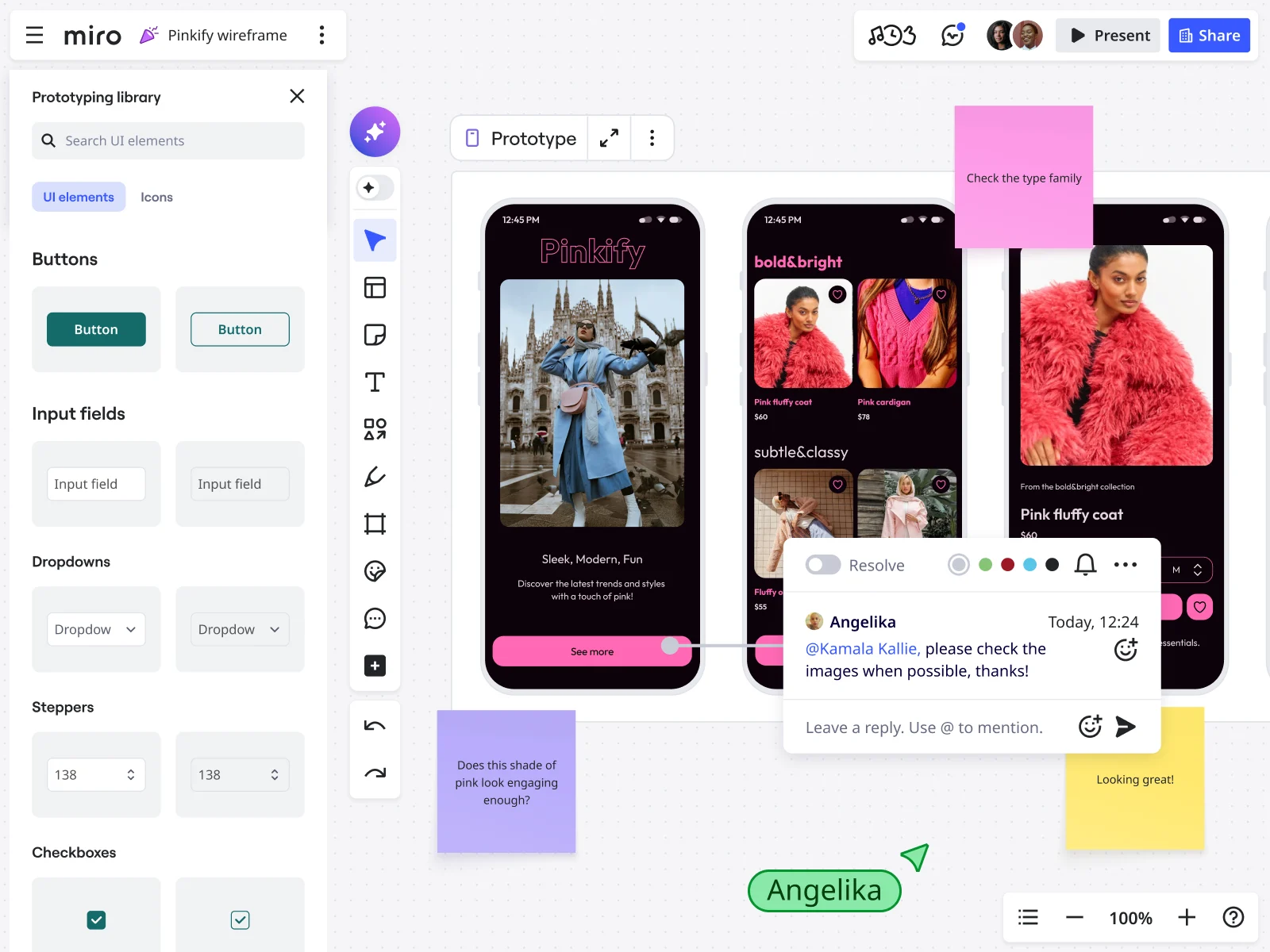
Start with Miro’s wireframing capabilities to map multiple solution approaches at the speed of thought—then test them before committing resources to the wrong one.
Logic validation: Testing if the flow makes sense
You have a concept. Now you need to know if it actually works before investing in making it beautiful.
The situation: shopping cart flow redesign, checkout process optimization, complex form simplification, multi-step workflow where users currently drop off.
Why low-fidelity wins: Users focus on the journey, not the interface polish. Low-fidelity reveals flow problems that high-fidelity often masks. When designs are polished, users are more forgiving of logical inconsistencies—they assume the finished appearance means someone thought this through.
Cross-functional brainstorming: Including non-designers
Your best ideas don’t come from designers working in isolation. They come from product managers who understand business constraints, engineers who know what’s technically feasible, researchers who’ve talked to users.
But most design tools exclude these voices. Non-designers can’t contribute when everything requires pixel-perfect precision.
Low-fidelity solves this.
Why low-fidelity wins: Non-designers contribute ideas without feeling intimidated by design tools. Your engineer can’t create components, but they can definitely draw a box and write “API call happens here.” Your product manager can sketch “what if we moved this step earlier?”
Everyone has permission to contribute because low-fidelity doesn’t require special skills.
With Miro’s AI features, your team can even generate initial wireframe concepts from text descriptions, then collaboratively refine them—democratizing the design process further while maintaining that crucial speed advantage.
Use high-fidelity when…
Deliver phase: Ready for development handoff
User flow: validated. Design direction: approved. Technical feasibility: confirmed. You’re ready to build.
Now you need high-fidelity.
Why high-fidelity wins: Developers need exact specifications. What’s the padding on that button? What happens on hover? What’s the error state messaging? Low-fidelity can’t answer these questions. High-fidelity must.
Specific needs: Component libraries showing all states (default, hover, active, disabled, error, loading), interaction specifications detailing animations and transitions, responsive breakpoints showing how layouts adapt, exact spacing, typography, and color values.
Executive/investor presentations: The “wow” factor matters
You’re not testing usability. You’re selling vision.
The situation: board meetings where strategy needs approval, investor pitches where funding depends on product vision, executive steering committees where budget decisions happen.
Why high-fidelity wins: Decision-makers need to visualize the end product to approve significant investment. A rough sketch doesn’t inspire confidence in a $2M development budget. A polished prototype demonstrates that you’ve thought this through.
The reality is that presentation fidelity affects how quickly you get approval. A beautiful prototype is approved faster than wireframes that require people to imagine the final product.
Testing specific UI interactions: Details matter
You’ve validated the overall flow. Now you need to know if the specific interface elements work as intended.
Why high-fidelity wins: Users can’t evaluate interaction quality from gray boxes. Does that loading spinner provide adequate feedback? Does the error message clearly explain what went wrong? These questions require high-fidelity to answer.
Late-stage validation: Confirming before launch
You’re weeks from production release. This is your last chance to catch issues when fixes are still cheap.
Why high-fidelity wins: You’re looking for the small problems that only appear in detailed implementation. Alignment issues. Inconsistent spacing. Labels that get cut off at certain viewport widths. Finding these now prevents expensive post-launch fixes.
Decision framework summary
Before you open your design tool, answer one question: What’s my current uncertainty level?
Simple decision tree:
- Are you still exploring what to build? → Low-fi
- Have you validated the user flow works?
- No → Stay low-fi
- Yes → Continue
- Do you need development-ready specifications? → High-fi
- Are you presenting to executives for approval? → High-fi
- Are you testing micro-interactions? → High-fi
- Everything else? → Start low-fi, increase fidelity as certainty increases
Your uncertainty level changes as you test, learn, and validate. As you become more certain, you should increase fidelity, but not before.
The hybrid approach—moving fast without compromise
Why pure approaches often fail
Using only low-fidelity creates a problem: stakeholders can’t see how your brand fits the solution. Using only high-fidelity causes the opposite issue: changes become expensive, so teams avoid making them.
The reality: most projects need different fidelity levels for different parts of the design, based on what’s certain versus what’s still exploratory.
Strategic fidelity mixing
The approach that works best is to use high-fidelity where you’re sure, and low-fidelity where you’re still exploring.
Example: E-commerce product page redesign
You’re redesigning how users browse products. Your navigation and header are established patterns—you’ve tested them, users understand them, they’re not changing. Your content layout is experimental—you’re testing three different ways to organize product information.
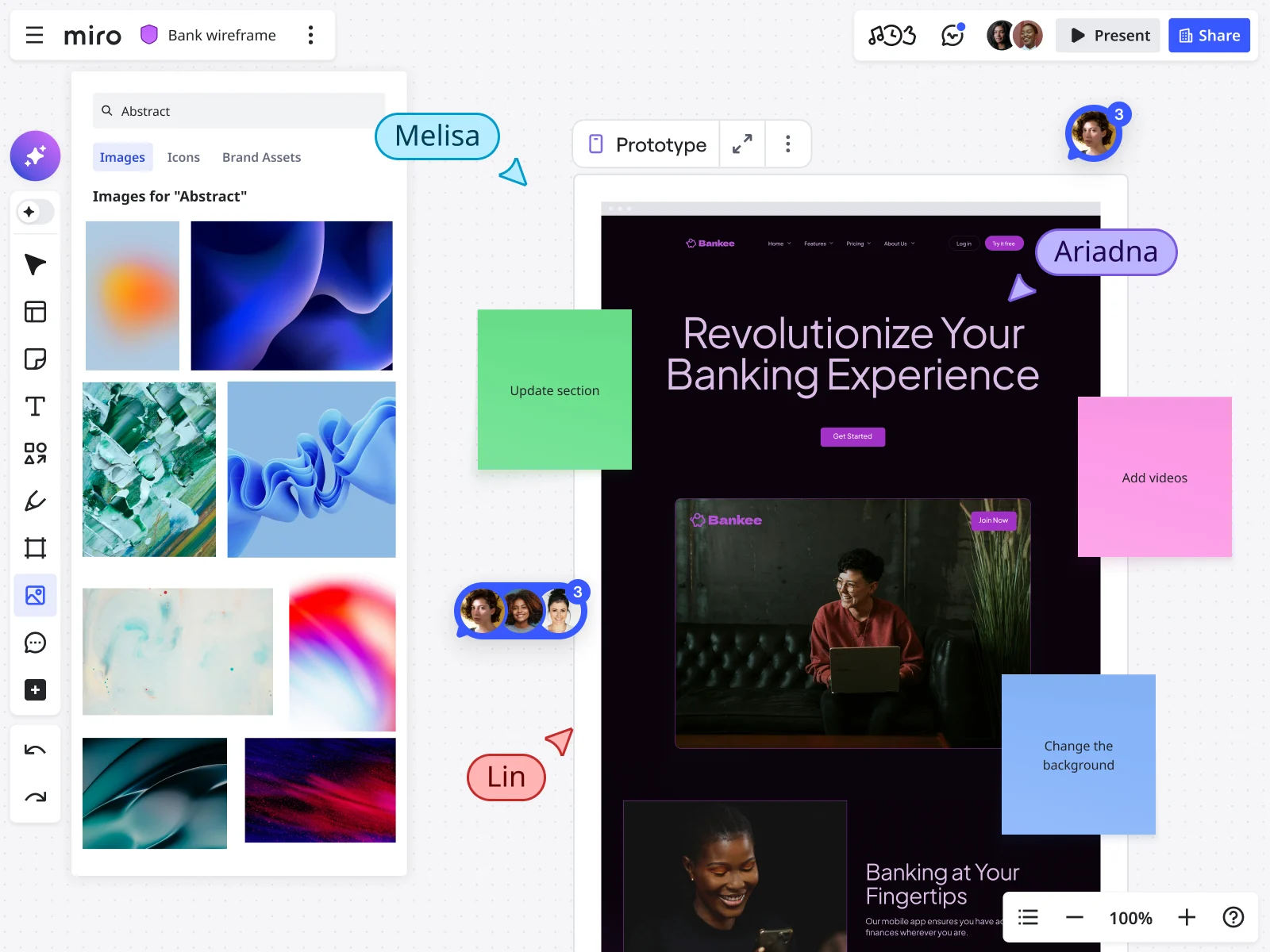
Hybrid approach: Create high-fidelity header and navigation (shows stakeholders the branded experience). Create low-fidelity content blocks in multiple variations (tests different information architectures quickly).
Result: Stakeholders see brand consistency and understand the overall experience. You iterate rapidly on the uncertain elements without rework. Time saved: 60-70% compared to making everything high-fidelity.
Progressive fidelity in practice
Here’s the actual workflow that keeps teams moving fast:
Phase 1: Start everything low-fidelity Sketch ten variations of the main user flow. Test them with users. Find out which one works best. Drop the ones that don’t work—you only spent 30 minutes on each, not days.
Phase 2: Increase validated sections to medium fidelity The winning flow gets real content and proper structure. Still simplified visuals, but actual headlines, real data, specific calls-to-action. Test again to refine.
Phase 3: Polish refined sections to high fidelity After validation confirms the flow works and content is clear, apply full visual design. Brand colors, final typography, polished imagery, detailed interaction states.
This process matches the level of detail to your confidence. You’re not guessing which idea to polish; you let the evidence guide you.
How Miro accelerates the entire process
Speed as competitive advantage
Traditional design tools focus on pixel perfection. But making things beautiful often leads to rigidity.
Changing a high-fidelity flow in traditional tools means updating components across multiple screens, adjusting layouts to maintain visual consistency, ensuring spacing remains perfect. Real time investment: 4-6 hours to revise a 10-screen flow.
The impact on the team is that changes feel expensive. If it takes hours to make updates, teams avoid suggesting changes, even when user feedback shows something isn’t working.
The Miro difference: changing a flow means duplicating a frame and rearranging elements in seconds. No component system to update. No mathematical precision to maintain.
Real time investment: 10-15 minutes to revise a 10-screen flow. Same changes, 20x faster.
Team impact: Changes feel free. User feedback gets implemented immediately because there’s no technical barrier to trying it.
AI-powered wireframing
Miro’s AI capabilities fundamentally change how fast teams can move from concept to validated design:
Generate from description: Describe your concept in natural language—“a dashboard showing project metrics with a sidebar navigation and card-based layout”—and Miro Sidekicks generates initial wireframe structures instantly. This isn’t about AI replacing designers. It’s about accelerating the blank-canvas-to-rough-concept phase from 30 minutes to 30 seconds.
Rapid iteration: Once you have initial concepts, Miro Prototypes helps you quickly generate variations. Testing three different dashboard layouts? Generate all three, compare them side-by-side, test with stakeholders immediately. You’re exploring 10x more options in the same timeframe.
Smart suggestions: As you work, Miro AI suggests improvements to information hierarchy, identifies potential usability issues in your layouts, and recommends pattern libraries that match your use case—essentially giving every designer access to design system thinking without the overhead of maintaining a formal design system.
The key is that AI takes care of the routine parts of wireframing, like generating layouts and creating variations, so your team can focus on strategy, user validation, and making smart decisions.
“Trashable” ideas that keep teams moving
There’s an emotional attachment problem: when designers spend hours perfecting something, they want to defend it. But if they sketch it in ten minutes, they’re happy to replace it.
Miro enables throwaway thinking through infinite canvas space where you can put 10 ideas side-by-side and compare them. You’re not choosing which one idea to build—you’re testing all options and picking the winner based on evidence.
Traditional approach: 10 weeks to test 10 ideas (one per week, serial exploration). Canvas approach: 1 week to test 10 ideas (all at once, parallel exploration). Learning velocity: 10x faster.
Unified workspace: From rough sketch to developer handoff
The context-switching cost nobody talks about:
Traditional workflow requires jumping between tools: Brainstorm in one tool, rough wireframes in another, high-fidelity in a third, developer handoff in a fourth. Each transition loses context. Decisions made during brainstorming don’t transfer to wireframes. Rationale behind design choices doesn’t carry to developer handoff.
Unified workspace approach: Brainstorm → wireframe → iterate → polish → prototype → document → handoff—all in one workspace.
Your early rough sketches stay visible next to polished final designs. Engineers see the entire evolution: which approaches you tested, why you picked this solution, what trade-offs you made.
Nothing gets lost in handoffs because everything happens in one workspace. The design evolves continuously in the same place.
Cross-functional collaboration at every fidelity
The design silo problem: designers design, then present to stakeholders for feedback, then hand off to engineers for implementation, then discover problems that could have been caught earlier if everyone collaborated during design.
Breaking the silo:
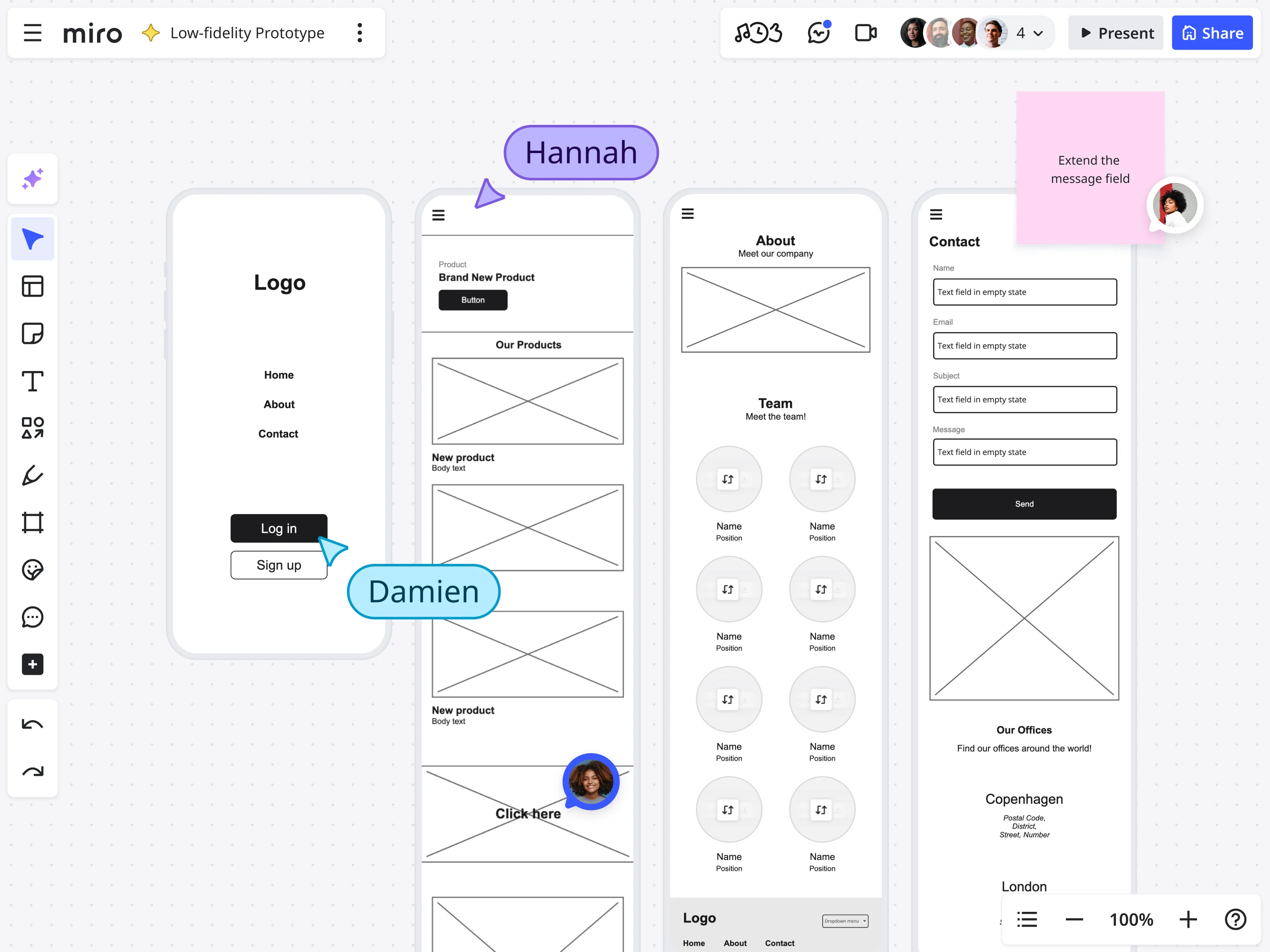
Low-fidelity phase: Product managers sketch user flows alongside designers. Engineers add technical constraint notes directly on wireframes. Researchers share user insights via sticky notes adjacent to relevant designs. Nobody’s waiting for “design to be done.”
Real collaboration scenario: Designer sketches a proposed feature (2 minutes). Engineer adds sticky note about technical constraints (30 seconds). Product manager validates business logic (30 seconds). The team just made a technical architecture decision, validated a product assumption, and adjusted the design—in 5 minutes, collaboratively.
Traditional workflow: Designer spends 2 days building high-fi mockup → presents to engineering → discovers technical constraint → redesigns → loses 4 days.
Medium-fidelity phase: Content strategists add real copy directly to wireframes. Researchers annotate screens with user testing insights. Stakeholders flag concerns before designs are locked.
High-fidelity phase: Developers extract specifications, flag implementation questions, confirm technical feasibility—all in the same workspace where design evolved.
The speed advantage comes not just from faster individual work, but from removing the wait time between roles. When engineers, PMs, and designers work together in real time on the same canvas, the level of detail can change easily based on what the team understands, not on strict process steps.
Start with Miro’s low-fidelity wireframe templates to accelerate your discovery phase, then collaboratively increase fidelity as your team’s certainty grows.
Key takeaways: Fidelity as strategic advantage
Teams that get fidelity right aren’t just faster—they’re smarter. They learn more for every dollar spent, adapt easily, and launch products that are tested, not just polished guesses.
Your fidelity philosophy:
- Start rough. Stay rough until evidence demands polish.
- Increase fidelity only where uncertainty decreases.
- Never confuse polish with validation.
- Make changes cheap so teams make better decisions.
The economic truth is that every hour spent polishing an untested design is an hour not spent learning what users really need. Your fidelity choices decide if your design budget goes toward learning or just making things look good.
Take action: Compare your current project to the fidelity decision matrix. Find where you used high-fidelity too soon. Make low-fidelity versions for the uncertain parts. Focus on testing flows instead of details.
The quickest way from idea to impact is through rough sketches, quick changes, and smart polishing—all in a workspace where changing your mind is easy, not costly.
Frequently asked questions
Does Miro integrate with our existing design tools?
Yes. Miro integrates with design and development tools including Figma, Sketch, Adobe XD, Jira, Azure DevOps, and GitHub. You can embed design files directly in Miro boards, sync prototypes for stakeholder reviews, and connect wireframes to development tickets. This means your low-fidelity exploration in Miro can seamlessly transition to high-fidelity execution in your preferred design tool—while maintaining that crucial context about why decisions were made.
How does Miro handle security for sensitive design work?
Miro provides enterprise-grade security including SOC 2 Type II compliance, GDPR compliance, data encryption in transit and at rest, SSO and SAML 2.0 support, and granular access controls. Design leaders at regulated industries—including financial services and healthcare—trust Miro with sensitive product development. You can wireframe competitive features, explore strategic initiatives, and collaborate on confidential projects with confidence that your intellectual property is protected.
Can our entire product team contribute to wireframes, even non-designers?
Absolutely. That’s the point. Miro’s visual workspace is designed for cross-functional collaboration. Product managers, engineers, researchers, and stakeholders can all add ideas, annotations, and feedback directly on wireframes—no design software expertise required. Combined with Miro AI’s ability to generate wireframe structures from text descriptions, even team members with zero design background can propose concepts and iterate alongside designers. This democratization of design thinking is how fast teams move—everyone contributes when ideas are still cheap to change.
What’s the Miro community like for learning wireframing best practices?
Miro’s community includes millions of designers, product managers, and UX professionals sharing templates, techniques, and best practices. You’ll find extensive template libraries for low-fidelity wireframes, progressive fidelity workflows, and industry-specific wireframing approaches. The Miro Academy offers courses on wireframing strategy, and the community forums connect you with practitioners solving similar challenges. When you’re deciding between low-fi and high-fi for a specific use case, chances are someone in the Miro community has already tested that exact scenario and shared their learnings.
How do Miro’s AI features improve wireframing specifically?
Miro AI accelerates three critical wireframing phases: (1) Initial concept generation—describe your idea in plain language, get wireframe structures instantly; (2) Rapid variation testing—generate multiple layout approaches to compare side-by-side; (3) Pattern recognition—AI suggests proven UX patterns and identifies potential usability issues in your layouts. The result: you spend less time on mechanical wireframe creation and more time on strategic validation. Teams using Miro AI for wireframing report 3-5x faster progression from concept to validated design—because the tool handles structure while humans focus on user needs.