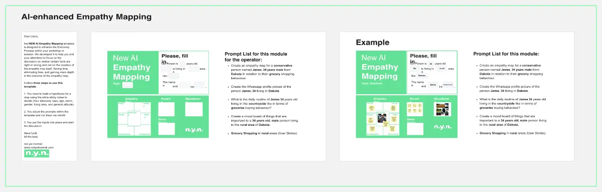
About the empathy map templates collection
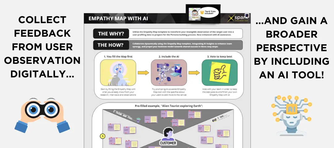
Miro's empathy map templates collection is a curated set of tools designed to help you and your team dive deep into the user experience. These templates serve as a visual aid to better understand and share insights about your customers' needs, behaviors, and emotions. With a variety of templates to choose from, you can select the one that best fits your project's context or inspires a new perspective on user empathy.
What is an Empathy Map?
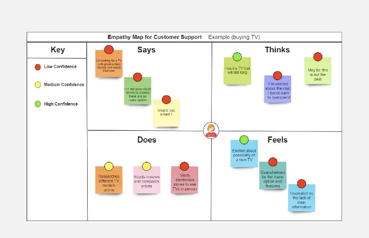
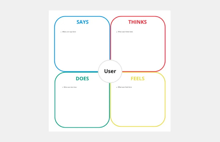
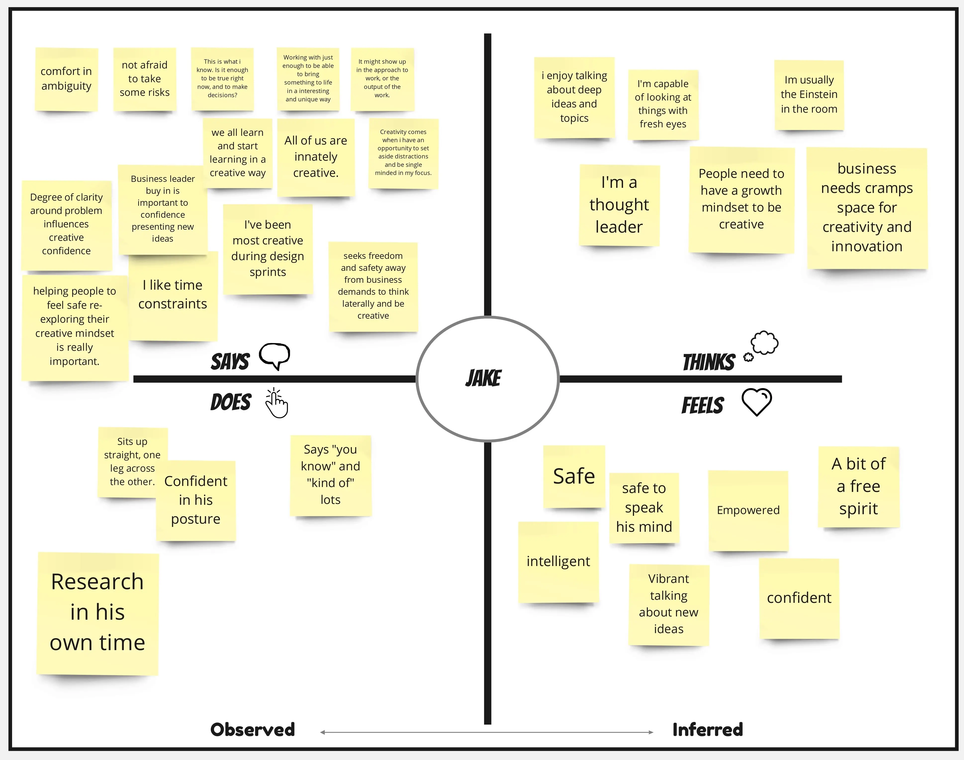
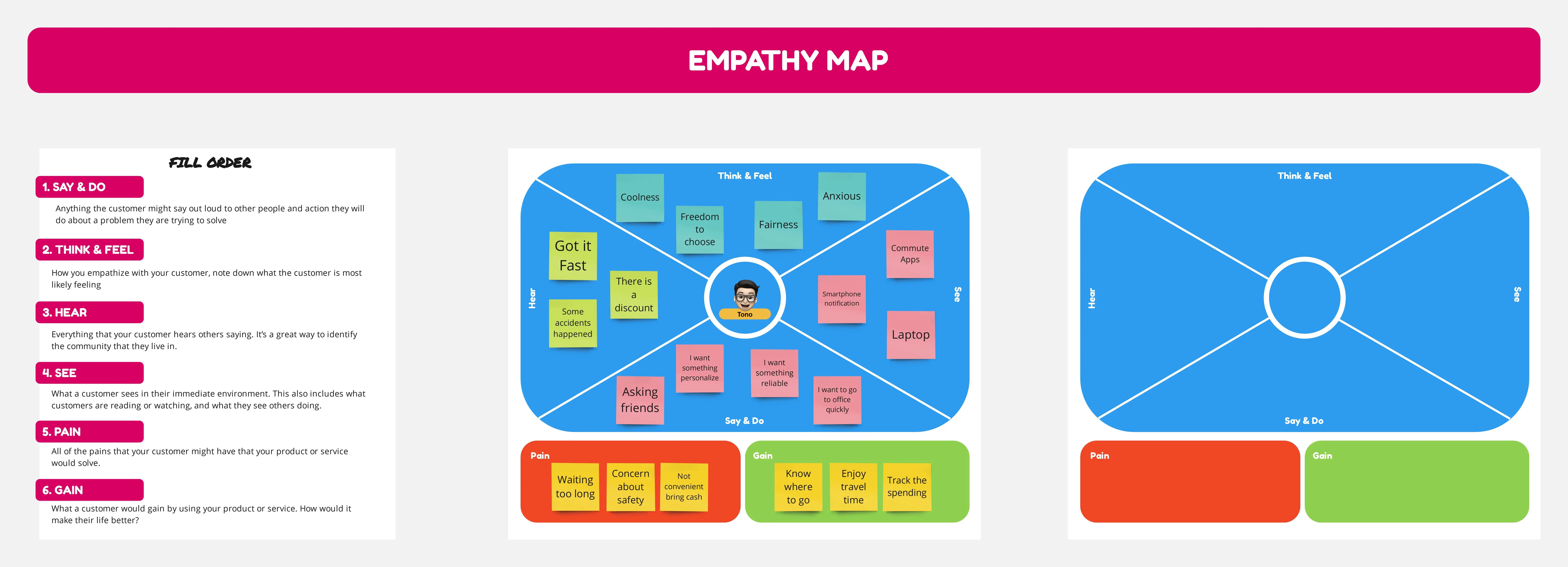
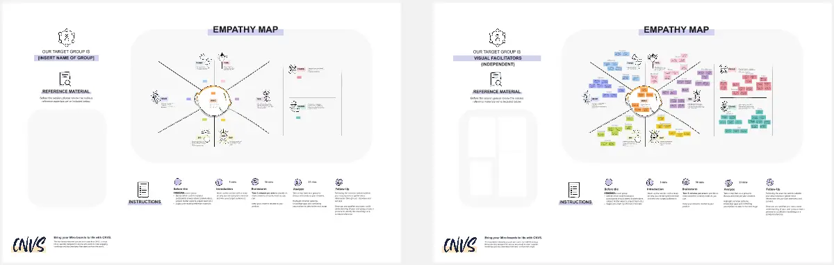
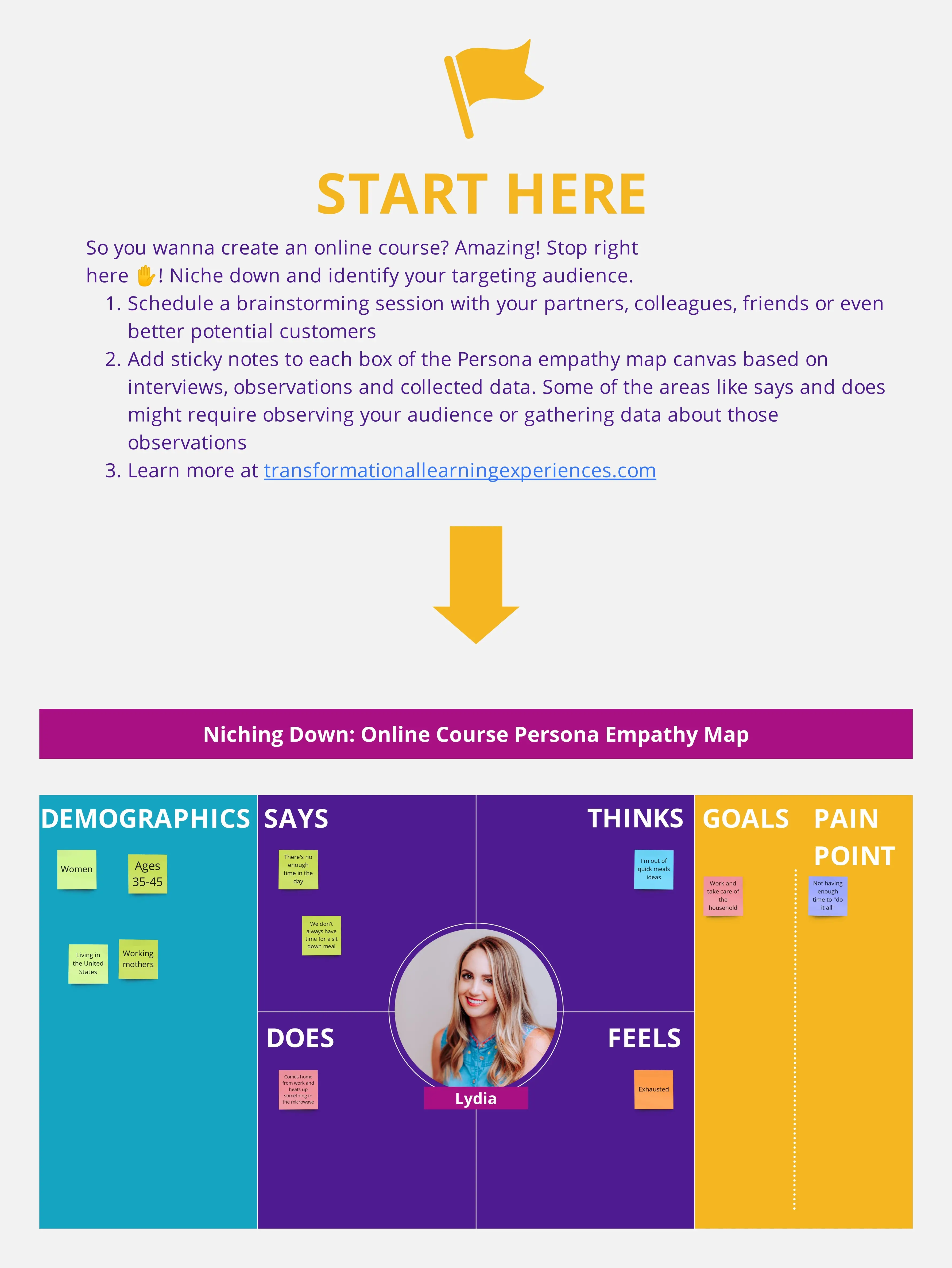
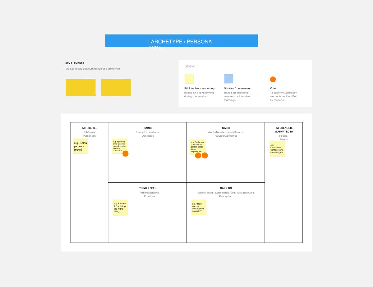
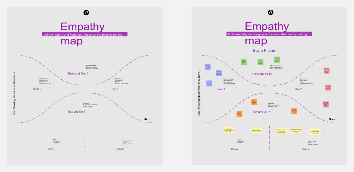
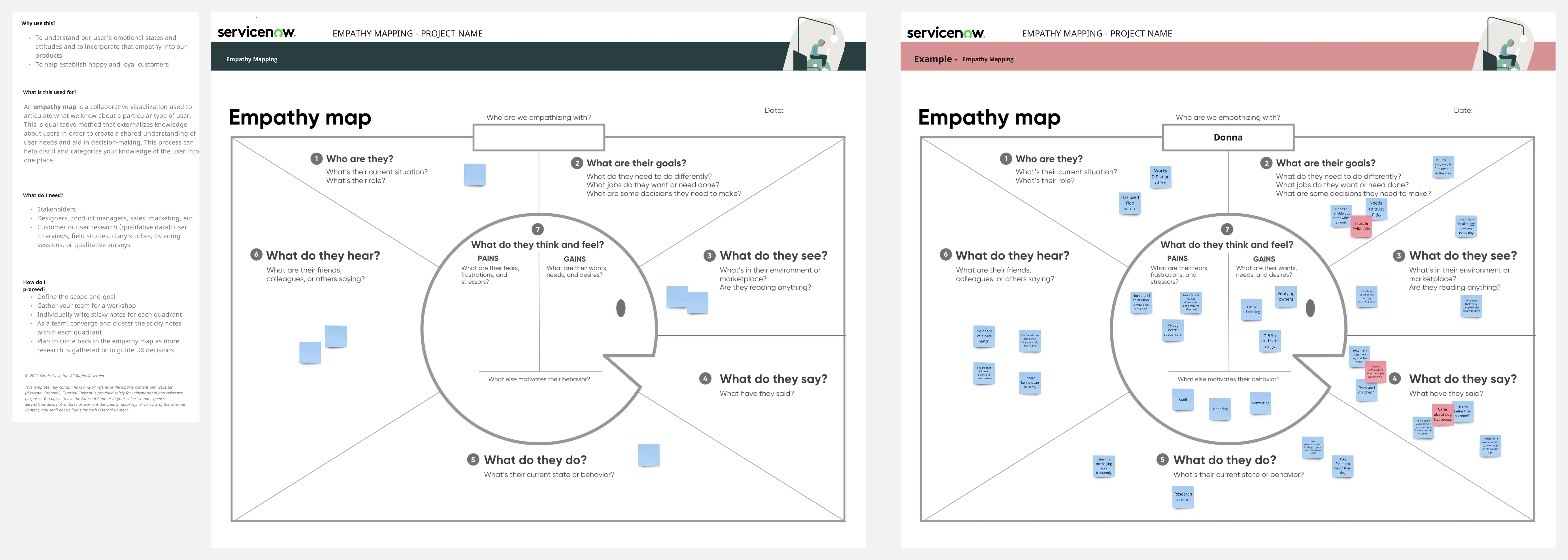
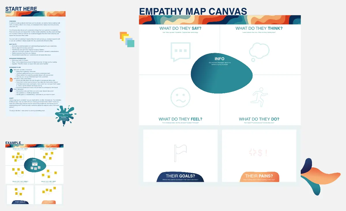
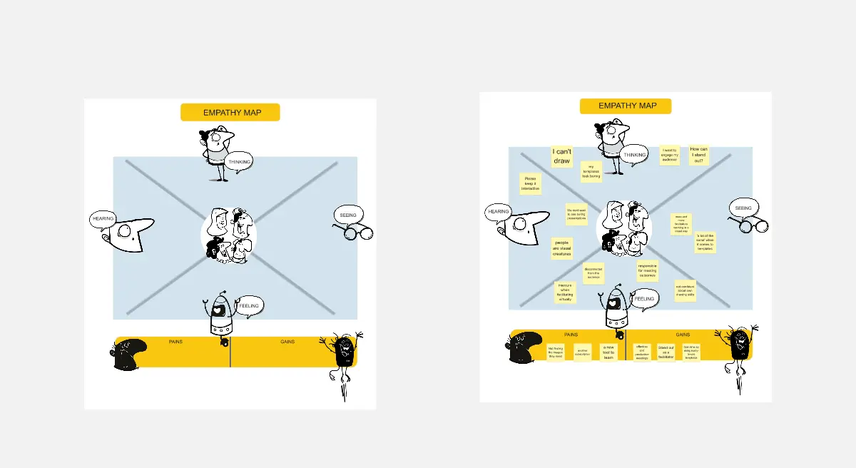
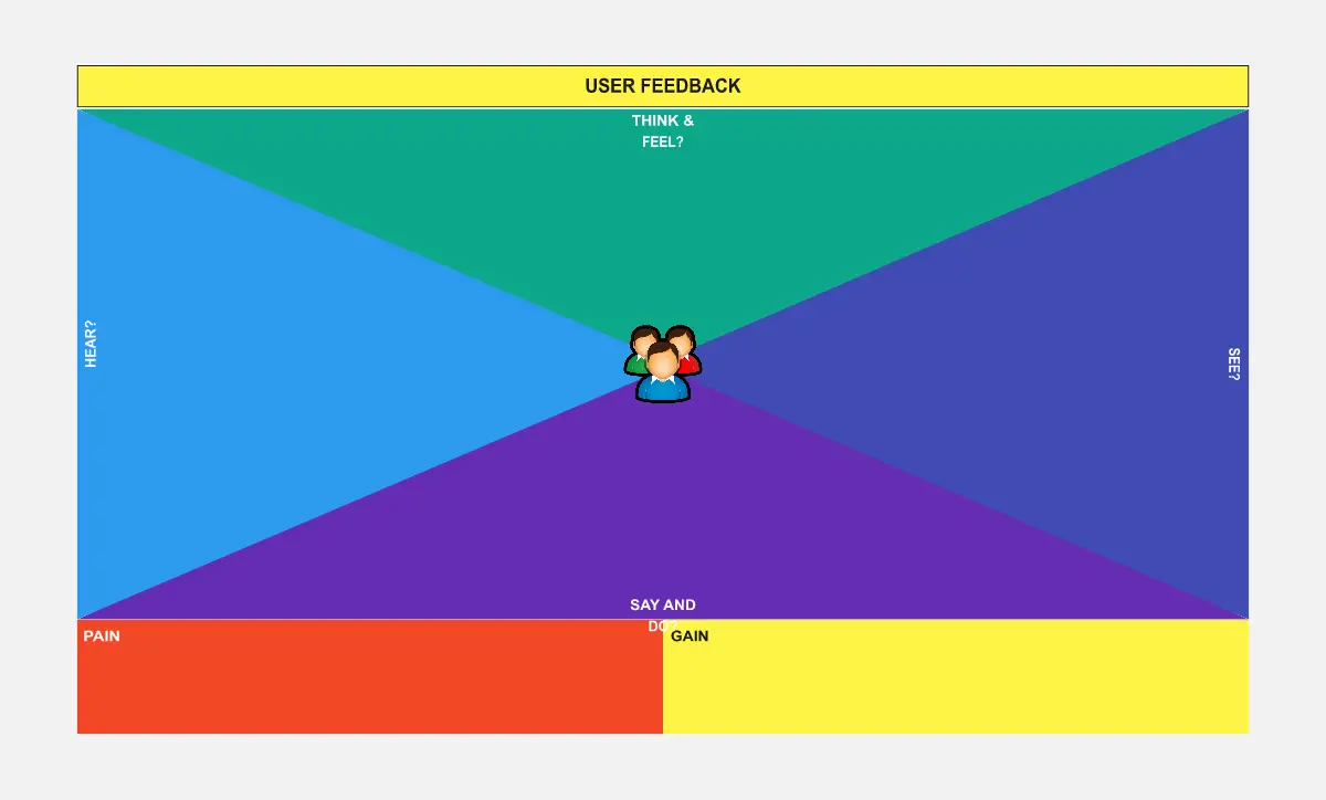
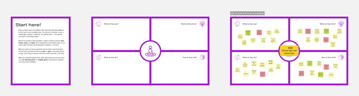
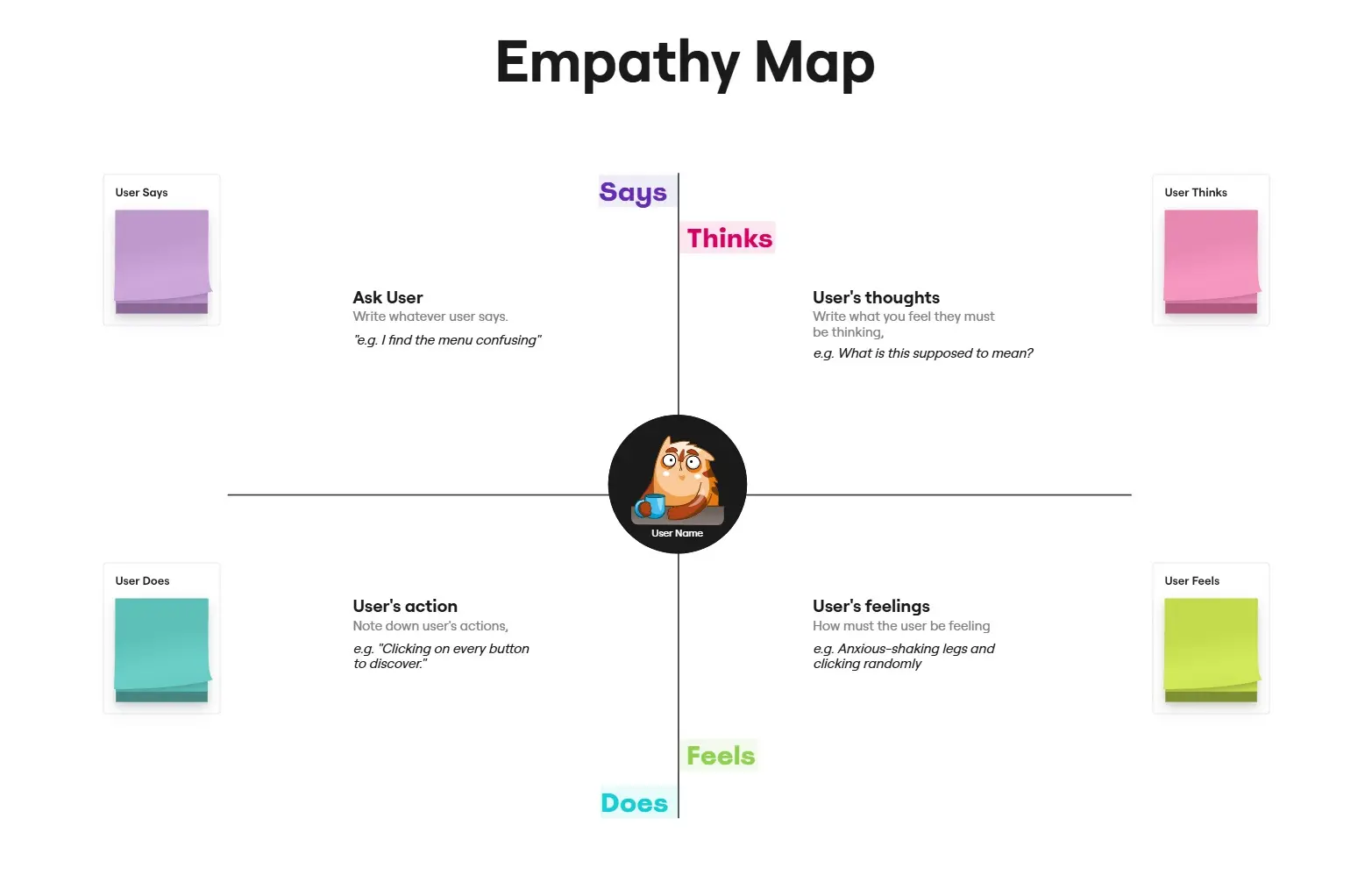
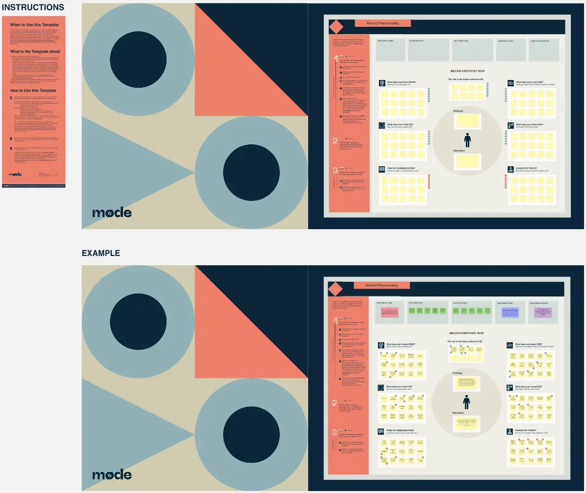
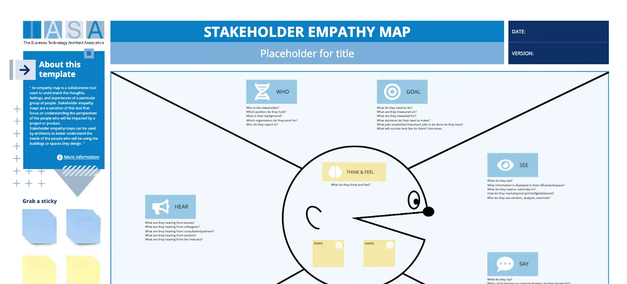
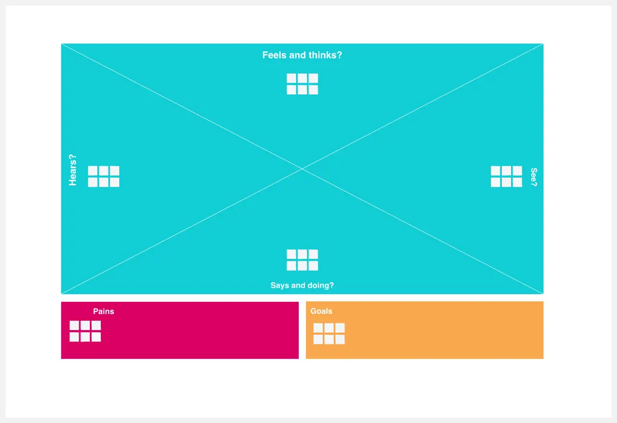
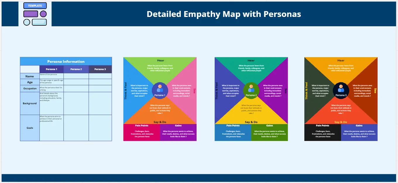
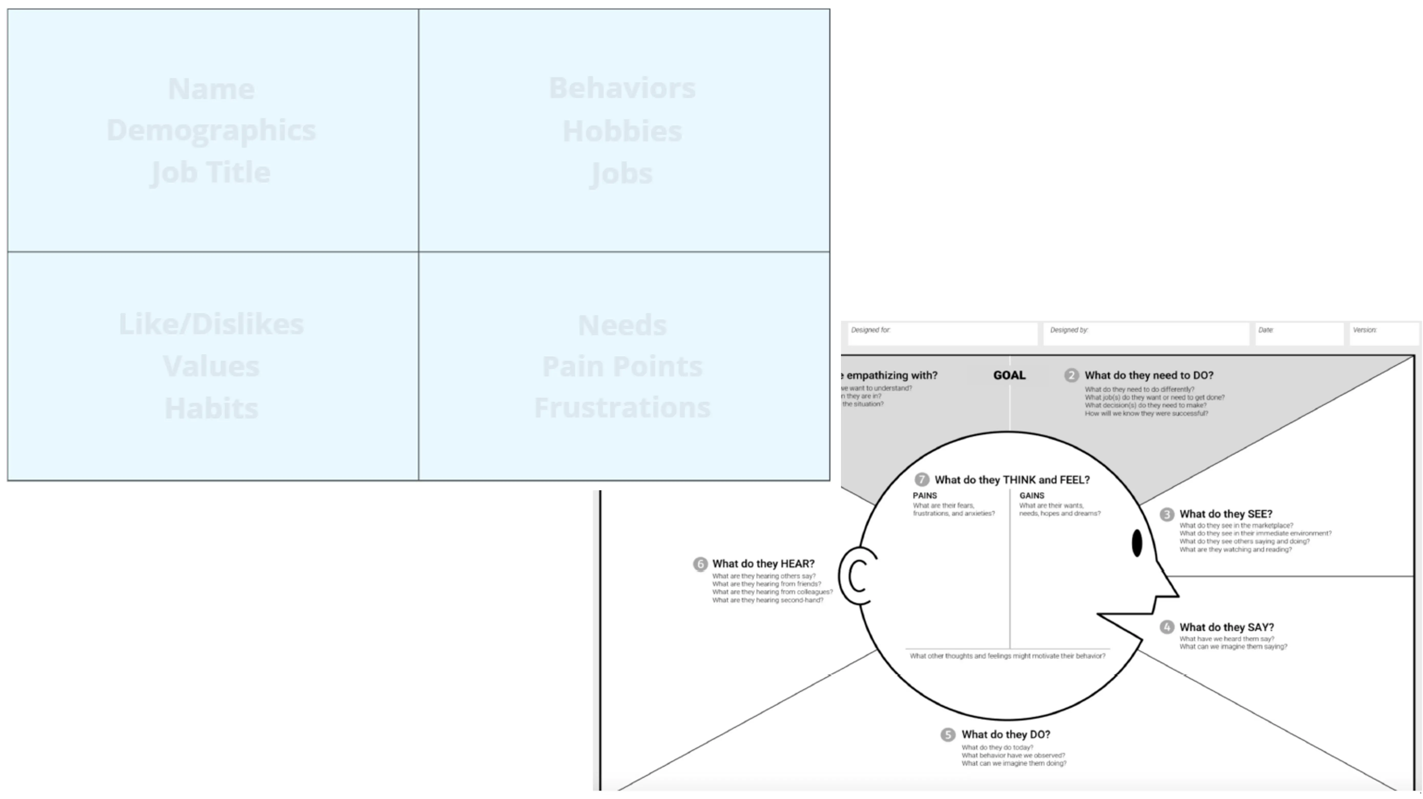
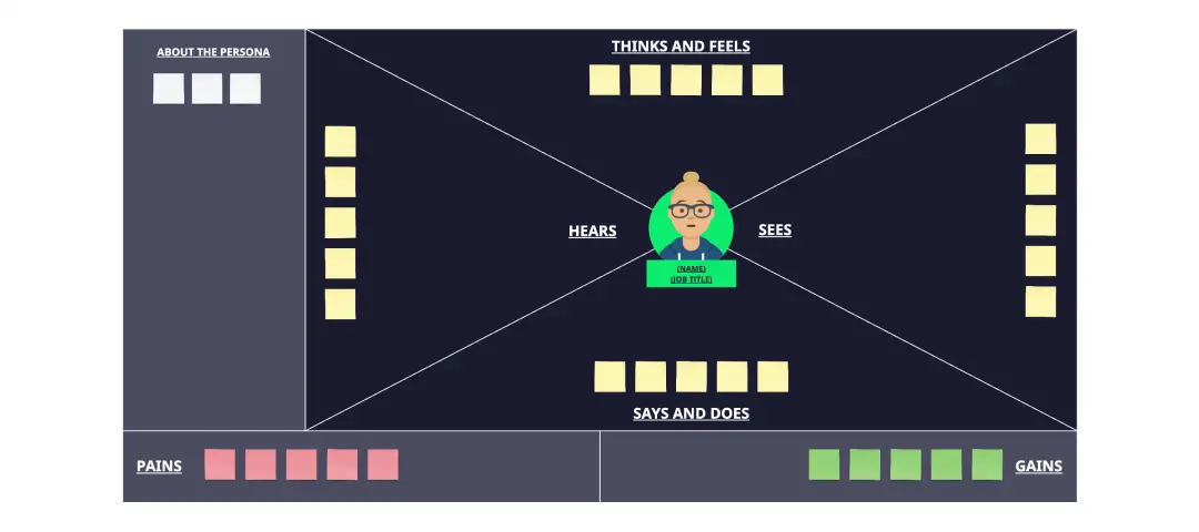
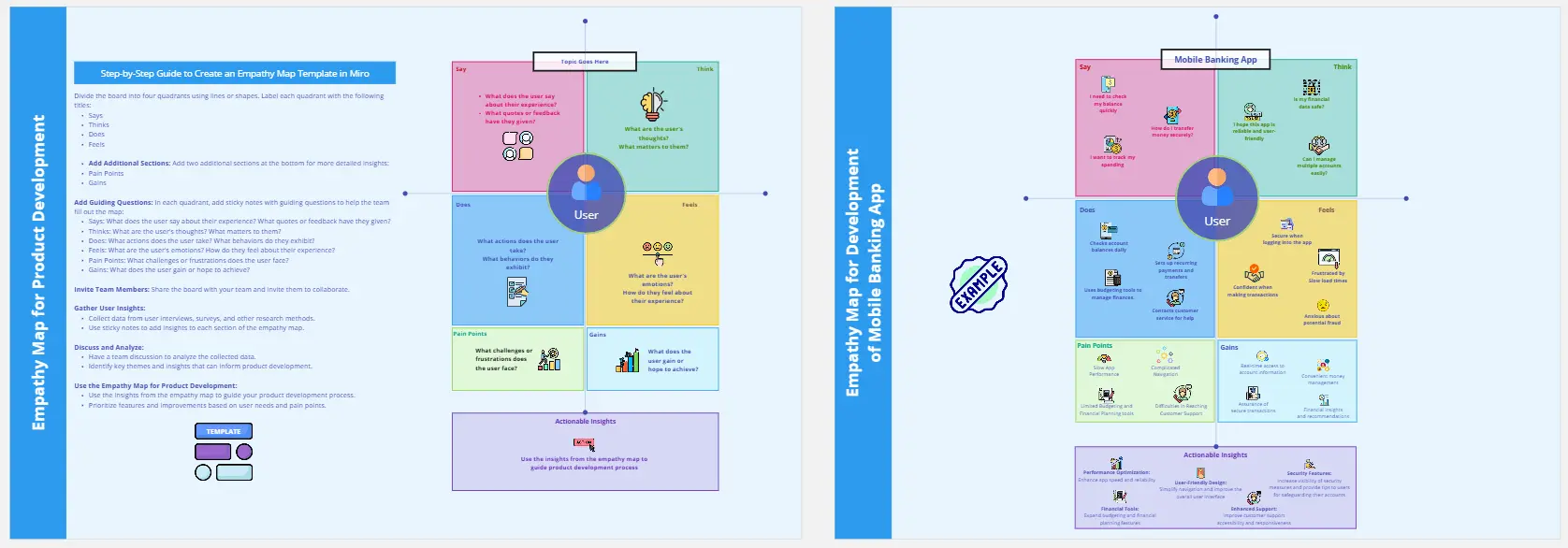
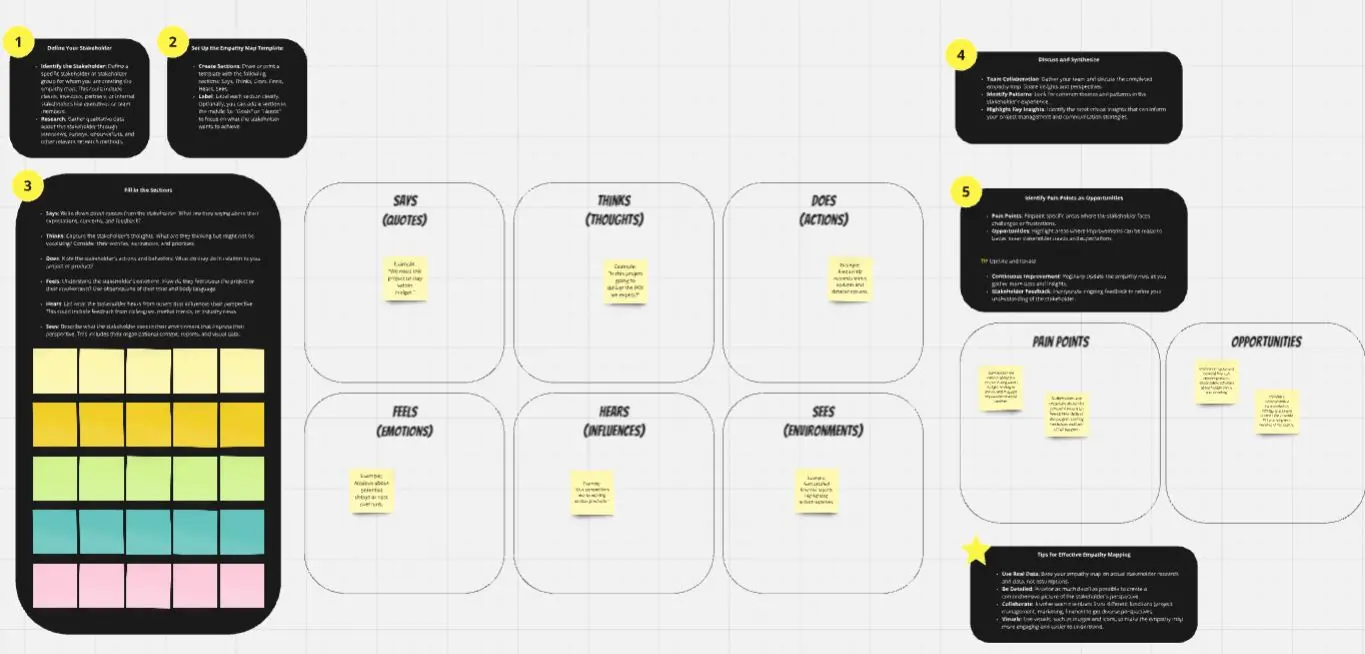
An empathy map is a collaborative visualization tool used in Design Thinking to articulate what a team knows about a specific type of user. It goes beyond traditional demographics by synthesizing qualitative research into four core dimensions: what the user says, does, thinks, and feels. By centralizing these behavioral observations and emotional drivers, teams can identify latent pain points and motivations that aren't always obvious on the surface.
Why you'll love our empathy map examples
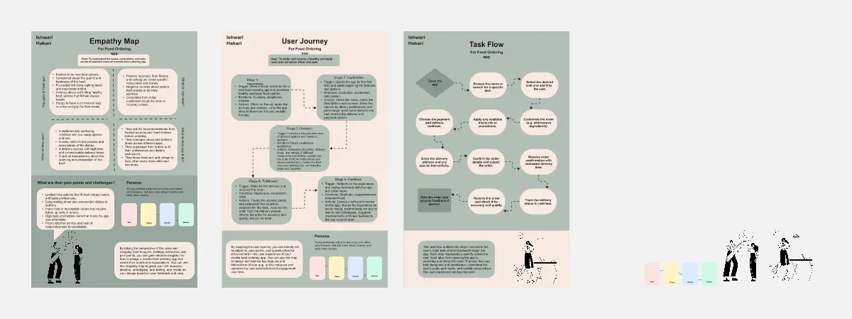
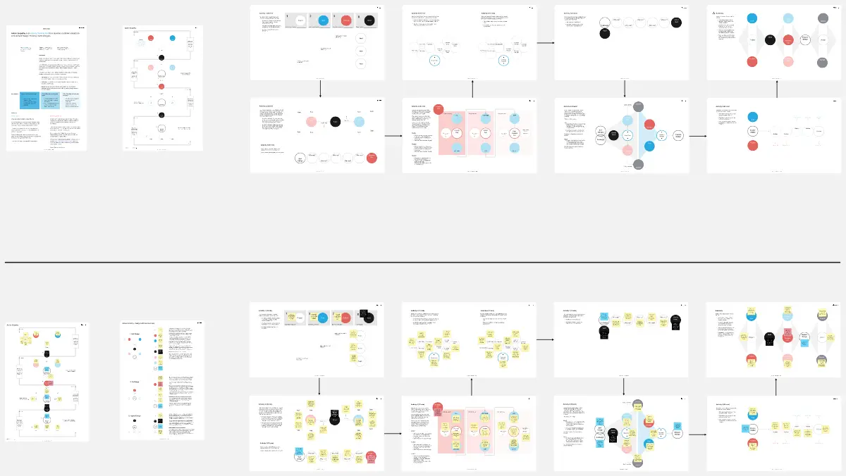
Our collection of empathy map examples showcases the versatility and impact of empathy maps across different industries and use cases. These real-world examples provide a glimpse into how other professionals have successfully utilized empathy maps to gain a richer, more nuanced understanding of their users. By exploring these examples, you'll be inspired to apply similar strategies to your own design research, ensuring that the end product is not only functional but also emotionally resonant with your target audience.
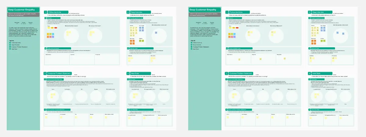
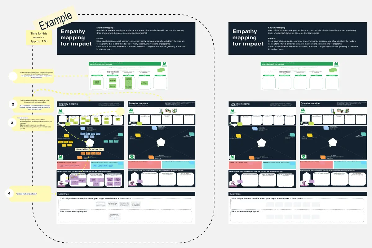
How to use the empathy map template in Miro
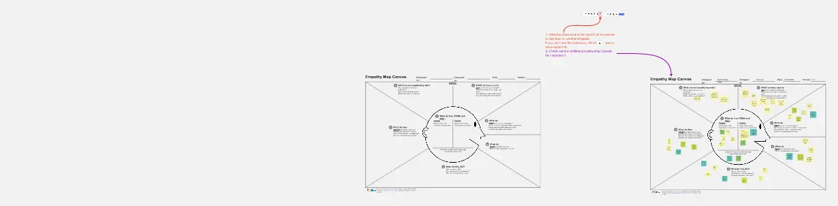
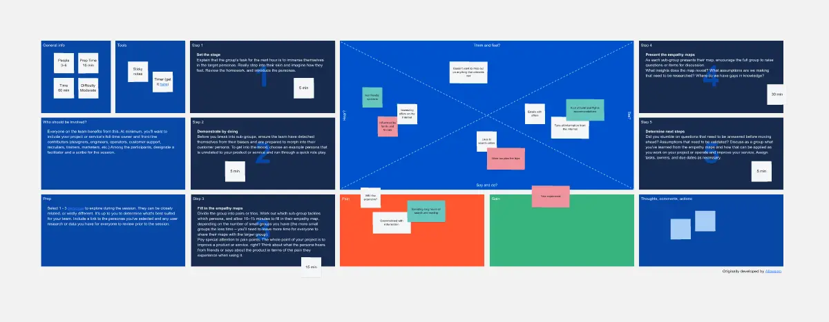
Choose your template: Start by selecting an Empathy Map Template from Miro's collection that aligns with your project goals.
Define your user: Clearly articulate who your user is. This could be a specific persona or a segment of your customer base.
Gather your data: Collect qualitative data from user interviews, surveys, or any other user research methods you've employed.
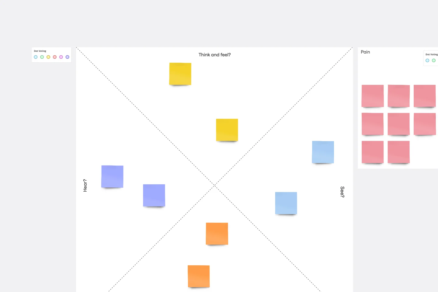
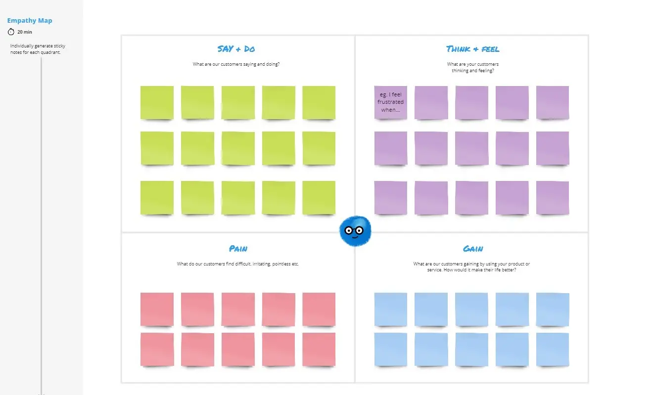
Fill in the quadrants: Break down your findings into the four quadrants of the empathy map: 'Think & Feel,' 'Hear,' 'See,' and 'Say & Do.'
Identify pain points and goals: Use sticky notes to add insights about the user's pain points and goals within each quadrant.
Draw conclusions: Analyze the completed map to identify patterns and insights that will inform your design decisions.
Share and collaborate: Invite team members to review and contribute to the empathy map, fostering a shared understanding and collaborative approach.
Act on insights: Use the insights gained from your empathy map to guide the development of your product, ensuring it meets your users' real needs.
By following these steps, you can use Miro's empathy map templates to create a shared understanding of your users and develop products that truly make a difference in their lives.