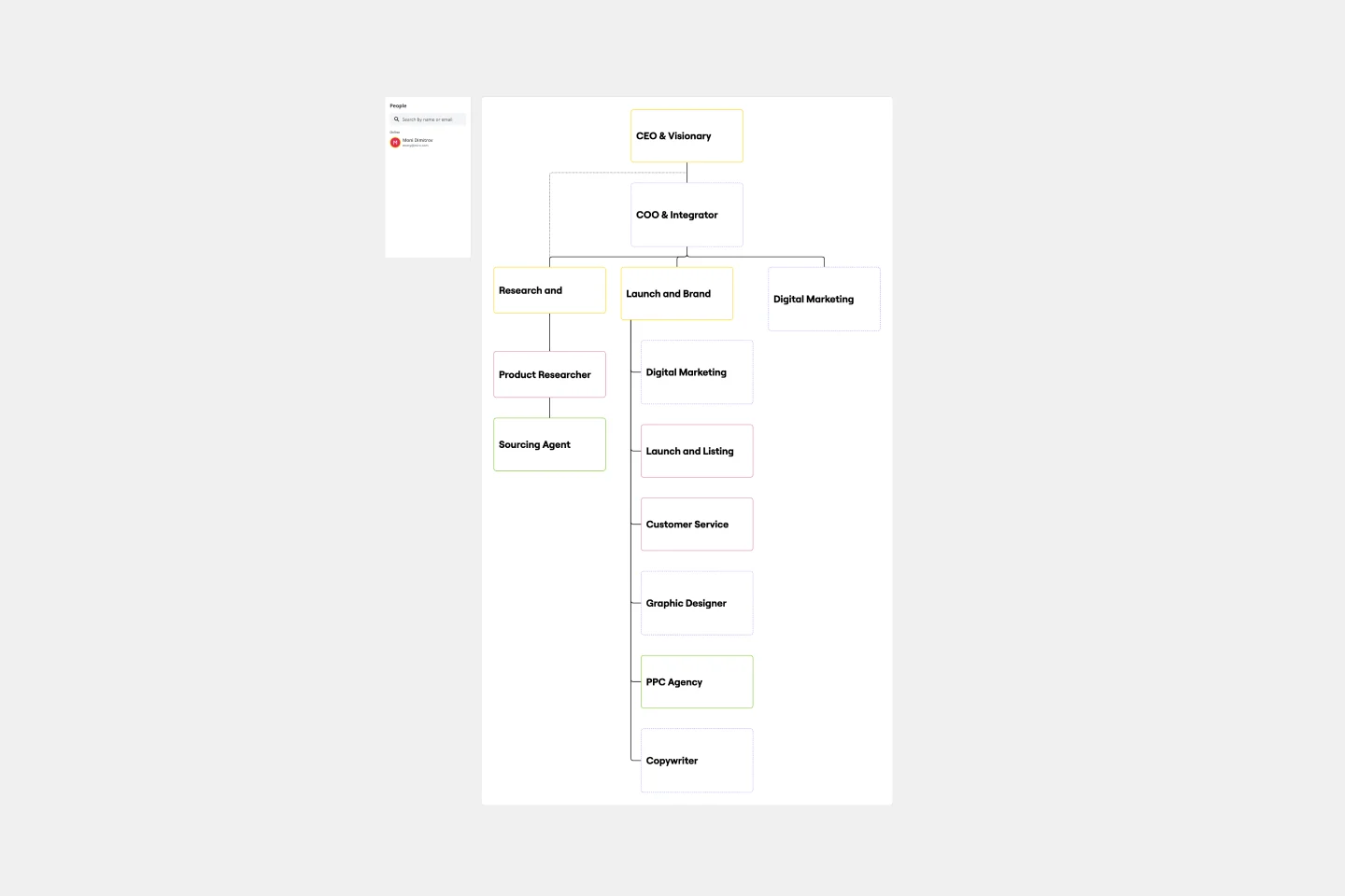
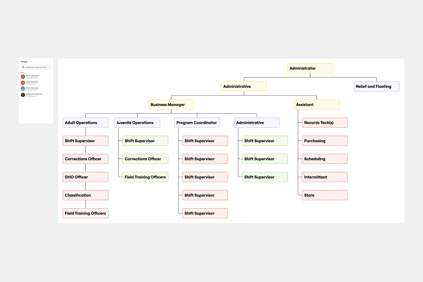
Organizational Chart Template
Show the reporting relationships between job titles and the roles in your organization, and create a visual guide with an Organizational Chart Template. Quickly onboard new team members, and bring clarity to teams.
About the Org Chart template
An organizational chart is a diagram that shows the relationships between different parts of an organization. These charts come in handy when companies grow rapidly, as it gets more challenging to keep track of changes in hierarchies and leadership. An org chart helps everyone visualize the company’s structure, team interdependencies, and how cross-functional collaborations happen.
What is an Organizational Chart Template?
Organizational Charts also are known as Organization Charts, Org Charts, Org Chart Template, Organograms, Organogram Charts (sometimes also spelled Organigrams or Organigrammes), and Hierarchy Charts.
They are visual diagrams that illustrate who is on your team, whom they report to, and what roles they play. In addition to showing connections between your employees, your team can also use an org chart template to represent connections between different departments or organizational functions.
Creating an organizational chart is easy when building from a template. Most companies follow similar structures, whether it’s a top-down structure or a matrix structure.
You can use the organizational chart templates below as jumping-off points. To create your custom org chart, start by downloading one of the templates below that best represents your company structure. Then, fill in the labels to fit your unique team needs.
4 types of organizational charts
There are four types of organizational charts, according to how companies’ structures are set in place:
1. Functional top-down (Vertical organizational chart)
A functional top-down org chart is the most common structure, with the company functioning as a hierarchy. At the top of this organizational structure, there is one team member, who usually has the title of president or CEO.
Branching off from that team member are the leaders who are next in charge, like the company vice presidents. The hierarchy extends further into departments and eventually branches into teams. These teams with similar skill sets are normally grouped together.
2. Matrix organizational chart
The Matrix org chart is a more complex structure than the traditional top-down design. If your company uses this reporting structure, team members report to multiple managers or are working cross-functionally.
For instance, in some departments, employees may report to their direct managers and project managers. In this case, the matrix org chart will be more of a rectangular shape instead of tree-like. Numerous companies use this structure to enhance collaboration and transparency.
3. Divisional structure
A divisional organizational structure is a high-level version of the traditional hierarchical structure. Divisional structures make sense for companies that have departments working independently from one another.
For example, companies with separate product lines may work in divisional structures because each product line has separate IT, marketing, HR, and sales departments.
4. Flat organizational chart (Horizontal organizational chart)
The flat organizational chart is unique because it shows few or no levels of management. This type of organizational structure may be present in a small business or a modern business that’s experimenting with no chain of command.
With this type of organizational structure, the company promotes widespread team member self-management and decision-making.
5 steps on how to make an organizational chart
An org chart should be used to demonstrate your company’s structure. In order to create an org chart, you will need to collect your team members’ information and decide which structure you would like to follow. Most organizational charts follow a top-down approach. Employees and positions are represented by boxes, photos, or other shapes, with different rows representing hierarchy and lines linking to each other. Every organizational chart is unique, so you will really want to customize your own to fit the correct needs of your organization.
Below you will find a small guide to help you get started with your own customized organizational chart:
1. Define the scope
Just like any project you will work on, it is important to always define the scope before getting started. This will help you clearly represent your team structure and demonstrate the purpose of your organization.
What will this org chart be used for?
Will it be used as an informative resource for other members to know who is who within the company?
Will this org chart be shared externally?
Will you need more charts for different levels of the company?
Asking these questions at the start can really help you gather the correct information and truly understand the purpose of the chart.
2. Gather information
The next step is to gather the correct information. Without the right information, you will not be able to proceed. Utilize the HR department or survey your teams in order to get the information you need.
Ensure that the information you receive is up-to-date, and consider also using headshots of your team to personalize the org chart a bit more.
3. Structure your org chart
Now one of the most important points. Decide on how you want to structure your org chart. This is a vital stage as doing it properly can help make your process a lot more easy and efficient. Therefore, using our Organizational Chart Template to sketch out the roles and job titles each individual will play in the organization. Make sure you include every person, team, and department necessary, and determine their place according to the initial structure you chose.
Determine the organizational structure you want to portray: is it hierarchical or more of a matrix? Do individuals have multiple roles? Which departments are going to participate?
4. Plot connections between roles
Now, use lines to plot the various responsibility flows between each individual, team, and department. When diagramming these connections, make sure to be specific about who is reporting to whom, what each person’s role or tasks are, and when they may need to interact with other teams or departments.
5. Iterate as necessary
Customize any elements you’d like, changing the sizes, shapes, and colors. You may want to use colors or shapes to indicate levels of authority or department. Easily add photos or other images to represent each person visually. And invite your coworkers to collaborate with you. Any changes they make to the chart will be reflected in real-time.
Once your chart is done, set time aside to plan for regular updates. People change roles or companies all the time, therefore, it would be best to stay on top of it and plan ahead! With Miro's graph maker, you can also present other important data about your organization to supplement your organizational chart.
How to use an org chart
Using an organizational chart is beneficial as this provides a visual representation of different job titles and departments. These charts can help team members understand who to work with and understand the organization’s structure and roles, and responsibilities more clearly.
You can use an organizational chart in various useful ways. Here are a few ways your company can use and benefit from an org chart:
Demonstrate work responsibilities and reporting relationships. For managers, org charts are key when demonstrating work and reporting responsibilities. These org charts also help new hires to know who their team members are and who is who within the company.
Help leadership effectively stay organized and manage growth or change. Org charts can help leaders identify lack of headcount and also identify whether certain teams have too much headcount. This can help them shift or hire new employees to maintain balance.
Allow employees to see where they fit within the organization. An org chart can clearly show an employee’s role and position within the team and department, so they can understand who they report to and who is in their team.
Improve communication. Having a structured organizational structure can improve clear communication as it helps identify who they need to reach out to when questions arise.
Create a visual directory. With an up-to-date org chart, you can see when team members leave or get promoted. This will keep your team up-to-date with who is working on what and what their current positions are.
How do I create an organizational chart template?
You can create an organizational chart template first by choosing your chart’s structure. Afterward, you can sketchy out roles from your organization inside this structure and connect them with arrows and flows so you can visualize how your organization is structured.
What is an organizational chart template?
An organizational chart template is a visual representation of your organization, who is on your team, and what role everyone plays inside your organization.
How do you organize an organizational chart?
There are different ways you can use an org chart creator to make your organizational chart. The most traditional one is a top-down structure, where the C-suite is at the top. You can also have a more divisional way of visualizing your company, where employees are grouped according to product lines and geographies. There is also a matrixed organization chart where teams are divided according to projects and product or a flat organizational chart template where hierarchies are often flat and teams self-managed.
Get started with this template right now.
Venn Diagram Template
Works best for:
Education, Diagrams, Brainstorming
Venn Diagrams have been a staple of business meetings and presentations since the 1800s, and there’s a good reason why. Venn diagrams provide a clear, effective way to visually showcase relationships between datasets. They serve as a helpful visual aid in brainstorming sessions, meetings, and presentations. You start by drawing a circle containing one concept, and then draw an overlapping circle containing another concept. In the space where the circles overlap, you can make note of the concepts’ similarities. In the space where they do not, you can make note of their differences.
Bar Graph Template
Works best for:
Operations, Diagrams
Bar graphs are an excellent way to compare different types of categories and datasets visually. Many professionals use this type of graph to support their presentations and make data storytelling more understandable. With just a few clicks, use this bar graph template and customize it according to your needs.
Mental Model Template
Works best for:
Business Management, Mind Mapping, Diagrams
Smart solutions and strong, strategic decisions. The best organizations make both, and a mental model is designed to help them do it. We give you a fast and easy way to try it out — just fill out our ready-made, flexible template and add sticky notes, shapes, and arrows to create a powerful map.
2x2 Prioritization Matrix Template
Works best for:
Operations, Strategic Planning, Prioritization
Ready to set boundaries, prioritize your to-dos, and determine just what features, fixes, and upgrades to tackle next? The 2x2 prioritization matrix is a great place to start. Based on the lean prioritization approach, this template empowers teams with a quick, efficient way to know what's realistic to accomplish and what’s crucial to separate for success (versus what’s simply nice to have). And guess what—making your own 2x2 prioritization matrix is easy.
To-do List Template
Works best for:
Project Management, Education, Decision Making
A to-do list helps teams manage, organize, and prioritize their upcoming tasks. As a result, they can improve time management and streamline work operations. Using Miro’s to-do list template, teams create interactive, collaborative, and user-friendly task lists.