
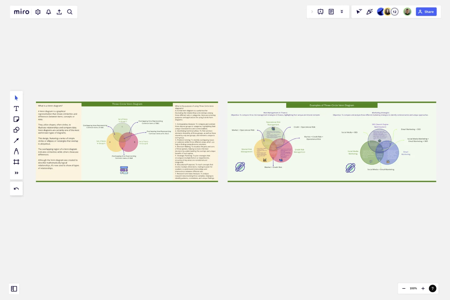
Three-Circle Venn Diagram
A Venn diagram is a graphical representation that shows similarities and differences between items, concepts or data.
Overview
A Venn diagram is a graphical representation that shows similarities and differences between items, concepts or data. They utilize shapes, often circles, to illustrate relationships and compare data.
Venn diagrams are certainly one of the most well-known types of diagrams. This design, featuring a series of simple circles or ellipses or rectangles that overlap is ubiquitous. The overlapping region of a Venn diagram indicates similarities while others showcase differences. Although the Venn diagram was created to describe mathematically logical relationships, it’s now used to show all types of relationships.
Purpose of using Three Circle Venn diagrams
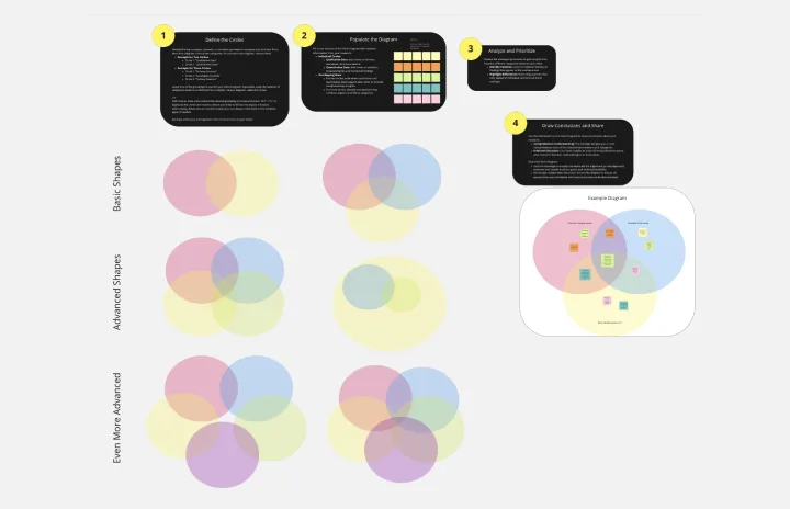
A 3-circle Venn diagram is a useful tool for illustrating the relationships and overlaps among three different sets or categories. Here are some key purposes and applications for using 3-circle Venn diagrams:
1. Comparative Analysis: To compare and contrast three distinct groups or categories, highlighting their unique characteristics and commonalities.
2. Identifying Commonalities: To find common elements shared by all three groups, as well as those shared by only two groups, and elements unique to each group.
3. Problem Solving: To identify overlapping issues or solutions within three different areas, which can help in finding comprehensive solutions.
4. Decision Making: To visualize the pros and cons of three options, helping to make informed decisions by understanding the overlaps and unique benefits of each option.
5. Strategic Planning: To plan strategies that encompass multiple factors or departments, ensuring all key areas are considered and integrated.
6. Educational Purposes: To teach concepts that involve multiple dimensions, making it easier for students to understand relationships and intersections between different sets.
7. Research and Data Analysis: To analyze research data involving three variables, helping to identify patterns, correlations, and unique findings.
Along with step by step guide, two examples have also been provided to help you understand the concept of using 3-circle venn diagram. These can just be copy/paste to your own board.
Regards
Khawaja Rizwan
Get started with this template right now.
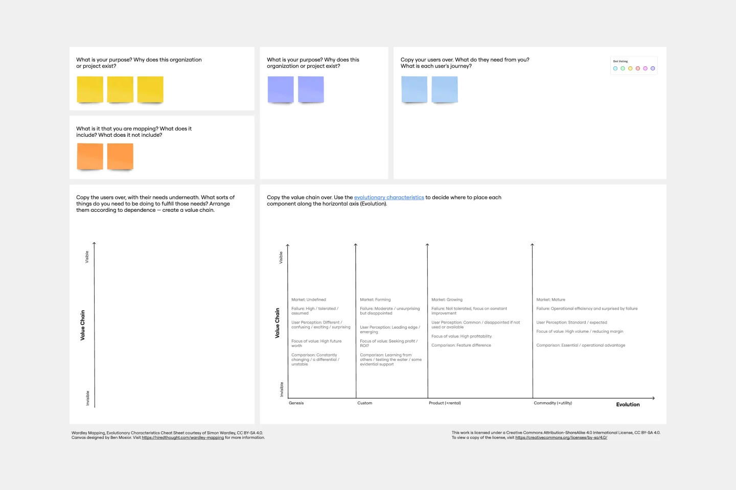
Wardley Mapping Canvas Template
Works best for:
Leadership, Strategic Planning, Mapping
A Wardley Map represents the landscape in which a business operates. It's made up of a value chain (the activities required to fulfill user needs) graphed against the evolution of individual activities over time. You place components with value on the y-axis and commodity on the x-axis. Use a Wardley Map to understand shared assumptions about your environment and discover what strategic options are available. Easily communicate your understanding of the landscape to your team, new hires, and stakeholders.
Content Strategy
Works best for:
Strategic Planning
Bring consistency across communication channels and develop killer content strategies with this Content Strategy Template. Designed to plan and deliver high-impact content, use this tool to collaborate faster and better.
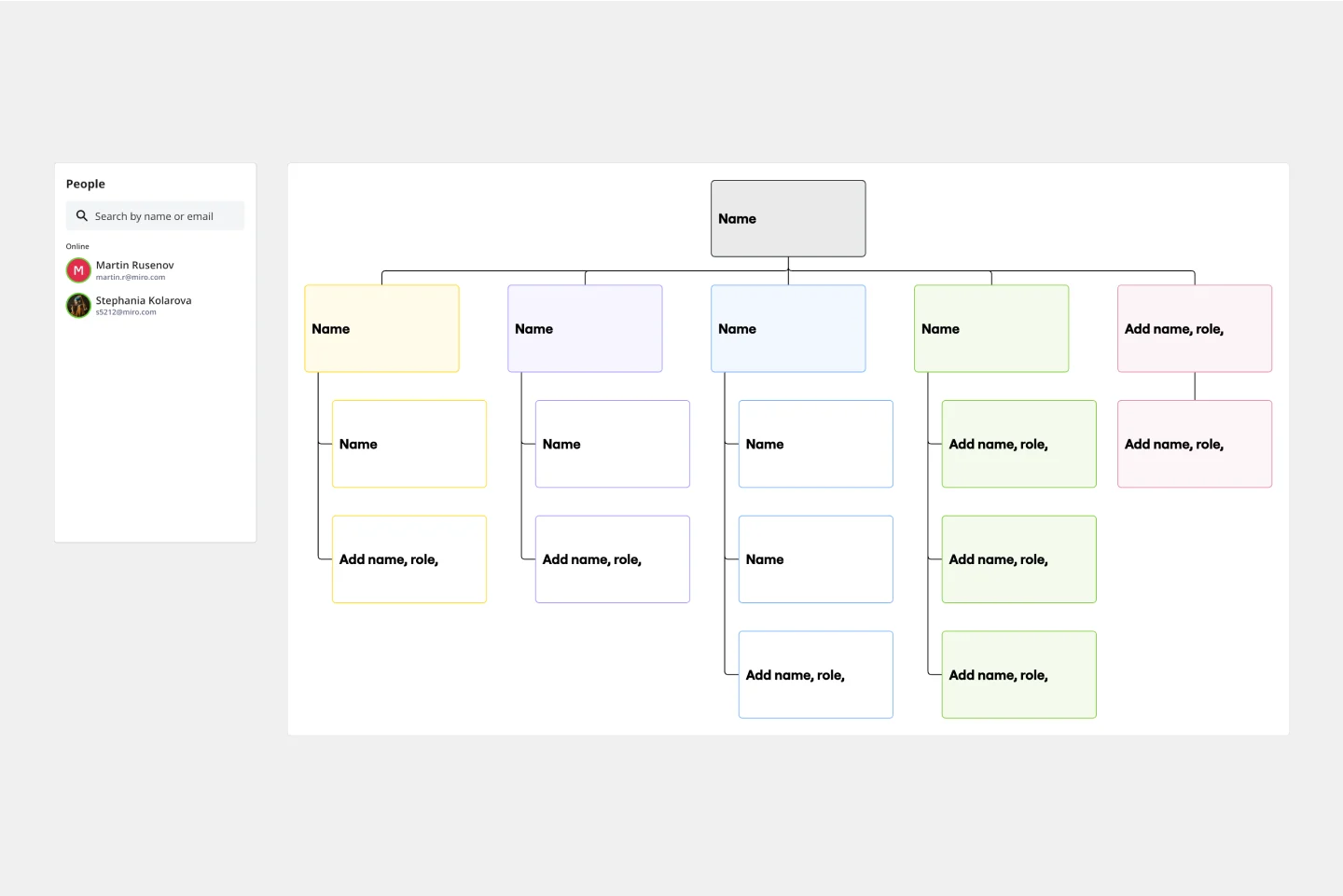
Organizational Chart Template
Works best for:
Org Charts, Operations, Mapping
Who makes up the team? What roles do they play? Who does each member report to? An organizational chart, or org chart, can answer it all at a glance. Ideal for onboarding new employees, these visual diagrams plot out company structure and the chain of command to help your team members understand reporting relationships, their role, and how they fit into the broader organization. Our template lets you choose your own chart structure and easily plot the connections between employees, roles, and departments.
Startup Canvas Template
Works best for:
Leadership, Documentation, Strategic Planning
A Startup Canvas helps founders express and map out a new business idea in a less formal format than a traditional business plan. Startup Canvases are a useful visual map for founders who want to judge their new business idea’s strengths and weaknesses. This Canvas can be used as a framework to quickly articulate your business idea’s value proposition, problem, solution, market, team, marketing channels, customer segment, external risks, and Key Performance Indicators. By articulating factors like success, viability, vision, and value to the customer, founders can make a concise case for why a new product or service should exist and get funded.

Fishbone Diagram for Process Improvement
Works best for:
Planning, Strategy
Process improvement is key to enhancing efficiency and productivity. The Fishbone Diagram for Process Improvement template helps you identify the root causes of process inefficiencies. Categorize potential causes into areas such as workflow, resources, technology, and personnel. This structured analysis enables your team to systematically explore and address issues, streamlining processes and boosting overall productivity.
Venn Diagram for Research
Works best for:
Venn Diagram
The Venn Diagram for Research template is a powerful tool for analyzing relationships and intersections in research data. Use it to compare different variables, identify overlaps, and draw insights from complex datasets. This template is ideal for researchers, analysts, and academics looking to visualize their findings and communicate results effectively. It's perfect for scientific studies, market research, and any field that requires detailed data comparison.