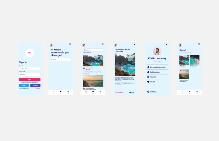
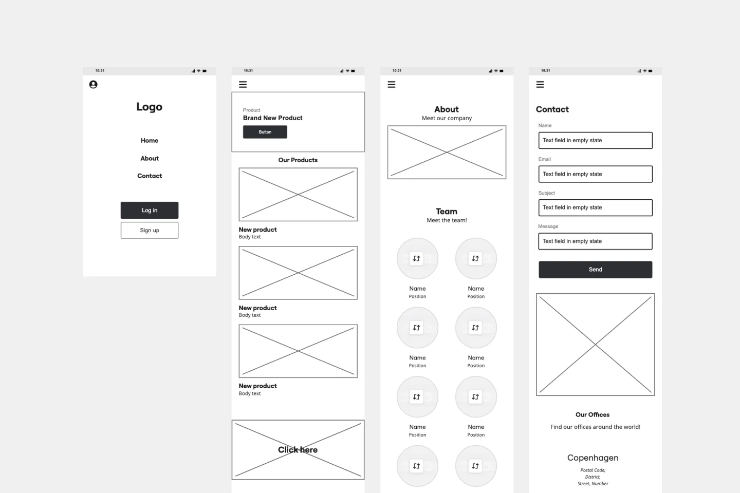
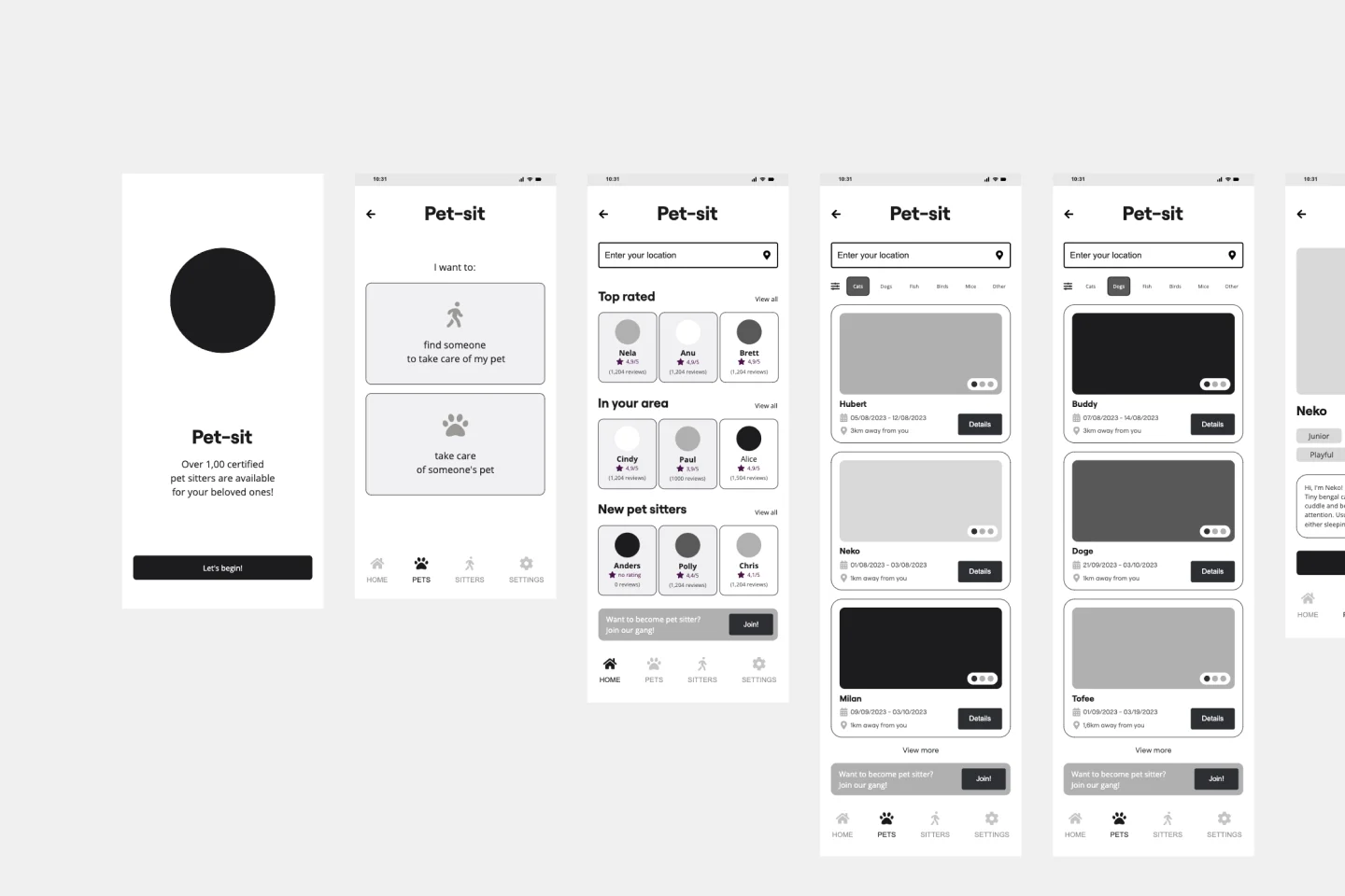
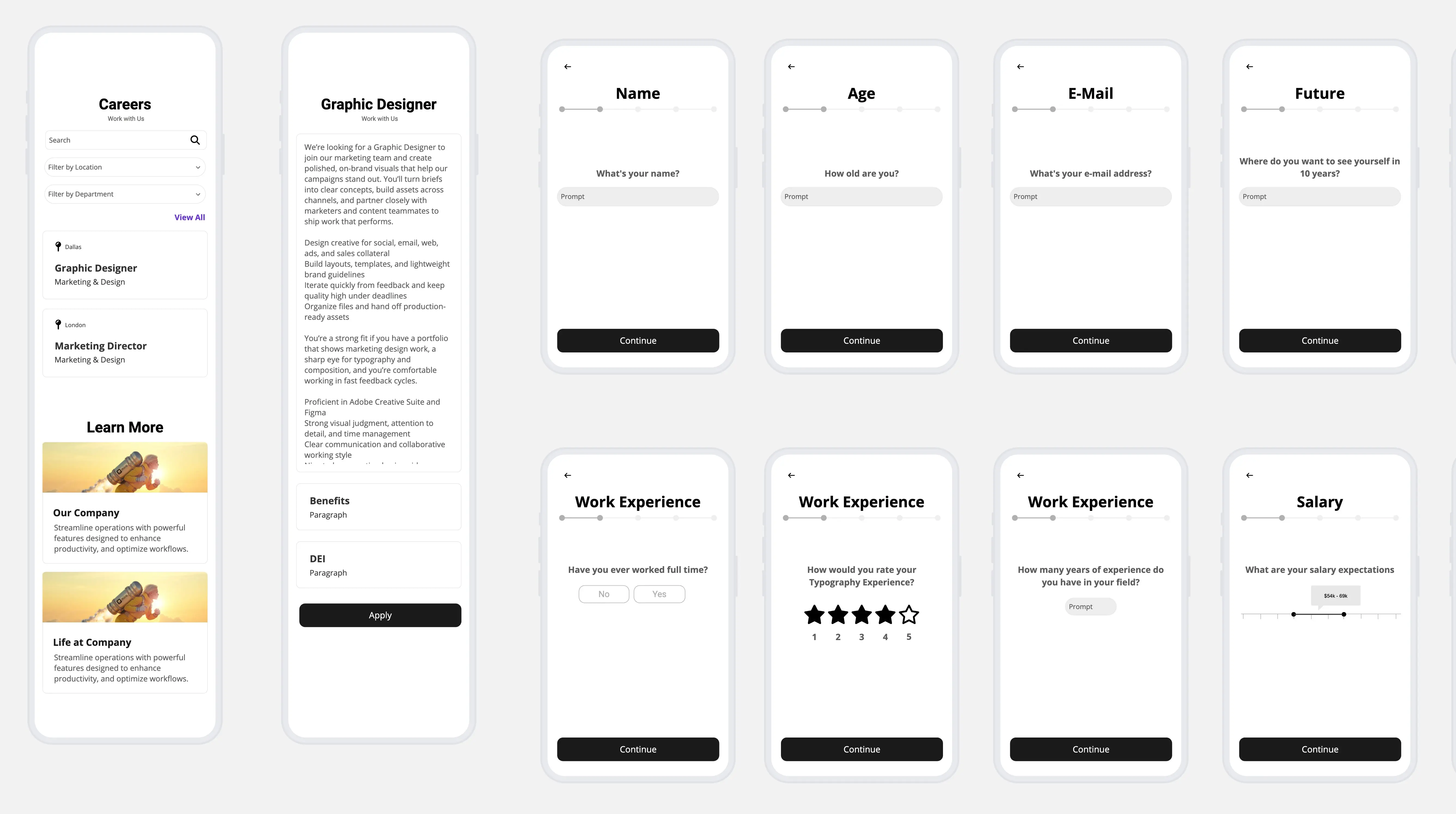
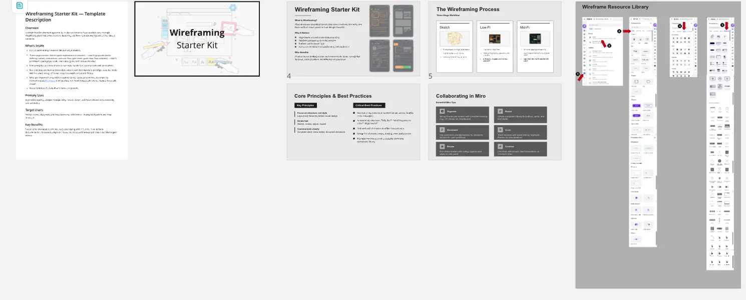
About the Mobile App Wireframe Templates
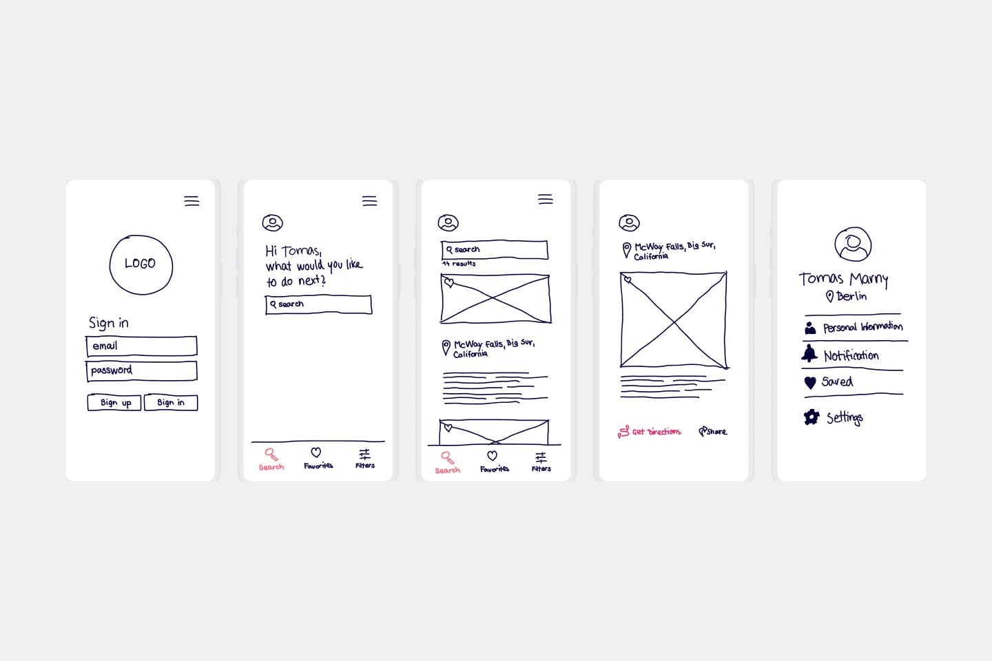
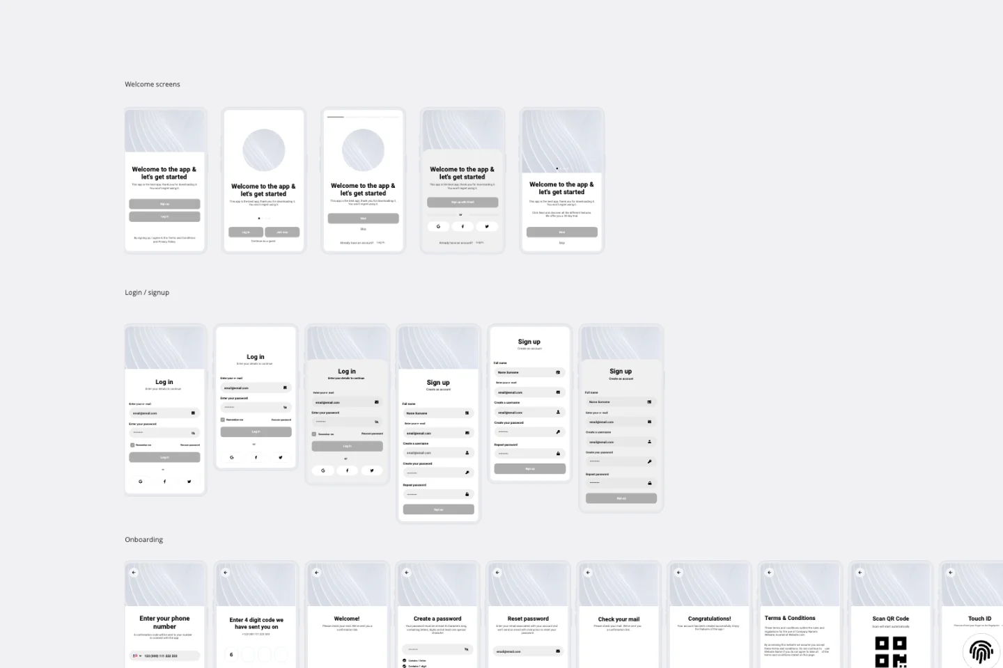
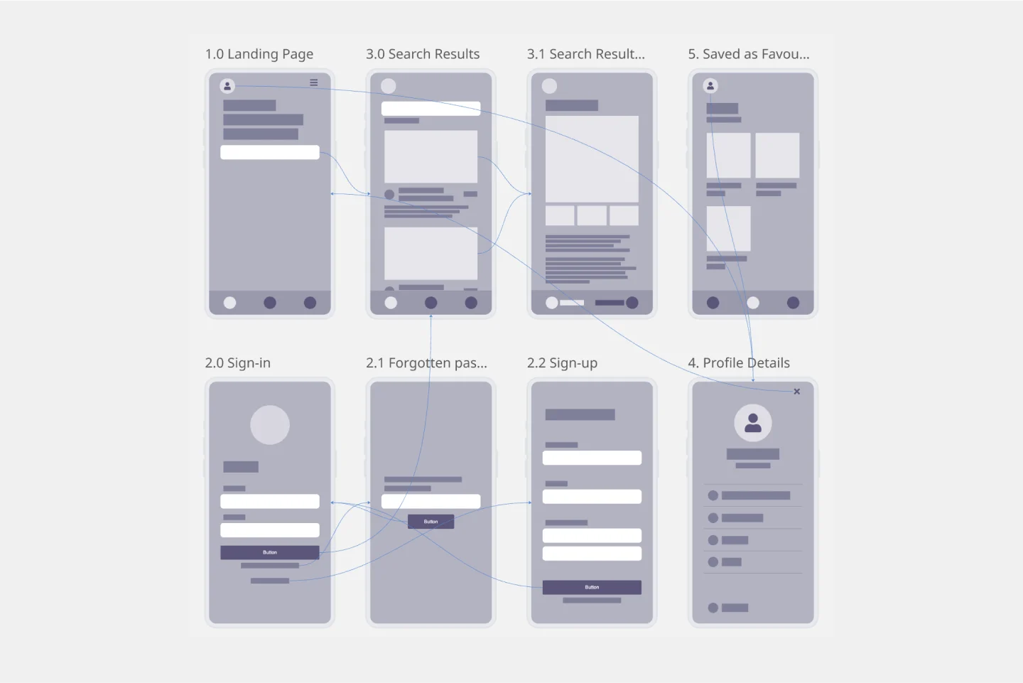
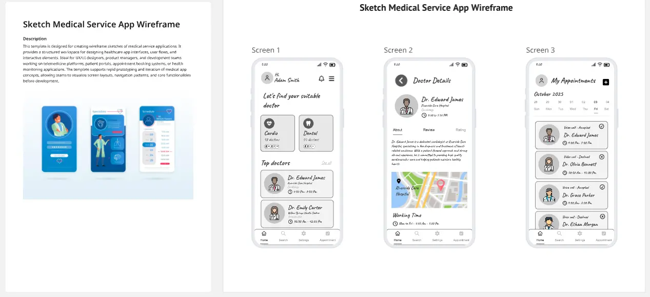
Use an App Wireframe Template to display the interface elements of your mobile app. Product teams can use it to lay out the structure and functionality of a mobile app, showing the user flow and interaction between elements. Miro’s App Wireframe Template helps you structure your mobile app layout, making it easy to manage design and app development from the get-go.
How to use the Mobile App Wireframe Templates
1. Select the App Wireframe Template
On the left toolbar, browse through the Templates Library and select the App Wireframe Template.
2. Drag and drop your wireframe components
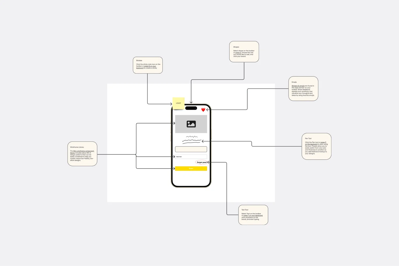
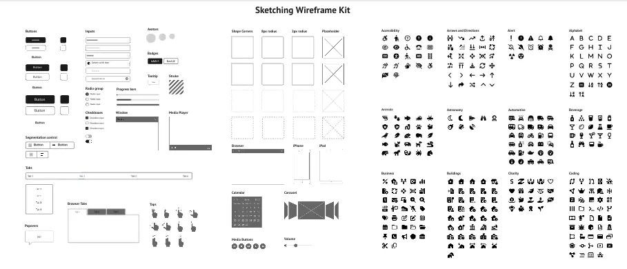
Miro's intuitive drag and drop feature makes adding and moving interface elements around your wireframe on the board easy. Use our robust Wireframe Library with pre-built components and icons to add functionality and visual interest to your app wireframes.
3. Ideate and co-create
Collaborate in real time or async, inviting your team to your board. Request instant feedback with comments directly on the app wireframe, tag stakeholders, and make it easy to iterate as you work on your design.
4. Circulate your app wireframe
Once you've created your app wireframe, export it as a PNG or PDF, or invite others to view and collaborate on the wireframe by sharing the board link.
How Miro helps you create a mobile app wireframe
Do you need help creating a wireframe app with your team? Here is what the process looks like:
Step 1: Define your app's flow
Write down the most important steps of your app's flow. List the key actions for each step. Be clear about your mobile application goals. Before you start wireframing, discuss your goals with your team and what you hope to accomplish by creating this mobile app wireframe; that way, it will be easier to map out the user flow and experience.
Step 2: Sketch your app’s functions
Use the app wireframe template components to sketch what functions need to be visible on the screen in each step. You can also use Miro's Wireframe Library for more components and icons. Users who interact with your mobile app are taking a journey. Consider the information presented on each app screen and how users will interact with it. You’ll also want to think about how a mobile app’s screen size is smaller than a webpage, so the content presentation should match accordingly.
Step 3: Add copy
Start filling in the content to determine if the intended copy will fit the app design. In general, real content generates better feedback, so it’s best to use real content and not just placeholder texts at this stage.
Step 4: Annotate
Since multiple stakeholders will be involved, don’t assume that your mobile app wireframe speaks for itself. Annotate as you work on your app wireframe to make receiving feedback easier and staying aligned.
Discover more app wireframe template examples to help you create the next big thing.
FAQ about the App Wireframe template
How do I make a wireframe template for an app?
You can make a mobile app wireframe using our template and customize it as you see fit. You can use Miro’s infinite canvas to mock up the flow between your app screens and have a great overview of your app layout.
What should a wireframe app contain?
An app wireframe template should contain the basic information about your app screens flow as well as how your layout should be designed and where content should sit. There are some elements that a mobile app wireframe should contain: logo, search fields, headers, the body of content, buttons, and footer.
What are some app wireframes examples?
There are three types of app wireframes: low-fidelity, mid-fidelity and high-fidelity. The difference between these app wireframe examples is the level of detailed information they contain about your mobile application.
