Onion Diagram Template
Discover the power and precision of the Onion Diagram Template. Visualize the components of a specific concept, system, or process and clarify their hierarchy and importance.
Trusted by 65M+ users and leading companies
About the Onion Diagram Template
At Miro, we always look for innovative ways to visually represent complex ideas, making collaboration more intuitive and productive. Our Onion Diagram Template is yet another tool in our suite designed to help you streamline your processes and achieve clarity in your projects.
What's an Onion Diagram Template?
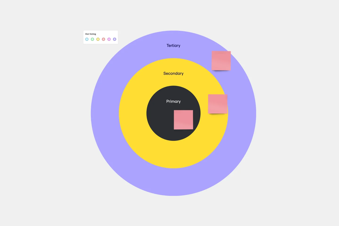
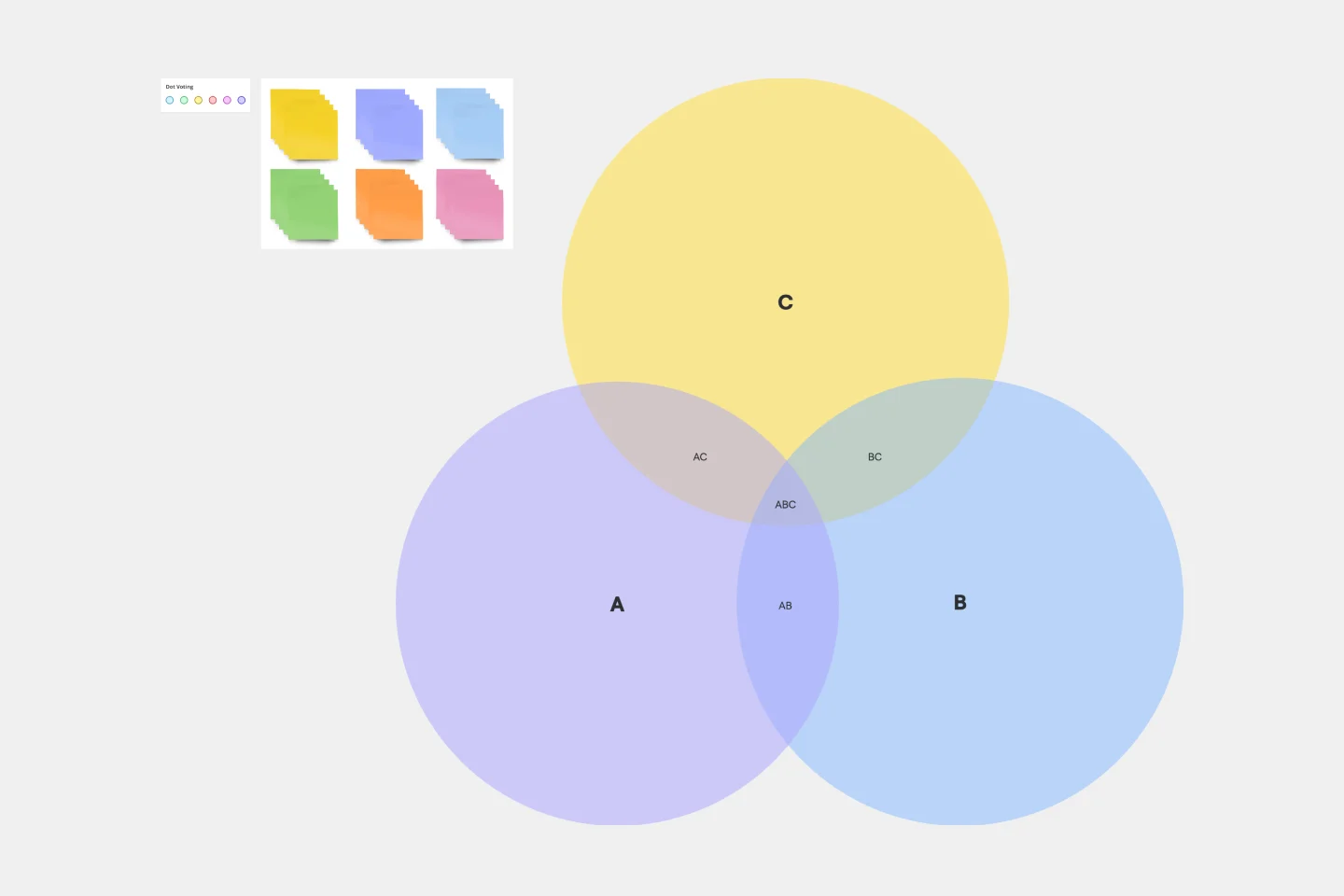
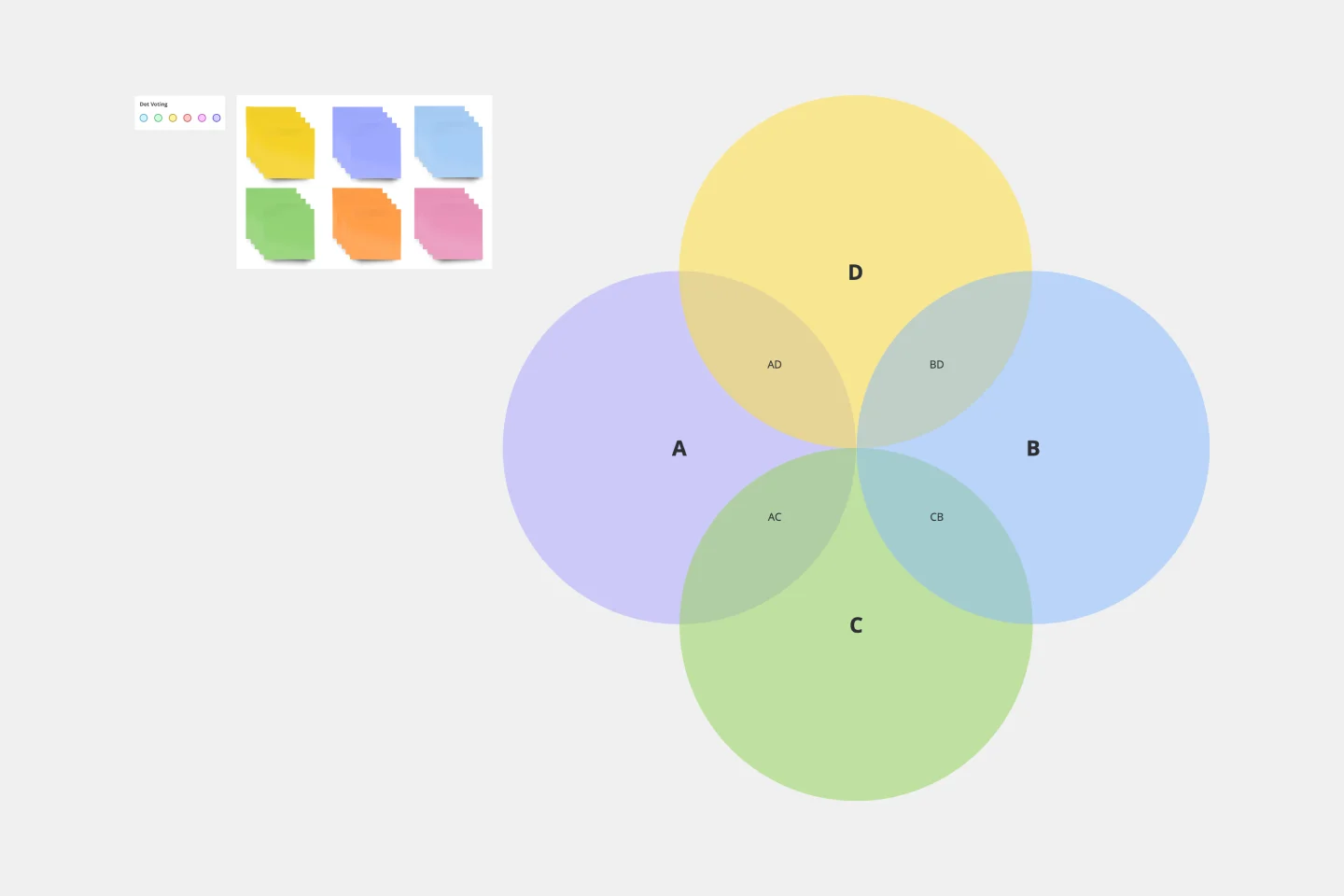
An onion diagram is a type of diagram that showcases layers of a concept, system, or process, much like the layers of an actual onion. Each layer of the diagram represents a different aspect or phase, starting from the innermost core and moving outwards to the outer layers. This structure allows viewers to understand relationships, hierarchies, or sequences in a visual, layered format.
What are the benefits of using an Onion Diagram Template?
Hierarchical visualization: Clearly see the priority or sequence of different elements in a process or system.
Easy analysis: Quickly identify bottlenecks, dependencies, or relationships between layers.
Universal usage: Suitable for various industries, including IT, business analysis, and education.
Enhanced collaboration: Team members can collectively analyze and change diagrams in real time.
How to use an Onion Diagram Template in Miro?
Using the Onion Diagram Template in Miro is straightforward:
Select the template: Go to Miro's Template Library and select the Onion Diagram Template.
Explore automated diagramming: Miro has automated diagramming features. Use our ready-made template and edit data as you see fit, or create an onion diagram from scratch using our shapes library. As you create your diagram, it can auto-adjust, making it easier to visualize complex layers.
Customize your diagram: Drag and drop elements, change colors, or add sticky notes to suit your specific needs.
Save and share: Once your onion diagram is complete, share the board link with team members for collaborative viewing and editing.
How many layers can I add to my onion diagram?
There's no strict limit to the number of layers. However, for clarity and usability, it's best to limit the layers to a number that's easily digestible for viewers.
Can I use the Onion Diagram Template on mobile devices?
Yes, Miro's platform is optimized for both desktop and mobile use, ensuring seamless collaboration regardless of the device.
Are there preset color schemes available for the onion diagram?
Yes, Miro provides a range of color palettes. You can also customize colors to align with your branding or preference.
Get started with this template right now.
Yes No Flowchart
Works best for:
Diagramming
The Yes-No Flowchart Template is a simple and efficient tool that helps to simplify complex decision-making processes into clear and easy-to-follow steps. This template uses standard shapes to illustrate processes, decisions, and outcomes, with arrows that guide users from one action point to the next based on binary 'yes' or 'no' decisions. Its most prominent benefit is its ability to bring clarity to decision-making. By presenting processes visually, teams can effortlessly understand and navigate complex scenarios, ensuring that each step is transparent and reducing the potential for misunderstandings or missteps.
4-Circle Venn Diagram Template
Works best for:
Diagramming, Mapping, Brainstorming
The 4-Circle Venn Diagram Template has an easy, interactive, and dynamic way to visualize complex relationships between data sets. Empower your team's collaboration and communication with this powerful tool.
Spaghetti Diagram Template
Works best for:
Operations, Mapping, Diagrams
Spaghetti diagrams are valuable for finding connections between assets, services, and products, as well as identifying dependencies in a visual way. Use this template to get an overview of a process and quickly find areas of improvement.
Inverted Org Chart Template
Works best for:
Diagramming, Org Charts, Organizational Design
The Inverted Org Chart Template is a tool that reimagines the traditional hierarchical model by placing frontline employees at the top of the organizational structure. This innovative approach highlights the crucial role played by those who interact with customers directly, ensuring that their insights and contributions are not only recognized but also celebrated. One of the key advantages of this template is that it fosters a feedback-driven environment. Prioritizing frontline workers promotes a culture where valuable insights from the ground can quickly reach the top of the hierarchy, streamlining decision-making processes and ensuring that strategies are based on real-world experiences.
Use Case Diagram Template
Works best for:
Marketing, Market Research, Diagrams
A use case diagram is a visual tool that helps you analyze the relationships between personas and use cases. Use case diagrams typically depict the expected behavior of the system: what will happen and when. A use case diagram is helpful because it allows you to design a system from the perspective of the end user. It’s a valuable tool for communicating your desired system behavior in the language of the user, by specifying all externally visible system behavior.
Euler Diagram Template
Works best for:
Business Management, Operations, Diagrams
Euler diagrams are valuable for showing different relationships between subjects by representing them with circles or "cells." Euler diagrams are frequently used in IT systems to show how objects relate to one another and how they interact. However, you can use them for any sort of explanation that needs to show connections.