About the Low-Fidelity Wireframe Template
Low-fidelity wireframes allow you to explore big ideas in a simple way, visualize the structure of your creation, and identify areas for improvement before adding technical details and user testing.
What is the low-fidelity wireframe template?
A low-fidelity wireframe template allows app creators and website designers to quickly outline their designs. It shows them how their designs will work at a high level, making it the perfect starting point for bringing their creation to life.
Are you looking for an interactive wireframe template that still serves as a practical, early vision of your product? Or are you looking for a template specifically for an app? Check out our wireframing tool.
What is a low-fidelity wireframe?
Low-fidelity wireframes are basic wireframes that outline blueprints for web pages or app screens. They help you communicate your product’s “big idea” rather than the specific details. That’s what high-fidelity wireframes are for (more on this later).
Think of it as a rough layout — the digital equivalent of some quick sketches of a concept on the back of a napkin. The simple preliminary design enables teams and project stakeholders to quickly determine the best solutions for users.
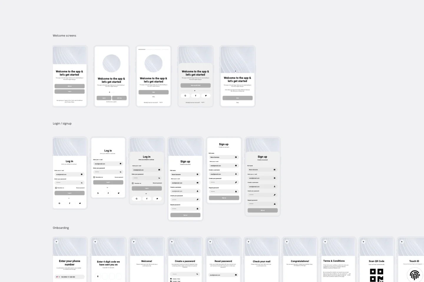
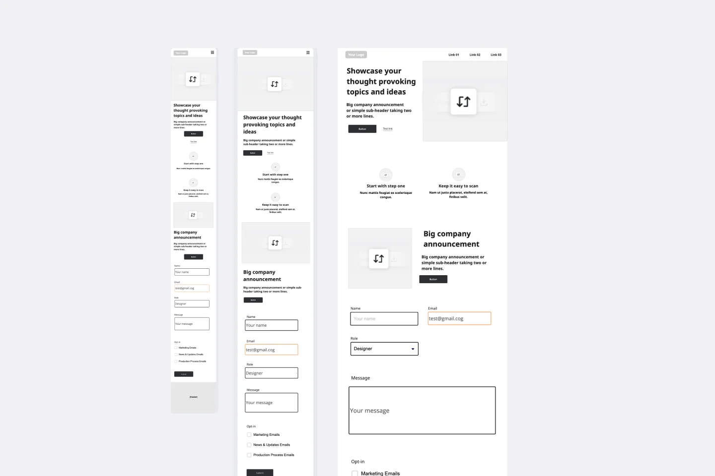
Typically, low-fidelity wireframe designs are grayscale. Each frame also relies on basic design elements, including shapes, image placeholders, and generic text to map the layout for future designs. You can divide your screen into a series of “zones” or “blocks” and indicate where elements like buttons, menus, images, text, and headings should sit on the screen. One screen will typically take a few minutes to sketch out. They can be linked together as a “wire flow” to show each screen's relationship or navigational order.
Whether designer or non-designer, you shouldn’t worry at the low-fidelity stage about scale, fitting into a grid system, or being pixel-perfect in execution. Product and UX teams can also use low-fidelity wireframes to empower non-designers to help shape a product or service in the early development stages.
Create a low-fidelity wireframe with Miro
Making low-fidelity wireframes is easy. Miro is the perfect workspace to create, share, and edit your wireframes. Get started by selecting our low-fidelity wireframe template, then take the following steps to make one of your own.
1. Ask your team to take research notes or record ideas. Have your team write down some quick thoughts on sticky notes. Let everyone get comfortable with the board's default state, think about new potential solutions, and ask any questions. Everyone on your team can then review and reflect on the problem that needs solving before diving into sketches.
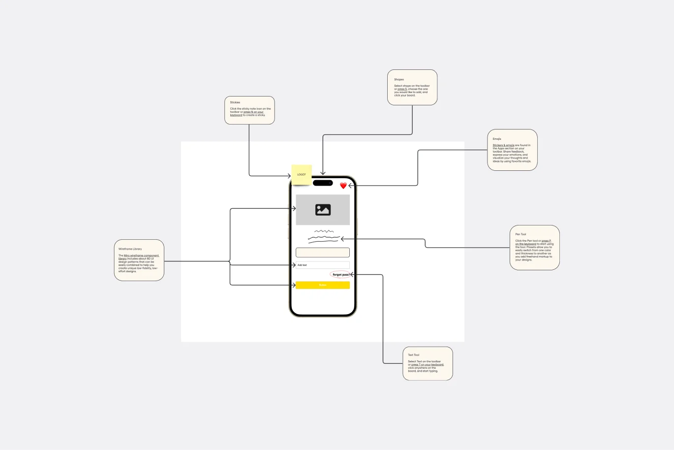
2. Sketch some initial rough ideas using the “Crazy Eights” method. Crazy Eights asks everyone to rapidly sketch eight different screens or interactions in eight minutes, equivalent to one wireframe per minute. The aim is to let go of perfection and instead get your ideas onto the screen as quickly as possible. Miro’s wireframe library allows you to create lo-fi solutions with over 15 UI components.
3. Create solution sketches or “wire flows” based on your best ideas. Now that you have a few individual sketches to work with, try adding some extra context (without getting caught up in the details). Stay focused on the information architecture (foundational structure) of each page or screen rather than the visual design. Use textboxes or sticky notes to label each screen and map out a narrative, e.g., “Landing Page” → “Our Product” → “Shopping Cart Checkout.”
4. Critique your solutions as a team. Spend ten minutes reviewing all the solutions and vote for the sketches you like best using Miro’s voting plugin. This helps you figure out together which ideas stand out. As a team, you can also discuss the wire flows to gain clarity, ask questions, and find patterns or common ideas from different sketches.
Share your expertise on Miroverse 🚀
Publish your own template and help over 60M+ Miro users jump-start their work.
Get started →
What does a low-fidelity wireframe include?
There’s no checklist for what your low-fidelity wireframe should include. Every wireframe is different depending on what you’re trying to create. For example, a mobile wireframe won’t be the same as a website wireframe.
However, there are some common elements you might want to consider in all of your wireframes:
Your company logo. Keep your branding consistent across all your channels and platforms by using your company logo.
A search field. Having a space for users to search for what they need makes it easier for them to navigate.
Breadcrumbs. Breadcrumbs are the trails that show how your website or app is connected. It draws connections between the different elements so you can see how users will navigate it.
Headers. Using headers gives some structure to the content of your wireframe. This includes the page title (H1) and any subheadings (H2).
Body content. Following your headings, you should also have body content within the wireframe. If you don’t have the copy, you can use filler content as a placeholder.
Contact information. How can users get in touch with you if they have a question or want more information? Make sure your contact information is visible so they know how to get in touch.
Low-fidelity vs. high-fidelity: What’s the difference?
Let’s clarify the differences between low-fidelity and high-fidelity:
Low-fidelity: A low-fidelity wireframe outlines the basic elements of your website or app. It maps out the blueprint in its simplest form. This helps teams visualize and test early concepts at the beginning of the creation process. Low-fi wireframes are usually static, meaning that you can’t test the wireframe as a user. This is where a high-fidelity framework would be helpful.
High-fidelity: A high-fidelity wireframe is a more complete visual representation of the framework. It has more technical detail, and it’s usually clickable and responsive to user actions. This gives designers a feel for how the final design will work for real users, making it helpful for user testing.
So how do you know when to use low-fi or high-fi?
It depends on what stage you’re at in the design process.
If you’re at the beginning of the creation process and you want to get a feel for the structure and layout of your website or app, a low-fi wireframe would be better. If you’re ready to progress your design and figure out the technical details, high-fidelity prototypes will be necessary.
When to use a low-fidelity wireframe
Sequential low-fidelity wireframes are quick, easy representations and a great way to explain an initial idea to your team, clients, or stakeholders.
You can use low-fidelity wireframes in the early stages of design, such as:
Meetings or workshops to turn your team’s ideas into visual sketches
Presentations, to quickly share several product ideas in development
Information architecture phases of product development to focus on user flows
Critique sessions for honest, actionable feedback or direction on rough work
Exploring concepts as early as possible safeguards your team against last-minute changes or expensive setbacks and also enables you to improve and refine your product. Your team can consider different ways of approaching a problem and encourage everyone’s voice to be heard.
Why are low-fidelity wireframes important?
You might be wondering why you should use a low-fidelity wireframe. Why don’t you just go straight to high-fidelity?
There are a few reasons why using a low-fi wireframe first can be beneficial. Let’s take a look:
It gets the ball rolling. If you have to wait to get a developer involved, creating your new website or app can take a while. But using a low-fi wireframe, you can start creating without needing intricate technical detail.
Identify areas of improvement. With a low-fi structure, it’s easier to spot bigger issues. There isn’t as much detail, so you can see from the top level where the gaps are. Using a low-fi template first also means it’s easy to make changes before things get too technical and harder to change.
Create a solid foundation. A low-fi wireframe gives you a solid foundation to build on. If you don’t have a solid starting point, your future wireframes will be built on an unstable foundation.
Easily share the blueprints. Low-fidelity wireframes are easier to understand. This means you can share basic technical information with key stakeholders who might not have technical knowledge.
Although high-fidelity wireframes provide more detail and user-testing capabilities, it’s important to create a solid foundation with a low-fi structure first.
Discover more mobile app wireframe examples to help you build your next big thing.
Low-fidelity Wireframe Template FAQs
What does "Low-fidelity" mean?
A low-fidelity prototype is a practical and early vision of your product or service. These simple prototypes share only a few features with the final product. For example, let’s say you’re designing an app. The low-fidelity prototype will provide an outline of where things will go and how it will function for users. The specific details and product development process come later. For this reason, low-fidelity prototypes are best for testing broad concepts and validating ideas.
Low-fidelity prototypes are also static and tend to be presented as individual screen layouts. Each screen looks like a sketch or wireframe, with simple black-and-white illustrations. Instead of intricate details, each frame is filled with dummy content or labels, depending on what’s available.
What is a high-fidelity wireframe?
A high-fidelity wireframe is more visual and interactive than a low-fidelity wireframe. Unlike the low-fi wireframe, a high-fi wireframe will include all the real content, copy, images, and branding. This makes it helpful for testing the user experience. It also provides more detail about the technical aspects of the app or website. Because it’s more advanced in its design, it’s best suited to the advanced stages of the creation process.
What are low-fidelity designs?
Low-fidelity designs are visuals that outline the structure and blueprint of a new app or website. They’re basic in their design, making it easy for everyone to understand the concept and visualize the different elements. Because they’re basic in their designs, they don’t often allow user interaction. If you need to do interactive user testing, you’re better off using a high-fidelity design. But we’d always suggest starting with low-fi to give your mobile app or website a good foundation to build from.
Are all wireframes low-fidelity?
Yes and no. Some wireframes are low-fidelity, but some wireframes are high-fidelity. Low-fidelity frames are used earlier in the design process and don’t include as much graphic detail as high-fidelity wireframes.


