About the Inverted Org Chart Template
The structure of organizations is constantly changing. The traditional hierarchical arrangement where executives are at the top and frontline employees at the bottom is no longer the norm. Instead, we have the Inverted Org Chart Template.
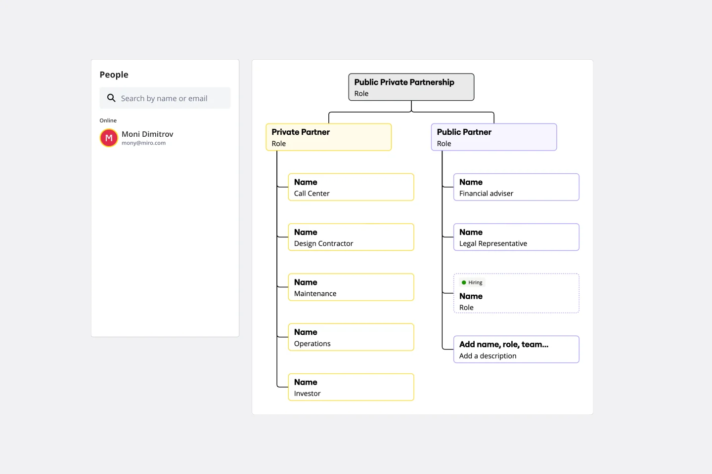
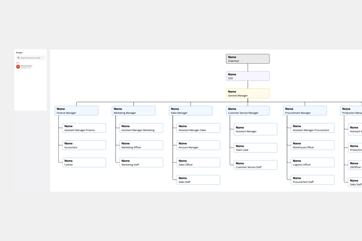
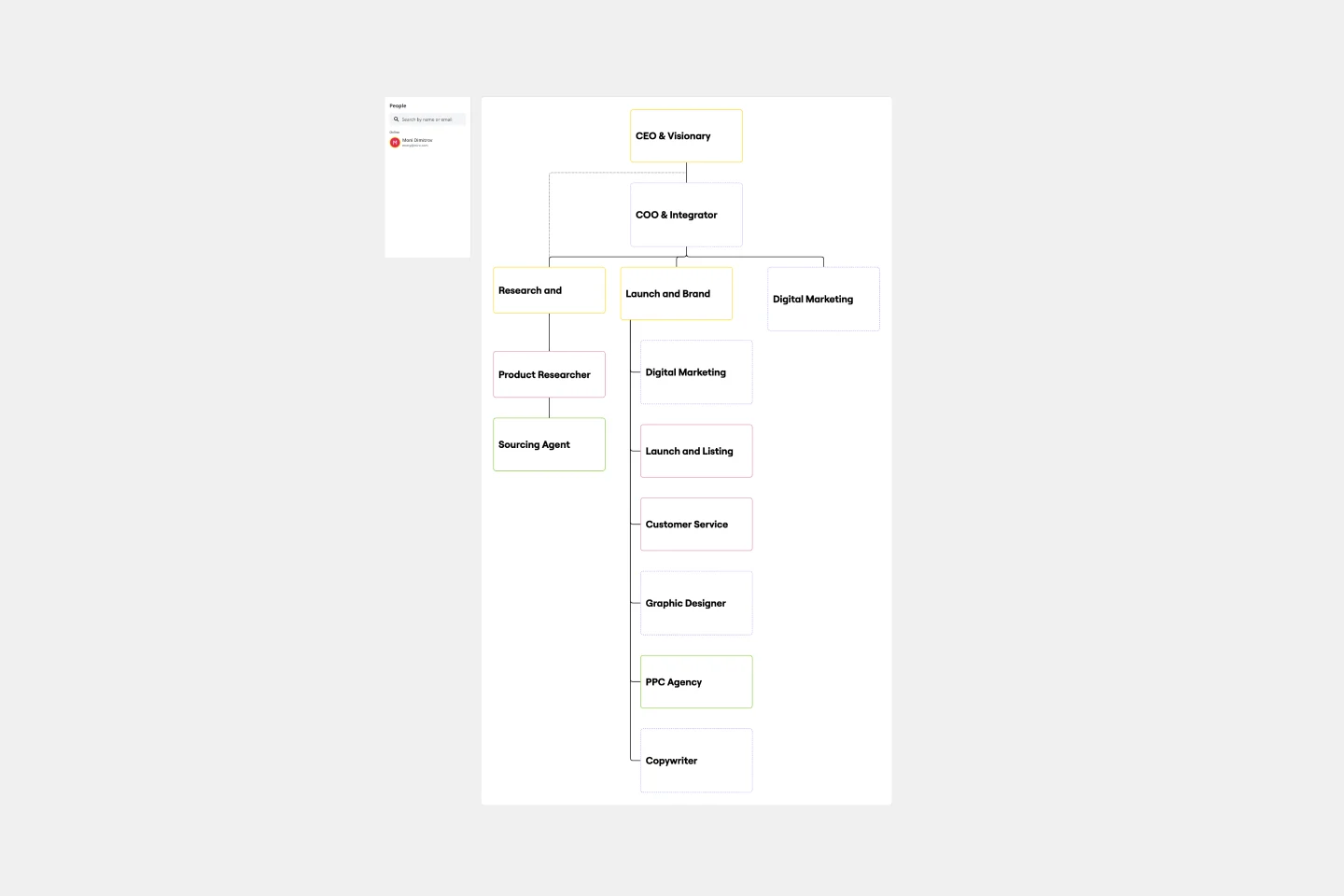
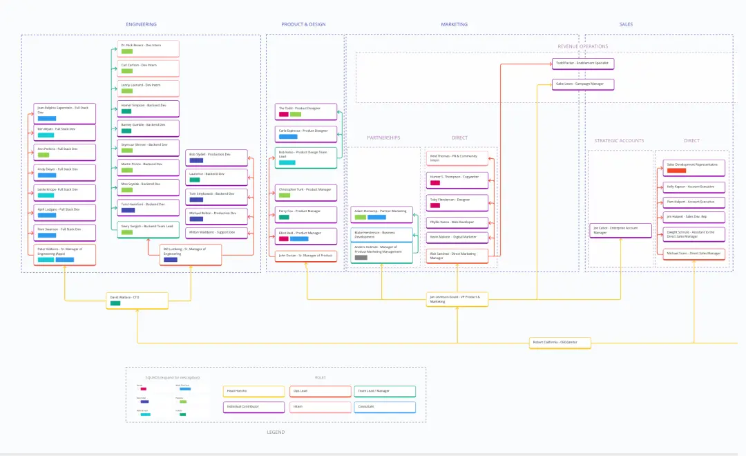
This new and innovative tool prioritizes frontline employees in visualizing organizational structure. This template flips the traditional pyramid, giving prominence to those closest to the customers, products, or services. The layout includes areas for frontline employees, mid-level management, senior leadership, and executive roles, among others. Miro's org chart maker is designed to be intuitive, allowing stakeholders to quickly understand the structure and identify where each role fits within the inverted hierarchy.
How to use the inverted org chart template
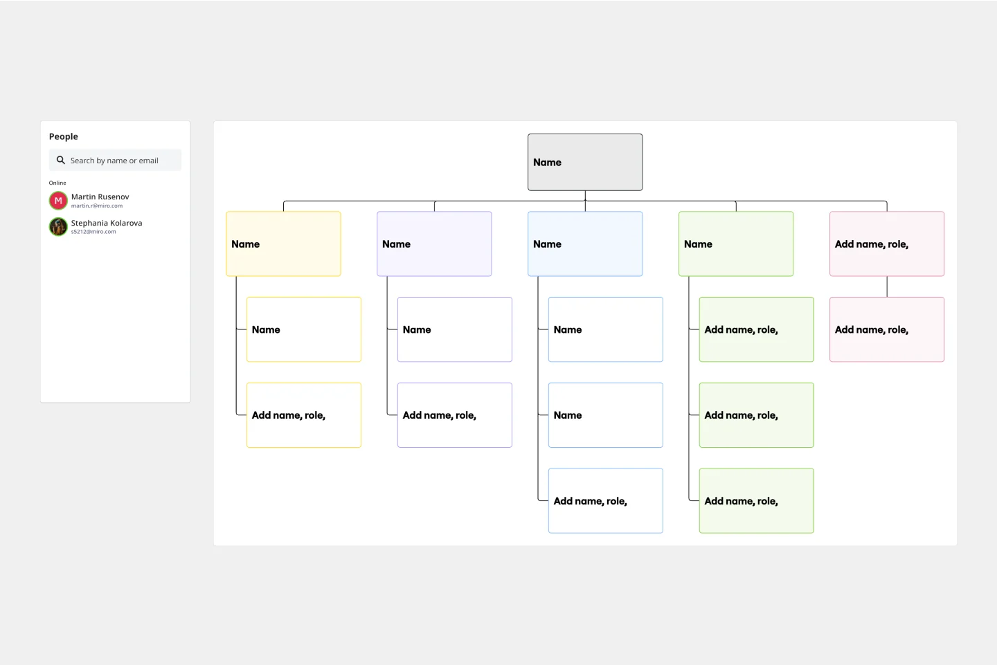
Edit with ease: By double-clicking shapes, adjust the template to your liking. Whether renaming positions, adding new roles, or reshuffling the structure, the template is designed for simplicity and efficiency.
Expand as needed: The automated diagramming features make it a breeze to expand the template. Add more shapes for new roles or departments, and connector lines automatically adjust to maintain a coherent visual.
Add contextual artifacts: Enhance the chart's clarity and relevance by adding any artifact—be it notes, images, links, or documents. The template seamlessly integrates with other tools, allowing you to provide richer context and deeper insights.
Why should you use an inverted org chart template?
Employee-centric Vision: The chart places frontline employees at the top, emphasizing the importance of those who directly interact with customers and creating a culture of appreciation and recognition.
Improved transparency: This layout provides a clear view of the company's structure, making it easier for everyone to understand the chain of command and reporting relationships.
Encourages feedback loop: With frontline employees in a prominent position, it promotes a feedback-driven environment where insights from the ground can quickly ascend the hierarchy, fostering communication and collaboration.
Adaptable to change: The template's design is flexible, allowing for swift modifications as the organization evolves, grows, or restructures.
Enhances communication: By visualizing the flow of communication in an inverted manner, teams can better understand how information should flow and ensure effective cross-departmental collaboration.
Inverted org chart template FAQs
Is the inverted org chart suitable for all industries?
Yes, the Inverted Org Chart is adaptable and can be tailored to suit any industry, emphasizing the roles and responsibilities most crucial to that particular sector.
How many levels can I add to the chart?
The template is designed for scalability. You can add as many levels as necessary to represent your organization's structure accurately.
Can I integrate other tools with this template?
Absolutely! The template is designed to seamlessly integrate with other tools, allowing you to add notes, images, links, or documents for richer context.
What if my organization follows a traditional hierarchy?
While the Inverted Org Chart prioritizes frontline employees, it can be easily adapted to represent traditional hierarchies. The key is to use its features to depict your organizational structure best.