About the Visual Story Mapping Template
Visual story mapping creates a single source of truth about your projects, ensuring your product managers and team members are aligned. These powerful maps help teams identify how different parts of a project will come together to create a successful whole.
Use this Visual Story Map Template to harness the power of story mapping with your team.
What is a visual story map?
A visual story map is a way to capture different parts of a project in one consolidated place. These maps are designed to give teams a more visual way of understanding complex patterns or relationships.
The aim of a visual story map is to harness the power of storytelling. This is done with the CAST method, which breaks a visual story map into four steps: Content, Audience, Story, and Tell. By looking at a problem or project like a story, teams can get a high-level overview of those important questions — who, what, where, why, how? From here, they can see how all the smaller details fit into the bigger picture.
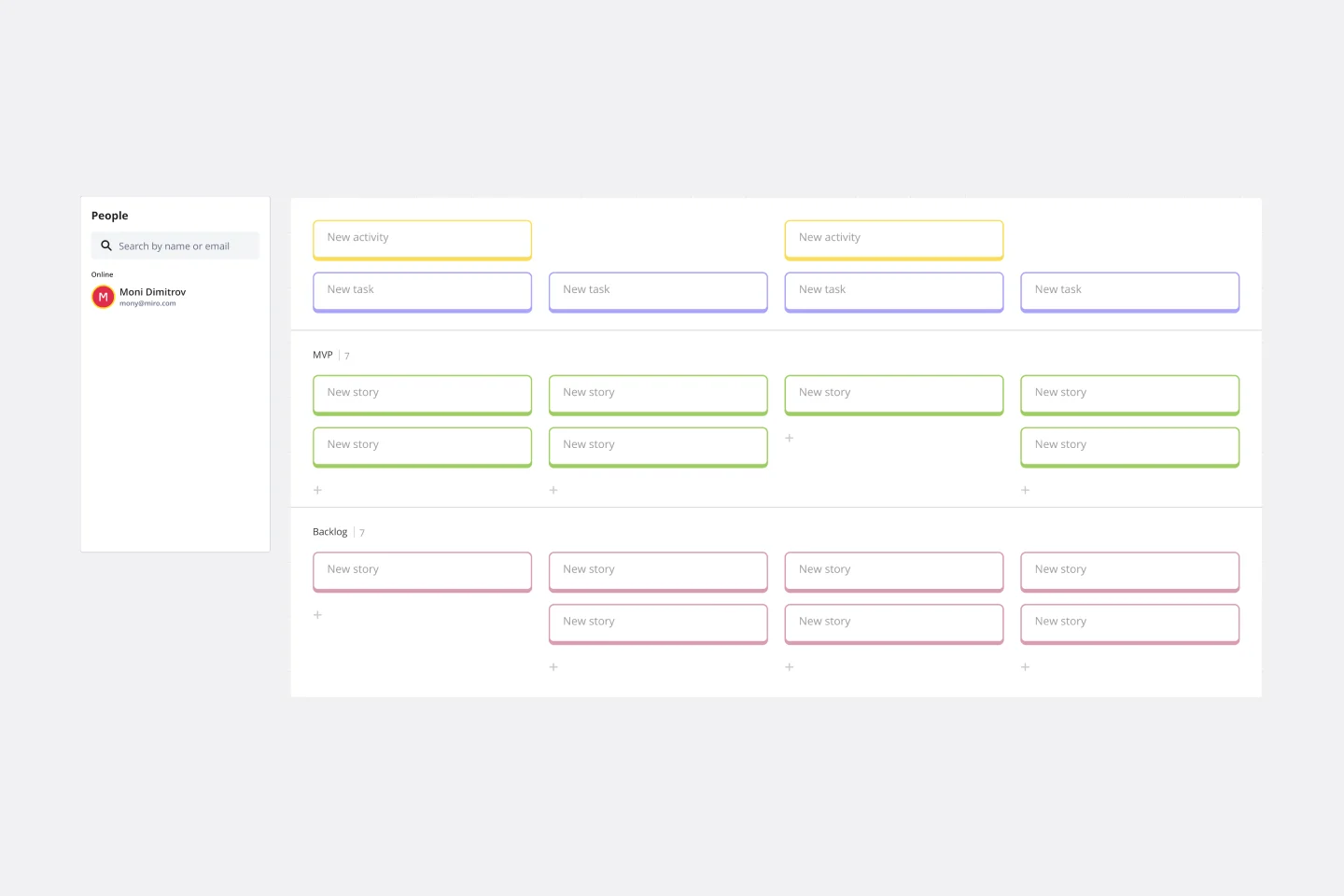
Visual story maps are particularly popular for mapping user stories. With story mapping, product teams can understand how individual user stories fit into the overall user experience.
A visual user story map is divided into individual stories, and each story is associated with a bigger, more significant step in the customer journey. With a complete visual story map, a product team can see all of the different ways a user might interact with a product.
How does visual story mapping add depth to your ideas?
Some people like to think of a visual story map as a stylized to-do list, but it’s a lot more powerful than that.
Visual story mapping allows your product management team to visualize multiple dimensions of information. In doing so, you can identify how these parts will come together to create a successful whole. Use the visual story map template to make sure your product managers are aligned and to create a single source of truth about your projects.
What are the 4 benefits of using a visual story map?
1. See the entire project from start to finish. When planning out a project, it can be difficult to visualize it from beginning to end. Visual story maps give you a holistic view of the project. This includes types of tasks or “stories” you must undertake to finish it, story viability, how stories unfold over a timeline, how stories are prioritized, and when you can expect each story to be finished. The visual story map brings everything together on the page.
2. Foster collaboration. Story mapping enhances your understanding of a project by giving you a complete picture. That’s why a visual story map is a great tool for encouraging collaboration within and across teams. Use the visual story map template to assign stakeholders, give people ownership over their responsibilities, scope out projects, share learnings, and brainstorm.
3. Conduct a gap analysis. Once you’ve mapped out your product management tasks as a visual story, it becomes easier to identify missing elements. Your teams can then get together to add solutions to the workflow, brainstorm ideas, and identify missing features. The visual story map allows you to see these elements before they impact your customer and bottom line. Try Miro's gap analysis templates.
4. Plan out timelines. Visual story mapping helps you think about how one aspect of your project flows into another. You can use this knowledge to figure out how long your project will take. This makes it easier to define your scope, assign roles, and budget accordingly. You can use Miro's timeline templates.
What does CAST stand for?
Our Visual Story Map Template incorporates CAST, which stands for Content, Audience, Story, and Tell. Microsoft experts originally developed this method as a presentation method for Enterprise Architects. But today, the CAST method is used to build any persuasive story, including visual story maps.
Here’s how CAST is incorporated into our Visual Story Map Template:
Content row: A lot of presentations have too much content that is not relevant to the decision or to the aim of the presentation. The content must lead the audience to understand why and what they must do.
Audience row: You need to understand your audience's needs and motivation. What do they need to know? How can you motivate them to take the desired action?
Story row: When you are clear about the content and your audience, you can focus on the story structure. Using the format of a story, rather than simply adding text to your presentation, makes it easy for your audience to listen to you and become involved.
Tell row: Create the words and visuals to focus on the telling of the story. Work out how the story will be conveyed in different formats and test that it has the intended impact.
Why use the CAST model for visual story mapping?
Here’s why the CAST model is particularly useful when creating a visual story map:
Easy to understand. CAST is based on easy but powerful ideas around visual design and storytelling. It breaks down the effort needed to produce a visual story into discrete steps that any professional can follow.
Makes change happen. CAST looks at visual storytelling in a new light. It is a proven, simple technique for communicating ideas in such a compelling way that audiences want to act. Using CAST for your story maps helps you create high-impact, visual presentations that tell a complete story. Once your product team has that complete story, they’re better prepared to take action.
Based on scientific research. The CAST method has been developed over 12 years by a team of visual experts, including two Microsoft presentation experts. It’s based on decades of scientific research in psychology, linguistics, design, and education. Using the CAST method allows your team to harness the power of this scientific research during product development.
Create your own visual story map
Here’s a step-by-step walkthrough of how to create a visual story map using our template.
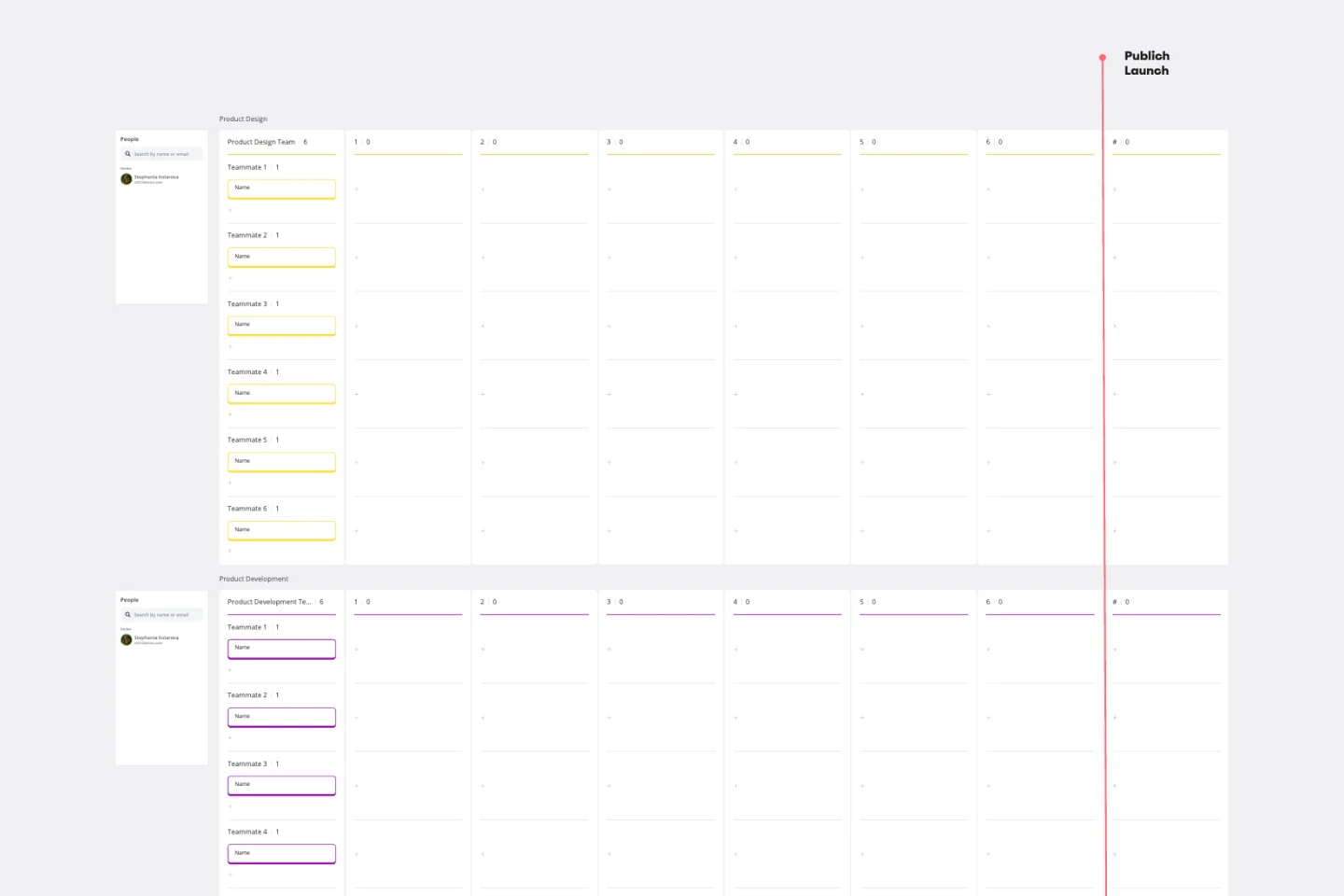
1. Start with the top horizontal row, which is the Content row. In this row, you need to be clear about what the story is about. This section is about making sure you have the right content before building your visual story.
The Content row is divided into four sections: Why, What, How, and What If.
Why: This is where you give people a clear reason to act. You need to explain the key issues and drivers that are forcing the change.
What: This is where you define the thing that is going to be affected by the change.
How: Change can’t happen on its own. This is where you identify the activities that must be done for change to happen.
What if: This is about looking at all the possible outcomes from the change. What will the future look like if the change is successful? What would happen if there was no change?
2. The next row is Audience. This section is about understanding your audience so you can lead them to act.
You need to fill out two sections in the Audience row:
Who is where you define your audience. Who are the key individuals or groups involved in the change?
Learning and decision styles involve a deeper analysis of your audience. It’s about understanding how your audience will react to what you give them based on different learning and decision styles.
3. The Story row is where you create a memorable, impactful story. It involves looking at four elements:
Structure: All good stories need a beginning, middle, and end. This is where you decide on the framework for your story.
Character: These are the key characters in your story. Your audience needs to connect with the characters in your story on some level.
Sense of urgency: There needs to be a reason for the characters in your story to act. Why should your audience make the choice to support the change now? This sense of urgency will make your story compelling.
Delivery plan: Stories can be told in many different ways. This is where you decide how you want to deliver your story. What is the sequence of people, places, and events to tell the story for the audience?
4. The final section of the visual story map is about putting all the parts together to tell the story. The Tell row consists of two parts:
Design: How you present your story will have a big impact on how you influence your audience. This section is for you to decide on the relevant formats for the visual content.
Test: Finally, you need to assess whether you have successfully told your story. The testing phase is where you decide if your visual story is good enough to influence your audience.
When should you use a visual story map?
Visual story mapping is a powerful tool that can be used during any phase of a product life cycle. For example, you can create a story map when building a minimum viable product. Use your map to identify the minimum technical requirements and product features to test your concept. Another popular use for story mapping is for improving an existing product by mapping all the potential enhancements.