18 likes
580 uses
There’s power in simplicity. Our Simple Presentation Template gives you the perfect framework to communicate powerful messages by shedding excess and unnecessary design elements that take away from the core components of your speech. Instead, it focuses on a clean and simple design that’ll keep your audience engaged throughout.
A simple or minimal presentation is a presentation that focuses on the art of communicating a complex idea or process in a simple and memorable way. It embraces the “less is more” movement and uses as few components as possible to deliver a compelling, noteworthy speech.
Thus, instead of using multiple elements to grab and hold the audience’s attention, it focuses on only including the most important elements that all have a purpose in getting the message across effectively.
While minimal presentations have fewer elements than other presentations, the minimalist design still needs to be visually appealing and make sense to keep the audience engaged for the duration of your presentation.
A simple presentation should include:
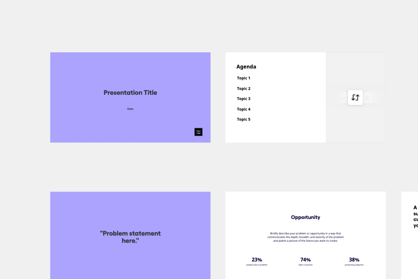
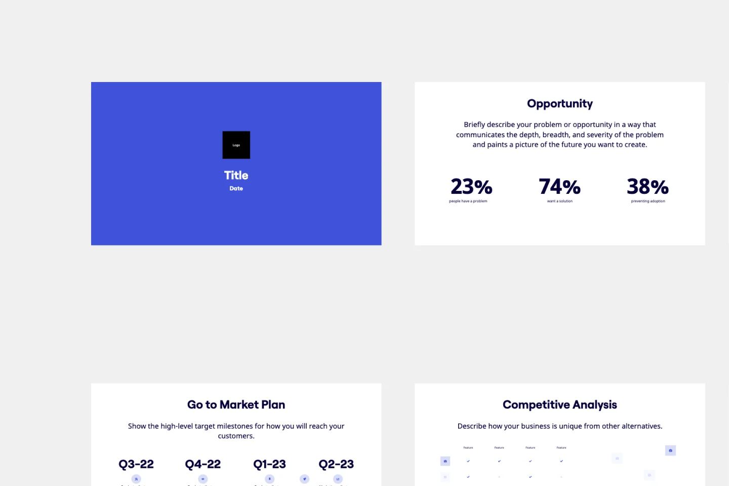
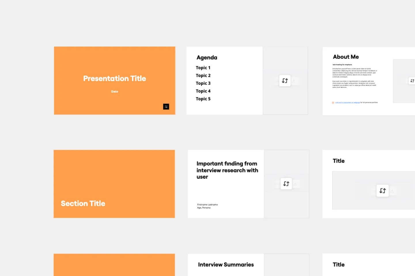
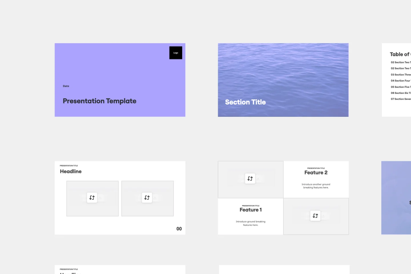
Limited color schemes: The best simple presentations only include one or two colors from a monochromatic color palette. This means that a single-color family or tint is used, and only the saturation or hue is adjusted to create other variants of the same color.
Use of negative space: These presentations make use of a lot of white space between text, images, and blocks to create high levels of contrast. The amount of text is also very limited to make sure that viewers don’t spend too much time reading the slides.
Strategic content placement: Images and text are placed strategically throughout the slides and are only used when they add to the message in some way. Often, images in these speeches include graphs, tables, bubble charts, or other data-driven images.
Powerful typography: Bold and dramatic typography is incorporated into minimal presentations to draw the viewer’s eyes and make a statement. The typography needs to tell a story or convey a certain emotion.
A call to action: End the presentation with a clear CTA that leaves the viewers (and potential clients) with actionable steps that they can take to implement the tips, messages, or instructions that you’ve given them throughout the speech.
Due to its minimal use of elements, simple presentations make it far easier for viewers to stay focused and enticed.
Audience members are forced to listen because there’s minimal text on the screen. The only way they can truly walk away with food for thought is if they pay attention to what you’re saying.
These presentations also allow for a more dynamic design since there’s a faster transition between slides, creating a more interesting narrative arc.
Here are the steps you can follow to get the most out of the Simple Presentation Template.
Step 1: Decide on your colors
Don’t choose more than two colors. You can either use your business colors or choose theme colors that portray your message best. For example, when you look at color psychology, the color “yellow” portrays creativity and warmth, whereas the color “purple” portrays luxury and ambition. Have a look at other colors to find one that suits your speech best.
Step 2: Decide on your font
Different fonts convey different messages. Make sure to choose a font that suits your presentation. Dramatic fonts that are bold and big make a great impact. To make it easier for the audience to read, try choosing a basic font that’s part of the Serif, Display, Monospace, Handwriting, or Sans Serif font families.
Step 3: Choose a few key images
Only include images that support your message or add to the speech’s credibility. Try to include different types of charts or data-driven images that support your claims. You can also use original, bright, high-quality photos that were either taken or designed by you or one of your team members. Avoid using boring and barely related stock photos.
Step 4: Create your slides
Combine all of your components — text, images, colors — in different slides. Minimalist presentations are all about strategic placement. When you want to place focus on a specific element, place it in the center of the slide. This way, your audience’s eyes will be drawn directly to it.
Step 5: Deliver the presentation
When you’re done adding your elements to the slides, you can use the presentation mode to adjust the slide layout and remove or add more slides. You can simply click the “present” button and move between slides with your arrows during the presentation.
The more you remove distracting elements, the easier it’ll be for your audience to access the information you’re giving them. They won’t be distracted by unnecessary clutter — and will be far more likely to take in your core message.
The reduced amount of text on your slides means that your audience will be forced to listen to you as opposed to simply reading the slides (which will likely result in them not understanding a single word of it). Thus, your audience won’t only understand your message better, but they’ll also be more engaged since you’ll be able to transition between your slides a lot faster.
The minimum text-point size for a presentation slide is 24 points. Text smaller than this is too small for your audience to read. Keep in mind that different font types are smaller or bigger at the same font size. For example, Arial’s 24-point text might be bigger or smaller than Georgia’s 24-point text. To ensure that your text is, in fact, comparable to common fonts in 24-points, measure it against a common font (such as Arial) to guarantee that it’s still readable.

Miro
The AI Innovation Workspace
Miro brings teams and AI together to plan, co-create, and build the next big thing, faster. Miro empowers 100M+ product managers, designers, engineers, and more, to flow from early discovery through final delivery on a shared, AI-first canvas. By embedding AI where teamwork happens, Miro breaks down silos, improves alignment, and accelerates innovation. With the canvas as the prompt, Miro's collaborative AI workflows keep teams in the flow of work, scale shifts in ways of working, and drive organization-wide transformation.
Project Presentation Template
Use our Project Presentation Template to provide an overview of your upcoming project. Get buy-in from investors, keep stakeholders in the loop, and show colleagues your plan of action.
Pitch Deck Template
Stand out and leave a lasting impression with the Pitch Deck Template. Make people care about your idea and gain supporters everywhere.
Keynote Presentation Template
Designed to create enthusiasm and build knowledge about a specific topic, keynote presentations are more powerful than most people think. With them, you get to inspire and unify an audience with a common purpose. We give you an easy way to do this — just use our Keynote Presentation Template to create your own captivating presentation.
Presentation Template
At some point during your career, you’ll probably have to give a presentation. Presentations typically involve speaking alongside an accompanying slide deck that contains visuals, texts, and graphics to illustrate your topic. Take the stress out of presentation planning by using this presentation template to easily create effective, visually appealing slides. The presentation template can take the pressure off by helping your audience stay focused and engaged. Using simple tools, customize a slide deck, share slides with your team, get feedback, and collaborate.