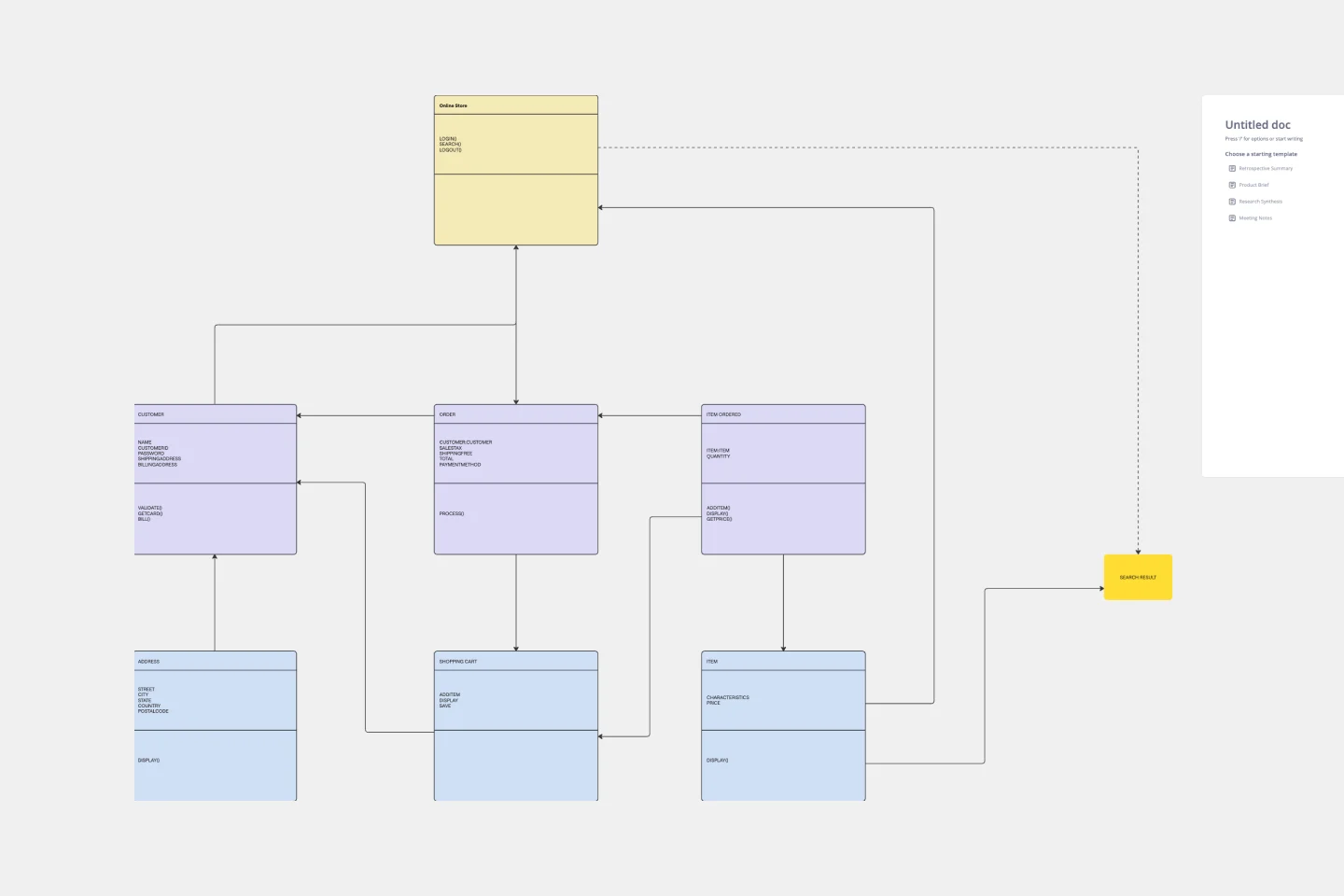
UML Activity Diagram
Plan, analyze, and optimize activities by breaking them into subprocesses and constituent decisions with our Activity Diagram template.
About the UML Activity Diagram template
Want a bird’s-eye view of everything that happens in your organization, department, or system? We’ve got you.
Activity diagrams are powerful visual tools that break down large processes and process chains into small, bite-sized activities. It’s a simple way to analyze processes or share them with someone else visually.
This template is a fast, easy way to start your first (or next) activity diagram. Use it to optimize, explain, onboard, and more. Keep reading to learn more about what an activity diagram is and how you can use our template to create one.
What is an activity diagram?
An activity diagram is a visual representation of a process or system. It shows the actions, subprocesses, and decisions that constitute a larger activity. A diagram like this is often used to plan, implement, and optimize processes in I.T. and management.
At first glance, an activity diagram can look a lot like a flowchart. The difference is perspective and application. A flowchart tells people (and robots) what they should do at each point in an activity by demonstrating the flow of objects. It’s about describing ways to get work done.
In contrast, an activity diagram gives you a high-level view of processes and their subprocesses. It’s a tool that system designers and managers can get more value from. It’s commonly used by project managers, team leads, business users, etc.
Benefits of activity diagrams
An activity diagram has a number of benefits.
They show you the sequence of actions and decisions that go into a larger activity. With activity diagrams, you can easily see all the decisions and sub-activities an activity is made up of. This makes it easy to visualize processes, including complex ones, and understand or explain them.
They help you understand how complex systems can be optimized. With long chains of processes and decisions, optimization can get difficult. Activity diagrams make things easier — you can quickly visualize ways to shorten your critical path, chunk subprocesses together, and more. This makes optimization faster and easier, especially in collaborative environments.
They tell you whether a process is being executed as intended or not. It’s easy to compare what is actually happening in your system or organization against an activity diagram. This makes it easy to make sure processes are being executed as intended — and correct them if necessary.
They make it easy to identify and remove unnecessary actions from a process. Activity diagrams make it easy to see dead ends, duplicate activities, and more. This makes it easy to identify and remove superfluous, unnecessary actions clogging up your system or organization.
Activity diagram shapes
Reading an activity diagram is straightforward. There are only five main activity diagram symbols you need to know and remember.
Ellipses: Ellipses represent actions within a system. It’s easy to recognize these — they usually have text describing the action they represent inside them. It’s common to use a color to fill ellipses so that they’re more noticeable against the background.
Diamonds: Diamonds represent decisions. These, too, are easy to recognize. They have two or more lines extending from them, symbolizing different decisions that can be made. Diamonds are usually black but can be filled with other colors too.
Bars: Bars mark the starting and ending points of parallel flows or multi-part activities. The starting bar is where a process splits, and the ending bar is where the process joins back together again. Like diamonds, bars are usually black shapes.
Black Circles: A regular black circle is where an activity, system, or workflow starts. A black circle inside a black circle is where an activity ends (i.e., the final node).
Other Symbols: Sometimes, unique activity symbols are added to specific diagrams. If you add these, we suggest adding a small diagram key to help viewers understand what new symbols mean.
Create your own activity diagram
Miro’s whiteboard tool is the perfect canvas to create and share activity diagrams. Get started by selecting this Activity Diagram template. Then, follow these steps:
Step 1: Use the shape function to create ellipses that represent key activities and subprocesses. Add text to the ellipses using a color that makes sense to you. Once you’re done, arrange key activities in sequence, either from top to bottom or from left to right.
Step 2: Still using the shape function, add diamonds to represent decisions within the process you’re mapping. Then, add bars to represent the start and end of any parallel activities. Finish by using black circles — encircled and plain — to show where a process starts and ends.
Step 3: Check to see that you’ve represented a process and its logic properly. Confirm that you haven’t missed or misrepresented sub-processes, decisions, etc. Make sure your diagram is a truthful representation of what’s actually happening.
Step 4: Share and collaborate on your activity diagram using Miro’s convenient sharing features.
Step 5: Once your collaborators have added comments and edits, give your activity diagram one more review to make sure it still makes sense. You don’t want to find out your process or activity doesn’t work as intended in the middle of it later on!
Example of an effective activity diagram
We can use an activity diagram to map out the purchase process in an e-commerce store. This makes it easy for teams to see how the actions of machines and humans create the entire shopping experience (and its backend).
In this example, the starting node comes at the moment a customer visits your website or app. At this point, you map out a linear sequence of actions: “Search for Product,” “Find Product,” “Add to Cart,” and “Buy Product.” These actions can be further broken up into smaller subprocesses and decision paths — like saving a product for later, choosing an address, etc.
Once you have this basic sequence of a purchase process, you can build on top of it. For example, you can add retargeting advertisements for customers who leave your website without buying. You can also add server-side processes performed by machines into the mix.
Activity diagrams like these are a common way to plan, understand, and develop e-commerce flows. They’re used by project managers, marketers, developers, and others.
What is an activity diagram used for?
An activity diagram is used to map out processes by visualizing them as sequences of smaller subprocesses. This can help you understand, collaborate on, and optimize complex processes. Activity diagrams are most commonly used to offer a high-level view to managers, developers, and other system and business process architects.
What are the elements of an activity diagram?
The elements of an activity diagram are action, decision node, initial node, and end node. An ellipse represents an action, usually with text on the inside, and a diamond represents a decision. Regular and encircled circles represent start and end nodes, respectively. There are also bars, which mark the start and end of simultaneous flows and processes.
How do you create an activity diagram?
The simplest way to create an activity diagram is by using an online tool. Miro has all the shapes you need to draw activity diagrams, and it’s easy to use alone and in collaboration with team members and third parties. To get started, just follow the links on this page and start using our Activity Diagram template.
What is the difference between a flowchart and an activity diagram?
Flowcharts and activity diagrams both show us how systems work. The difference is that flow diagrams are used to show steps of sequences that people and machines need to perform. They’re more about getting work done. Activity diagrams are more about understanding how complex processes work at a high level.
Get started with this template right now.
Blue Ocean 4 Actions Framework Template
Works best for:
Leadership, Decision Making, Strategic Planning
For entrepreneurs, so much comes down to new users—how to attract them, impress them, and convert them to loyal customers. This template, designed by the authors of Blue Ocean Strategy: How to Create Uncontested Market Space and Make the Competition Irrelevant, will help you maximize value for you and your customers alike. Using the template’s four steps (divided into easy columns), you’ll easily evaluate your products in more innovative ways and make sure money is being spent in areas that really matter.
Influence Diagram Template
Works best for:
Business Management, Decision Making, Diagrams
See the big picture of any business decision with this Influence Diagram Template. You’ll define the decision you have to make and brainstorm everything that could impact it. When you build connections between these factors, you’ll be able to put the right amount of weight into each one as you make your decision.
Azure Data Flow Template
Works best for:
Software Development, Diagrams
The Azure Data Flow is a diagram that will allow you to combine data and build and deploy custom machine learning models at scale. Azure is Microsoft’s cloud computing platform, designed to provide many cloud-based services like remote storage, database hosting, and centralized account management. Azure also offers new capabilities like AI and the Internet of Things (IoT).
UML Component Diagram Template
Works best for:
Mapping, Diagrams, Software Development
Use our Component Diagram template to show how a system’s physical components are organized and wired together. Visualize implementation details, make sure planned development matches system needs, and more — all in a collaborative environment.
Timeline Template
Works best for:
Project Management, Flowcharts, Project Planning
A timeline displays a chronological order of important dates, and scheduled events. Timelines help product managers, project managers, and team members tell visual stories about progress and obstacles. Timelines enable teams to see at a glance what happened before, what progress is happening now, and what needs tackling in the future. Projects or products with specific purpose or deliverables should be based on a timeline to be successful. Use the timeline as a shared reference for start dates, end dates, and milestones.
AWS Architecture Diagram Template
Works best for:
Software Development, Diagrams
The AWS Architecture Diagram is a visual representation of the AWS framework, and it also translates the best practices when using Amazon Web Services architecture. You can now have an overview of your AWS architecture with Miro’s AWS Architecture Diagram Template, track your cloud solutions easily, and optimize processes like never before.