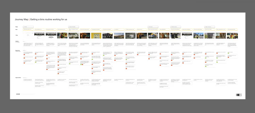
This template serves as a comprehensive visualization tool for mapping out the user journey and user flow of a product, offering a structured approach to understanding and improving the user experience. It follows a two-step process, beginning with the depiction of the current user journey followed by the creation of the proposed user flow.
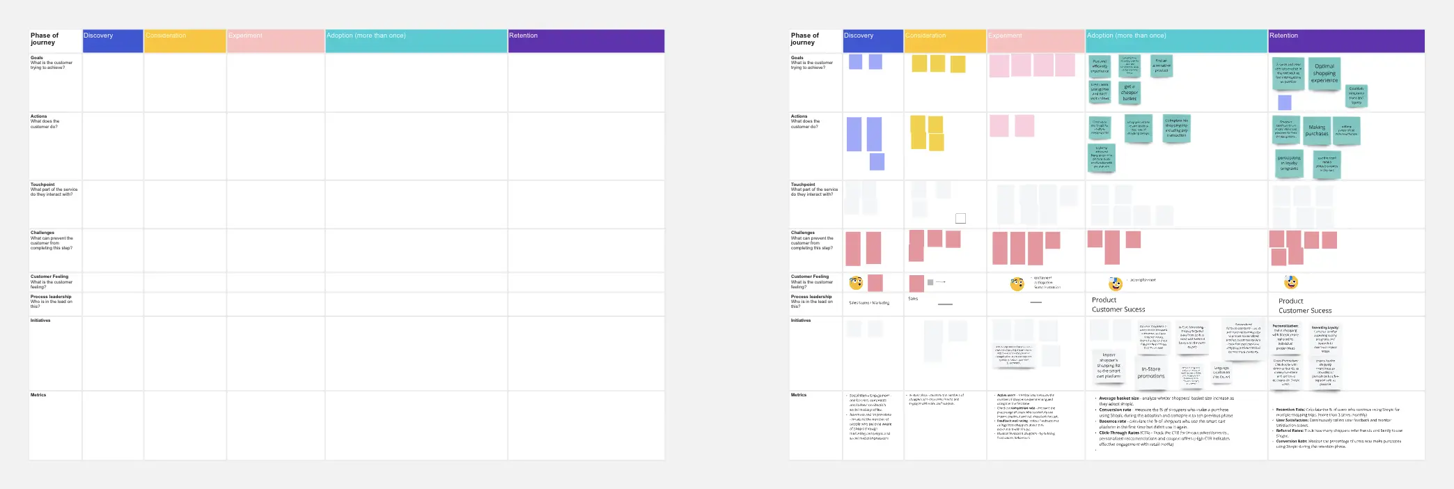
Understanding the current user journey is an essential first step. It involves meticulously mapping out the various touchpoints, interactions, and experiences a user goes through when engaging with a product or service. By visually representing this existing journey, it becomes easier to identify pain points, bottlenecks, and areas where user satisfaction can be enhanced. This process allows stakeholders to gain a holistic perspective of the user's experience, pinpointing areas that require optimization.
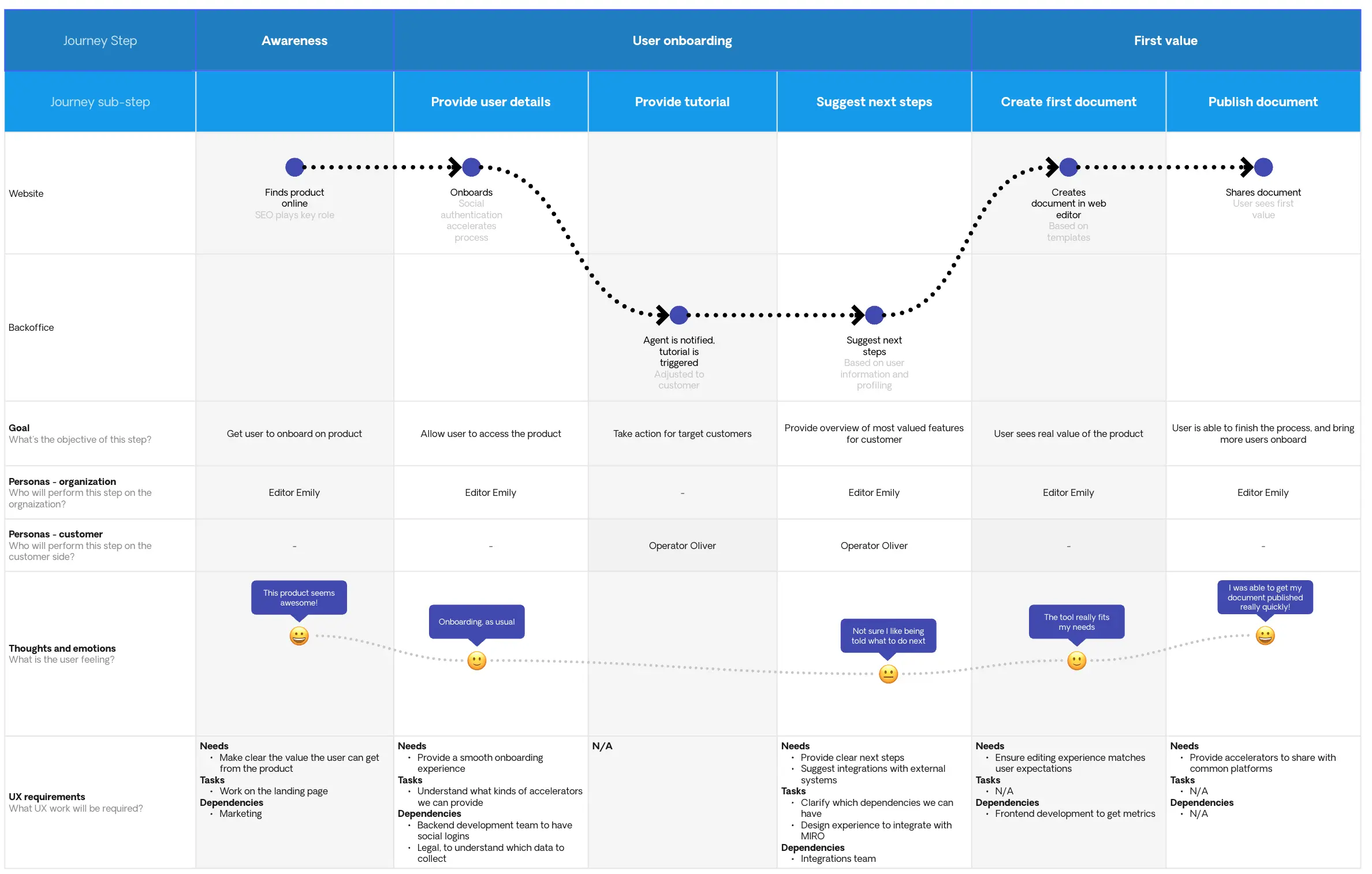
Once the existing user journey is thoroughly documented, the template moves on to the proposed user flow. This step entails envisioning an improved user experience by redesigning the sequence of actions and interactions within the product. It allows for the incorporation of user-centered design principles, best practices, and innovative ideas. By creating a user flow that aligns more closely with the desired user experience, the template empowers teams to conceptualize and communicate how the product should ideally function.
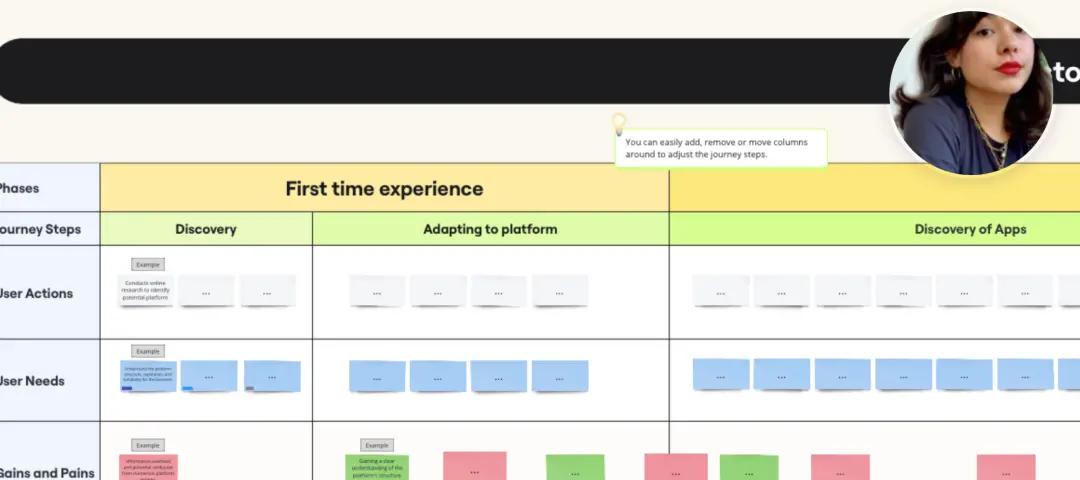
The template's visual format is a valuable asset in presenting findings and recommendations to stakeholders and team members. It enhances clarity and fosters collaboration by providing a common visual language for discussing user experience improvements. It serves as a tangible reference point for ongoing discussions and decisions related to the product's development.
Moreover, the template is adaptable to various stages of product development. Whether you are starting from scratch, redesigning an existing product, or implementing incremental improvements, it can accommodate your needs. It promotes an iterative approach to design, allowing teams to revisit and refine the proposed user flow as the project progresses or user feedback is gathered.
In conclusion, this user journey and user flow template is a versatile tool that promotes a user-centric design approach. It facilitates the exploration of the current user experience landscape and guides the envisioning of an improved user flow. By utilizing this template, product teams can foster better communication, enhance collaboration, and ultimately create products that resonate with users and exceed their expectations.