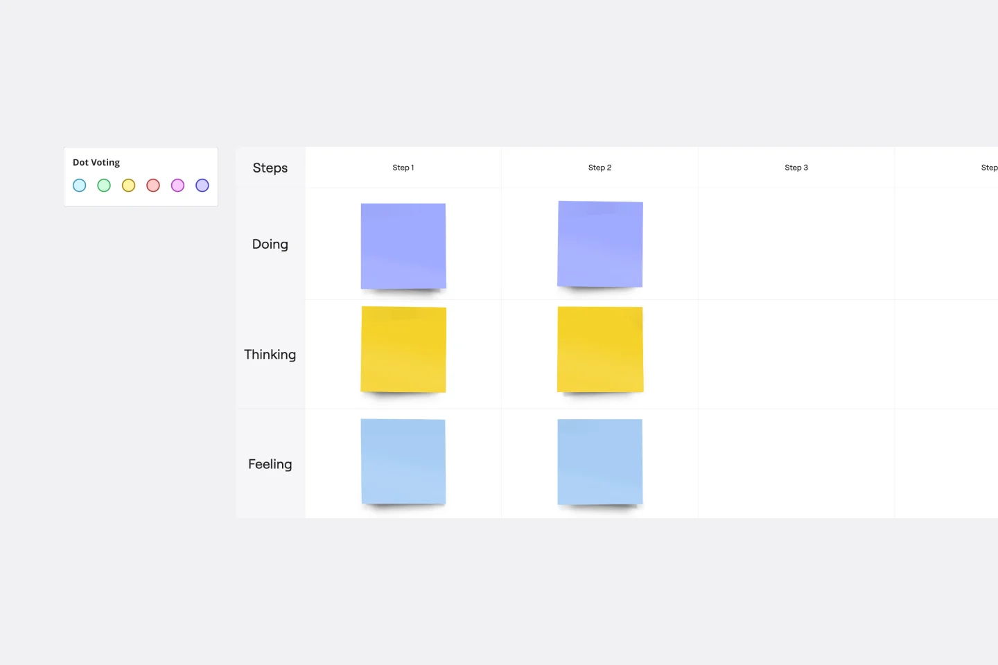
About the Card Sorting Template
Card sorting is a widely used research technique that helps UX and design teams decide how to structure a website or app's information architecture (IA).
Teams can use this technique to figure out how much users already know about your product or service.
By asking users to group digital “cards” representing pages or concepts, teams gain insight into how people mentally organize and understand content, their mental models. These insights guide decisions on how to organize and label navigation so it feels natural and intuitive.
Traditionally, card sorting uses sticky notes or index cards to organize and categorize information during an in-person workshop.
Miro’s Card Sorting Template brings this research method online, where you can run a card sorting session seamlessly in real-time or asynchronously. This means you can collaborate with participants, capture results instantly, and move from research to design with fewer bottlenecks.
What is card sorting?
Card sorting is about creating a set of cards, each representing a concept or item. The card sorting process has participants matching your ideal customer or target persona, grouping the cards in a way that makes sense to them.
Typically, cards get sorted in one of three ways with a card sorting tool:
Open card sort
Participants sort cards into their categories and label them themselves. The open card sort is a generative approach and helps UX teams learn:
How customers understand and analyze your information
Where people expect to find information when they click on your website
How to brainstorm new ideas for structuring and labeling your website information
Whether your site has multiple user groups that think in different ways about your information
Closed card sort
Participants sort cards into categories you give them. The closed card sort is an evaluative approach to see how customers organize information based on a given framework, and helps UX teams learn:
Whether people agree on where your information is best found in existing categories
Specific, unclear, or misleading category labels that need fixing
How to reduce the number of categories you have, based on categories that were ignored
Hybrid card sort
Participants can either create new categories to complete their card sort (an open approach)or sort cards only into their categories, less likely to make their own labels (a closed approach). This mixed approach can lean toward more open or more closed, and helps UX teams learn:
How to generate ideas for grouping information based on inspiring participants with a given category pattern
Categories that have high agreement after an open card sort, but need more clearly defined card groupings
When to use card sorting
Designing navigation without user input often leads to confusing menus, misaligned categories, and frustrated users who can’t find what they need. For UX and design teams, this creates rework, wasted time, and missed opportunities to meet user expectations.
Card sorting online removes the guesswork. In a session, each participant (representing your user) organizes topics into categories and helps you label these groups. By the end of the session, you’ll learn how to meet your users’ expectations, help them quickly find what they need, and have a frictionless experience when navigating through your website or app.
Running a card sorting session enables your team to:
Decide on a structure for the information architecture of a new or existing website
Find the right language to make your navigation user-friendly
Group your content (or products and services) in a way that makes sense to your users
Compare how different customers or user groups understand concepts related to your products and services
Find a quick, cost-effective technique for collecting and presenting real data on user goals that most benefits business needs
Once you’ve found new insights into how customers navigate your website or app, you can use this data to develop a new, improved information architecture.
Create your own card-sorting session
Running a card sorting session is easy. Start by selecting the Card Sort Template, then take the following steps to make one of your own.
1. Choose your sorting card topics
You can edit the default card set, including text and images, to suit your website or app’s information architecture. Aim for 30-60 cards per session. Only the most relevant cards have to end up sorted into groups.
2. Explain what card sorting method you’d like users to follow
Do you prefer an open, closed, or hybrid card sort? Edit the instructions to tell participants your expectations.
3. Invite your participant to organize topics into groups
Now they can start making sense of your product or service’s information architecture. We recommend timing this exercise with Miro’sCountdown Timer. Aim for 15-20 minutes. Add an extra five minutes if they haven’t completed the timed sort after 20 minutes.
4. Ask your participant to name groups
After all the cards are grouped, ask the participants to label. This will reveal the participant’s mental model during open or hybrid card sorts. It’s unlikely they’ll create labels that perfectly align with your product’s marketing or branding—so treat it as a source of inspiration.
5. Debrief with your participant
Hop on another video call (orchat, if preferred) and ask the user to explain the rationale behind their card sorting decisions.
Which cards were easier or more difficult to sort? Did any cards seem to belong to two or more categories? Any thoughts about items left unsorted (or placed in the “not sure” category)?
Card sorting template FAQs
How do you sort cards online?
Many UX researchers use online card sorting sessions since it’s a practical and quick way to conduct user research within remote and hybrid teams. To run an online card sorting session, open the template, add your cards, and invite participants to start sorting.
You can use sticky notes to make directions clear on the board, add comments, or tag any teammate or participant. Don't forget to set the timer to know how much time participants have to sort the cards. After your card sorting session, analyze your data and share insights with your team.
How do you present card sorting findings?
You can present your card sorting findings using one of Miro’s ready-made presentation templates. UX researchers often present their findings by creating a full report on the methodology, mentioning the common card categories, the percentages of cards sorted into different categories, and possible directions and insights from the pre and post-questionnaires.
How many participants do I need for a reliable card sort?
It depends on your content complexity, diversity of users, and how much variation you're expecting. For many projects, 20-30 participants give you enough insight into patterns without overburdening your team. If you have multiple user groups, you might run separate sorts per group.
With Miro’s card sort template, you can run both real-time or asynchronous sessions to reach users at scale, then compare results side by side to spot consensus.
What type of card sort (open, closed, hybrid) is right for my project?
Open card sort is best early in a project when you want to discover how users group and label content naturally.
Closed card sort works when you already have category names and want to test their clarity.
Hybrid gives you a mix, letting participants suggest new categories while also using some provided structure.
In Miro, you can set up any of these methods, tailor instructions, and adjust the template so your approach matches both your users’ needs and your design goals.
Can I use the card sorting template for a redesign, or only for building IA from scratch?
You can absolutely use card sorting for redesigns. It helps you identify where existing navigation is confusing, where category labels are misaligned with how users think, or where content is grouped wrongly. In the template, you can import current categories or menus and compare them with users’ groupings to inform improvements.
With Miro’s free card sorting tool, you can go from raw user input to clear navigation patterns in one place. No spreadsheets, no scattered notes. Just an organized, visual workflow your whole team can understand.
Whether you’re redesigning an app or launching a new site, our template makes it simple to uncover users’ mental models and build experiences that feel intuitive.
What do I do with the results of a card sorting session?
Once participants have grouped and labelled cards, you analyze for patterns: frequent groupings, category labels that recur, cards that are sorted differently by different users, etc. Use this insight to adjust navigation labels, merge or split categories, and optimize IA.
Miro helps by letting you export results, visualize consensus vs divergence, and iterate quickly on your IA based on what you learn.
How should I choose the number of sorting cards or topics to include?
Too few cards risk missing important content; too many cards may cause fatigue or confusion. A common guideline is around 30-60 cards per session. If your content set is large, prioritize the most important items first, or run multiple sorts. Using Miro’s card sorting tool, you can easily duplicate, filter, or hide cards to tailor sets per participant group.
How does Miro help my team collaborate on card sorting sessions?
Miro makes collaboration seamless, whether you’re running a card sorting session live or asynchronously. Teammates can co-create on the board, leave comments, and even record a Talktrack to share insights.
This keeps research, discussion, and decisions all in one place—reducing extra meetings and ensuring alignment as you refine your information architecture.
Can I find other card sorting templates or examples from teams like mine?
Yes. In Miroverse—our community-driven library—you’ll find thousands of templates created by product teams, researchers, and industry leaders. Explore ready-made frameworks for card sorting, user journey mapping, feedback sessions, and more. You can also join the Forum to ask questions, share tips, or connect with peers running similar UX studies.
Is it difficult for teams new to Miro to run a card sorting session?
Not at all. Miro’s card sorting template is designed to be intuitive. You simply set up cards representing your content, invite participants, and watch them sort. Features like clustering, tagging, and color-coding build on familiar activities, so most teams see value within their very first session.
Can Miro handle large or complex card sorting studies?
Absolutely. With Miro’s infinite canvas, you can run small, focused sorts or scale up to handle large sets of cards and multiple categories. You can duplicate frames, run parallel sessions, and use integrations like Jira or Confluence to connect your findings back to product workflows.
Can I adapt the Card Sorting Template to match my team’s process?
Yes. You can fully customize the template. Add or remove cards, apply brand guidelines, or set up categories to match your project. For recurring studies, you can save your customized template for future use. For more complex workflows, Miro Blueprints let you preconfigure entire spaces with boards, tools, and templates that fit your team’s research process.