Table of contents
Table of contents
What is process mapping?
Summary
In this guide, you will learn:
- Process mapping visualizes workflows step-by-step, revealing bottlenecks, redundancies, and improvement opportunities that text documentation misses
- As-is maps document current reality (including workarounds and delays), while to-be maps show optimized future states — comparing both drives successful implementation
- Common formats include flowcharts (simple workflows), swimlane diagrams (cross-functional processes), value stream maps (Lean improvement), and BPMN (technical processes)
- Real impact: GE Digital maintained Lean transformation momentum remotely using Miro's visual workspace, creating transparency that exceeded physical workshops
- AI-powered creation: Generate initial process maps from text descriptions in seconds, then refine collaboratively with your team in real-time or async
- Best practices: Map actual workflows (not ideal ones), keep diagrams scannable, focus on handoffs and decision points, and treat maps as living documents
Collaborative AI Workflows
Join thousands of teams using Miro to build the right thing, faster.
Process mapping explained
Here’s the truth: You can benefit from visualizing even the simplest of processes.
Think about doing something straightforward and intuitive — like making a sandwich. Anyone who’s made a sandwich knows it’s just about putting different ingredients between two slices of bread.
But imagine if you were to break down the process of making a sandwich into its various steps. We’re willing to bet you’d find ways to be even more effective and efficient — like grabbing all of your ingredients at once rather than taking multiple trips back to the fridge.
That’s essentially what process mapping is for. It’s about understanding your current processes and how to optimize them.
What is a process map?
Chaotic processes derail projects before they even start. Your team wastes hours in meetings trying to figure out who owns what, information disappears into silos, and small inefficiencies compound into major bottlenecks. You know something needs to change — but you can't fix what you can't see.
Process mapping turns that chaos into clarity. It's a visual technique that documents every step of a workflow, showing exactly how work gets done — not how you wish it happened, but how it actually unfolds. By creating a visual representation of your processes, teams can spot inefficiencies, eliminate redundancies, and build workflows that actually work.
Whether you're streamlining customer onboarding, optimizing product development, or improving cross-functional handoffs, process mapping gives you the foundation to move from reactive firefighting to proactive improvement.
Why process mapping matters
Process mapping isn't just about drawing pretty diagrams — it reveals the hidden friction slowing your team down.
Here's what makes process mapping essential:
Spot the bottlenecks you didn't know existed. That approval step your team thinks takes two days? Process mapping shows it actually takes seven — and reveals why.
Get everyone speaking the same language. Marketing thinks handoff happens at stage three. Sales says stage five. Your process map settles it definitively.
Make improvements that stick. Without documenting the current state, process improvements become guesswork. Map first, improve second, measure third.
Onboard new team members faster. New hires can see exactly how work flows instead of piecing it together from scattered conversations and tribal knowledge.
Meet compliance requirements. Regulated industries need documented processes. Process mapping creates the audit trail you need while improving operations.
The real power comes from seeing your processes as they truly are — complete with handoffs, delays, decision points, and dependencies. Only then can you redesign them to work better.
The foundation: As-is vs. to-be process mapping
Most process improvement fails because teams jump straight to solutions without understanding the problem. That's where as-is and to-be process mapping comes in — a two-step approach that grounds improvements in reality.
Think back to 1952, when brothers Richard and Maurice McDonald closed their BBQ restaurant for three months to focus on one thing: making hamburgers faster. They took their crew out to a tennis court, mapped out kitchen appliances in chalk, and had the team practice cooking with a timer. When it rained on the second day, they scrubbed everything out and started over.
When they finally reopened, they introduced the world to the Speedee Service System — a process that would launch McDonald's into franchise history. They achieved 15-cent burgers and lightning-fast service all thanks to as-is and to-be process mapping on that tennis court.
As-is process mapping: Your current reality
As-is process maps document exactly how work happens today — warts and all. Not the sanitized version from your SOPs, but the actual workflow your team follows, including workarounds, delays, and that step where someone manually copies data between systems.
Creating an as-is process map means:
- Observing how work actually flows, not how it's supposed to flow
- Talking to everyone who touches the process — from junior staff to managers
- Documenting every step, decision point, and handoff
- Identifying pain points, bottlenecks, and redundancies
- Capturing timing data: how long each step actually takes
This current-state view becomes your baseline. You can't measure improvement if you don't know where you started.
Why as-is mapping matters:
Onboard and train new hires faster. Updated as-is process maps get new employees up to speed quickly and shorten their time to productive contribution. No more piecing together workflows from scattered conversations.
Identify bottlenecks and inefficiencies. Inefficient processes slow down production, lower profits, and decrease employee and client satisfaction. When you create an as-is process map, you can pinpoint exactly which stages are slowing things down or causing extra work.
Collaborate better across teams. Most processes require multiple people from different functional areas. Deloitte and MIT found that 75% of organizations coordinate workforces across functional areas, but just 41% say their organization has the right functions working together in the right way. With an as-is process map, even cross-functional teams can better understand roles and responsibilities, and align their priorities.
To-be process mapping: Your future state
To-be process maps visualize how your process should work after improvements. This is where you redesign the workflow to eliminate inefficiencies, streamline handoffs, and remove unnecessary steps.
A to-be process map shows:
- Optimized workflows with bottlenecks removed
- Clearer responsibilities and ownership
- Automated steps replacing manual work
- Reduced handoffs between teams or systems
- Faster cycle times and better outcomes
However, the crucial point is that your to-be map should be realistic. While it's valuable to have ambitious goals, focus first on creating a 'minimum viable process.' This concept mirrors Scrum's sprint philosophy, encouraging teams to test and iterate just as they would with a prototype. Treat the to-be map as a hypothesis that should be validated through short cycles of experimentation and feedback, rather than viewing it as a static end goal. Ground your improvements in what is actually feasible given your current resources, systems, and constraints.
Why to-be mapping matters:
Plan and allocate resources effectively. Process mapping isn't just for refining existing processes — it's powerful for planning new initiatives. A to-be map lets you budget appropriate resources and staffing to bring a plan to fruition.
Facilitate scenario testing. A to-be process is essentially a hypothesis about how a new or improved process will work. Companies may build multiple to-be process maps to test and assess the effectiveness of each one, tweak their process, then try again.
Improve productivity and team satisfaction. Inefficient processes lead to low morale and employee churn. McKinsey & Company estimates that employee disengagement and attrition costs a median S&P 500 company $228 million per year. To-be process mapping helps teams align around a common purpose, communicate and contribute ideas, and feel valued as part of the improvement process.
The power of mapping both states
Here’s the cost of our current chaos versus our future flow: The real transformation happens when you put your as-is and to-be maps side by side. Suddenly, everyone can see the gap between current reality and future possibility. This visual comparison creates urgency for change (when teams see the inefficiencies), builds consensus around improvements (everyone reviews the same information), helps prioritize what to fix first (which changes deliver the most impact), provides a roadmap for implementation (the step-by-step path forward), and gives you measurable before-and-after metrics.
- Creates urgency for change (when teams see the inefficiencies)
- Builds consensus around improvements (everyone reviews the same information)
- Helps prioritize what to fix first (which changes deliver the most impact)
- Provides a roadmap for implementation (the step-by-step path forward)
- Gives you measurable before-and-after metrics
Real-world examples: As-is and to-be process maps
Let's look at practical examples showing how mapping both states reveals improvement opportunities.
Example 1: Workflow diagram
As-is process map: Current order fulfillment workflow
This workflow diagram shows how an e-commerce company currently processes customer orders:
- Customer places order on website
- Order confirmation email sent automatically
- Order details forwarded to warehouse via email
- Warehouse employee manually checks inventory spreadsheet
- If item in stock: Employee prints packing slip from email
- Employee walks to storage area to locate item
- Item retrieved and brought to packing station
- Employee manually enters tracking number into spreadsheet
- Shipping label created and attached to package
- Package placed in outbound shipping area
- At end of day: Shipping manifest created from spreadsheet
- Customer notified via separate email system about shipment
Bottlenecks identified:
- Manual inventory checks cause delays (5-10 minutes per order)
- Employees spend 30% of time walking around warehouse
- Double data entry (email system + spreadsheet)
- Tracking information lags behind actual fulfillment
- End-of-day batch processing means customers wait hours for shipping notifications
To-be process map: Optimized order fulfillment workflow
The improved workflow eliminates manual steps and integrates systems:
- Customer places order on website
- Order automatically enters warehouse management system
- System checks inventory in real-time and reserves item
- Optimal pick path generated based on warehouse layout
- Mobile device shows employee exact location and shortest route
- Employee scans item barcode at pick location
- System automatically generates shipping label and updates tracking
- Package placed in outbound shipping area
- Customer automatically receives tracking notification within 2 minutes
Improvements achieved:
- 60% faster fulfillment (eliminated manual inventory checks)
- 40% reduction in walking time (optimized pick paths)
- Zero data entry errors (single integrated system)
- Real-time customer notifications (within 2 minutes vs. end of day)
- Improved accuracy (barcode scanning eliminates picking errors)
These examples show the power of documenting current reality (as-is), envisioning a better future (to-be), and implementing the changes that close the gap.
Process mapping symbols and notation
Process maps use standardized symbols so anyone can understand your workflow at a glance. Here are the essential shapes you'll use most often.
Remember, process mapping is a visual exercise. That means you won’t want your diagram to be cluttered with big blocks of text — that would make it harder to get the information you need at a glance.
That’s why process map symbols (also called process symbols or flowchart shapes) can be so helpful. These icons help you portray an idea or divulge a piece of information without having to explicitly write it out.
Here’s the good news: You have the freedom and flexibility to come up with symbols that work well for you and your team.
That said, there are a few default symbols that you’ll see on a lot of different process maps based on the Unified Modeling Language (UML) — a standardized format for creating process maps. So it’s worth getting familiar with them. Some common process map symbols include:
Terminator
Depicted by an oval, the terminator typically represents your process map's entry and exit points.
Process
A rectangle often represents a process symbol, indicating a task or step you need to take.
Arrow
An arrow – or a line – shows the direction a process map flows in — as well as the relationships between different shapes.
Decision
Represented by a diamond, the decision symbol indicates any decision that gets made during the process. Arrows that flow from here usually carry the following labels: true, false, yes, or no.
Delay
As the name implies, a delay symbol indicates a delay in the process, highlighting pauses or slowdowns. It usually comes as a D-shape — half a rectangle, half an oval.
Subroutine
Represented by a rectangle with double vertical lines, a subroutine symbol indicates a set of detailed actions within a larger process.
Preparation
Often shown as a hexagon, a preparation symbol represents an initial step that sets up others in the process.
Input and output data
Information or objects that enter or leave the process are known as input and output data. These often come in the form of parallelograms.
Document
A rectangle with a wavy bottom represents a document symbol. You’d include it anytime a step results in a document getting produced.
Stored data
Any step in the process where data gets stored – including data management – uses the stored data symbol. It’s usually a cylinder.
Database
A database refers to any structured collection of data. Just like stored data, you’d also use a cylinder to represent it on a process map.
Regardless of the symbols you decide to use, make sure that you document them and share them with your team so that you can all use them consistently. After all, symbols are only helpful when everybody understands what they mean.
Basic flowchart symbols
Rectangle (Process): Represents a single step or action in your process. Example: "Review application" or "Send confirmation email."
Diamond (Decision): Shows a point where the process branches based on yes/no or true/false criteria. Example: "Is budget approved?" leads to two different paths.
Oval (Start/End): Marks where your process begins and ends. Use these to set clear boundaries.
Arrow (Flow): Connects steps and shows the direction work moves. The arrow tells you what happens next.
Parallelogram (Input/Output): Indicates information or materials entering or leaving a step. Example: "Customer order received" or "Invoice generated."
Circle (Connector): Links different parts of your process map when arrows would create clutter. Useful for complex processes spanning multiple pages.
Swimlane-specific symbols
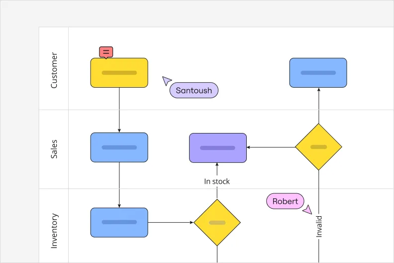
Horizontal or Vertical Lanes: Each lane represents a different person, team, or department. The lane shows who's responsible for each step.
Handoff Arrow: A special arrow crossing from one swimlane to another, highlighting where work transfers between teams or systems.
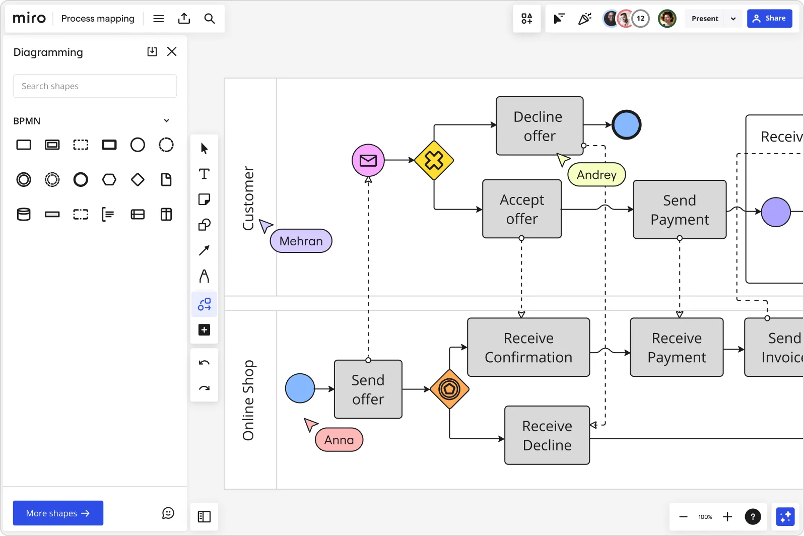
BPMN symbols (for technical processes)
Events: Circles that show something happening. Empty circles are start events, bold circles are end events, double circles are intermediate events.
Gateways: Diamonds showing how the process flows. X means exclusive (only one path), + means parallel (all paths), O means inclusive (one or more paths).
Activities: Rounded rectangles representing work being done. Can be a single task or a collapsed subprocess.
Message Flows: Dashed arrows showing communication between different participants or systems.
Value stream mapping symbols
Process Box: Rectangle showing a process step, typically includes cycle time and number of people.
Data Box: Below each process box, shows key metrics like cycle time, changeover time, and uptime.
Inventory Triangle: Shows waiting inventory or work in progress between steps.
Push Arrow: Shows material pushed to the next step regardless of demand.
Pull Arrow: Shows material pulled by the next step only when needed.
Timeline: Runs along the bottom showing cycle time (value-adding) versus lead time (total time including wait).
Using symbols effectively
Keep it simple. Most process mapping needs just 4-5 basic shapes: rectangles for steps, diamonds for decisions, ovals for start/end, and arrows for flow. That covers 90% of business processes.
Stay consistent. Pick one symbol for "decision" and use it throughout all your maps. Mixing notation styles confuses people.
Add a legend. If you're using specialized symbols or color coding, include a small key on your map so viewers know what everything means.
In Miro, you'll find all these symbols ready to use. The shape libraries include standard flowchart notation, BPMN elements, value stream mapping icons, and swimlane templates. Just drag, drop, and connect — Miro handles the formatting automatically.
Process mapping examples
Now that we’ve painted a picture of what a process map looks like, let’s look at a few different ways you could use a process map.
Here are three process mapping examples in particular:
1. Pizza delivery process
One way you could use a process map is to explain the various steps involved in carrying out a pizza delivery — from when a customer places their order to when they’ve received their pizza. Here’s what each stage of the process might look like and what symbols you’d use to represent them on the map:
- Terminator (oval) — the customer places an order, either online or on the phone
- Process (rectangle) — the kitchen staff gets to work preparing the pizza based on the order
- Process (rectangle) — the pizza bakes in the oven to perfection
- Process (rectangle) — a staff member boxes the pizza up and hands it over to the delivery person
- Arrow (line) — the delivery person travels to deliver the pizza to the customer
- Process (rectangle) — a delivery person successfully delivers the pizza to the customer
- Terminator (oval) — the delivery is complete.
At a glance, this process map provides a clear start and end point using ovals, and a sequence of rectangles and arrows visualizing every step. You can also add arrows to connect more of the shapes, visualizing the order of the steps and any other important connections.
2. Employee onboarding process
Imagine a process map visualizing the various steps you could take to onboard a new employee — from the moment HR receives their documents to the moment the employee completes their first week on the job. Here are some steps you could include and the symbols you’d use for each stage:
- Terminator (oval) — the new hire submits their documents to HR upon signing their contract
- Process (rectangle) — HR processes the documents in the company’s system
- Process (rectangle) — IT prepares the new hire’s laptop and workstation
- Arrow (line) — the new hire travels to the office to pick up their IT equipment and have their first day
- Process (rectangle) — the new hire’s manager conducts orientation for their entire first week
- Terminator (oval) — the new hire completes their first week on the job.
This process map uses rectangles to represent each key action in the employee onboarding process, with arrows guiding the flow and ovals marking the start and end points.
3. Hospital appointment process
Here’s how you might use a process map to visualize the various steps involved in checking a patient in at the hospital — from the moment they arrive to the moment they’ve completed their visit:
- Terminator (oval) — the patient arrives at the hospital and heads to the reception desk
- Process (rectangle) — The patient notifies the receptionist that they’d like to check in
- Process (rectangle) — the patient takes vital tests with a nurse (i.e. heart rate, blood pressure)
- Arrow (line) — the nurse delivers the readings to a doctor to prepare for the examination
- Process (rectangle) — the patient meets with the doctor for a consultation
- Decision (diamond) — the doctor decides if the patient needs to take more tests
- Process (rectangle) — the patient schedules a follow-up appointment depending on the doctor’s decision in step 6
- Terminator (oval) — the patient’s visit is complete
Like the previous two examples, this map uses ovals to mark a clear start and end point, and rectangles to visualize various stages of the process. But the diamonds imply that you’ll need to make decisions in order to determine how you’ll complete the process.
Common types of process maps
Chances are, you’ve already used process maps without realizing. That’s because you could use a few different types of diagrams for process mapping. Here are a few of the most common types:
Flowchart
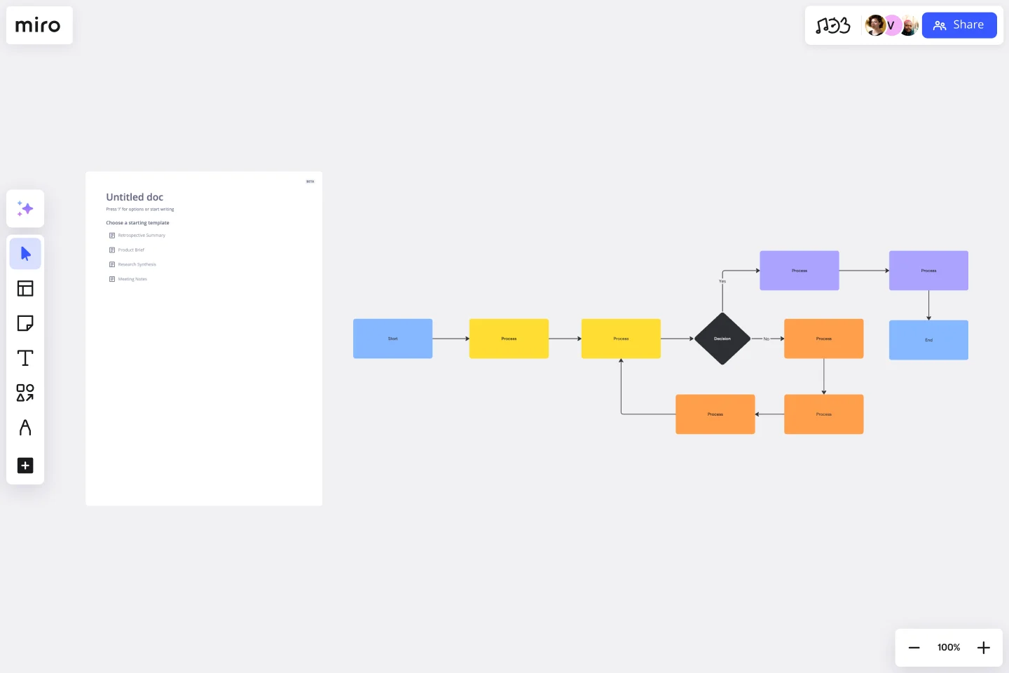
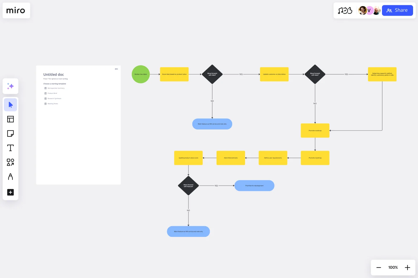
The classic. Flowcharts use standard shapes (rectangles for steps, diamonds for decisions, arrows for flow) to show the sequence of activities in a process. They're straightforward, universally understood, and perfect for documenting straightforward workflows.
Best for: Simple processes with clear start and end points, decision trees, troubleshooting guides.
Business process mapping
Business analysts and technical developers use BPMN diagrams to thoroughly overview business processes. The aim is to create a shared understanding of your business’s procedures, which means this diagram helps streamline communication and improve productivity across the organization.
Best for: Complex business processes, IT system integrations, processes that need technical precision
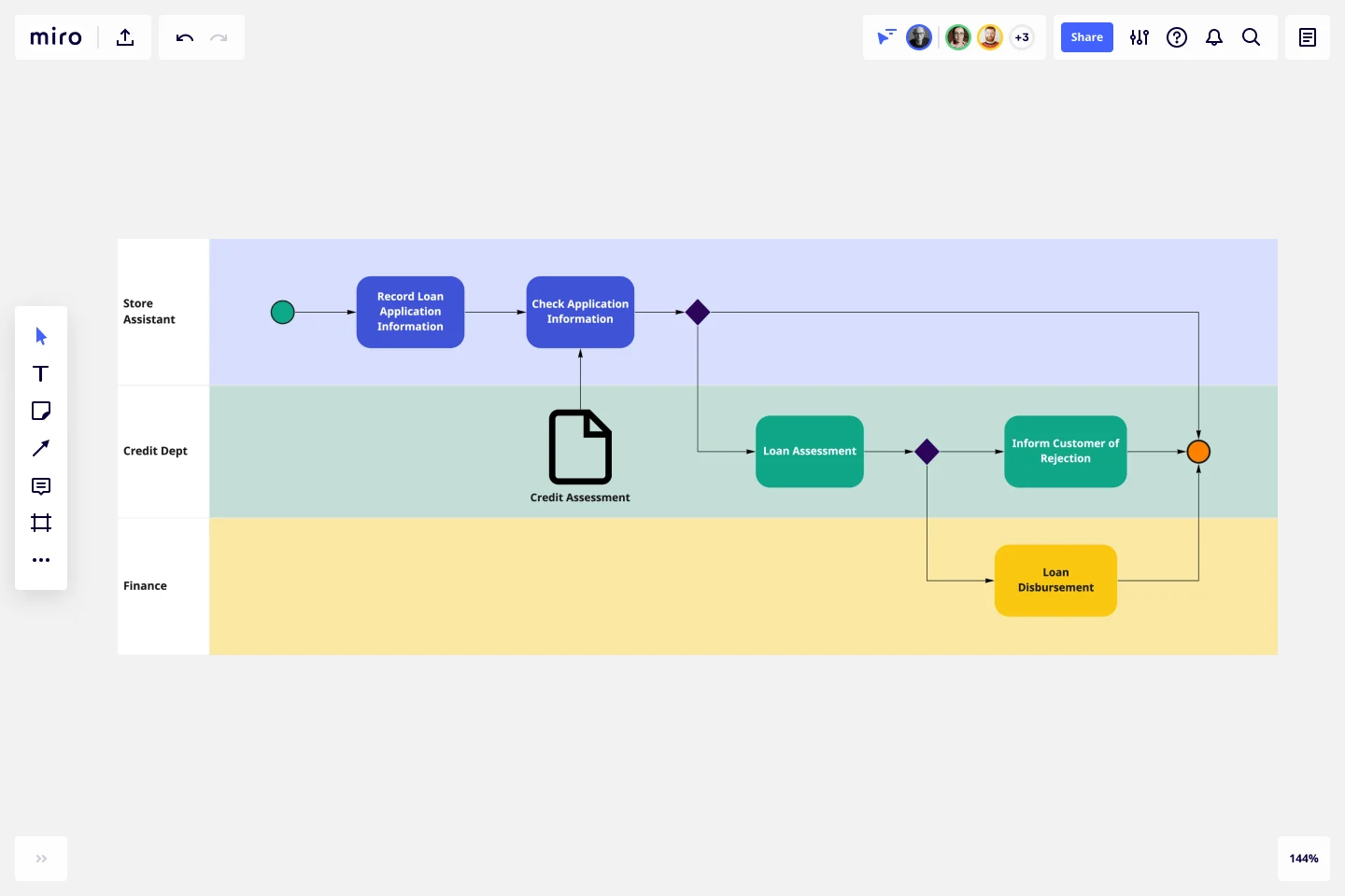
Swimlane diagram

A swimlane diagram, also frequently called a deployment map, outlines processes with particular emphasis on who’s responsible for what. Each person or team gets their own “lane” on the map where their specific tasks and responsibilities get plotted.
Best for: Cross-functional processes, identifying handoff delays, clarifying roles and responsibilities
Value chain diagram
A value chain diagram (also known as a value chain analysis or value stream mapping) is a slightly more complex diagram. It shows every step of a process, focusing on how you and your team can provide value at every step. It’s largely about process improvement, helping you spot bottlenecks and inefficiencies — giving you the information you need to streamline the process.
Best for: Lean process improvement, manufacturing, supply chain optimization, identifying waste
SIPOC map
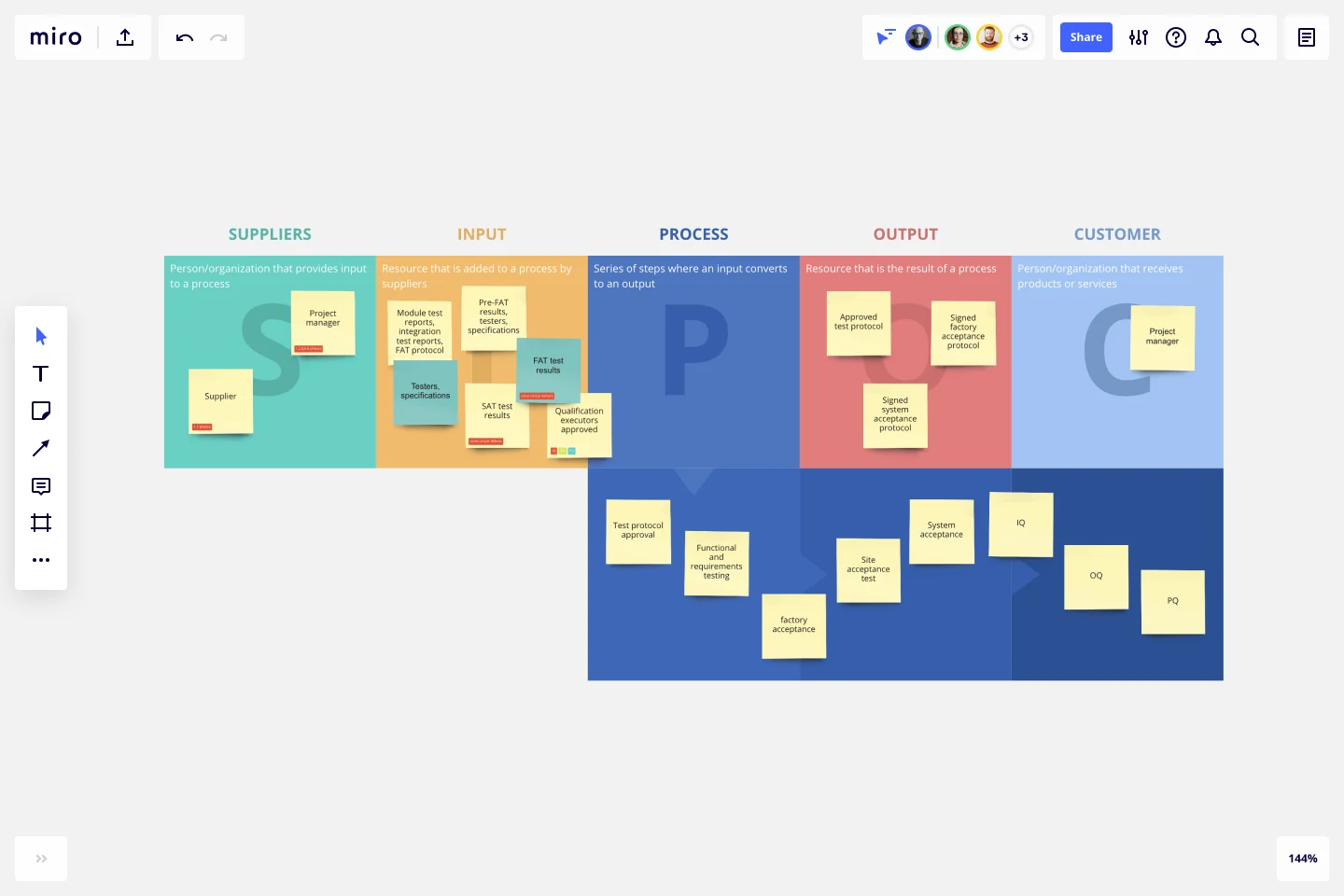
A SIPOC map – which stands for suppliers, inputs, process, outputs, and customer – works through every step of the process, from beginning to end. It starts with who supplies the project's inputs (think things like tools, resources, and knowledge) and ends with who receives the outputs (the final deliverables).
Best for: Process scoping, Six Sigma projects, getting alignment before detailed mapping
The format matters less than choosing the right one for your audience and purpose. Engineering teams might need BPMN precision. Executive stakeholders probably want a high-level swimlane diagram they can scan in 60 seconds.
How to create a process map with Miro
Process mapping works best when it's collaborative, not a solo exercise behind closed doors. Here's how to build process maps that drive real improvement using Miro's AI-powered workspace.
1. Define the scope and objectives
Start by answering: What process are we mapping, and why?
Be specific. "Customer onboarding" is too broad. "Enterprise customer onboarding from signed contract to first login" gives you boundaries. Define:
- Where the process starts and ends
- What you want to learn or improve
- Who needs to be involved
- How detailed the map needs to be
Clear scope prevents mapping sprawl — that thing where you start mapping customer onboarding and somehow end up documenting your entire company.
2. Choose your format and start your board
Miro offers pre-built process mapping templates for common process mapping formats:
- Flowchart templates for simple workflows
- Swimlane diagram templates for cross-functional processes
- Value stream mapping templates for Lean improvement
- BPMN templates for technical processes
- SIPOC templates for process scoping
Or start with a blank board if you prefer building from the ground up.
Speed up with AI: Use Miro's Create with AI to generate an initial process map from a text description. For example, describe your process:
"Map our customer support ticket workflow: starts when customer submits ticket, includes assignment to support agent, troubleshooting, escalation if needed, resolution, and customer satisfaction survey. Involves support team, engineering team, and product team."
Miro AI creates a starting point you can immediately refine with your team. Go from idea to visual diagram in seconds rather than starting from a blank canvas.
3. Assemble the right team
Get everyone who actually does the work in the room (or on the board). Invite team members directly to your Miro board so they can contribute in real-time during live workshops or asynchronously on their own schedule.
This means:
- Front-line employees who execute the process daily
- Team leads who handle exceptions and escalations
- Managers who understand broader context
- Anyone who hands off work to or receives work from this process
Leave out the people who designed the process five years ago but haven't touched it since. You need current reality, not nostalgic theory.
4. Gather information and document the current process
Map what actually happens — not what's supposed to happen according to your SOPs. Use digital sticky notes for individual steps, shapes from Miro's extensive library (flowchart symbols, BPMN notation, value stream mapping icons), and arrows to show flow.
With Miro's Diagramming Mode, you get essential tools at your fingertips without searching through menus. Access 3000+ expert diagramming shapes — from process maps and BPMN to AWS, Azure, Google Cloud, Kubernetes, UML, and ERD.
Add swimlanes to show which team or person owns each step. Note timing, pain points, and dependencies directly on your map. Use comments to gather specific feedback, mentions to loop in stakeholders, and voting to prioritize improvements.
Shadow people as they work. Interview team members individually. Capture timing data: How long does each step actually take? How long do items wait between steps?
5. Create layers for different views
Miro's layers feature lets you create multi-dimensional diagrams. Toggle between high-level overviews for executives and detailed flows for team members. This means you can serve multiple audiences with a single process map — just show the appropriate layer.
6. Validate with stakeholders
Your first draft won't be perfect — and that's fine. Share the process map with:
- The people who actually do the work (do they recognize their reality?)
- Adjacent teams (do the handoffs match their experience?)
- Process owners (does this align with business goals?)
Walk through it step by step. Ask "Is this what really happens?" Revise based on feedback. The map should reflect consensus reality, not one person's perspective.
7. Identify improvements and create your to-be map
Now that you understand current reality, spot the opportunities:
- Where are the bottlenecks?
- Which steps add no value?
- What's duplicated unnecessarily?
- Where do handoffs cause delays?
- What could be automated?
Brainstorm improvements with your team using Miro's collaboration features. Use voting to prioritize which changes to tackle first. Then create a to-be process map showing how the optimized workflow would function.
Let AI help: Describe your desired improvements to Miro AI and let it generate an optimized to-be map. "Remove manual approval steps, automate data entry, integrate with CRM system, reduce handoffs between teams." AI suggests a streamlined version you can refine.
8. Share broadly and update regularly
Export your process map as a PDF for presentations, share a link for stakeholder review, or embed it in Confluence or Notion for your knowledge base.
Set a recurring calendar reminder to review and update your process maps quarterly.
Connect your process mapping workflow
Miro integrates with the tools your teams already use to make process improvement seamless:
Project management: Connect process maps to Jira, Asana, Monday.com, and Azure DevOps. Turn process steps into tickets and track implementation progress.
Collaboration platforms: Share maps in Microsoft Teams and Slack channels, get asynchronous feedback, and notify stakeholders when processes change.
Documentation: Embed live Miro boards in Confluence and Notion so your process documentation updates automatically. Import data from Google Sheets to add context.
Enterprise tools: Monitor adoption with SAM tools like ServiceNow, Zylo, and BetterCloud. Track process-related events with SIEM solutions like Splunk and IBM QRadar.
Native Miro features: Use Create with AI to generate initial maps, leverage templates for common processes, and collaborate with comments, voting, and timers.
Best practices for effective process mapping
Great process maps don't just document workflows — they drive action. These practices separate maps that gather dust from maps that transform operations.
Start with the customer outcome in mind
Every process exists to deliver value to someone. Before mapping a single step, ask: What does the customer need? How does this process serve them?
This customer-centric view helps you distinguish between steps that add value and steps that just add time. If a step doesn't directly improve the customer outcome, it's a candidate for elimination.
Map current reality, not aspirational fiction
The temptation is strong to map how things "should" work according to your documented procedures. Resist it.
Map what actually happens. Include the workarounds. Document the unofficial steps. Capture where things break. The messier your as-is map, the more opportunities you'll find for improvement.
Keep it simple and scannable
Process maps fail when they're too complex to understand. If someone can't grasp your map in 60 seconds, simplify it.
Use consistent shapes and colors. Limit text in each step to 5-7 words. Break complex processes into multiple related maps rather than creating one overwhelming diagram. Your goal is clarity, not comprehensiveness.
Make it collaborative from the start
Process mapping isn't a solo document creation exercise — it's a team conversation visualized.
Bring the right people together (in person or on a Miro board) and build the map collaboratively. Real-time input surfaces hidden steps, resolves disagreements about how work flows, and builds shared understanding that drives implementation.
Focus on handoffs and decision points
The biggest inefficiencies live in two places: handoffs between teams or systems, and decision points where work waits for approval.
Mark every handoff clearly in your process map. Note how information transfers. Identify decision points and who makes them. These spots are where work stalls — and where improvements deliver outsized impact.
Measure before and after
Document baseline metrics before you change anything:
- Cycle time (how long the full process takes)
- Touch time (actual work time vs. waiting time)
- Error rates
- Customer satisfaction scores
- Cost per transaction
After implementing improvements, measure again. The gap between your baseline and new metrics proves ROI and justifies further process improvement work.
Treat process maps as living documents
Processes evolve. Systems change. Teams shift. Your process maps should evolve too.
Review and update your maps quarterly or after any significant process change. Set a owner responsible for keeping each map current. Use version control so you can track how processes improve over time.
Use the right level of detail for your audience
Executives need the 10,000-foot view. Team members need step-by-step detail. Create multiple versions of the same process at different altitudes.
Start with a high-level map showing major phases. Then create detailed maps for each phase. Link them together so viewers can zoom in where they need detail and zoom out for context.
How Miro customers transformed their processes
Process mapping delivers real results when done right. Here's how GE Digital used Miro to drive operational improvements across their global teams.
GE Digital: Lean transformation at scale
When COVID-19 forced GE Digital's Lean transformation program fully remote, Vice President Paul Sloup faced a challenge: how do you conduct hands-on kaizen workshops (Lean events where teams identify process improvements) when everyone's distributed?
For 15 years, Sloup practiced Lean through face-to-face collaboration — teams gathering in conference rooms with sticky notes covering walls, building value stream maps to visualize processes and spot inefficiencies. Suddenly, that approach wasn't possible.
The challenge: Maintain momentum in a critical Lean transformation while working fully remotely. GE Digital needed to recreate the collaborative, visual nature of in-person kaizen workshops in a digital format that felt natural and maintained transparency across global teams.
The solution: Miro became GE Digital's virtual kaizen workspace. Sloup prepared Miro boards ahead of each workshop the same way he'd prepare a conference room — but instead of covering walls with physical sticky notes, he filled boards with digital sticky notes, relevant documents, and dedicated workspaces.
An initial kaizen focused on the end-to-end process of how GE Digital developed proposals, generated quotes, then built and delivered software to customers. The team created a visual value stream map in Miro, giving them a bird's eye view of the current state process and revealing issues and opportunities they hadn't spotted before.
The impact: Unlike whiteboards that get erased after workshops, Miro boards became living documents. Sloup could follow up months after each kaizen to track progress, gather additional information, and resolve open questions — all within the same digital space.
"Miro allows us to connect with dispersed groups and, in a way, creates more transparency than a physical board," said Sloup. "I can go work with one group, leave, go work for two months with another group, then check back in by reviewing the digital board."
The team began using boards for daily management of projects, tracking key metrics like quality and time to delivery. By pasting snapshots of metrics side-by-side daily or weekly, they could visualize changes over time.
Miro became the single source of truth for GE Digital's Lean transformation, enabling them to maintain the hands-on, visual, collaborative nature of Lean practice while working fully distributed — and actually increasing transparency in the process.
Read the full GE Digital customer story
Streamline your projects with process mapping
Process mapping is a game-changer when it comes to managing projects across industries. By visually outlining each step of a process, teams can identify inefficiencies, streamline workflows, and ensure everyone is on the same page. Whether you're working in tech, healthcare, or manufacturing, a clear process map helps teams collaborate more effectively, reduce errors, and keep projects on track.
For project managers, process mapping brings clarity. It turns complex workflows into easy-to-follow diagrams, making it easier to allocate resources, set timelines, and communicate with stakeholders. This level of organization not only saves time but also improves overall project outcomes by preventing bottlenecks and identifying opportunities for improvement.
Ready to dive deeper into process mapping and how it can transform your project management? Explore Miro's advanced diagramming capabilities to see how you can bring more clarity and efficiency to your processes.
Process mapping FAQs
What's the difference between process mapping and process documentation?
Process documentation describes how work should be done (typically in text). Process mapping visualizes how work actually flows. Maps show relationships, handoffs, and decision points that text documentation can't capture clearly. Best practice: use process maps as the foundation, then add text documentation where needed for specific procedures.
How detailed should my process map be?
It depends on your audience and purpose. Executive stakeholders need high-level maps showing major phases and outcomes. Team members executing the work need detailed maps with specific steps and decision criteria. Start high-level to build consensus, then create detailed maps for critical or complex processes. A good rule: if someone unfamiliar with the process can't follow your map, add detail. If team members say "this is too much," simplify.
Can I map processes in Miro without special training?
Yes. Miro's intuitive interface and pre-built templates make process mapping accessible to anyone. Use Create with AI to generate starting points from text descriptions. The shape libraries and smart connectors handle formatting automatically. For advanced notation like BPMN, Miro provides guides — but most process improvement work succeeds with simple flowcharts and swimlane diagrams that anyone can build.
How do I get stakeholder buy-in for process changes?
Visual comparison is powerful. Put your as-is and to-be maps side by side. The gaps become obvious and undeniable. Include stakeholders in creating the maps (people support what they help build). Calculate the cost of current inefficiencies in time, money, or customer satisfaction. Show quick wins — small improvements that deliver fast results and build momentum for bigger changes.
Should I map every process in my organization?
No. Start with processes that are:
- Critical to customer experience
- Known sources of frustration or delays
- Undergoing change or improvement initiatives
- Required for compliance or auditing
- Frequently executed with high impact
Map these first, measure improvements, then expand to other processes. Trying to map everything at once overwhelms teams and delivers no results.
How often should I update my process maps?
Review quarterly or after any significant change (new system, team restructure, major policy change). Assign an owner for each map responsible for keeping it current. Set calendar reminders to avoid maps becoming outdated documentation that nobody trusts. Active maps that evolve with your business remain valuable. Static maps gathering digital dust help nobody.
What's the ROI of process mapping?
The return on investment varies significantly by process complexity and improvement opportunities. Track baseline metrics before mapping (cycle time, error rates, cost per transaction, customer satisfaction), measure after implementing improvements, and calculate the gap. Your specific ROI depends on what you find and fix. Real-world examples like the ones in this article show dramatic improvements are possible when you systematically identify and eliminate inefficiencies.
Can I import existing process documents into Miro?
Yes. Miro accepts imports from Visio (.vsdx), Lucidchart, and other common formats. You can also copy/paste process steps from spreadsheets or documents into Miro and quickly turn them into visual maps using shapes and connectors. This lets you bring legacy documentation into a collaborative workspace where teams can actually improve it.
Is Miro secure enough for sensitive process information?
Yes. Miro provides enterprise-grade security including:
- SOC 2 Type II certification
- GDPR compliance
- SSO and 2FA authentication
- Role-based access controls
- Data encryption at rest and in transit
- Custom data residency options
You control who can view and edit each board. For additional security requirements, Miro Enterprise Guard adds advanced data classification, encryption key management, and enhanced governance controls. See our Security documentation for complete details.
What Miro plan do I need for process mapping?
Process mapping tools (flowcharts, diagrams, shapes, connectors) are available on all Miro plans including the Free plan. AI-powered process map generation requires Miro AI (available as an add-on to any paid plan). Advanced features like Enterprise Guard, SCIM provisioning, and advanced integrations are available on Enterprise plans. Most teams start with Free or Team plans and upgrade as their process improvement work scales.
How does process mapping work with Agile or Lean methodologies?
Process mapping complements both approaches. In Agile, map your sprint processes, release workflows, and cross-functional handoffs to spot delays and improve velocity. Lean practitioners use value stream mapping to identify waste and optimize flow. Miro's templates support both methodologies, and you can combine process maps with sprint boards, retrospectives, and continuous improvement practices all in one workspace.
Can remote teams effectively collaborate on process mapping?
Absolutely. Miro was built for distributed collaboration. Teams can work synchronously in real-time workshops or asynchronously across time zones. Use video chat for live sessions, comments for asynchronous feedback, and screen recording to capture workshops for team members who couldn't attend. Many teams find digital process mapping actually increases participation compared to physical workshops where only the loudest voices get heard.
Author: Miro Team Last update: December 5, 2025