
Project management is a tough job. It’s hard to plan out all the tasks and resources for your team so that you can get everything done on time.
One way of making this easier is using a PERT chart.
A PERT chart lays out all the different tasks, their dependencies, and how long each task should take.
It also shows the “critical path,” which is the longest sequence of dependent tasks that need to be completed on the project before it can be considered finished.
This post will teach you exactly how to use a PERT chart for project management.
What is a PERT chart in project management?
A PERT chart, also known as PERT diagram or PERT analysis, is a popular technique used in project management that provides a visual representation of tasks needed to finish a project.
It offers three different estimations for how long each task might take: the optimistic estimate, the most likely estimate, and the pessimistic estimate. These are then put into the following formula to come up with one average estimate for each task:
Task length estimate = (Optimistic time + [4 X Most Likely time] + Pessimistic time)/6
A typical PERT chart then displays those task length estimates to calculate the overall probable length of the project. Here’s an example:

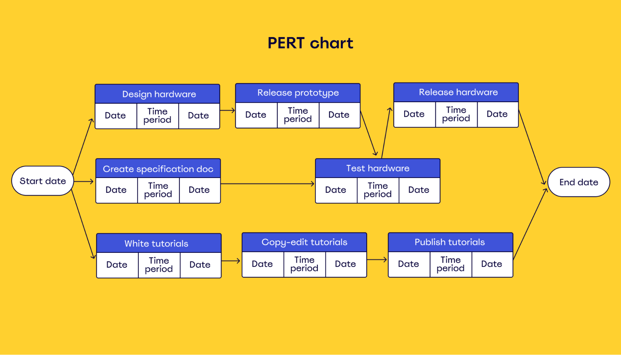
In addition to tasks and their duration, a PERT chart shows task dependencies.
This is a crucial element for project planning because it allows you to schedule tasks based on their dependency order and estimate the total time for each task based on its three potential timelines.
You can also use PERT for estimating project budgets and the timing of spending — although this is less common.
Instead of durations, you could do pessimistic, optimistic, and most likely cost of each task and use that to come up with an expected overall project cost.
Then, you could map it out in a PERT chart to better understand when the money would be spent.
You could do the same to estimate resources, like how many employees are needed to complete a project.
In essence, a PERT analysis is extremely helpful at the planning stage because it gives you a high-level understanding of the project timeline and helps you plan accordingly.
We’ll provide you with more specific instructions on creating a PERT chart a bit later, but first, let’s answer a crucial question.
What does a PERT chart do?
First of all, a PERT chart allows you to plan and schedule out the entire project timeline.
It does this by getting you to come up with three different estimates for task duration, and then taking an average of the three, with the most likely estimate weighted more heavily.
In theory, this allows you to schedule your project more accurately than if you only estimated one duration for each task. A PERT chart also allows you to map out dependencies, find the critical path — more on this later — and plan out the entire timeline for a project before it even begins.
This is particularly useful when planning a complex project with multiple deadlines, such as a construction project. But you can also use PERT charts in smaller projects.
You can even use PERT charts for strategic planning.
For example, you can use PERT to map out a program management strategy or portfolio management, mapping out project durations and interdependencies, rather than those of individual tasks.
This is especially beneficial if you run a large business and need to see what projects make the most sense in terms of time and budget or where you might get resource conflicts across your portfolio.
What are the benefits of using a PERT chart?
We’ve talked about what a PERT chart is and how it can be used for project management. Now, let’s talk about the benefits of using one.
First, using a PERT chart makes your team more accountable to each other.
If you lay out all the tasks in a clear way that everyone has access to, it makes it easier to see what everyone else is working on.
This helps prevent bottlenecks in the project while also allowing everyone to collaborate and help each other out.
Second, a PERT chart should give you a pretty accurate idea of how long your project might take. Without one, there’s no way to know what’s on the critical path (the longest thing that needs to be completed before the project is finished).
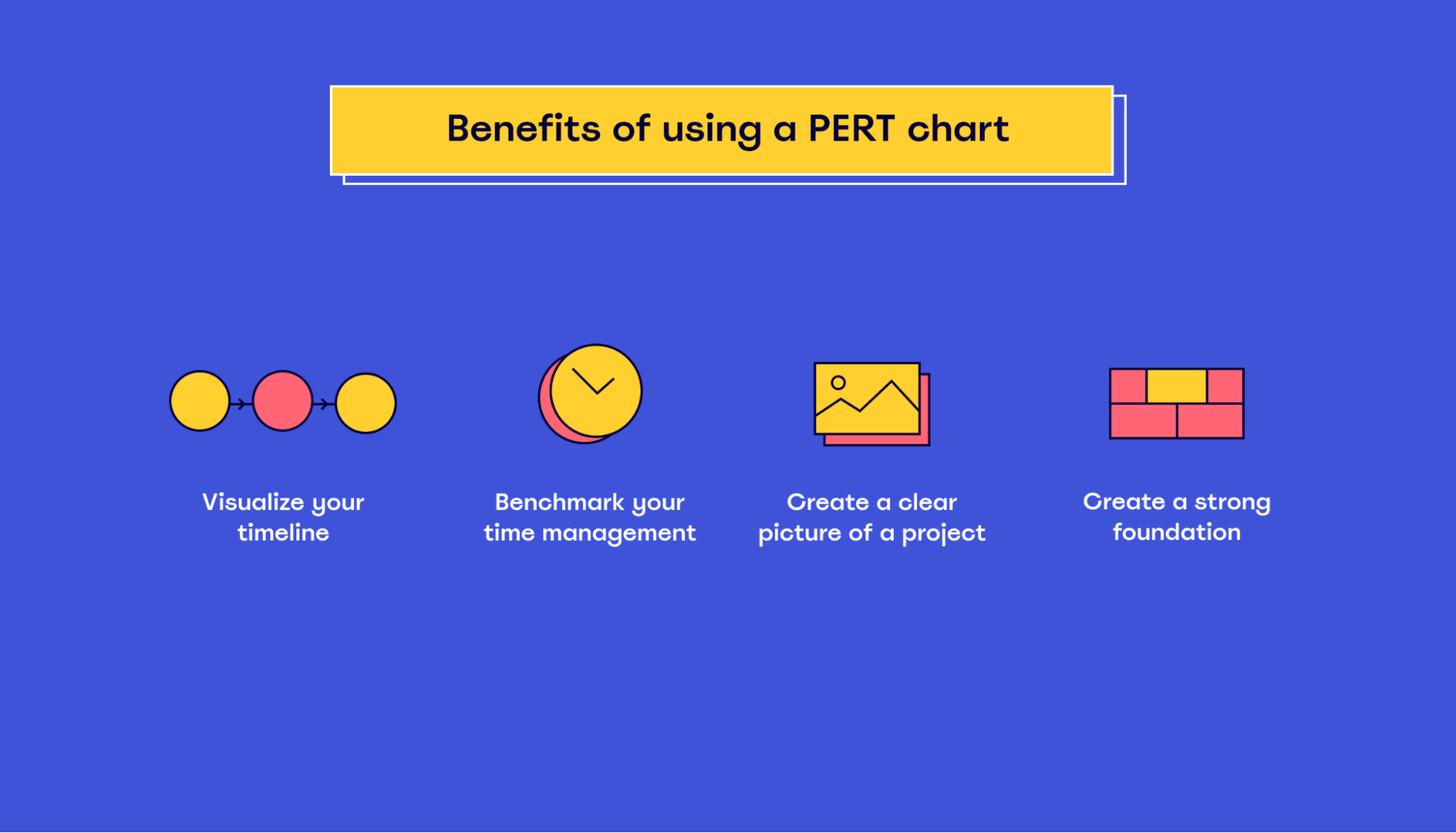
Some other benefits of implementing a PERT chart might include:
- Visualizing your timeline: Using a PERT chart for planning projects allows you to visualize the entire scope of your project, including milestones and what needs to be done at each step along the way.
- Benchmarking: A PERT chart allows you to benchmark your time management against other similar projects. This can be helpful in identifying where improvements should be made and what to expect during the course of your project.
- Creating a clear picture of a project: With a PERT chart, you’ll have a clear picture of how your project should run, which can provide a sense of confidence to those working on the project.
- Creating a strong foundation: A PERT chart is a great way to create a strong foundation. From the initial plan to milestones and expected results, you’ll be able to map out how your project should look once it’s completed.
In short, PERT charts are an effective way to plan out projects.
From the initial planning stages all the way through project completion, PERT charts provide project managers with a clear picture of their plans and the steps required to get there.
How to read a PERT chart
At this point, you already understand the basics of PERT charts. Now the question becomes, how can you actually read one?
The first thing you must understand is the different elements that make up a PERT chart:
- Tasks
- Duration
- Sequence
You start reading a PERT chart from left to right and then follow the arrow or number to its corresponding task.
In the example below, numbers represent each task, and arrows represent duration and/or dependencies. These lines are what you should look at to determine the sequence of the project.
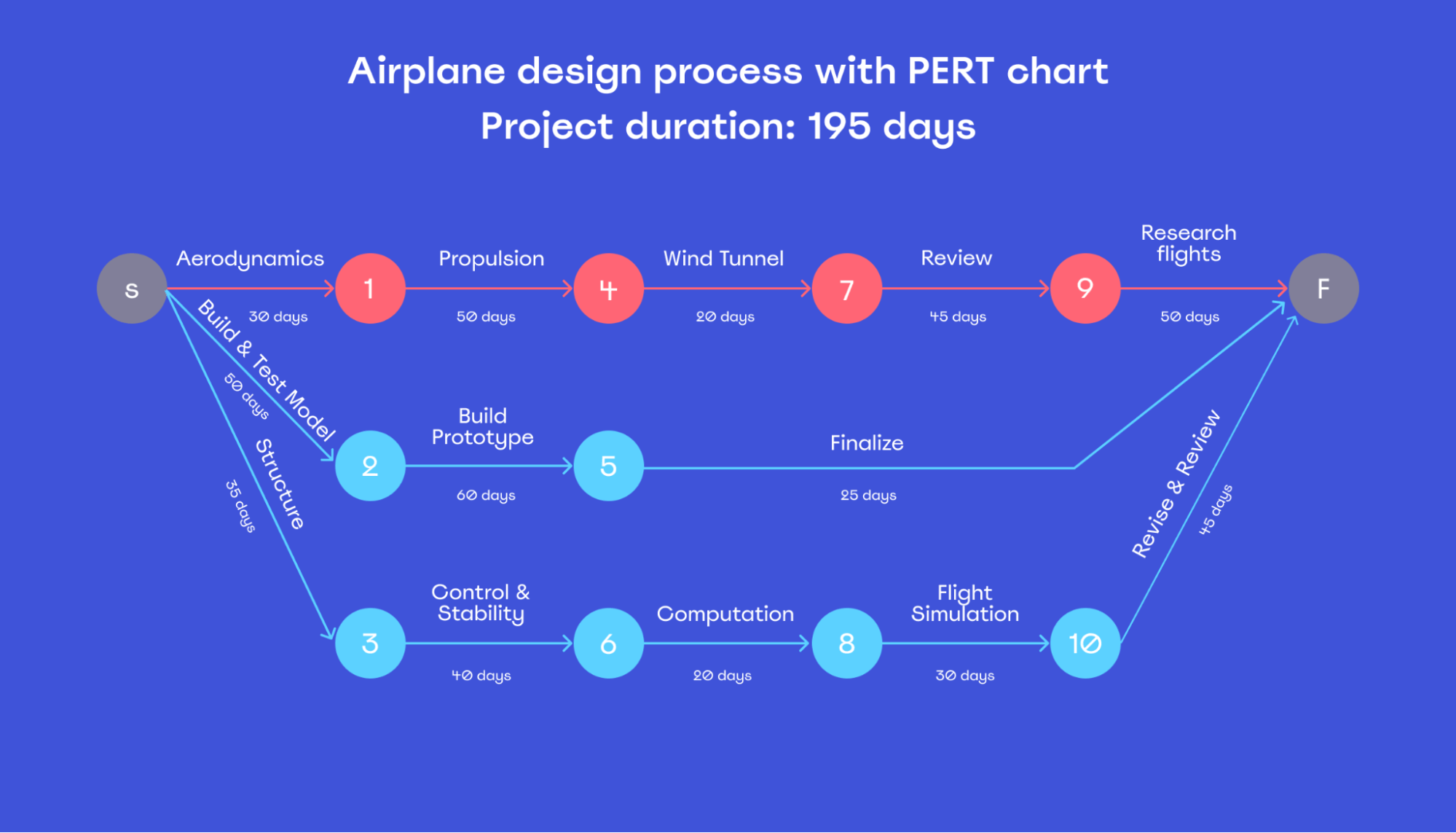
For example, you can’t start task 7 until both 1 and 4 are completed. In the same way, you can’t start task 8 until both tasks 3 and 6 are finished.
Each task indicates how long it’s expected to take, totaling 195 days.
For a more complex project, you could replace days with months or even years and group tasks into sub-projects.
Also, you could add a lot more detail to your PERT chart, depicting each task with a different color. This way, you could see your progress from one week to another.
Gantt chart and PERT chart: Main differences
You might wonder why you should use a PERT chart over other methods for project management, like the Gantt chart.
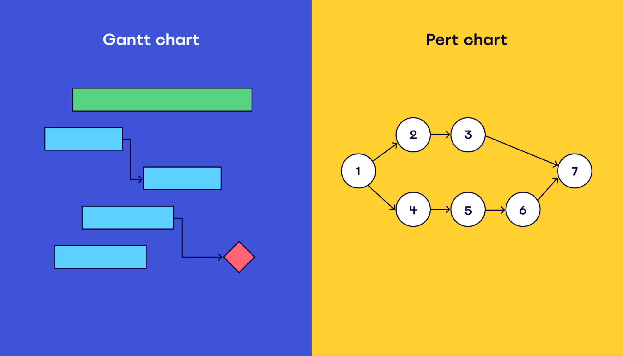
To help you, let’s first explore what both types of charts are mainly used for:
What is a PERT chart used for?
A PERT chart maps how tasks interact and how long they’ll take. It’s used for planning purposes — to visualize the different tasks that need to be completed, the required task sequence, and to understand the project duration before it begins.
In other words, PERT charts provide a high-level overview of a project, which helps during the planning and scheduling phases.
What is a Gantt chart used for?
A Gantt chart is used to understand when specific tasks need to be completed. It shows the relationship between each task and helps project managers understand how each task impacts others.
A typical Gantt chart looks like this:
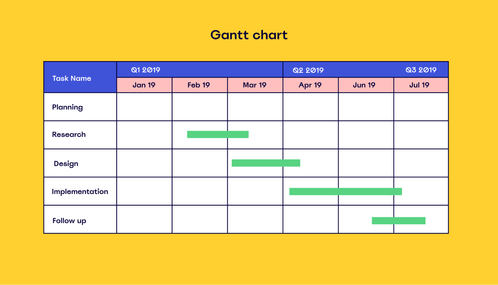
Gantt charts are pretty useful for tracking and monitoring project activity during the execution phase.
To dig a bit deeper into Gantt charts, we suggest you read our comprehensive guide on how to make a Gantt chart.
Also, you can use our Gantt chart templates to create a Gantt chart in minutes and collaborate with team members in real-time.
What are the main differences between Gantt and PERT charts?
Gantt charts are often used during the execution phase of a project, as they provide a good overview of a project in a linear fashion.
In comparison, PERT charts are used before a project begins to provide a roadmap for management and clients that shows when each task will be completed.
It’s helpful to utilize both PERT and Gantt charts in a project plan, as they complement each other.
How to build a PERT chart in 4 steps
Here’s a quick process you can use to create a PERT chart:
1. Gather all the information about your project.
First, you’ll need to gather all the information about your project.
You might want to consult with everyone involved in the process, including stakeholders and people from multiple departments.
Write down all the project tasks associated with your project and three time estimates for each task: optimistic, pessimistic, and most likely.
Then use the following formula to come up with an estimated length for each task — this will be the length of time you put in your PERT chart.
Task length = (Optimistic time + [4 X Most Likely time] + Pessimistic time)/6
You’ll need to gather all the information about your project and its timeline before proceeding to the next step.
2. Organize your tasks based on the relationships between them
Now that you have a list of all the project tasks, organize them based on their relationships.
You’ll need to determine what tasks are dependent on each other — which ones need to be completed in order for you to move on to the next one.
It’s helpful to create a table to sort all this information out. For example, you may want to create a grid with the following headers:
- Task name
- Task description
- Pessimistic duration
- Most likely duration
- Optimistic duration
- Calculated duration
- Predecessors (tasks that have to be completed first)
3. Draw a PERT chart based on the timeline of your project
Now that you have all the necessary information, you can go ahead and create your PERT diagram.
The easiest way to do this is by drawing a timeline on a whiteboard. You can use Miro’s timeline templates. Share your whiteboard with your team so they can review and comment on your PERT diagram as it evolves. You can also use Miro’s PERT diagram template to start immediately.
You can indicate the expected time it will take to complete each task by adding its name and an arrow pointing to the next task in line.
Add time estimates for each arrow, but keep in mind that these are only estimates you’ll use to plan the project.
You can also share whiteboards with clients and stakeholders to keep everyone on the same page and on schedule.
You can create an unlimited number of whiteboards, so you’ll always have space to plan your projects and meet goals.
4. Determine the critical path
Your next step is to determine which tasks represent the critical path of your project. This is the path that will have the greatest effect on how long the project will take to complete.
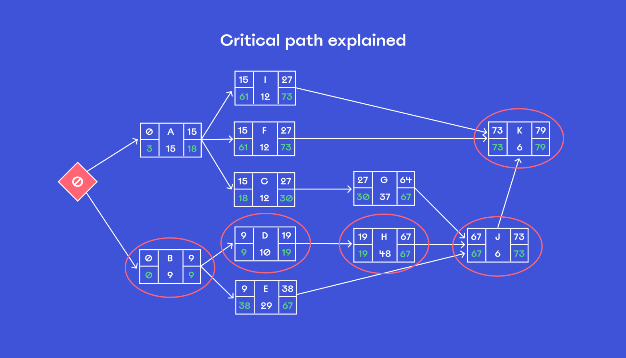
These tasks must be completed on time in order to keep your project on schedule. If any of these critical tasks are delayed, the entire project timeline will also be delayed.
Here’s how to determine the critical path in a PERT chart:
- Find all the potential paths from start to finish (all the possible routes through the PERT).
- Add up the length of each potential route by adding the time estimates of each task on the route.
- Identify the sequence that has the longest time estimate, and label it as a critical path.
- Draw a heavy line from the first task to the second, and continue adding lines for each dependent task.
- Label these tasks with red text to indicate that they are critical path tasks, and label all other tasks with blue text to indicate that they are non-critical path items.
Ready to build your own PERT chart?
PERT charts are a great way to plan out your project. They make the process of planning easier and help you understand your project in a more detailed manner.
The good news?
Creating a PERT chart doesn’t need to be hard.
With Miro, the process is pretty straightforward.
We provide you with visual and interactive tools to help you plan your projects in a simple way.
Start a new whiteboard and give it a try.
Curious to see what other
apps Miro integrates with?