Table of contents
Table of contents
What is a Venn diagram?
Summary
In this guide, you will learn:
- What a Venn diagram is: a graphic of overlapping circles for comparison and probability analysis
- How to create a Venn diagram step-by-step
- How to customize your Venn diagram with colors, labels, and notes
- The availability of various Venn diagram templates in Miro
- How Miro’s Venn diagram maker supports easy editing, collaboration, and integration
- Tips for sharing, downloading, and collaborating on Venn diagrams within Miro
Venn diagrams: A tutorial
A Venn diagram is a type of graphic chart made of overlapping circles. Each circle represents a different concept or group of data, with the overlapping sections representing their shared qualities. This makes Venn diagrams an excellent tool for data comparison and measuring probability. By plotting out your thoughts on a Venn diagram, you can begin to see relationships and patterns emerge, which can then help you make decisions or better understand complex concepts. Creating a Venn diagram makes it easy to visualize how concepts overlap, compare, and contrast.
Types of Venn diagrams
A Venn diagram can be represented in a variety of ways. You may be most familiar with the 3 circle Venn diagram, but there are several types of Venn diagrams, each of which is used for a different reason.
2 circle Venn diagram
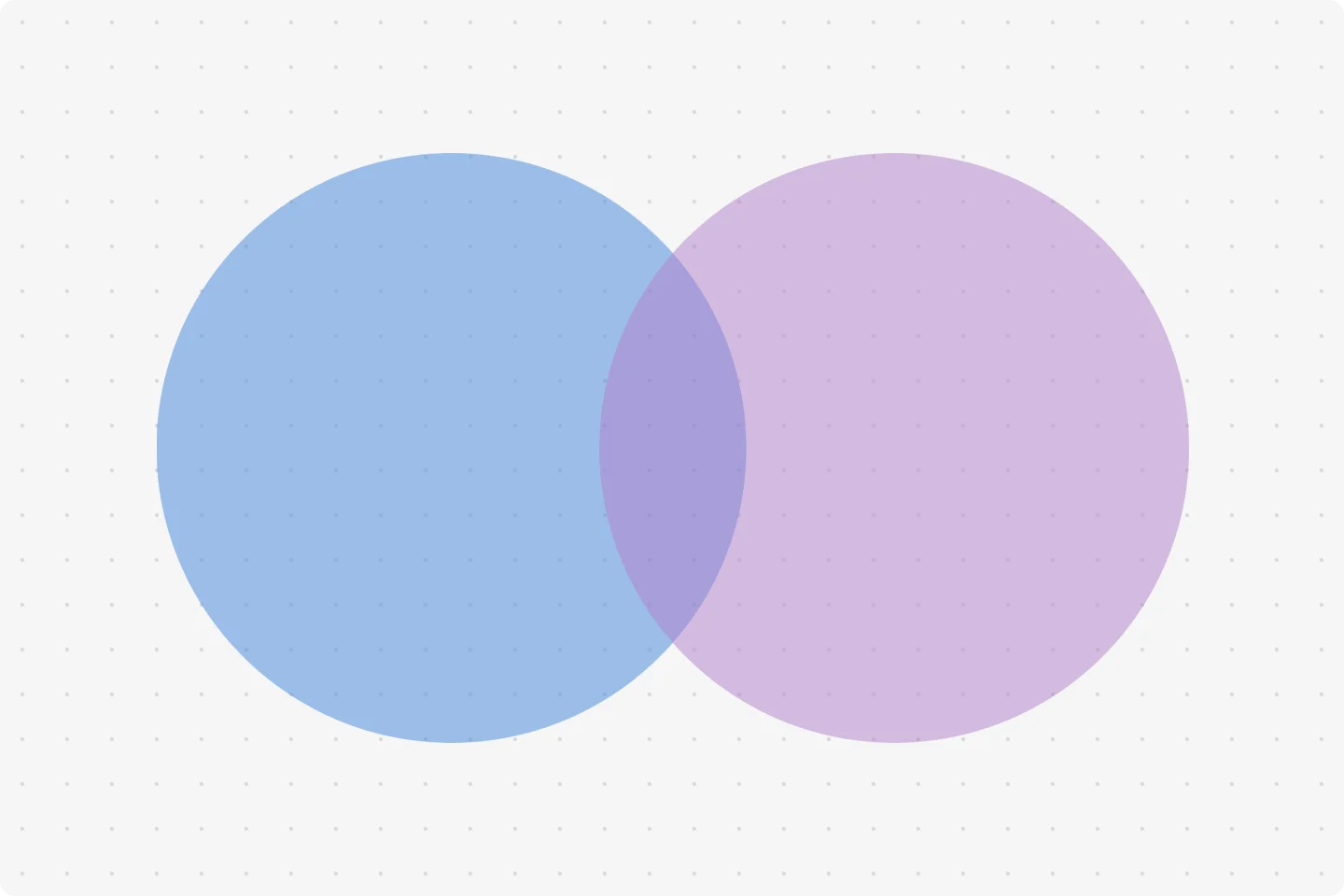
Two circles overlapping at the center.
Create a 2 circle Venn diagram with Miro's template.
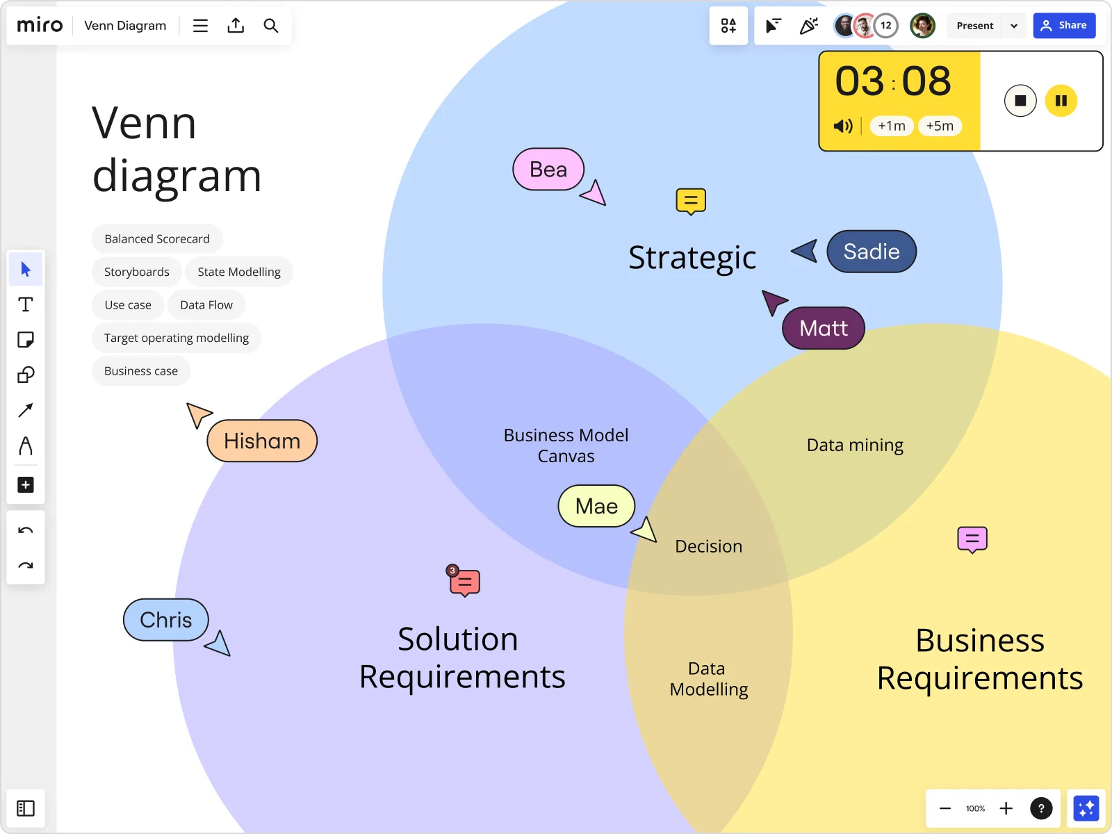
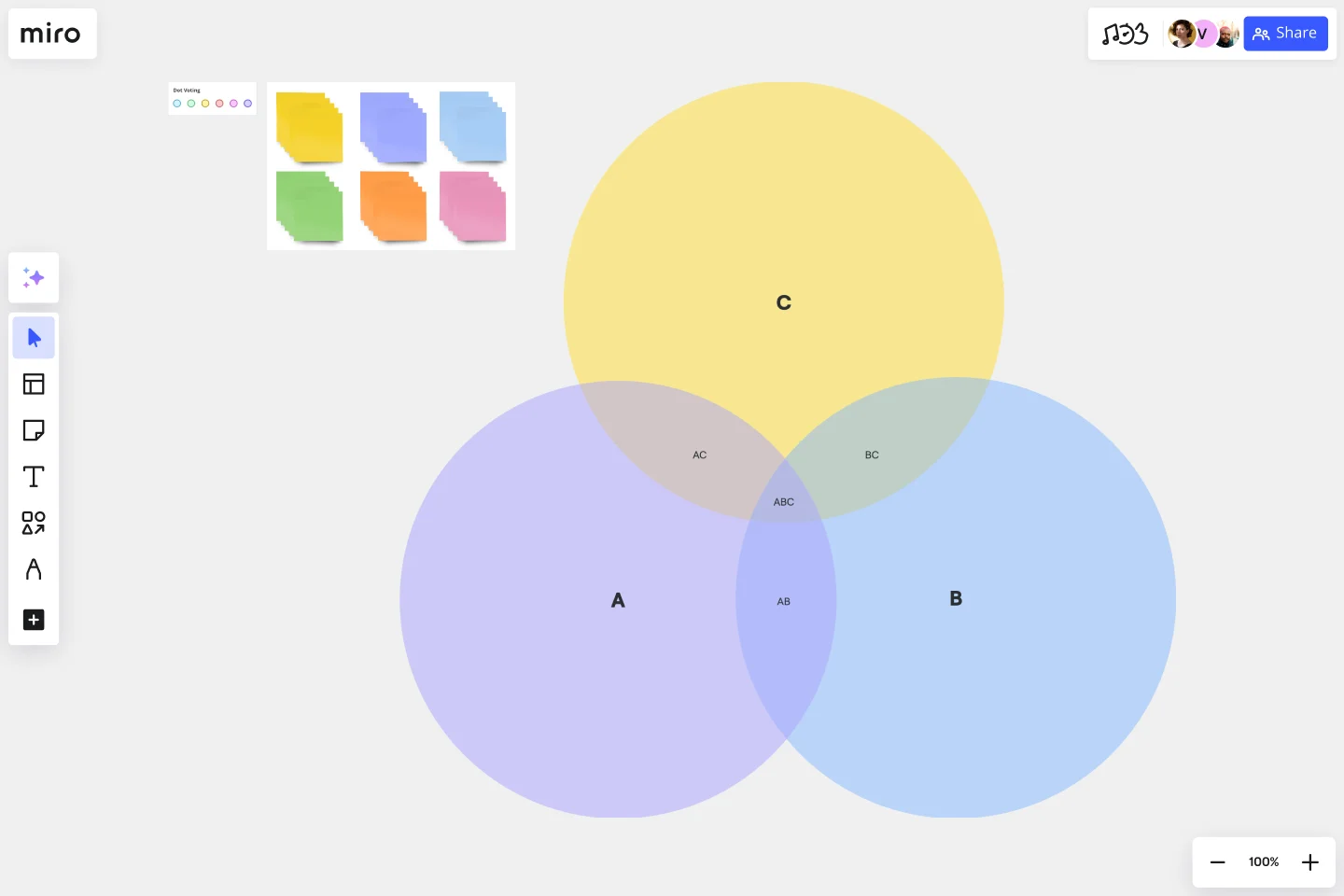
3 circle Venn diagram
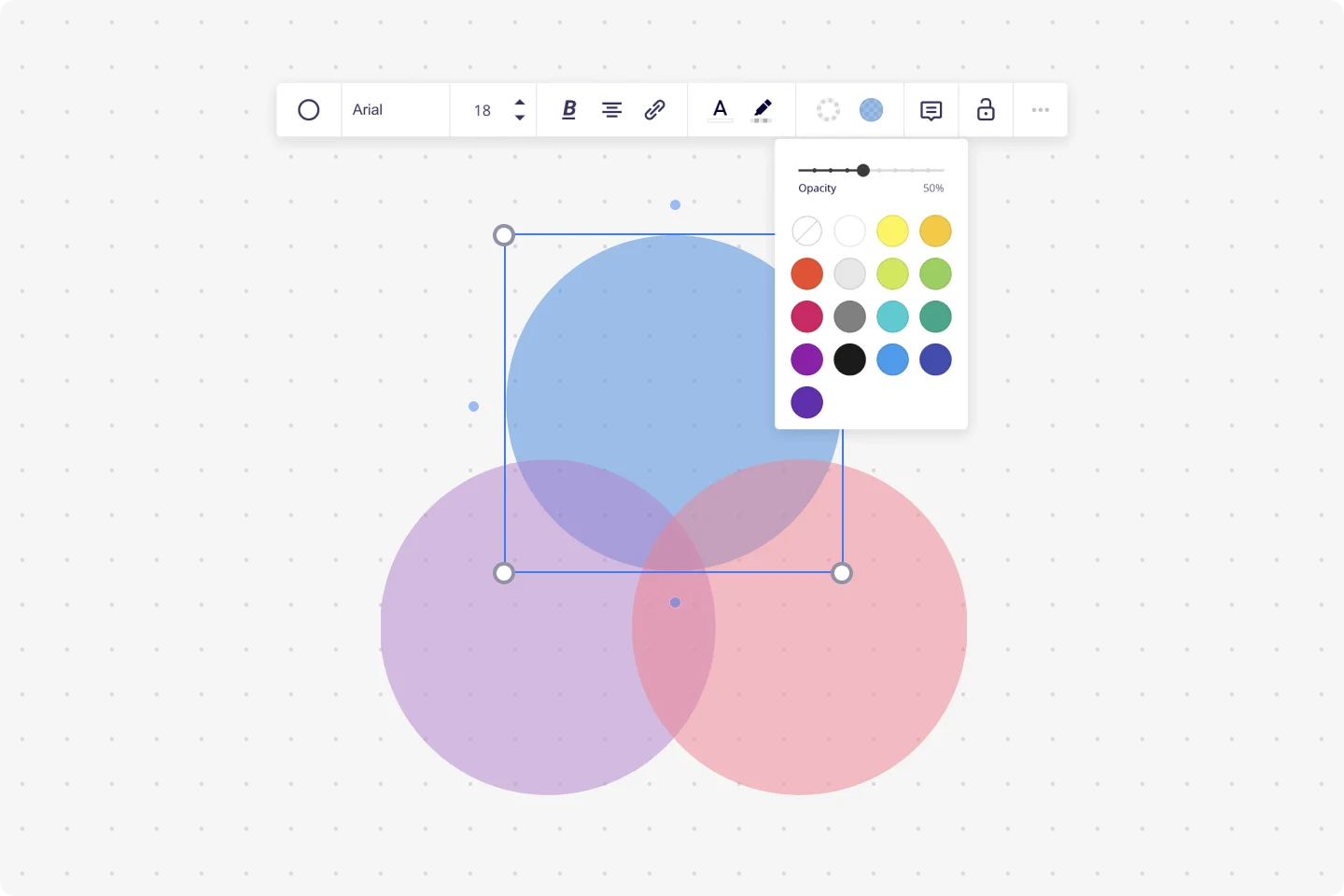
Three circles in a triad form, overlapping at the center form the 3 circle Venn diagram.
4 circle Venn diagram
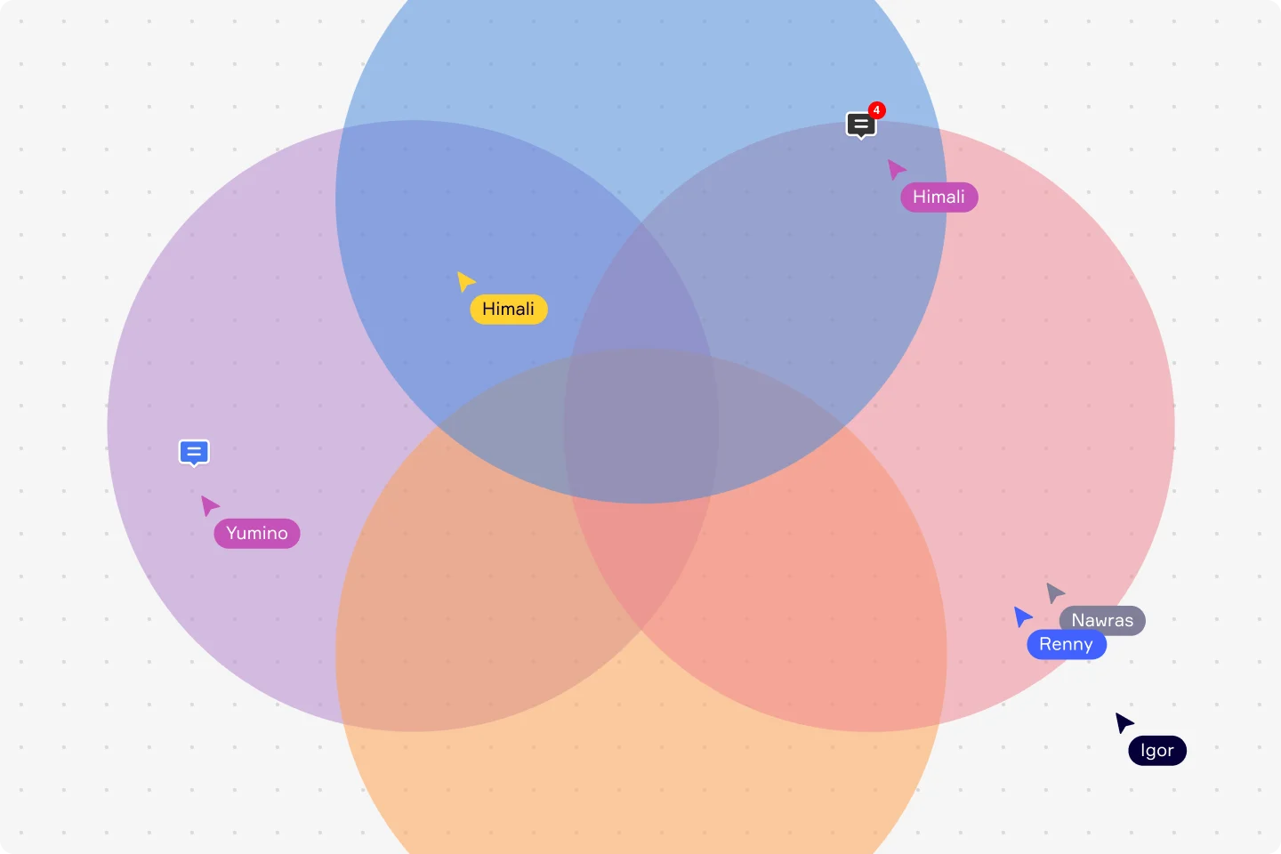
Four circles in diamond form, overlapping at the center.
Create a 4-circle Venn diagram with Miro's template.
5 circle Venn diagram
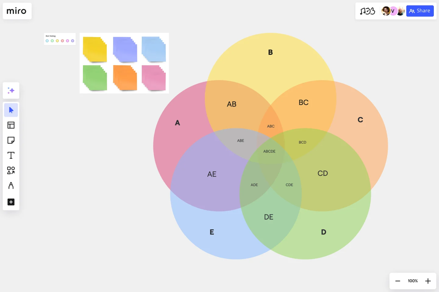
Five circles overlapping at the center.
Miro has a fully customizable 5-circle Venn diagram template.
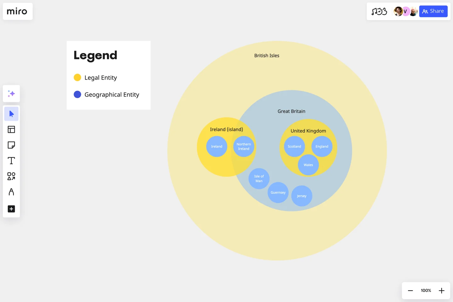
Edwards-Venn diagram
A fourth version of the Venn diagram was developed in the mid-1800s by a British biologist named Anthony Edwards. He called it the Edwards-Venn diagram, or EV diagram. Instead of having 2-4 circles, the EV diagram is inspired by the layout of a tennis ball. This Venn diagram type helps identify and classify overlapping characteristics between a much larger number of groups or concepts. While the traditional 2, 3, and 4 circle Venn diagrams are best used for smaller groups of datasets, the Edwards-Venn diagram is best suited for analyzing a subject from a wider variety of perspectives. However, all Venn diagram types serve the purpose of comparison and contrast.
Check out all Venn Diagram Templates and Examples available on our library.
Advantages of using a Venn diagram
The beauty of a Venn diagram lies in its simplicity but versatility. From marketing to mathematics, the Venn diagram is an asset. Here are some of the many benefits of using Venn diagrams with your team.
Useful for brainstorming
If your team is looking for a quick way to brainstorm ideas and get to the root of an issue, a Venn diagram may be just what you need. By using the circles to represent potential ideas, the overlapping areas can help highlight what works best and is most conducive to your strategy.
See the relationships between two items
When two circles inside a Venn diagram overlap, the overlapping portion shows the connection point between the two different groups. This can be extremely useful in identifying the relationships between various subjects and gaining a deeper understanding of shared benefits.
Compare choices
A compare and contrast Venn diagram is one of the most popular ones you will find in the workplace. This unique visual chart allows teams to draw tangible comparisons between vastly different datasets, allowing for more informed decision-making.
Visually organize and represent information
A visual chart is a great way to encourage an intuitive understanding of a diverse group of people. During a meeting or a conference, using a Venn diagram can help speakers communicate and organize their ideas in a naturally graspable way.
Solve difficult math problems
The Venn diagram has been used for thousands of years in mathematics and science. When applied through a mathematical lens, Venn diagrams can visually compare numbers and reach probability conclusions instead of simply comparing concepts or ideas.
When to use a Venn diagram
Many professions and environments rely on the Venn diagram as a source of clarity for measuring and dissecting relationships between items. You can find Venn diagrams in a wide variety of industries, including:
Teaching
Part of what makes the Venn diagram so popular in so many different industries is the fact that it can be simplified to such a point that even a child can easily interpret its symbols. Education is a great place to use the Venn diagram because it introduces students to the concepts of probability and interconnectedness between multiple objects. It also helps lay a foundation for learning mathematics in high school.
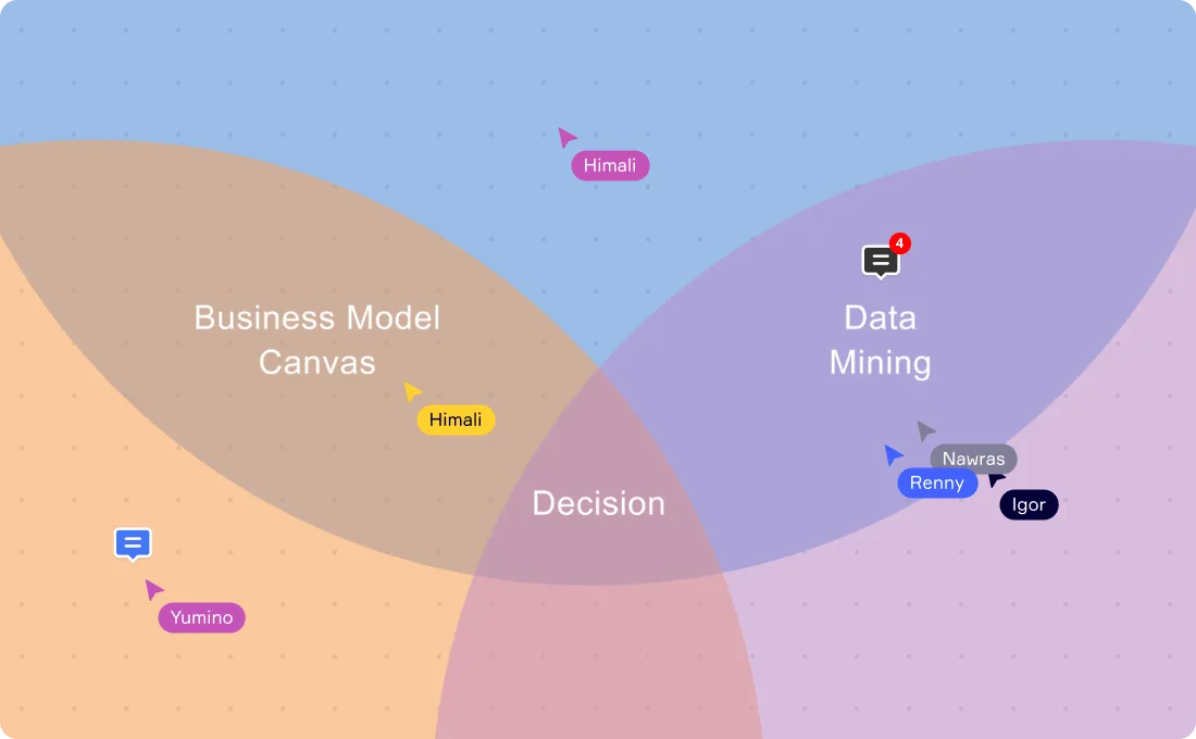
Decision-making
Venn diagrams are a great tool for helping you make decisions. When you need to consider several factors that overlap to make a decision, creating a Venn diagram can help you analyze the different options available and which one will give you the best outcome. For example, you may have come up with a list of business ideas and are trying to decide which idea is the best to pursue. A Venn diagram can help you decide on the best option by identifying which hits that ‘sweet spot’ of being profitable, has demand, and is something you are passionate about.
Mathematics
In the field of mathematics, a Venn diagram can illustrate logical connections between numbers and determine probability outcomes. For example, a mathematician may use a Venn diagram to show the correlation between different groups of subsets or numbers. Because a Venn diagram can help you measure, compare, and connect data sets, it makes sense that this unique chart can be used to analyze numerical values.
Statistics
When estimating or predicting a particular event’s outcome, you need tools to help visualize all the potentialities. For this reason, the Venn diagram has been instrumental in the field of statistics and probability.
Logic
There is something very straightforward and logical about the structure of a Venn diagram. Separating different concepts or items into equally positioned circles makes it easier to visualize and understand the relationships between a diverse group of ideas.
Computer science
In modern computer science, Venn diagrams are often used to help visualize relations between sets of data. They are helpful in understanding how different classes, sets, and objects relate to each other within any given computing system, and can be used to express similar elements between different languages of code to create more efficient systems.
Linguistics
Global linguistics is full of interconnected pathways and hierarchies. The Venn diagram is extremely useful to those studying the complex relationships between different languages and dialects. This diagram allows people to visualize these connections with ease.
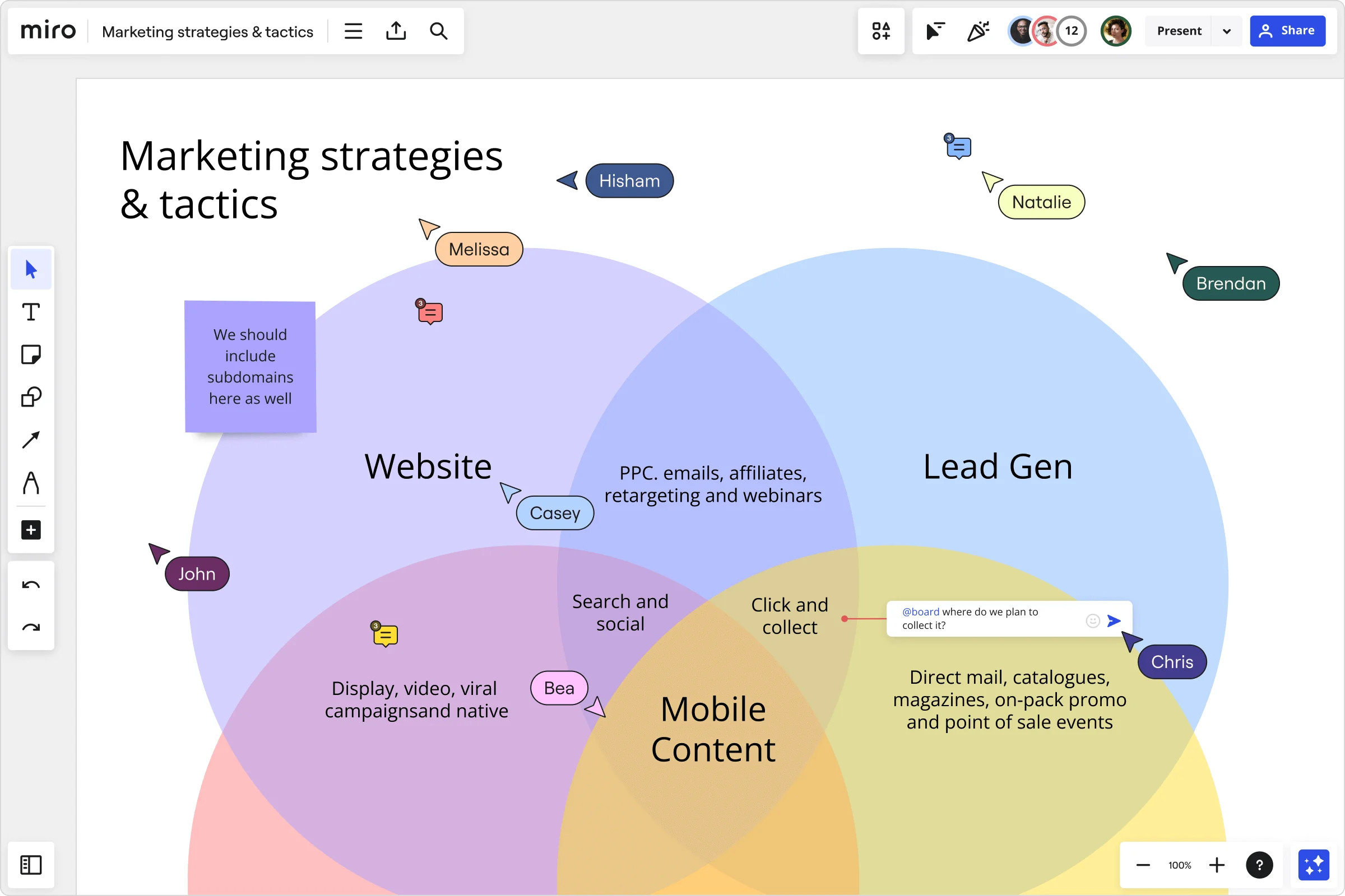
Business
You might most commonly find the Venn diagram in the corporate world. Business operations call for constant comparisons of data. This helps professionals set up business strategies and campaigns for future success.
Glossary and symbols of the Venn diagram
There are many symbols of a Venn diagram worth learning if you want to use this type of diagram to its full potential. The most notable ones include:
Set
A collection of objects or elements. Each set is represented by a closed shape, most commonly a circle.
Union (∪)
Where two shapes (representing individual ideas) interconnect. This is represented by the union symbol ∪. For example, A ∪ B denotes all elements that are in set A, or in B, or in both.
Intersection (∩)
The center point of a Venn diagram, where all the shapes intersect. The intersection is represented by the symbol ∩. In this example, A ∩ B includes all elements that are in both A and B.
Universal set (U)
A set that includes all the relevant information from your Venn diagram. The universal set is denoted as U or sometimes ξ.
Empty set (Ø)
A set that does not contain any elements.
Complement (')
A set comprised of the elements present in a universal set. The complement of a set A (denoted by A' or sometimes Ac) includes all elements that are not in A, but are in the universal set.
How to make a Venn diagram
There are lots of different ways to go about creating a Venn diagram. But the right template can help format and structure any compare or contrast analysis. Here’s how to draw a Venn diagram using Miro’s intuitive Venn Diagram Template:
Step 1
First, write down all the objects, elements, and ideas you want to depict. This collection of data is your universal set.
Step 2
Next, decide which type of Venn diagram is most suitable. For example, to find the similarities and differences between three sets, you should use a 3 circle Venn diagram.
Step 3
Draw a circle for each data set. The template already has three circles for each set, and you can add and delete circles as necessary.
Step 4
Add each element to your diagram depending on whether they have similarities or differences with the other sets. Elements with no similarities will go in one of the circles for each set: A, B, or C. If there is a similarity between an item from A and B, this item will go into the overlapping section of these two circles. This will be included in the union of your Venn diagram.
If the characteristic of an element is shared with A, B, and C, this element will go into the center of the diagram, where all the circles intersect. This will be the intersection of your diagram.
Step 5
Once all your sets are added to your diagram, it’s time to personalize your Venn diagram with colors, labels, and notes. Share your Venn diagram with your team, and tag your team members to ask for their input and feedback.
Venn diagrams and set theory
We discussed earlier how Venn diagrams are useful in several fields. Let’s look at how Venn diagrams are used in a branch of mathematics called set theory. Set theory is a branch of mathematics that tackles an object’s shared and individual properties. The 2, 3, and 4 circle Venn diagram is used in this segment of mathematics. The process behind set theory marries well with the structure of a Venn diagram because they both deal with comparing multiple objects (or numbers) at once. For example, a Venn diagram could help illustrate a set theory equation to determine which properties are shared by a group of numbers. A “set” is a collection of objects, each object representing a single element of the whole. Let’s say we have a 2 circle Venn diagram. One circle is red, and the other is blue. These are our two objects. The center point where these two objects overlap is called the intersection. The space within that intersection now represents the quality that red and blue share: purple. This process can be applied to any objects and their relative overlapping similarities. From colors to numbers to sports, any objects can be compared through the lens of set theory and a Venn diagram.
Calculating probability with a Venn diagram
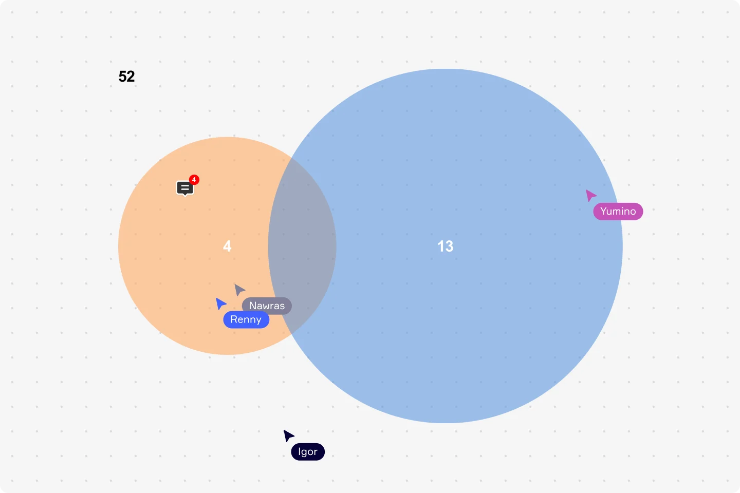
Another area where Venn diagrams are used extensively is to calculate probability. Venn diagram probability is a product of mathematics used to predict the outcome of a scenario. For example, you might use a 2 circle Venn diagram to calculate the probability of an event occurring. They would do this by inserting numbers rather than concepts or ideas into the circles. Let's use the example of a pack of playing cards to show how Venn diagrams are used to calculate the probability of different events. Excluding jokers, a pack of cards has 52 cards. The pack consists of four suits, with 13 types of cards in each suit. You want to know the probability of picking a Queen or a Heart. The rectangle represents all of the outcomes, which is all 52 cards. Since there are four Queens in a pack, the possibility of picking a Queen is 4/52. The probability of picking a Heart is 13/52. But one of those cards is both — a Queen and a Heart (the Queen of Hearts). The circles overlap to show that this card is in both sets. Visualizing the outcomes with a Venn diagram ensures you don’t double-count the Queen of Hearts. Based on the Venn diagram, you would use the following calculation: 4+13-1 = 16. The probability of picking a Queen or a Heart is 16/52. A calculation like this could help people determine the probability of a wide variety of events or situations, such as the success of a project, how many customers to expect, or the outcome of a marketing campaign. Probability forms a big part of how businesses track and measure success.
Using Venn diagrams to compare and contrast
One of the most popular uses for the Venn diagram is as a tool for brainstorming ideas by comparing and contrasting them against one another. A compare and contrast Venn diagram is easy to understand visually and can be broken down into simple structures for easy interpretation. For example, if you were writing a compare and contrast essay, you might use a Venn diagram to help elucidate the main differences between your chosen topics. To write a compelling compare and contrast essay, you need a profound understanding of your subjects' innate characteristics and differences. Start by drawing 2-4 overlapping circles representing your main topics or subjects of comparison. Then, fill up the overlapping spaces with characteristics that the intersecting subjects share. The outer, non-connected spaces can be filled with characteristics that are unique to the subject, thus representing the differences. The central intersection will represent what ties all of your subjects together. Before writing a compare and contrast essay, you might consider using a Venn diagram to help draw a clearer picture of how your topics are related to each other — and how they are not.
Venn diagrams vs Euler diagrams
Another type of diagram that looks very similar to a Venn diagram is the Euler diagram. Both Euler and Venn diagrams are based on set theory and consist of circles showing the relationships between a set. However, they are not the same. A Venn diagram shows all the possible relationships between different sets. This includes relationships that are hypothetically possible. Venn diagrams include all possible combinations of intersections between the elements. An Euler diagram only shows the intersection combinations or relationships that already exist. It includes circles that either include, exclude, or intersect.
A key tip for identifying whether a diagram is a Venn or Euler diagram is to see if there is an empty intersection. With Venn diagrams, you must depict each intersection between sets, even if the intersection is empty. But an Euler diagram only depicts intersections that are not empty. Euler diagrams tend to be more complicated than Venn diagrams. They are used to explain complex hierarchies, depict overlapping definitions, and determine whether a logical argument is valid.
Venn diagram example
Here’s a practical example of how to use a Venn diagram in the world of business. Let’s say you need to compare the roles or responsibilities of different teams within an organization for a more streamlined workflow. You want to depict the relationship between marketing teams and web development teams. Marketing teams handle data analytics, legal administration, consumer research, social media representation, and brand management. Web development teams handle UX and UI design, brand management, quality testing, SEO analysis, project management, consumer research, and data analytics. In this Venn diagram example, the intersection would include all the overlapping areas of responsibility — data analytics, brand management, and consumer research. These would be areas where marketing and web development teams can collaborate. Venn diagram examples can illustrate the relationships and differences between any objects or elements. In the workplace, a Venn diagram provides profound insights for brainstorming, strategy development, and comparing or contrasting arguments.
Author: Miro Team Last update: August 14, 2025