Burndown Chart Template
Help your Agile team make their productivity and progress visible
About the Burndown Chart Template
Burndown charts are visual graphs that show teams how much work is left to complete and how much time is available to finish the job.
A typical layout will have two lines representing the volume of work and the number of workdays. Team members leading and executing the day-to-day workload can use a burndown chart to make realistic project estimates.
The visual format helps project managers figure out the difference between the “ideal” progress of work and how the “actual” work is tracking. Teams can use a burndown chart to work toward specific goals and finish a project on time and within budget.
When to use a burndown chart
A burndown chart is a useful project management tool and can be a quicker alternative to a Kanban board or a Gantt Chart. With a burndown, the team can focus on the time left to finish tasks instead of each task’s specific breakdowns.
As a visual reference, burndown charts encourage team transparency and awareness of how much work is getting done on a day-to-day basis.
Burndown charts can also help individual team members realize their pace of work. By checking on it at least once a day, everyone can figure out how to adjust or maintain their output level according to project needs.
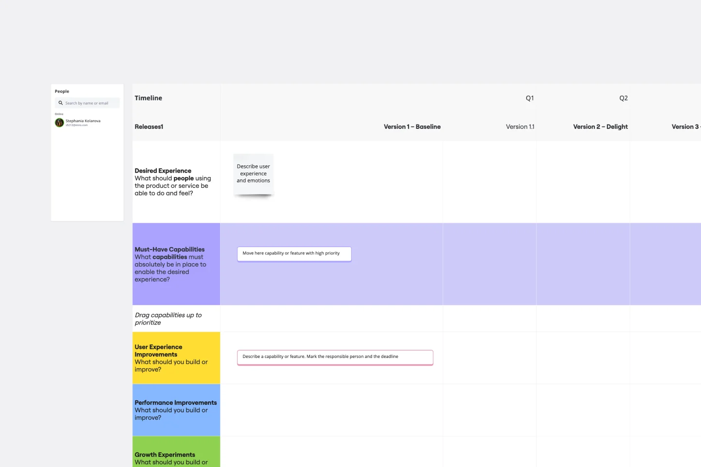
How to use the burndown chart template
Making your own burndown chart is easy with Miro's template. Simply follow these steps to get started:
1. Set a target
Set a target for the ideal number of story points you need to finish. Once “total story points” is set, that number should stay untouched for the duration of your team’s sprint.
By default, this template assumes your sprint will last 2.5 weeks. You can edit the X-axis to accommodate week-long, fortnightly, or month-long sprints as well. Your team should keep an eye on the “completed” and “remaining” numbers as these will be updated daily.
2. Set the completion rate
Edit the “ideal” completion rate line to set your target. The grey dotted line represents what the best-case productivity rate would look like. Consider this your visual baseline for whether or not your project is on track.
3. Add to the "completed" storyline
As your team completes story points on a daily basis, update the relevant sticky notes. Grow the solid line that represents your team’s actual completion rate by adding daily extensions. Keep in mind non-working days like weekends or public holidays where progress slows down or isn't expected.
4. Check-in regularly
Keep an open line of communication with your team to set expectations, predict risks, and keep your project on track. Priorities will evolve, and stakeholders may come back to your team with new requests. If your team keeps a record of their progress, they can push back on unreasonable requests together.
A burndown chart tracks your team’s daily progress honestly. Burndowns should also account for when new items are added after the sprint kicks off.
5. Plan future sprints based on previous ones
Use the chart as a reference to plan for future sprints. The chart can help you visualize the impact of new stakeholder requests over time and how much your team can do in an allocated sprint period. Notice a large productivity spurt at the end of your sprint? Break tasks into smaller, manageable tasks for your next sprint.
Get started with this template right now.
Azure Demand Forecasting Template
Works best for:
Software Development, Diagrams
The Azure Demand Forecasting diagram will show the architecture of a demand forecast, making it easier for you to predict data consumption, costs, and forecast results. Azure is Microsoft’s cloud computing platform, designed to provide cloud-based services such as remote storage, database hosting, and centralized account management. Azure also offers new capabilities like AI and the Internet of Things (IoT).
Feature Planning Template
Works best for:
Desk Research, Agile Methodology, Product Management
Features are what make a product or service fun, but adding new ones is no walk in the park. It takes many steps—ideating, designing, refining, building, testing, launching, and promoting—and just as many stakeholders. Feature Planning lets you put a smooth, sturdy process in place, so you can add a feature successfully, and spend less time and resources doing it. That makes our Feature Planning Template a smart starting point for anyone looking to add new product features, especially members of product, engineering, marketing, and sales teams.
Product Brief Brainstorm Template
Works best for:
Product , Product Management
The Intelligent Product Brief Brainstorm template in Miro is crafted to supercharge your product development process. One standout benefit of this template is its AI-powered capabilities that elevate your brainstorming sessions. Not only does it help in organizing and capturing ideas, but it also provides additional insights and solutions, ensuring a thorough and innovative approach to problem-solving. This intelligent feature significantly cuts down the time spent on synthesizing information, allowing teams to concentrate on refining and implementing the best ideas, ultimately leading to more effective and efficient product development.
5Gs Retrospective
Works best for:
Agile Methodology, Retrospectives, Meetings
The 5Gs Retrospective template offers a structured approach for teams to reflect on their projects or iterations, focusing on five key aspects: Goals, Gains, Gratitude, Gaps, and Growth. It provides elements for identifying achievements, expressing gratitude, and addressing areas for improvement. This template enables teams to conduct retrospectives systematically, fostering a culture of learning, appreciation, and continuous improvement. By emphasizing the five dimensions of reflection, the 5Gs Retrospective empowers teams to optimize their performance, enhance collaboration, and achieve their goals effectively.
Sitemap Template
Works best for:
Mapping, Software Development, Diagrams
Building a website is a complex task. Numerous stakeholders come together to create pages, write content, design elements, and build a website architecture that serves a target audience. A sitemap is an effective tool for simplifying the website design process. It allows you to take stock of the content and design elements you plan to include on your site. By visualizing your site, you can structure and build each component in a way that makes sense for your audience.
Impact/Effort Matrix Template
Works best for:
Project Management, Strategic Planning, Prioritization
Growing organizations have countless to-do’s and only so many hours in a day (or weeks before a big launch) to get them done. That’s where an impact effort matrix comes in. It gives you a quick visual guide to help prioritize your tasks and know exactly what’s worth doing. Using our template, you can create a matrix that organizes your activities into four main categories: quick wins that are low effort, effort-intensive projects that provide long-term returns, fill-ins that are low effort but low value, and time-wasters.