Types of organizational structures
Summary
In this guide, you will learn:
- The divisional structure: semi-autonomous divisions, market responsiveness, but risks resource duplication.
- The matrix structure: combines functional and divisional elements, enhancing flexibility but can cause confusion.
- The hierarchical structure: pyramid-like, clear control, defined roles, but can slow decision-making.
- How each structure impacts decision-making, communication, and collaboration.
- The importance of choosing the right structure to align with company goals.
- Practical insights on visualizing and managing these structures using tools like Miro.
Collaborative AI Workflows
Join thousands of teams using Miro to build the right thing, faster.
Introducing organizational structures
An organizational structure is a systematic approach detailing the hierarchy within an organization and defining the roles, responsibilities, and relationships of its members. While a company's products or services might be its face, the organizational structure is its backbone. It provides stability, directs workflow, and establishes authority, ensuring that every component, from the highest executive to the frontline employee, works cohesively towards a unified goal.
Types of organizational structures
Organizational structures have evolved over time, adapting to socioeconomic shifts, technological advancements, and changing business landscapes. Historically, businesses often adopted rigid hierarchical models, with clear top-down chains of command. These were suitable for the industrial age, where consistency and standardization were paramount.
However, as we transitioned into the digital age, with its rapid technological progress and globalized markets, newer, more adaptive structures emerged. Concepts like the matrix, flat, or networked structures came to the fore, reflecting the need for agility, flexibility, and cross-functional collaboration in today's dynamic business environment.
Let’s explore some of these traditional and more modern organizational structures.
Functional organizational structure
A functional structure is one of the most common types of organizational structures. Here, the organization is divided based on the functions they perform. Departments like marketing, finance, human resources, and operations each become their separate entities. For beginners, think of this as organizing a school where departments are divided into subjects like mathematics, history, or science. The functional approach offers clear delineation of roles, allowing expertise to be concentrated. It promotes efficiency within each department. However, it might also lead to a silo mentality where departments work in isolation, possibly hindering cross-departmental collaboration.
Divisional structure
In a divisional structure, the organization is divided into multiple divisions, each responsible for its own set of tasks. These divisions can be based on products, geographic areas, or customer segments. It's like a conglomerate of "mini-companies" within a bigger entity, each serving a specific market or product.
The structure’s primary strength is its focus; each division can respond quickly to its market conditions without being weighed down by the broader organizational bureaucracy. Yet, this can also lead to duplication of resources if multiple divisions perform similar functions.
Matrix organizational structure
Combining the elements of both functional and divisional structures, the matrix structure places employees under multiple supervisors. Picture a grid (or 'matrix'); vertically, you might have functional roles and horizontally, project or product teams. An employee could report to both a functional manager and a project manager. The dual-reporting relationship intends to optimize resource utilization and flexibility. It promotes adaptability in the face of complex tasks. However, it's not without its pitfalls, as the dual chains of command can sometimes lead to confusion or even conflicts of interest.
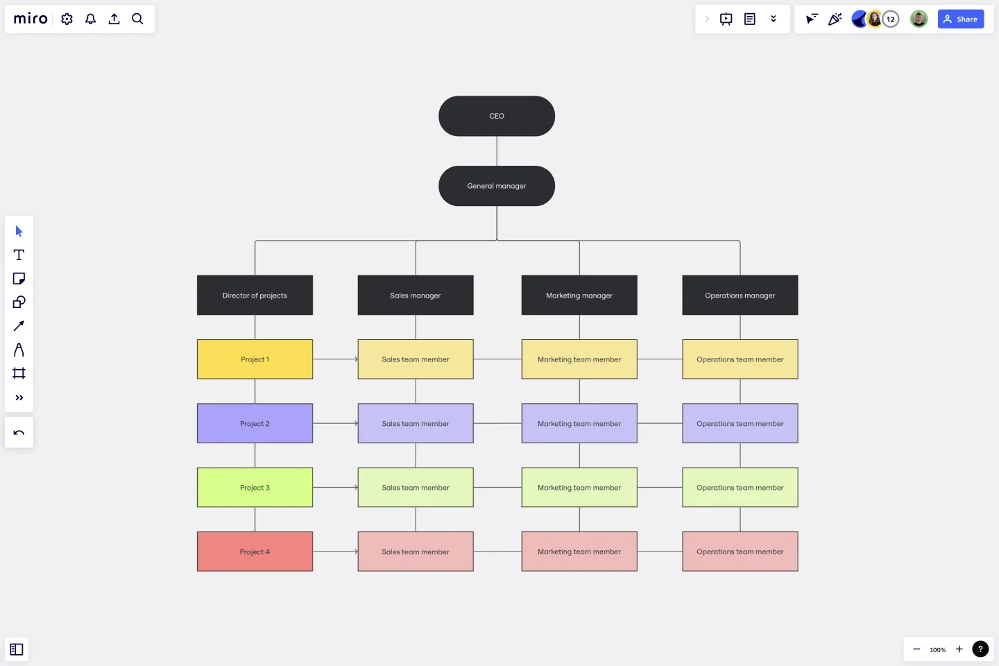
Hierarchical organizational structure
Resembling a pyramid, the hierarchical structure has the most employees at the base and fewer as one moves upwards, with top management at the pinnacle. Each level controls the level directly beneath it. For those new to this concept, envision a military ranking system, from generals down to privates.
This method offers clear roles and responsibilities, ensuring everyone knows their position in the pecking order. Yet, the structure's rigidity can sometimes slow down decision-making, with each decision potentially needing to pass through various layers.
Flat structure
Contrary to the hierarchical model, a flat structure has minimal levels of middle management, if any. Essentially, it's a “flatter” system where a larger number of employees report to a small number of managers. For those outside the organizational world, think of a startup environment where roles are fluid, and there's a direct line to the CEO. With fewer layers, decision-making can be quicker, and employees might feel more involved in the company’s direction. However, as a company grows, this structure can become unsustainable, potentially leading to managerial burdens on a few individuals.
Network organizational structure
The network structure is more of a decentralized approach wherein specific functions or services are outsourced to other organizations, creating a network of interdependent entities. This structure offers organizations significant flexibility and scalability, allowing them to tap into global talents and resources. On the downside, managing and monitoring external partnerships can sometimes be challenging.
Team-based organizational structure
Here, the organization is divided into teams that are responsible for specific tasks or projects. These teams operate relatively autonomously, often setting their own goals and workflows. Team-based structures can boost collaboration and innovation, with members bringing diverse perspectives to the table. However, care must be taken to ensure inter-team coordination and alignment with the broader organizational goals.
Hybrid structure
The hybrid structure combines elements from different types of organizational structures, catering to the unique needs of the business. It offers a balance, ensuring functional efficiencies while allowing for specialization or decentralization where needed. Adopting a hybrid structure allows businesses to enjoy the benefits of multiple structures while mitigating their individual drawbacks. The challenge lies in ensuring seamless integration and preventing any potential conflicts or overlaps.
Factors influencing the choice of organizational structure
The design of an organization's structure isn't a mere game of trial and error. Instead, it's a strategic decision influenced by various factors. Just as architects consider environmental, functional, and aesthetic factors when designing a building, business leaders must weigh numerous elements when determining the optimal organizational structure. Let's delve into the myriad of considerations that play a role in this crucial choice for organizational structure types:
1) Company size and scale
Simply put, a company's size refers to its number of employees, while its scale pertains to its operational reach and complexity. A local bakery will have different structural needs than a multinational tech corporation. Smaller companies might find a flat structure more conducive, with its nimbleness and direct lines of communication. Conversely, large enterprises often lean towards hierarchical or matrix structures to manage their vast operations efficiently.
2) Business goals and strategy
Every company operates with a set of objectives, whether it's market dominance, innovation, or customer centricity. The overarching strategy maps the route to achieve these goals. A company aiming for rapid innovation might adopt a matrix or divisional structure to foster cross-functional collaboration. On the other hand, an entity focused on cost leadership might prioritize a functional structure for its efficiency.
3) Industry and market dynamics
This pertains to the external environment a company operates within. Industries like tech are fast-paced and ever-evolving, while sectors like utilities may be more stable and predictable. In volatile markets, organizations may prefer flexible structures like matrix or flat to adapt swiftly. Stable industries might lean towards traditional hierarchical models, valuing stability and clarity.
4) Company culture and values
Culture encapsulates the collective values, beliefs, and behaviors within an organization. It's the intangible vibe, dictating how things get done. A company that values autonomy and innovation might veer towards a flat or divisional structure, empowering employees at all levels. Conversely, a firm that emphasizes discipline and clear chains of command might opt for a more hierarchical setup.
5) Regulatory and compliance needs
Certain industries, like finance or healthcare, are bound by stringent regulatory requirements. Compliance isn't optional; it's a mandate. In sectors with heavy regulations, the clarity of a hierarchical or functional structure might be favored. Clear delineation of roles can aid in ensuring that compliance standards are consistently met.
6) Technological advancements
As the digital era progresses, technology continues to reshape how businesses operate, from AI-driven insights to remote work tools. Companies at the forefront of technological adoption might lean towards dynamic structures, like matrix or divisional, to harness the benefits of tech innovations fully. These structures can support the agility and collaboration needed in a tech-centric world.
Best Miro features for org charting
Unlike in spreadsheets or word processors where you can’t customize much, Miro has an organizational chart maker with a user-friendly, drag-and-click design. Here are five features that make it easy to make a custom org chart.
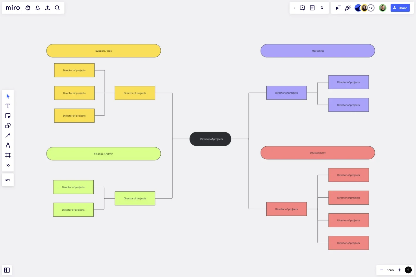
- Mind map. A mind map is a free-form branching structure that connects concepts — or in the case of an org chart — people. Simply click to create connectors between boxes or sticky notes.
- Shapes and lines. Choose from a library of basic and complex shapes, change the color, and add text. Then, connect shapes with lines. You can use different line styles to signify different things, like solid and dotted lines for direct and indirect reporting.
- Cards. A Miro card is a textbox on your board that represents a task. You can use this to assign projects to users, much like a Jira card (in fact, these integrate with Jira cards). If you keep an org chart in the cloud, you can add cards to request users like HR or managers to update organizational changes as they occur.
- Auto-layout. Trying to manually align lines and boxes is no one’s idea of a good time. Save yourself the hassle with auto-layout, which snaps elements to a grid and automatically aligns space between them.
- Images, icons, and videos. While many label org chart boxes simply with job titles, you can personalize them further with photos or avatars to help new employees get acquainted with the team. You can also use Talktrack to let employees leave a quick video introduction of themselves. Get creative! Just keep in mind that this takes more time and effort to maintain.
Final thoughts on types of organizational structures
Organizational structures play a pivotal role in its success and sustainability. These structures provide more than just a hierarchy or a chain of command; they shape the culture, influence decision-making processes, and drive operational efficiencies. From the traditional hierarchical model that speaks to clarity and authority to the more contemporary flat or matrix structures emphasizing agility and collaboration, each structure has its unique strengths and challenges.
One thing is abundantly clear: there is no one-size-fits-all. The optimal structure for any organization hinges on its specific goals, the industry it operates in, its scale, and the challenges it faces. And as the business world continues to evolve, spurred by technological advancements and changing market dynamics, so too will the nature and design of organizational structures.
To effectively visualize and map out an organizational structure, you can use Miro's org chart creator, a tool designed to bring clarity and structure to your team or organization.
Author: Miro Team
Last update: December 23, 2025