Diagramming helps us visualize abstract information so we can understand, problem-solve, improve, and innovate. Luckily, you don’t need to be an artist or designer to create a diagram. Anyone can create effective diagrams by following basic diagram design.
In this post, we’ll cover why diagrams can be such useful communication tools, the anatomy of a good one, and a few pro tips to take your designs to the next level. Finally, we’ll provide you with a few diagram examples, all of which you can find and customize right here on Miro.
What is diagram design?
Diagram design is the process and principles of visualizing relationships between information, systems, and people. It teaches us best practices for using visual strategies to support communication goals.
How to use diagrams for visual communication strategies
When you create a diagram, the end goal isn’t the diagram itself. It exists to help you reach a goal, like teaching a new employee a process or convincing leadership to allocate resources in your favor. The purpose of a diagram is typically learning, persuasion, problem-solving, or all three. You may want your audience to understand a complex topic more clearly, or you might want to change their mind.
When you’re making a diagram, consider your goal and the context: Will your diagram be used in a presentation or just shared on its own? If it’s shared without any context or explanation, what should you add to the diagram itself to support your communication goals?
Use a diagram maker for better, faster design
A diagram maker is a design tool with pre-set templates, shapes, and features specifically for diagram design. Miro’s diagramming tool, for example, gives you shape packs and hundreds of pre-built diagram templates for any kind of diagram, including process maps, user flows, supply chain diagrams, and org charts.
Drawing shapes and arrows freehand can take a long time and have inconsistencies. A diagram maker, on the other hand, lets you snap arrows to shapes with just a click and use repeating elements to save time. The best part? You don’t need to be a graphic designer to use one.
The anatomy of a good diagram
Like any design, visual design principles like contrast, balance, emphasis, and repetition apply. A good rule of thumb is to convey importance and meaning with consistent visual elements and avoid clutter.
Here are a few diagram design principles to ensure an attractive, effective design.
Consistency
Keep your design clean by sticking to the same typography and arrow styles throughout your diagram. Any style change should have a very specific meaning, like varying colors representing different teams. If a style variation doesn’t have a reason, don’t use it.
The easiest way to do this in Miro is to create a legend of repeating elements like shapes and arrows at the top of your diagram, then simply copy them whenever you add a new item. In the video below, user Valerie Mawhinney shows how she uses repeating components to create a process flow diagram.

Hierarchy
Hierarchy in design means that the most important items carry the biggest visual weight. Take this brainstorming spider diagram, for instance. You can tell that the “Problem” is the most important part of the diagram because it’s the largest shape in the diagram.
Consider how we read from left to right and top to bottom in the West. It’s logical, then, for sequential diagrams to flow from left to right and relationship diagrams from top to bottom to match a user’s natural reading flow. In a top-to-bottom diagram like an org chart, your eyes are naturally drawn to the top element even when it’s the same size because of the white space around it and the branching effect.
Color and shape coding
Color plays a special role in diagram design. It’s common to use different colors to show categories of users and actions. You can also use color to show intensity, like red for a bottleneck in a process.
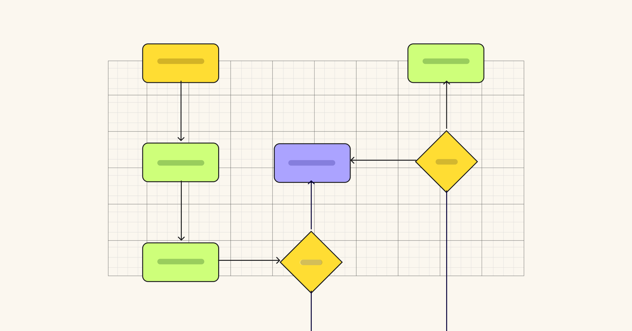
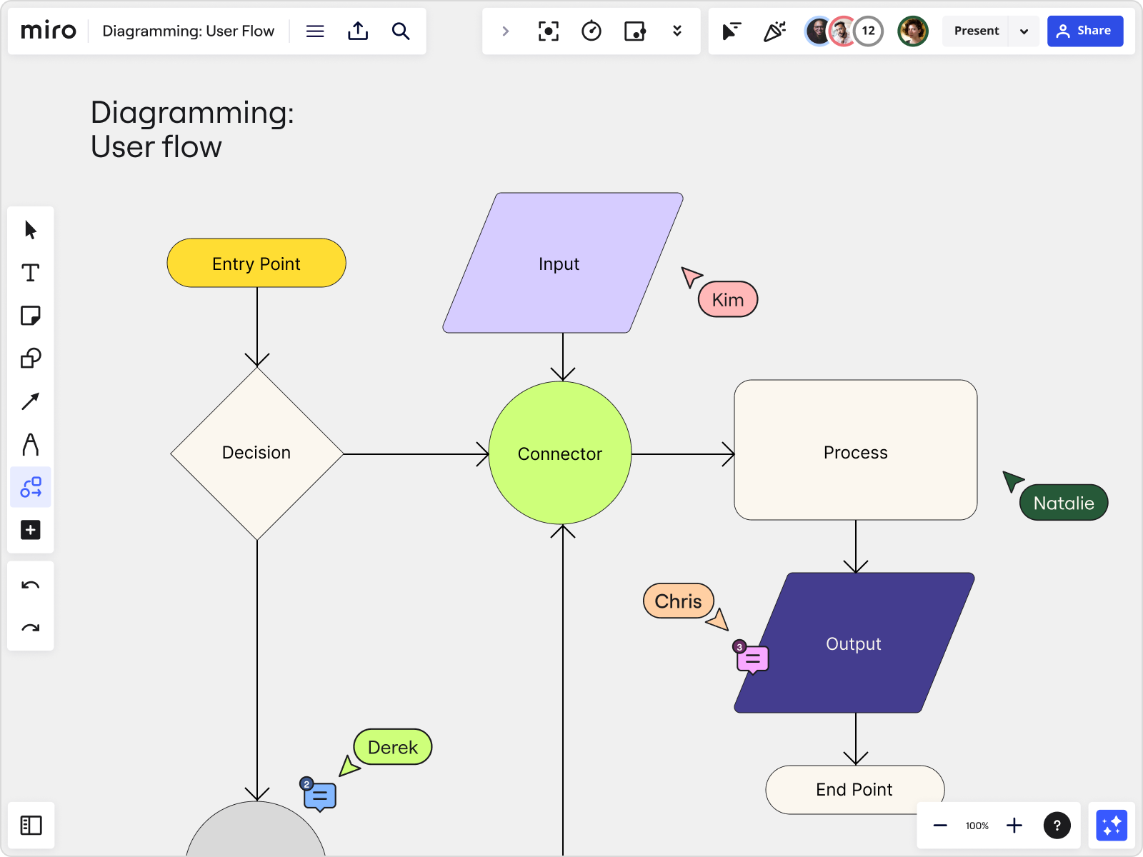
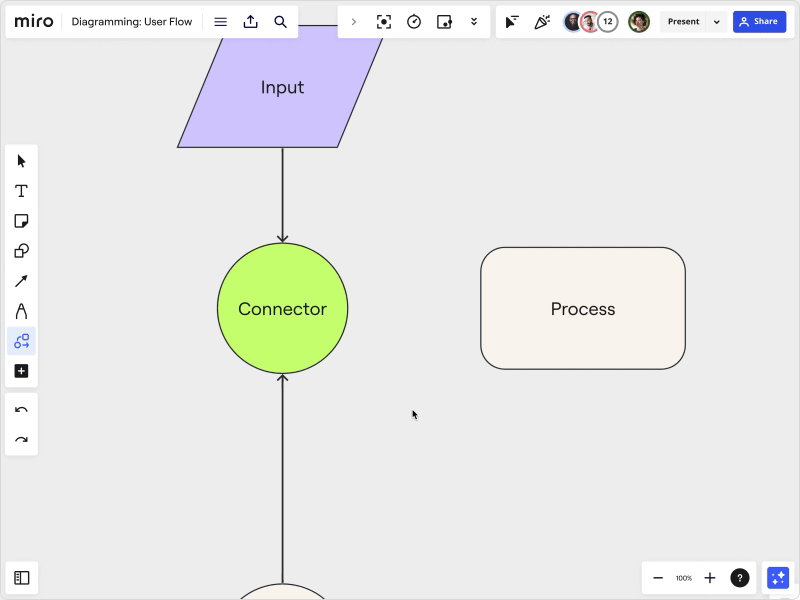
Another unique element of diagram design is shape coding. In UX and process design, for instance, designers often use specific shapes to signify something in a flowchart. An oval, also known as a terminator, shows an entry or end point of a process. Rectangles represent tasks or actions, and a diamond represents a decision where the flow branches off into multiple directions.
Labeling
If it’s designed well, a diagram shouldn’t need much text, but it will need some. Label each shape or symbol with the action, person, or process it represents. Keep the text as short as possible and use abbreviations your audience will understand. You can use color coding or symbols to minimize label text. Just be sure to add a legend to the side.
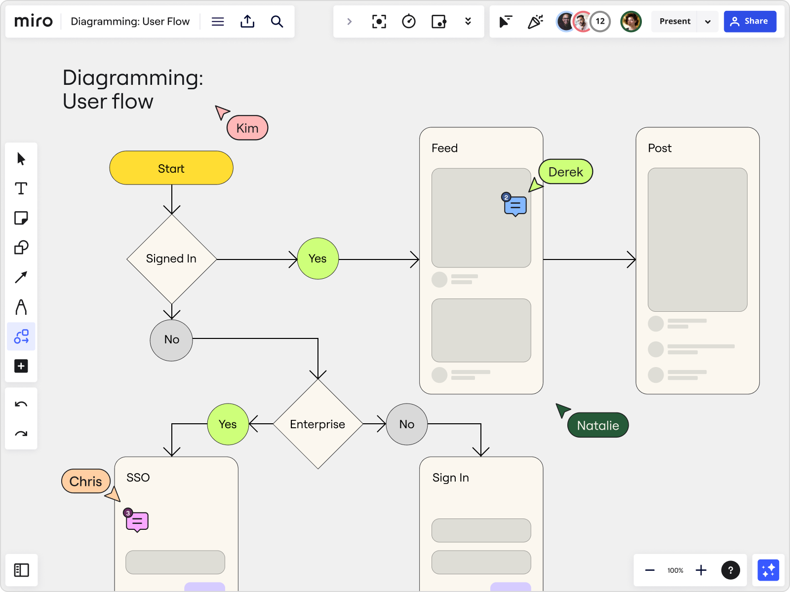
When you use branching, labeling is important to help viewers understand the flow. Most diagram makers let you label each arrow with the choice it represents. This can be simple, like Yes/No, or can name specific choices like the user flow below. Notice how concise the label text is on each object.

Product Development Flowchart Template
Readability
Of course, labels should be easy to read. One element of readability is contrast, which is making sure your text color is different enough from its background to be legible. White text on a yellow background is hard to read, for example. Consider your font choice, including the typeface you choose and how it’s formatted, sized, and spaced.
Readability tips for diagrams
- Use sans-serif typefaces like Arial.
- Size your text box so your label text doesn’t run into or off the edge of your shape.
- Use a free contrast checker like WebAIM to check for contrast and accessibility.
- Don’t worry too much about font size for digital diagrams since users can zoom in to read complex diagrams.
Alignment
When you draw shapes and connectors between them, you should have consistent spacing between objects and vertical and horizontal alignment. This gives your diagram a clean, professional look and makes it easier to understand.
Alignment is difficult to achieve when diagramming freehand. Look for a diagram maker with auto-alignment features and arrows that snap into place when you simply drag and click from one shape to the next.
Tips for making next-level diagrams
Once you’ve mastered the basics, elevate your diagram design skills with these pro tips.
1. Use color palettes and pattern libraries
Diagrams can be used as sales tools, client deliverables, and internal communications tools, so you want to give them the same design and branding treatment you would any other high-value asset.
If you want your team to make diagrams in your brand colors and style, create a color palette or pattern library for them to use and use an icon library to pull matching icons when needed. These little touches will make your diagrams stand out.
2. Take shortcuts
Since a diagram is a tool to support a larger goal, embrace any time-saving shortcuts you can find to make the diagramming process more efficient. Here’s how:
- Start with a diagram template already designed for best practices. Need inspiration? Browse our diagram examples below, or check out user-generated diagrams in Miroverse.
- When switching diagram makers, import your diagrams from platform to platform (like Lucidchart to Miro) so you aren’t starting from scratch.
- Reuse components within the same diagram to speed up the process and add consistency.
- Want to create a diagram with just a prompt? Ask AI to get it started for you. Describe your diagram, and Miro Assist will use natural language processing to build one.
3. Collaborate
Diagramming is rarely a solo venture. It takes multiple stakeholders to diagram a process and discuss improvements, so you’ll need a collaborative workspace. Look for a diagramming tool with features like commenting, annotation, video call integration, and real-time, multi-user editing. When you can’t present a diagram live, you can use a TalkTrack to record a walkthrough of your diagram to give context and support your goals.
Diagram examples for inspiration
There are innumerable types of diagrams, from Venn diagrams to spaghetti diagrams to fishbone diagrams. Here are a few more examples to get you started:
Cycle diagram
This beautifully simple cycle diagram helps you visualize a cyclical process, like a customer life cycle or marketing flywheel. Name your topic in the middle, then label the steps with linked objects.

Product development flowchart
This product development flowchart can be adapted for any kind of decision mapping or workflow you need to map. Use shapes to symbolize entry points, actions, and decisions, with labels to move you from one step to the next.

Product Development Flowchart Template
Sitemap diagram
Visualize your website page structure with a hierarchical branching structure in a sitemap diagram. Our sitemap template offers both horizontal and vertical diagram styles to choose from.

Data flow diagram
Understanding how data flows in and out of systems can be very complex. Make it easier to grasp with a data flow diagram, which can chart the relationship between systems and information flows.

Vertical organizational chart
Avoid miscommunication and align roles and teams with a vertical, hierarchical org chart. This top-down diagram starts with the highest leadership and branches down to teams, middle management, and then individual contributors.

Stakeholder map
Diagrams are excellent for mapping relationships between ideas and people. One example of this is a stakeholder map, which illustrates interest and influence both inside and outside of an organization. Use this diagram to map your stakeholders and plan your communications.

Better than 1,000 words
Visualizing your processes helps you communicate, innovate, and persuade. This brings us back to the idea that the diagram itself isn’t the end goal — problem-solving is.
“A visual representation of processes helps you analyze and visualize problems fast and bring clarity to specific tasks and responsibilities,” explains Andreas Lindenberg, UX CSAT specialist for MISUMI Europa. “By visualizing the entire system landscape, from high-level company-wide processes to intricate departmental workflows, organizations gain insight into inefficiencies and areas for improvement.”
Start your visual problem-solving with a collaborative diagram maker — no designer needed.