PERT chart
Summary
In this guide, you will learn:
- What a PERT chart is for project management
- Its historical background and origin in the 1950s
- Core components: tasks, dependencies, nodes, vectors
- How the critical path is identified
- The use of three time estimates (optimistic, most likely, pessimistic)
- Step-by-step instructions on how to create and use a PERT chart
Collaborative AI Workflows
Join thousands of teams using Miro to build the right thing, faster.
What is a PERT Chart?
A Program Evaluation Review Technique (PERT) chart, is a network diagram meant for project management. By breaking projects down into key events and milestones, PERT charts are great for identifying dependencies between tasks and estimating how long it’ll take to complete everything.
Because of that, PERT charts are also useful for identifying a project’s critical path — the longest sequence of essential tasks needed to complete a project. That said, PERT charts use variable task durations – as we’ll cover more later on – making it a more nuanced approach than a standard critical path method.
Key components of a PERT chart
A PERT chart consists of nodes and vectors – or directional lines – that map out the sequence of tasks within a project.
Nodes
Nodes are circles or rectangles representing project milestones and major events — the critical points throughout the project.
Each node also contains estimates for how long it would take to complete a task:
- Optimistic time: the minimum amount of time it would take considering ideal circumstances
- Pessimistic time: the maximum amount of time it would take if things go wrong
- Most likely time: your best estimate based on a realistic perspective.
When indicating time on a PERT chart, you can either use the most likely time or create different potential project timelines.
Vectors
Vectors are lines that represent tasks you need to complete to move from one event to another. The direction of the vectors implies the sequence of task or event completion. You can also add more details to the vectors by using numbers to indicate the order of events, or even use one of four common labels:
- Finish-to-Start (FS): You can’t start a task until you’ve completed the preceding task
- Start-to-Finish (SF): You can’t finish a task until you’ve started the preceding task
- Finish-to-Finish (FF): You can’t complete a task until you’ve completed the preceding task
- Start-to-Start (SS): You can’t start a task until you’ve started the preceding task.
How to make a PERT chart
Creating a PERT chart involves several important steps. You’ll need to clearly identify tasks and milestones, sequence activities logically, and estimate the most optimistic, pessimistic, and realistic amounts of time needed to complete everything.
While you could use more traditional methods like whiteboards and spreadsheets to create one, modern PERT chart makers have simplified the process with features like drag-and-drop diagramming and real-time collaboration.
Once you’ve picked out the right tool, here are a few steps to take to create an effective PERT chart:
1. Identify tasks and milestones
The first step in creating a PERT chart is to meticulously list every task and milestone within the project's scope. Start by running a brainstorming session involving all your stakeholders, making sure you haven’t overlooked any part of the project.
For example, let’s consider a project to launch a new software product. The tasks might include market research, product design, software development, testing phases, marketing strategy development, and the official launch event. Each task represents a significant step toward project completion, which means you should include it in the PERT chart.
Milestones, on the other hand, mark the completion of a major phase of the project. Using the software launch example, some milestones could be completing the prototype, completing the alpha and beta testing phases, getting final product approval, and the successful market launch. Milestones are crucial because they serve as clear targets for the team and help indicate progress for stakeholders.
2. Sequence activities
Once all tasks and milestones are identified, the next step is determining their logical sequence. This involves analyzing dependencies between tasks to understand which ones should come first and which come later. Going back to the example of a software product launch, you’d want to complete market research before product design can begin. Similarly, software development can’t start until the design is finalized. From there, we can represent this sequencing in a flowchart format, with arrows indicating the order of progress — from one task to the next.
It's also important to identify tasks that you can complete in parallel, which can significantly reduce the project's overall timeline. For example, while the software development team works on the product, the marketing team could develop the marketing strategy simultaneously. Properly sequencing these activities on the PERT chart ensures that the project progresses as efficiently as possible.
3. Estimate time
The final step in creating a PERT chart is to assign time estimates to each task. Typically, it’s about calculating three scenarios:
- the optimistic time estimate (the least amount of time to complete a task)
- the pessimistic time estimate (the maximum amount of time)
- the most likely time estimate (the most realistic amount of time).
Let’s go back to our previous example of a software launch project. The development team might estimate that coding the software could take four months optimistically, six months most realistically, and eight months pessimistically.
With these estimates in mind, you can calculate the expected duration of each task using the PERT formula: (Optimistic + 4(Most Likely) + Pessimistic) / 6. This weighted average gives a more realistic timeline for each task, accounting for the best and worst-case scenarios.
Once the time estimates are in place, you can use the PERT chart to identify the critical path, which is the sequence of tasks that will determine the project's minimum completion time. It’s worth closely monitoring the critical path because any delays will directly impact the project's delivery date.
Use Miro’s visual workspace to build your PERT chart in minutes — or save even more time using our free PERT chart template.
Example of a PERT chart
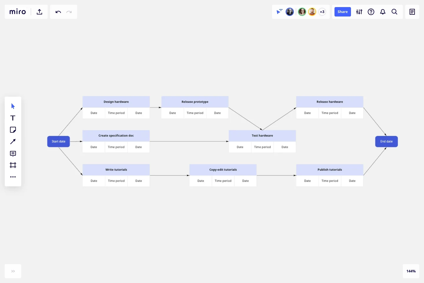
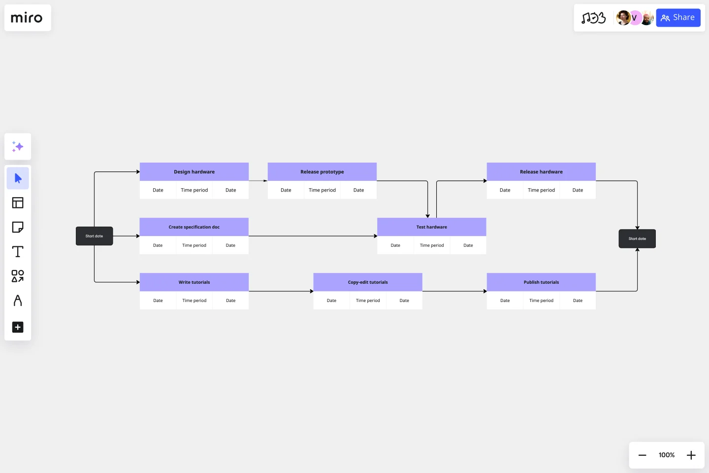
Let’s take a look at an example of a good PERT chart. We’ll use the product development and launch example to help illustrate how PERT charts work.
Let’s say there are 10 critical events:
- Start date
- Design hardware
- Create specifications doc
- Write tutorials
- Release prototype
- Test hardware
- Release hardware
- Copy-edit tutorials
- Publish tutorials
- End date
In this case, you’d use nodes to represent the events and arrows to connect them. You’d also add numbers or other labels to the arrows to establish a sequence.
For example, the first node would say “Start data,” and an arrow would connect it to the “Design hardware” node — marking the first project sequence that needs to be completed.
You can draw divergent arrows from the first node to define different workflows. In this example, you can draw arrows in three directions — one workflow for product design, one for specs and testing, and one for creating and publishing tutorials. The arrows eventually lead to the final node — “End date”.
Benefits of using a PERT chart
There are many reasons project managers use PERT charts. Let’s take a look at a few key benefits:
Plan time effectively
By creating a PERT chart early on, project managers can gauge the time and resources they need to complete various tasks and the overall project — including anticipating potential blockers.
Keep stakeholders informed
A well-crafted PERT chart visualizes the entire project timeline, making it a valuable tool for clearly communicating goals and milestones to stakeholders.
Simplify complex projects
Projects can get messy, especially when you have multiple responsibilities and deadlines to keep track of. A PERT chart helps break down a project into smaller tasks, allowing you to focus on no more than a few milestones at a time — making it easier to manage and achieve overall.
Identify key people
Keeping a project on track includes knowing who’s responsible for overseeing each task. A PERT chart can help you easily identify these people, which is especially helpful if you’re working with employees from other departments. It also helps establish a sense of shared accountability across the project.
Easily make changes
Even the most well-planned projects can run into unexpected circumstances — whether you get new information from stakeholders that affect your goals, or a team member leaves the project affects dependencies. Either way, a PERT chart – especially one made using an intuitive PERT chart tool – makes it easy to rethink and edit project details on the go.
Best practices for creating PERT charts
Now that you know what a PERT chart is and how to make one, here are some best practices to keep in mind to help you create effective diagrams going forward:
Integrate with other tools
Using multiple tools for your project? Make use of software integrations where you can to save time. Miro’s PERT chart tool, for example, integrates with over 130 apps — including popular project management tools like Jira and Asana — allowing you to get more done using one visual workspace.
Involve your team members
It’s not enough to create a great PERT chart if your project team isn’t on board. Foster an environment where your team understands the value of a PERT chart and can easily access it.
Training sessions are a great way to walk your team through the PERT chart and communicate expectations. Using a collaborative tool like Miro also allows you to grant team members access to your PERT chart and have them add comments with their input.
Determine the critical path
Because PERT charts visualize your project’s entire timeline, it’s easy to identify various possible task sequences and, therefore, see which one can help you complete the project the soonest. For this reason, PERT charts are excellent for determining a project’s critical path.
Evaluate needs early on
Another benefit of having a visual timeline is to easily see what you need at different stages of the project — such as resources, software, and even what team members are best to involve. Taking the time to identify needs early on helps you anticipate potential blockers and keep the project moving in a timely manner.
Conduct regular reviews
And remember, creating a PERT chart is just the start of project management. Be sure to consistently review and make adjustments as needed to help keep the project on track over time.
Ready to create your own PERT chart? Sign up for free with Miro to discover what our diagram maker can do for you.
Author: Miro Team
Last update: October 16, 2025