Data flow diagrams examples
Summary
In this guide, you will learn:
- What a data flow diagram (DFD) is and how it visually represents data movement.
- The different levels of DFDs (Level 0-2) providing increasing detail.
- How Miro’s free DFD template helps optimize data flows.
- Key features of Miro’s DFD tool, including industry-standard shapes and integrations.
- Collaborative capabilities in Miro for real-time and asynchronous teamwork.
- Who benefits from Miro’s DFD tools, including developers, analysts, and product teams.
3 examples of data flow diagrams to understand data movement
Data flow diagrams (DFDs) serve as a vital tool to understand how data behaves in complex workflows, offering a clear, visual representation of data movement within systems. Let's delve into the world of data flow diagrams, exploring three distinct examples to illustrate their utility and application.
Collaborative AI Workflows
Miro's DFD tool lets you easily create diagrams online with automated features.
What is a Data Flow Diagram?
A data flow diagram is more than just a diagram; it's a roadmap of how data travels through a system. It uses standardized symbols and structures to depict the flow, making complex processes easier to understand at a glance. Whether you're a seasoned engineer or a newcomer to the field, understanding how a data flow diagram works can significantly enhance your grasp of system operations.
Example 1: Online Sales System
Consider an online sales platform. Here, data flow is the backbone of operations, from customer orders to inventory management.
Customer Order Entry:
- Customer inputs order details.
- System validates and records the order.
Payment Processing:
- Customer payment information is captured.
- Payment is verified and processed.
Order Fulfillment:
- Order details are sent to the warehouse.
- Inventory is checked and allocated for shipping.
Shipping and Delivery:
- Order is packaged and shipped.
- Customer receives updates on shipping status.
Inventory Management:
- Sales data updates inventory levels.
- System triggers restock orders if necessary.
This data flow diagram example not only simplifies the understanding of the sales process but also highlights key decision points and data storage locations.
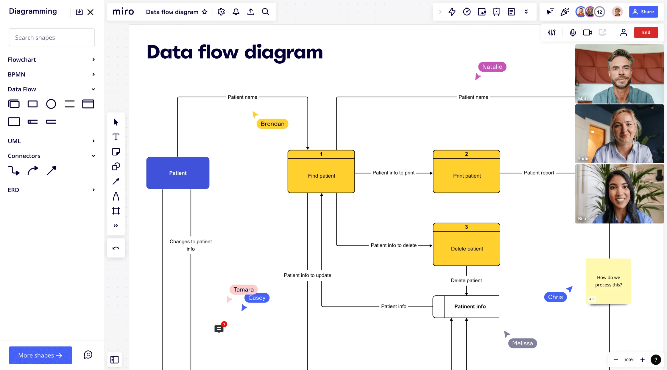
Example 2: Hospital Management System
A hospital management system is a complex network of patient data, medical records, and administrative details.
Patient Registration:
- Patient provides personal and medical history.
- Data is entered into the hospital system.
Medical Assessment:
- Patient is examined by healthcare professionals.
- Medical findings are recorded in the system.
Treatment Planning:
- Doctors plan and record treatment procedures.
- Prescriptions and procedures are scheduled.
Billing and Insurance Processing:
- Treatment costs are calculated.
- Insurance details are verified and billed.
Patient Discharge and Follow-up:
- Patient receives discharge instructions.
- Follow-up appointments are scheduled.
In this example, the data flow diagram showcases the patient's journey from registration to treatment and billing. It's a clear visual guide that helps hospital staff understand how patient information moves through different departments, ensuring efficient and error-free operations.
Example 3: Inventory Control System
Inventory control is critical for any business. A well-designed data flow diagram can be the difference between efficient stock management and operational chaos.
Stock Receiving:
- Inventory items are received and logged.
- System updates to reflect new stock levels.
Inventory Storage:
- Items are stored in designated locations.
- Inventory system tracks location and quantity.
Stock Monitoring:
- Continuous monitoring of stock levels.
- Alerts for low stock or overstock situations.
Order Processing:
- Inventory is allocated for customer orders.
- System updates to reflect reduced stock levels.
Inventory Auditing:
- Regular checks for inventory accuracy.
- Adjustments made for discrepancies.
This data flow diagram example illustrates how inventory data is collected, processed, and updated. It's a vital tool for identifying bottlenecks and ensuring a smooth supply chain.
Now that you saw real examples of data flow diagrams, let's understand better what are DFDs levels and how do they work.
Levels of data flow diagrams
To effectively capture the complexity and scope of different systems, DFDs are typically structured in multiple levels, each offering a different degree of detail. Understanding these levels is crucial for anyone looking to analyze or design systems using data flow diagrams.
Level 0: Context Diagram
- Overview: This is the highest level of a data flow diagram and provides a bird's-eye view of the system. It is also known as a context diagram.
- Components: It typically includes a single large process (representing the entire system), external entities, and data flows between them.
- Purpose: The context diagram sets the boundary of the system and shows how it interacts with the outside world, making it an excellent tool for communicating with non-technical stakeholders.
Level 1: Top-Level Diagram
- Expansion: This level expands on the single process shown in the context diagram, breaking it down into its major components or subsystems.
- Detail: While more detailed than the context diagram, Level 1 DFDs still maintain a high-level overview, focusing on the primary functions of the system.
- Functionality: It helps in understanding the major processes within the system and how they interact with each other and with external entities.
Level 2: Detailed Diagram
- Further Breakdown: At this level, each process in the Level 1 DFD is broken down into more detailed sub-processes.
- Granularity: This level provides a more granular view of the system's operation, showing more specific data flows and storage points.
- Usefulness: Level 2 DFDs are particularly useful for analysts and designers who need to understand the detailed workings of each part of the system.
Level 3 and Beyond: Highly Detailed Diagrams
- Deep Dive: In larger and more complex systems, DFDs can go beyond Level 2, breaking down processes into even more detailed components.
- Specificity: These levels are highly specific and are used to drill down into the minutiae of each process within the system.
- Target Audience: They are typically used for in-depth analysis and are most useful for individuals directly working on or with the specific process being detailed, such as developers or system engineers.
Understanding the different levels of data flow diagrams is essential for effectively mapping out and analyzing systems. Each level serves a specific purpose, from providing a general overview to detailing specific processes, making DFDs a versatile tool for a wide range of applications in system design and analysis.
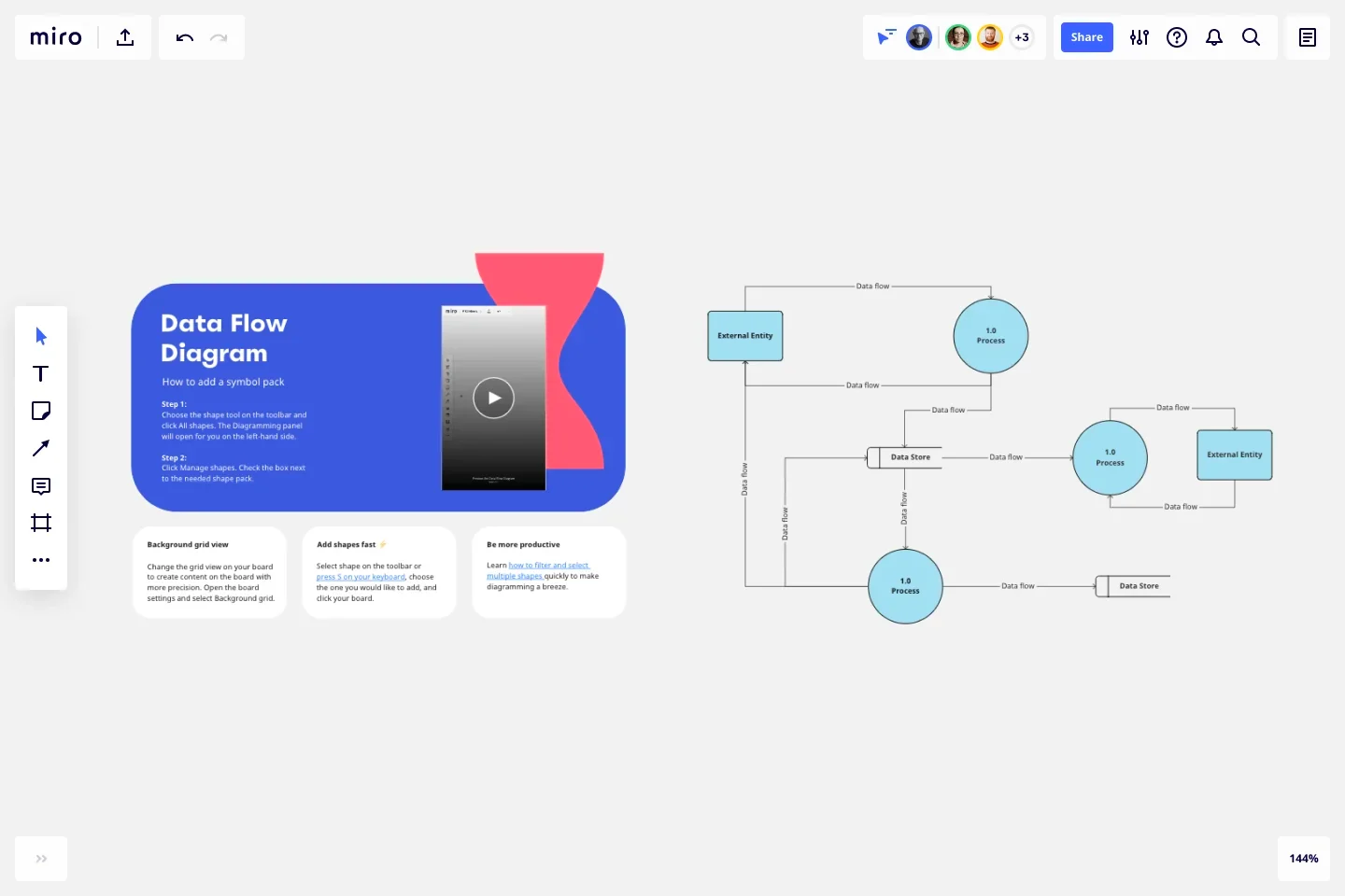
Key components and symbols of DFDs
Every data flow diagram consists of several key components, each represented by specific symbols. These components play a pivotal role in illustrating how data is processed, stored, and transferred within a system:
- Processes: Represented by a circle or a rounded rectangle, processes are the actions that transform incoming data flows into outgoing data flows. They are the active elements where data is processed or manipulated.
- Data Stores: Shown as open-ended rectangles or parallel lines, data stores indicate where data is held for later use. They can represent anything from a simple filing system to a complex database.
- Data Flows: Depicted by arrows, data flows show the route that data takes from one part of the system to another. They illustrate how data moves from external entities to processes, between processes, and to data stores.
- External Entities: Represented by rectangles or squares, external entities are the sources or destinations of data outside the system being diagrammed. They can be people, organizations, or other systems that interact with the analyzed system.
Understanding these components and their symbols is crucial in creating and interpreting data flow diagrams. By mastering these elements, you can effectively map out and analyze the flow of data in any system, leading to improved system design and process optimization.
Start faster with a template
Miro's Data Flow Diagram template can help you get quick started with your own DFD. You can build your data flow diagram with shapes, which will visually show the steps or actors of your system, and use the connector lines with arrows to show the flow of your system.
Conclusion
Data flow diagrams are not just diagrams; they are the language of systems and processes. Understanding and utilizing data flow diagram examples in your field can lead to improved efficiency, clearer communication, and better decision-making. Be sure to use a Data Flow Diagram tool to map out and analyze your systems in a visual and clear way.
Author: Miro Team
Last update: October 7, 2025