Data Flow Diagrams vs Flowcharts

Summary
In this guide, you will learn:
- DFDs focus on data movement; flowcharts detail step-by-step processes.
- DFDs are abstract, showing data flow; flowcharts offer detailed workflow views.
- DFDs suit system analysis; flowcharts are ideal for process mapping and troubleshooting.
- Flowcharts use basic symbols (ovals, rectangles, diamonds); DFDs use entities, processes, data stores, and arrows for data handling.
- DFDs identify data dependencies; flowcharts provide comprehensive process views.
- Choose DFDs for data flow and system interactions; use flowcharts for detailed process steps and decisions.
Data Flow Diagrams and Flowcharts: How are they different?
Visual representations play a crucial role in conveying complex information. When it comes to depicting the intricacies of data management and process flow, two common tools come to the forefront: data flow diagrams and flowcharts.
Both are graphical tools used to represent and document processes, but they have different focuses and are used in different contexts. In this article, we will delve into the differences between these visualization techniques and shed light on their distinctive features.
Collaborative AI Workflows
Miro's DFD tool lets you easily create diagrams online with automated features.
Features of data flow diagrams
Data flow diagrams (DFDs) are used to depict the flow of data within a system or process. These diagrams provide a structured view, showcasing how data moves from input to output through various processes.
DFDs employ standardized symbols like circles, arrows, and rectangles to represent entities, data stores, processes, and data flow. Commonly utilized in software engineering and system analysis, DFDs enable analysts to understand and communicate the data movement with clarity.
Features of flowcharts
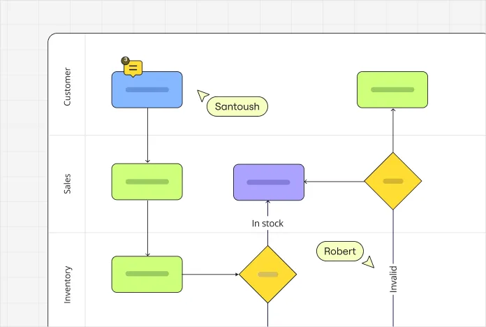
Flowcharts, on the other hand, are visual representations that illustrate the sequence of steps or decision points in a process. They are more general and can be used to represent the flow of any type of activity or process, not just data flow.
Widely used in fields such as project management, education, and programming, flowcharts provide a comprehensive overview of a process, allowing stakeholders to identify bottlenecks, communication gaps, and potential improvements. With the help of flowchart templates, teams can easily design and customize flowcharts to fit specific needs and improve overall clarity and efficiency.
Key differences
While data flow diagrams and flowcharts serve the purpose of visualizing processes, they differ in their scope, level of detail, and focus. One notable distinction lies in their respective levels of abstraction.
Data flow diagrams operate at a higher level of abstraction, emphasizing the movement and transformation of data. In contrast, flowcharts offer a more detailed view, encompassing the entire process flow, including decision points, actions, and dependencies.
Another significant difference is the specific focus of each tool. Data flow diagrams primarily concentrate on the movement and transformation of data within a system, aiming to illustrate how data flows between processes, entities, and data stores. In contrast, flowcharts provide a broader perspective, showcasing the overall process flow, including actions, inputs, outputs, and decision points.
Choosing between data flow diagrams and flowcharts
The choice between using a data flow diagram or a flowchart depends on the specific nature of the system or process you are trying to represent, as well as the goals of your analysis or documentation.
Data flow diagrams offer several advantages in system analysis and design. They provide a clear understanding of data dependencies, enabling analysts to identify areas for optimization and improvement. By visualizing the data flow, stakeholders can comprehend the impact of changes, ensuring the integrity and efficiency of the system.
Flowcharts, on the other hand, are great for visualizing complex processes. They offer a holistic view, allowing stakeholders to identify inefficiencies, potential bottlenecks, and areas for improvement. Flowcharts facilitate effective communication and collaboration among team members, providing a shared understanding of the process.
However, it is important to acknowledge the limitations of both tools. Data flow diagrams might oversimplify complex systems, potentially omitting critical details. Flowcharts, while comprehensive, can become overly intricate for complex processes, leading to confusion. It is essential to select the appropriate visualization technique based on the specific requirements and complexity of the process at hand.
Selecting the right visualization tool
To choose between data flow diagrams and flowcharts, consider the specific context and purpose.
If the primary objective is to analyze and optimize data movement within a system, a data flow diagram is the ideal choice. Miro’s data flow diagram tool is easy-to-use and can help you get started.
For processes requiring a comprehensive view, encompassing actions, decisions, and inputs, a flowchart provides the necessary depth. Miro’s flowchart maker is the perfect tool to help you do just that.
Conclusion
Data flow diagrams and flowcharts are powerful tools that serve distinct purposes in process analysis. While data flow diagrams focus on data movement and provide a high-level perspective, flowcharts offer a comprehensive view of the overall process.
By understanding the key differences and selecting the appropriate tool based on specific requirements, anyone can make a diagram to effectively analyze, communicate, and improve processes.
Author: Miro Team
Last update: October 7, 2025