The value stream mapping tool for efficient teams
Create a value stream map that changes the way you work
Why Miro is the go-to tool for value stream mapping
Foster collaboration
Brainstorm ideas and promote knowledge-sharing when creating a value stream map. Identify the gaps in communication between teams and streamline processes quicker.
Infinite possibilities
No matter how complex your value stream map gets, there’s always room for more. Plus, Miro’s value stream mapping software lets you dive deep into specific stages or zoom out for a complete overview of the product's journey.
Ready-made templates
Miro celebrates the uniqueness of every team with a diverse collection of value stream mapping templates. Pave the way for a quick start tailoring them to your specific product journey, reducing prep-time and offering the benefit of a standardized yet flexible approach to value stream map creation.
Share it
Present your value stream map directly within the Miro board or export it as an image or PDF. Ensure your map reaches stakeholders effectively, facilitating clear communication and alignment. Plus, add a customizable view and edit permissions to maintain the integrity and security of your product strategy.
Accelerate insights with Miro AI
Spotting inefficiencies manually takes time. Miro AI streamlines the process by clustering related activities and summarizing feedback. Turn messy data into clear, actionable insights so teams can focus on improvement, not admin.
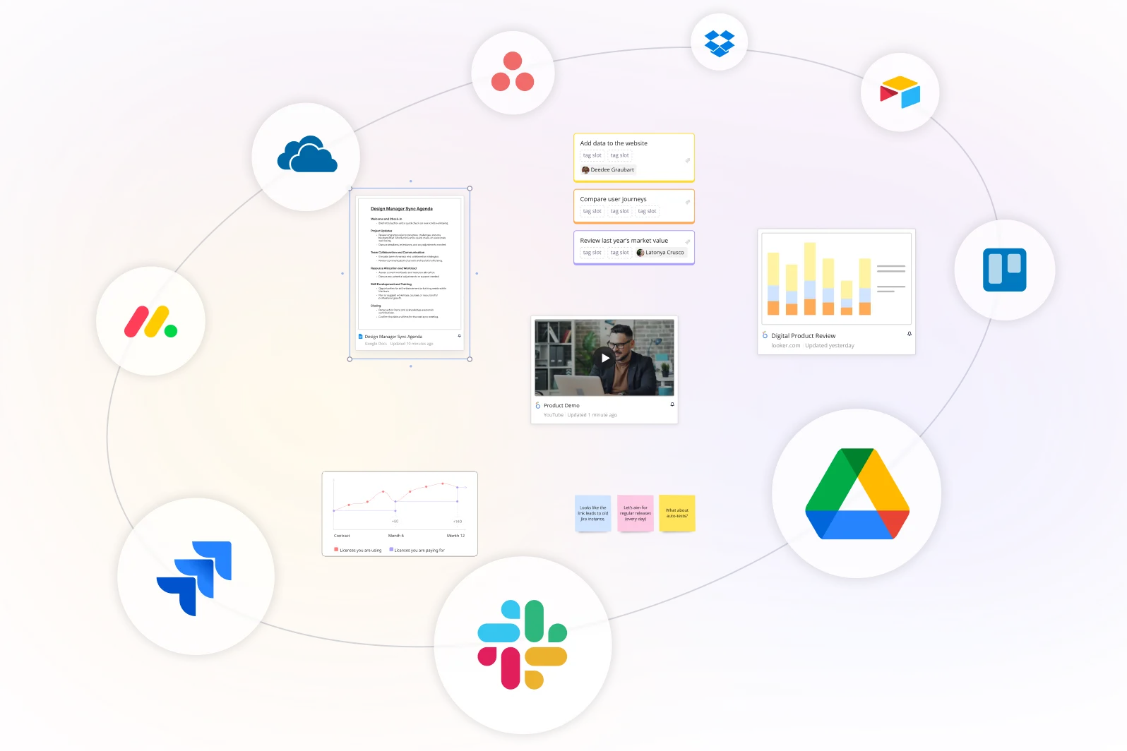
Integrate into your tool stack
Process maps deliver the most value when tied to real work. Miro integrates with tools like Jira, Asana, and Smartsheet, linking mapped insights directly to action items. Keep your value stream mapping tool connected from visualization through to delivery—and your team on the same page every step of the way.
Integrated with your favorite tools
Related templates
What is Value Stream Mapping?
How to use Miro’s value stream map creator
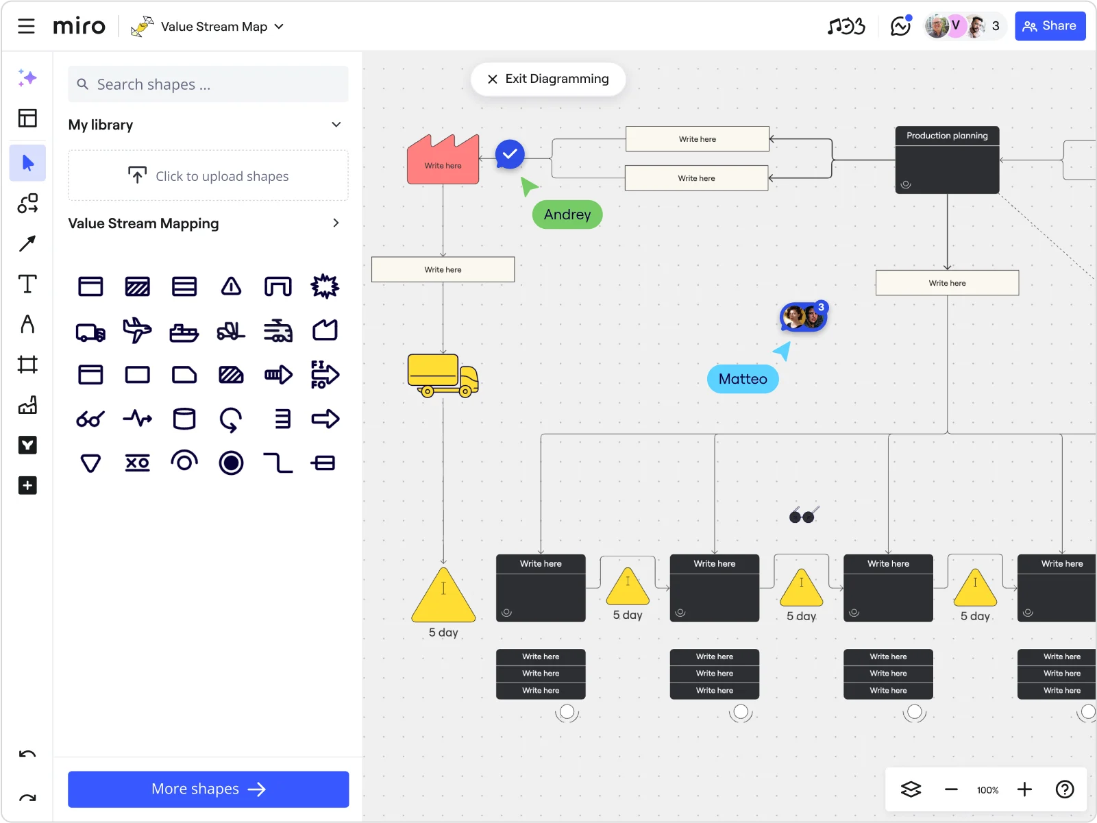
Start quickly with one of Miro’s value stream mapping templates, or build your own from scratch using the diagramming tools. Customize your swimlanes, shapes, and text boxes to match your process before you begin mapping. Or build a value stream map from scratch using the many editing tools.
Discover Miro's capabilities

The world's most innovative companies are collaborating in Miro, everyday
“With Miro, we went from project brief to in-market launch in 10 months. That usually takes 3 years at PepsiCo.”
Caroline de Diego
Senior Manager, Global Design & Marketing Innovation at PepsiCo

“Bringing everyone together to plan in Miro means the most impactful initiatives will happen at the right time.”
Lucy Starling
Product Operations Lead at Asos

“The team onboarded in 10 minutes to use Miro for workshops. Getting our organization to adopt this product was a no-brainer.”
Konrad Grzegory
Agile Transformation Lead at CD PROJEKT RED

“Miro templates helped us go from scratch to a full-fledged plan where we mapped activities, ideas, and dependencies.”
Marc Zukerman
Senior Director of Project Management at Hearst

“Miro allows all our teams to align themselves with certain tools and models: they work independently and create products that really meet our customers' needs.”
Luke Pittar
Sustainability Innovation & Design Coach at The Warehouse Group

“To be truly innovative, everyone needs to have a voice, and everyone needs to be able to iterate on each other’s ideas. Miro has made that possible for us.”
Brian Chiccotelli
Learning Experience Designer at HP

Users love Miro for end-to-end innovation. We're the G2 leader in visual collaboration platforms and are rated in the top 50 enterprise tools. Miro helps large companies get meaningful work done.
Top 50 Products for Enterprise
G2 reviews

Value stream mapping tool FAQs
Can non-Miro users view or comment on my value stream map?
Yes, you can share your work with non-Miro users who can view and, depending on the permissions you set, comment on your map.
Can I present my value stream map directly from Miro?
Absolutely. Miro has a presentation mode that allows you to showcase your value stream map directly from the platform.
Can I customize the Value Stream Mapping templates?
Yes, all templates in Miro are fully customizable to fit your unique needs and workflows.
Are there templates or examples from other teams I can use?
Yes. In Miroverse, you’ll find templates built by industry professionals to help teams get started quickly. From lean process mapping to product development flows, you can customize community templates to match your team’s structure and goals.
What’s the learning curve for teams new to Miro AI capabilities?
The learning curve is minimal. Miro AI is built into the canvas, so it feels intuitive from the start.
Teams can use AI-powered clustering to organize process data, AI shortcuts to automate repetitive steps, and AI text editing to refine notes. They should see real value within their first session.
Can Miro handle complex or enterprise-level workflows?
Absolutely. Miro’s infinite canvas lets you map extensive, multi-department processes without limits. You can zoom out for a global view or focus on specific steps in detail. Combined with integrations like Jira, Asana, and Smartsheet, Miro scales easily with your organization’s needs.
How much does it cost to use Miro AI features?
Miro AI is available on all plans through a credit system, from Free to Enterprise. Each AI action uses one credit. The number of credits varies by plan and can be shared across all Miro AI features.
How do I know my team’s ideas and data are secure in Miro?
Miro is built with enterprise-grade security to protect your data. We provide advanced controls for user and access management, ensuring you can manage who sees what. You can innovate confidently knowing your team’s sensitive work and strategic plans are secure.
What are the main purposes of value stream mapping?
VSM serves three primary purposes. First, it makes the entire value delivery process visible in one place, including steps that individual team members may never see. It creates a shared understanding of how work actually flows. Second, it quantifies waste: by capturing cycle times, wait times, and inventory levels at each step, VSM transforms vague feelings of inefficiency into measurable data that can be prioritised and acted on. Third, it provides a structured improvement framework: the gap between the current-state and future-state map defines a clear action plan for process improvement, rather than leaving teams to guess where to start.
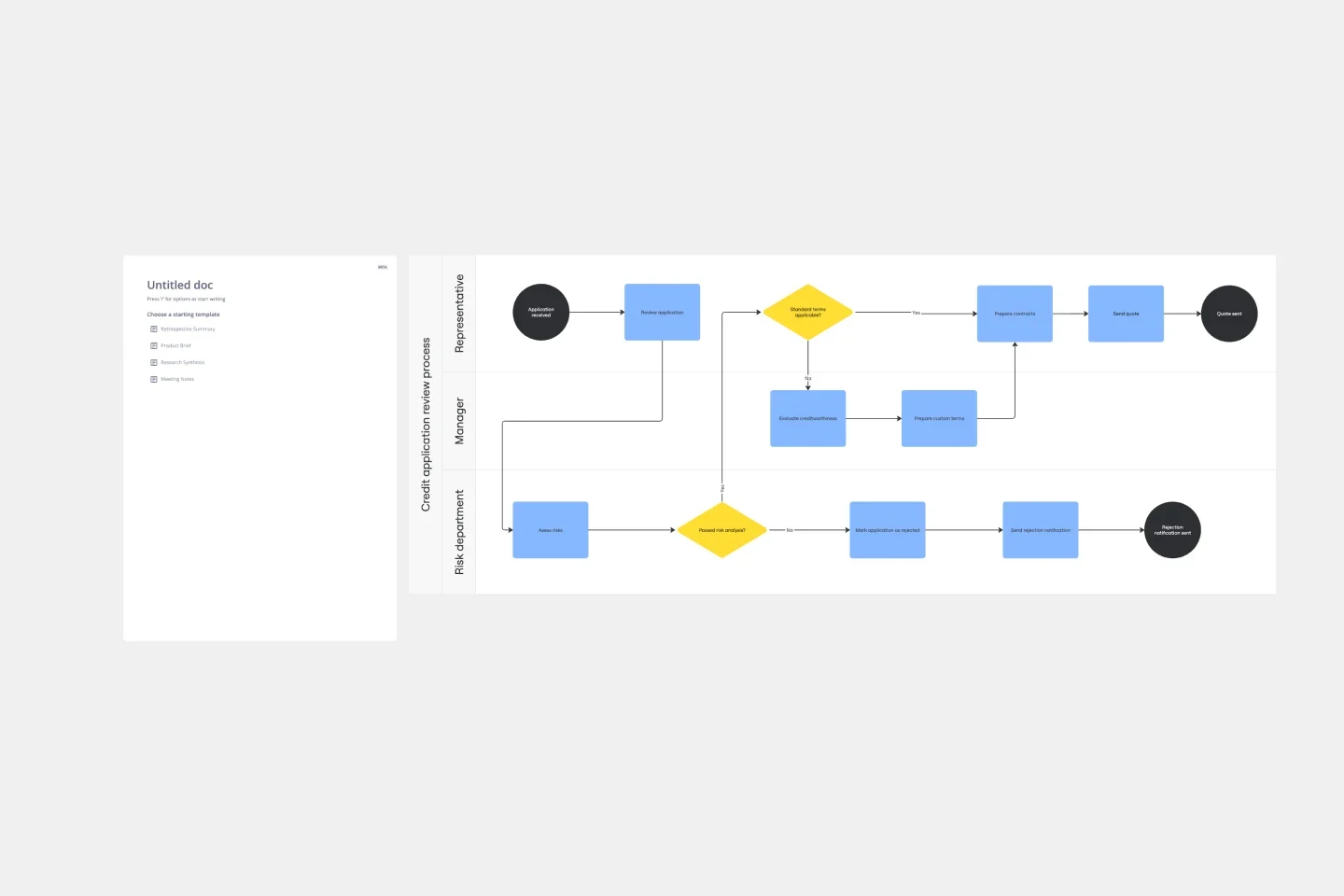
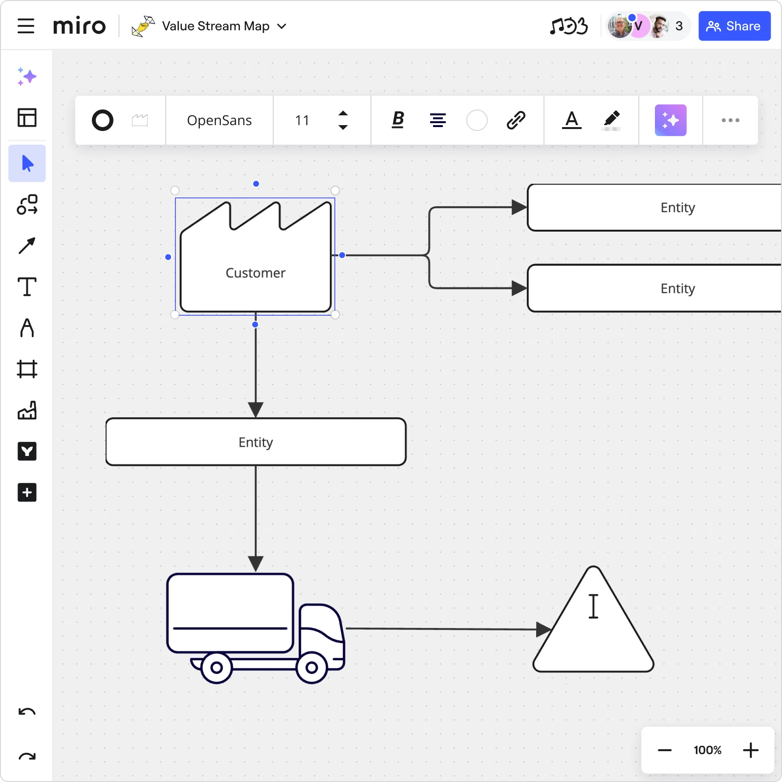
What is the difference between a value stream map and a process flow diagram?
A process flow diagram shows the sequence of steps in a specific process. It maps what happens in what order. A value stream map goes further, and shows not just the process steps but the flow of materials and information between them, along with key data such as cycle times, wait times, and inventory levels. This data layer is what makes VSM a lean improvement tool rather than just a documentation tool. It quantifies where waste is occurring so teams can prioritize what to fix.
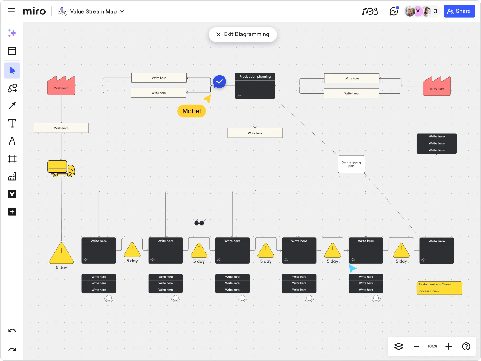
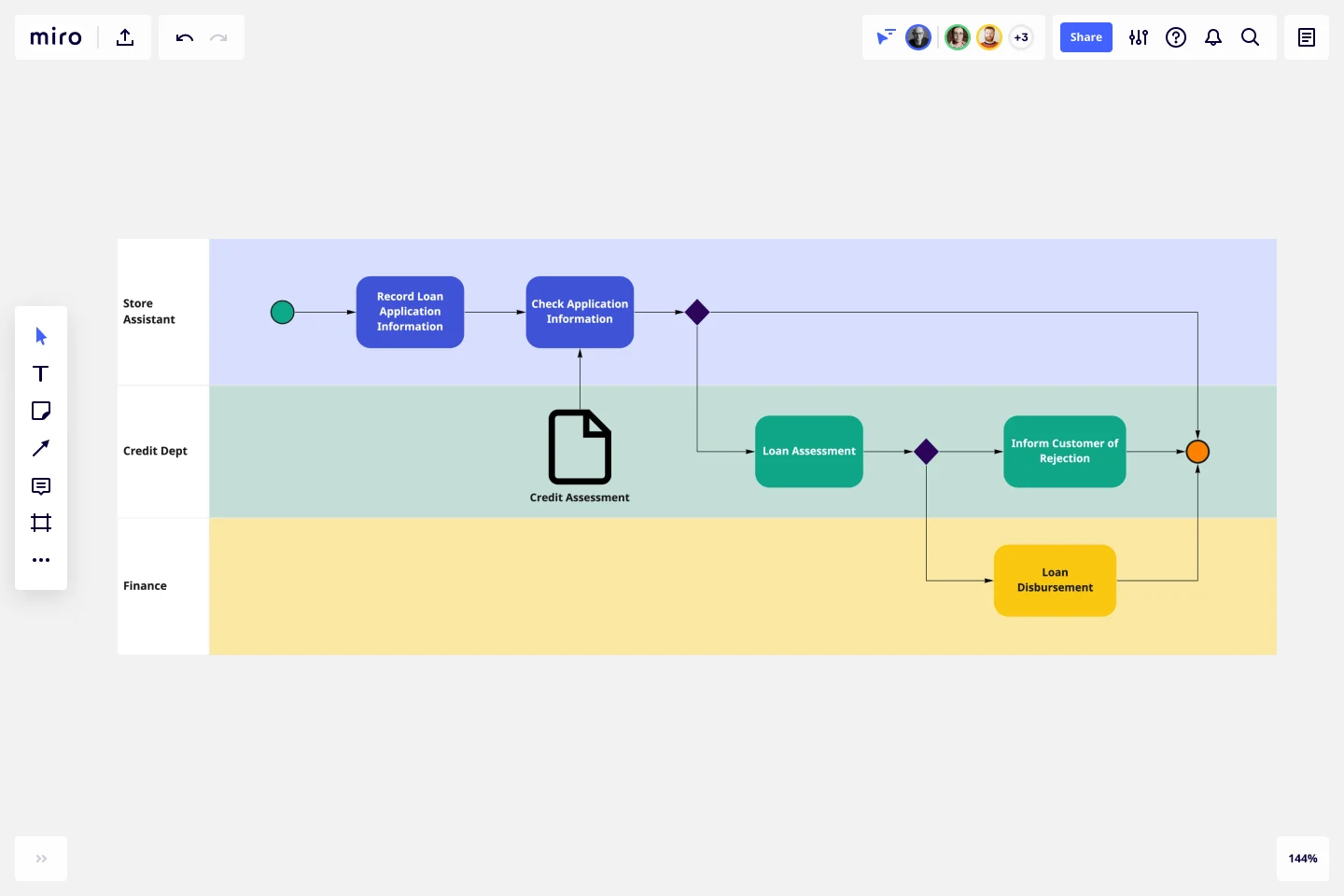
What are the standard symbols used in a value stream map?
Value stream maps use a standardized set of symbols to represent different elements of a process. Process boxes (rectangles) represent steps where value is added. Inventory triangles show where materials or work items are waiting between steps. Arrows indicate the flow of materials (push arrows or pull arrows) and information (straight or zigzag lines for electronic and manual information flows respectively). Data boxes sit below process steps and capture key metrics such as cycle time, changeover time, and uptime. Kaizen bursts (jagged circles) highlight areas identified for improvement. Using standardized symbols ensures that anyone familiar with VSM can read and interpret a map created by another team.