
A Venn diagram is a graphical representation of the logical relationship between datasets, made with two or more overlapping circles. Each circle is assigned a key concept. In the areas where circles overlap, you can make a note of any similarities between concepts. In the areas where they don’t overlap, you can outline their differences.
Even though this description sounds technical, it’s one of the most straightforward ways to present concepts. It’s simple to create, easy to use, and has been adopted in an array of fields such as engineering to education.
The diagram gets its name from the British logician John Venn, who introduced it in scientific papers in the late 1800s. Even before it was formally named, the concept dates back to the 1200s, when medieval philosophers and scientists used it.
It’s certainly a diagram that’s proved useful in the test of time. Now, let’s find out more about how to use it and how to create your own successful Venn diagram.
Keep reading to learn more about the Venn diagram and how to make one with Miro.
Why is the Venn diagram still relevant?
The Venn diagram is still one of the most widely used diagrams to show logical relations between concepts. No matter the subject matter, these diagrams are excellent tools for breaking down complex ideas while brainstorming or problem-solving.
Thanks to their visual simplicity, these diagrams are often used in elementary schools to teach simple set relationships. It also serves as a helpful visual aid in brainstorming sessions, meetings, and presentations in the workplace. Many businesses also use them when comparing two or more potential choices to determine their commonalities and critical differences. In other words, it’s a great way for businesses to look at their options and make fast, informed decisions.
Key takeaways so far:
• Venn diagrams use circles to represent concepts/ideas, and they can or cannot overlap.
• The overlapping circles show the commonalities, and the standalone circles represent the differences.
• These diagrams are one of the most popular ways to illustrate business presentations, and teachers often use them for educational purposes in schools and academia.

How do you make a Venn diagram?
Getting started with Venn diagrams isn’t complicated. But you can simplify the process further by using an existing template.
Follow these steps to create the diagram:
1. Draw your circles. Start by drawing a circle containing one concept and then draw an overlapping circle containing another idea. Let’s say you’re using the diagram to identify the similarities and differences between your target markets. In one circle, you put your male audience. In the second circle, you put your female audience.
2. Find the similarities. In the space where the circles overlap, you can make a note of the similarities between the two audiences. For example, they may both have a similar budget when buying from you.
3. Outline the differences. In the area outside of the overlap, you can make a note of their differences. For instance, they buy different products from your range.


Venn diagram terminology
Although Venn diagrams are simple in their design, there’s still a lot of jargon to wrap your head around. Here are some of the common terms used when describing the different elements:
- Set. This is another word for the concepts you want to compare in your diagram. Because these diagrams are so varied, a set could mean anything. It could be an item, an object, a theory, an action… the list goes on.
- Set notations. Set notations are the mathematical symbols used to outline the elements of a set (more on this later).
- Set theory. The branch of mathematical knowledge that deals with sets.
- Union. Everything that’s in the set.
- Absolute complement. Everything that’s not in the set.
- Intersection. The item of overlap between the circles. It’s also known as a subset.
- Symmetric difference of two sets. Everything outside of the overlap (intersection).
- Relative complement. In one of the sets, but not all of them.
- Scaled Venn diagram. A diagram that sizes the circles based on their proportional representation.
- Reuleaux Triangle. The curved-triangular shape appears in the overlap of a triple Venn diagram design.
Venn diagram symbols
Another important thing to know is the most commonly used symbols and what they represent. Researchers based these diagrams on mathematical set theory, and they put in place language and systems to make them understandable and consistent.
There are three main symbols to be aware of:
∪ – the union of sets
- Use the symbol ∪ to represent the union of two datasets. If you have a diagram with two overlapping circles, ∪ represents everything that falls into one category, the other category, or both categories
∩ – the intersection of sets
- Use the symbol ∩ to represent the area where the datasets intersect or the commonalities between sets
Ac – the complement of sets
- Use the symbol Ac to represent everything not belonging to a particular set (neither the larger circle nor the overlapping section)
When to use a Venn diagram
Venn diagrams are helpful for any number of subjects, from diagramming complex mathematical systems to grouping together basic concepts. They are most commonly used for math and logic problems but are also well suited for linguistics, computer science, and business.
Let’s take a look at some use cases:
- Explaining relationships between datasets. A Venn diagram can be helpful to better understand how two datasets interact. It clearly outlines the similarities and differences between them, giving you a deeper understanding of their relationship to one another.
- Organizing ideas and their relationships to one another. If you have a lot of ideas floating around, it’s sometimes hard to visualize how they all relate to one another. This is where a Venn diagram is helpful. You can pinpoint the relationship between concepts and see exactly how they interact with one another.
- Illustrating complex systems and hierarchies. Venn diagrams are simple. They allow you to present complex systems and concepts in a simple format. This is helpful if you need to share ideas with your team or external stakeholders. You don’t have to worry about explaining everything in detail because the diagram outlines the top-level information.
Differences between a Venn diagram and a Euler diagram
We know people use the Venn diagram most commonly to understand the logical relationship between sets of ideas. Another equally important diagram is the Euler diagram.
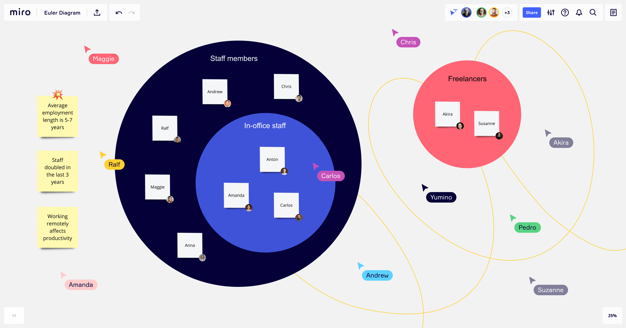
The Euler diagram shows the relationship between datasets in a similar visual manner, but it only shows the relevant connections between sets — not all possible relations. As you can see from the image, the Eulerian circles don’t overlap in the same way.
They’re best suited for representing overlapping categories or highly complex hierarchies, focusing only on the relevant relationships.
If you want to focus solely on the relevant relationships between your ideas, use the Euler diagram. But if you need a diagram layout that’ll allow you to explore the differences as well as the similarities, stick with a Venn diagram.
Venn diagram examples
What is a Venn diagram for kids?
As we mentioned before, teachers and educators use these diagrams quite regularly. Because of their visual nature, they are a popular teaching method for elementary school-aged children. You can visually show your students the relationships between different categories of things and how they can classify them correctly.
Since the diagrams consist of basic shapes, creating a blank one and filling it out is easy. As a teacher, you can involve your students in crafting a Venn diagram to learn how to make and use one practically.
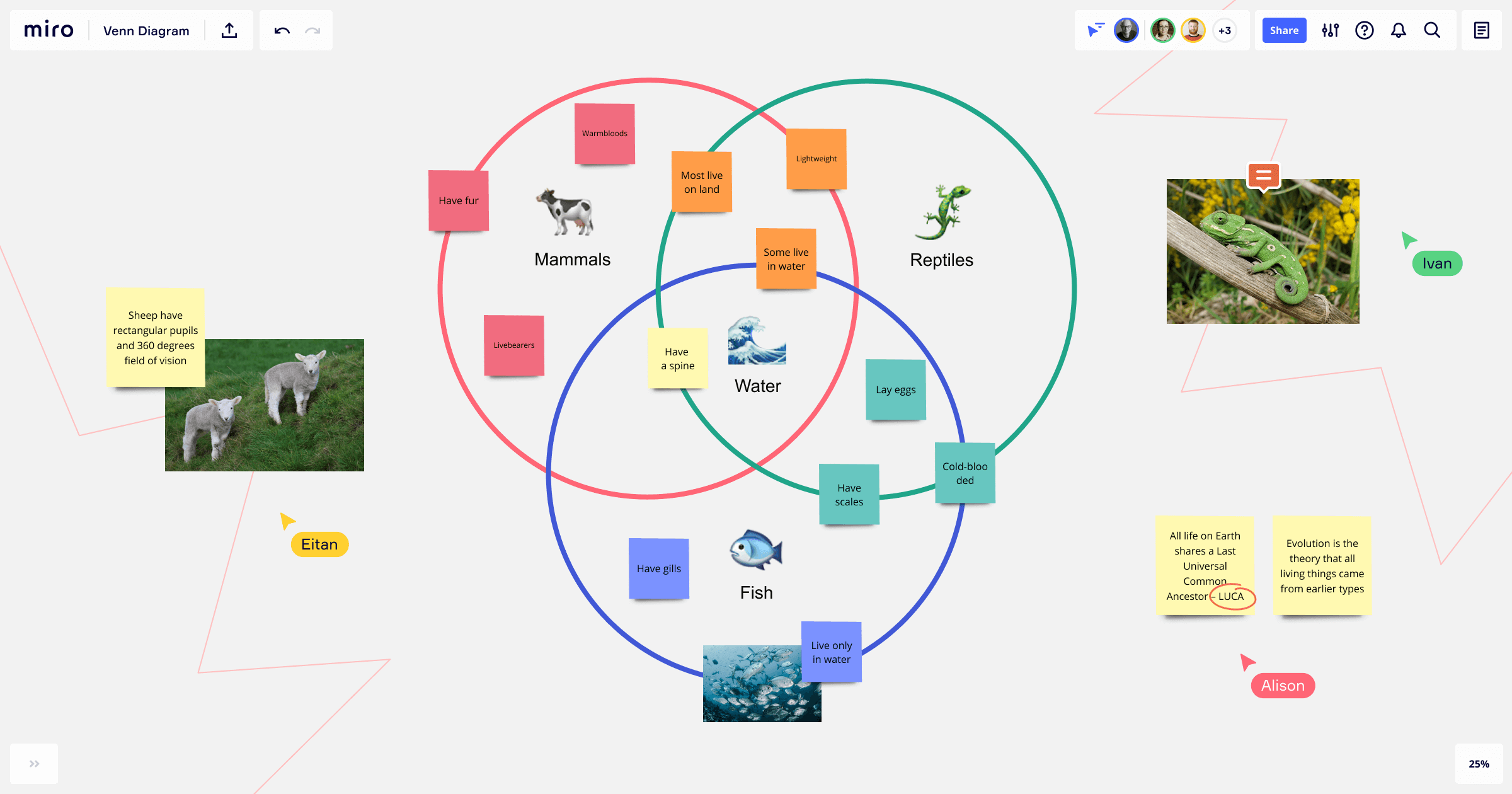
What is a triple Venn diagram?
One of the most common variants is the triple Venn diagram, which shows how three sets of elements are related between each other and overlapping. This is helpful if you have multiple concepts you want to compare in one diagram. It gives you a broader oversight of three different concepts and how they relate to each other.
Fun fact: the triple Venn diagram is trendy amongst engineers, mathematicians, and designers. It has the so-called “Reuleux triangle” right at the center of the diagram, a beautifully curved triangle with constant width.
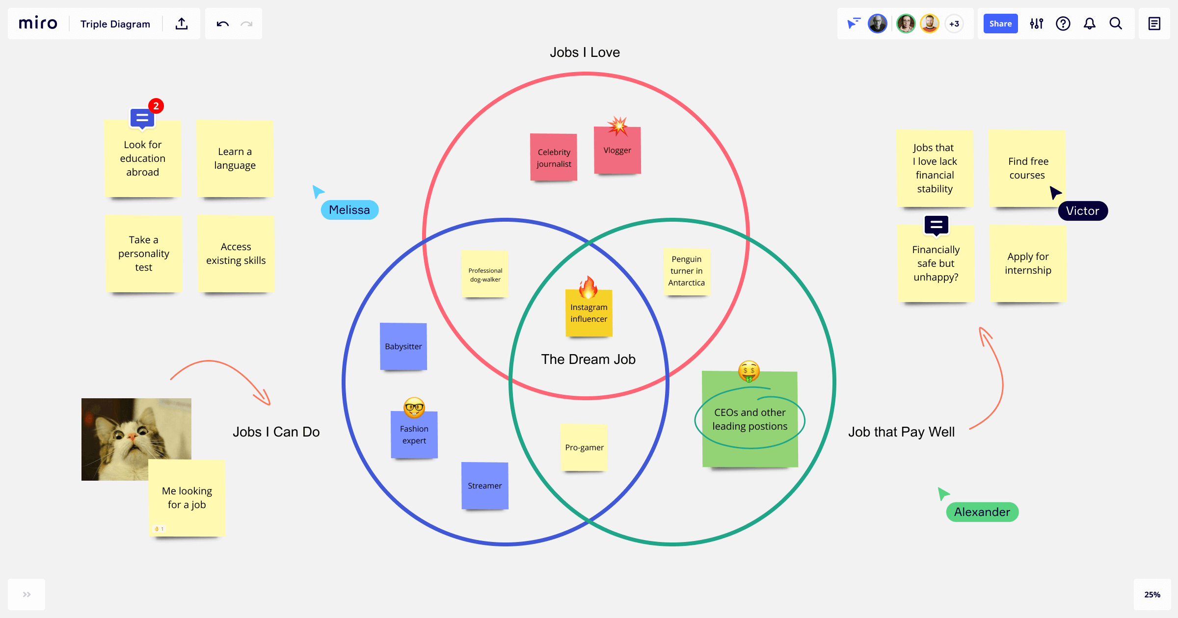
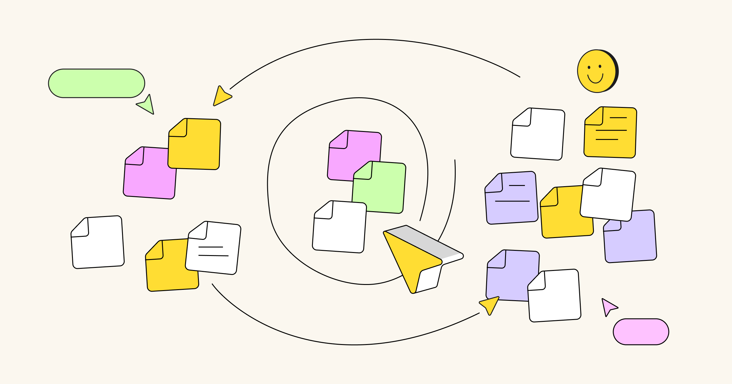
Make a Venn diagram with Miro
If you want a diagram that enables collaboration with your internal team and stakeholders, take a look at Miro’s Venn diagram template. Our online whiteboard tool is the perfect canvas to create a shareable diagram. You can collaborate with your team, easily make changes, and share the diagram with anyone that needs to see it.
In our Venn diagram template, you have three diagram circles that intersect right in the middle of the diagram, forming that perfectly curved triangle. Since all of our templates are easily customizable, you can edit the template according to the needs of your project.
Step 1: Choose Miro’s template or draw circles with the shapes tool.
Step 2: Brainstorm and ask yourself: what concepts do you want to compare? Why? Write the concepts each circle represents and determine where they intersect and where they differ. Look for the contrast.
Step 3: Intersect the circles according to the commonalities and highlight the intersection in one color and the differences in another.
PRO TIPS FOR MAKING YOUR DIAGRAM:
• You can use the diagram for comparison, contrast, and classification. One doesn’t exclude the other.
• You can play around with the shapes and sizes in your diagram, and it doesn’t necessarily have to be perfect circles.
• You can use these diagrams to solve any sort of problem or compare all kinds of information. Get creative!