Storyboard vs mood board

Summary
In this guide, you will learn:
- The distinct roles of storyboards and mood boards
- How storyboards visualize user journeys and narrative sequences
- The purpose of mood boards in capturing emotional tone and aesthetic style
- When to use storyboards versus mood boards
- How storyboards and mood boards can complement each other
- Practical insights into creating and applying these boards
Collaborative AI Workflows
Join thousands of teams using Miro to build the right thing, faster.
Storyboards vs. mood boards: A quick intro
We know that great product design doesn't just materialize out of thin air. It's a meticulous process that often starts with abstract ideas and goes through several stages of development. Among the many tools at a designer's disposal, storyboards and mood boards serve as vital visual aids. They're like the roadmap and compass for your design journey, respectively. But when do you use which? Let's dig deeper.
Storyboards in product design and development
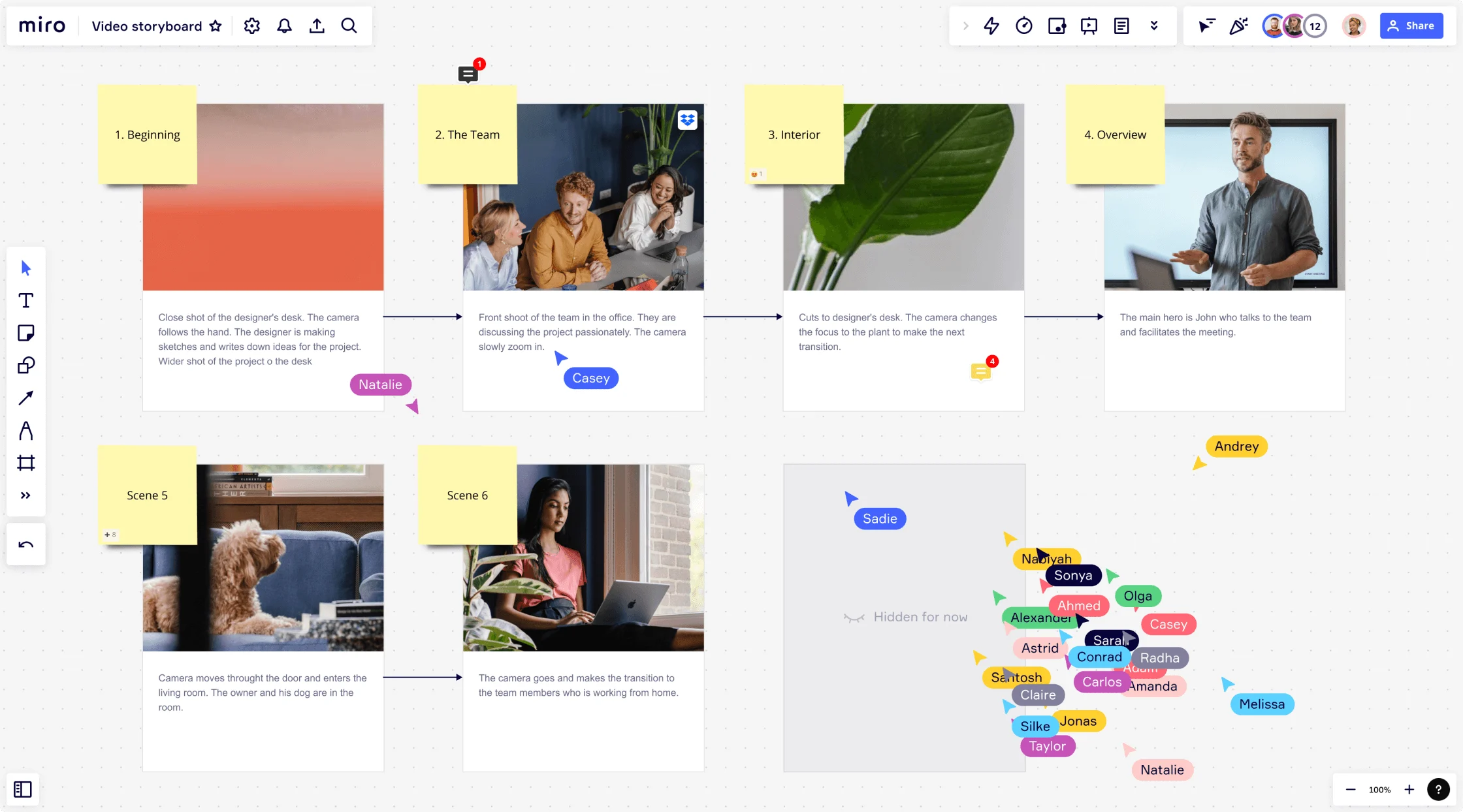
In essence, a storyboard is a sequence of drawings that illustrate the step-by-step journey through a user experience. It's like a comic strip for your design, offering a visually guided tour of how a product behaves in the hands of its users.
Storyboards are an effective way to humanize your design process in Design Thinking and product development. They depict user actions, reactions, and emotions at each touchpoint, providing a user-centered perspective that promotes empathy and understanding. Think of a storyboard as your visual user journey map. It's about the interaction of people with your product in a given context, adding a narrative to your design process.
Mood boards in product design and development
Contrary to storyboards, mood boards are not about sequences or user interactions. They're about capturing the intangible elements of a design—the look, the feel, the emotions. A mood board is a collage of images, text, materials, color palettes, typography, and other design elements that communicate a design's intended mood or vibe.
In product development, mood boards are a tool for establishing and communicating a design aesthetic. They help the design team build a collective understanding of the emotional landscape the product is intended to fit into.
Storyboard vs. Mood board: Key differences
Although storyboards and mood boards communicate design intentions visually, their roles differ significantly in the design process. While storyboards help designers empathize with users by visualizing their journey with the product, mood boards help capture the desired emotional response to the design.
Storyboards are typically used in the earlier stages of design, during ideation and concept development. They are the go-to tool for imagining and exploring the user's journey, helping the team understand the pain points, needs, and wants of their user base.
On the other hand, mood boards are most effective during the aesthetic development phase. They help designers express the emotional essence of the design, bridging the gap between the abstract idea and the tangible product. Mood boards are used to establish the visual language of the product, including color schemes, typography, textures, and more.
Storyboard in action: A practical perspective
In exploring practical design tools, looking at storyboarding through a real-life lens is vital.
Storyboarding a mobile banking app
To illustrate, let's consider the design of a mobile banking app. In such a scenario, your storyboard could start by depicting the initial touchpoint: a user opening the app. From this point, the user journey unfolds through a sequence of hand-drawn frames or digital illustrations, each representing a specific user action and the app's response.
For instance, the first frame might show the user at the login screen. The second frame could represent the user entering their login credentials, while the third might show them successfully accessing their account dashboard.
Considering user scenarios
Different user scenarios can be storyboarded. In one, the user might be transferring funds. The storyboard would depict the steps the user takes to execute this task, illustrating potential challenges and the user's emotional response at each stage. In another, the user might be depositing a check via the app's mobile deposit feature. The storyboard would, again, visually represent this process, providing valuable insights into user experience.
Storyboarding for problem-solving
A critical function of storyboarding is problem-solving. In our banking app, users might find a step in the fund transfer process confusing or a technical error that frequently appears. A storyboard will help the design team visualize and understand these issues, enabling them to find intuitive, user-friendly solutions.
Mood Board in action: A practical perspective
Switching gears, let's dig deeper into the role of mood boards in design. Using our mobile banking app as a continued example, we can explore the creation and application of a mood board.
Establishing the mood
First and foremost, a mood board for this project would set out to establish a certain 'mood.' Given the nature of the app, this would likely be a sense of trust, reliability, and security. These abstract feelings are then translated into visual elements.
Visualizing the mood
For trust and reliability, a designer might choose a color palette dominated by blues and whites, as these colors are often associated with these emotions. For security, the mood board might include images of locks, shields, or other symbols traditionally linked with protection.
Incorporating functional aesthetics
Beyond this, the mood board could include sleek, minimalist layouts to suggest efficiency and user-friendly icons and legible fonts for easy navigation. These visual components work together to create a cohesive mood or vibe for the design, informing every design decision after that.
Conveying the mood to stakeholders
Finally, a mood board is an excellent communication tool for the design team. It provides a visual reference point that can be shared with stakeholders to convey the design's intended aesthetic and emotional impact. This way, everyone involved in the project gets a unified understanding of the design direction.
Distinguishing the two: When to use which
At the end of the day, the choice between storyboard and mood board boils down to the design stage and the specific problem you're trying to address. When conceptualizing how users interact with your product, a Storyboard Template is your best friend. When trying to capture your design's emotion, aesthetic, and feel, the mood board comes into play.
Yet, it's important to remember that these tools aren't mutually exclusive. They often intersect and complement each other in a design process. For instance, while a storyboard can help you design a functional and user-friendly product, a mood board can ensure that the product is aesthetically pleasing and emotionally resonant.
Conclusion
In a nutshell, storyboards and mood boards are two sides of the same coin. Both are essential visual tools in product design, yet they serve distinct purposes. Storyboards map out the user journey, focusing on functionality and usability. Mood boards, in contrast, encapsulate the emotional and visual ambiance of a design. Knowing when to use which tool can streamline your design process, making it not only efficient but also empathetic and aesthetic.
As a final note, remember that the ultimate goal is to create a product that works flawlessly and resonates emotionally with your users. Using storyboards and mood boards wisely will help you do just that. Happy designing!
Author: Miro Team
Last update: October 22, 2025