At Miro, we regularly talk to designers, product developers and other professionals leading the industry to gain insights about the future of experience design, product development and remote work. Today, we talked to Jack Schulze and Timo Arnall, designers from BERG London and Playdeo who have worked with Google, BBC, Nokia, the Guardian and many other companies. They shared with us their unique approach to experience design.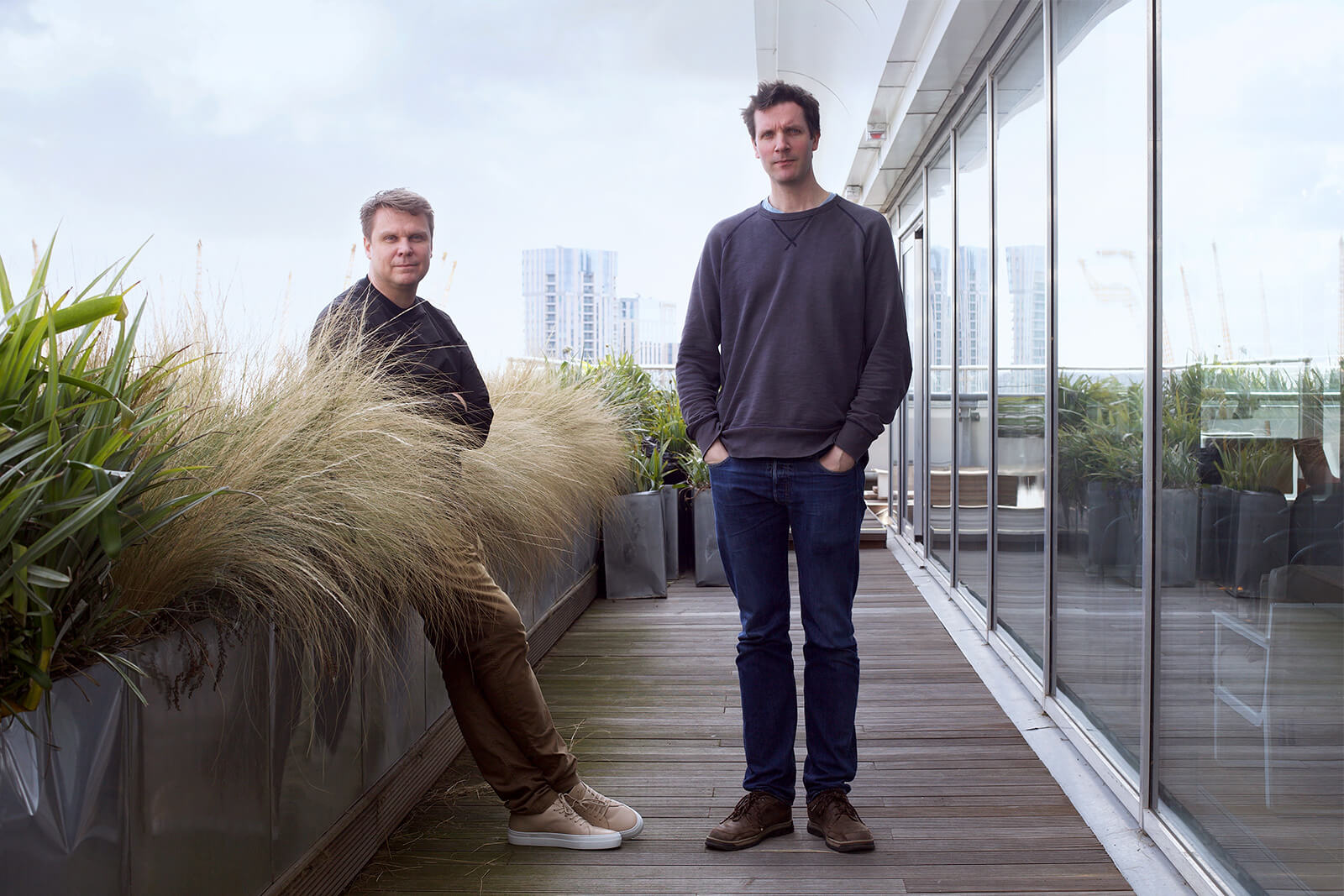
Can you tell us about the way you approach your projects? What steps do you usually take?
Timo: Over the last 10 years, we’ve developed the idea of material exploration. Woodworkers, metalworkers and others have to understand the qualities of the material they work with. For us, material exploration entails getting deep into the technology and understanding its material grain and flaws so we know what we can really design with it.
We put emphasis on trying to understand how technologies work, and then we flip from material exploration into a process of communication. We have to keep two processes running in parallel: understanding the materials then communicating about them. We found that it works incredibly well, whether for Google or other companies we’ve been working with.
Jack: The material exploration includes something quite rare for most UX designers, which is an appetite for true technical curiosity. It’s tempting to design products from the user’s experience. There is an entire genre defined by it: UX design. You take the perspective of the user and the task they want to complete – for example, printing a letter – and then you design an interface associated with that.
The difficulty is that you quickly realize you need a huge amount of abstraction between what’s actually happening inside computers and what’s possible on the surface of those systems through the interface. It’s obvious when you think about it in terms of architecture. No one would design a building without looking at the land and the environment it sits on. It’s unusual that, in software design and in UX design, the user’s intention is prioritized over almost everything.
One of the largest projects we worked on was an e-commerce redesign for a large FMCG company selling some of their key products online. We realized that the e-commerce structure was based on systems that were built decades ago.
There was not really any point in doing user journeys to radically change the future of this e-commerce product. There was a technical legacy, a system that was running and integrated into their operational systems. How do you change that? It’s not a matter of drawing the UI and hoping it will get better, because it was borne out of software at that time. What differentiated BERG in some respects was that we had the appetite for understanding why things work the way they work, based on technical opportunity, legacy and the commercial or political pressures of any given decision.
Profile
Timo Arnall & Jack Schulze
are co-founders of multiple design-led companies (BERG, Ottica, Playdeo). They’ve worked together since 2005. Jack obtained his MA from the Royal College of Art in 2006, where he worked on physical products connected to the web and new behaviours for mobile phones. Jack lead product development work at BERG and many of the partnership projects, including engagements with Intel, Google and the BBC among others. Timo is working with games, design, product invention, filmmaking, photography and strategy, most recently working with Google ATAP. Timo’s design, photography and filmmaking work is about developing and explaining emerging technologies through visual experiments, films, visualisations, speculative products and interfaces.
Based in London, UK
Can you give any examples of this material exploration?
Timo: Probably the best example of material exploration was a project called Immaterials for the Oslo School of Architecture and Design. We worked with a technology called RFID (radio frequency identification). RFID is used widely in credit cards and transport systems. It’s a very low-power radio technology; it only works across a few centimeters.
That project started in 2006, when RFID was seen as the building block of the Internet of Things. You could build interfaces and interactions between low-power chip objects that would know what objects were close to them. We realized that RFID also had a lot of interesting controversy around it. There were people like Katherine Albrecht, a lawyer from the US who wrote a book about how Christians should oppose RFID because it was equivalent to the “mark of the beast.”
We wanted to explore how the technology works. That included unpacking the technology itself, breaking apart all the systems and physical components so we could actually build stuff. Perhaps the most famous thing that we did was a visualization of the radio waves around an RFID card. Imagine that you have this contact credit card and that there’s a field surrounding it.
Jack: We used a technique called light painting and stop-frame animation to visualize the shape of the readable volume in the radio field and help people see the radio around that electronic device. The very nature of most modern digital systems is to be invisible. All the user interfaces and all the behaviors of these objects and systems, whether it’s your phone vibrating or money being transferred, are all happening in invisible space. One of Timo’s challenges has been finding ways of visualizing and making transparent the invisible systems of modern technology so people who don’t have in-depth knowledge of technology can understand how systems behave. That means they are less likely to fall for false or damaging mythologies. Probably, your credit card doesn’t contain the mark of the devil.
I’ve always been interested in technologies that are widespread and a bit boring. A good example of this is the pager motor. It’s the component inside your phone that makes it vibrate. There are about 3 billion smartphones running right now, and if you think about every mobile phone that has been manufactured since about 2000, they all had pager motors in them, which means on Earth there must be 10 billion motors of this kind. They almost never burn out and are incredibly efficient. They’re amazingly well made pieces of technology.
Another technology I liked was thermal printers. If you think about all the chip-and-PIN machines in the world, every single receipt printer, every single cash register, they’ve all got these little thermal printers in them. They (were) mostly made in Germany. They’re incredibly well manufactured, extraordinarily reliable components. Because of that volume, they are relatively cheap, yet all we use them for is receipts. Receipts are things that almost nobody wants. The purpose of Little Printer was to imagine how something like that could be brought into a consumer product, with play, with charm. If you’re interested in understanding the technology underneath the things of our world, then you can piggyback on the successes and strengths of huge industries by making subtle interventions without having to invent something new.
Modest things can be made into quite exciting objects just by looking properly. This project didn’t just emerge because we thought it would be cool to have a printer with a face, it was because of the opportunities afforded to us by the industrial systems already in place. My favorite thing is that there are thousands and thousands of those little boxes which print out their own face, but it’s only plausible and real because we have a technical understanding of the things inside it.
How product teams can benefit from connecting physical and digital worlds
Tell us about your recent project, Playdeo.
Jack: We’re an entertainment and media company. We’re building a product inside a mixed-reality platform that will launch this summer. We’re excited by VR, and we worked for three months on a VR project. We enjoyed that but VR has limitations. Products by Oculus and HTC are very good, but they require expensive desktop-class video cards and a room to do that in. So the market for VR experiences is quite limited.
We’re more interested in phones because there are so many of them and the market is so large. It’s about exposure to culture.
When the first iPhone came out, I was fascinated by pinch zooming and how those pixels stuck to your finger. It’s mesmerizing because there’s no physical analogue. It’s totally native to the quality of that screen on that particular device. Video interaction is really old fashioned, if you want to scrub to a specific moment, it’s usually pretty hard. Everyone struggles using their finger to move 10 seconds back or forth in a two hour movie on the timeline.
We’re seeking a new level of fluency in interactions in video, we want you to feel like you’re putting your finger into the world rather than against the screen.
You have been working on this project for two years. What have you learned about experience design during this time?
Jack: Timo and I have been working together for a long time, and we were commissioned for many projects, most recently for Google, but we always wanted to have something of our own. We have always worked between software, animation and media, and we wanted to combine these three things. Before starting Playdeo, we realized that the technical side of that was theoretically possible. We began exploring whether our idea would actually work and whether it would run on the phone.
I think the key learning for us is that we’re in an entertainment market, and it’s very different from software. In software, you have a clear set of strategic goals. A user wants to know the news, and then the news comes along. Of course, there is a huge amount of work behind that, but you know what you have to make when you start. Making entertainment media is a bit like telling a joke; you really can’t tell whether it’s going be funny until you’ve told it.
You can see a trend emerging in more formal software. Snapchat is very interesting in that regard. UX designers are critical of its interface, because it’s not that clear how to use the various functions or find your way around. For users though, it doesn’t seem to really matter. They aren’t that worried about whether they’re doing it right, it’s more like a game, playful and experimental.
Developing an experience map for AI startups to define their product vision
Timo, what is your key learning?
Timo: We are learning a lot about making games, and it has been a harder and longer process than I thought. We made hundreds of films, hundreds of video prototypes, and I’m very used to moving projects forward through prototypes. The games are much more about systems. You have to build lots of interacting systems, and they can be prototyped in isolation, but you won’t be able to tell if the game will be fun or engaging until you bring all the systems together. It has been a hard process to move from pure interaction design into designing games.
Is there any advice you can give to experience and interaction designers that are working right now or just starting out?
Timo: Always share the work upfront and make sure that the heart of the work goes into the first thing that you show. I see far too much design work where you have to sit through half an hour of research before you actually see the result. It’s very easy for designers to rest in the comfort of research and not to make confident assertions about the things that they’ve made. My advice is to make an assertion about what you are doing up front.
Looking for a tool developing experience maps and doing UX research?
Try Miro free, no strings attached
No credit card required

JACK: My advice to students these days is to learn how to code so you can make the interfaces yourself. Swift is not a difficult programming language, so instead of spending hours and hours researching user journeys or user behaviors, I would put my time into learning how to program an iPhone because that’s what really happens in the end. If you just hand developers Photoshop images of screens, then you’re doing it wrong.
How would you describe Snapchat before you built it? It’s one of those things where you just have to try making things to understand them. I would encourage a culture of prototyping rather than planning and research. Work things out by building them rather than by observing people. Prototype; don’t plan.

