Matt Corrall, Design Director at Pancentric Digital, explains how new approaches can transform a conservative industry.
The insurance firms we work with have often been operating in the same way for years, and they know there’s a huge opportunity for them in innovation. It’s common for us to see different customer service departments working in silos and legacy systems severely hampering what can be offered by way of insurance products. Change is coming, however, driven by challenger startups and rising customer expectations.
We’re asked to help organizations make better digital experiences, experiment with new service models and establish more regular, meaningful contact with customers that they can learn from. The insurance industry is starting to pick up design methods, and companies are seeking to undergo digital transformation projects or learn how to nurture an internal culture that allows for innovation and change. These can be huge undertakings for large organizations, and it’s exciting for us to be able to help them shake things up!
First and foremost, we help clients get to know their own customers better and learn what matters to them. This is fundamental. Before a company can make any meaningful decisions on what future services will be like, they first need to understand what people need and how well they’re being served today. We sometimes find our clients require qualitative research from us in order to really understand the “whys” of customer behavior. In other cases, they already have that knowledge in their firm; it just isn’t being utilized well enough.
Profile
Pancentric
is a digital agency based in Bermondsey, South London. They’ve been designing, building and hosting websites for their clients since 2003. Today, they spend their time helping established organizations learn to innovate, adopt new technologies and create better digital experiences.
Founded: 2003
Founders: Simon Fenn, James Downes, Martin Boswell, Bruce Stewart
Team: 55
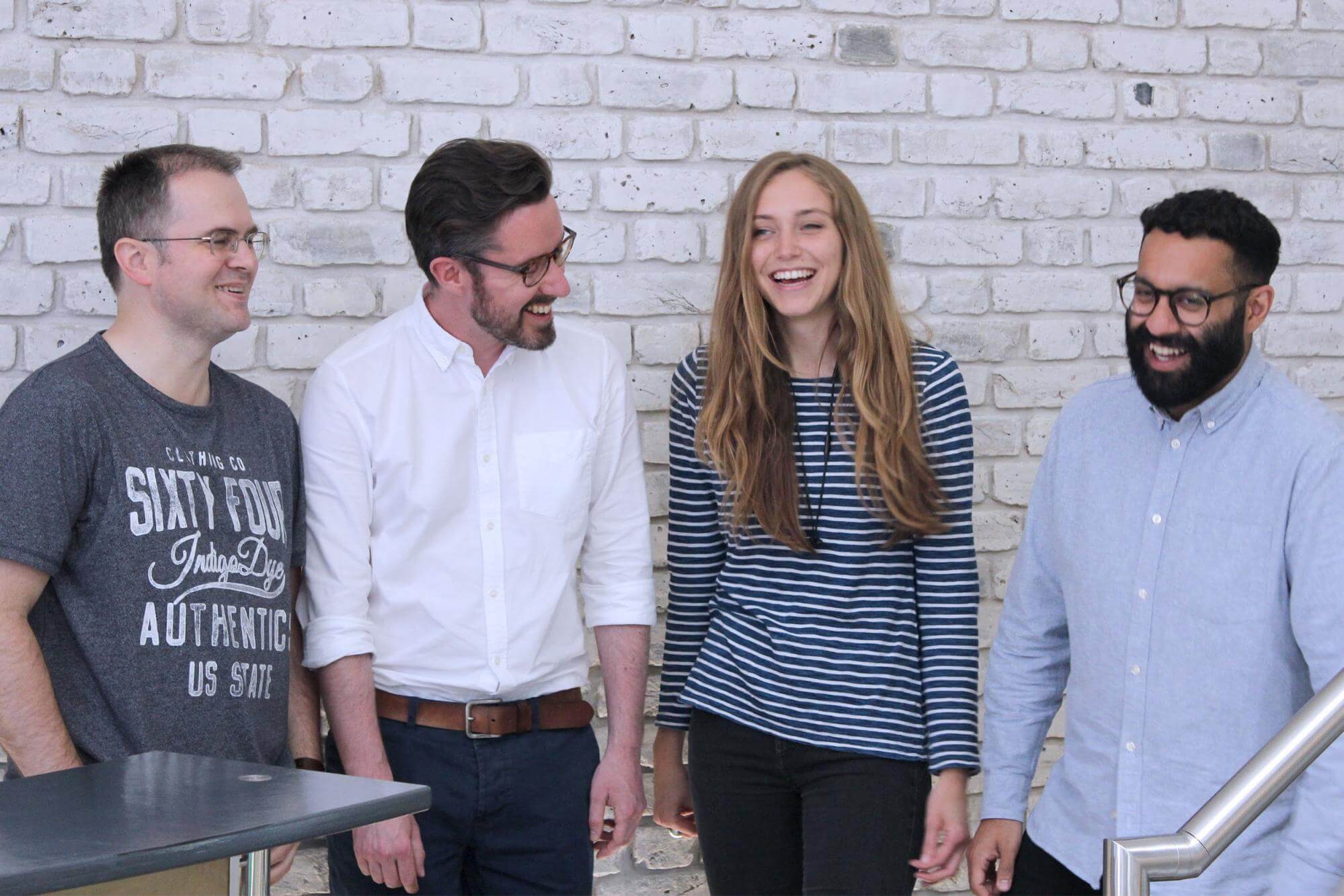
One such case is Jelf, whom we helped kick-off a several-year digital transformation journey by getting to know not just their customers better, but their own staff, too. Jelf has dozens of offices around the UK, all with specialties in insuring different kinds of commercial businesses. For our project team trying to determine a roadmap of new developments, there was no easy overview of how each office operated or what the entire customer experience looked like as people interacted with different departments. We needed to learn what was going on before we could decide what to do next.
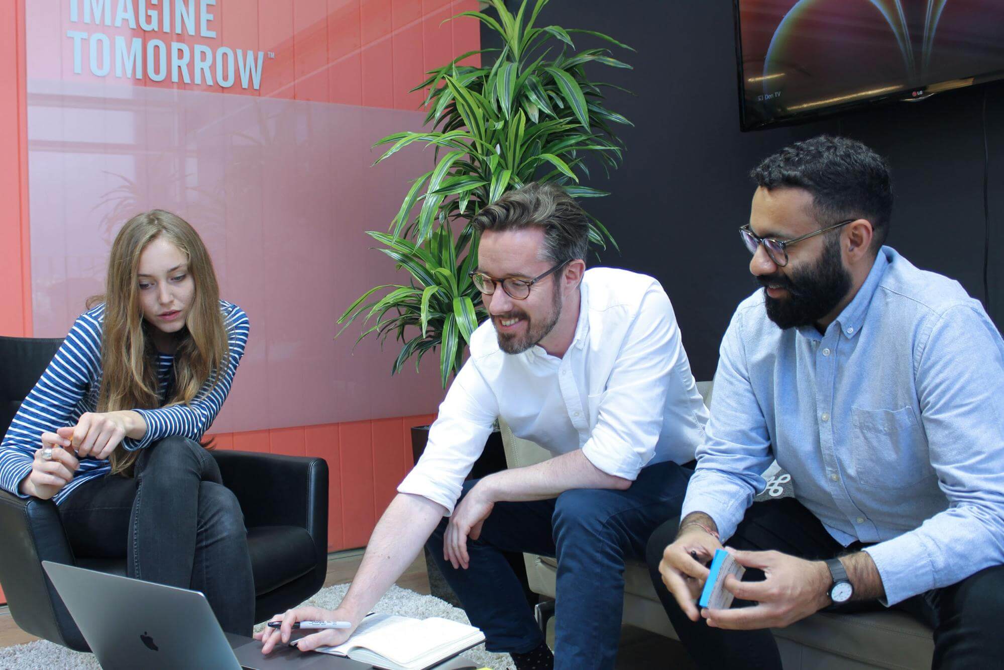
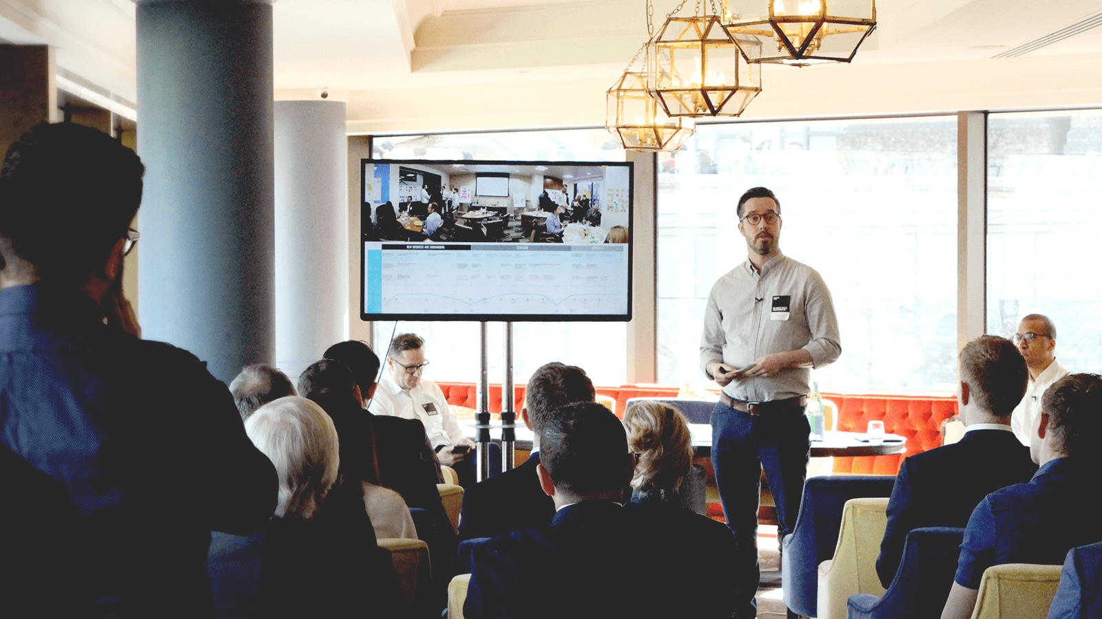
Pancentric hit the road and ran a series of events at Jelf offices all around the country, talking to customers and running workshops with staff, too. Staff members were able to help us map customer journeys, build personas, note pain points and share their own ideas for where innovation should happen. For example, we learned that Jelf is particularly good at building personal relationships and trust with their clients and made it a project goal to ensure the new digital services would enhance that. Done poorly, it’s all too easy for tech to make things less personal, so this was an important insight.
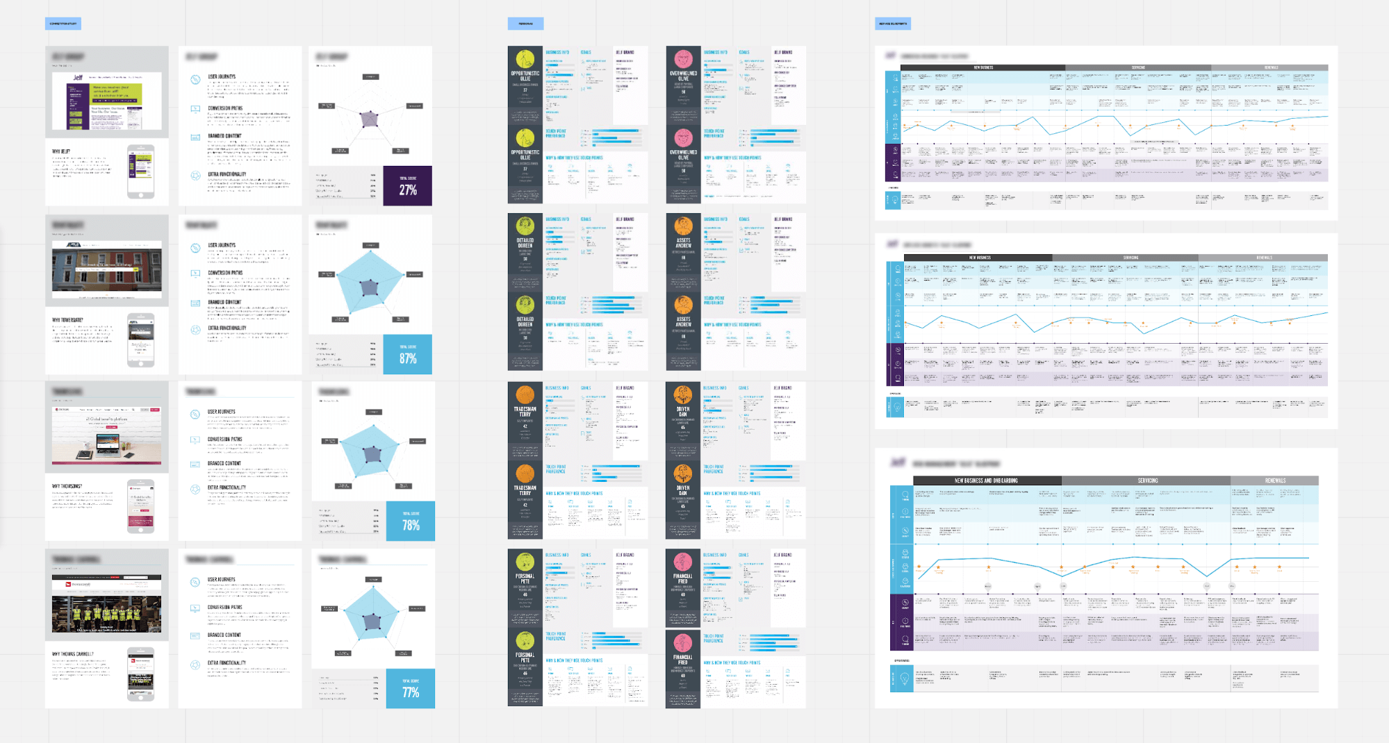
Once we’d gathered all our info, we created service blueprints that gave senior stakeholders the overview they needed. Deciding what to transform into became far easier with something clear to reference. We guided the project team through a structured, creative process, using design-thinking techniques to generate new ideas and decide which to pursue.
How to integrate Miro into your Agile workflow
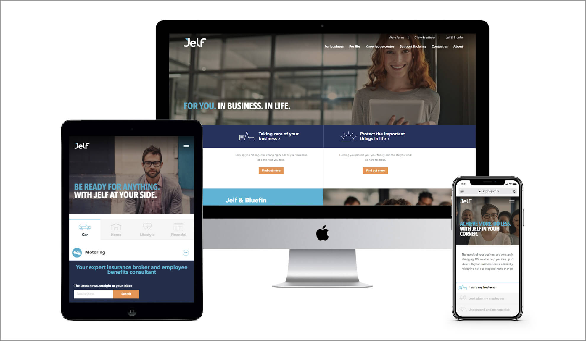
Jelf now has a roadmap of digital projects for the next few years, all targeting particular customer needs or fixing experiential pain points. The first thing on that roadmap was a new corporate site that Pancentric designed, built and launched in January.
Built with Sitecore, the new site gives Jelf modern web standards that they didn’t have before – a responsive site, a robust CMS system, more modern visual design that conveys trust and expertise – and a solid platform from which to launch their roadmap of ideas.
We learned during the discovery process that we needed to better present the full range of Jelf insurance products online and make it easier for potential clients to find the right one for them. During UX design, clearer categorization of products, faster navigation and more familiar terminology were all required, so Pancentric worked closely with Jelf to group products and choose terms new customers would understand.
Stick everything up on the walls – digitally
Since we picked it up a year ago, Miro has become one of Pancentric’s favorite tools. We use it to present design mockups and to collaborate and discuss with clients remotely. It also serves as a notice board, ensuring everyone involved in a project can see the latest designs at all times. Having one go-to place for the latest information in a visual format works wonders for keeping teams organized and informed.
The designers are often the first involved in a project, and we use Miro as a central repository of information we collect. Discovery phase outputs such as personas, mood boards and competitor studies all make their way here, as it helps us see all the pieces of the puzzle laid out in one place. No one should miss something important because it’s buried in a folder structure or email chain.
After the discovery phase, we begin to create. We often run Design Sprints, for which we take over dedicated project rooms. Having everything visible on the workspace walls makes a noticeable difference to our efficiency when working with broad, holistic challenges like service design. We use Miro to do the same thing digitally. The digital copy allows our clients to easily share materials and discuss them with us.
User stories help teams stay focused on people’s real needs, rather than features
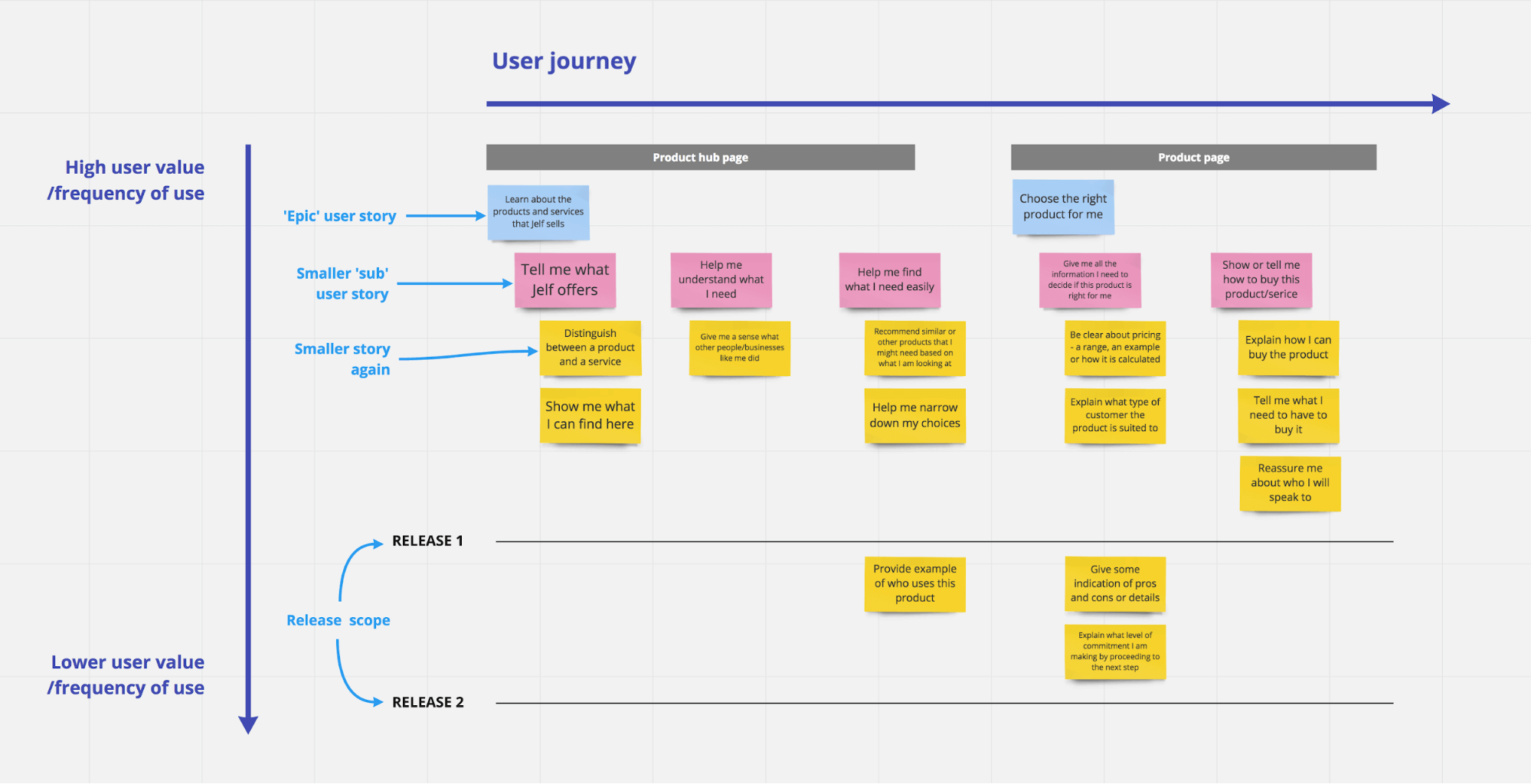
User story mapping is our preferred way to define the scope, details and priorities of a new digital product or service. It’s a favorite mapping technique of mine that I learned working with Agile development teams in a previous role, and it originates with Agile expert Jeff Patton.
User stories are short, easily understood descriptions of things users want or need to do, written on post-it notes or index cards. On a digital project, each user story might eventually equate to a page on your website or feature in your product, but by determining and writing our scope as a collection of user stories rather than features, we keep our focus squarely on real people and are free to make well-informed decisions on solutions later.
A user story map is what we get when we arrange a collection of user stories in a big grid and arrange them in a logical manner. You can read stories from left to right and follow a user’s journey, making it easy to understand what people are thinking and doing at every step. If you’re building a website, the map describes what is going on in the minds of the people who come to your site and what they are trying to achieve by being there. This is the best fuel for design work, and it’s from here that we can envisage high-quality experiences, make good decisions on features and UI components and begin sketching and prototyping what this will look like.
You can’t make good design decisions until you understand your customers
You can’t write user stories or make any design decisions whatsoever unless you first understand the needs of the people you’re designing for. That’s why Pancentric is often out conducting user interviews and ethnographic studies and running workshops in early project stages. If we don’t help our clients build a solid foundation of understanding, then, frankly, we’re all just sitting around in meeting rooms making stuff up.
Our interviews with Jelf customers during the discovery phase gave insights into what they valued and when and how they interacted with the company. For example, we learned that Jelf knew their customers well and had great working relationships built up over many years. However, when customers needed to contact a different specialist – perhaps to inquire about a different product – things could occasionally feel disjointed. People wanted more regular interactions with their new contacts to reassure them that their inquiry was being dealt with. You can’t get these kinds of rich insights if you’re just looking at quantitative data.
At Pancentric, it’s natural for us to draft a user story map once we’re confident we’re getting a clear understanding of customer journeys. When we hear something new – perhaps through usability testing later – we can easily add that information to the map or move things around. User story maps reflect our present understanding of our customers, and so they keep evolving as we learn.

User story maps make sense to both designers and developers
The Pancentric development team uses user stories to guide their work, which we have recorded in Jira as many teams do. Jira and similar backlog management tools are great for tracking progress and staying organized, but in my opinion they lack the clear overview of stories that you need to craft a good user experience.
Miro’s Jira plugin has solved that problem for us, allowing us to arrange user stories on a flexible, visual map and sync them with our backlog. For developers, the map allows them to understand how a single story fits into the bigger picture and provides context on what customers are thinking and doing at the time. That makes a noticeable difference to the quality of the digital products we design and build.
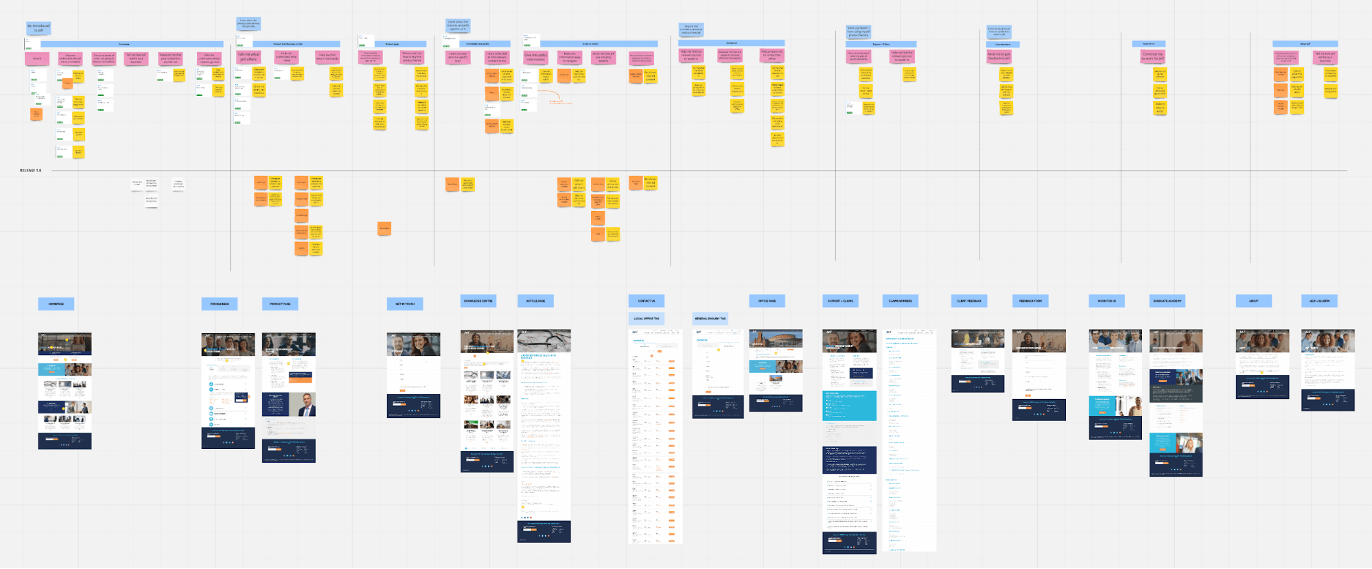
Crucially, the map provides a common format for designers and developers at Pancentric to talk about scope, features and priorities, and helps make it clear to everyone what’s planned for each upcoming release. It tends to result in fewer misunderstandings and ensures that what we learned about customers in the discovery phase isn’t forgotten weeks and months later as we code.
Looking for a convenient user story mapping tool?
Try Miro free, no strings attached
No credit card required
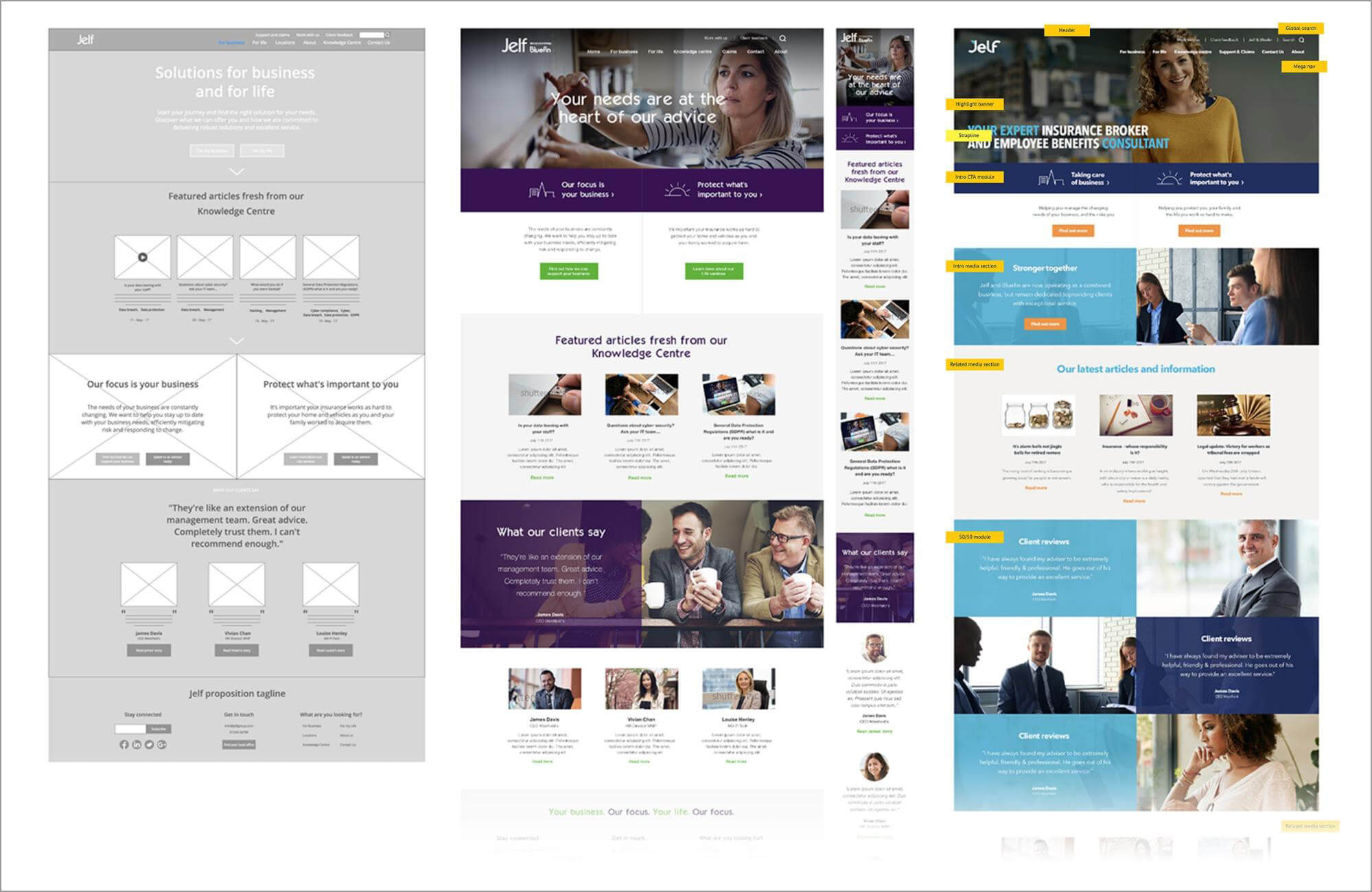
At Pancentric, our designers get the user story map started in Miro, before the rest of the team comes on board and takes joint ownership. The first thing we do is discuss the user story map. Digital tools are wonderful prompts, but the best way to reach a common understanding is usually conversation. They’re called stories for a reason. Alongside this, we communicate the design via an interactive prototype made in Invision for simple sites and Axure for complex ones. User stories describe what people need to do, and the prototype shows how they’ll do it with the new product or service. We also produce component libraries and style guides as appropriate, but these two are our main design deliverables.
UX design should be done in close collaboration with clients
As we’re designing, we prefer to work in close collaboration with clients; daily discussions with product owners and business analysts help us make good decisions on content and features. The more contact we have, the greater our velocity and sense of joint ownership. The interactive prototype is invaluable, but it also helps to see all the screens together to compare them, and so these go on our board alongside the user story map, with components tagged for reference.
Our clients appreciate being able to check Miro several times a day to see the designs evolve and contribute their own suggestions and sketches. We find that people quickly learn the benefit of leaving comments and questions, which we can track and respond to every day. This transparent and iterative way of working suits both parties. Our clients are reassured by being able to see what we’re doing every day, and we get a quick and efficient way to collaborate on designs.
Conclusion
Your team shouldn’t be designing anything until you feel confident that you’ve understood your customers, including qualitative research that checks your assumptions and helps you really empathize. Do this and you’ll find it easy to make good design decisions. Display your discovery materials and let everyone see, then give user story mapping a try with your team. You’ll be surprised how much it helps everyone understand your customers and reveals the gaps in your knowledge. Designers, make the effort to work closely with your clients and help your team keep real customers in mind throughout. I guarantee you’ll be building better experiences in no time.
If you’d like to learn more about user story maps and how to create them for your project, try my recent tutorial video, which explains the structure and shows you how we build them for our digital projects at Pancentric.
More on Jelf’s digital transformation project
About the speaker
Matt Corrall is a Design Director at Pancentric Digital. You can read his blog or follow him on Twitter.

