17 examples of organizational charts to inspire you
Summary
In this guide, you will learn:
- How Miro's org chart tools enable easy creation and customization.
- The types of org charts available in Miro: hierarchical, matrix, and mind map.
- How Miro's native org chart widget allows real-time collaboration and dynamic editing.
- The benefits of using org charts for visualizing structure, clarifying relationships, and aligning teams.
- Access to free, customizable org chart templates.
- Step-by-step instructions for creating, editing, and filtering org charts in Miro.
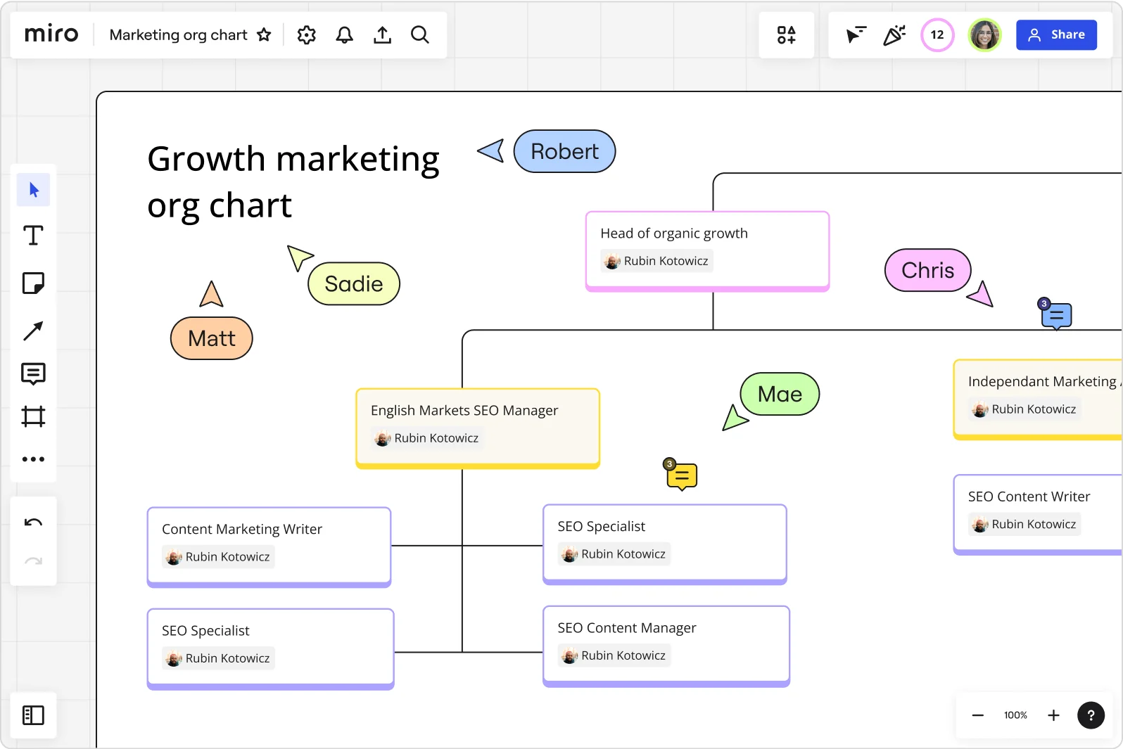
Get inspired with these org chart examples
How you design your organizational structure can play a pivotal role in your company’s success. After all, a well-defined structure makes things clearer and helps keep things running smoothly in any organization.
But if you’re not sure where to start, we’ve got you covered. With gathered 17 examples of organizational charts across industries to inspire you. Plus — we’ve included some free templates along the way so that you can create your own org chart in no time.
Let’s take a look.
Collaborative AI Workflows
Join thousands of teams using Miro to build the right thing, faster.
17 organizational chart examples by industry
As we dive into these organizational chart examples, keep in mind that they aren't one-size-fits-all cases. It’s worth thinking about what’s best for your industry and your company’s unique org chart needs.
Here are 17 examples of org charts by industry:
1. Technology org chart example
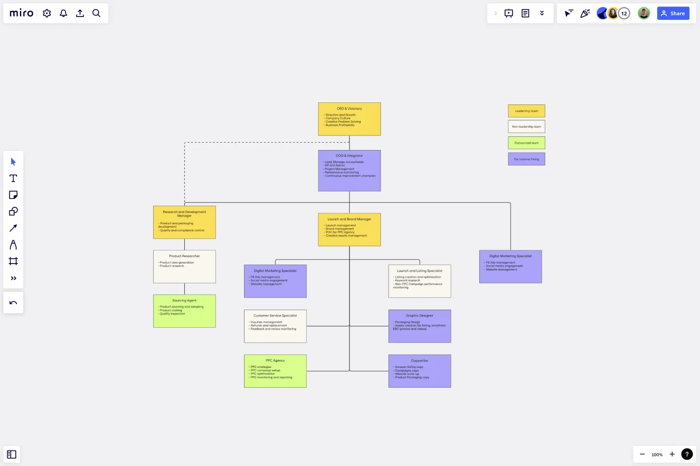
Tech companies, especially those in the SaaS space, usually go for a flat or matrix organizational structure. This approach lets teams from product development, engineering, UX/UI design, marketing, sales, and customer support work together more smoothly.
It’s all about being quick and flexible—essential in tech, where things change fast. This kind of structure cuts down on the red tape, making it easier for these companies to innovate and respond to new challenges as they come.
Template: Create a matrix org chart in seconds using Miro’s free matrix org chart template.
2. Manufacturing org chart example
In manufacturing companies, you'll typically find a clear-cut hierarchical structure. This means everyone knows who's in charge and what their role is — from the production line all the way up to management.
Key departments like production, quality control, supply chain management, research and development, and human resources are all clearly defined. This type of org chart is super practical, helping tackle everyday manufacturing challenges while keeping everything from assembly lines to shipping running smoothly.
3. Healthcare org chart example
In healthcare, facilities like hospitals often organize themselves into divisional structures based on medical specialties — think cardiology, orthopedics, or pediatrics. Org charts like this help foster collaboration and improve patient care by making sure experts in each field can focus on their areas of expertise.
4. Retail org chart example
Big retail companies often go with a divisional structure, breaking things down by regions, store types, or product categories. This type of org structure lets each area focus on what works best for its market — like tailoring marketing strategies or stocking shelves to fit local tastes.
It helps keep things running smoothly and makes sure all the stores are hitting their marks, whether they’re down the street or across the country.
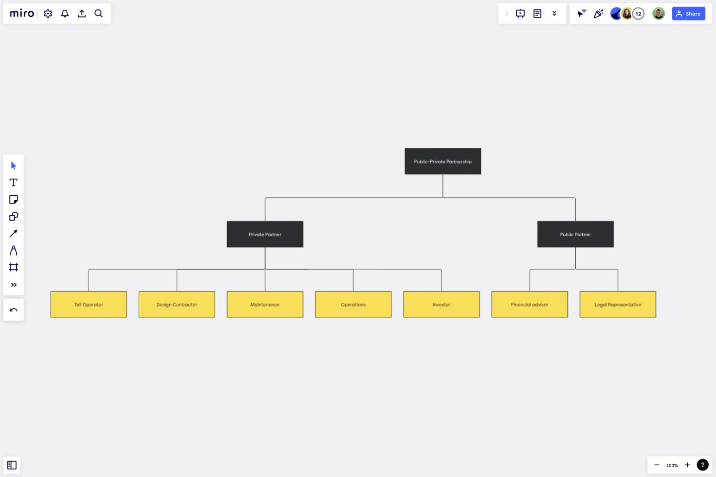
5. Partnership org chart example
Partnership organizational charts often look like a big network, linking different partners and stakeholders across sectors and industries. This type of structure is great for boosting collaboration and making the most of each partner's strengths.
It’s all about building synergistic relationships that amplify everyone’s impact. Whether in technology, healthcare, or finance, this network approach helps partners work seamlessly together and achieve impressive results.
Template: Create a partnership org chart using Miro’s free partnership org chart template — it’s fully customizable.
6. Banking and finance org chart examples
Banking and finance organizations typically sport a hierarchical structure. At the top, you’ll typically have upper management and senior leadership roles, and towards the bottom, you’ll find more specialized divisions — like retail banking, investment banking, asset management, risk management, compliance, and human resources.
This type of setup helps support accountability and precise control — which matters a lot in a high-stakes field where precision and trust are key.
7. Education org chart example
Schools and universities typically organize their operations into key departments such as academic affairs, student services, administration, and operations. This hierarchical org structure helps each area focus on its specific responsibilities while streamlining decision-making.
In other words, it helps students and employees quickly understand who handles what — keeping class schedules, student activities, and daily operations running smoothly.
8. Government org chart example
Government organizational charts tend to be more complex and hierarchical, which is essential when it comes to public services like health, education, transportation, and defense. It not only helps each department focus on its specialty but also makes it easier for residents to identify the services they're looking for.
9. Non-profit org chart example
Non-profit organizations often balance top-down guidance from a board of investors or directors with collaborative team setups, blending flat and hierarchical structures.
This mix of structures and teamwork helps effectively address unique challenges like fundraising goals, program effectiveness, advocacy efforts, and community engagement — all while striving to achieve their mission.
Template: Create a flat org chart in seconds using Miro’s free flat org chart template.
10. Hospitality org chart example
In the hospitality world – especially with facilities like hotels – hierarchical structures are crucial for keeping things running smoothly across different services.
For example, front offices manage guest interactions and reservations, while housekeeping ensures rooms stay clean and comfortable. Departments like food and beverage handle dining experiences, while human resources take care of staffing and employee welfare.
This org structure helps hospitality businesses streamline their processes and deliver top-notch guest experiences — with each department focusing on its specific tasks.
11. Construction org chart example
Construction companies often operate with similar flexibility seen in tech firms, using matrix or project-based structures. This setup isn't just about dividing teams into departments like project management, engineering, and procurement. It's about working smarter.
With this approach, teams collaborate better, resources get allocated more efficiently, and projects run smoother overall. Whether it's adjusting to client demands or optimizing timelines, this structure is handy for quick decisions and adaptable workflows.
12. Entertainment org chart example
With so many different media types to manage – like film, TV, and music – entertainment companies often organize themselves with a divisional structure. Within these divisions, teams handle everything from production to marketing and distribution. It's a system designed for efficiency, making sure each aspect of the entertainment process is expertly managed.
13. Oil and gas org chart examples
In the oil and gas industry, hierarchical structures are standard practice. Each department or division is dedicated to a crucial aspect of the industry — like exploration, production, refining, distribution, and corporate functions.
This setup guarantees that every stage of the process is managed with precision and accountability. From kicking off with resource exploration to wrapping up with product distribution, each phase is clearly mapped out and managed by the right team.
14. Accountability org chart example
When it comes to communicating accountability, think of org charts as the blueprint for teamwork. It’s all about laying out who does what with crystal-clear precision. This way, everyone knows their part, promoting transparency and keeping everything on track.
Template: Use Miro's free accountability org chart template to create your own chart in seconds.
15. Agriculture org chart example
In the agricultural sector, simplicity is key. Farming organizations often adopt a flat structure, emphasizing direct communication and hassle-free decision-making.
With teams dedicated to crop production, livestock management, equipment maintenance, and sales, the focus is on keeping things efficient and effective. This straightforward setup helps make sure responsibilities get clearly delegated — all while promoting a collaborative environment with shared goals.
16. Aerospace and defense org chart examples
In the aerospace and defense sectors, companies often opt for hierarchical or matrix structures. These org structures help them handle diverse operations more effectively — with departments focused on critical functions like research and development, manufacturing, quality control, and admin.
Overall, it helps streamline collaboration among different teams involved in designing, producing, and overseeing aerospace and defense systems.
17. Pharmaceuticals org chart example
Pharmaceutical companies often organize themselves into divisions based on different product categories or lines — with additional departments for research and development, clinical trials, manufacturing, and marketing.
Using a divisional structure encourages focused attention on each product category, which helps maintain dedicated efforts in research, development, and tailored marketing strategies to meet specific therapeutic needs.
No one size fits all
Remember, these org chart examples are just the start of what’s possible. No single solution fits all when every organization has its own unique blend of scale, industry nuances, and culture.
Let these examples inspire you — and why not take the next step and see what you can come up with? Sign up for Miro to create your own unique org chart — or try one of our many organizational chart templates. They’re free and fully customizable.
5 detailed org chart examples
Now that we’ve had a general overview of different org chart examples, let’s take a closer look at how you might actually structure some of them.
Here are five detailed org chart examples — including more free templates to get you started:
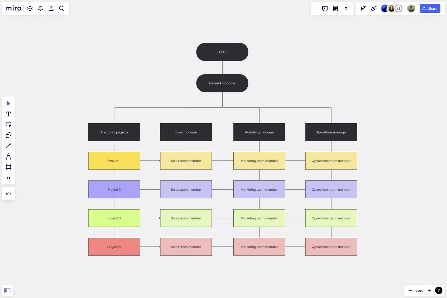
1. Corporate org chart example
Corporate organizational charts usually adopt a more traditional, vertical approach — with clear lines of authority and specialized departments.
Template: Create your own vertical org chart in seconds with Miro's free vertical org chart template.
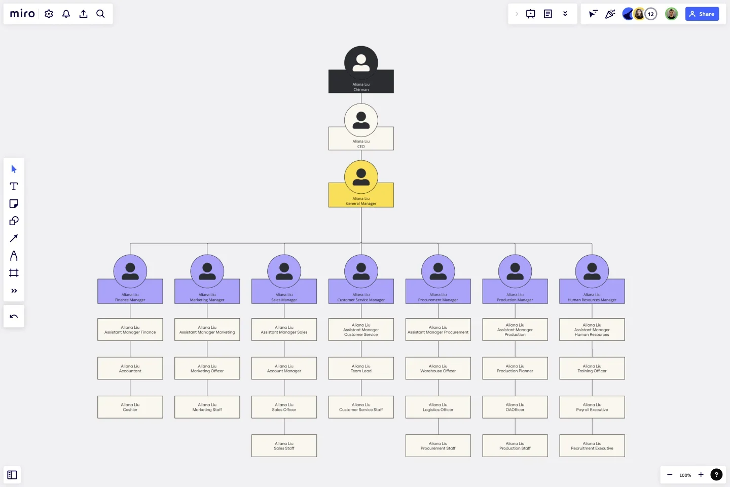
Here are some roles you might include:
CEO or president Provides overall leadership and strategic direction for the organization.
Executive team Consists of top-level executives who work closely with the CEO to make important decisions and oversee various departments.
Middle management Includes managers and supervisors who oversee specific departments or teams within the organization.
Departments Each department has its own set of responsibilities and is headed by a department manager or director.
Employees Work within the different departments and report to their respective managers or supervisors.
2. Non-profit org chart example
Here’s how you might structure a non-profit organization:
Executive director or CEO Provides overall leadership and strategic direction for the organization.
Board of directors Sets policies, oversees governance and provides guidance and support to the organization.
Finance department Manages the financial operations, including budgeting, accounting, and financial reporting.
Programs department Develops and implements programs and services to fulfill the organization's mission and objectives.
Fundraising department Plans and executes fundraising initiatives to secure financial resources for the organization.
Marketing department Promotes the organization's mission, programs, and events to the public and stakeholders.
Department managers Oversee the day-to-day operations of specific departments and ensure smooth functioning.
Program coordinators Coordinate the implementation of specific programs and manage program-related activities.
Fundraisers Plan and organize fundraising events and campaigns to generate funds for the organization.
Volunteers Contribute their time and skills to support the organization's programs and initiatives.
Administrative support Provides administrative assistance and support to various departments and staff members.
This type of organizational chart visually represents the reporting lines and responsibilities within the non-profit organization — enabling effective coordination and collaboration to achieve its mission and goals.
3. Healthcare organizational chart example
One example of a healthcare organizational chart includes the following hierarchy and roles:
CEO or president The top-level executive who oversees the entire healthcare organization.
Chief medical officer Responsible for the medical operations and policies within the organization.
Chief nursing officer Oversees the nursing staff and ensures high-quality patient care.
Medical directors Heads of various medical departments, such as Surgery, Pediatrics, Internal Medicine, etc.
Department managers Responsible for the day-to-day operations of specific departments, such as Radiology, Laboratory, Pharmacy, etc.
Physicians and specialists Provide medical care and expertise to patients within their respective specialties.
Nurses and nursing staff Deliver direct patient care, administer medications, and assist physicians.
Allied health professionals Include professions such as pharmacists, physical therapists, occupational therapists, and respiratory therapists, who provide specialized healthcare services.
Support staff Administrative and technical staff members who support the operations of the healthcare organization, such as receptionists, medical coders, and billing specialists.
This organizational chart ensures clear reporting lines, effective communication, and coordination to provide efficient and high-quality healthcare services to patients.
4. Education org chart example
An example of an educational organizational chart typically includes the following hierarchy and roles:
Superintendent The top-level executive who oversees the entire school district or educational institution.
Assistant superintendent Assists the superintendent in managing the operations and policies within the district.
Principals Head administrators of individual schools within the district, responsible for the overall management and academic performance of their respective schools.
Vice principals Assist the principals in the day-to-day administration of schools, including student discipline, teacher evaluations, and curriculum development.
Department chairs Lead teachers within specific academic departments, responsible for curriculum planning, teacher professional development, and departmental coordination.
Teachers Educators who deliver instruction and facilitate learning in classrooms are responsible for developing lesson plans, assessing student progress, and providing guidance and support.
Support staff Administrative and support roles within the educational institution, such as school counselors, librarians, school nurses, and office staff, who contribute to the smooth functioning of the school and student support services.
Special education coordinators Oversee and coordinate special education programs and services, ensuring compliance with legal requirements and individualized support for students with disabilities.
Support specialists Include roles such as speech therapists, occupational therapists, school psychologists, and behavior specialists, who provide specialized support to students with specific needs.
Paraprofessionals Assist teachers and students in the classroom, providing additional support and guidance to individual students or small groups.
This organizational chart helps to define roles and responsibilities within the educational institution, ensuring effective administration, teaching, and learning.
5. Tech start-up org chart example
An example of a tech start-up organizational chart typically includes the following roles and hierarchy:
CEO and founders The top-level executives who oversee the entire company and set the overall vision and strategy.
CTO or head of engineering Responsible for the technical direction and development of the company's products or services.
Product managers Lead the product development process, working closely with cross-functional teams to define product requirements and prioritize features.
Software engineers Develop and maintain the company's software or technology products, coding and implementing new features and functionalities.
Designers Create the user interface (UI) and user experience (UX) design for the company's products, ensuring a visually appealing and intuitive user experience.
Data analysts Analyze and interpret data to provide insights and inform decision-making, leveraging data-driven strategies.
Sales and business development Responsible for generating revenue and identifying new business opportunities, building partnerships and acquiring clients.
Marketing Develop and execute marketing strategies to promote the company's products or services, including branding, advertising, and digital marketing.
Operations Manage day-to-day operations, including logistics, supply chain management, and administrative functions.
Customer support Provide assistance and support to customers, addressing inquiries, troubleshooting issues, and ensuring customer satisfaction.
Human resources Oversee recruitment, onboarding, employee relations, and other HR functions to support the company's growth and maintain a positive work environment.
It's important to note that the specific roles and structure of a tech start-up org chart can vary depending on the company's size, industry, and unique needs.
Tip: Use a free and customizable company org chart template to structure your team.
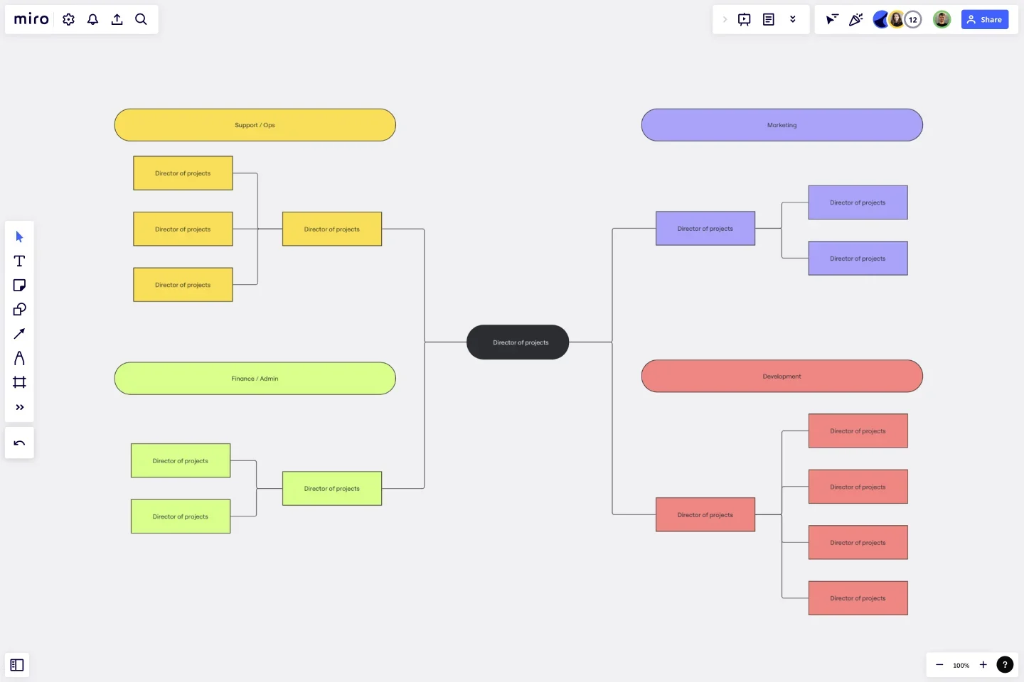
3 creative org chart examples for you to try
Most company org charts use a branching structure to show how teams and individual roles branch off from executive leadership to management to individual contributor roles. While a hierarchical structure is easy to understand, it isn’t the only way to visualize teams. Consider these three alternative org chart styles to bring your team structure to life.
1. Cross-functional swimlane chart
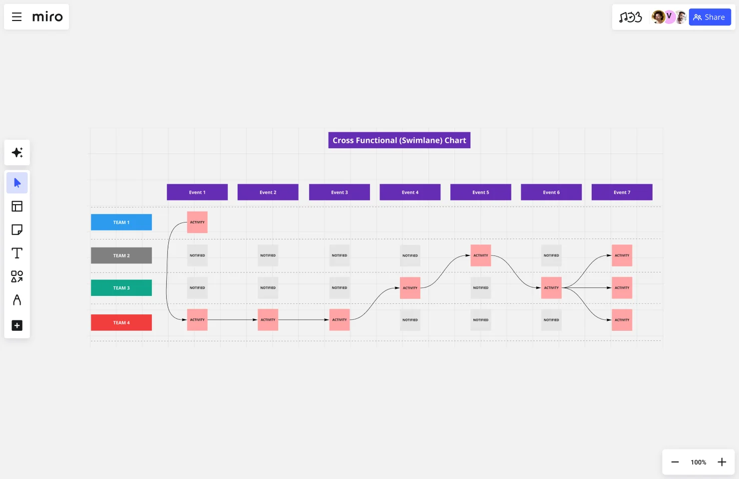
If you have nonlinear processes in your organization, try a swimlane flowchart, which shows how actions transverse roles. In the diagram, each “lane” represents a different team or individual, with the flowchart crossing lanes to illustrate the flow of productivity.
2. Cross-functional flowchart
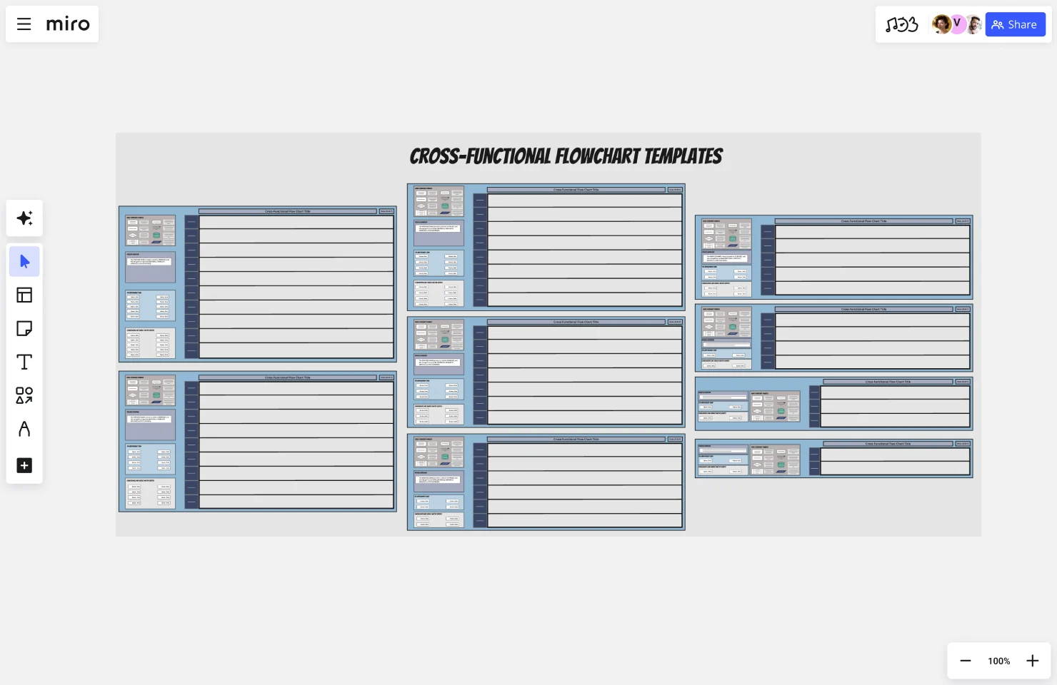
Like the swimlane chart, this cross-functional flowchart organizes teams or stakeholders into lanes and shows how a process flows across them. The template includes instructions for documenting your loops, decision points, and process steps.
3. Headcount approval process
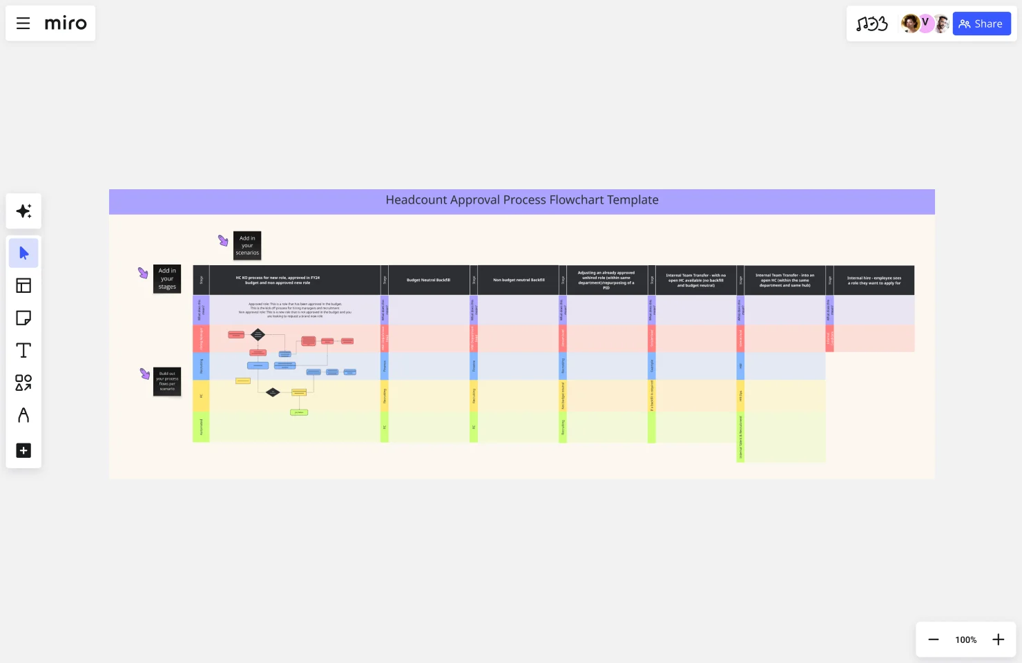
Complicated hiring process? Create a chart of all of the parties involved to approve headcount and which actions they take at different stages of the process.
Bring clarity to your team with Miro’s organizational chart maker
If you’re looking to achieve clarity, efficiency, and growth for your business — an organizational chart is a must-have. It’s especially helpful during both the employee onboarding process and when reporting roles and relationships.
But because every organization is different, you’ll also need a tool that can help you create an org chart that suits your unique setup and goals.
Miro’s org chart maker is a powerful visual workspace that’s built for collaboration — making it easy for your team to align and co-create your org chart. Between plenty of creative tools and a drag-and-drop interface, you’ll have everything you need create a clear, detailed, and on-brand org chart in seconds.
Sign up now to see for yourself!
Author: Miro Team
Last update: November 26, 2025