
Companies are investing big in cloud infrastructure worldwide, with no signs of a slowdown on the horizon. We’re talking an eye-popping $1.35 trillion worth of spend being driven toward cloud services by 2027. That’s no wonder, given that 89% of organizations recently surveyed in Flexera’s 2024 State of the Cloud report say they’ve already adopted a multi-cloud strategy.
Cloud is the backbone of many modern organizations. And as spending and reliance on the cloud increases, so too does the complexity and the risks associated with a failure. Effective management is key.
Management, as most IT pros know, starts with understanding the scope of the cloud infrastructure. To do that, companies need to effectively plan reliable, secure, scalable, and cost-effective infrastructure. This requires a ton of cross-functional collaboration and alignment to make a decision on the best approach. That’s where collaborative cloud architecture diagramming comes in.
Are you an IT pro? Jump directly to the diagram templates!
What is a collaborative cloud architecture diagram?
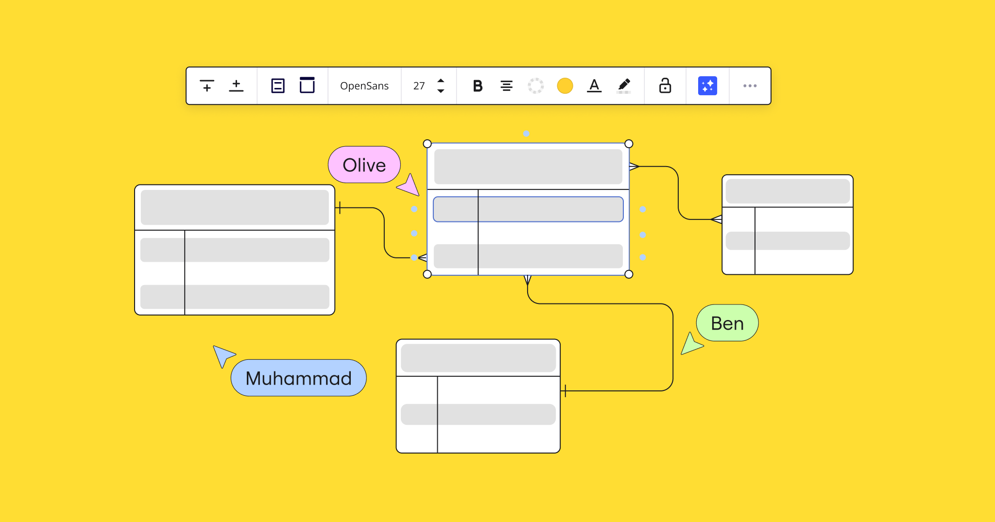
A collaborative cloud architecture diagram is a visual representation of a cloud environment — either at a macro level or through a specific workflow lens — designed to be collaboratively created, reviewed, and modified by multiple stakeholders in real-time or asynchronously.
Collaborating on these technical diagrams helps IT teams and extended stakeholders work together to design, implement, and manage new cloud architectures or change existing ones.
Key components in a cloud architecture diagram include:
- Compute resources
- Storage resources
- Networking components
- Database services
- Integration services
- Security and identify services
- Development and DevOps tools and processes
- Application services
- Users and external systems
Each of the above components — and the relationships between them — are represented in a cloud architecture diagram by icons and symbols, connectors (i.e. arrows and lines), groups, and labels. These elements help visualize relationships, dependencies, and component clusters within a cloud environment.
The benefits of collaborative cloud architecture diagramming
Collaborative cloud architecture diagramming offers a range of benefits for individual cloud architects, as well as the wider organization. Here are a few of them:
Cost savings
Designing and optimizing cloud infrastructure is difficult because most tools are not visual or collaborative, and that slows down the process and causes human error. Working with collaborative diagrams allows teams to visualize infrastructure and collaborate in real-time on optimization, risks, and improvements.
By identifying these issues and opportunities, teams can make informed decisions about resource allocation and optimization, resulting in significant savings.
Improved communication
Visual diagrams are easier to understand and explain to both technical and non-technical stakeholders, ensuring all relevant parties have a shared understanding of the information. It’ also helps gain alignment from leadership and cross-functional teams, allowing you to discuss openly and make decisions in real time.
Efficient planning and execution
Visualization makes it easier to map complex infrastructures, identify bottlenecks and trouble areas, and plan future roadmaps with full visibility into all components. And, it helps teams to execute faster as they move into implementation.
Greater adaptability
Having a full, visual picture of your cloud infrastructure enables you to plan and execute quick interactions with a full understanding of the dependencies and downstream impact.
You can also visualize your architecture alongside other project components, such as the roadmap, product brief, performance data, and cost. This helps get a full-picture view of the current status and future implications of your architecture.
Stronger risk management
Visualization and collaborative input help you identify potential risks and vulnerabilities in the cloud architecture. For example, cross-departmental teams can collaborate to identify potential risks or points of failure before a new technology rollout, enabling them to design and plan more resilient systems.
Types of collaborative cloud architecture diagrams (with examples)
Different types of collaborative cloud architecture diagrams can be used to isolate and visualize specific components and relationships within a cloud environment. The specific part of the cloud environment you want to work on will dictate the type of diagram you use.
Here are four examples:
1. Cloud architecture diagrams
Cloud architecture diagrams provide a visual representation of the overall cloud infrastructure. They showcase the structure and interactions of various components, helping IT teams and network admins understand and manage physical and virtual resources.
For example, an IT team planning to migrate their on-premise data center to the cloud can use cloud architecture diagrams to map the entirety of their existing infrastructure. This helps them understand the corresponding cloud services that they’ll require, existing dependencies between services, and opportunities to improve efficiency post-migration.
Key components: Compute, storage, working, databases, and middleware. Diagrams also include relationships and interactions between these components.
2. Network diagrams
Network diagrams visualize all key networking components and connections within your cloud environment. These diagrams help you provide secure and efficient communication within and across your cloud environments.
A network architect may use these diagrams when designing a new virtual private cloud (VPC) to ensure an efficient and secure data flow between different services. This is especially useful when setting up secure connections between different operational regions, or when integrating hybrid cloud environments.
Key components: Virtual: virtual: Data sources, data destinations, data storage locations, and lines depicting the processes and pathways that data goes through.
4. Security diagrams
Security diagrams isolate and visualize the security components of your cloud architecture. They’re a critical tool for security analysis, helping IT teams audit, troubleshoot, and update security and compliance measures in their cloud environments.
A security analyst may use these diagrams to audit the security of their cloud infrastructure, identify vulnerabilities, plan mitigation strategies, and make sure that all controls are correctly implemented. This can be done either as part of a monthly or quarterly hygiene check or in tandem with a larger change project.
Key components: Firewalls, IAM roles, security groups, data encryption methods, and compliance boundaries.
5. Cloud organization diagrams
Cloud organization diagrams visualize how organizational units (OUs) and accounts are structured within your cloud environment — particularly for platforms like AWS Control Tower. This helps you understand the hierarchy, account relationships, and governance policies within your cloud infrastructure, which can lead to more efficient management and compliance across multiple accounts.
A cloud governance team may use these diagrams to help manage multi-account AWS environments, including setting up appropriate access control and ensuring compliance with organizational policies across all cloud resources under management.
Key components: organizational units (OUs), AWS account, account structures, access permissions, resource groups, and governance policies.
How to visualize your cloud architecture diagrams in Miro
Chances are, your cloud infrastructure is either wholly or in part run through one of the major cloud service providers: AWS, Azure, or Google. Each provider offers a unique set of shapes and notations that you can use to represent and map your cloud computing infrastructure.
Using Miro, you can use these shapes and notation to map various parts of your cloud infrastructure. Here are three examples, with templates.
AWS architecture diagram template
Miro’s AWS architecture diagram template, as shown below, uses AWS-specific icons and symbols to help users map their cloud infrastructure. This template can be used to design new AWS architectures, optimize existing ones, conduct security reviews, and ensure compliance with AWS best practices.
The Miro AWS cost calculator app, likewise, helps you estimate AWS service price points, plan to spend on the platform and find cost-saving opportunities in your existing infrastructure.
Did you know?
Miro has a strategic partnership with AWS and is developing a new seamless way to import AWS data directly into the canvas, helping to speed up the cloud visualization process. Try the new beta experience and provide feedback!
Azure architecture diagram template
The Azure architecture diagram uses Azure-specific icons and symbols, providing you with a familiar visual framework for designing and deploying applications on Microsoft Azure. This includes visualizations for Azure services, data flows, and connections.
Google Cloud architecture diagram template
The Google Cloud architecture diagram offers the same visualization capabilities as above but with Google-specific icons and symbols.
Build and collaborate on cloud architecture diagrams with Miro
Visualizing cloud infrastructure can be complex, with various dependencies and stakeholders at play. This is made much easier with a collaborative cloud architecture diagram. Build, expand, and plan new architectures in real-time or asynchronously with a collaborative diagram.