Table of contents
Table of contents
What is a wireframe for an app? Everything you need to know

Summary
Creating effective app wireframes is the foundation of successful product development. This comprehensive guide covers everything from basic concepts to advanced techniques, helping you build apps that users love.
What you'll learn:
- What an app wireframe is — A simplified visual guide that acts as your app's blueprint, showing layout, navigation, and functionality before design and development begin.
- Platform-specific wireframing — Master the differences between mobile and web wireframing, plus iOS and Android design patterns that make your wireframes feel native to each platform.
- How to create wireframes with Miro AI — Use Create with AI and Sidekicks to generate wireframes in minutes, iterate with visual context processing, and collaborate with your team in real-time.
- Advanced wireframing techniques — Learn progressive disclosure, state-based wireframing, component libraries, and accessibility considerations for professional-grade wireframes.
- Strategies for different app types — Get specific guidance for e-commerce, social media, productivity, health and fitness, financial, streaming, and marketplace applications.
- Real customer success stories — See how EPAM Systems reduced wireframing time from 6 weeks to 30 minutes and how Moladin doubled their productivity using Miro's AI-powered platform.
- 8 free wireframe templates — Access ready-to-use Miro templates including mobile app wireframes, tracking apps, travel planning, productivity tools, and platform-specific designs.
- Complete wireframing checklist — Use our 50+ point checklist covering user flows, screen states, navigation, accessibility, security, and handoff readiness to ensure nothing gets missed.
In the world we live in today, there's a boom in app development everywhere you look. But, behind every slick app experience, there's a lot of planning that goes on, mainly starting with something called wireframing. In this article, we'll break down what app wireframes are all about, explaining why they’re so crucial, how they're designed, and why they’re super useful, especially if you're still getting the hang of this.
Collaborative AI Workflows
Join thousands of teams using Miro to build the right thing, faster.
Understanding the basics of wireframe application
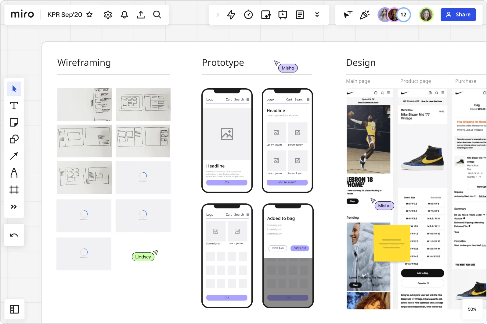
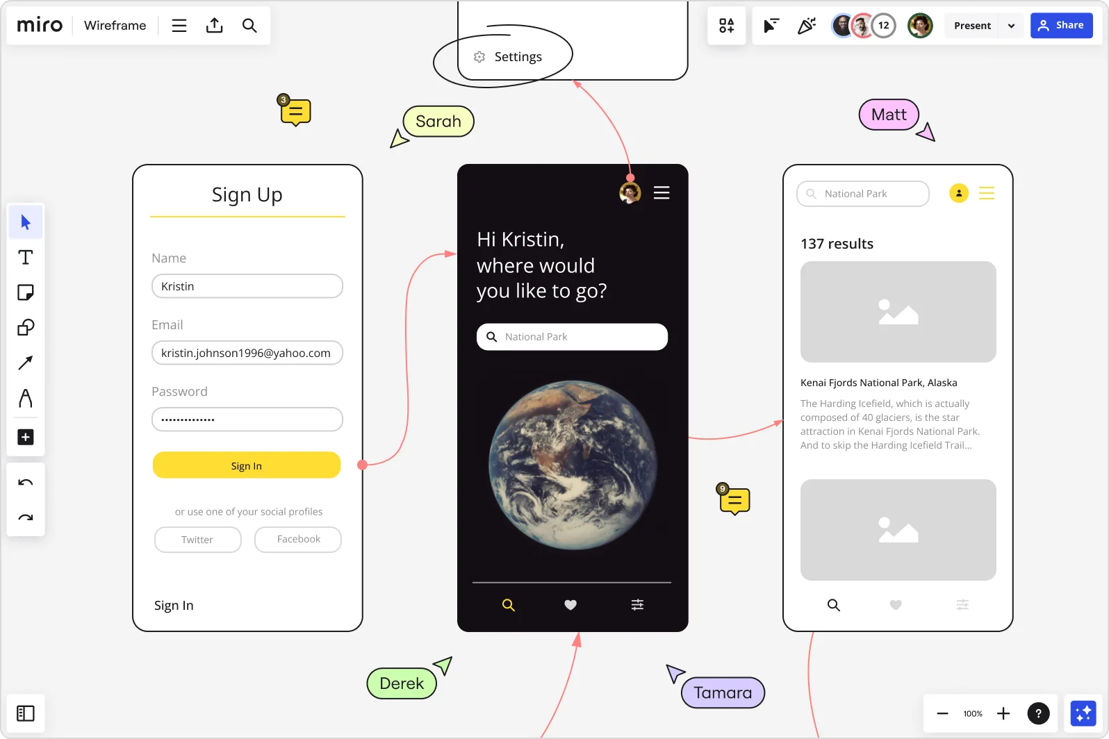
To fully grasp the concept of wireframing, it's necessary to understand its place in the broader context of user experience (UX) and user interface (UI) design. A wireframe is a simplified visual guide representing an application's skeletal framework. It shows a clear and straightforward layout, stripped of any graphic design elements or complex details, showcasing the app's functional components and how they interact with each other.
Imagine a wireframe as the blueprint of a building. Architects use blueprints to plan and visualize the structure before any construction begins, outlining where walls, windows, and doors will be located. Similarly, app designers use wireframes to plan and visualize the structure of an app interface, including where to place various elements such as buttons, icons, and navigation menus.
In app development, a wireframe serves as the groundwork for the UI. It shows the arrangement of the app's interface elements, the prioritization of content, and the functions that will be available to the end users. The wireframe's primary focus is on the app's functionality, behavior, and hierarchical structure rather than its visual aesthetics.
This distinction is important, as it allows the team to focus on the usability aspect of the app, such as user journey and information architecture, rather than getting distracted by colors, typography, or images. It encourages a user-centric approach, prioritizing the user's needs and experiences.
Wireframing started with web design but quickly became an integral part of app development, as it provides a straightforward and effective method to plan and organize an app's structure and functions. Many designers now rely on wireframe templates to jumpstart the process, ensuring they have a consistent framework that allows them to quickly test ideas and iterate.The process of creating a wireframe is usually one of the first steps in the app design process, serving as the foundation upon which subsequent stages like mockups and prototypes are built.
Why app wireframes are crucial for product development
So, what is a wireframe for an app, and why should you care? Well, think of it as your app’s roadmap. Wireframes help you visualize the structure and flow of your app before you dive into the nitty-gritty of design and development. They let you focus on what really matters—how your app works and how users will interact with it. As you can see, app wireframes are a game-changer because they simplify complex ideas. Instead of worrying about colors or fonts, wireframes show the bare-bones layout: screens, navigation, and key interactions. This makes it easier to spot gaps, refine your ideas, and make sure your app delivers what your users need—all without wasting time on reworks down the line.
Plus, wireframes bring your team together. They give everyone—from designers to stakeholders—a clear, shared vision of what the app will look like and how it will function. It’s a super-efficient way to get everyone aligned and ready to build something that not only works but also delights your users. In short, app wireframes are the first step to building an app that’s smart, user-friendly, and ready to impress.
Key components of an app wireframe
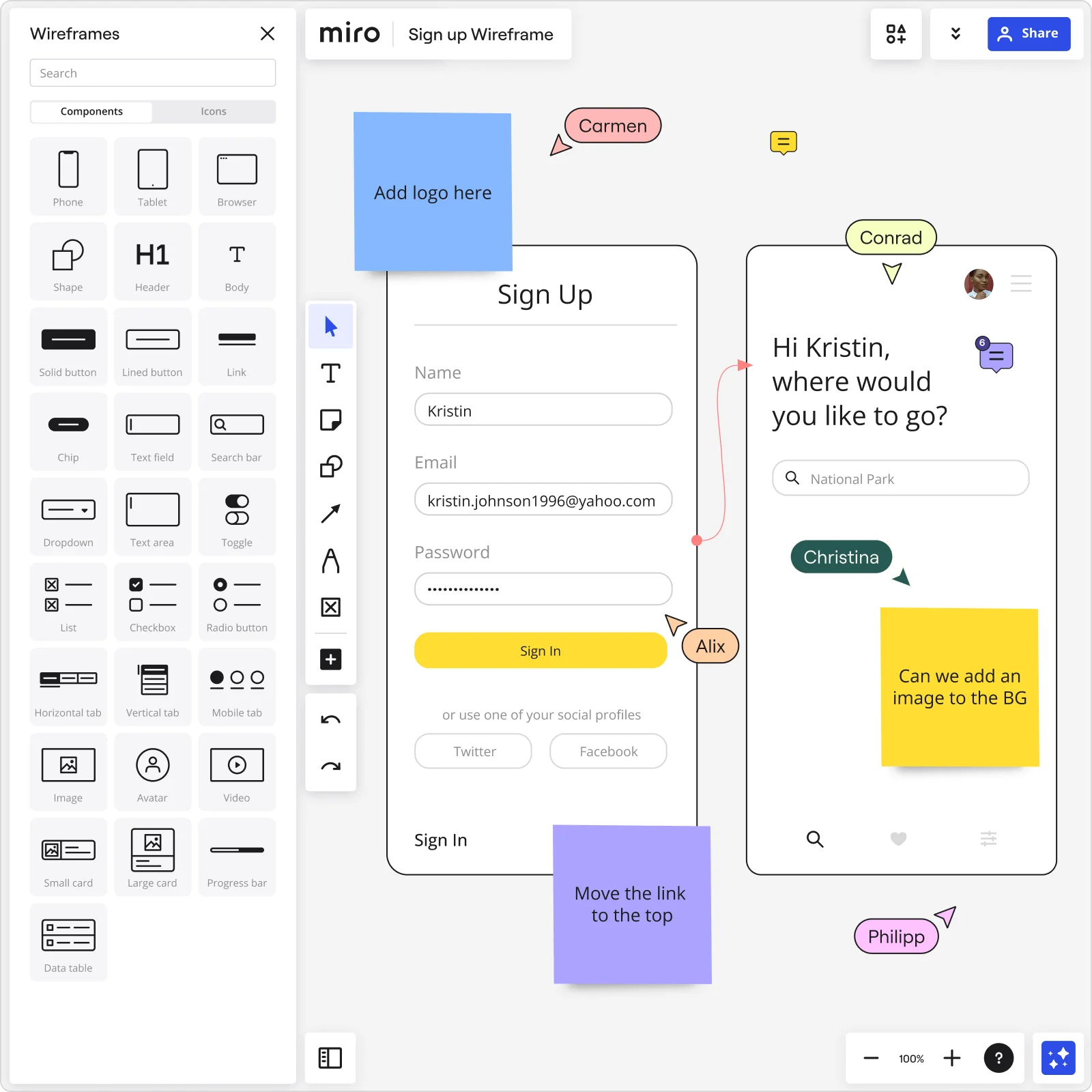
To gain a better understanding of what a wireframe is for an app, let's examine the elements of a wireframe application:
Layout: The arrangement of the interface elements on each screen.
Interface elements: These include input controls (buttons, text fields, checkboxes), navigational components (breadcrumbs, sliders, icons), and informational components (tooltips, icons, notifications).
Navigation system: Demonstrates how users move through the app.
Each component serves a specific purpose, contributing to the app's usability, efficiency, and user satisfaction.
Mobile vs. web app wireframing
Creating an application wireframe requires different approaches depending on whether you're designing for mobile or web. While both share fundamental wireframing principles, the constraints and opportunities of each platform demand distinct strategies.
Screen real estate and touch targets
Mobile app wireframes work within tight constraints:
- Standard screen sizes: 375x667 pixels (iOS) and 360x640 pixels (Android)
- Touch targets must be at least 44x44 pixels
- Design for thumbs, not cursors
- Every pixel counts
Web app wireframes offer more flexibility:
- Desktop screens typically 1920x1080 pixels or larger
- Mouse precision allows smaller, more detailed controls
- Room for complex layouts with multiple panels
- Space for extensive navigation menus and data tables
Input methods and interactions
The way users interact with each platform shapes your wireframing approach differently.
Mobile interactions include:
- Gestures like swiping and pinching
- Bottom navigation bars for easy thumb reach
- Pull-to-refresh patterns
- Long-press for contextual menus
Web interactions leverage:
- Hover states and tooltips
- Right-click context menus
- Keyboard shortcuts
- Precise cursor positioning
Viewport and responsive considerations
Mobile wireframes handle:
- Single, fixed orientation (portrait or landscape)
- Consistent screen dimensions within platform
- Predictable layout behavior
Web wireframes must account for:
- Screen sizes from 13-inch laptops to 27-inch monitors
- Multiple breakpoints for responsive design
- Layout adaptations across vastly different dimensions
- Browser window resizing behavior
Content hierarchy and layout structure
How you organize information differs dramatically between platforms.
Mobile wireframe layouts:
- Single-column layouts with vertical scrolling
- Linear information flow
- One primary focus per screen
- Multiple screens to show what fits on one desktop view
Web wireframe layouts:
- Multi-column grids
- Side-by-side content comparisons
- Horizontal information architectures
- Rich data tables and complex dashboards
Navigation patterns
Navigation reveals the starkest platform differences.
Mobile navigation patterns:
- Hamburger menus to conserve space
- Bottom tab bars (3-5 primary sections)
- Bottom sheets for contextual actions
- Swipe-to-go-back gestures
Web navigation patterns:
- Persistent left sidebars
- Top navigation bars with dropdown menus
- Breadcrumb trails showing location
- Mega menus with multiple options
Choosing your wireframing starting point
When you're figuring out what is a wireframe for an app, ask which platform drives the primary experience:
Start with mobile-first when:
- Users will predominantly access your app on phones
- Core features are designed for on-the-go use
- Touch interactions are central to the experience
- Then expand and enhance for web
Start with web-first when:
- Desktop is your core platform
- Complex data manipulation is required
- Users need large-screen real estate
- Then thoughtfully adapt for mobile — don't just shrink everything down
Understanding these platform-specific patterns helps you create wireframes that feel native to each environment rather than forcing one approach to fit all contexts.
Platform-specific app wireframing guidelines
iOS and Android users expect different experiences, even when using the same app. Platform-specific wireframing ensures your application wireframe aligns with the design languages users have internalized through years of platform use.
iOS wireframing guidelines
iOS wireframes follow Apple's Human Interface Guidelines, emphasizing clarity, deference, and depth.
Navigation patterns:
- Tab bar at the bottom (up to 5 primary sections)
- Back buttons in top-left corner
- Primary actions in top-right corner
- Fifth tab becomes "More" when you need additional options
Key iOS elements:
- Modal sheets that slide up from bottom for focused tasks
- System fonts (SF Pro)
- Rounded corners on buttons and cards
- Subtle shadows for depth
- Clean, minimal top navigation bars
iOS-specific gestures to indicate in wireframes:
- Swipe to go back
- Pull to refresh
- Long-press for contextual menus
Your wireframe app should indicate these interactions with simple annotations rather than trying to make them visible in static screens.
Android wireframing guidelines
Android wireframes follow Material Design principles, emphasizing bold, graphic, and intentional design.
Navigation patterns:
- Navigation drawer (side panel from the left)
- Bottom navigation for 3-5 top-level destinations
- System navigation at screen bottom or gesture-based
Key Android elements:
- Floating action button (FAB) in bottom-right corner for primary actions
- More flexibility in layout and component styling
- Elevation (shadows) to indicate hierarchy
- Bold, graphic design language
Important considerations:
- System navigation lives at the bottom — avoid placing critical content there
- FAB should trigger the primary action for the current screen
- Material Design elevation shows interactive elements
Platform-specific components
Different platforms use different names and behaviors for similar components.
Component terminology differences:
- iOS "action sheet" = Android "bottom sheet"
- iOS "segmented controls" = Android "tabs" or "chips"
- iOS "alerts" = Android "dialogs"
Keyboard behavior:
- iOS: Toolbar above keyboard with actions like "Done" or "Next"
- Android: Actions built into the keyboard itself
These details matter in wireframes when you're showing forms or input-heavy screens.
Following platform guidelines
When deciding what is a wireframe for an app on a specific platform:
Study the official guidelines:
- Apple's Human Interface Guidelines for iOS
- Material Design documentation for Android
- Specific measurements, behaviors, and patterns
Balance adherence with practicality:
- Respect fundamental patterns users expect
- Don't need pixel-perfect adherence to every guideline
- Focus on patterns that affect user experience most
Use platform-appropriate terminology:
- Communicate effectively with developers
- Ensure design intent is clear
- Prevent confusion during handoff
Wireframing strategies for different app types
What is a wireframe for an app? The answer depends heavily on what type of app you're building. Different app categories demand different wireframing approaches to address their unique challenges and user expectations.
E-commerce App Wireframes
E-commerce apps live and die by their conversion funnel. Your wireframe needs to show the complete journey: browsing, searching, product details, cart, checkout, and order confirmation.
Focus on:
- Product detail pages where buying decisions happen
- Every step of checkout including guest flows and saved payment methods
- Error recovery (declined cards, out-of-stock items)
- Post-purchase experience (order tracking, delivery updates, returns)
Social Media App Wireframes
Social apps center on content feeds and user interactions. Start with the feed — the core screen users return to repeatedly.
Essential wireframes:
- Different post types: text, images, videos, polls, stories
- Creation flows for each content type with filters and editing tools
- Notification center showing different notification types
- Messaging for one-on-one chats and group conversations
Productivity App Wireframes
Productivity apps like project management tools or task managers need to handle complex data structures while remaining intuitive.
Key considerations:
- Information hierarchies (projects contain tasks, tasks contain subtasks)
- Empty state experience guiding new users toward first meaningful action
- Customization options showing how users personalize their workspace
- Collaboration features if teams work together
Health and Fitness App Wireframes
Health apps require careful wireframing around data collection and visualization.
Critical elements:
- Simple logging flows for meals, workouts, and health metrics
- Data dashboards showing daily, weekly, and monthly views
- Progress visualization with graphs, trends, and achievements
- Privacy settings and data control options
Financial App Wireframes
Banking and finance apps demand trust and security through their design.
Must-have wireframes:
- Detailed authentication flows (biometric, PIN, security questions)
- Transaction history with filtering and search capabilities
- Transfer flows with confirmation screens and success states
- Statement downloads and bill pay interfaces
Content Streaming App Wireframes
Streaming apps need excellent content discovery and playback experiences.
Focus areas:
- Personalized recommendations and search results
- Playback screen with player controls and progress indicators
- Minimized player state that persists while browsing
- Offline downloads and playlist management
Marketplace App Wireframes
Two-sided marketplace apps require wireframes for both buyer and seller experiences.
Essential coverage:
- Separate flows for each user type
- Where buyer and seller intersect (bookings, messaging, reviews)
- Strong search and filtering capabilities
- Complete transaction flow from discovery to completion
Types of wireframes
Wireframes are primarily classified as low-fidelity and high-fidelity.
Low-fidelity wireframes: They are quick and easy to create, focusing more on the app's functionality than the aesthetics.
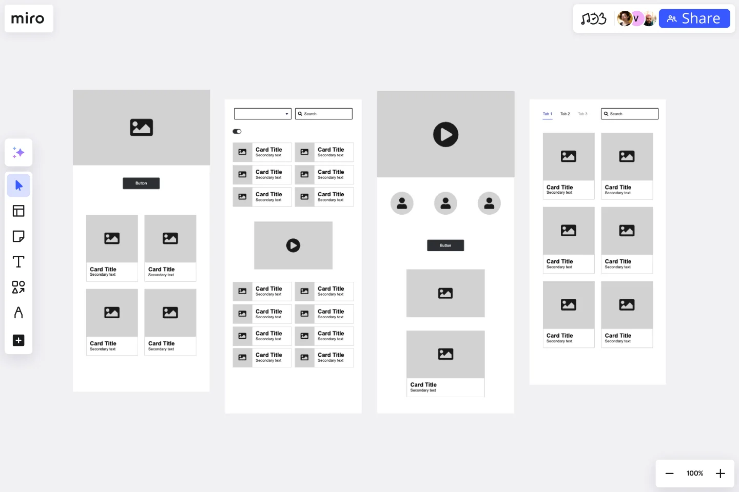
High-fidelity wireframes: They offer a more detailed and interactive experience, showcasing functionality and visual design elements.
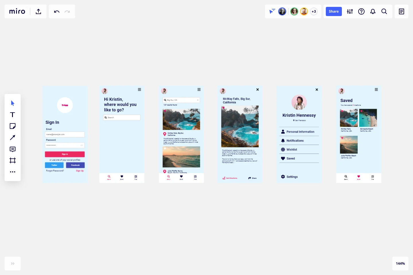
While using Low-Fidelity Wireframes Templates is great for quick brainstorming, high-fidelity wireframes are used for user testing and a more accurate representation of the final product.
How to create an app wireframe
Creating an application wireframe used to mean hours of placing rectangles and labels one by one. Miro's AI-powered features have transformed this process, letting you move from concept to detailed wireframe in minutes rather than hours.
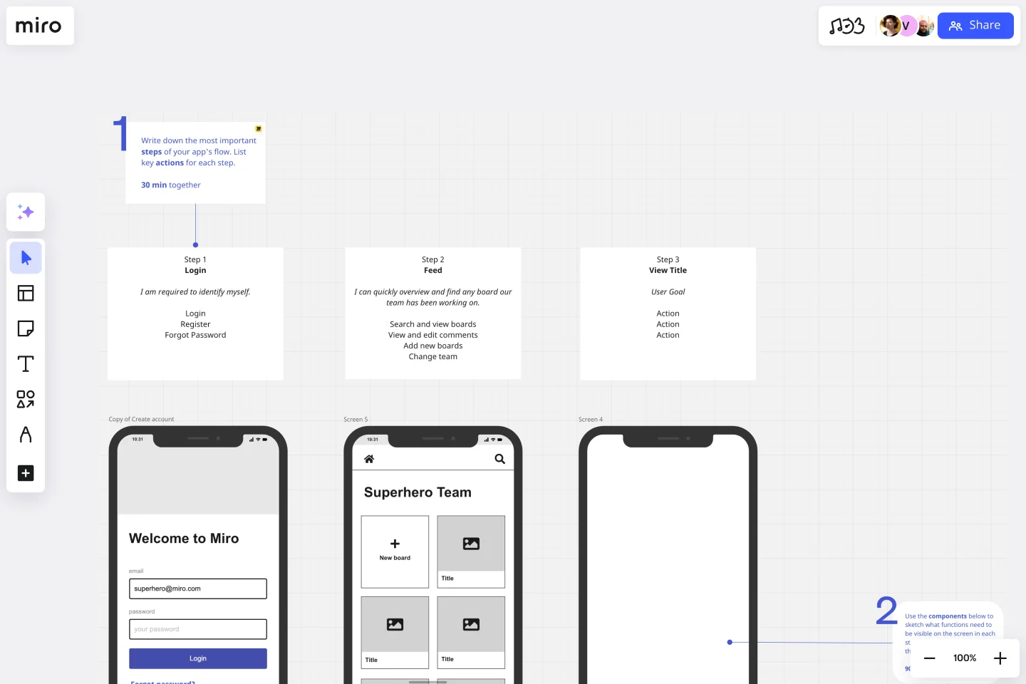
Creating a wireframe involves a systematic approach:
Step 1: Start with AI
Open any Miro board and click on the Sidekicks icon in the toolbar. This opens Miro's AI-powered creation panel where you can describe your wireframe in plain language. The more specific you are, the better your results.
Instead of: "Create a mobile app wireframe" Try: "Create a mobile app wireframe for a fitness tracking app with a dashboard showing daily steps, calories burned, and workout history"
Miro AI analyzes your prompt and generates a structured wireframe with appropriate components like navigation bars, content areas, and call-to-action buttons. The AI understands common app patterns, so when you mention "dashboard" or "login screen," it knows the typical elements these should include.
2. Use Sidekicks for smart iteration
Once you have your initial app wireframe, Miro's Sidekicks feature becomes your collaborative AI partner. Click on your wireframe and select "Ask Sidekicks" to get AI-powered suggestions for improvement.
Sidekicks can help you:
- Identify missing screens in your user flow
- Suggest alternative navigation patterns
- Recommend where to add empty states or error handling
- Spot inconsistencies in your wireframe design
You can also ask Sidekicks specific questions like "What screens am I missing for a complete checkout flow?" or "How can I simplify this navigation structure?" The AI analyzes your existing wireframe and provides contextual recommendations.
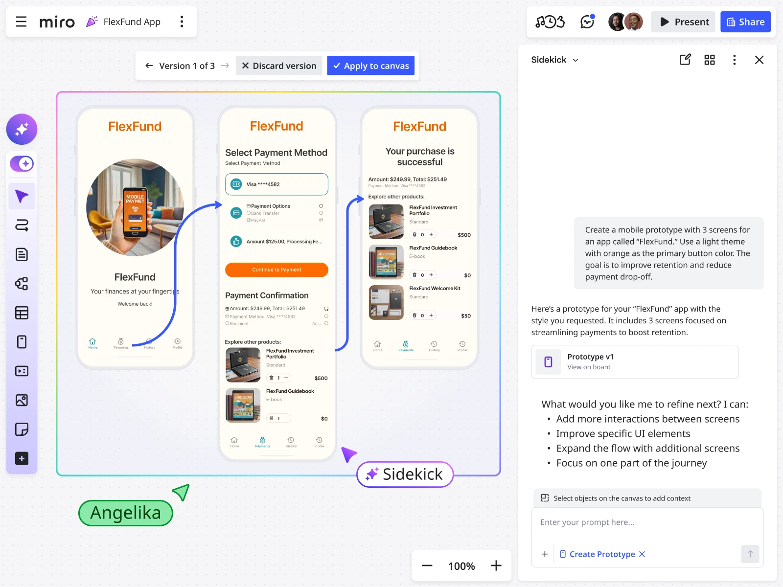
Step 3: Refine with visual context processing
Select any existing screens, mockups, or sketches on your board, then use the AI to generate variations. Miro's visual context processing analyzes what you've selected and maintains consistency with your existing design direction.
This is particularly powerful when you need to:
- Extend an existing wireframe with new screens
- Maintain design consistency across multiple user flows
- Iterate on specific sections without rebuilding from scratch
- Create platform-specific versions (iOS vs. Android) from the same base wireframe
Step 4: Convert and transform with the context menu
Select any group of sticky notes, text elements, or rough sketches on your board. Click "Miro AI" in the toolbar that appears above your selection. The context menu shows transformation options specific to what you've selected.
Convert sticky notes from a brainstorming session into structured wireframe screens. Transform text outlines into visual layouts. Cluster related ideas by sentiment or keyword to inform your wireframe structure. This bridges the gap between ideation and wireframe creation, keeping your design work connected to the insights that sparked it.
Step 5: Collaborate in real time
Miro's canvas brings your entire team into the wireframing process. Engineers can review your wireframe and add technical constraints. Product managers can annotate with business requirements. Designers can suggest visual refinements. Everyone works on the same board simultaneously, eliminating the endless cycle of exporting, sharing, waiting for feedback, and updating.
Use Miro's commenting feature to have threaded discussions directly on specific screens or components. Tag teammates to pull them into the conversation. When feedback comes in during a meeting, update your wireframe in real-time so everyone sees changes immediately.
Step 6: Generate multiple variations quickly
When you're not sure which wireframe approach will work best, use Miro AI to generate multiple variations quickly. Describe different approaches in your prompts:
"Create a wireframe for app onboarding using a step-by-step tutorial" "Create a wireframe for app onboarding using video introduction with skip option" "Create a wireframe for app onboarding using interactive product tour"
Compare these variations side-by-side on your Miro board. Share them with stakeholders or test users to validate which approach resonates best before investing in high-fidelity designs or development.
Pro tips for AI-powered app wireframing
Start with "basic processing" for quick results when sketching out ideas. Switch to "advanced processing" when you need more refined, contextually relevant wireframes based on board content.
Be specific about screen states. Don't just ask for "a profile screen" — describe what happens: "a profile screen showing user info with edit mode and confirmation message."
Use Miro AI attribution to track which screens were AI-generated versus human-created. This transparency helps your team understand where AI assisted your workflow and where human creativity drove the design.
Remember that AI-generated wireframes are starting points, not finished products. Use them to accelerate your process, but apply your product knowledge, user research, and design expertise to refine them into solutions that truly serve your users.
Advanced app wireframing techniques
Once you've mastered the basics of creating wireframes for apps, these advanced techniques help you tackle complex design challenges and communicate more sophisticated interactions.
Progressive disclosure in wireframes
Most apps overwhelm users by showing everything at once. Progressive disclosure reveals information gradually, showing users what they need when they need it. In your wireframe app, indicate progressive disclosure with annotations like "Expands on tap" or "Reveals after scroll."
Instead of displaying 30 settings options upfront, your wireframe might show five major categories that expand when tapped. Use simple arrows or plus icons to indicate expandable sections.
State-based wireframing
Every screen in your application wireframe exists in multiple states: loading, empty, error, success, and partial data. Most wireframe examples only show the "happy path," but comprehensive wireframing documents all critical states.
Create wireframes for:
- Loading state: Skeleton screens or spinners
- Empty state: No content yet, with guidance
- Error state: Failed to load, with recovery options
- Normal state: Displaying content as expected
This prevents "we didn't think about that" conversations during development and ensures your app handles edge cases gracefully.
Component-based wireframing
Rather than recreating common elements across multiple screens, build reusable component sets in Miro. Create a navigation bar once, then duplicate it across all your wireframes. When you need to update the navigation, change it once and propagate the update to all instances.
This approach mirrors how developers build apps with reusable components and keeps your wireframes consistent.
Annotation layers and interactive notes
As wireframes become more complex, visual annotations can clutter your screens. Use Miro's frames and layers to organize annotations separately from the wireframe itself. In Miro, use comment threads attached directly to wireframe elements — this creates a clear connection between the note and what it's describing.
Wireframing for accessibility
Accessibility isn't something you add after the app is built — it's baked into your wireframe from the start. Indicate tap target sizes (minimum 44x44 pixels), show focus order for keyboard navigation, and note where screen readers should announce important information.
Use Miro's measurement tools to verify spacing and sizing. Add annotations for ARIA labels, heading hierarchy, and color contrast requirements.
Free app wireframe templates library
Starting with a proven template accelerates your wireframing process and ensures you're following established patterns users already understand. Miro has dozens of wireframe templates specifically designed for different app types and use cases — all free and ready to customize.
1. App Wireframe Template
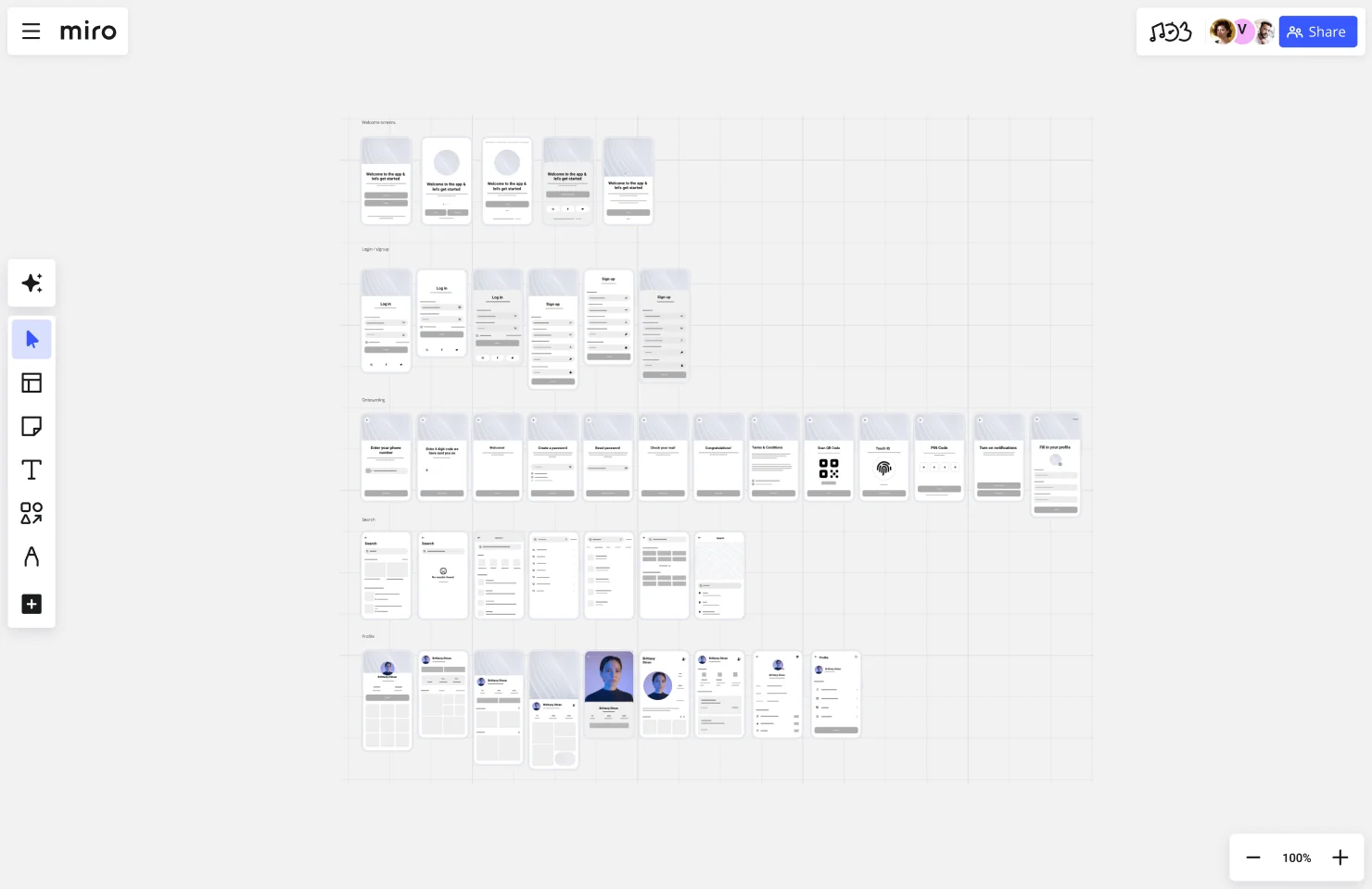
The foundational template for any mobile application wireframe. This comprehensive kit includes common screens and design elements to help you start wireframing quickly. Perfect for testing broad concepts and validating ideas before moving to high-fidelity designs.
Perfect for: First-time app designers, startup MVPs, client presentations
2. Mobile App Wireframe Template
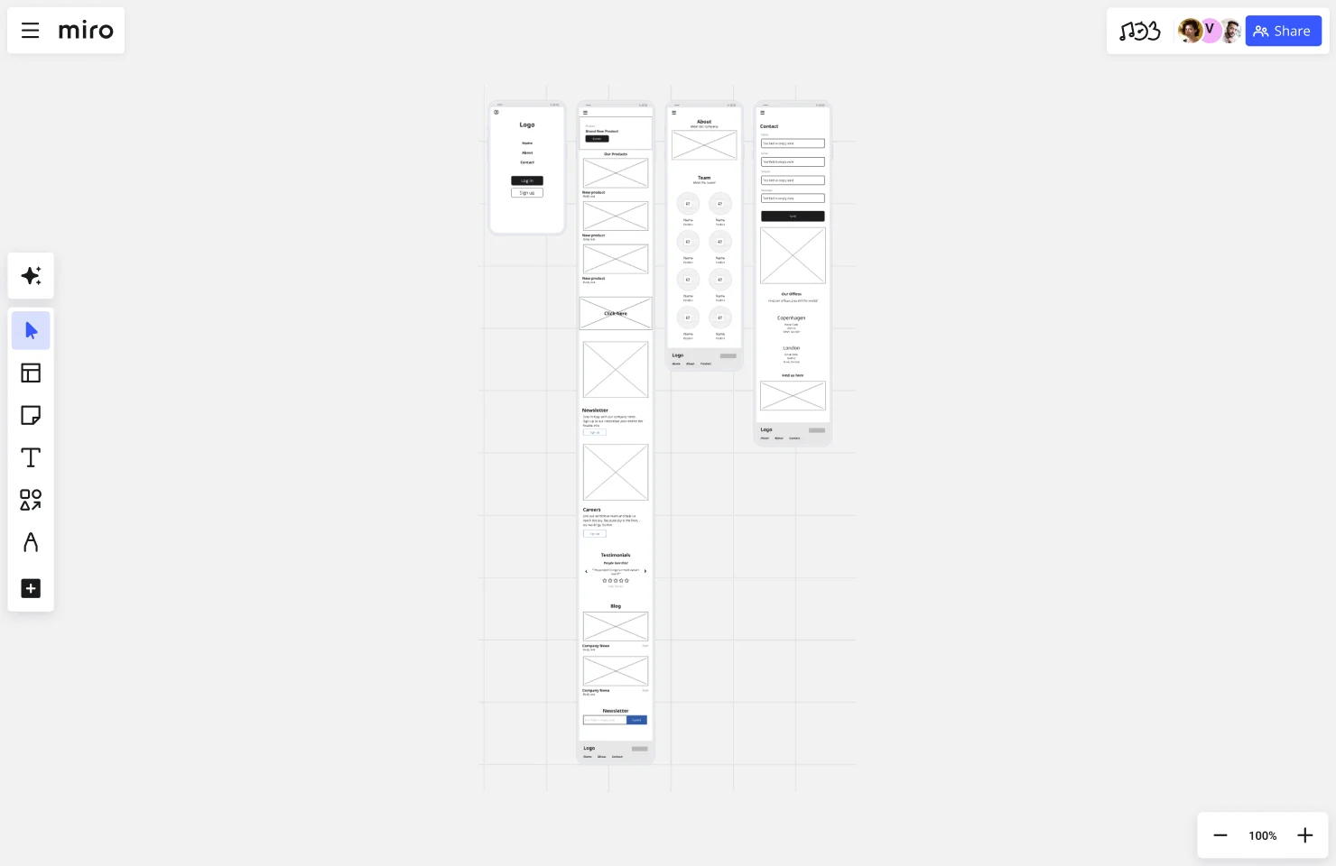
Built to support UX teams, this template enables you to craft impactful low-fidelity wireframes that serve as the foundation for your mobile app designs. Once you've completed the basic framework, you can seamlessly transform your wireframes into mockups with just one click.
Perfect for: Mobile-first applications, iOS and Android apps
Use Mobile App Wireframe template →
3. Tracking App Wireframe Template
Start your tracking app design project with pre-designed app screens that make building your wireframe fast and easy. Whether you plan to turn it into a prototype or keep it as a wireframe, this template covers essential tracking features and user flows.
Perfect for: Health tracking apps, habit trackers, cycle tracking apps
Use Tracking App Wireframe template →
4. Pet Sitting App Wireframe Template
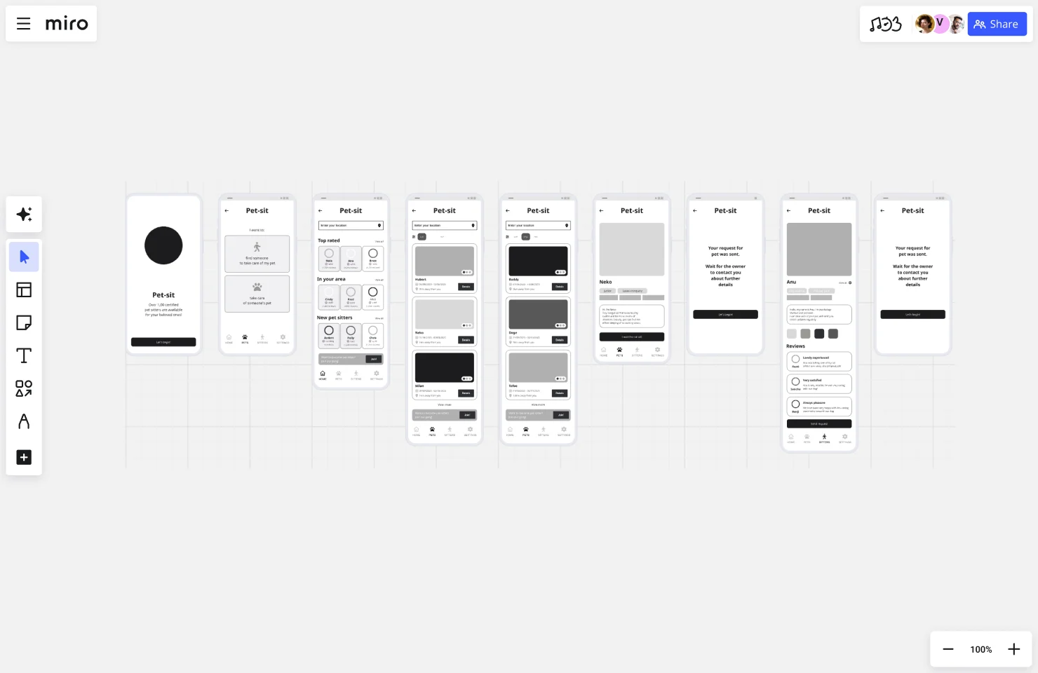
This template includes multiple low-fidelity app design screens, providing everything you need to quickly craft a service marketplace app. Covers booking flows, user profiles, service management, and payment processing screens.
Perfect for: Service marketplace apps, booking platforms, on-demand services
Use Pet Sitting App Wireframe template →
5. Plant Care App Wireframe Template
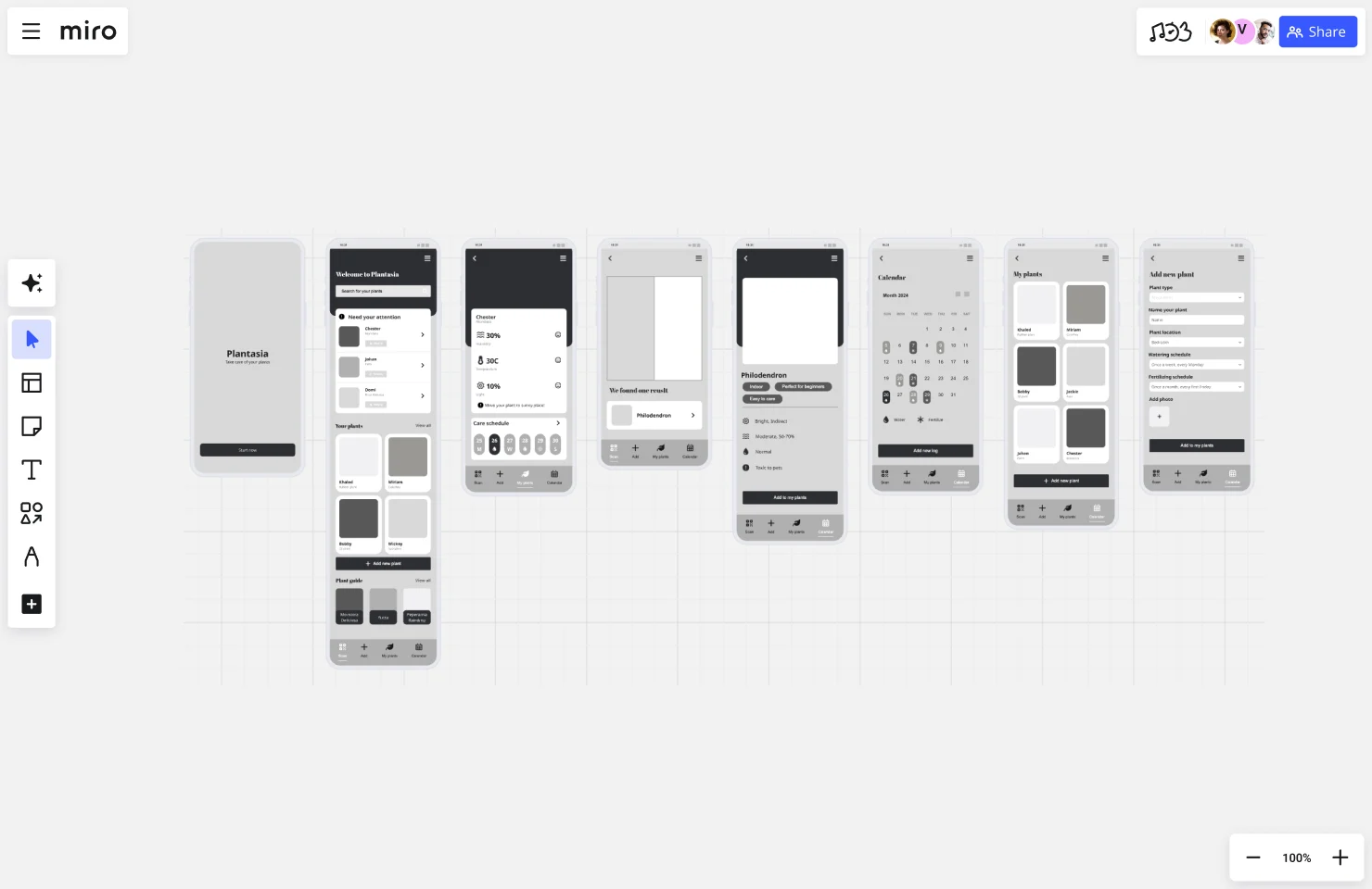
This template provides a multi-screen app wireframe along with all the necessary design pages to get started. Easily customize the wireframe to meet specific needs — add, remove, or adjust screens to create smooth user flows, and personalize the design by modifying colors, typography, and layouts.
Perfect for: Lifestyle apps, hobby management apps, reminder-based applications
Use Plant Care App Wireframe template →
6. iPhone App Template
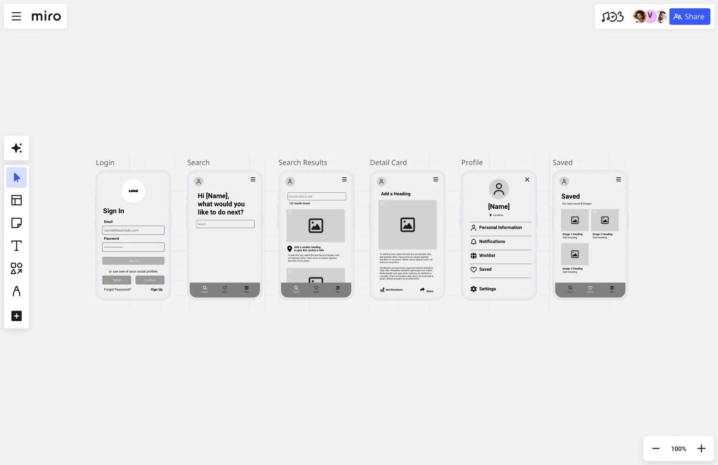
Designed specifically for iOS applications, this template helps you create iPhone app designs with platform-specific components. Customize designs, create interactive protocols, and share with collaborators to iterate as a team before development.
Perfect for: iPhone-specific apps, iOS-first products, App Store submissions
7. Travel Planning App Template
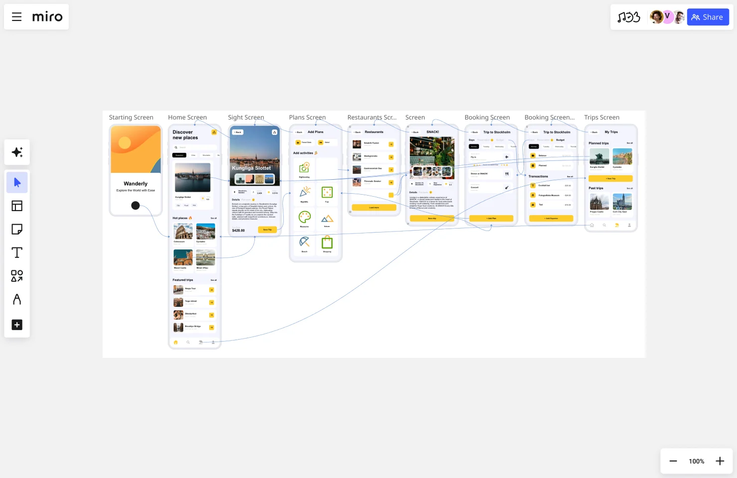
Complete wireframe flow for travel planning services, covering trip research, booking interfaces, itinerary management, and travel document organization. Shows how to handle complex, multi-step planning processes in a mobile app format.
Perfect for: Travel apps, booking platforms, trip planning services
Use Travel Planning App template →
8. Productivity App Template
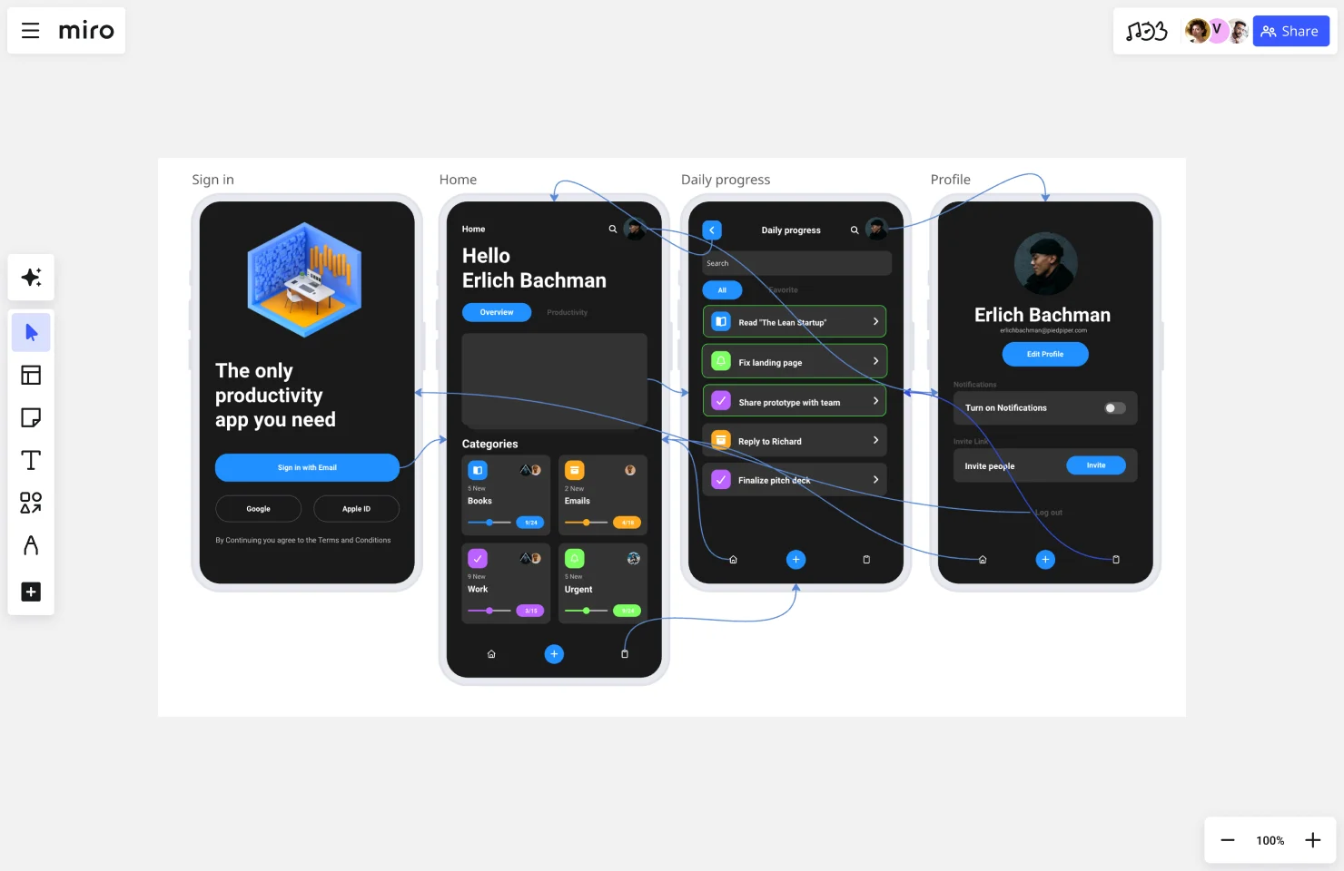
Designed for task management and productivity applications, this template includes task lists, project views, collaboration features, and progress tracking screens. Demonstrates effective ways to organize complex information in mobile-friendly layouts.
Perfect for: Task managers, project management apps, team collaboration tools
Use Productivity App template →
How to use these templates
Each template opens directly in Miro where you can customize screens, add your own content, and adapt the layouts for your specific needs. The templates include design elements that follow established mobile app patterns, helping you create wireframes that feel familiar to users.
To get started:
- Click any template link above
- The template opens in a new Miro board
- Duplicate screens you need, delete ones you don't
- Use Miro AI to generate additional screens that follow the same style
- Collaborate with your team in real-time as you customize
These templates serve as starting points, not rigid constraints. Feel free to mix and match components across templates, adapt patterns for your specific use case, and build on these foundations with your own creative solutions.
Looking for more wireframe templates? Browse Miro's complete template library →
Common mistakes and misconceptions when wireframing
A lot of people think wireframing isn't necessary, but missing out on this step could end up costing you more later because of architectural changes that you could have easily avoided early on. Plus, wireframes aren't all about how things look; they're really about how things work for the user. If you focus too much on making it pretty at the wireframing stage, you might lose sight of what's actually important: making sure it's easy and friendly for users to navigate.
The complete app wireframing Checklist
Before you hand off your application wireframe to developers or stakeholders, run through this comprehensive checklist to ensure you've covered critical details that keep projects on track.
User Flow Completeness
☐ All user entry points are wireframed (deep links, notifications, onboarding) ☐ Complete flows exist for primary user tasks ☐ Alternative paths and edge cases are documented ☐ Exit points and back navigation are clear
Screen States
☐ Loading states show skeleton screens or indicators ☐ Empty states provide guidance and next actions ☐ Error states explain what went wrong and how to recover ☐ Success confirmations acknowledge user actions
Navigation and Information Architecture
☐ Navigation patterns are consistent across screens ☐ Primary navigation is accessible from key screens ☐ Back button behavior is defined for each screen ☐ Navigation hierarchy makes sense to users
Interactive Elements
☐ All buttons have clear labels and purposes ☐ Touch targets meet minimum size requirements (44x44px mobile) ☐ Interactive elements are visually distinguishable ☐ Form fields have appropriate input types specified
Mobile-Specific Considerations
☐ Screen orientation behavior is specified ☐ Keyboard appearance doesn't hide critical content ☐ Pull-to-refresh interactions are indicated where relevant ☐ Swipe gestures are documented
Platform-Specific Patterns
☐ iOS Human Interface Guidelines are followed for iOS apps ☐ Material Design principles are applied for Android apps ☐ Platform-native components are used appropriately
Data and Content Management
☐ Data sources for dynamic content are identified ☐ Pagination or infinite scroll behavior is specified ☐ Search and filtering options are wireframed ☐ Real-time update behavior is indicated
Accessibility
☐ Touch targets meet minimum accessibility sizes ☐ Color isn't the only way to convey information ☐ Text has sufficient contrast against backgrounds ☐ Form fields have associated labels
Forms and Input
☐ Required vs. optional fields are distinguished ☐ Input validation behavior is specified ☐ Inline error messages are written ☐ Field formatting requirements are shown (phone, email, etc.)
Security and Privacy
☐ Authentication flows are complete ☐ Password requirements are specified ☐ Biometric authentication options are shown ☐ Permission requests are documented
Annotations and Documentation
☐ Complex interactions have explanatory notes ☐ Technical constraints are documented ☐ Business rules are noted on relevant screens ☐ Open questions are clearly marked
Handoff Readiness
☐ All screens are labeled consistently ☐ Screen dimensions are specified ☐ Component specifications are documented ☐ Related screens are clearly connected
Use this checklist at multiple points in your wireframing process: during creation to ensure completeness, before team reviews to catch gaps, and before handoff to developers to confirm nothing is missing. Save this checklist in your Miro board as a sticky note or frame so your team can reference it throughout the project.
Real-world success: How teams use Miro for app wireframing
Creating effective wireframes for apps isn't just theoretical — product teams around the world use Miro to ship better products faster.
EPAM Systems: From 6 Weeks to 30 Minutes
When EPAM Systems needed to build an internal database interface without UX designers, Mariana Carril used Miro's AI-powered wireframing to generate initial screens from text prompts. In under 30 minutes, she had all the screens needed.
"I can share my screen and start showing them, 'you can have this and you can put the buttons here,' and get feedback instantly."
Learn how EPAM achieved 99% time reduction →
Moladin: Doubling Productivity
Indonesian fintech company Moladin's workflows changed weekly. By wireframing complex workflows in Miro, product managers instantly identify all touchpoints affected by changes, accelerating decision-making dramatically.
Since adopting Miro in 2021, Moladin doubled their story points and experienced zero critical bugs in post-release deployments for two years.
Discover how Moladin doubled productivity →
What this means for you
These teams approach wireframing as a collaborative, iterative process. What is a wireframe for an app in this context? It's a living artifact that evolves through team input and maintains alignment across distributed teams — the conversation space where product decisions happen.
What now? The future of wireframing
Wireframing is always changing and growing. Nowadays, with cool tech like VR (virtual reality), AR (augmented reality), and AI (artificial intelligence) popping up, we're pretty sure wireframes are about to get a whole lot more lively, interactive, and just plain fun. This is super exciting for everyone in the app design and development game. So, what's a wireframe? Think of it as the skeleton of an app. It's super important because it shows you what goes where in the app, kind of like a blueprint for your app's design and how it's supposed to work. Getting wireframes right helps everyone involved get a crystal-clear picture of what's being built. This way, you can avoid misunderstandings and save a bunch of time and effort. Wrapping it up, having a solid wireframe is a game-changer for making a successful app. It makes things way easier to understand and communicate, not to mention the time and resources it saves. Whether you've been in the app development world for ages or you're just starting out, getting the hang of wireframing can seriously level up your skills. Get started with these Miro wireframing templates.
Author: Miro Team Last update: December 10, 2025