Every workplace has a layout through which employees, products, and information move. It could be an actual production factory, a professional kitchen, or a generic office with cubicles.
A messy layout leads to an inefficient flow of people and resources, leading to clutter, confusion, and accidents. More importantly, a poor work layout leads to wasted time and slower delivery of items.
When workers are forced to muddle through a poorly arranged workspace, they have to travel far distances and wait longer at each stage to get what they need.
Employers need a tool that helps them visualize their current layout and optimize it for a smoother workflow. A spaghetti diagram is the perfect tool for this.
In this article, we’ll help you understand what a spaghetti diagram is, when to use it, and how to create your own chart using Miro.
What is a spaghetti diagram?
A spaghetti diagram visualizes the flow of workers and products in a process to identify potential areas of improvement. It helps organizations see how their workers are moving physically through the workspace. You can also use it to chart the data flow between systems.
Using a spaghetti diagram, teams can optimize their movements to boost productivity and improve preparation and delivery times.
Let’s say the supervisor of a factory floor wants to understand how workers are moving from one station to the next. They can use a spaghetti diagram to visualize it and implement adjustments to the layout so that it cuts out unnecessary movements and helps workers prepare products faster.
Typically, a spaghetti diagram is a simple combination of lines representing physical workflows and boxes (or other symbols) representing workstations.
Spaghetti diagrams are part of the Lean Six Sigma methodology — a framework focused on reorganizing human activities to remove waste and deliver more benefits to workers and, ultimately, customers.
When workers waste time traveling cluttered paths to and from different workstations, or they have to wait at a particular workstation for a long time, they lose morale, reduce work efficiency, and increase delivery times.
The use cases of a spaghetti diagram
Process teams, supervisors, and organizational leaders can use a Spaghetti Diagram Template to map out:
People flow
People flow refers to how workers move in a workspace. It tracks the distance traveled and the order in which a worker would move from one part of the workspace to the other.
If there are ten workstations on your floor and employees are traveling from one to another in no particular order or in an unorganized and unclear manner, then it is time to improve.
Spaghetti diagrams can help you draw out this movement to track repeated motion. While every employee might not take the same path, you’ll likely find that most of them follow similar movement patterns.
Once this is visualized, you can ideate, test, and implement adjustments to the floor’s layout to ensure that workers have a clear and quick path to move through to complete the process.
Product or process flow
Product flow tracks how a product is physically manufactured and delivered. For example, in a restaurant kitchen, you want the food to be prepared and delivered without any hitches. This means prep, food arrangement, and packaging stations have to be arranged logically.
But, if your product flow is complicated and many workers overcrowd the prep station or the oven, it could lead to product errors such as wrong items in dishes, delivery delays, and disgruntled customers.
With a spaghetti chart, you visualize how the food is made from prep to delivery. So, you can ensure every part of the process is logically arranged such that both the workers and the food effortlessly go from one workstation to the next while avoiding bottlenecks and accidents.
Paper/information flow
Document management and information management are key to most businesses’ success today. You want your employees to have instant and easy access to the information they need.
While software can solve many of these issues, you still need to consider how data is stored and transmitted. Spaghetti diagrams can track and improve how information flows from one software to another and between different employees.
Similarly, if your organization relies on physical information storage and movement, you can combine both physical and information flow on a spaghetti diagram.
Use the chart to create a workspace layout where employees don’t have to travel to the other end of the office to make a copy or physically go to another work area to get data.
Once you’ve drawn a spaghetti diagram and identified solutions and improvements, you can use the diagram to convince leaders and stakeholders to back process optimization. After all, you can’t rearrange a factory floor without financial support and extensive resources.
Example of a spaghetti diagram
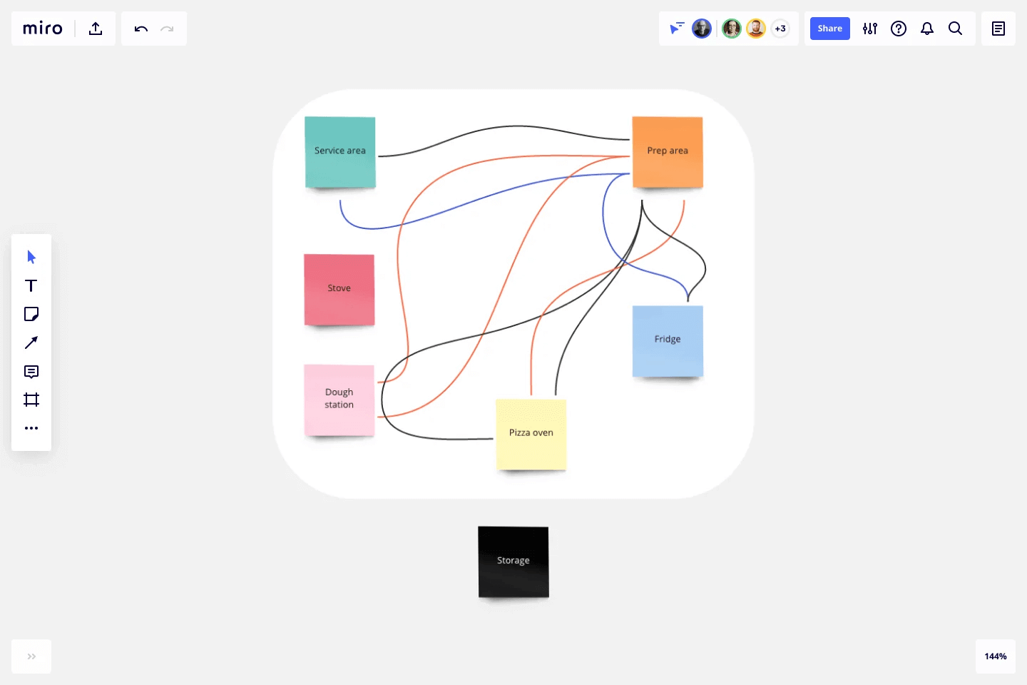
To better understand how a spaghetti diagram works, let’s imagine a car manufacturing company and its stamping process. When a supervisor wants to improve the efficiency of this process, they need to visualize the different work stages and how workers and materials move through them.
The six main steps are:
- Find the right metal
- Metal quality inspection
- Punch out the necessary shapes
- Produce additional shapes
- Quality check
- Final product delivery
They can map this workspace out using a spaghetti diagram. For example, this is what it could look like:
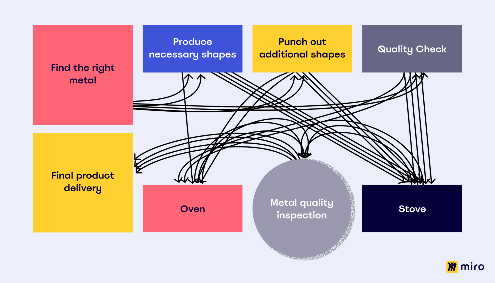
Now that there’s a visual overview, the supervisor can identify the errors in the layout. In this specific example, the layout forces a cluttered workspace without a clear flow. Workers have to move all over to get their tasks done instead of moving smoothly from one stage to the next.
Here, the supervisor can brainstorm potential ideas, get their team involved, and implement changes.
The benefits of a spaghetti diagram
A spaghetti diagram can help every organization streamline processes via process mapping. Here’s how:
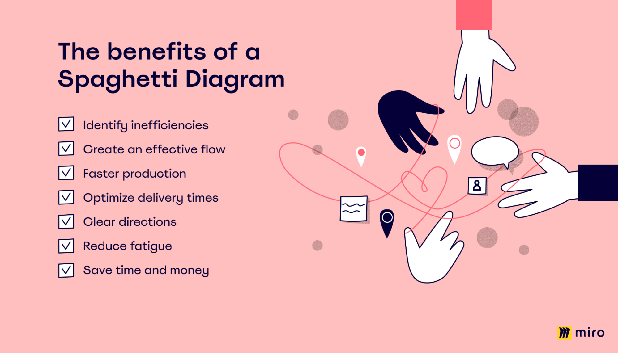
- Identify inefficiencies: Easily see the problem areas and pain points within your work layout and create plans to eliminate them.
- Create an effective flow: Reduce the time wasted and delays caused by workers moving through multiple locations to get their work done.
- Faster production: An improved process layout helps workers complete tasks faster. This, in turn, leads to more rapid production.
- Optimize delivery times: Identify areas where delivery could be improved, such as reducing the distance between specific workstations.
- Clear directions: Set a work path that reduces confusion amongst workers.
- Reduce fatigue: Employees greatly benefit when unnecessary movements are eliminated and physical exhaustion is reduced.
- Save time and money: All of the above factors lead to faster production and delivery times. It also saves time and money that would’ve been spent on a slower, chaotic process.
When to use a spaghetti diagram
A spaghetti diagram can break down complex processes that involve multiple work stages. It visually identifies product flow, waiting times in each stage, and the walking or movement of workers.
In many cases, managers don’t recognize an issue until it’s laid out in front of them.
With a spaghetti diagram, they can understand the current state of the process flow and the issues within it. Leaders can then ideate ways to create a smoother workflow that boosts productivity and relieves worker stress.
The spaghetti model is also excellent for visualizing a new layout. Implementing a new layout or optimizing an existing one requires time, money, and resources. You need stakeholders to back up the renovation, and a spaghetti diagram can help persuade them of the benefits of a better layout.
How to draw a spaghetti diagram
Drawing a spaghetti diagram is not a complex process, but it can be time-consuming to track worker movements on paper manually. It can also get messy.
Ideally, you should use an online collaborative tool like Miro’s diagram maker to get the job done in minutes and easily add and edit worker or product movement.
You can follow these simple steps to create your own spaghetti diagram:
Step 1: List all the work stages involved in the current product or process flow.
Step 2: Select Miro’s Spaghetti Diagram Template.
Step 3: Use the sticky notes in the template to represent each work process. Arrange the notes as they are in your current layout.
Step 4: Use the pre-loaded connector lines or noodles to depict the product flow from one sticky note to the next. Add new noodles, and move them around as you please. They will automatically adjust to remain connected.
Step 5: Invite team members to view your diagram via a sharing link. Ask for feedback, and implement any changes.
Step 6: Save your spaghetti diagram and use the link to share with all necessary workers and stakeholders.
How to optimize a process using a spaghetti diagram
Once you’ve created your spaghetti diagram on Miro, you have a visual overview of work processes. This overview makes it easier to identify bottlenecks, inefficient arrangements, and other areas that need improvement.
You can use Miro to remap your diagram and formulate a better layout. Here are some tips to do so:
- Identify stations that employees are walking to and from multiple times a day. See if the station can be rearranged so that it’s easier to reach.
- Similarly, sort and group related task items closer to each other.
- Identify optimal paths for multiple products that move through the same area.
- Determine tasks that can be done electronically and how to transition them from physical to digital.
- Place stations in a C or U shape to improve product flow and team communication.
The diagram can also be used to improve information flow. For example, if files are repeatedly moving back and forth between two employees to get one task done, there’s a higher chance of error, and it’s time to optimize. You can use a collaborative work platform or weekly team meetings to share the information instead.
With Miro’s easy editing features, your team and stakeholders can also analyze your new layout and provide feedback. It also enables your team to run a risk assessment of the new layout.
Tips for creating an effective spaghetti diagram
A basic spaghetti diagram is an excellent place to start, but once you get into the details, it’s essential to create a comprehensive diagram for process improvement. Here are a few tips to help with that:
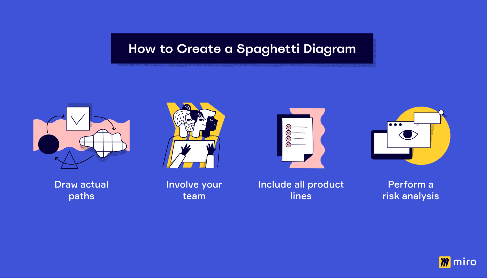
1. Draw paths exactly
When you’re drawing your paths or “noodles,” don’t draw the perceived path or the path you think the product or worker takes. Instead, draw the actual path by observing each worker.
Use different colors for each worker, and don’t draw paths through other machines, walls, etc. Draw it precisely as it is. Only exclude personal activities and restroom breaks.
You must measure the total distance between each workstation and the walking time for workers to go from one to another. Recording the time gives you a concrete measure of improvement, for example: “Reduced travel time from station A to B by X minutes or seconds.”
2. Bring your team into the discussion
Get your team involved in the exercise. Let them know you’ll oversee their movements so that they are engaged in the activity. You can also provide basic training about spaghetti diagrams to the workers, so they know why they’re being observed.
Some organizations build a team and train these workers to draw the diagram. They will act as operators and observe employee movement for a specific period before drawing a spaghetti diagram.
Once the diagram is complete, bring your team or at least the managers into the discussion about process improvement. Often, workers follow a particular process for reasons that are not apparent on paper.
Isolated process improvements could have disastrous results if the team is not on board. This is why it is crucial to include team members in the process, and a tool like Miro is the best option for it.
You can easily collaborate on the same diagram, leave comments, and edit in real-time with Miro.
3. Include all product lines
Many make the mistake of excluding smaller tasks, optional ones, and anomalies from their spaghetti diagram. Don’t do this.
It’s essential to include all product lines, no matter how insignificant it seems. The one anomaly you ignored could become a major roadblock when you’re trying to implement changes.
After all product flow lines are marked, identify intersections, bottlenecks, points of delay, etc.
4. Always perform a risk assessment
After planning out the proposed changes, carry out a comprehensive risk assessment to identify potential problems. To structure and evaluate these risks effectively, consider leveraging Miro’s risk assessment templates. There’s no point implementing a new layout or product flow if there will be more issues than before.
A risk assessment will help you see where things could go wrong and how probable this event is. When you’re prepared for these risks, they will be easier to manage or solve.
Conclusion
A spaghetti diagram is a valuable analysis tool that helps organizations eliminate wasted time and resources in the workplace.
When implemented correctly, a spaghetti diagram can quickly optimize how your team moves. You can bring them the resources they need where they need them to get work done faster.
You can create your own spaghetti diagram and get the team involved on Miro’s online collaborative whiteboard tool.
We have an intuitive interface and tons of features to help map out your layout in minutes.