Two-week sprints are ubiquitous at tech companies, with the assumption that they help teams ship products faster and better. Rob McMackin, Lead Product Designer at Slite, explains why his team moved away from this model, and provides a description of what they do instead.
Slite is building a tool for teams to write, share, and store their knowledge. Asynchronous, longer-form writing helps to push against the shallow and ephemeral nature of chat and email. Slite helps teams to think and work together more clearly, consistently, and with longevity.
As builders of a productivity tool, we’re invested in creating the most efficient and optimized process for shipping products. We’ve revamped our process a few times, and each time, shipping speed and quality have increased.
A lot of what we currently do is inspired by Ryan Singer and Basecamp (much credit to him, check out his work), very consciously adapted to our size and needs by our main product man, Mike, with me as a happy participant.
Here’s an outline of how (and why) we do what we do:
Cycles: Happier, healthier portions of work
At the center of our process are cycles: 5-week periods where we develop large groups of strategic work. After each cycle, we have a 2-week regroup to prepare for the next cycle, while tackling design and technical debt.

The length of each cycle is an intentional move away from the two-week sprint, which felt like an unending controlled crash of features into production, with too many check-ins, management overhead, and no room to step back and fix things.
With cycles, we actually ship more. People feel less unnecessary rush, and with the extra time we feel more confident in what we choose to build.
Not everything ships at the end of a cycle; we ship something when it’s ready. But by the end of each cycle, the team will have reached some key strategic milestones.
Pitching: Ideas being heard
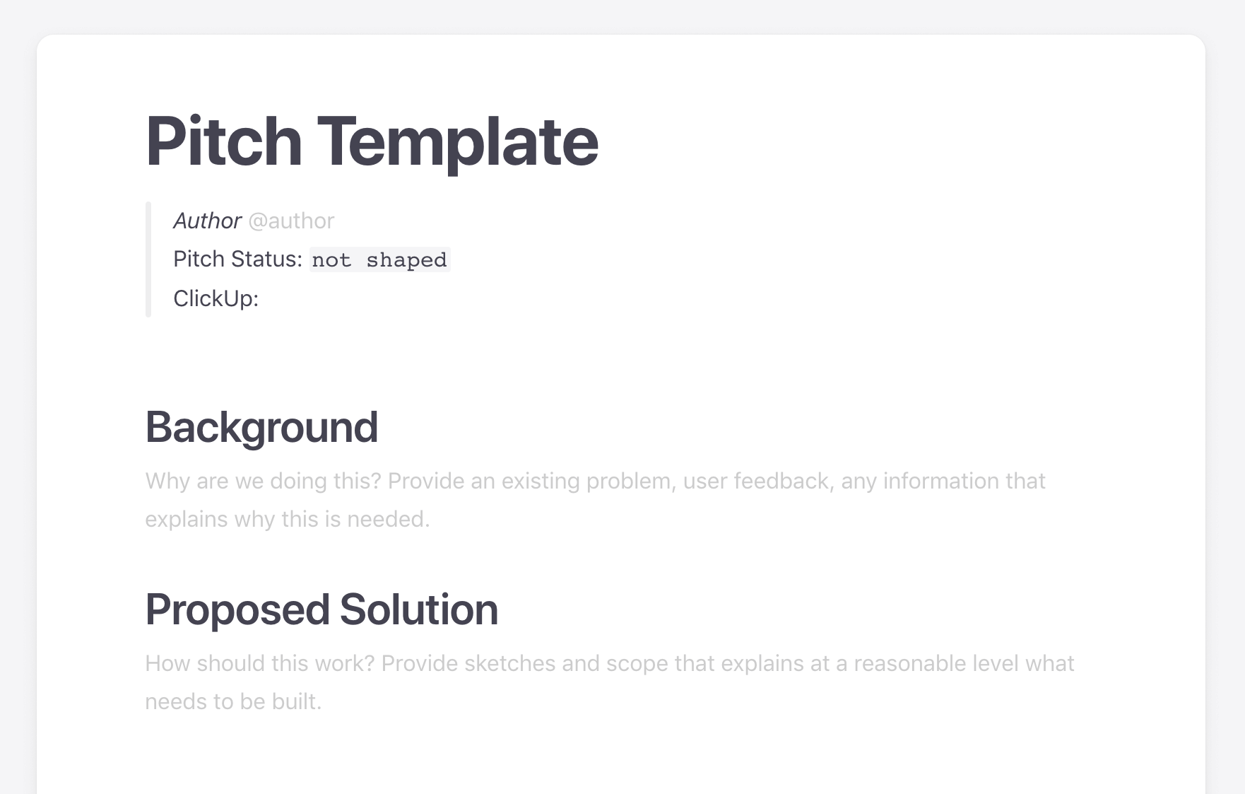
Pitches are notes/short descriptions containing rough concepts of what we should build or improve next – and why. Before each cycle, the whole team (not just the Product team) submits pitches into Slite and Clickup.

Pitch inputs can range from things such as sales blockers (e.g, larger teams requiring advanced security features) to ideas that solve needs we discovered through user research.
At a higher level, pitches are related to strategic themes of the cycle (e.g, growth, activation, or UI simplicity), and are prioritised and selected based on their potential impact on these areas.
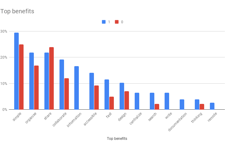
We base these strategic themes on findings from user research. First, we identified the users who said they’d be “very disappointed” to not be able to use Slite. Then, we asked them what the most important benefits of Slite are for them. Then, we aim to double down on this benefit.
Shaping: Foreseeing how ideas meet with reality
In earlier iterations of our product development process, we didn’t include a pitch “shaping” stage – but now we’re really happy that we do. Shaping is about telling the story of how feature concept benefits users.
Before, we would go straight from pitch into UI design and development, which resulted in surprises appearing in the late stages of development.
Now, we intentionally take a moment to pause and consider the full impact of the feature, and make sure everyone in the team understands it – before we get into any implementation details.

There is a back and forth between design, engineering, and product to define a solution at a high level, while proactively identifying any pitfalls we might run into.
During this stage, we also define the questions needed to answer whether this feature will meet its goals (e.g, are members converting to paid, creating more notes, inviting more people, etc).
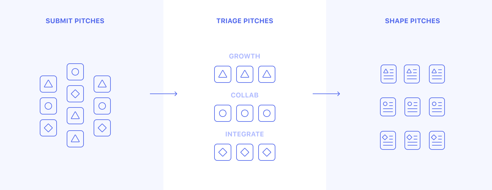
Shaping ultimately saves implementation time for both design and developers. Fewer nasty problems that delay shipping arise late in the game.
Shaping process
- Analyse the problem and how the solution fits it (what should we do and why).
- Map the full story of how the user gets from A -> B while using the feature.
- Define technical requirements and scope.
- Identify potential “what if” pitfalls like “What happens when user has x permissions”, “What happens in y data-state”, “What happens in Z UI mode”.
- Decide on the simplest, high level design approach.
- Represent with a sketch.
The sketch is not a refined design mockup, but a starting point that explored and defined bigger decisions related to a feature.
Shaping is the design that occurs before UI or interaction design. We work remotely, but shaping happens over a call, using real-time whiteboarding tools like Miro.
Looking for a tool to manage your remote product team?
Try Miro free
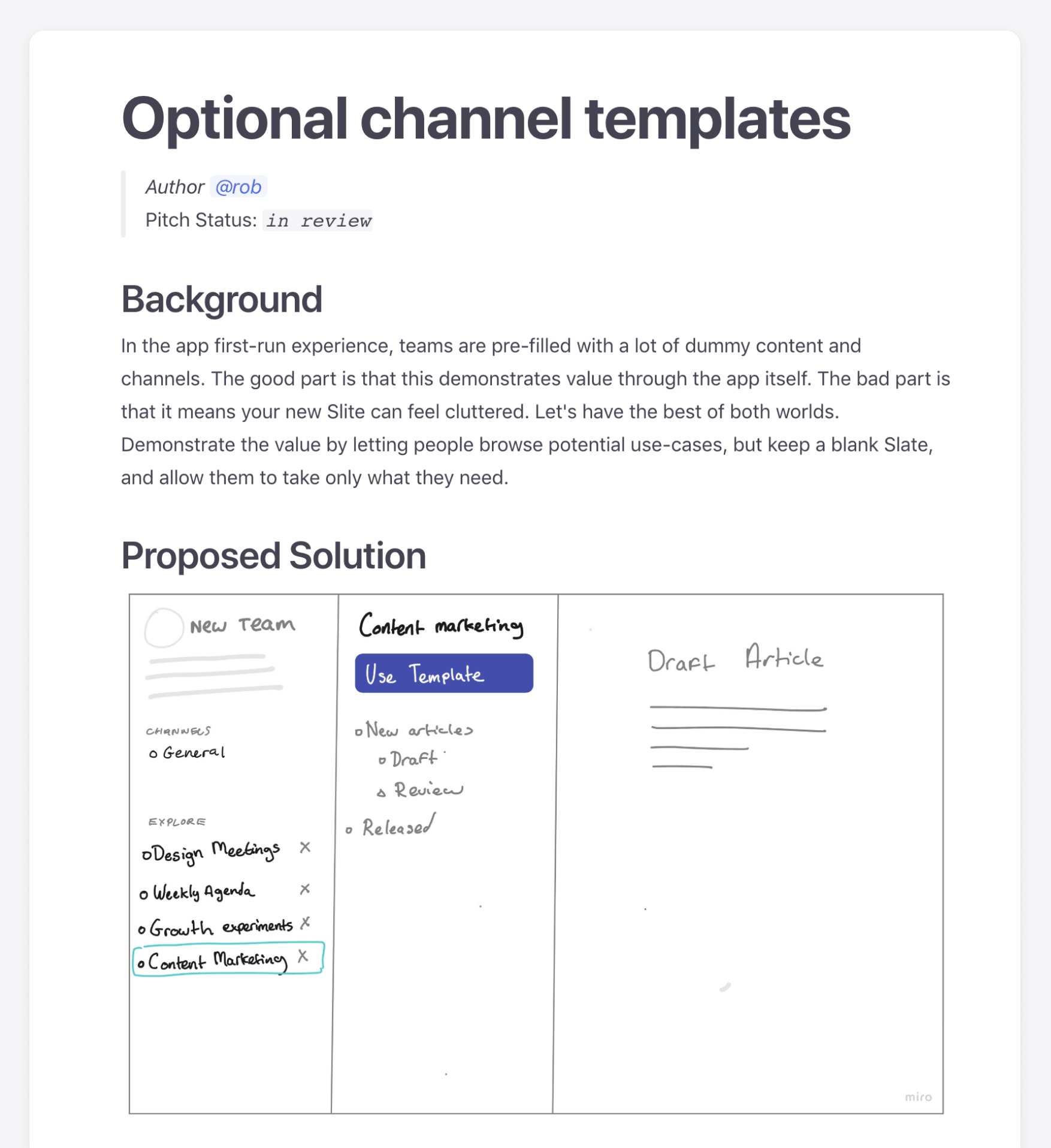
Example of a shaped note for a feature, “channel templates,” with a solution sketch made in Miro. The end product often looks nothing like the sketch, but helps everyone to quickly understand what needs to be done.
Kickoff
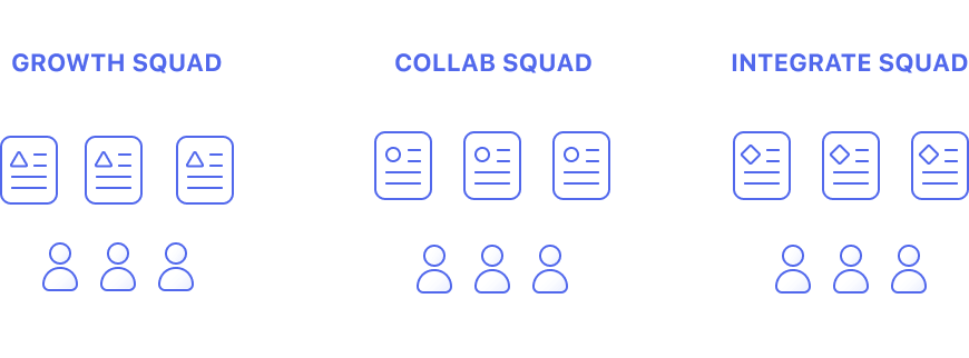
Shaped pitches are then assigned to goal-oriented squads of 2-3 (usually one designer, two developers). Each squad can have anywhere between 5 and 10 pitches to handle. The squads are self organising, and it’s totally up to them to plan the design and development of these.
UI design
Pre-shaping pitches makes the UI stage more focused. There are fewer questions to diverge into. Designers can focus purely on exploring optimal flow, which UI components to use, and how to construct them clearly.
We have a component library in Figma, and try to avoid creating any new components to keep the UI maintainable and conventional.
Feedback
Each problem is then owned by a designer. It’s their responsibility to explore solutions and gather as much feedback on them as needed.
Feedback comes from various sources (users, developers, product, marketing, sales) to help to reach the ideal solution.
Delivery
Once the back and forth has settled, depending on the size of the pitch, designs are delivered as either detailed specs in notes or just through Figma files for smaller features.
Quality
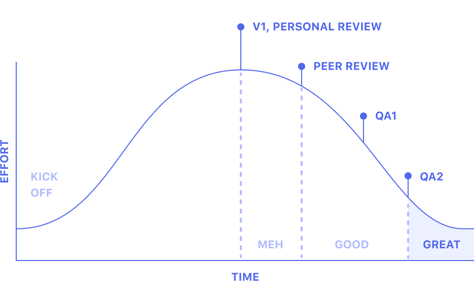
It’s easy to think the job’s done when the hardest part is over, but most of the time features don’t come out exactly as you’d like the first time round, so we find it important to have an intentional refinement phase.
This can be tedious or easy to forget, but QA phases are the key to getting UI interactions and details looking and feeling great before shipping.
Unpredictability
These rules may sound rigid but the reality is we often need to be flexible.
Sometimes we may drive features into production mid-cycle. Sometimes we need two cycles to research and test big changes. Sometimes we may need to run experiments that we know might not work.
Summary
- Develop in 5-week cycles.
- Have 2-week regroups to repay design and technical debt.
- Before a 5-week cycle, gather ideas and triage them based on strategic outcome.
- Before any UI or development, pull out the technical, product, and user requirements, and design a high-level solution in a sketch.
- Assign pitches to self-organising squads, oriented around strategic goals.
- Define the interactions, components, and visuals needed for the user interface.
- Review it as many times as needed to reach a high level of quality.
- Ship it.
- Check resulting data against predefined questions as to whether work meets its goals
Miro has helped us get things done throughout the whole process. From brainstorming, exploring solutions together and mapping out the experience, to wire-framing and building mood boards.
Rob McMackin, Lead Product Designer at Slite
